With a legacy spanning over 165 years, J.P. Wiser’s was ready to embrace its age with wisdom and an unwavering confidence in its position as a world-class icon. To showcase its proud position as Canada’s longest-continuously produced Whisky, J.P. Wiser’s underwent a rebranding led by international strategic design agency JDO.
Boasting an award-winning portfolio of Canadian rye whiskies, J.P. Wiser’s has always maintained confidence in the quality of its product and never felt compelled to follow trends. However, recognising the need to overcome the perception of being outdated, the Pernod Ricard-owned brand joined forces with JDO to revitalise its image. The collaboration resulted in the introduction of bold new elements that celebrate J.P. Wiser’s as a reliable option for those seeking an authentic whisky experience, without the need to impress anyone but themselves.
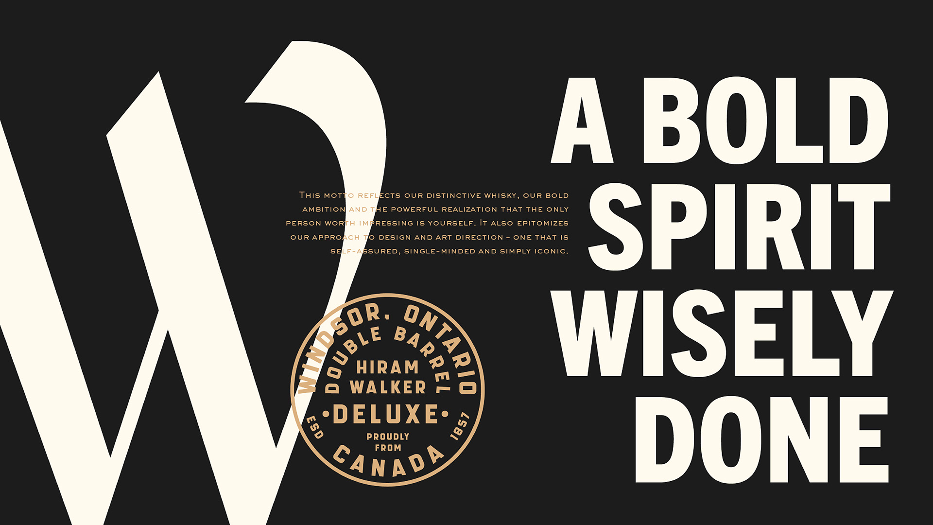
“We found inspiration in J.P. Wiser’s own words, ‘The boldest always draws wisdom from the past, while leading the charge forward,’ commented Ben Ridley, Associate Creative Director at JDO. “This powerful quote became the cornerstone of our creative guiding principle: ‘A Bold Spirit Wisely Done,’ reflecting the brand’s vision and our goal to make a strong impact with bold, self-assured, and iconic design at every touchpoint.”
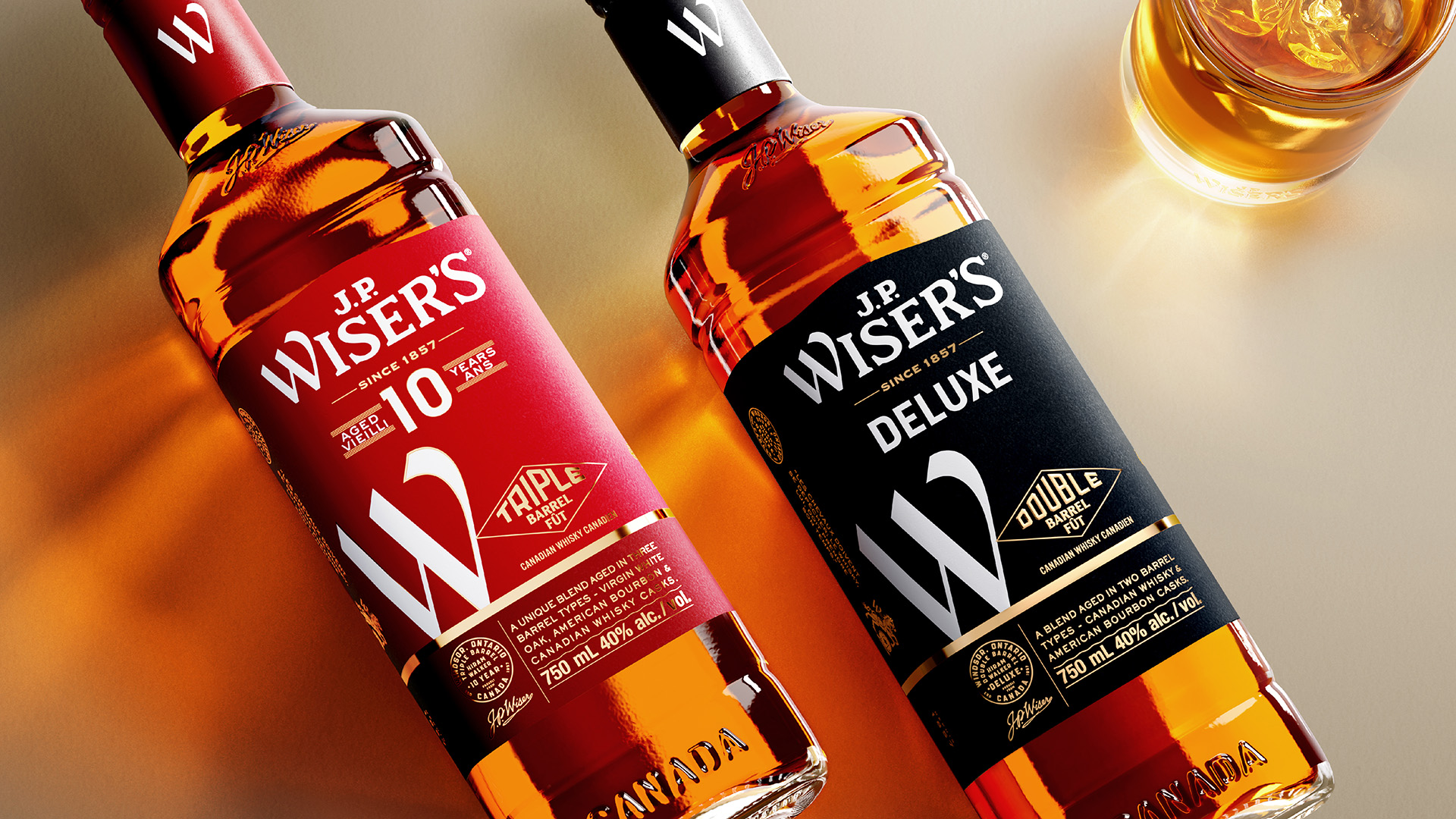
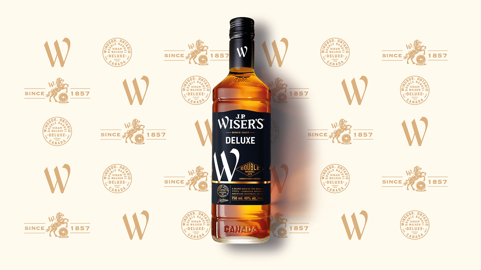
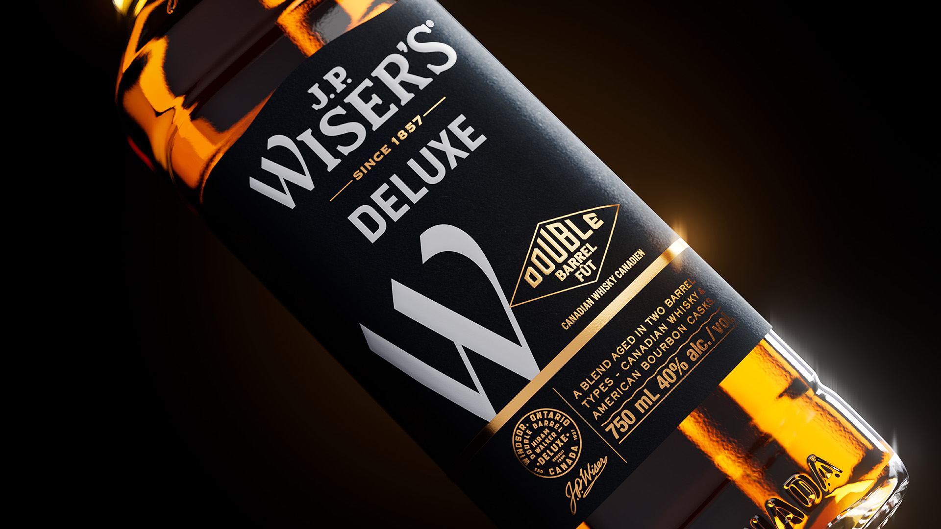
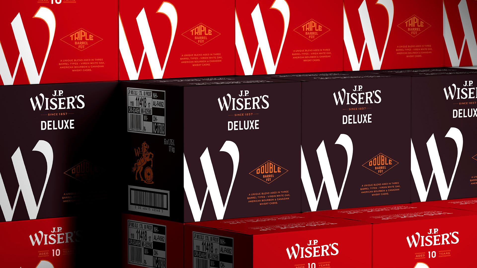
Just like J.P. Wiser’s whisky, the new identity balances a bold expression with moments of consideration and craft to deliver visual impact and premium appeal. The redrawn logo, complemented by a simple colour palette of black, gold, and red, pays homage to the brand’s industrial origins, whilst the new ‘Big W’ brand signifier not only makes a bold statement but also possesses the versatility to leave a lasting impression wherever it appears.
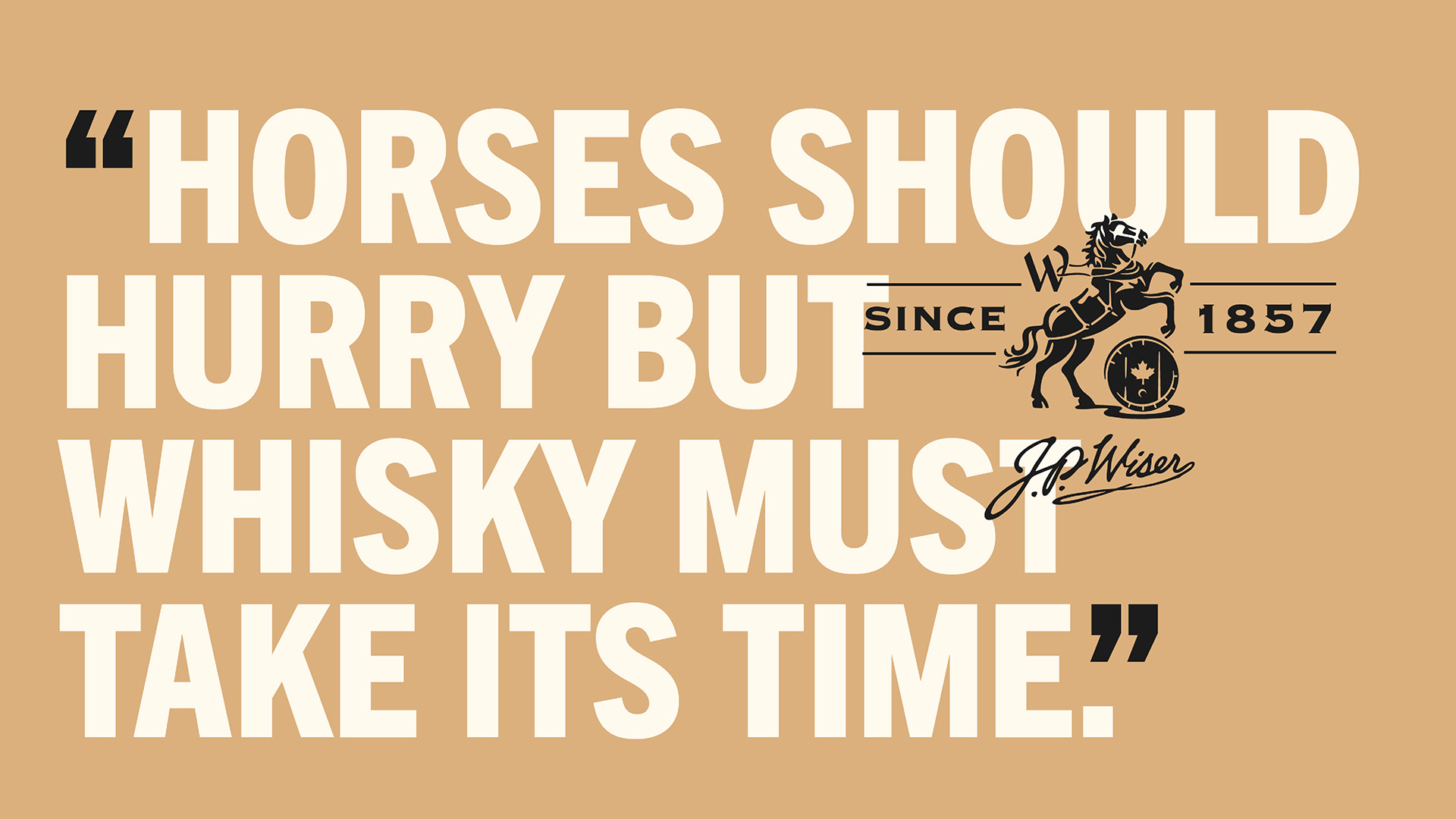
The new identity also features a new heritage icon depicting a horse rearing over a barrel, emblazoned with the impactful declaration, “Since 1857.” Inspired by J.P. Wiser’s quote, “Horses Should Hurry But Whisky Must Take Its Time,” this symbol beautifully honours the brand’s illustrious heritage and deep Canadian roots.
The new packaging exudes simplicity and confidence, prominently showcasing the brand’s iconic Big W signifier to make a bold statement on the shelf. Its clean, modern aesthetic, complemented by carefully crafted details, displays J.P. Wiser’s longstanding whisky credentials with powerful impact and distinctive character.
“J.P. Wiser’s relaunch marks a pivotal moment, transitioning the brand from its illustrious past to an exciting future,” comments Cory Owens, Senior Brand Manager, J.P. Wiser’s. “JDO’s craftsmanship has allowed us to establish a strong foundation for a more contemporary and genuine narrative that truly reflects our proud heritage. The design commands attention, effectively highlighting our commitment to quality. Simply put, it’s Wisely Done.”




CREDIT
- Agency/Creative: JDO
- Article Title: JDO Revitalises J.P. Wiser’s With a Bold New Identity
- Organisation/Entity: Agency
- Project Type: Identity
- Project Status: Published
- Agency/Creative Country: United States
- Agency/Creative City: New York
- Market Region: North America
- Project Deliverables: Brand Guidelines, Brand Identity, Brand Redesign
- Industry: Food/Beverage
- Keywords: WBDS Agency Design Awards 2023/24
- Keywords: whiskey, whisky, spirits, design, Canada, packaging, identity
-
Credits:
Associate Creative Director: Ben Ridley


