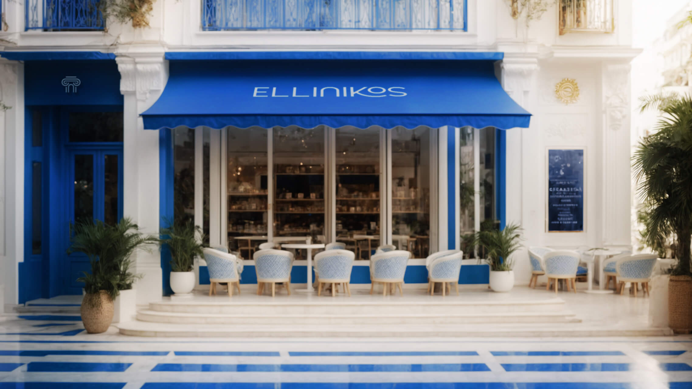
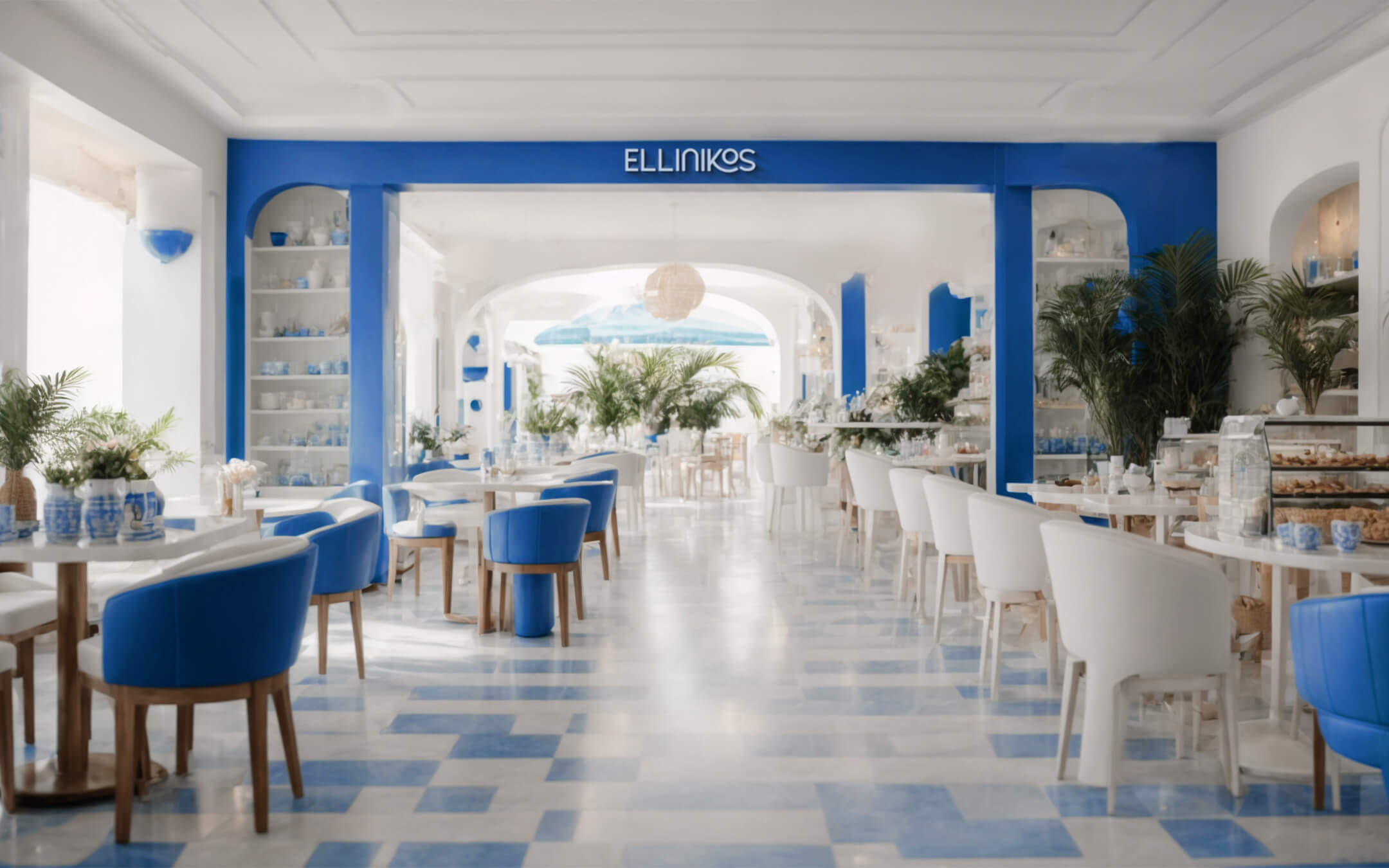
“Ellinikos Café Grego” is more than just a coffee shop; is a sensorial and cultural journey that transports its clients to the stunning Greek islands of the Aegean Sea without leaving Rio de Janeiro. Our mission is to celebrate the authenticity and richness of Greek culture, harmoniously blending it with the vibrant and joyful energy of ‘cidade maravilhosa’.
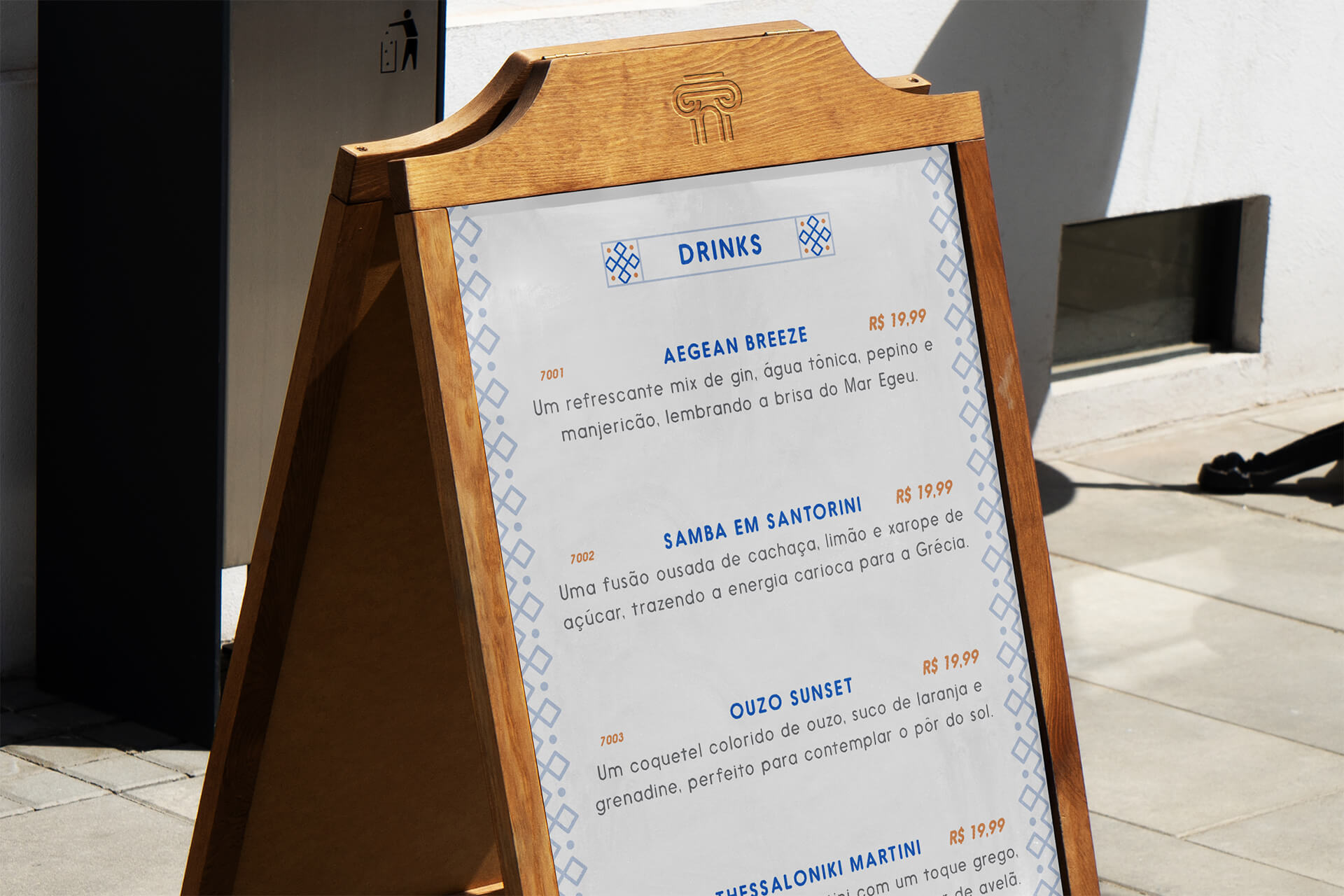
The visual identity for “Ellinikos Café Grego” was meticulously conceived with a clear set of goals in mind. Firstly, we sought to create a striking identity that authentically reflected Greek culture, taking into account Greece’s deep and rich roots.
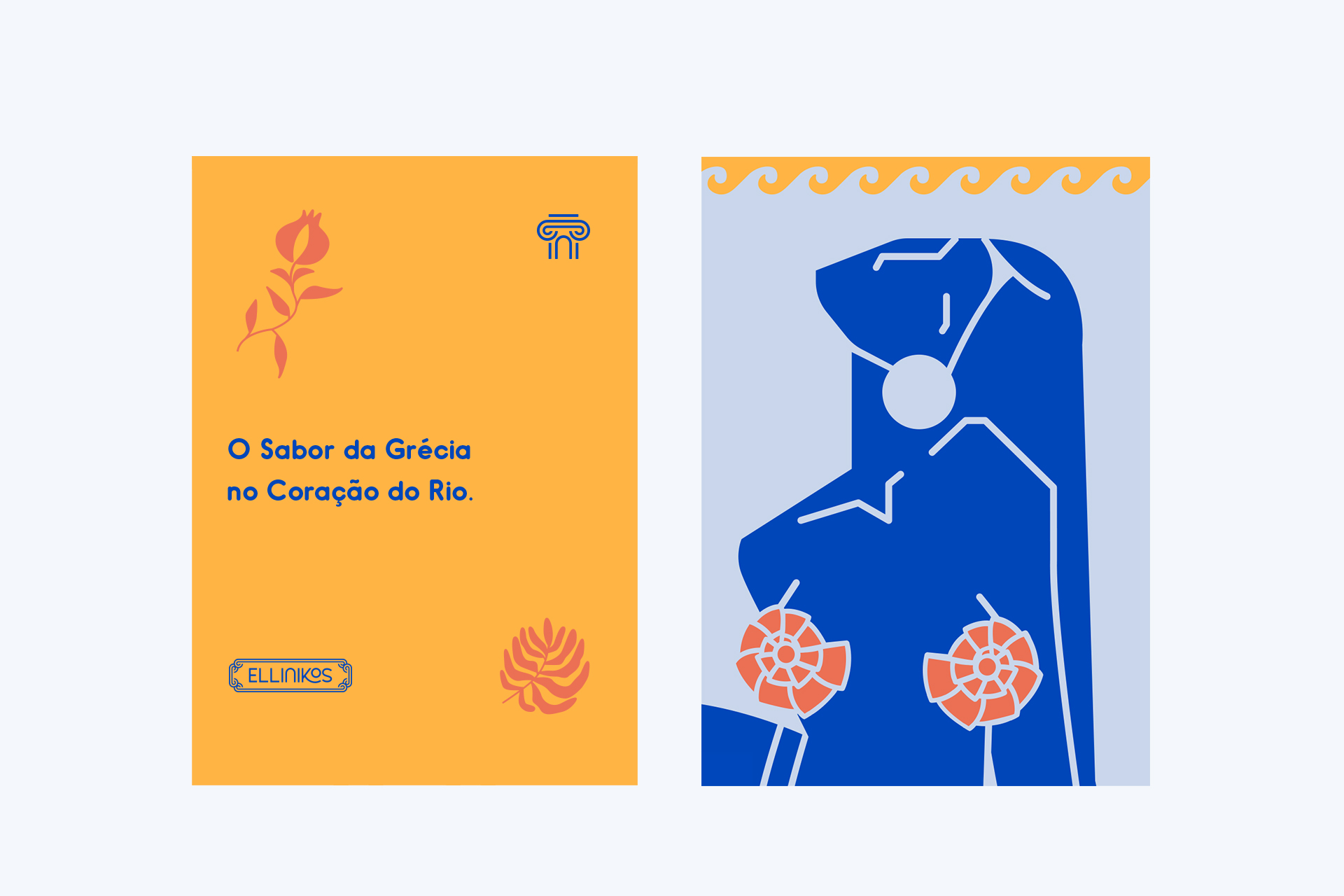
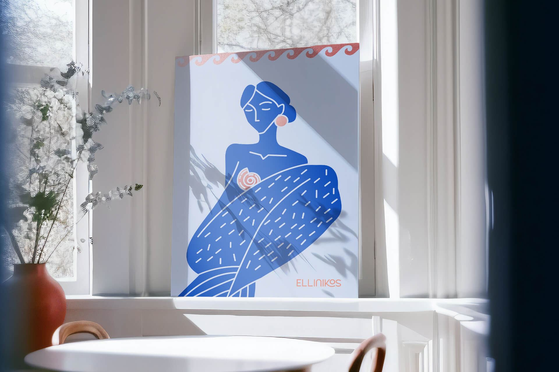
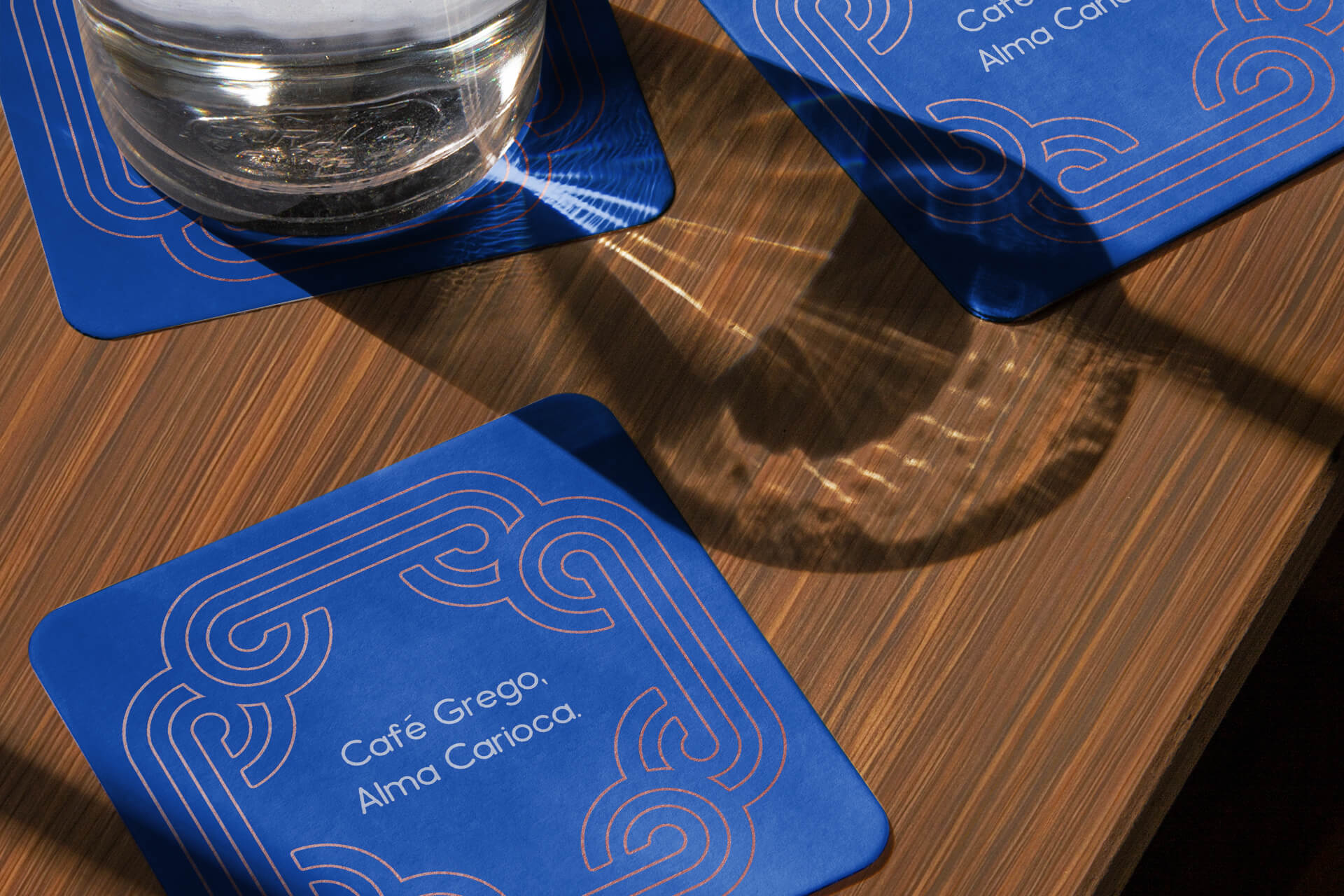
The visual identity features supporting illustrations developed tailor-made for the brand. Furthermore, mermaids, legendary mythological creatures, are highlighted, symbolizing the influence of the Aegean Sea and the enigmatic beauty that permeates Greek culture. The fusion between these elements is a tribute to Greece, its captivating history and its eternal inspiration in creating unique experiences at Ellinikos Café Grego.
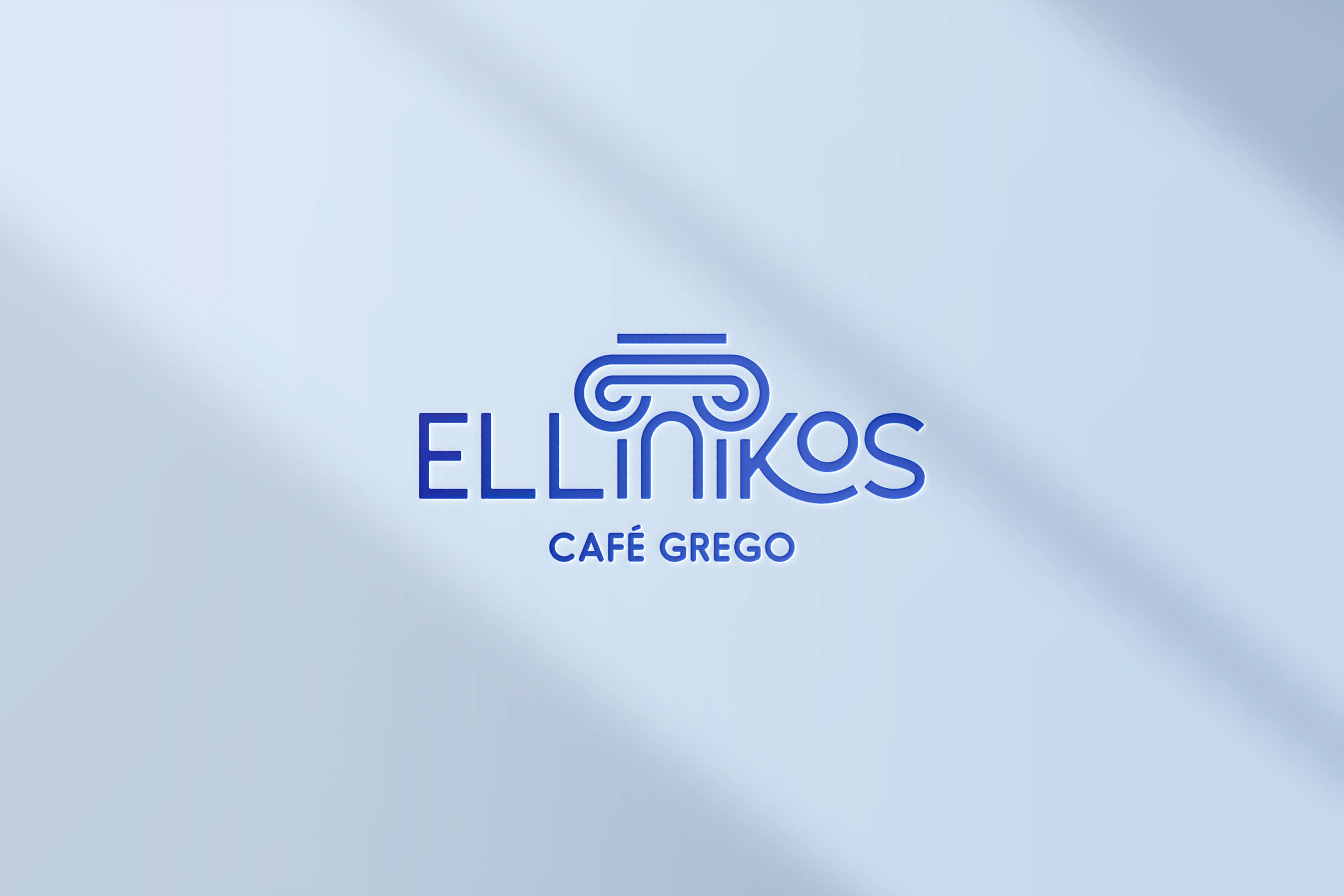
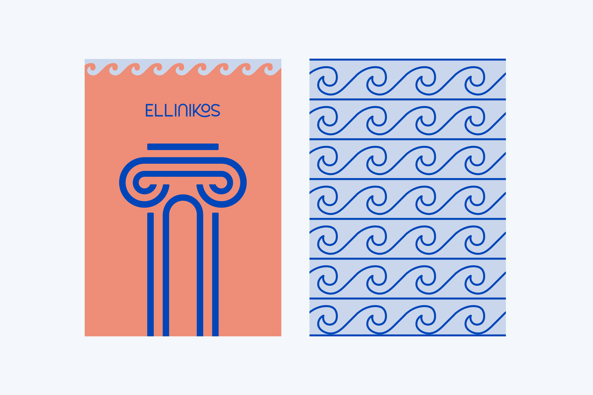
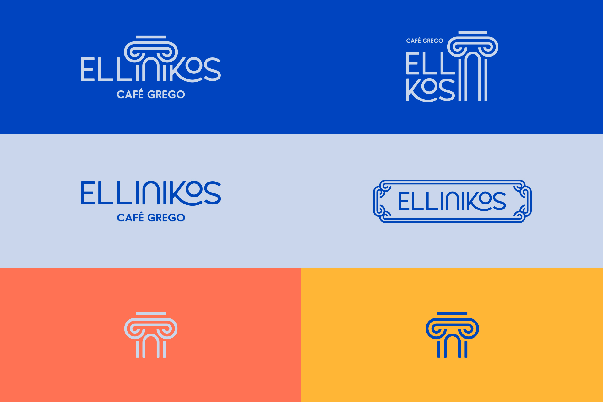
One of the main objectives of the project was to establish an immediate link between the brand and its cultural heritage. For this, we opted for a unique logo, where the letters ‘I N I’ elegantly transform into a stylized Greek column. This choice not only evokes the classic architecture of Ancient Greece, but also conveys the promise to uphold tradition and quality, fundamental elements of the brand.
The choice of symbol for a coffee shop plays a crucial role in building a solid and memorable brand identity. The symbol is much more than an image; it is the visual representation of the essence and values of the brand. In this case, the symbol of the stylized Greek column, incorporated in the letters ‘I N I’ of the “Ellinikos Café Grego” logo, is a strategic and meaningful choice that we passionately defend.
The choice of symbol is a declaration of commitment to authenticity, quality and Greek culture. It is a decision that we believe in, as we understand that the symbol not only elevates the brand’s visual identity, but also enriches the customers’ experience, inviting them to be part of a rich and tasty cultural history.
The logo brings together typographic and symbolic elements into a cohesive composition. The stylized letters and the Greek column work together to create a unique and unforgettable visual identity that reflects the fusion of cultures and flavors that the coffee shop offers.
The logo design itself is a representation of elegance, refinement and harmony – characteristics that are essential to Ellinikos’ welcoming atmosphere. It conveys the promise of a high-quality experience for customers.
The choice of colors in Ellinikos’ visual identity was a carefully considered decision, intended to effectively convey the essence of the brand and create an atmosphere that immerses customers in an authentic and memorable experience. Here is a detailed explanation of color selection and their meanings:
Royal Blue (Aegean): This deep shade of blue is a direct homage to the Aegean Sea, which washes the coasts of Greece and is an integral part of its culture and landscape. Royal Blue represents the calm and serenity of Mediterranean waters, whilst also evoking a sense of trust and reliability. In the visual identity of “Ellinikos Café Grego”, Royal Blue is the primary color, the backdrop that connects the café with Greece and its peaceful environment.
Light Blue (Marble): The shade of Light Blue, nicknamed Marble, is a nod to Greek marble, one of the most iconic and elegant materials in classical architecture. Just like marble, this color evokes a feeling of purity, elegance and sophistication. It captures the luminosity of the Mediterranean sun reflecting off the white marble surfaces that are emblematic of the Greek landscape.
Terracotta (Gaia): The color Terracotta, or Gaia, pays homage to the rich Greek land that sustains Mediterranean culture. It represents the connection with nature and tradition, evoking the feeling of authenticity and deep roots. This color adds warmth to the palette, creating a balance between the freshness of blue and the earthiness of Greece.
Orange (Rio): Orange, or Rio, is a bold and lively inclusion in the color palette. It brings a sense of energy, vitality and enthusiasm that connects to the vibrant environment of Rio de Janeiro, where Rio culture merges with Greek culture. Orange represents the fusion of two cultures into a unique experience.
CREDIT
- Agency/Creative: 268 Estúdio Design
- Article Title: Ellinikos Café Branding
- Organisation/Entity: Agency
- Project Type: Identity
- Project Status: Published
- Agency/Creative Country: Brazil
- Agency/Creative City: Rio de Janeiro
- Market Region: Europe, North America, South America
- Project Deliverables: Art Direction, Brand Design, Branding, Logo Design
- Industry: Food/Beverage
- Keywords: brand identity, coffee shop, greece, greek, brand design, branding, visual identity, 268 estudio
-
Credits:
Graphic Designer: 268 Estúdio Design


