From its humble beginnings as a small marketing agency in Seoul, our team, under the name waymakrs, always had a passion for helping brands go global. But within 3 years of its founding, our purpose was coming into focus in a way that required rebranding. Throughout the process, we hoped to establish a distinct positioning and set clear goals for the future, communicating all of this through a strong tone of voice and visual identity system.
Defining & Naming
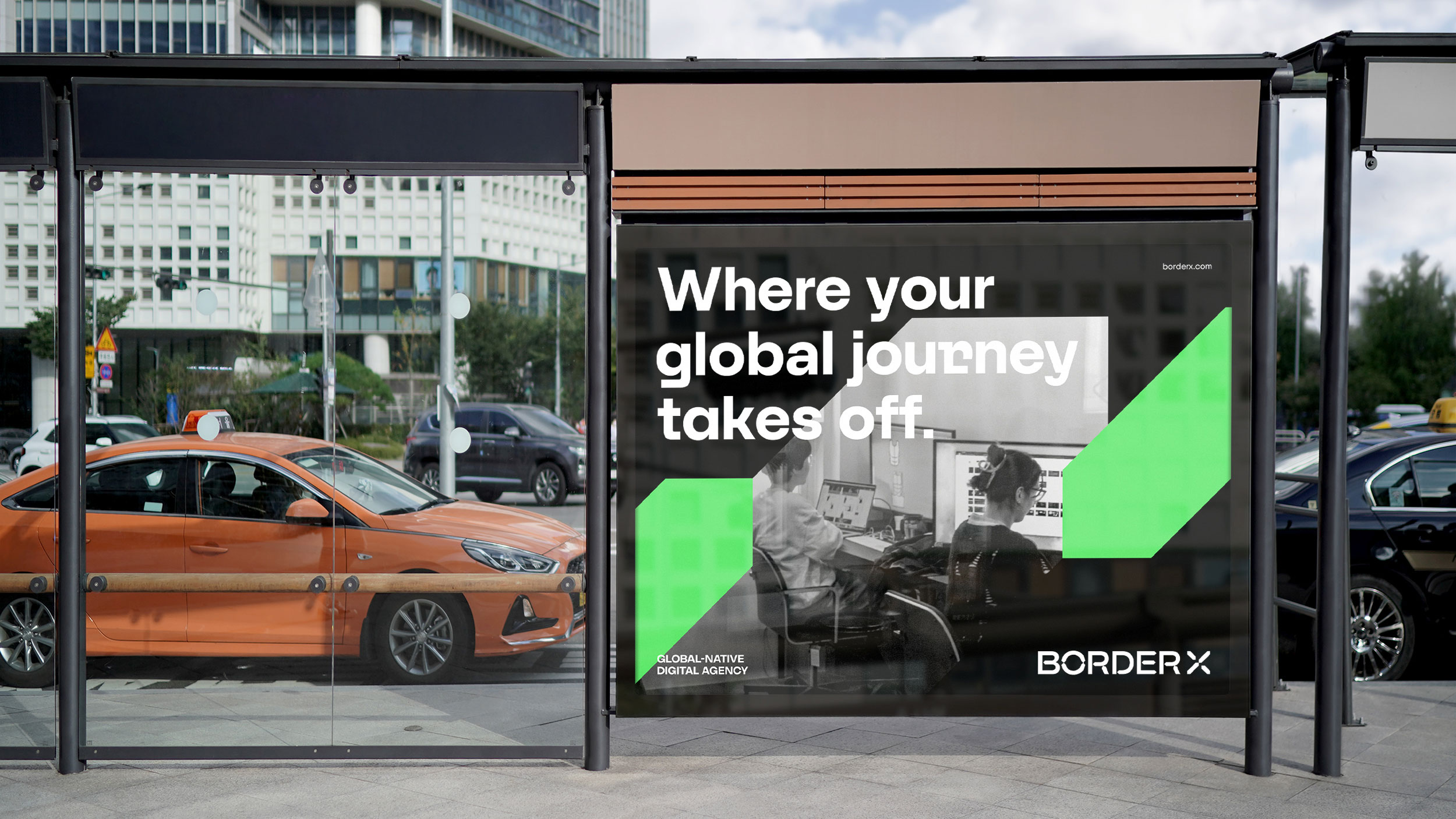
The name BorderX resonated with our constant pursuit of going beyond borders. The name drew attention not only to our global aspirations, but also to our role as leaders exploring the unknown and challenging the status quo. Because we saw ourselves as such a unique agency, categorizing BorderX presented challenges as well. After a lengthy research and contemplation process, we landed on “global-native digital agency.” We felt that this best captured the two key essential components of our unique agency’s offerings, blending our unique selling point (global services) and encapsulating our various services in the digital realm.
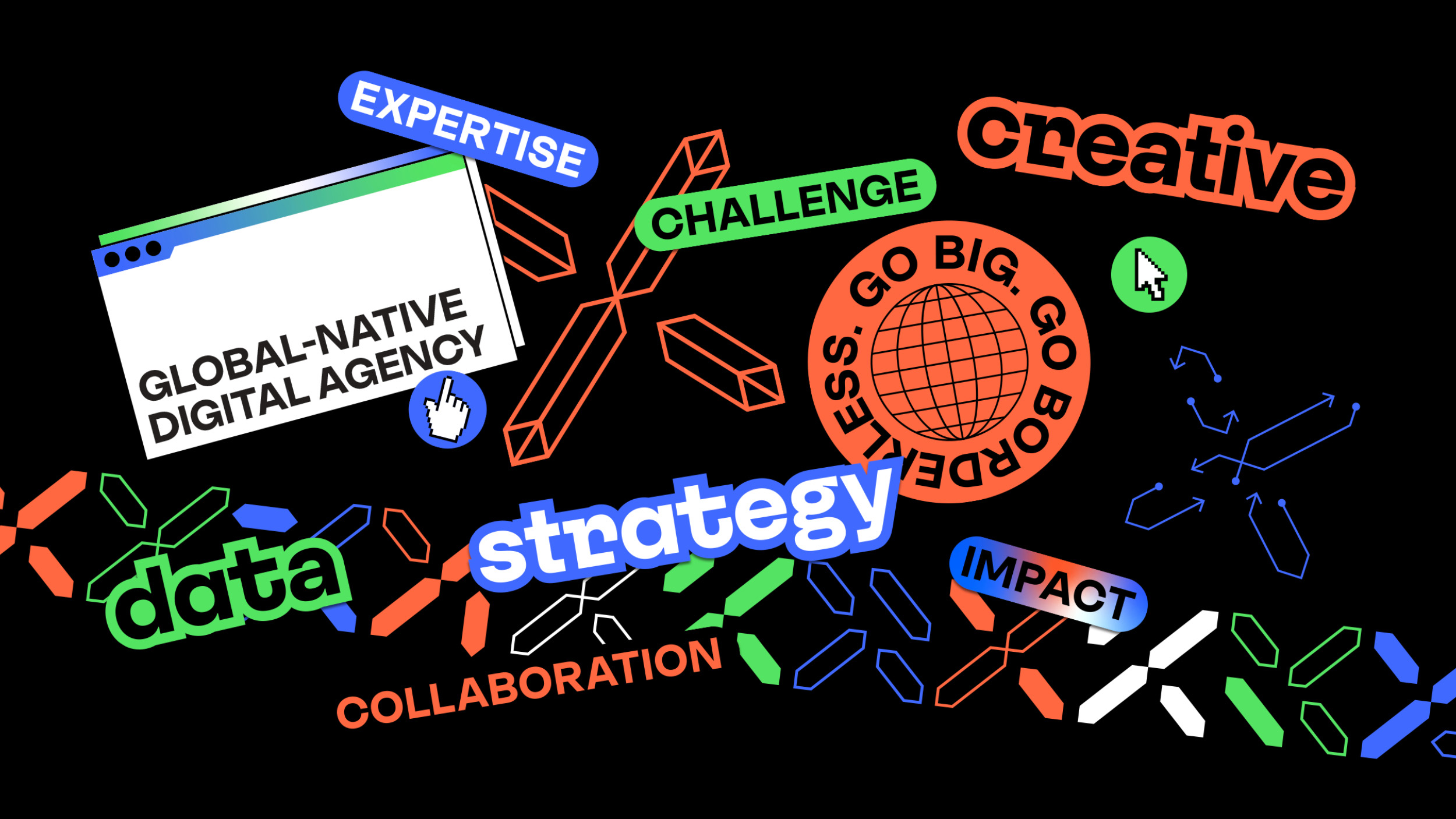
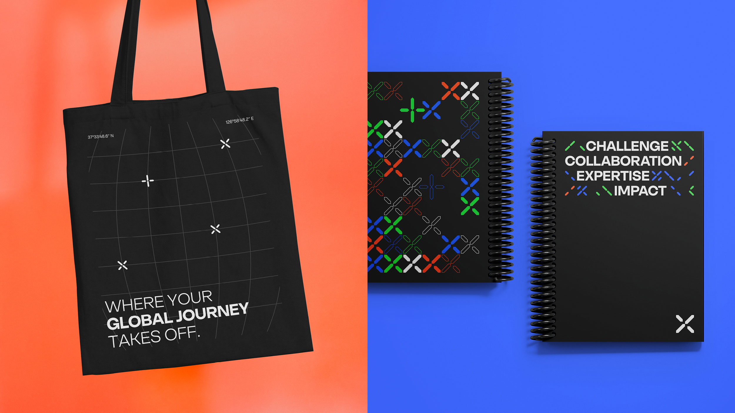
Values: Distilling our core beliefs into 4 words took sifting through our descriptive words with a fine-toothed comb. We recruited the help of our whole team, coming up with words and beliefs that defined the culture of the team. As the list grew longer, we placed them into categories, gradually shaping them into our 4 values: challenge, collaboration, expertise, and impact.
Mission and Vision: Our purpose was clear enough: to help unlock global potential for our clients. But the tough part was to sharpen it to make it specific for our agency. We fine-tuned lengthier iterations of our statements until this purpose was communicated in a clear way. We decided on the mission statement, “We unleash the full global potential of brands through strategy and creativity, with data as our compass,” and the vision statement, “We envision a future inspired by borderless growth.”
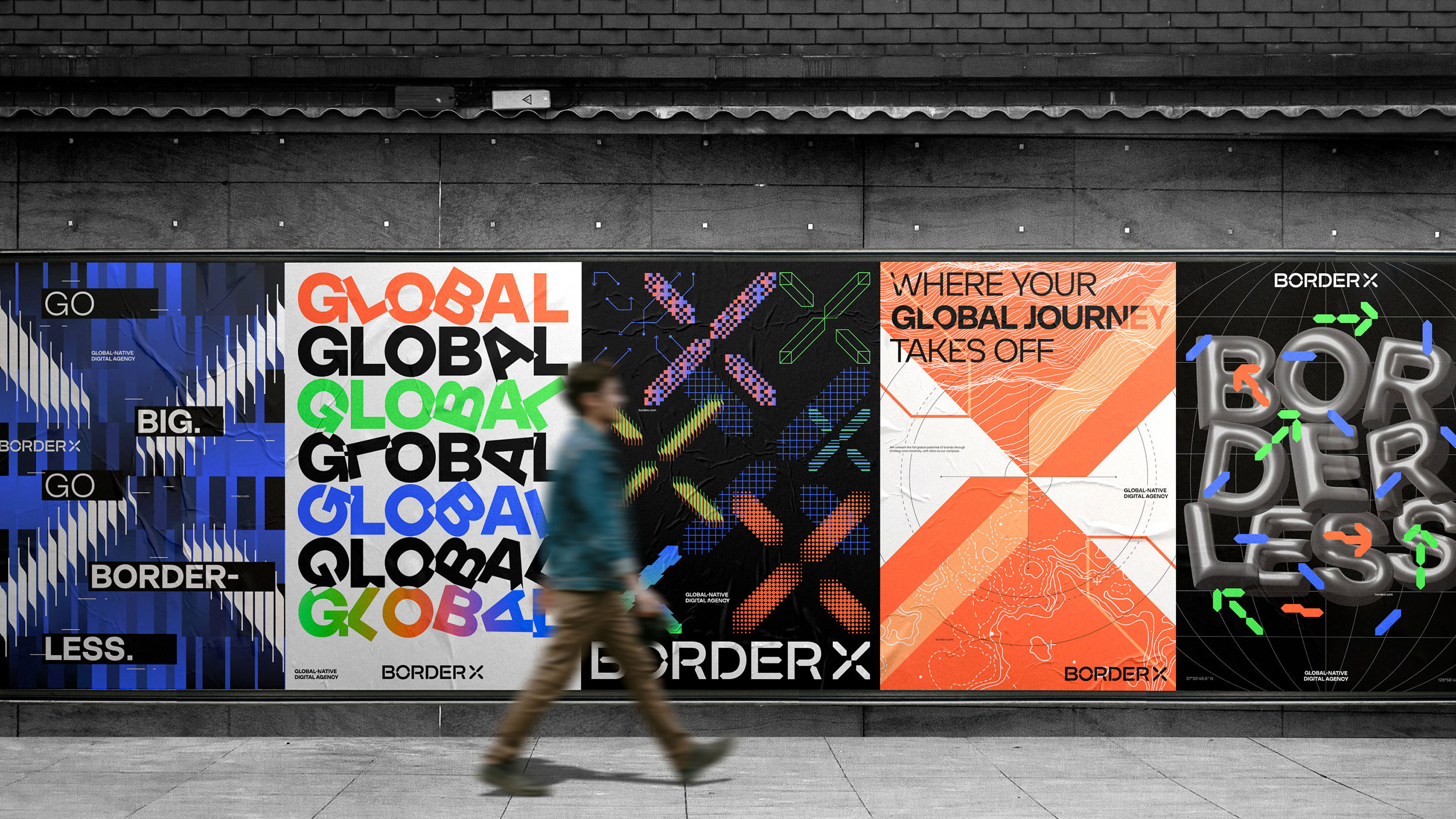
Tagline/Slogan: To write a memorable tagline and slogan, we began with word associations. The slogan was meant to capture BorderX’s services whereas the tagline was meant to conjure up bigger values, so we needed to make sure to differentiate between the two to serve distinct purposes. Narrowing down from long lists of potential slogans and taglines, we selected a slogan (“Where your global journey takes off.”) and tagline (“Go big. Go borderless.”) that naturally depicted action toward a global journey.
Tone of Voice: While we pulled from our descriptive words to help define our tone of voice, we went a step further by defining exactly how we want to sound on each platform. Depending on the type of social media platform for example, we wanted to differentiate and adapt, while maintaining a consistent personality throughout all outlets.
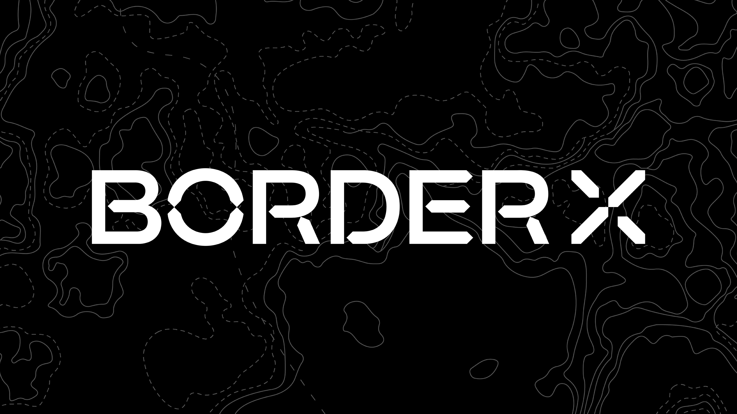
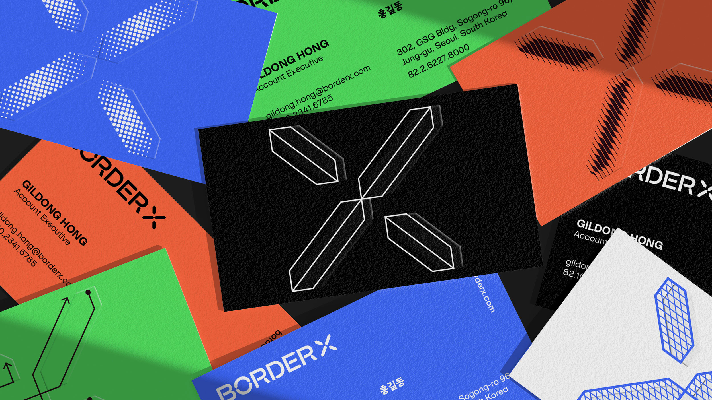
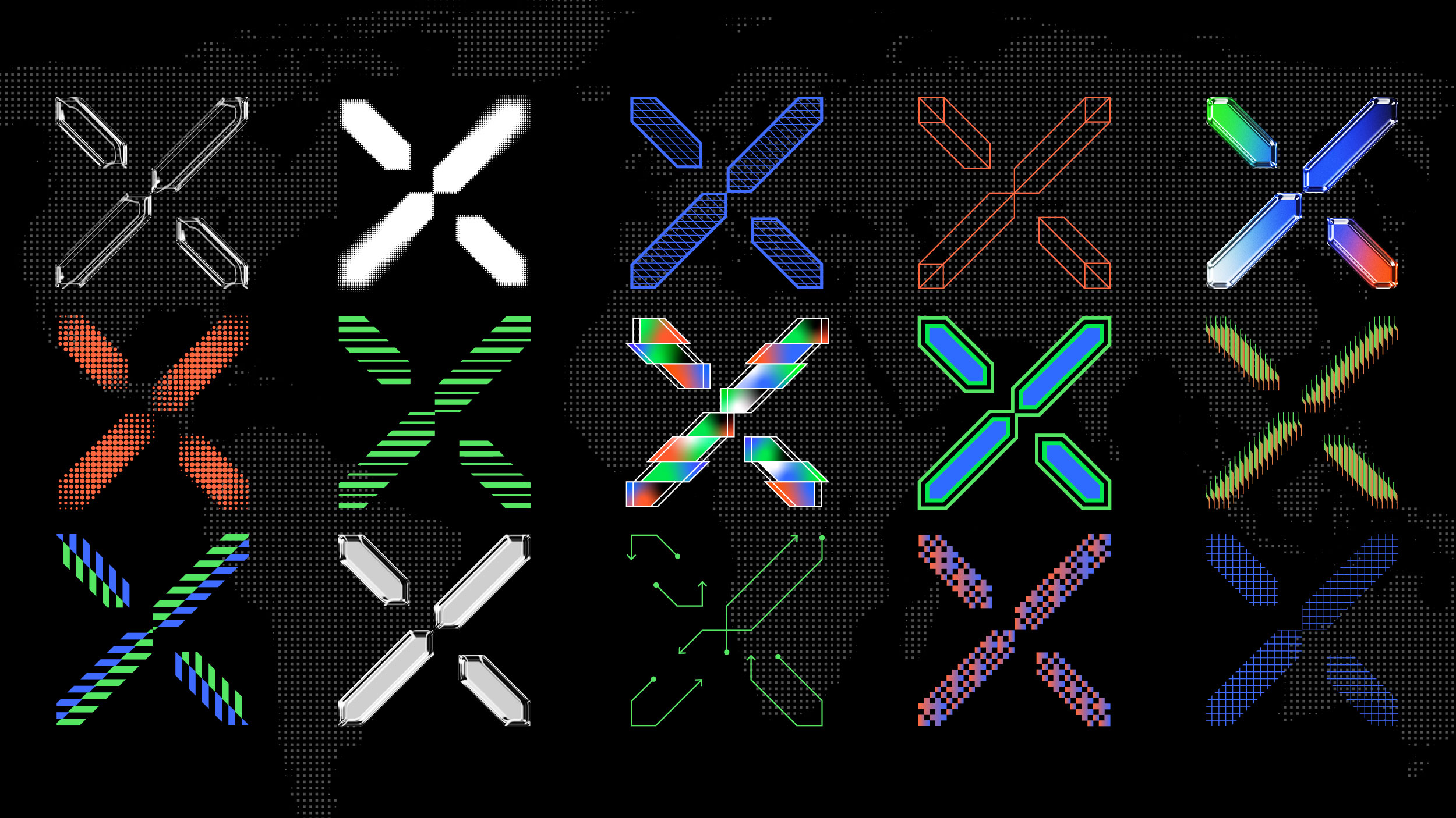
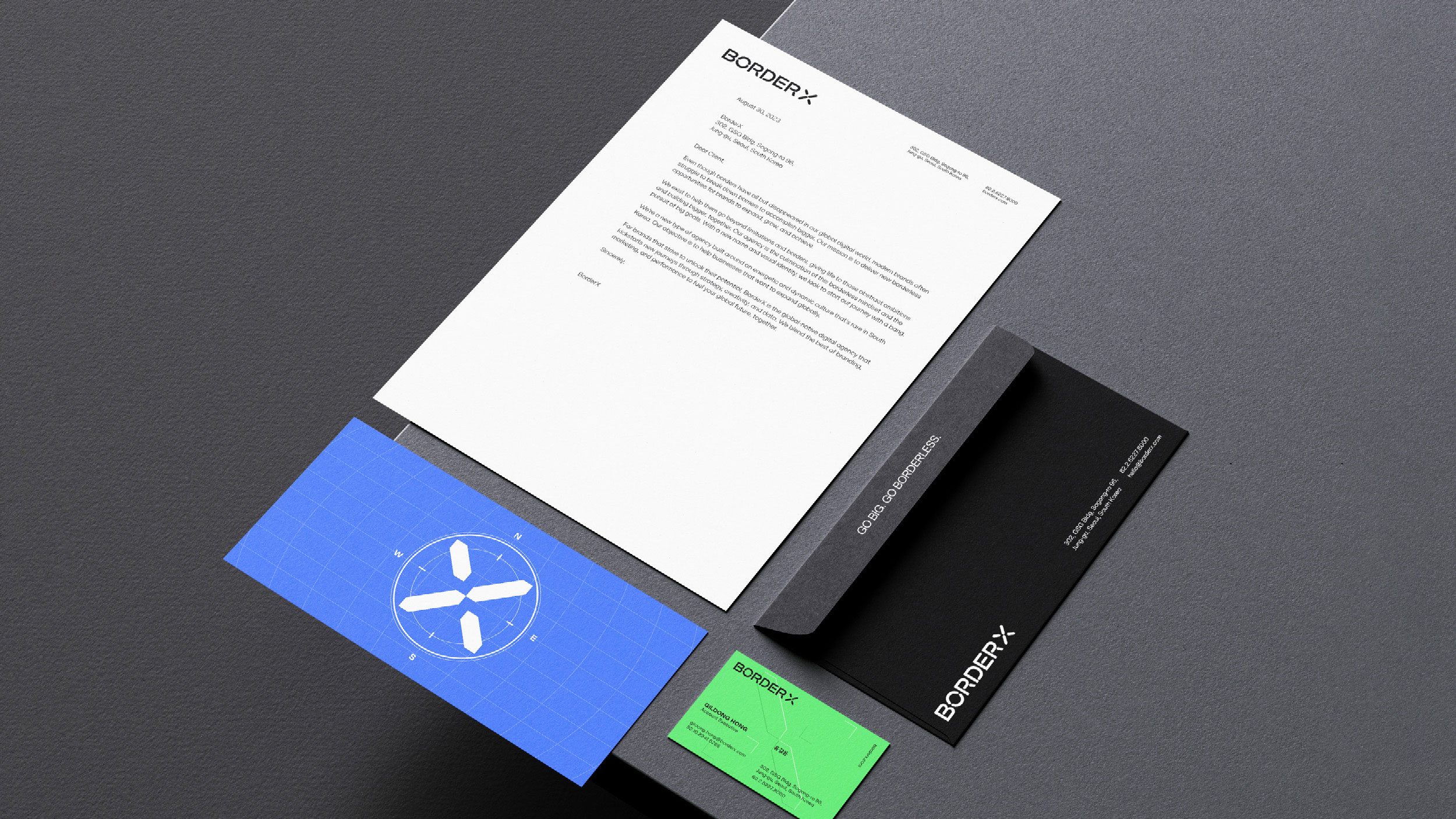
Logo: In creating the logo, we first began by deciding on the concepts we wanted to emphasize about our brand. In the end, we drew inspiration from the compass, a symbol of being the guiding light for the brands we support. This led to our statement-making logo and strong typography, inspired by the compass motif to evoke the feeling of exploration and guidance. The letter X in the logo animation mimicked the motion of a compass, searching for the right path to take.
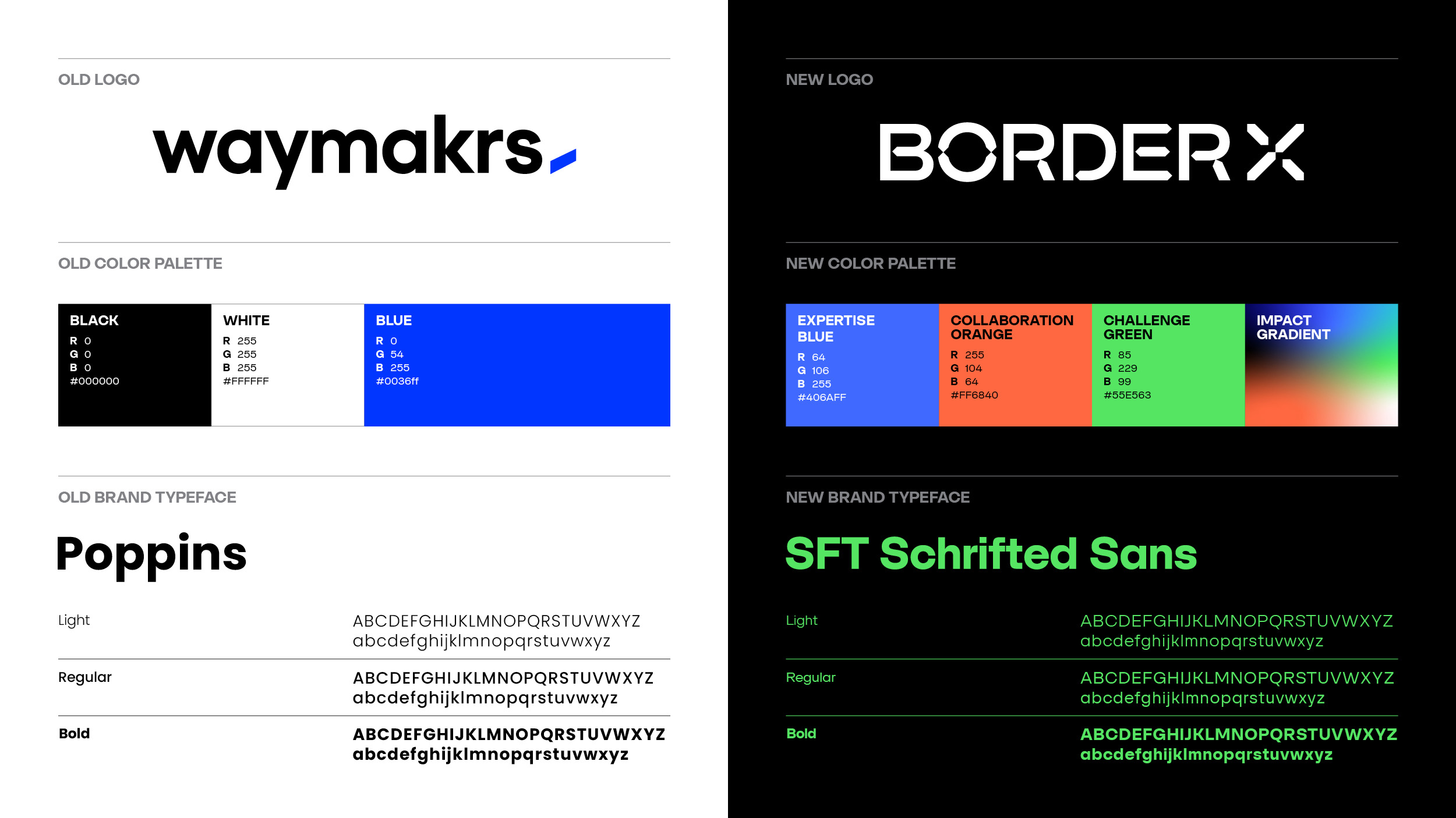
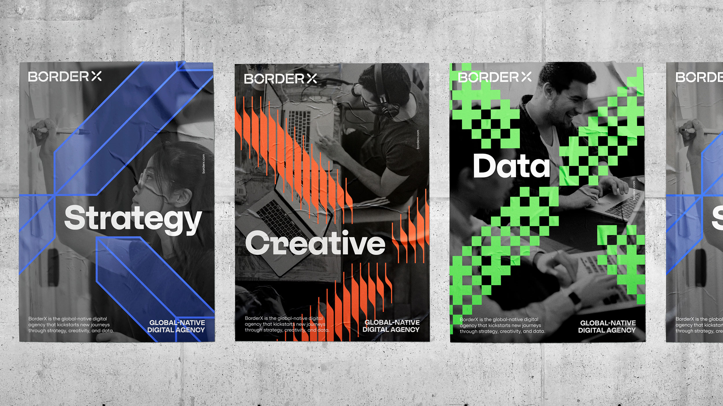
Color Palette: The colors of our brand were hand-selected after referencing color psychology. Just like our personality, they needed to be bold, punchy shades that would communicate our moxie. Each color in our color palette was meant to represent each of our carefully-selected values, and we represented our final value of “impact” through a gradient of the other 3 values. Through this “impact” value, we conveyed our role as guides for the companies that were unsure of next steps to make waves globally.
Reborn as BorderX
While the process of rebranding was not a short one, we were left with a brand identity that represented our current agency, its values, and its people. With consistent copy and design as well as an eye on consistency through our many outlets, we look forward to more effectively sharing this new journey full of global possibilities with our clients and the world at large.
CREDIT
- Agency/Creative: BorderX
- Article Title: BorderX Rebranding
- Organisation/Entity: In-House
- Project Type: Identity
- Project Status: Published
- Agency/Creative Country: South Korea
- Agency/Creative City: Seoul
- Market Region: Global
- Project Deliverables: Art Direction, Brand Guidelines, Brand Identity, Brand Redesign, Brand Strategy, Brand Tone of Voice, Copywriting, Creative Direction, Design, Graphic Design, Motion Graphics, Poster Design, Rebranding
- Industry: Professional Services
- Keywords: WBDS In-House Design Awards 2023/24
- Keywords: Corporate Rebranding
-
Credits:
Art Director: Yeryung Ko
Strategist: Erica Pellegatta
Graphic Designer: Yoolim Moon
Copywriter: Juhee Lee
Motion Designer: Flavyen Dupont


