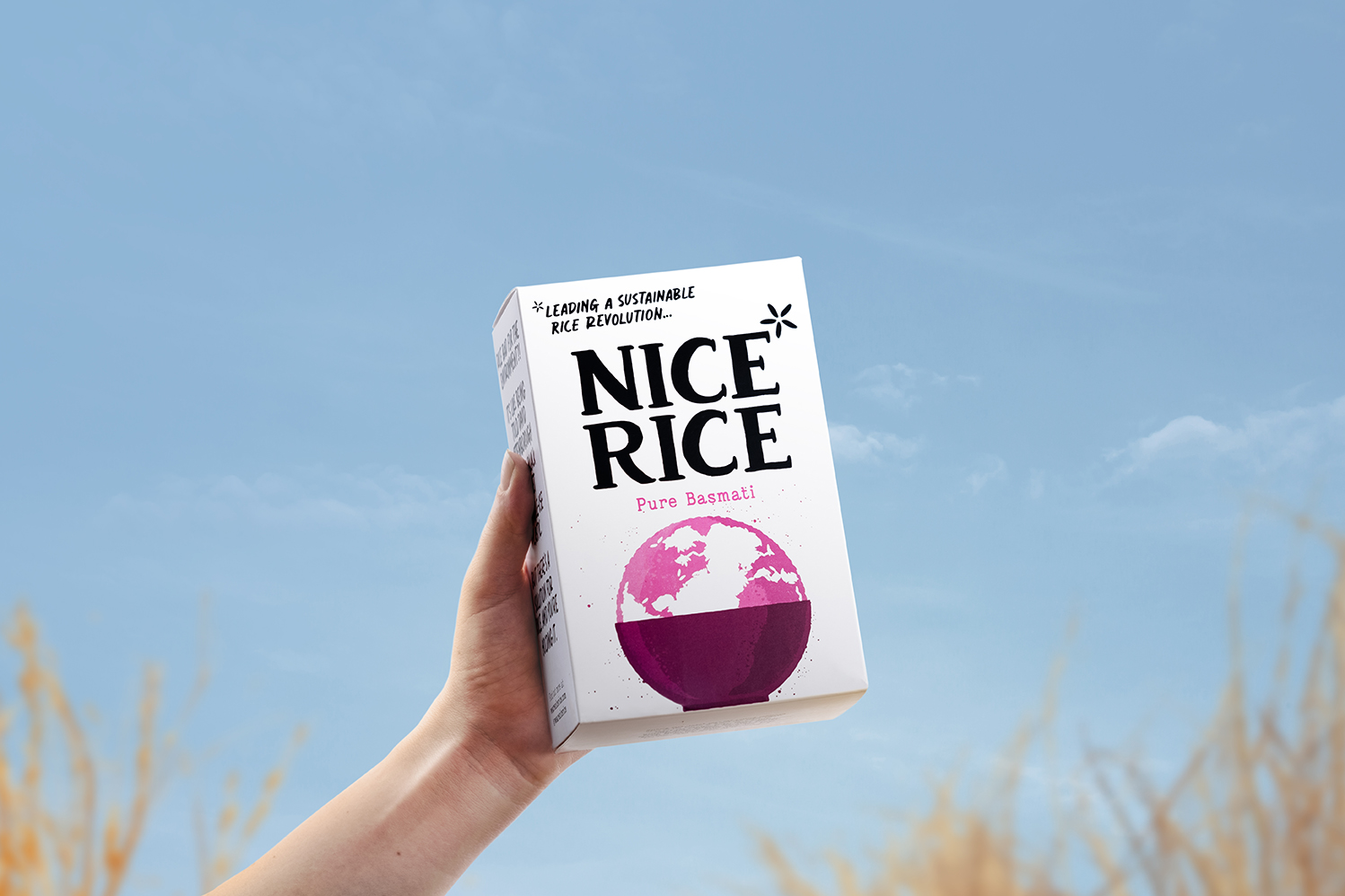
Project Background: Rice, a dietary staple worldwide, poses significant environmental challenges due to its high carbon emissions and water usage. Addressing this issue, Nice Rice aimed to introduce a sustainable and eco-friendly rice brand in the UK market, offering consumers a better option while promoting positive changes in the rice industry.
Better Tasting Rice, Better for the Planet, Better Way of Doing Business: Nice Rice’s three-pronged approach focused on delivering rice that not only tasted better but also contributed positively to the planet and the business landscape. By implementing sustainable farming methods that minimized emissions and water consumption, Nice Rice strived to bridge the gap between consumer preferences, environmental consciousness, and responsible business practices.
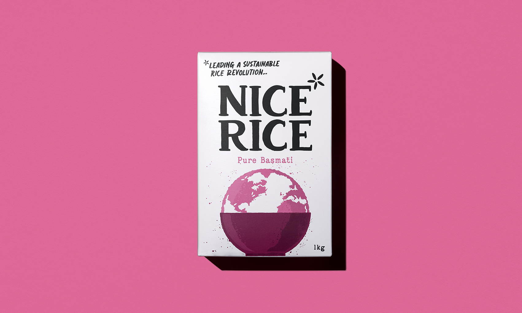
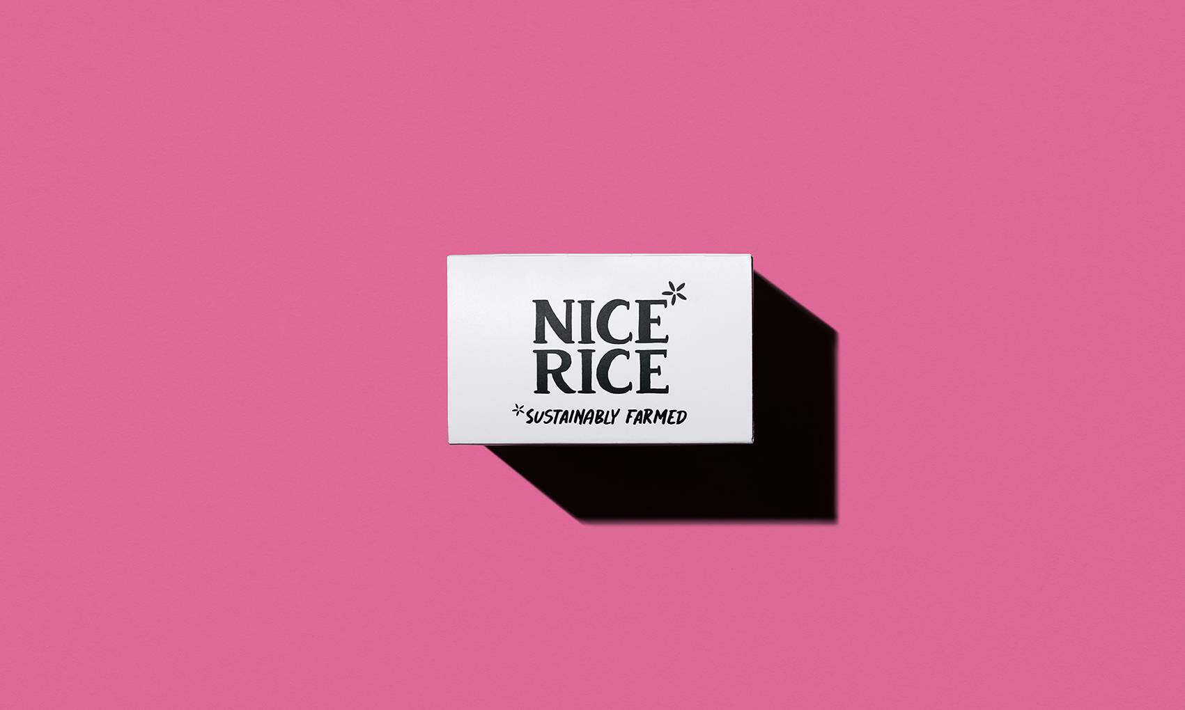
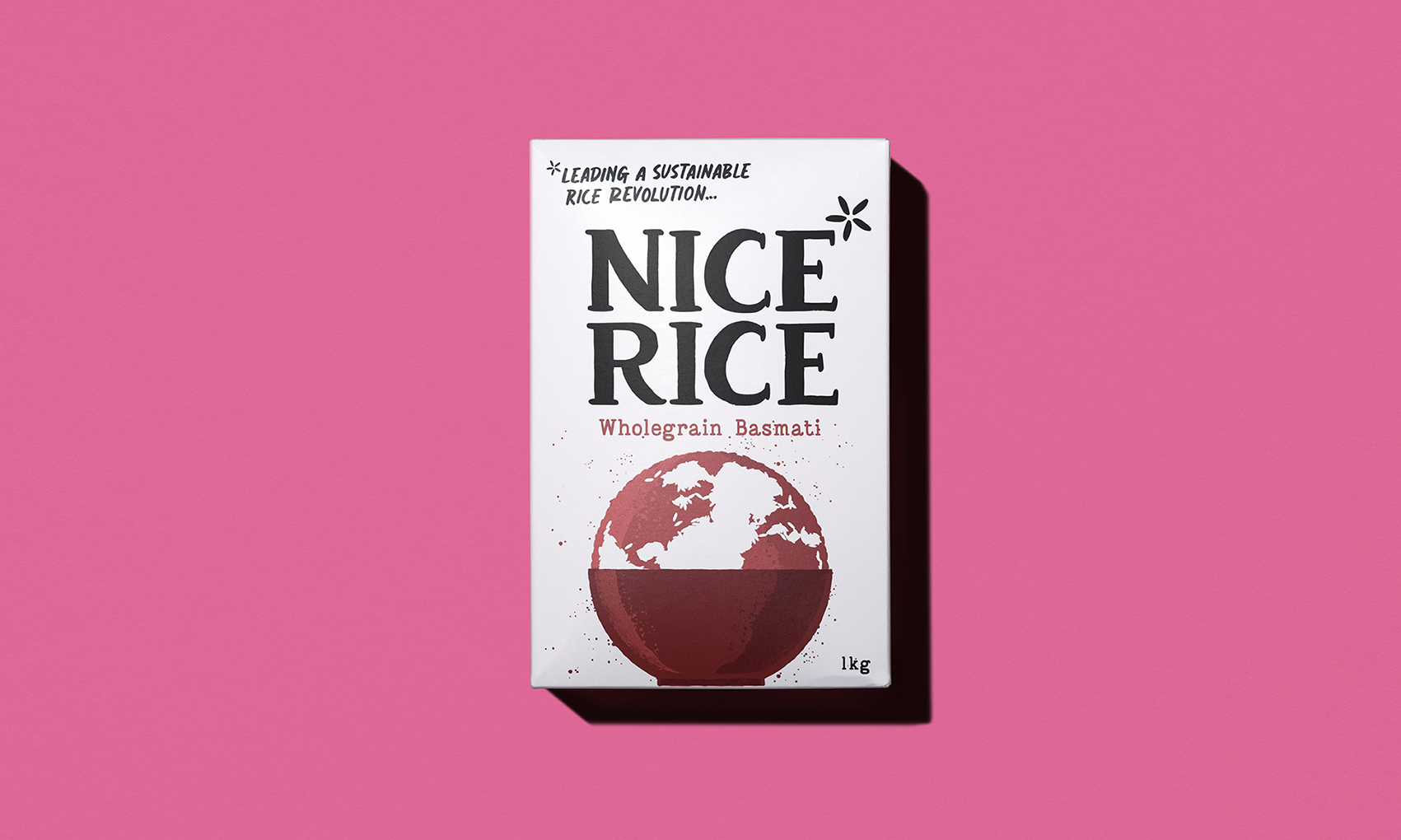
Project Description: The brand identity of Nice Rice was strategically developed to convey its sustainability mission. The logo, featuring an asterisk created from rice grains, symbolized the brand’s commitment to a better way of producing rice. This visual element was consistently integrated across various brand activations, establishing a strong connection with the sustainable mission.
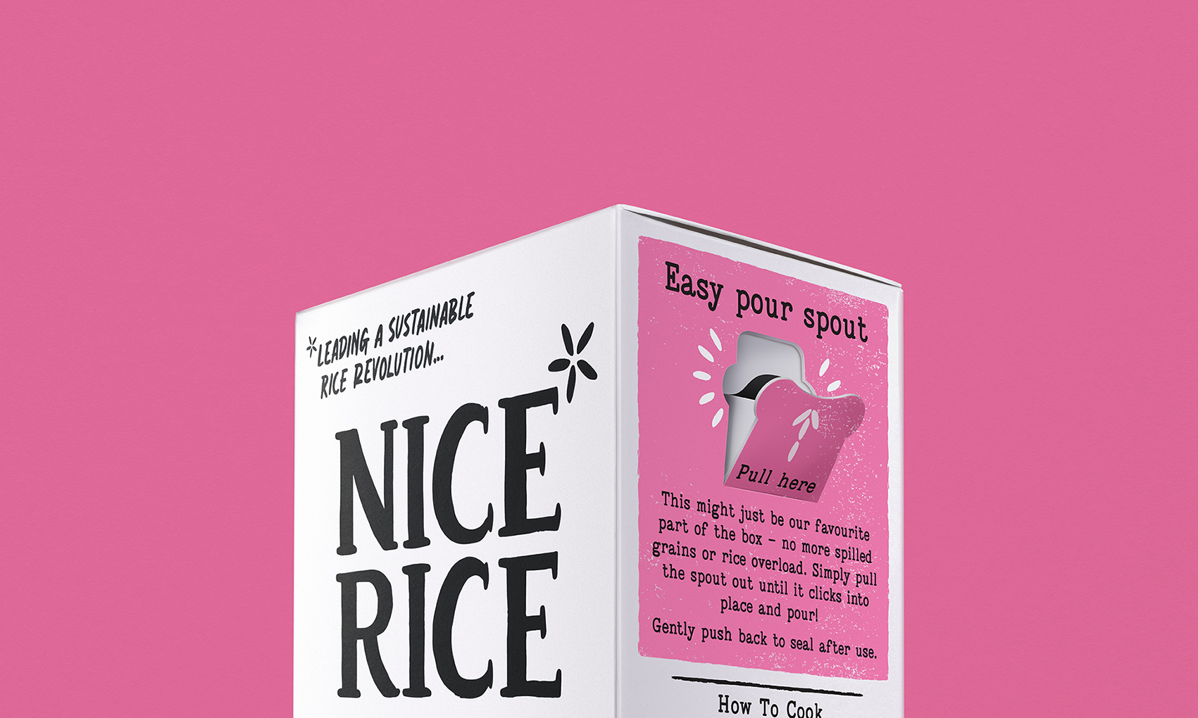
The choice of a black-and-white color palette provided visual clarity and ensured the brand stood out on supermarket shelves filled with vibrant packaging. The introduction of a secondary pink color added distinction to the brand’s identity within the larger brand landscape.
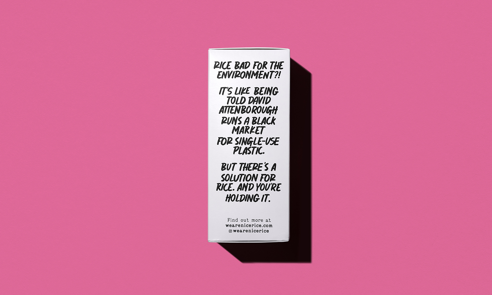
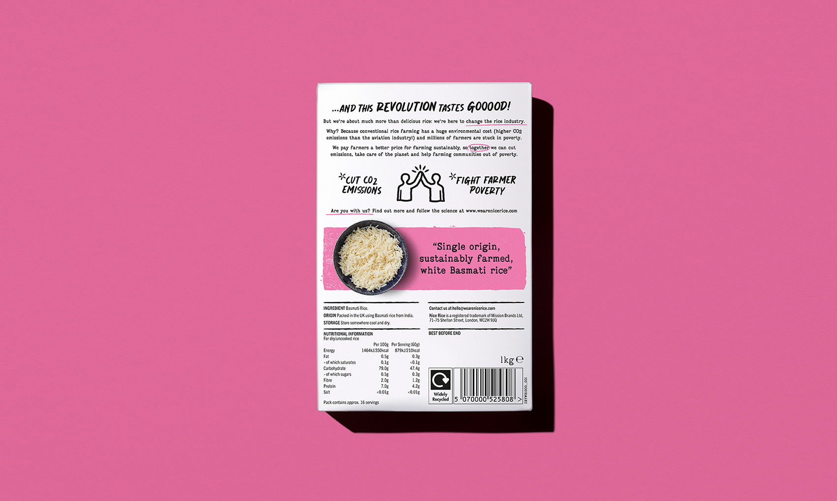
Through a blend of bold typography and intuitive icons, Nice Rice communicated its complex sustainability messaging effectively to consumers. This approach made it easier for customers to understand the brand’s values and mission.
Upon launch, Nice Rice secured a listing in 250 Waitrose stores, allowing the brand to make its presence felt on a significant scale.
Deliverables: Nice Rice’s comprehensive approach to reimagining the rice industry led to the creation and delivery of various essential elements:
Creative Strategy: A well-defined plan was crafted to communicate the brand’s unique selling points and values to the target audience effectively.
Brand Creation: The brand’s identity was strategically developed, encapsulating its sustainability mission and values.
Packaging Design: The packaging design was meticulously crafted to resonate with consumers and emphasize the brand’s commitment to better practices.
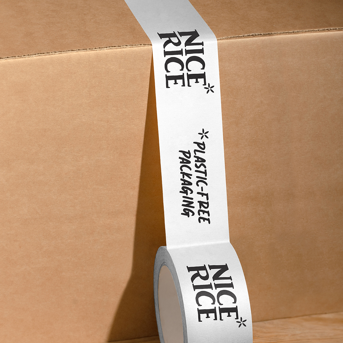
Brand World: A consistent brand world was established, ensuring a cohesive experience across all touchpoints.
Merchandise: Merchandise was designed to reinforce the brand’s identity and create a stronger connection with consumers.
Artwork: The visual assets were created with precision, adhering to the established brand guidelines.
Print Management: Ensuring high-quality print materials further reinforced the brand’s commitment to excellence.
Conclusion: Nice Rice’s case study serves as a testament to how a well-thought-out strategy and design can transform an everyday product into a symbol of positive change. By addressing the environmental challenges associated with rice production and presenting a sustainable alternative, Nice Rice demonstrated the power of innovation and conscious business practices in making a difference.

CREDIT
- Agency/Creative: Red Dot Studio
- Article Title: Packaging and Brand Design for Nice Rice – Redefining Rice Sustainably
- Organisation/Entity: Agency
- Project Type: Identity
- Project Status: Published
- Agency/Creative Country: United Kingdom
- Agency/Creative City: London
- Market Region: Europe
- Project Deliverables: Brand Creation, Brand Design, Brand Guidelines, Brand Identity, Brand World, Packaging Design
- Industry: Food/Beverage
- Keywords: Sustainability
-
Credits:
Red Dot Studio: Red Dot Studio


