Good Good Creative | Visual Identity
Good Good Creative is a full-service video production house based in Hong Kong. With a specialisation in producing commercial and music videos, Good Good Creative is known for its dedication and passion in every project. Welvermind was appointed to craft the identity system for this dynamic start-up.
The name “Good Good” derives from the Chinese phrase “好好創作,” which signifies creating with heart and passion. The core objective of the branding project is to visualise and capture their philosophy, and commitment to excellence. In short, Good Good Creative provides an all-rounded exclusive production experience.
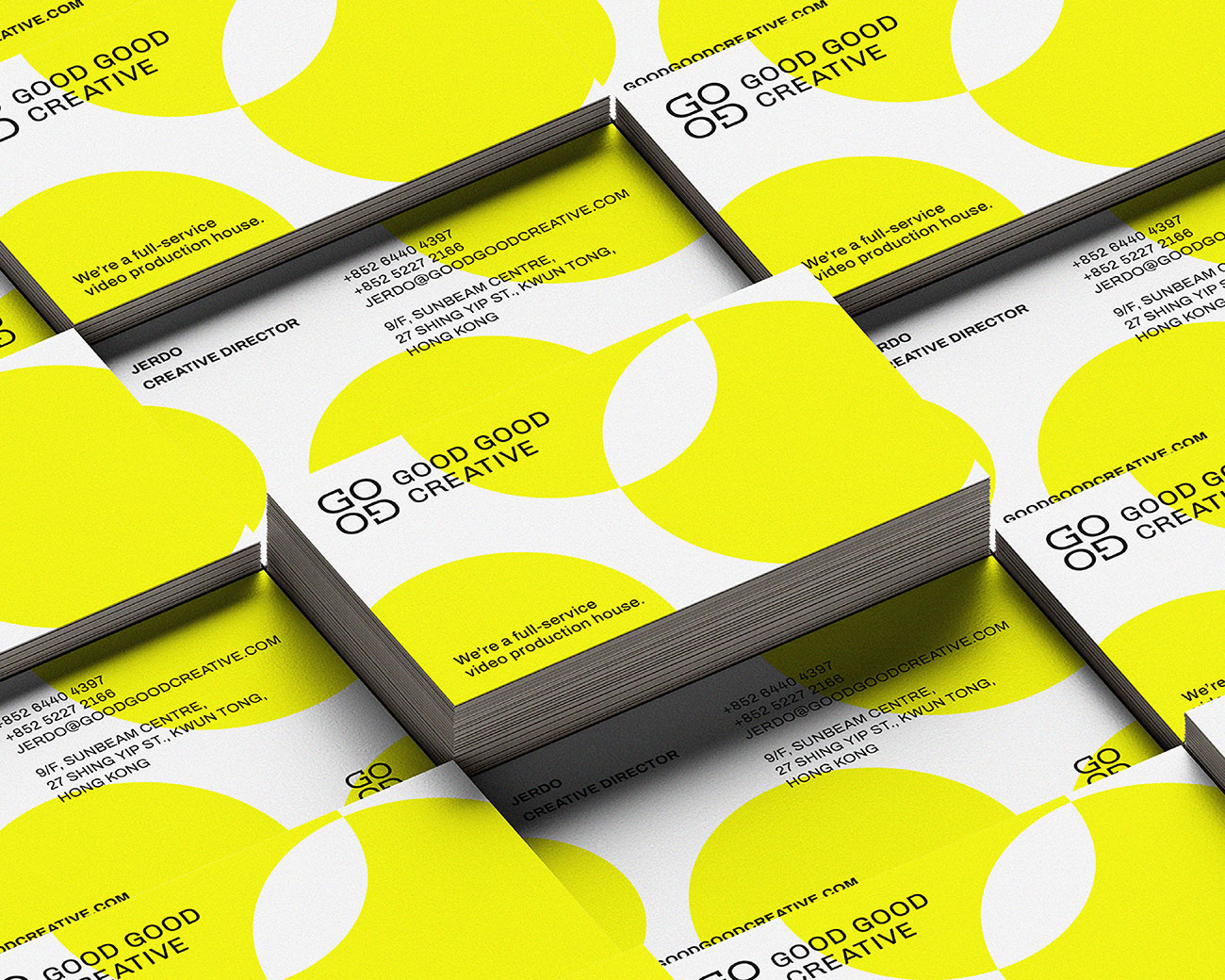
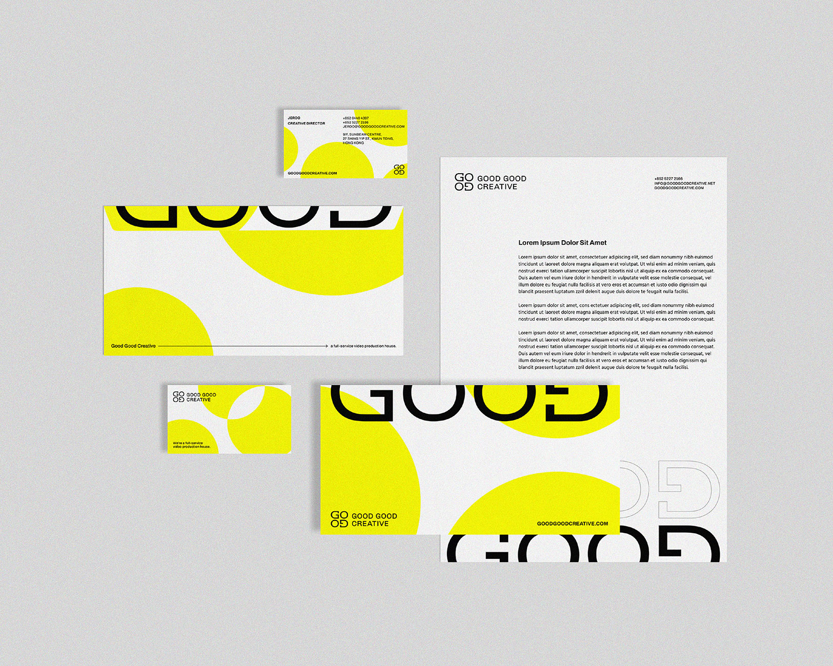
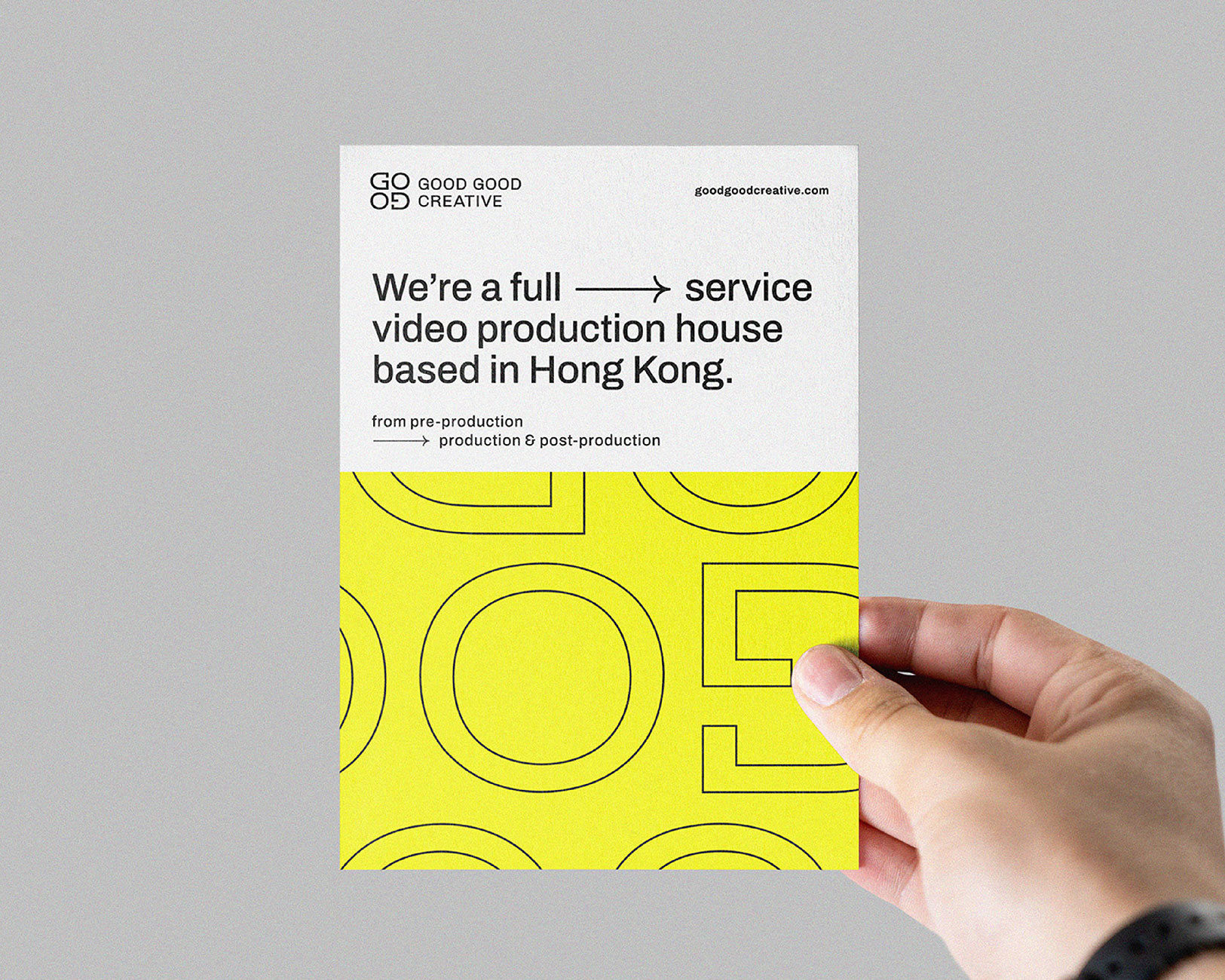
In addition to the logo and wordmark, the branding project encompassed the development of a cohesive visual identity, including color palettes, typography, and collateral materials such as sales kits, postcards, prints, and name cards.
The concept behind revolves around the idea that “Simply being good is never enough”, and therefore “Be Good Good”.
To illustrate the concept of “Be Good Good” effectively, two key ideas were incorporated into the creative process:
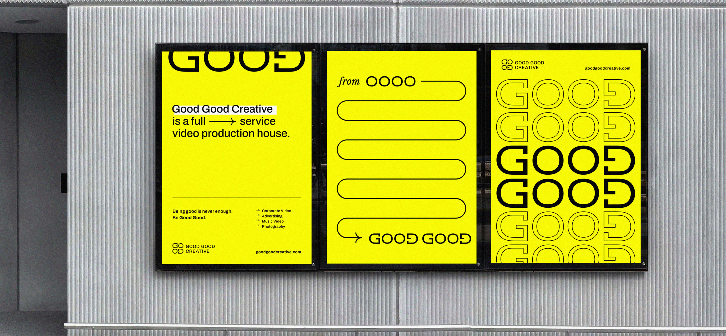
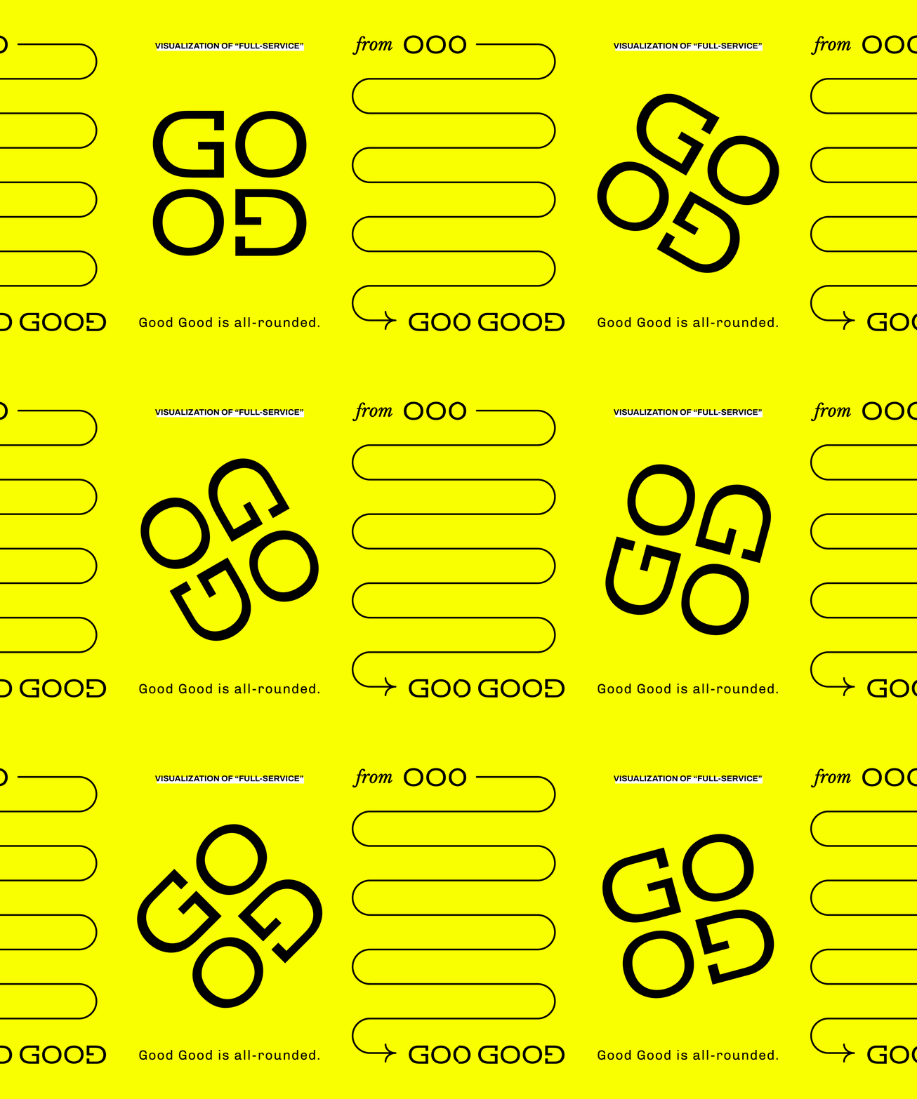
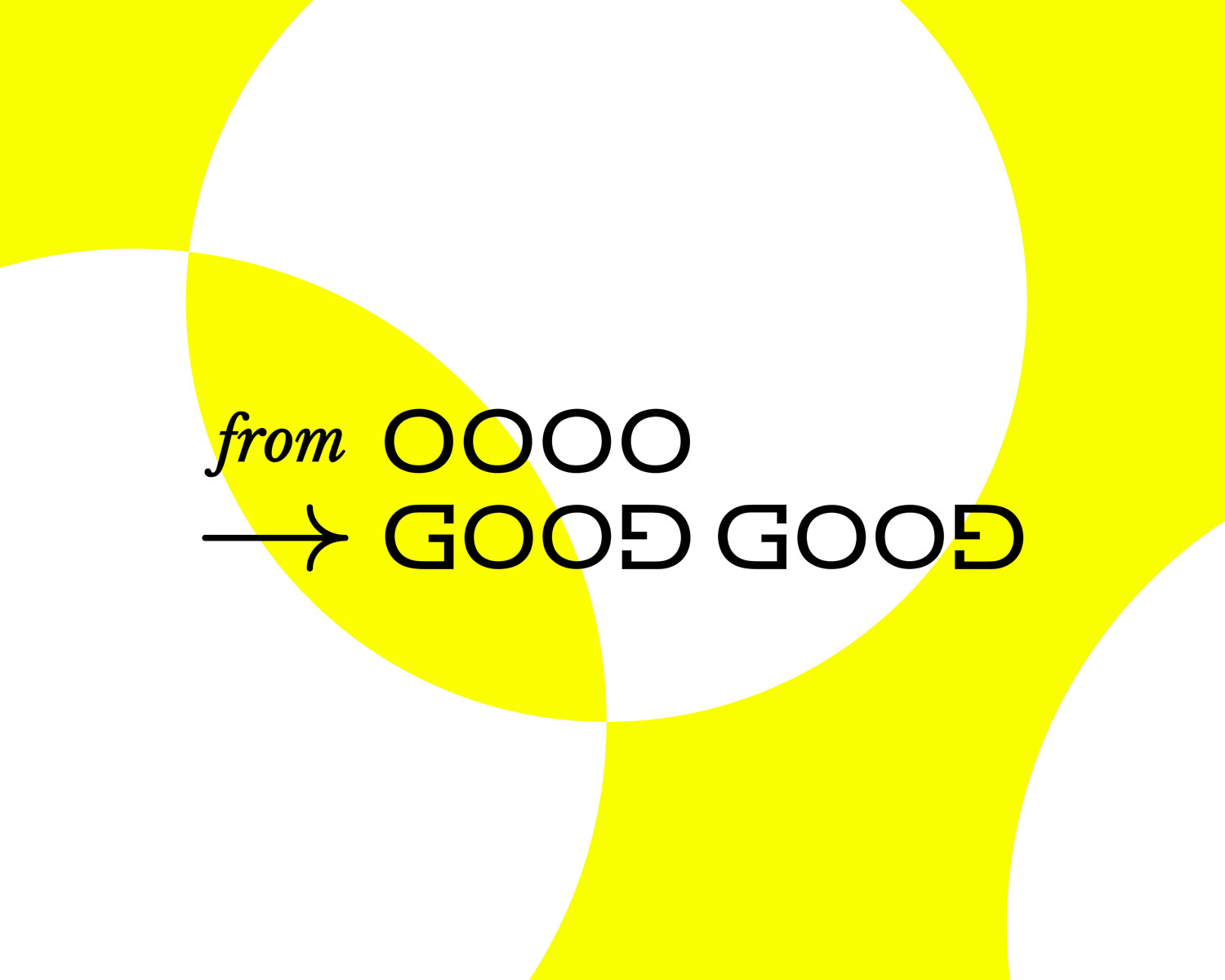
From 0000 to Good Good: The full range of services offered by Good Good Creative are presented as a continuum, symbolized by the graphic lockup of “from 0000 to Good Good.” This visually represents the company’s ability to start a project from scratch (zero) and transform it into something exceptional.
Overlaying for Excellence: Good Good Creative strives for excellence by overlaying good ideas. To convey this concept visually, key graphic elements and patterns featuring the overlaying of circles were developed. These patterns signify the synthesis of innovative ideas and the resulting harmonious output.
The creative solution for Good Good Creative’s branding involved carefully selected elements to reflect their vision and values.
Bold Yellow Color of Lemon Glacier: To emphasize the notiion of being “good good,” a bold and sharp yellow color was chosen. This color adds an impactful and memorable element to the brand, setting it apart from the market.
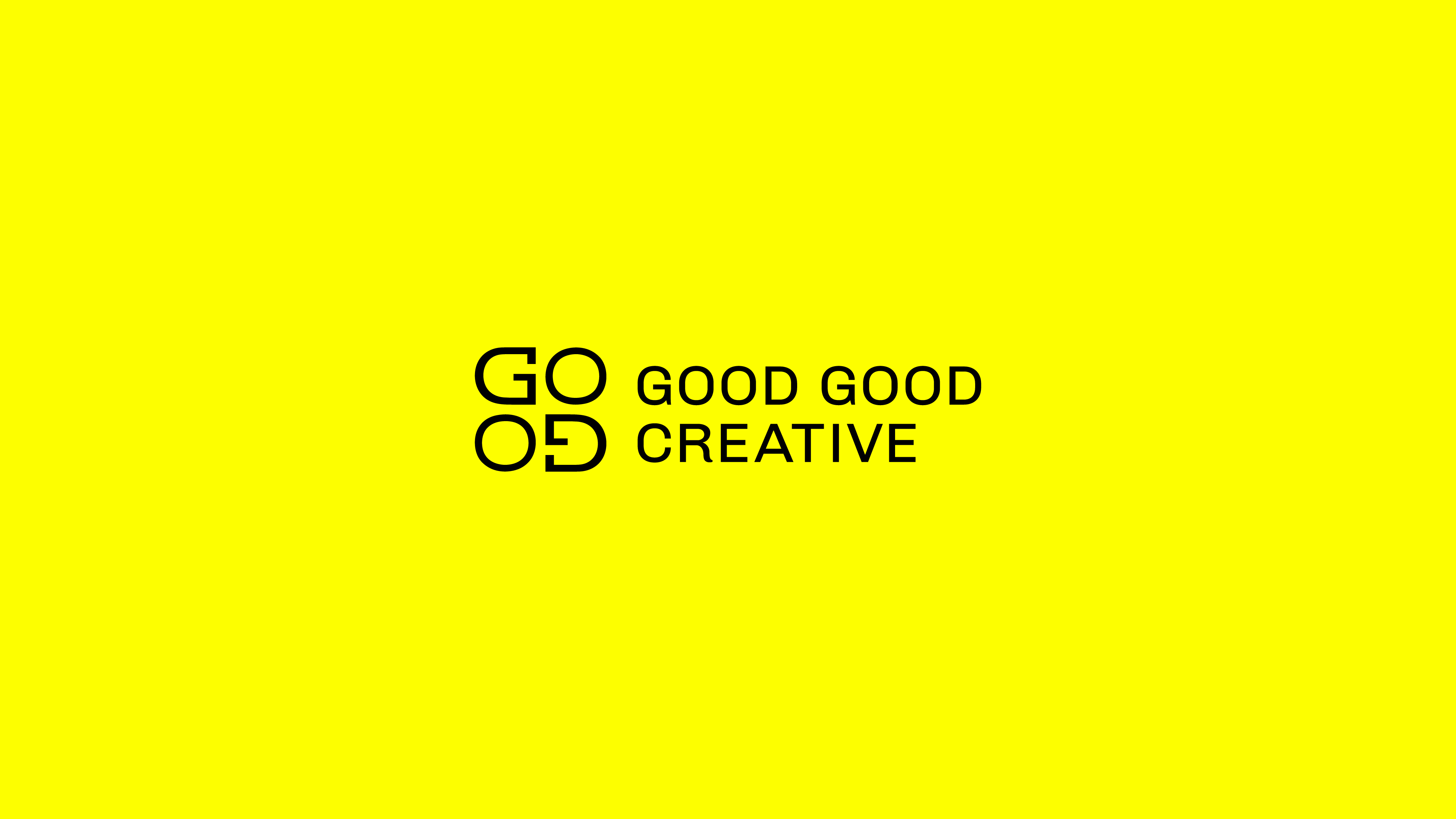
Abstract Symmetry: The company’s logo and wordmark were designed with the concept of “all-roundedness” in mind. The word “good” is structured in an abstract and symmetric graphic composition, allowing for a creative twist. When the logo is rotated, the word “good good” becomes visible, reinforcing the brand’s identity.
CREDIT
- Agency/Creative: Welvermind
- Article Title: Visual Identity for Good Good Creative
- Organisation/Entity: Agency
- Project Type: Identity
- Project Status: Published
- Agency/Creative Country: Hong Kong
- Agency/Creative City: Welvermind
- Market Region: Asia
- Project Deliverables: Art Direction, Brand Identity, Branding, Creative Direction, Logo Design
- Industry: Entertainment
- Keywords: Branding, Identity Design, Creative Concept, Visualization
-
Credits:
Creative Director & Graphic Designer: Jason Tsang


