Since its inception in 2011, Sunshine Sips has stood as a radiant and forward-thinking purveyor of all-natural juices, infusing a sense of vitality and rejuvenation into the lives of its consumers. With a deep-rooted dedication to harnessing the bounties of nature, Sunshine Sips embarked on a transformative odyssey to breathe new life into its brand identity and packaging aesthetics. In this ambitious pursuit, the principles of Gestalt psychology emerged as an instrumental compass, steering the design voyage and culminating in packaging that not only captures the eye but also resonates profoundly with the soul of the brand.
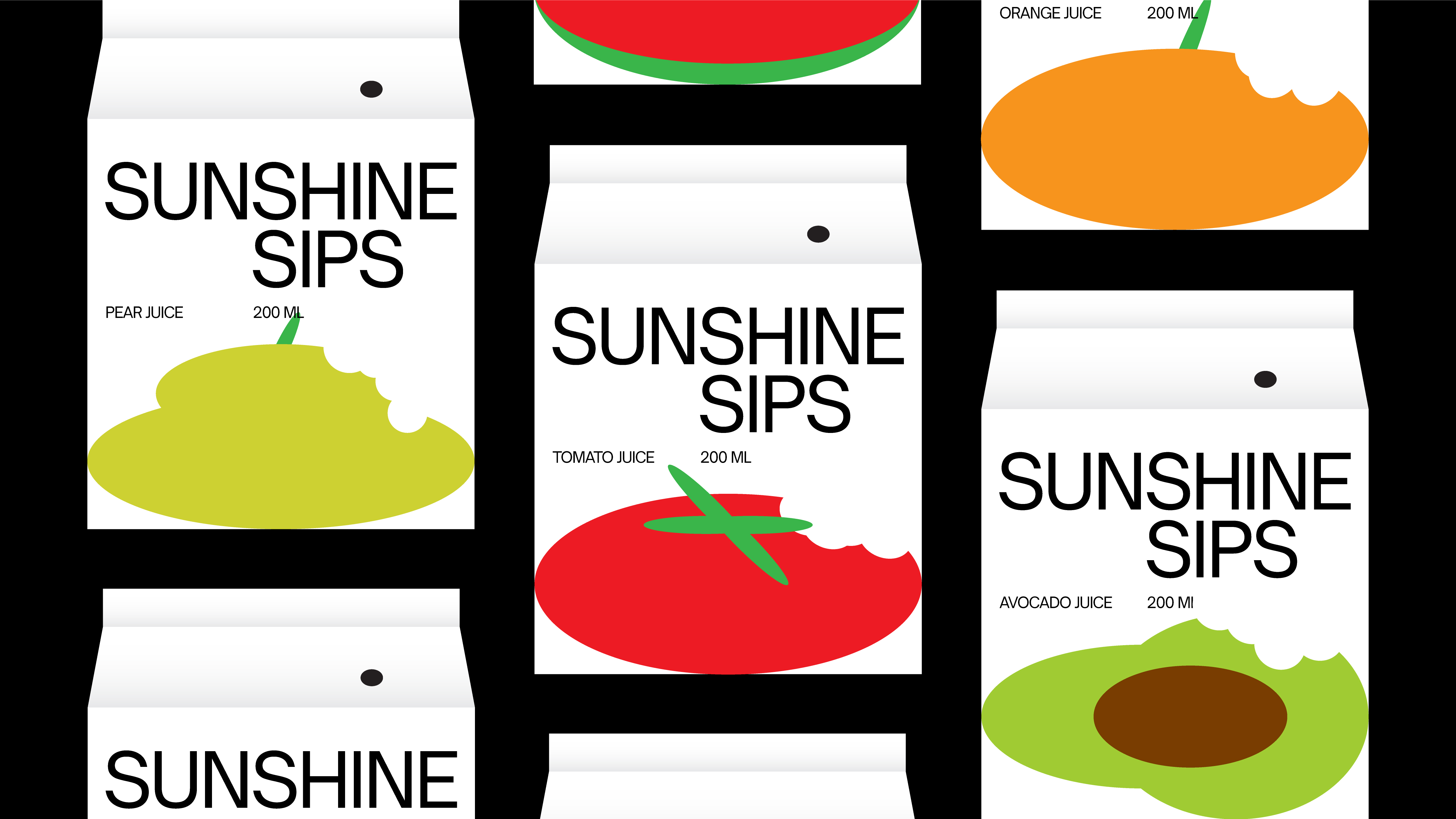
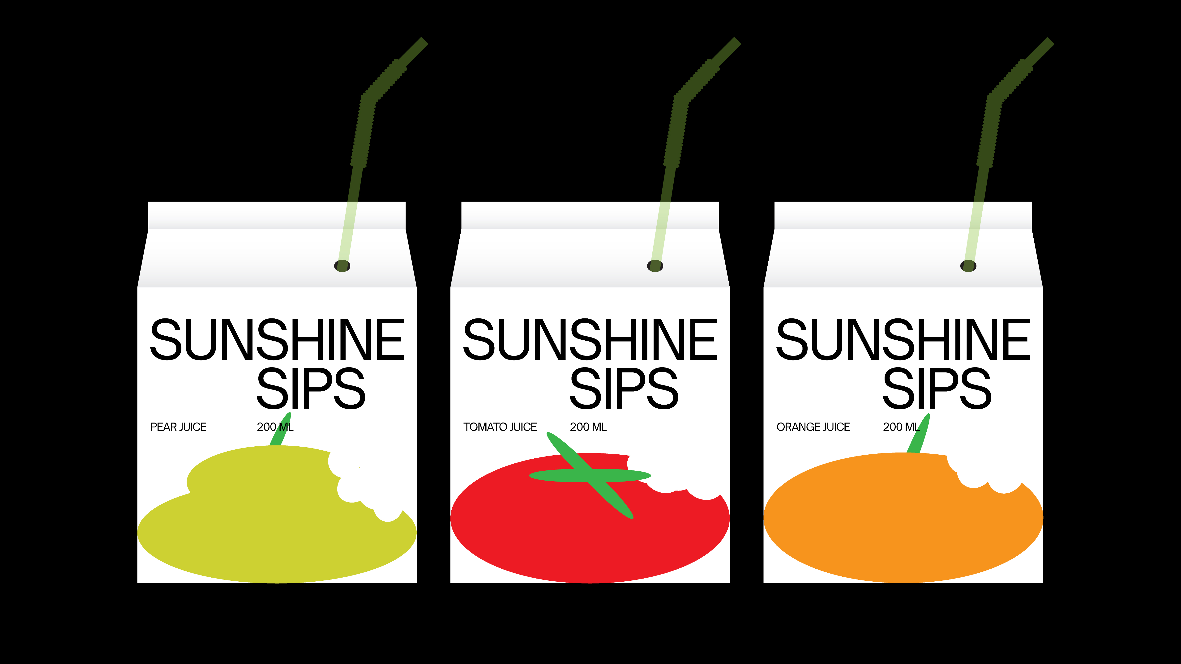
Guided by the tenets of Gestalt psychology, the process of revamping Sunshine Sips’ visual identity became an exercise in perceptual ingenuity. By understanding that the human mind innately seeks patterns and completeness in visual stimuli, the design team meticulously crafted packaging that seamlessly integrated elements, inviting the consumer’s gaze to dance harmoniously across the surfaces. The interplay of colors, shapes, and forms on the labels and containers triggers an immediate sense of coherence, encapsulating the unity of nature’s bounty and the brand’s commitment to holistic well-being.
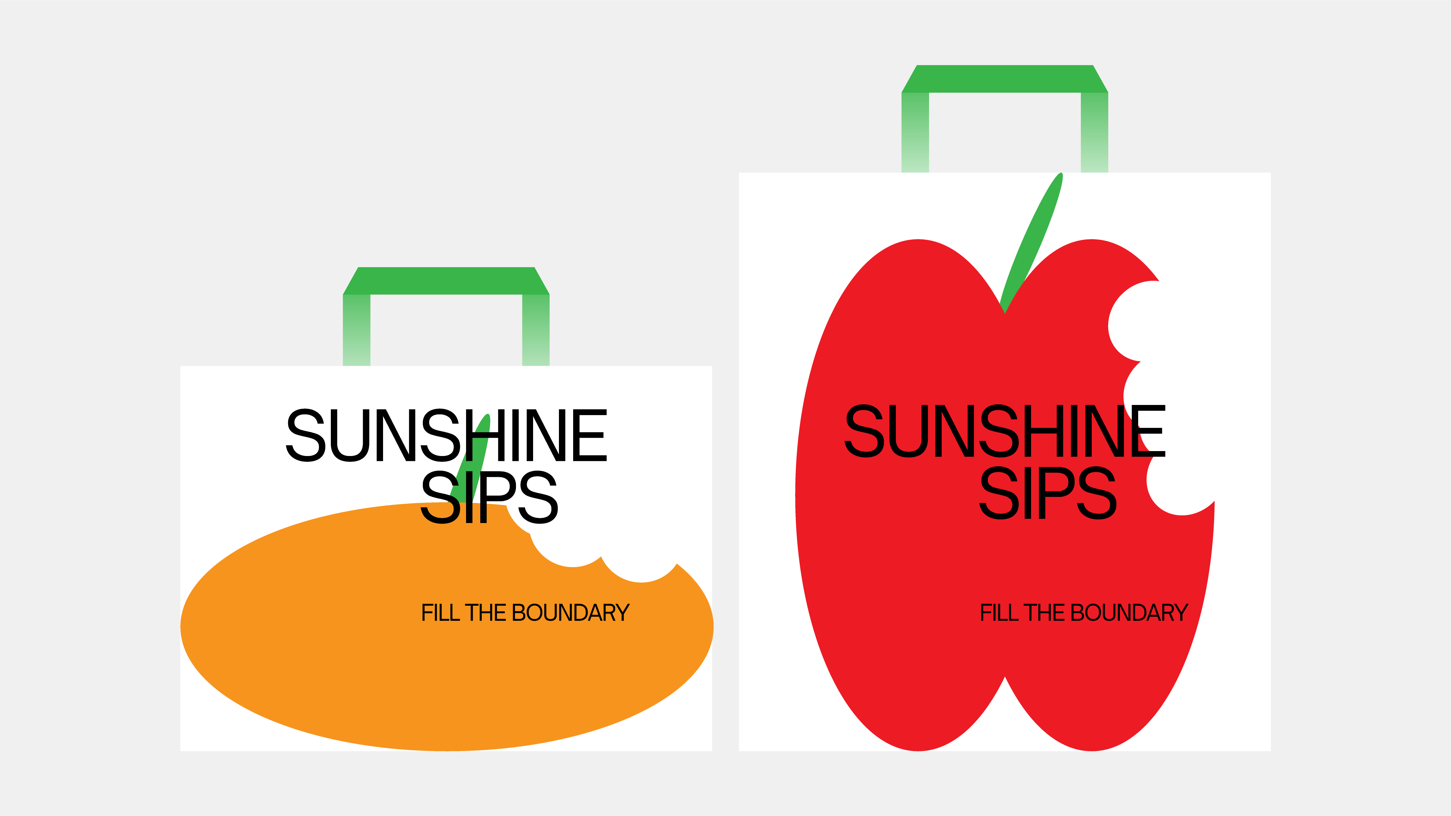
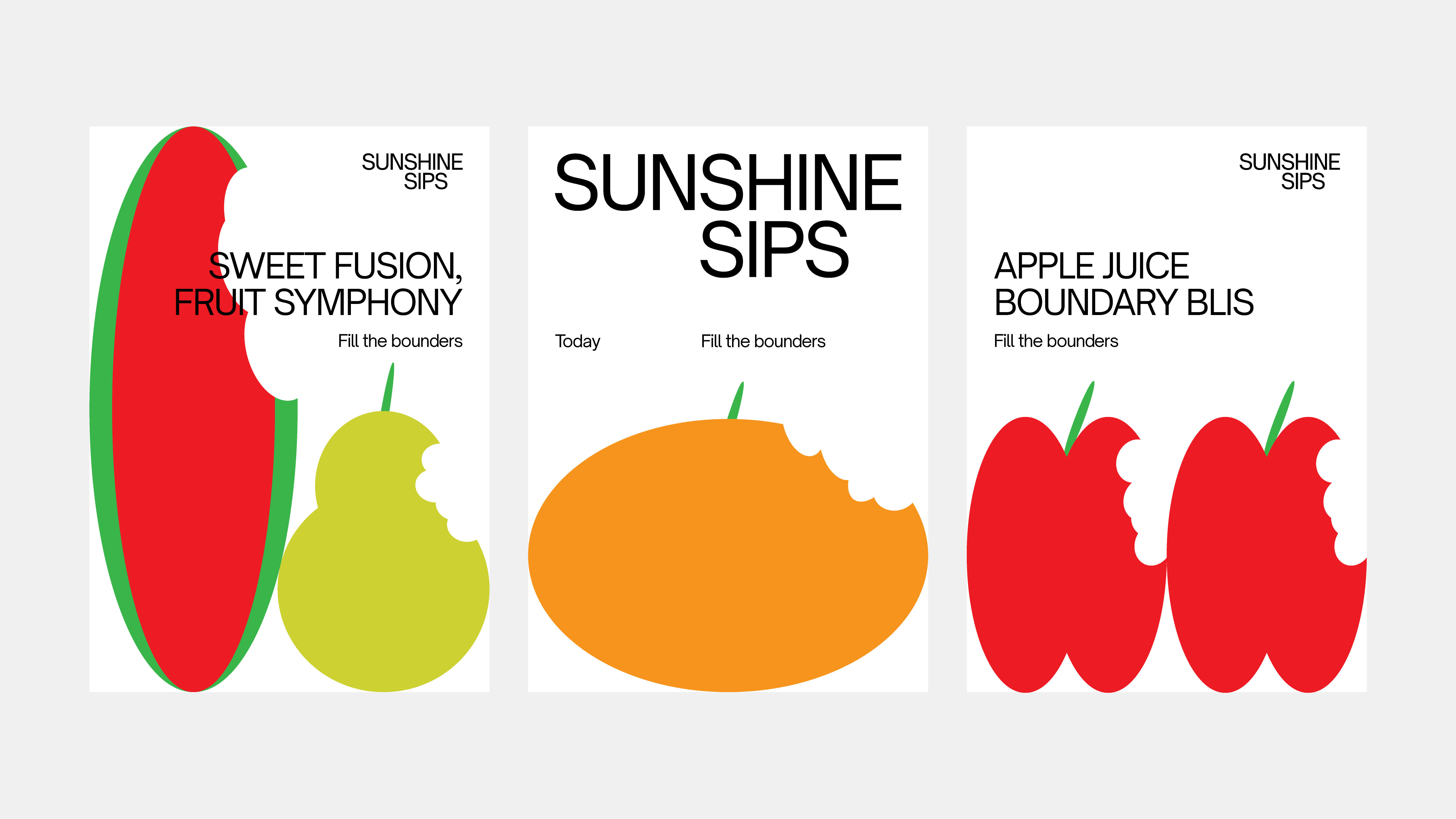
Central to Gestalt psychology is the concept of figure and ground – the notion that distinct objects emerge from a background, forming a dynamic interplay that captures attention. Sunshine Sips’ packaging deftly employs this principle, spotlighting the vibrant, succulent fruits as the focal point against a backdrop that exudes freshness and vitality. This interwoven duality not only captures the essence of the juices themselves but also reflects the broader brand narrative: a commitment to crafting an oasis of health and refreshment in a bustling world.
The principles of Gestalt psychology extend beyond mere visual arrangement; they delve into the realm of emotional resonance. Sunshine Sips’ redesigned packaging is a masterstroke in invoking emotions – a splash of exuberant oranges might evoke feelings of invigoration, while the calming greens conjure a sense of tranquility. By understanding the profound ways in which colors and forms evoke emotions, the brand fosters a unique connection with its consumers, offering not just a beverage but a sensorial experience.
As Sunshine Sips unveils its revitalized packaging, it becomes apparent that the principles of Gestalt psychology have served as catalysts for transformation. The brand’s journey of reinvention has culminated in an exquisite tapestry of design elements that harmonize with human perception and emotion. Beyond the confines of aesthetics, this endeavor encapsulates the very essence of Sunshine Sips – a vibrant testament to the company’s unwavering commitment to health, well-being, and the artistry of nature. In every sip, the legacy of Gestalt psychology lives on, a silent partner in Sunshine Sips’ continued pursuit of refreshing the body, mind, and soul.
CREDIT
- Agency/Creative: Akhmed Bunyadov
- Article Title: Sunshine Sips Brand Identity
- Organisation/Entity: In-House
- Project Type: Identity
- Project Status: Published
- Agency/Creative Country: Azerbaijan
- Agency/Creative City: Baku
- Market Region: Middle East
- Project Deliverables: Brand Design
- Industry: Food/Beverage
- Keywords: juice, fruit, identity, Packaging, visual identity, juice, brand identity, Logo Design, print, abstract, Health Fruit drink
-
Credits:
Art Director: Akhmed Bunyadov


