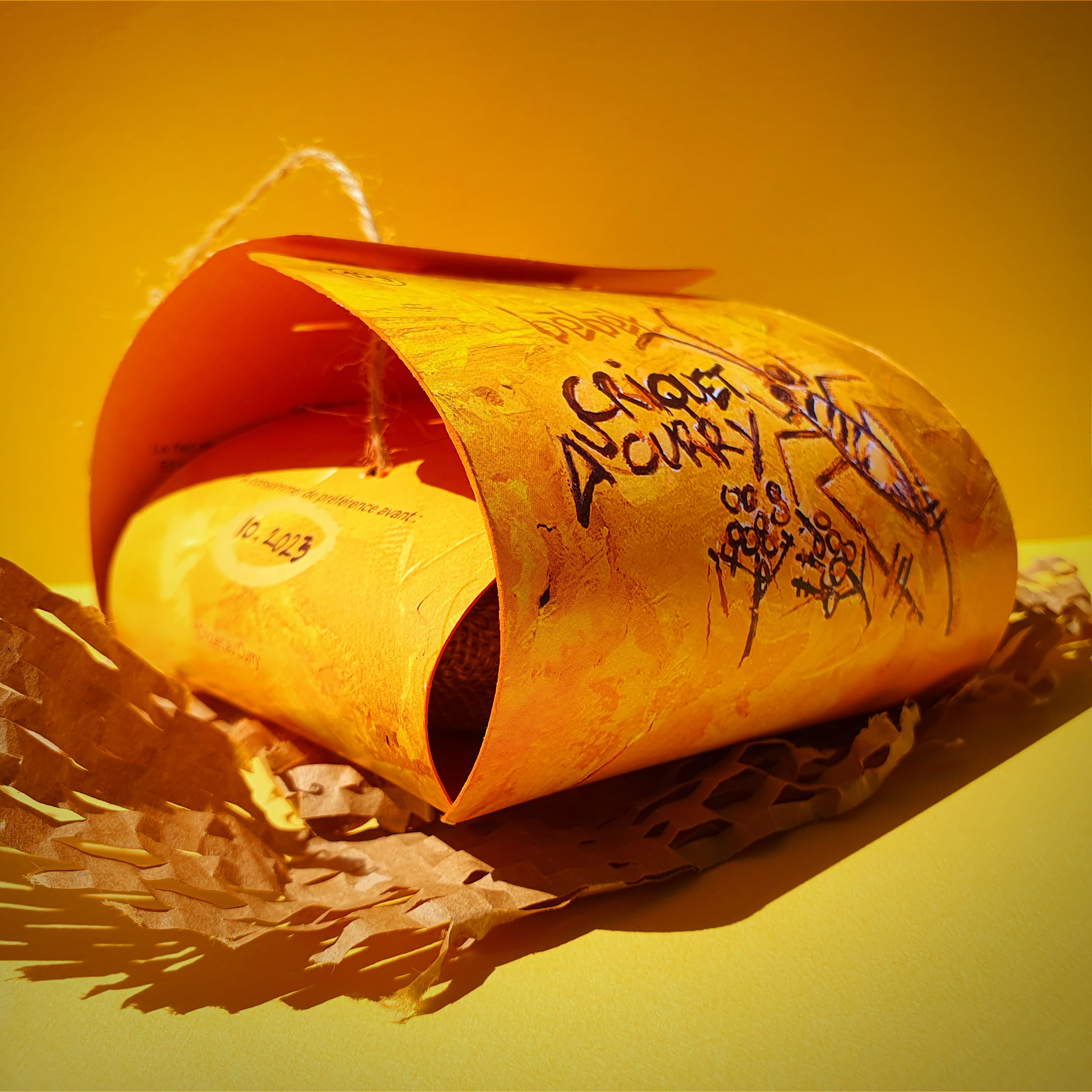
Bêbêt is a brand of edible insects for aperitifs with an organic, almost wild aesthetic. Its typography, done in paint, evokes the anatomy of the insect with lines evoking its legs or antennae. The rounded shapes contrast with the logo, recalling the eyes and wings. Entomophagy (eating insects) is a widespread practice in Asia and Africa, particularly in markets and on the streets. This is why the logo is almost symbolic. Influences from the urban environment and graffiti as well as symbols used by African and Asian peoples are mixed together in this logo. It’s a major component of Bêbêt’s visual identity. We are not indifferent to this logo. Rhythm, balance and color are the vectors of a culture, that of entomophagy, centered on nature and the environment. These notions are fundamental and are at the heart of Bêbêt.
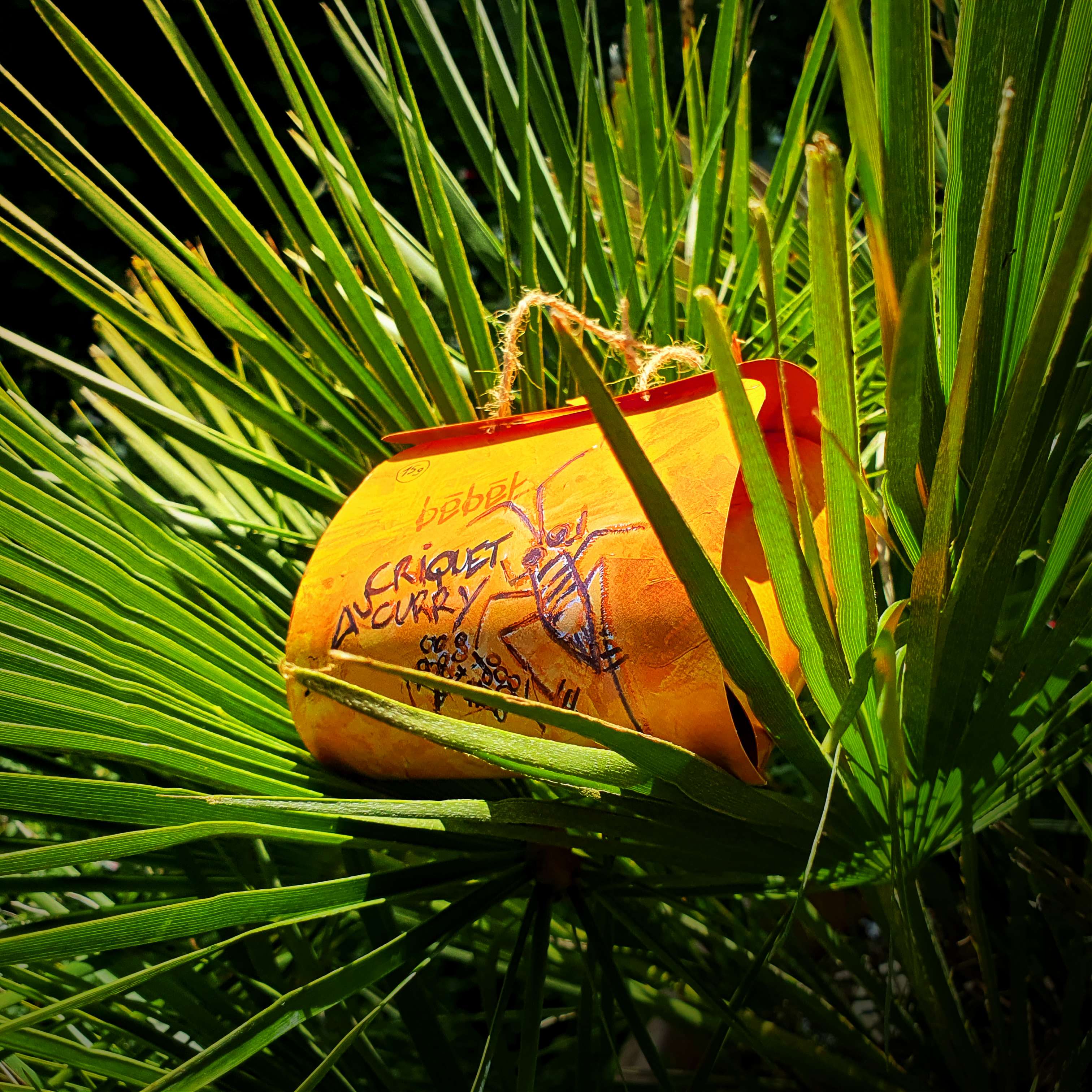
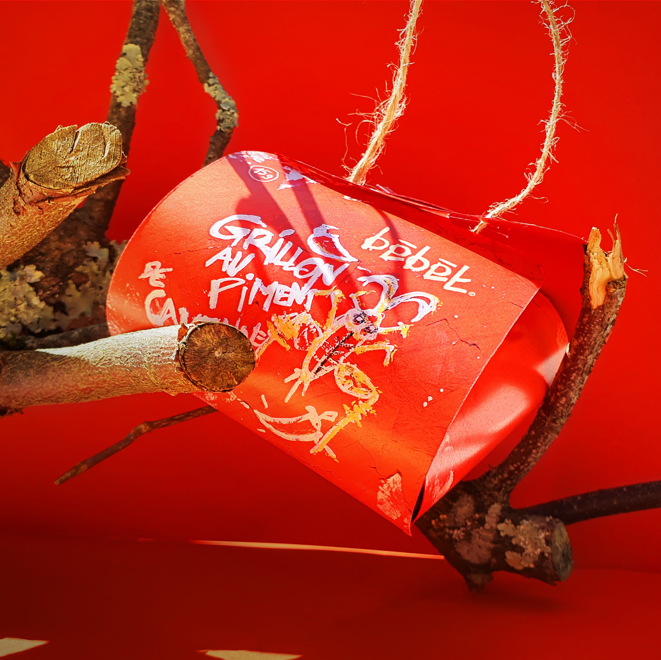
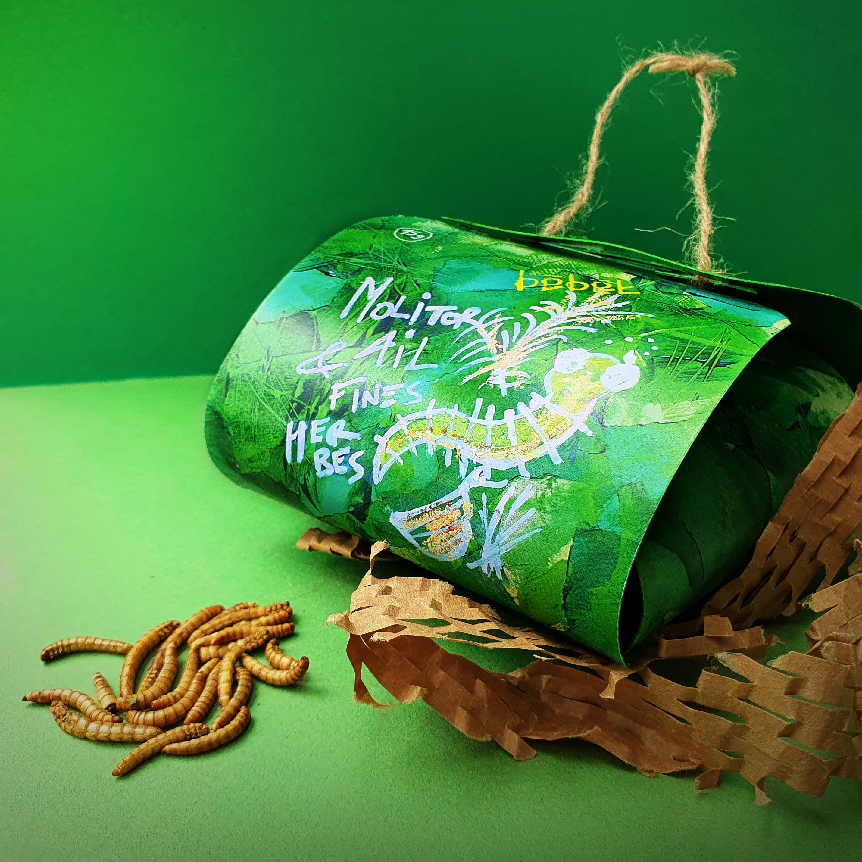
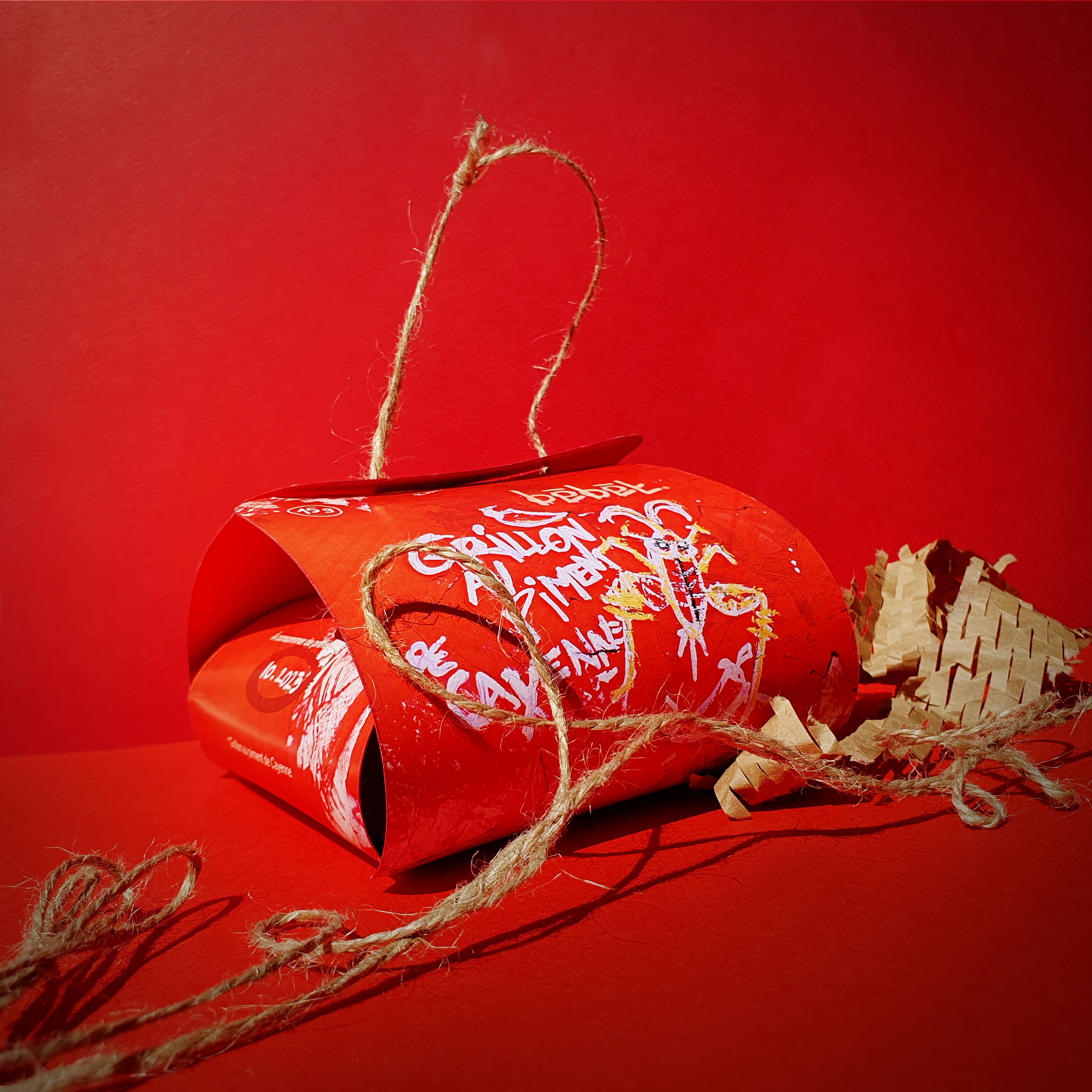
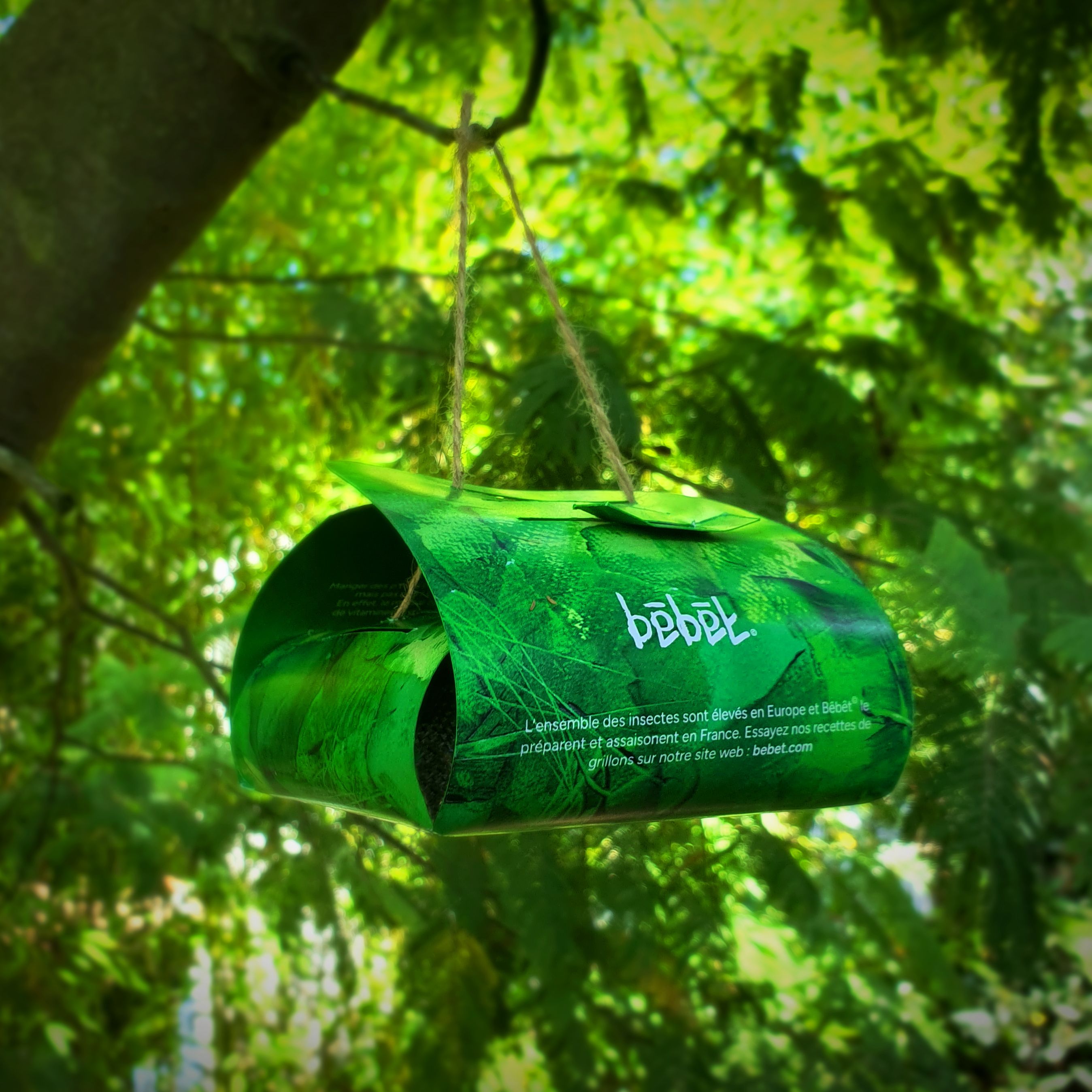
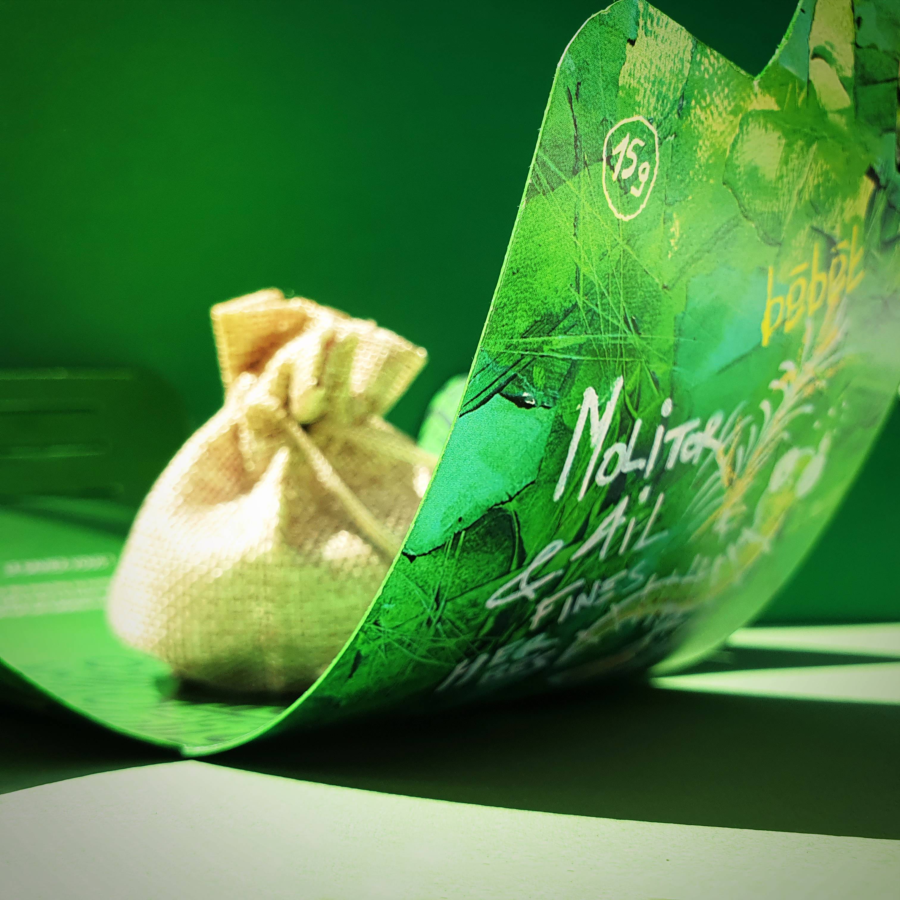
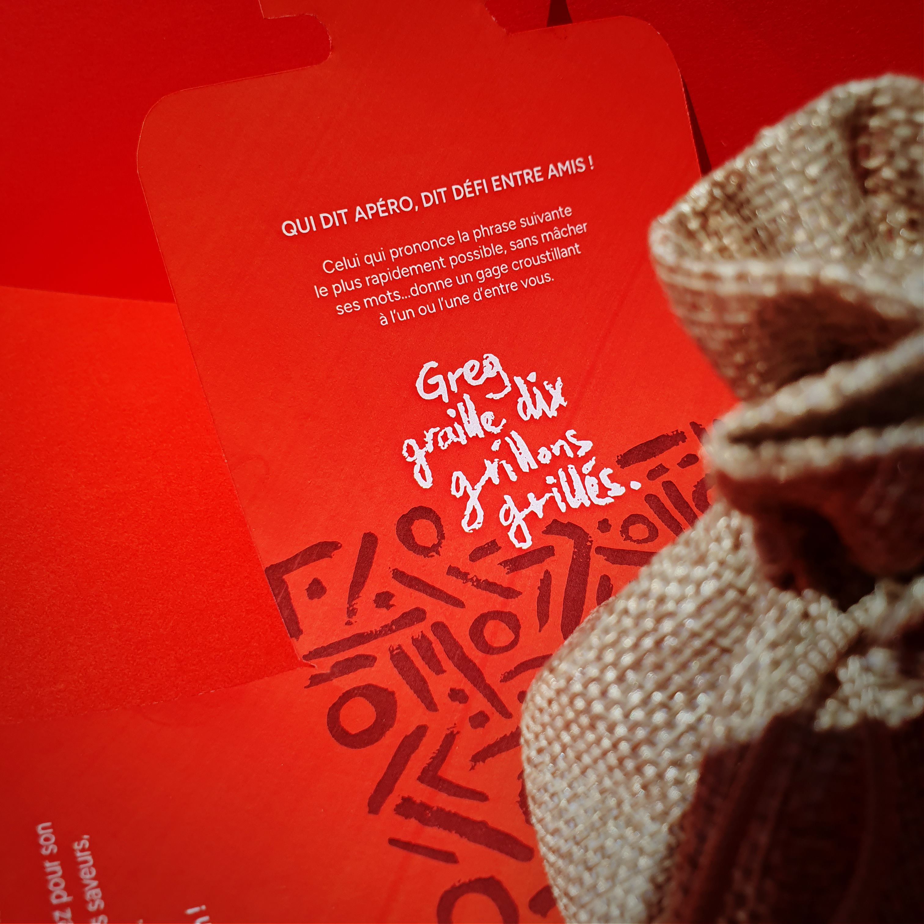
In the image of its logo, Bêbêt has developed a range of colorful aperitif insect packaging. Three types of insect are available: cricket with cayenne pepper, cricket with yellow curry and mealworm with garlic and herbs. In Asian and African markets, these insects are presented on large leaves (like bananas leaves). The packaging uses the folding of these leaves to emphasize their organic, natural appearance. The string accentuates the ‘portable’ nature of these little creatures, a key feature of the places where they were originally sold.The urban-inspired graphics allow users to immerse themselves in the world of Bêbêt. This spontaneity gives the products a certain authenticity. The opening is highly symbolic, because when unfolded it resembles a flower in full bloom. The insects are grouped together in a hessian bag, reinforcing the natural atmosphere. On each ‘leaf’ of the packaging, a strong motif is revealed and anecdotes about the insect adorn the inside of the packaging. This packaging is a clever blend of indomitable nature and an organic graphic universe inspired by the codes of urban art.
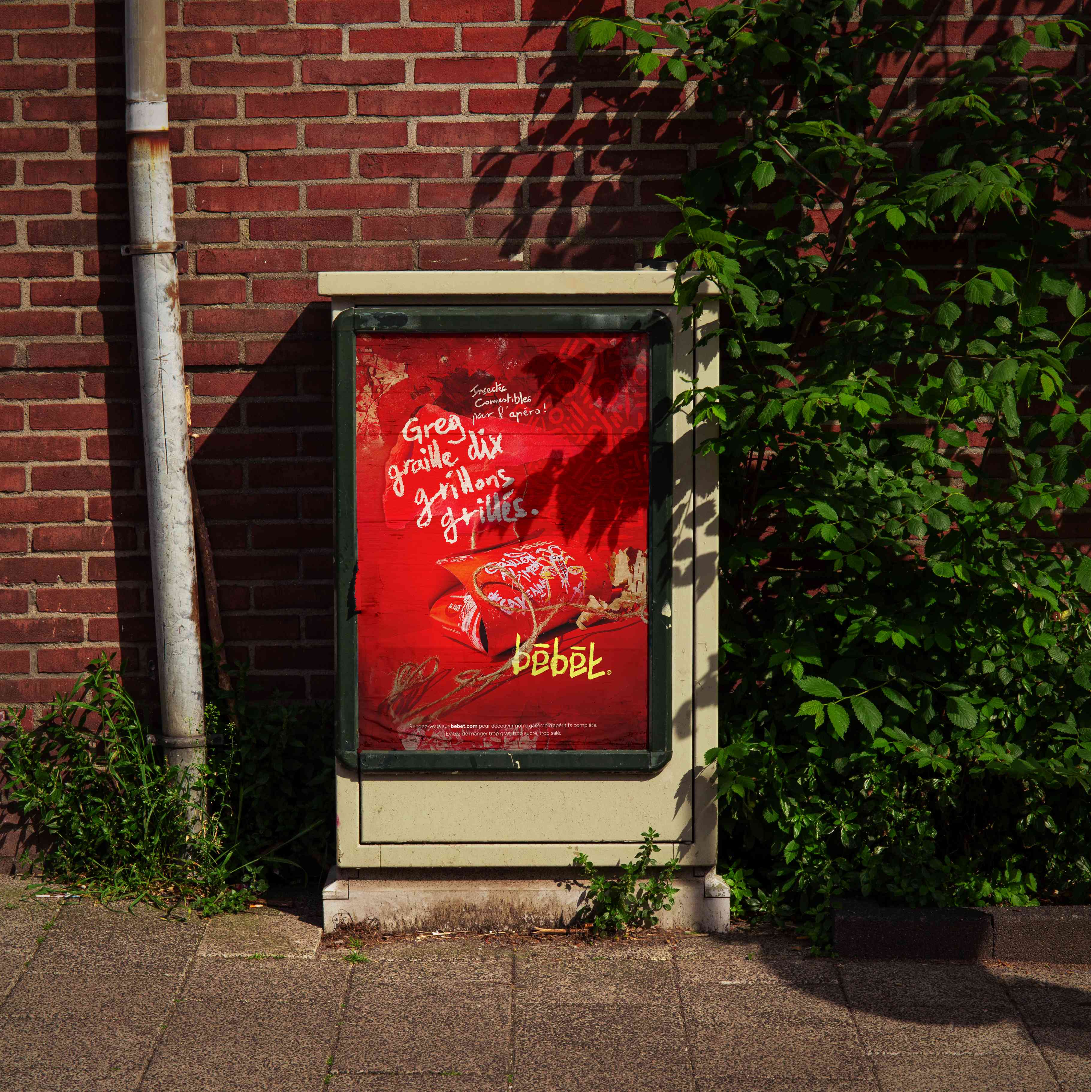
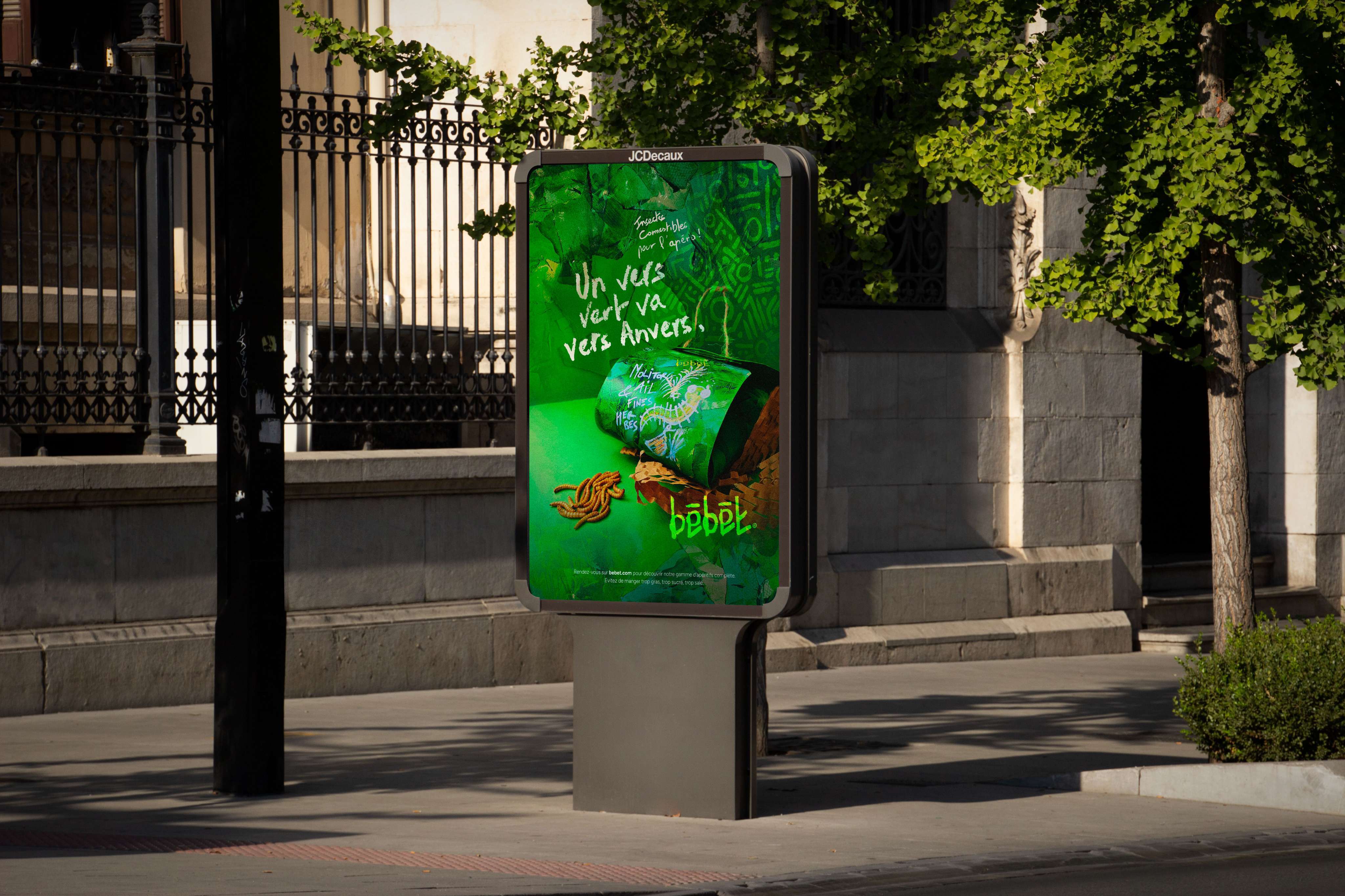
Through these ads, the Bêbêt universe is brought to the fore thanks to this mixed-media collage. The patchwork perfectly captures the brand’s wild, organic spirit. The colorful background and integrated typography make a link with the packaging, which has a similar layout. The slogan uses the homeoteleute (a phrase with similar syllables) already present on the inside of the packaging. The rhythm of these words echoes the rhythms of the graphics on the packaging and advertising. To enhance the effect, the fluorescent logo provides a visual cue for easy recognition of the Bêbêt brand. This advertising campaign is very different from what we are used to seeing. The visual is graphically strong and semantically rich.
CREDIT
- Agency/Creative: Mattéo Tabutieaux
- Article Title: Bêbêt – A Wild Identity for Edible Insects
- Organisation/Entity: Student
- Project Type: Packaging
- Project Status: Non Published
- Agency/Creative Country: France
- Agency/Creative City: Hayange
- Market Region: Europe
- Project Deliverables: Advertising, Brand Creation, Food Photography, Logo Design, Packaging Design, Product Photography
- Format: Bag, Sachet, Wrap
- Industry: Food/Beverage
- Keywords: Insects, Edible Insects, Aperitif, Insect lovers, Packaging, Logotype, Advertising
-
Credits:
Graphic Design: Mattéo Tabutieauxux


