About the client
A couple of months ago, we were approached by AD, an artist and DJ booking agency from Amsterdam. They represent and manage renowned electronic music artists such as The Advent, Alexander Kowalski, Robert Babicz, and Steve Rachmad. To celebrate their 20th anniversary, they decided to give their brand a refresh—one that would carry their name into their third decade of existence.
Our approach
We aimed to create a visual identity that resonates with their essence—an exceptional agency that celebrates the artistry of electronic music and the artists it represents. Our resulting identity is simultaneously robust and understated. A brand that literally offers the stage to the artists it champions.
The logo
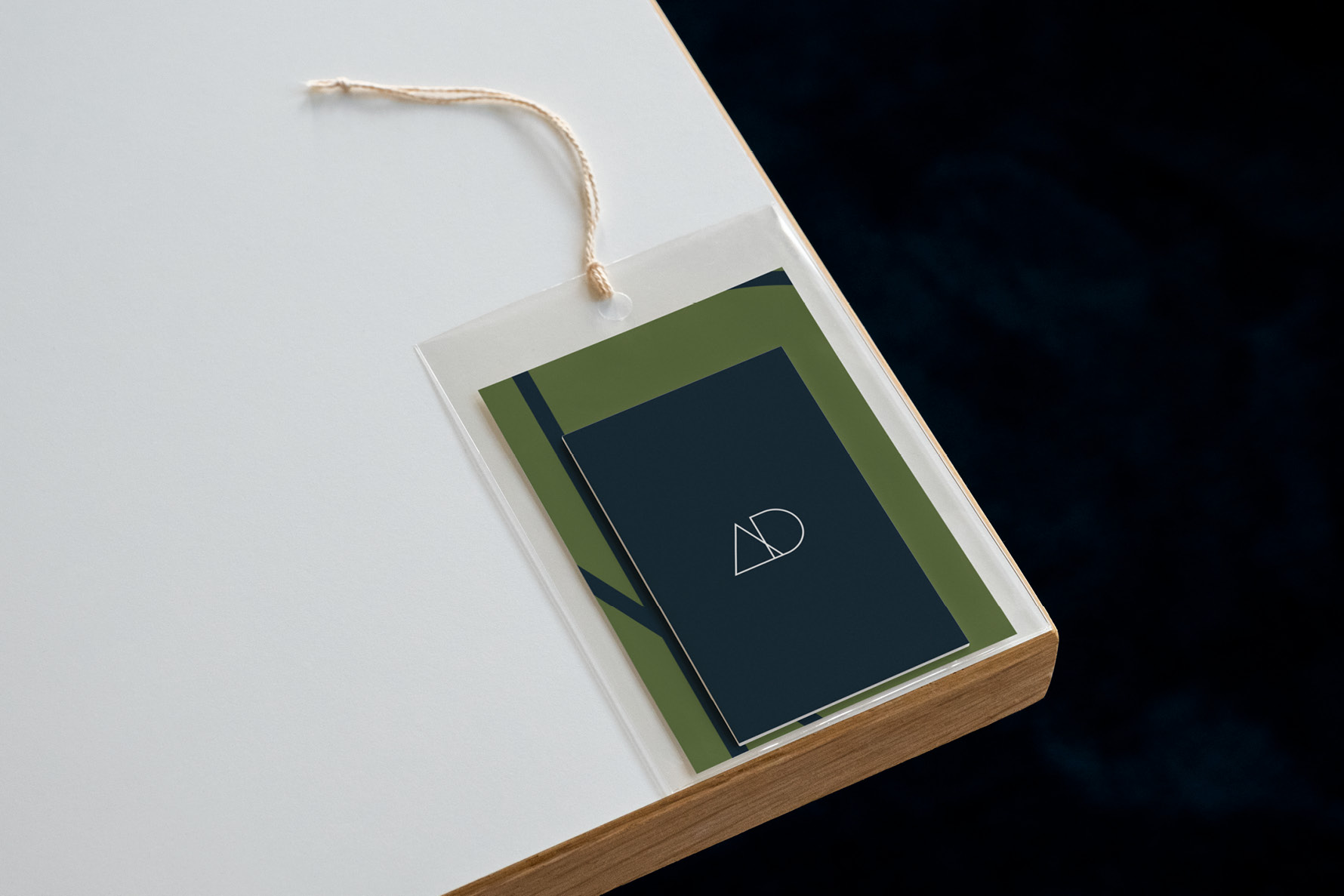
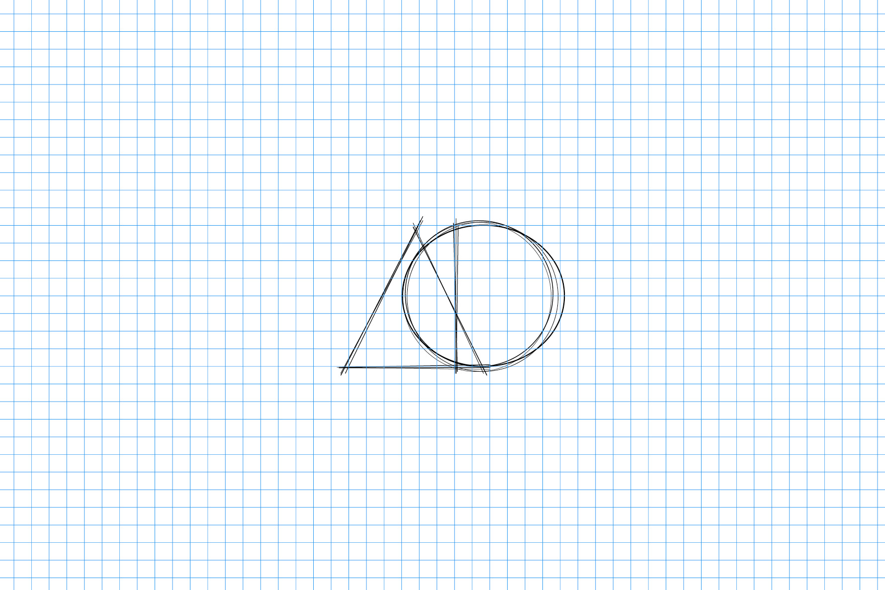
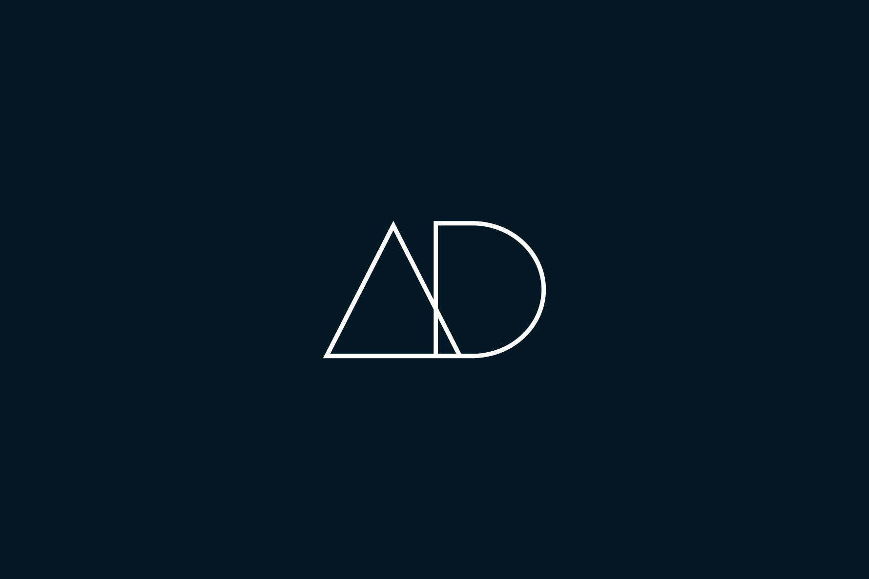
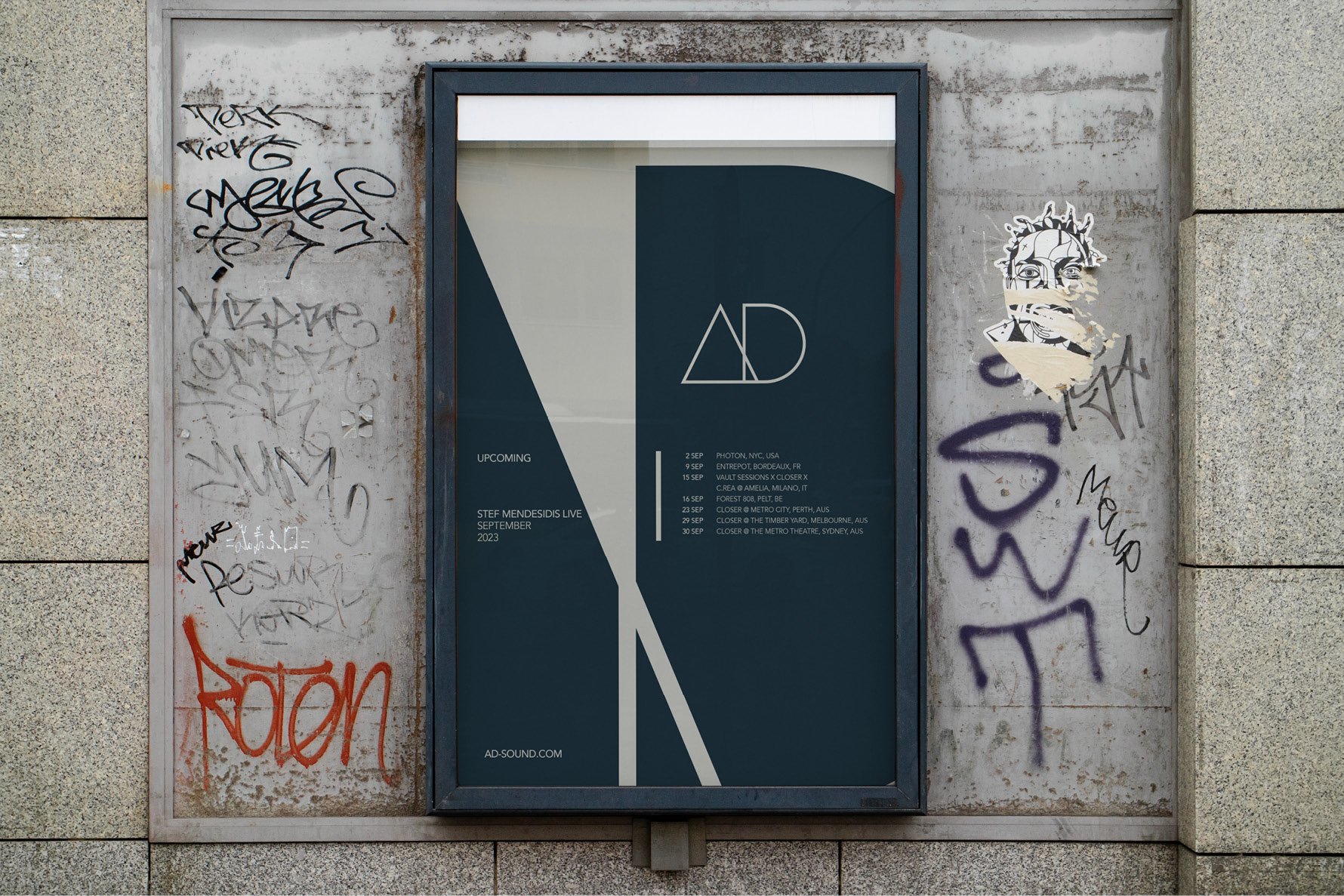
We evolved the previous logo into a shape rather than a typographic approach. While it remains unmistakably ‘AD,’ it sports a fresh perspective. This design choice establishes a clear hierarchy between the agency and the artists, placing the latter at the forefront. The logo’s form also grants the much-needed flexibility to seamlessly blend with the content’s backstage, a feature closely aligned with AD’s distinctiveness.
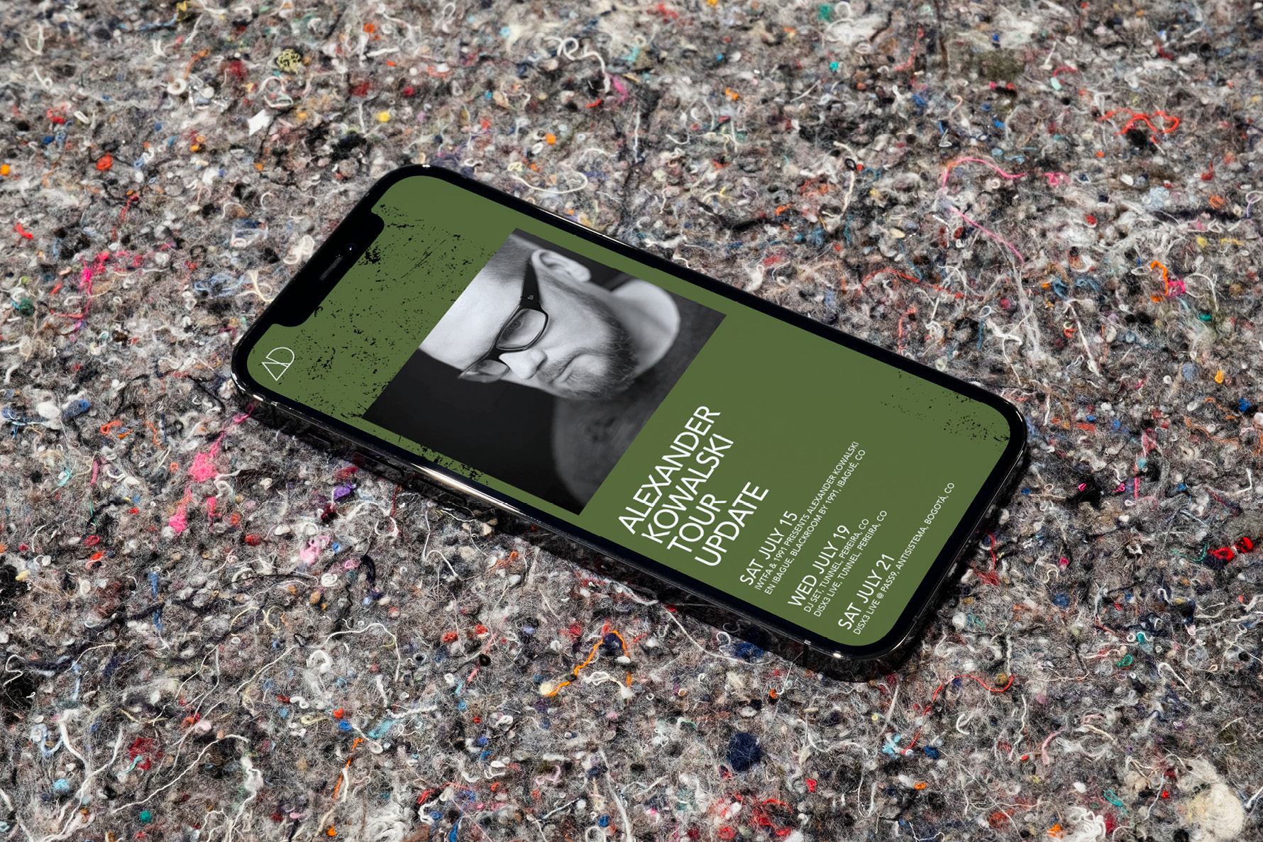
Given AD’s presence on externally produced materials like event posters and social media posts, we recommended providing utmost flexibility in color usage. Our goal is for the AD brand to harmoniously complement the broader landscape, rather than compete with it.
The typography
We selected Avenir as our primary and sole typeface. This geometric, honest, and clear typography perfectly resonates with AD. Notably, Avenir was adopted by the city of Amsterdam as its official typeface in 2003—the very year AD was established in Amsterdam. This choice reflects our intention to infuse Amsterdam’s recognizable essence into our brand.
Colors
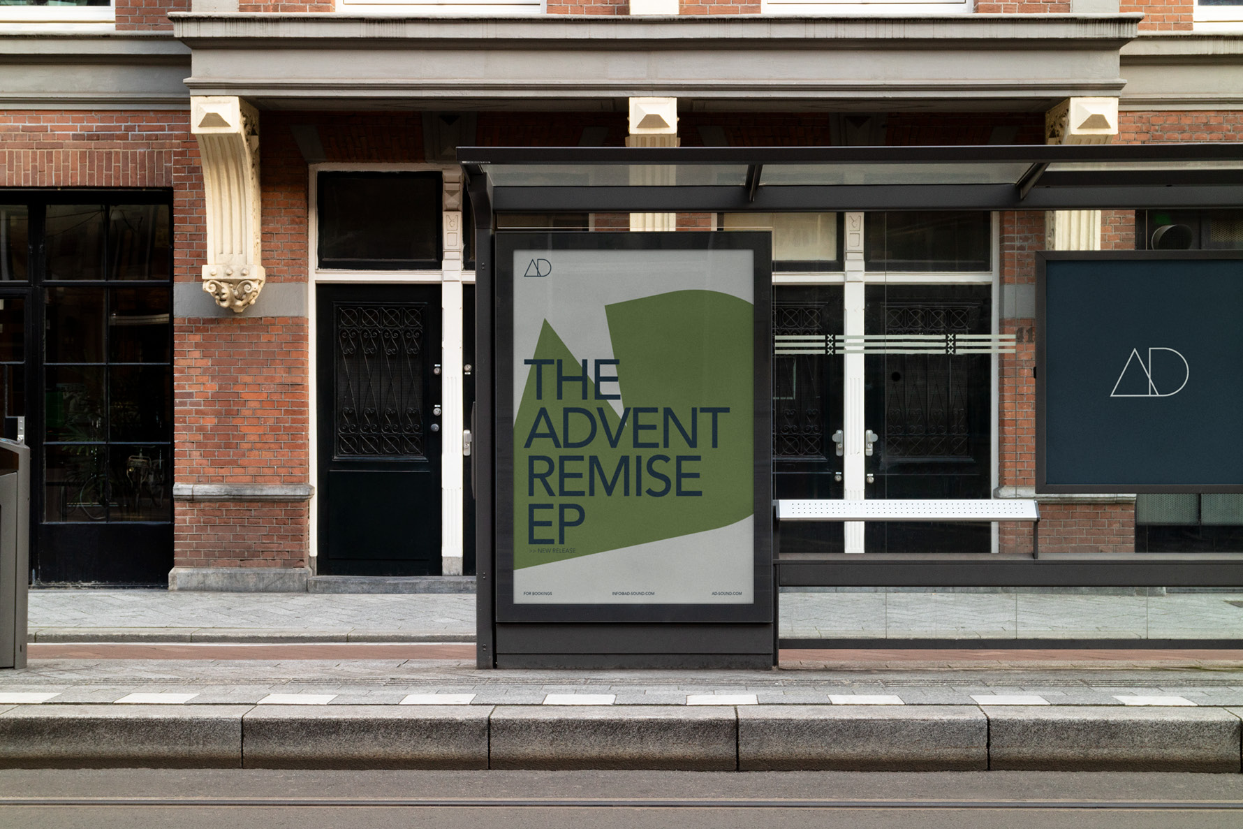
The brand colors provide a strong foundation, featuring a deep black reminiscent of night and a soft early morning grey. We have incorporated a vibrant Dutch orange to add accents, along with our client’s favorite green, which complements the overall palette.
The brand
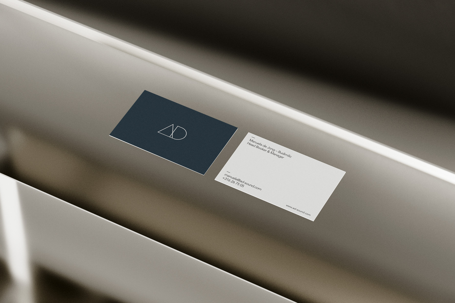
The identity of the brand truly shines when creating assets. This brand not only supports the represented artists but can also be discreetly placed backstage, complementing the content. It effectively conveys a clear message without the need for excessive elements and consistently maintains its recognizability.
Contributor credits
The brand strategy and brand identity was done by Frank Jansen, Creative Director at Jetway. We collaborated with Rick Böing for the motion work and AD’s Steve Rachmad for the custom sound design on the brand reveal video.

CREDIT
- Agency/Creative: Jetway
- Article Title: Jetway’s Rebranding for DJ Booking Agency AD
- Organisation/Entity: Agency
- Project Type: Identity
- Project Status: Published
- Agency/Creative Country: Netherlands
- Agency/Creative City: Amsterdam
- Market Region: Europe
- Project Deliverables: 3D Motion, Brand Creation, Brand Design, Brand Guidelines, Brand Identity, Brand Redesign, Brand Strategy, Graphic Design, Logo Design, Motion Graphics, Poster Design, Sound Design
- Industry: Entertainment
- Keywords: Brand identity, rebranding, motion design, logo design
-
Credits:
Creative Director: Frank Jansen (Jetway)
Motion Designer (video): Rick Boing
Sound designer (video): Steve Rachmad
Tapefaces: Avenir


