


Overview:
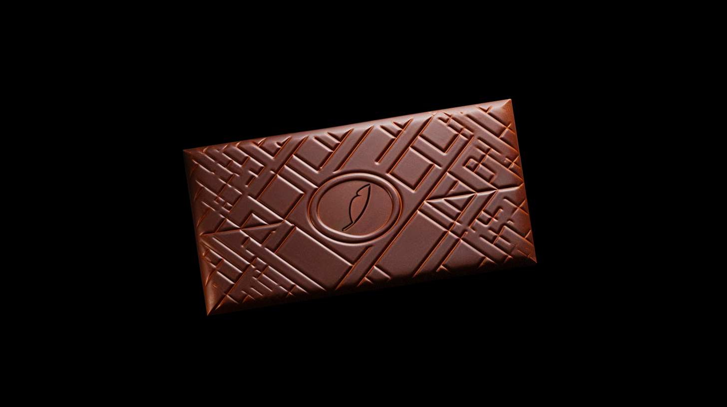
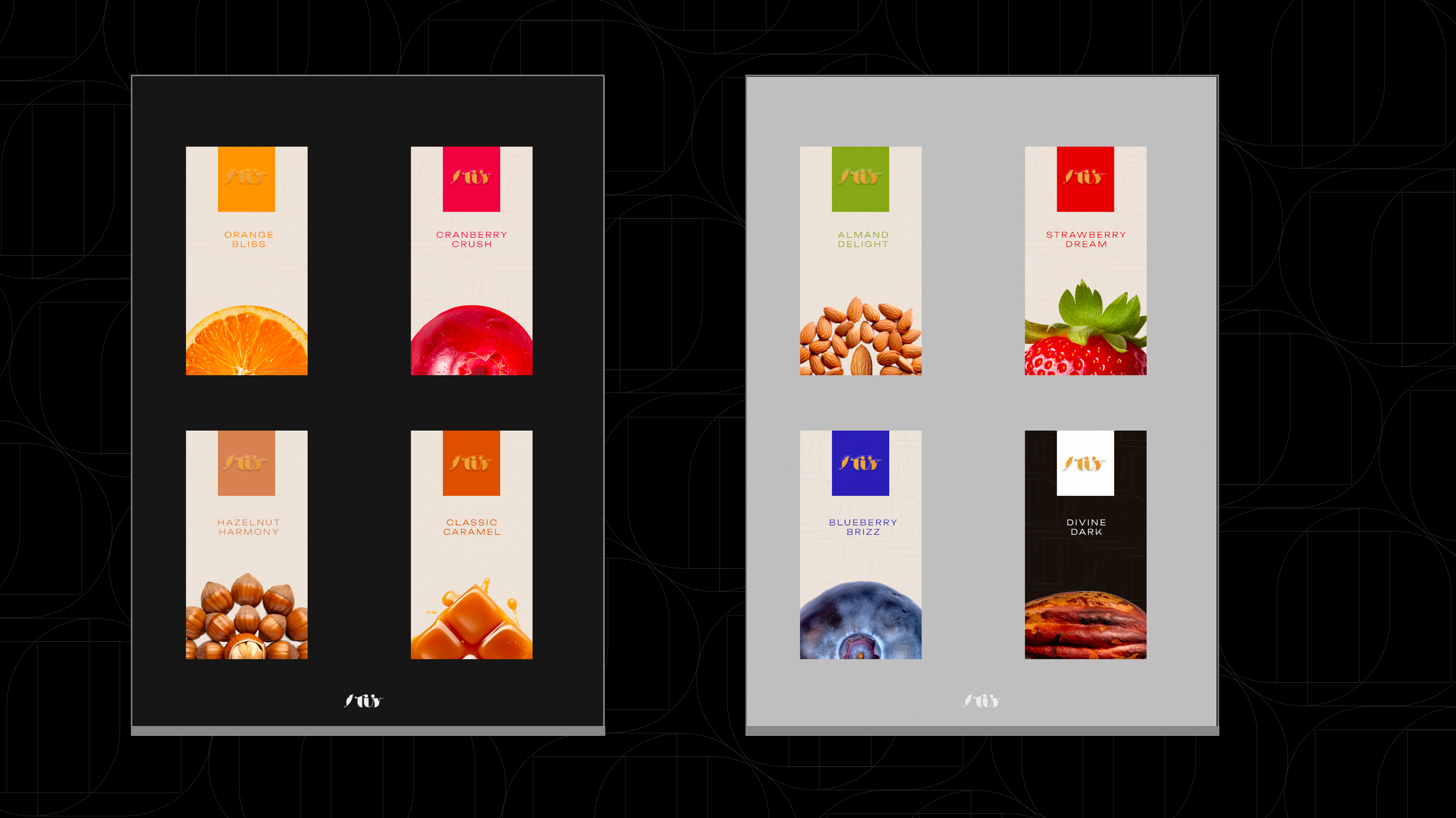
TÜY, an embodiment of luxury within the realm of chocolate brands, serves as a mesmerizing amalgamation of rich Turkish heritage and avant-garde sophistication. Revered for its opulent flavors meticulously crafted to perfection, TÜY offers more than just chocolates; it presents an entrancing experience replete with elegance and opulence that transcends mere confectionery. Drawing inspiration from the tenderness of feathers, the very name “TÜY” evokes a sense of delicate grace that defines the essence of their artisanal chocolates. This brand’s visual identity is a testament to refinement, featuring a gracefully designed feather logo adorned with intricate details. A palette of refined black and white is chosen deliberately, radiating an aura of sophistication and luxury that is second to none. Moreover, the ingenious use of a distinctive accent color for each flavor not only celebrates the decadence encapsulated in each creation but also weaves an artistic tapestry that signifies the spectrum of indulgence TÜY offers.
Mission:
Entrusted with the illustrious legacy of TÜY, my mission embarked on the creation of an unparalleled visual identity – a mirror reflecting the core tenets of elegance and sophistication this brand cherishes. Diving deep into the wellspring of Turkish heritage, I artfully curated the very name “TÜY,” a poetic homage to the tantalizing experience of relishing their handcrafted chocolates. Every stroke, curve, and line that constitute the brand’s visual elements were meticulously designed, ensuring that the feather logo embodied not just the brand, but an entire narrative of delicate indulgence. The harmonious dance between the refined black and white palette was carefully orchestrated to encapsulate the essence of TÜY’s intricacy and finesse. However, my creative odyssey didn’t conclude there; by ingeniously associating each flavor with a unique accent color, I endeavored to amplify the allure of TÜY’s chocolates. This artistic subtlety not only enthralled chocolate aficionados worldwide but also harmonized tradition with modernity in the most tantalizing manner conceivable, etching a vivid mark in the ever-evolving story of chocolate craftsmanship.


CREDIT
- Agency/Creative: Aymen Amokrane
- Article Title: TÜY Softness Of Chocolate Branding and Packaging
- Organisation/Entity: Freelance
- Project Type: Identity
- Project Status: Published
- Agency/Creative Country: United Arab Emirates
- Agency/Creative City: Dubai
- Market Region: Europe
- Project Deliverables: Brand Design, Brand Identity, Logo Design, Packaging Design
- Industry: Food/Beverage
- Keywords: chocolate, confectionery, türkiye, food, luxury, soft, elegant, sweets, sweet
-
Credits:
Strategic Brand Designer: Aymen Amokrane


