After 20 years of creating brands for other people, Leigh Chandler (previously of Fitch and Vault49) today unveils the brand, ethos, and website for her new agency venture: Sister Mary.
Through Sister Mary (which takes its name and sensibility from the radical Californian nun and artist, Sister Mary Corita Kent), Leigh will follow her calling to create culturally insightful brands that build a following of devotees, not merely customers.
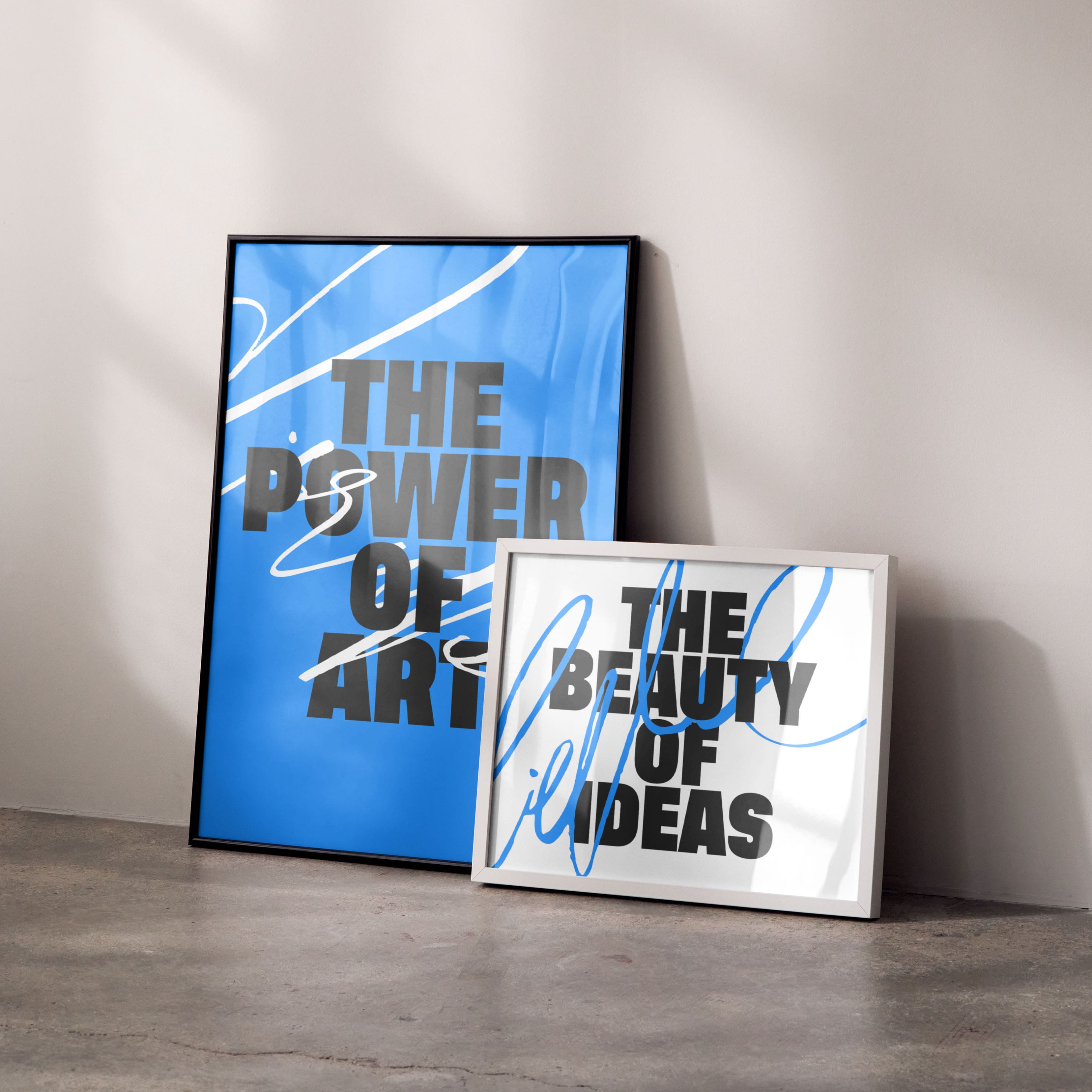
Through Sister Mary, Leigh combines her decades of experience to celebrate the power of art and the beauty of ideas. Summing up her approach, Leigh says: “At Sister Mary, we think in pictures and paint in stories. We dance between disciplines and create beautiful, meaningful and effective work as a result.”
Sister Mary takes its name from the 20th century pop artist, nun, and activist, Sister Mary Corita Kent, whose work and life has long been a source of inspiration for Leigh.
Leigh says: “Corita Kent has been an icon to me since my teenage years. I love how she used art as a medium to communicate powerful ideas. And how she took advertising slogans, billboards and packaging and made beautiful art from it. I love to take art and make advertising and packaging from it. She found inspiration at the intersection of art and enterprise, but just in the opposite direction to me.
“As an activist, artist, teacher and nun – Sister Mary Corita Kent was the OG female trailblazer who never really gained the recognition she deserved. So when I set out to create an agency that stood strong for womens’ contributions to design, I could think of no better way to honor her, and to signal my values, than to take on her name.”
Leigh devised the Sister Mary brand herself, taking cues from Corita Kent’s powerful, message-driven style and her unique point of view as a nun and advocate for social justice, but Sister Mary’s design direction is wholly unique – much more Leigh than Corita.
“Our design language is inspired by the intersection of art and ideas, of strategy and creativity. A bold and solid structure and grid underlies freedom of expression and creativity without boundaries,” Leigh explains.
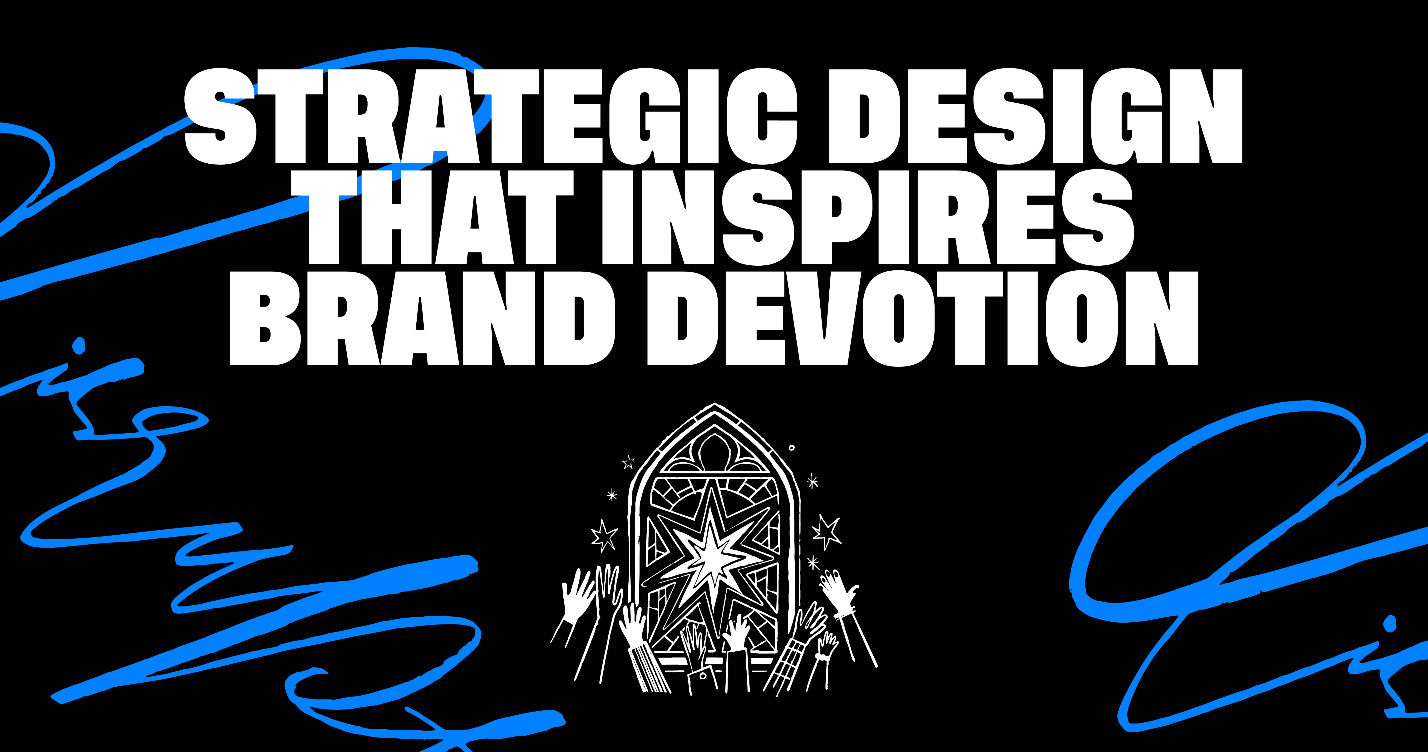
Sister Mary’s black, white and blue color palette is inspired by the traditional color of nun’s habits.
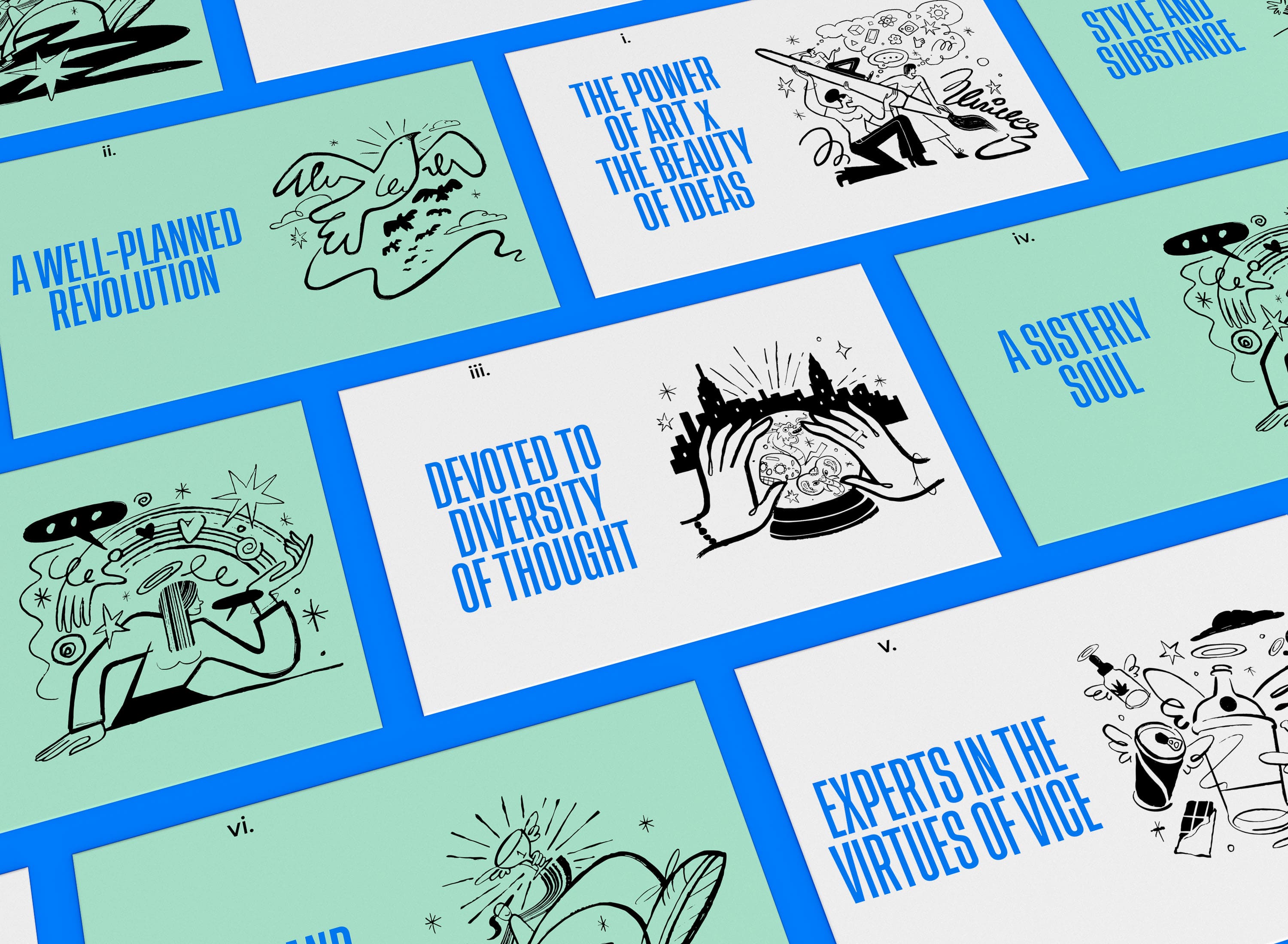
Sister Mary’s powerful yet playful tone of voice and a series of hand-drawn illustrations lightly inspired by religious symbolism create a tongue-in-cheek juxtaposition of religious cues as a nod to Sister Mary Corita Kent’s affiliation with the Church and Leigh’s creative penchant for “vice” products.
Leigh explains: “I have a passion for what could be called ‘vices’ – which I interpret as products that people simply crave. Products that are such a reflection of themselves and what they stand for that they are purchases made with love, not need: Cannabis, CBD, spirits, non-alc, beauty, cosmetics, luxury food and drink. I enjoy working for brands that want to unlock commitment and desire and LOVE in their followers, and clients who truly believe in the product they are marketing. Indeed, at Sister Mary a brand’s target audience won’t be considered as customers – they’re devotees, pilgrims in search of a transformative experience.
The Sister Mary website is now live, and Leigh is at work on some exciting passion projects – including a limited edition line of votive candles.


CREDIT
- Agency/Creative: Sister Mary
- Article Title: Sister Mary Launches Rebel Nun-Inspired Identity
- Organisation/Entity: Agency
- Project Type: Identity
- Project Status: Published
- Agency/Creative Country: United States
- Agency/Creative City: New York
- Market Region: Global
- Project Deliverables: Brand Design, Brand Strategy, Packaging Design
- Industry: Mass Media
- Keywords: branding, art, creativity, creative studio
-
Credits:
Founder/Creative Director: Leigh Chandler


