The St. Petersburg agency DS1 branding has developed the positioning and design system for the Candice brand
The brand & the task
Candice is a Russian manufacturer of low-calorie, sugar-free desserts. A young team of sweet lovers produces their own unique and incredibly delicious products in jars. These desserts meet the needs of people who care about their health, watch their figure, and monitor their sugar intake.
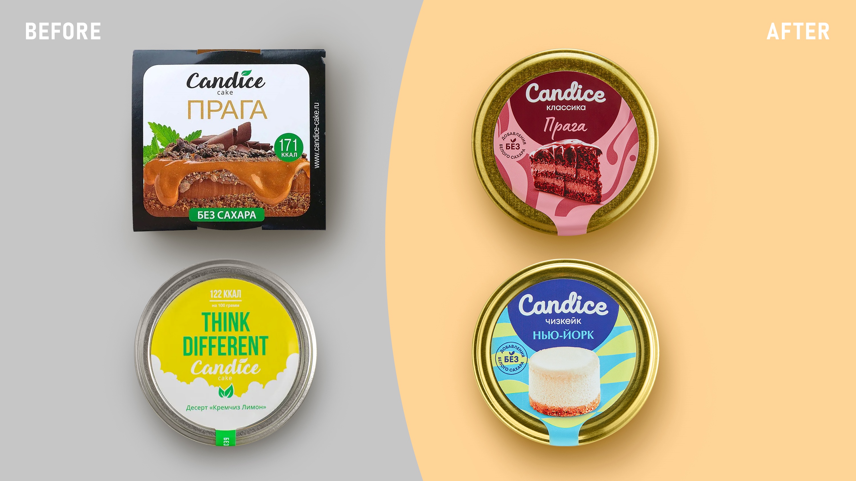
The sweets and desserts market today is in the maturity stage due to increasing competition and slowing growth rates. Standing out and rebuilding from competitors is difficult, but strategically important. Therefore, the goal of the Candice rebranding was to create positioning, convey the uniqueness of the product, and develop a clear, intuitive differentiation system.
To implement the set tasks, the company turned to DS1 branding agency, which has 13 years of expertise in FMCG branding.
Maria Yakushina, Candice Brand manager, on collaboration
We made the decision to rebrand because the current packaging did not reflect the essence of the product, did not convey its uniqueness, and did not provide a sense of pleasure from the dessert. Before choosing the performer, we talked to many agencies. Since we have a lot of different products, it was important for the performer to understand how to work with line extension and design systems. How to convey the uniqueness of each line and the essence of each dessert.
We quickly found a common language with DS1 branding. They also had relevant experience working with a wide range of products and design systems. We provided information about the entire range of products that are planned for the future in the brief, so that there was an understanding of the uniqueness of each product, and we started from scratch together.
Analytics, positioning, strategy
An analysis of the competitive environment, a product analysis, identification of drivers and core audience stoppers, conclusions on market trends were made during the analytical phase.
In 70% of cases, brands in the low-calorie desserts niche focus on functionality and benefits, safety, and naturalness. There is an increasing number of near-healthy themes, but we forgot about pleasure! It was decided to stand out from the competition by focusing on taste, aesthetics and hedonism. It gets the audience that takes care of themselves, but at the same time is not ready to sacrifice taste and the pleasure of life.
The key sales channel for the product is e-commerce (primarily, Russian online marketplaces). When a buyer scrolls through the app in search of “something delicious”, the pleasure should begin with the photo of the packaging on the product card. After all, the consumer has no opportunity to touch or feel the product. The packaging should awaken the appetite and desire to try it from the first seconds and tempt with its uniqueness and style.
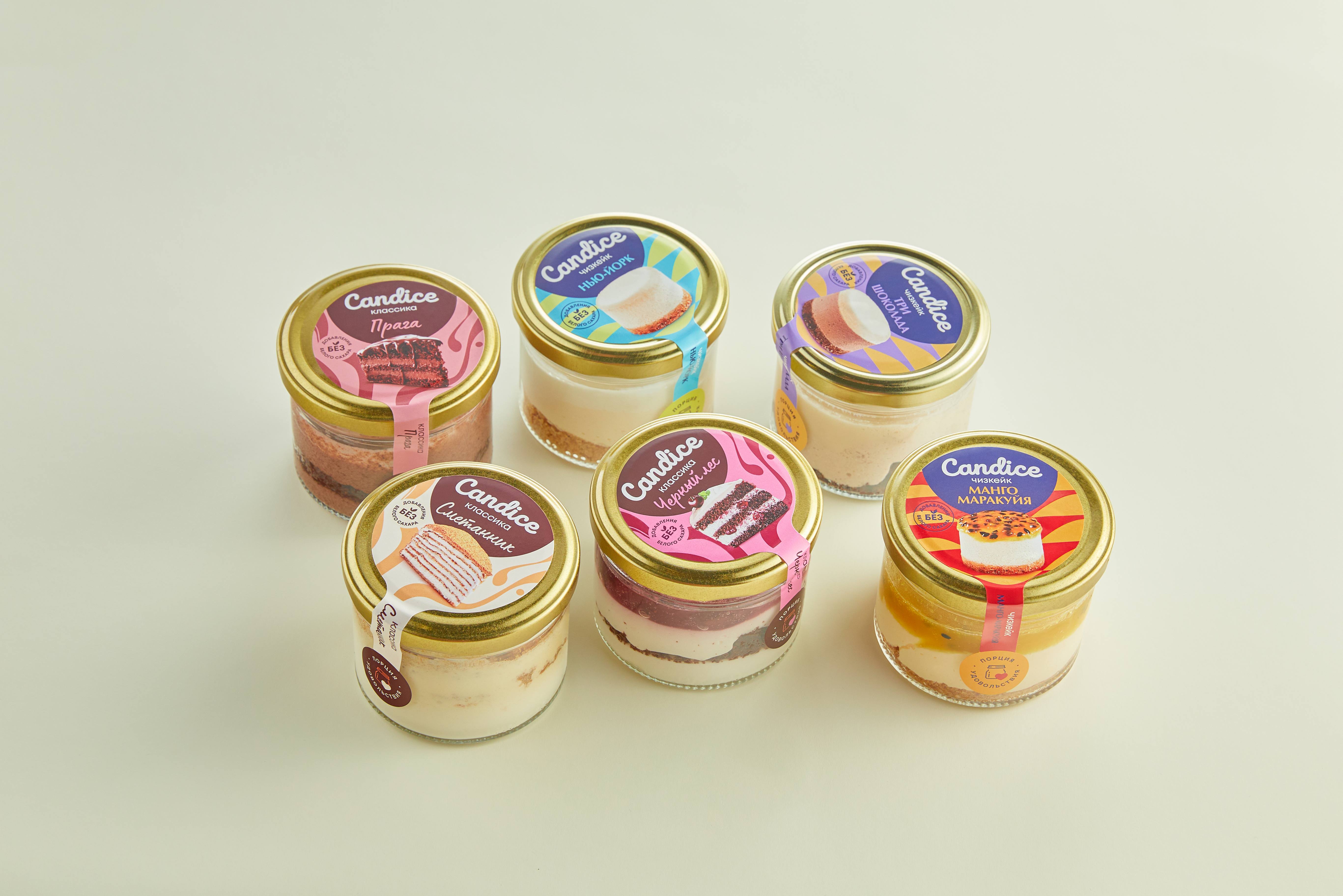
Seven directions were proposed by DS1 agency to solve the task. From these, the Candice team collectively selected three for visualization. In the final internal testing, the concept with an emphasis on a “delicious” layered food presentation was approved, as it best reflects the unique selling proposition of the product.
Svetlana Klupinska, DS1 agency Creative director, on collaboration
This solution catches the eye and touches a wide target audience because it balances between realism and flat abstract style, hedonism and the understanding of a familiar dessert, conciseness and taste richness. The Candice brand comes to the forefront in the design system. We want consumers to remember the name, associate it with pleasure, quality, and style, and in the future, instantly recognize the logo on the packaging of new products. Candice has a wide range of products and global development plans. It is important to establish a foothold in the minds and hearts of our audience.
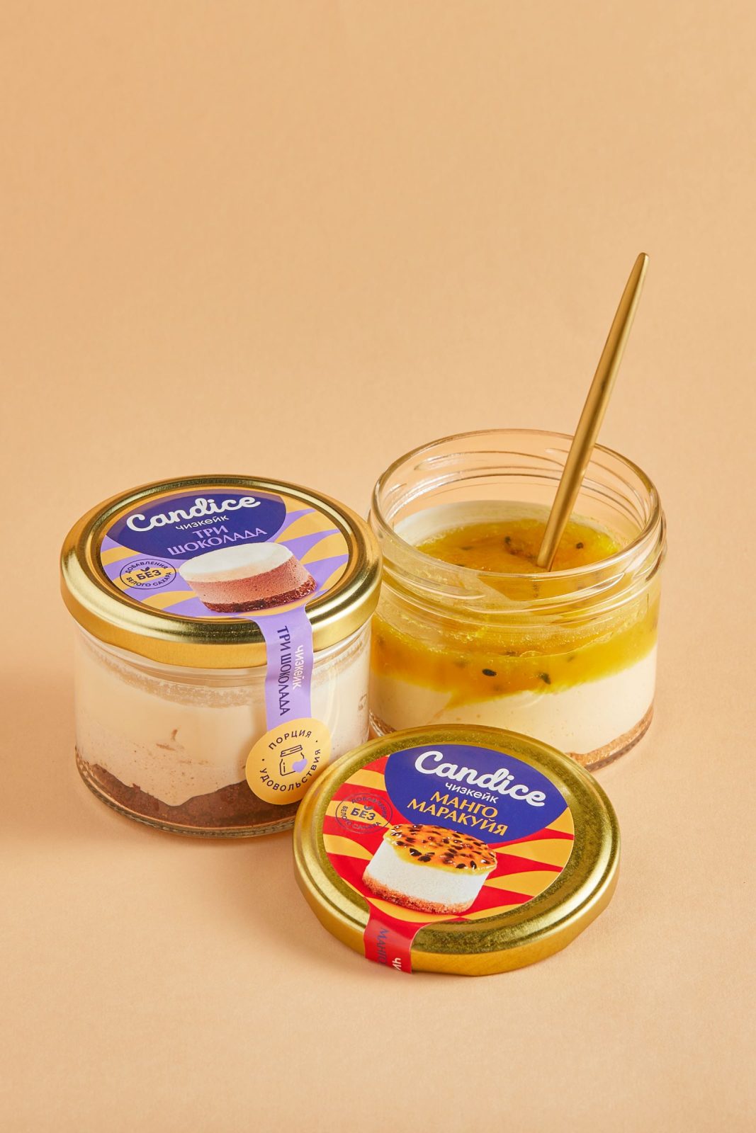
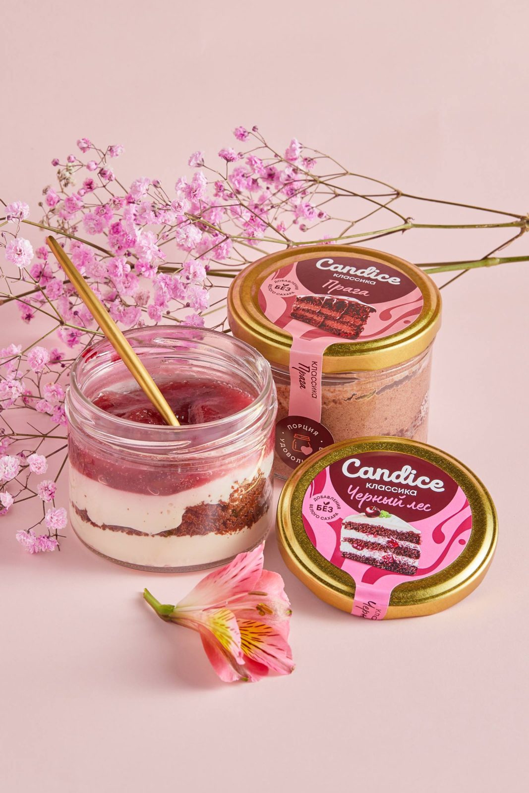
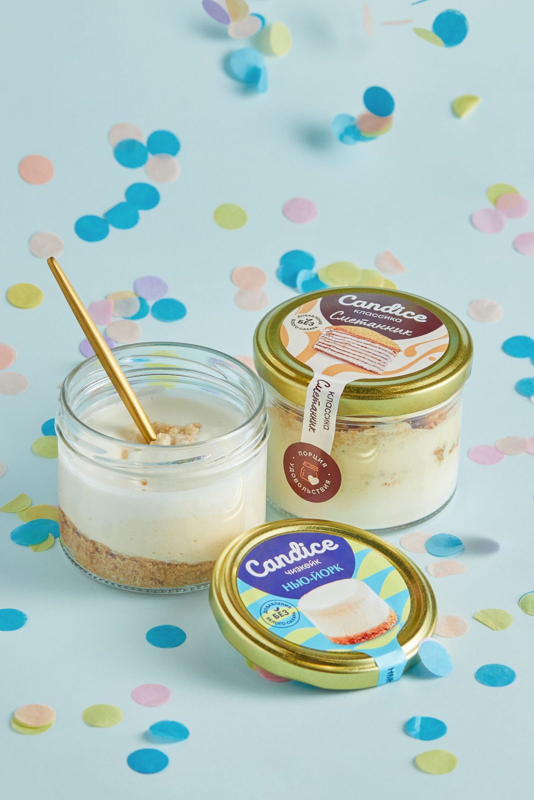
The entire design system maximizes the taste and uniqueness of each SKU. More classic desserts (Prague, Smetannik) use a more traditional color scheme and softer patterns. The bright colors and clearer patterns are used in cheesecakes (Mango-Passion Fruit, New York, Three Chocolates). Each product category has its own brand block color and pattern. This gives the buyer an understanding that the product is from a different line.
Maria Yakushina, Candice Brand manager, on collaboration
The comprehensive work on the design of product cards, descriptions, and visuals paid off, and we received an increase in clicks. It was easy to work with DS1 branding because they are very flexible. They listened to us and understood our preferences, and together we managed to find a solution that solves the problem and resonates with us internally. Very often you can hear “I am an artist – I see it this way” and many contractors insist on their point of view and do not listen to important points that can be voiced by the client. In addition to professionalism, it was important that they hear and understand us. That’s why we were able to find a solution that led to a positive result.
CREDIT
- Agency/Creative: DS1
- Article Title: Rebranding Candice: How to Make the Brand “Delicious” and Unique to the Target Audience
- Organisation/Entity: Agency
- Project Type: Packaging
- Project Status: Published
- Agency/Creative Country: Russia
- Agency/Creative City: St.Petersburg
- Market Region: Europe
- Project Deliverables: Brand Creation, Brand Design, Brand Redesign, Design, Logo Design, Packaging Design
- Format: Jar
- Substrate: Glass, Pulp Paper
- Industry: Food/Beverage
- Keywords: #dessert #packaging #ds1 #ds1branding #branding #packagingdesign #fmcg
-
Credits:
PR-manager: Yana Paramonova


