Alternative Airlines unveils a new, flexible identity full of ease, in a quest to become the world’s preferred choice for flight bookings
London-based brand consultancy Lantern has redefined the company’s strategic positioning and created a new visual identity, one that takes you on a journey, catering to every need.
Alternative Airlines is a leading online flights-only booking company. The company exists to undo the complexity of the booking process, enabling customers to ‘book a flight without the fear’ – a common experience for many people making one of the biggest purchases of their year.
With a strong emphasis on ease and flexibility, Alternative Airlines provides various payment options, unrivalled choice with the most routes and airline options and a highly rated human customer care team ready to assist with amendments or support at any stage of the booking process.
Lantern was appointed to define their brand story, better promoting the unique aspects of the business whilst revolutionising the visual identity.
“Alternative Airlines knew that their existing logo and visual identity didn’t accurately reflect their offering and level of service. Following a series of interviews and surveys from those within the business, it was clear that what set them apart from the competition was their level of flexibility, both in customer service and payment options, providing greater ease to their customers. The new strategy and visual identity is a true reflection of this, and is one that everyone can now get behind and feel proud of.” says Lantern’s Senior Designer, Baz Forrister.
The new brand essence, Freedom to fly, formed the starting point of the new story, identifying the common frustrations amongst customers and offering solutions; When did booking a flight become the most stressful part of a trip? Did I book the right baggage? When do I choose my seats? Can I even afford to fly so soon? You hover over ‘Book now’ and hope for the best. The new strategy challenges this convention, positioning the brand as the alternative by name and nature. By offering customers more choice, more flexibility and more alternatives, Alternative Airlines exists to give everyone, everywhere, the freedom to fly.
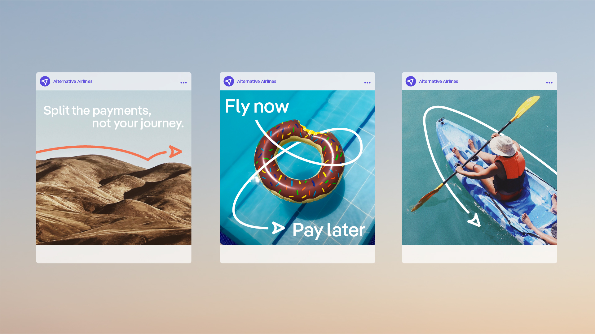
This is further demonstrated through creative messaging with headlines such as ‘Book without the emotional baggage’, ‘Fly now, pay later’ and ‘Easy booking, no turbulence’.
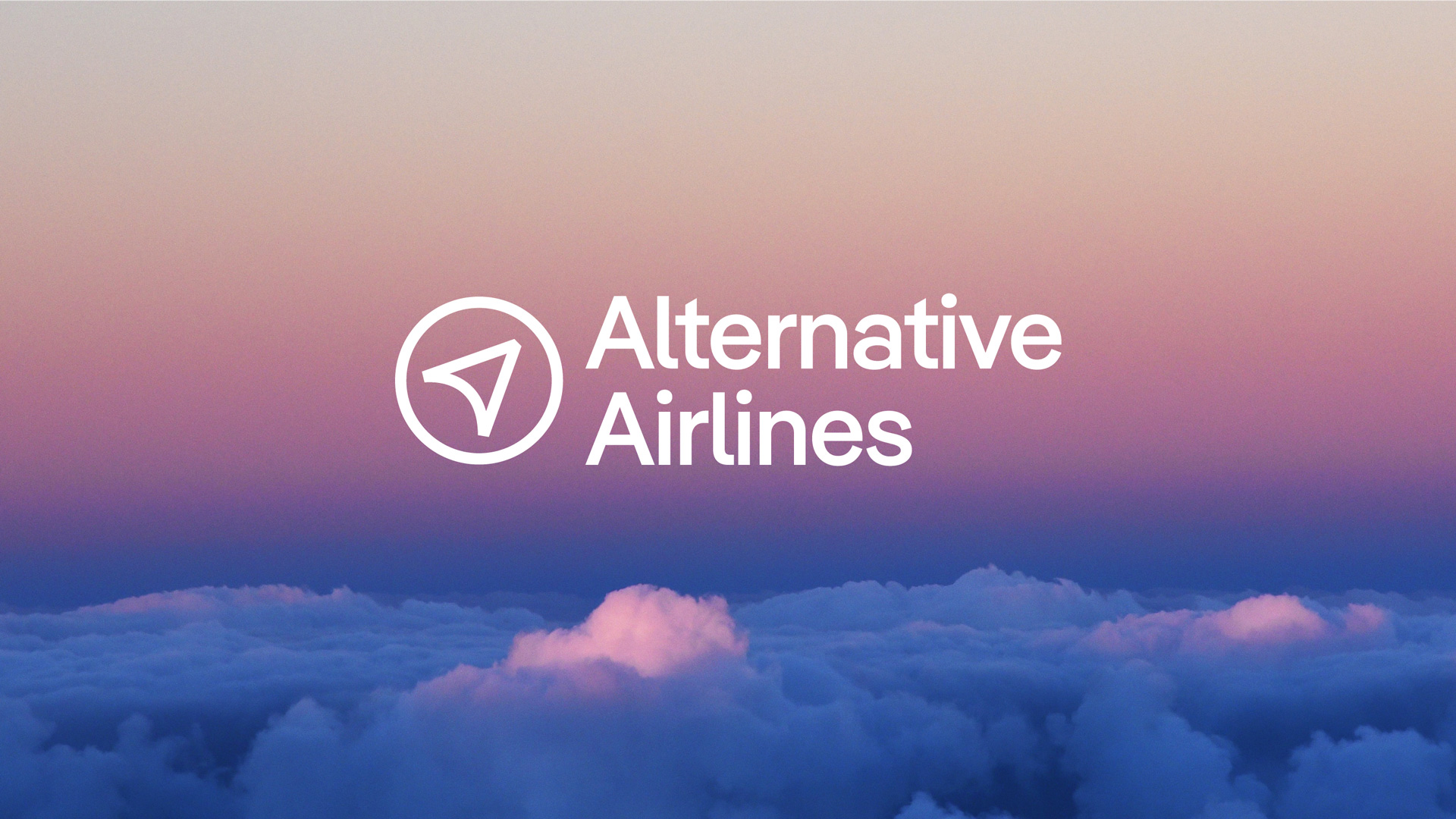
Lantern created a guiding arrow symbol that sits both with a new wordmark and as a standalone asset. It combines the ‘A’ from the brand name, a compass dial – highlighting the breadth of destinations available and a cursor reinforcing the online-only nature of the business.
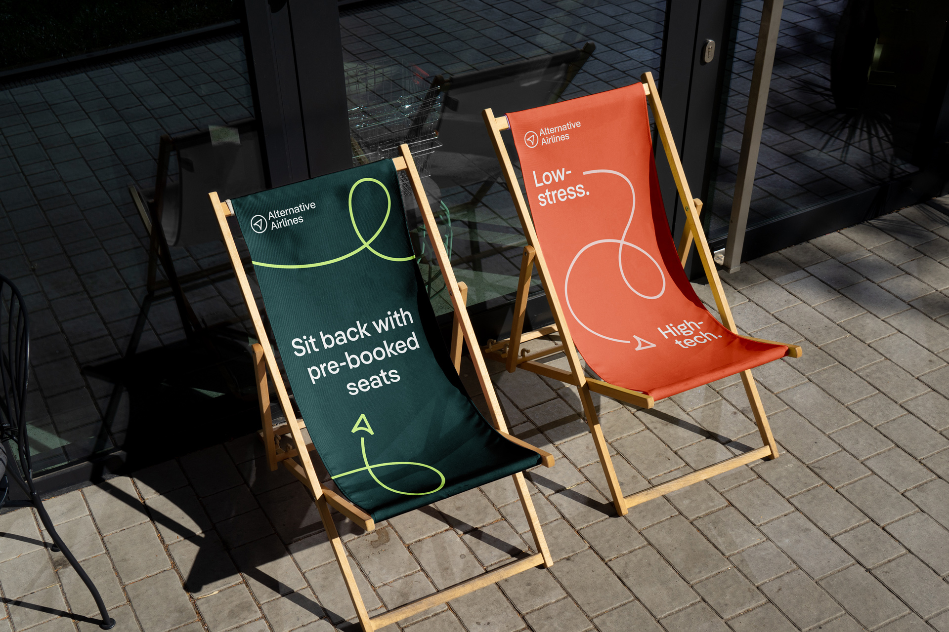
The visual system puts the symbol in motion, creating a continuous flowing journey line full of energy, flexibility and ease. Intertwined within the interplay of type and imagery the arrow guides users through the experience reflecting the smooth booking process whilst emphasising that they’re with you every step of the way.
Lantern’s rebrand for Alternative Airlines paves a new way for online booking. The refreshed visual and verbal identity tackle common sticking-points head on and offer a new way of doing things, reinstilling confidence in an otherwise complicated market.


CREDIT
- Agency/Creative: Lantern
- Article Title: Branding the Global Flight Booking Brand Giving Everyone, Everywhere, the Freedom to Fly
- Organisation/Entity: Agency
- Project Type: Identity
- Project Status: Published
- Agency/Creative Country: United Kingdom
- Agency/Creative City: London
- Market Region: Global
- Project Deliverables: Brand Design, Brand Identity, Brand Naming, Brand Strategy, Identity System
- Industry: Transport
- Keywords: travel, technology, flights
-
Credits:
Creative Director: Ryan Tym
Senior Designer: Baz Forrister
Designer: Mollie Kendell


