Safari Sundays Redefines Slurpee With a Bold, Tasty New Look
Slurpee’s newest look, courtesy of NYC branding studio Safari Sundays, taps into the inner “young you” of consumers and boldly asks them to “fill freely.”
Ever since 7-Eleven first introduced Slurpee to the masses in 1966, they have been at the forefront of pop culture and a bastion of icy refreshment that packs a flavorful punch.
But with all great convenience store legends, it was time for a design overhaul. 7-Eleven and its customer research panel Brainfreeze Collective, turned to NYC branding studio Safari Sundays for a delicious refresh, catapulting the legendary brand into the future for a new generation of consumers thirsty for a well-deserved brain freeze.
While the brand had undergone its fair share of nips and tucks over the past few years, the Slurpee largely remained untouched. Ultimately, the goal was to reintroduce the mouthwatering brand to Gen Z consumers without alienating its fanbase as Slurpee was landing in Speedway and Stripes locations.
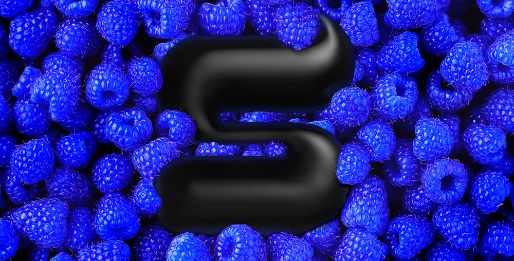
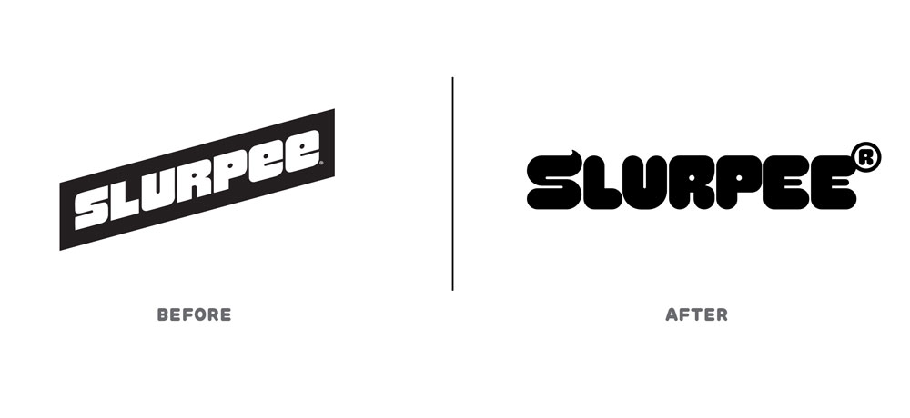
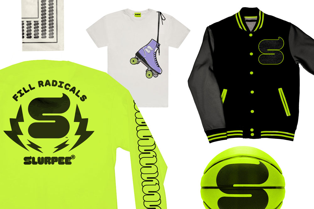
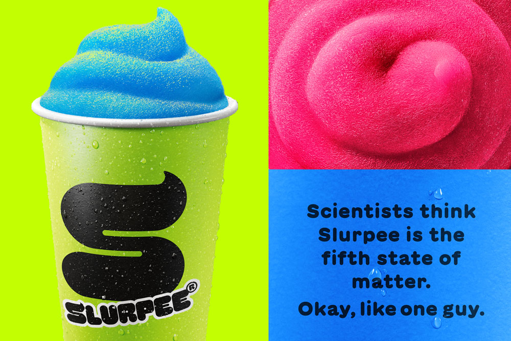
To do this, Safari Sundays leaned into what Slurpee is best known for—vibrant, electric colors, a look so refreshing you could taste it, big flavors, and a hefty dose of youth culture. Safari Sundays overhauled the brand’s visual identity by starting with the logo, opting for a tasty “S” monogram resembling a freshly-poured dollop of Slurpee. You can now find the mark everywhere, from the new packaging to the renovated design architecture, inviting Slurpee diehards and newbies alike to “fill freely.”
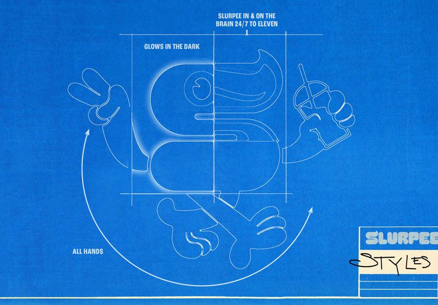
The studio also brought the “S” monogram to life with a new mascot—Styles—who embodies the mischievous scamp in us all. Styles comes to life through a variety of brand assets, giving 7-Eleven added flexibility and a vibe of everlasting flow.
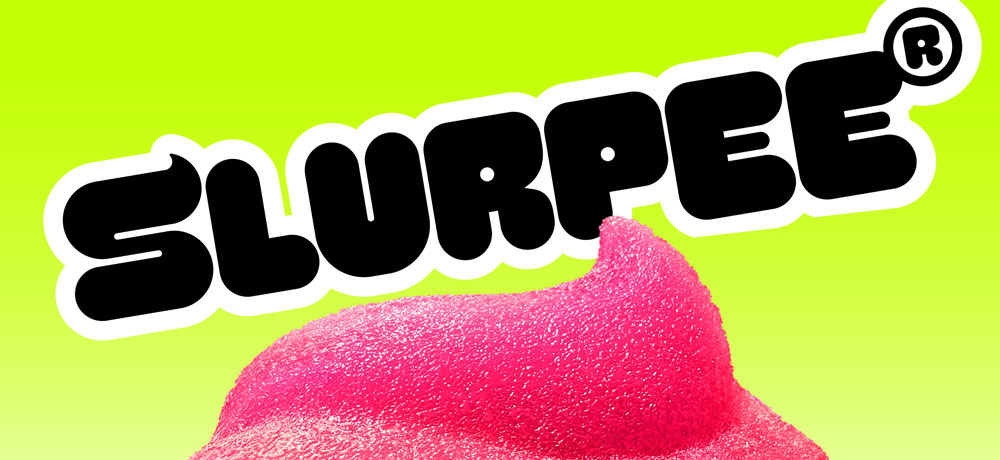
What’s more, Safari Sundays developed a proprietary typeface for Slurpee alongside Grilli Type, Swerve, to give the brand a more dynamic character. Borrowing from the “S” monogram and the liquid-slushy nature of the product, the new typeface adds even more personality to the visual identity and joy-inducing brand world.
“We love when opportunities like this come about to give a brand real depth and character—each of us on the team had a chance to inject a bit of their own true weird and wild young selves into the design story,” said Adam Walko, Creative Director at Safari Sundays. “The result is a world with simply fun truths and endless spaces that can let anyone be themselves.”
Overall, the new redesign plays to Slurpee’s fans, even while inspiring a new generation to “fill freely” with a bold, scrumptious look that’s easy on the eyes and demands a pit stop at America’s favorite convenience store.



CREDIT
- Agency/Creative: Safari Sundays
- Article Title: Safari Sundays Redefines Slurpee With a Bold, Tasty New Look
- Organisation/Entity: Agency
- Project Type: Campaign
- Project Status: Published
- Agency/Creative Country: United States
- Agency/Creative City: New York
- Market Region: North America
- Project Deliverables: Art Direction, Brand Design, Environmental Graphics, Rebranding
- Industry: Food/Beverage
- Keywords: Heritage Brand Slurpee
-
Credits:
Agency: Safari Sundays


