Daring. Without complexes. Naughtily honest.
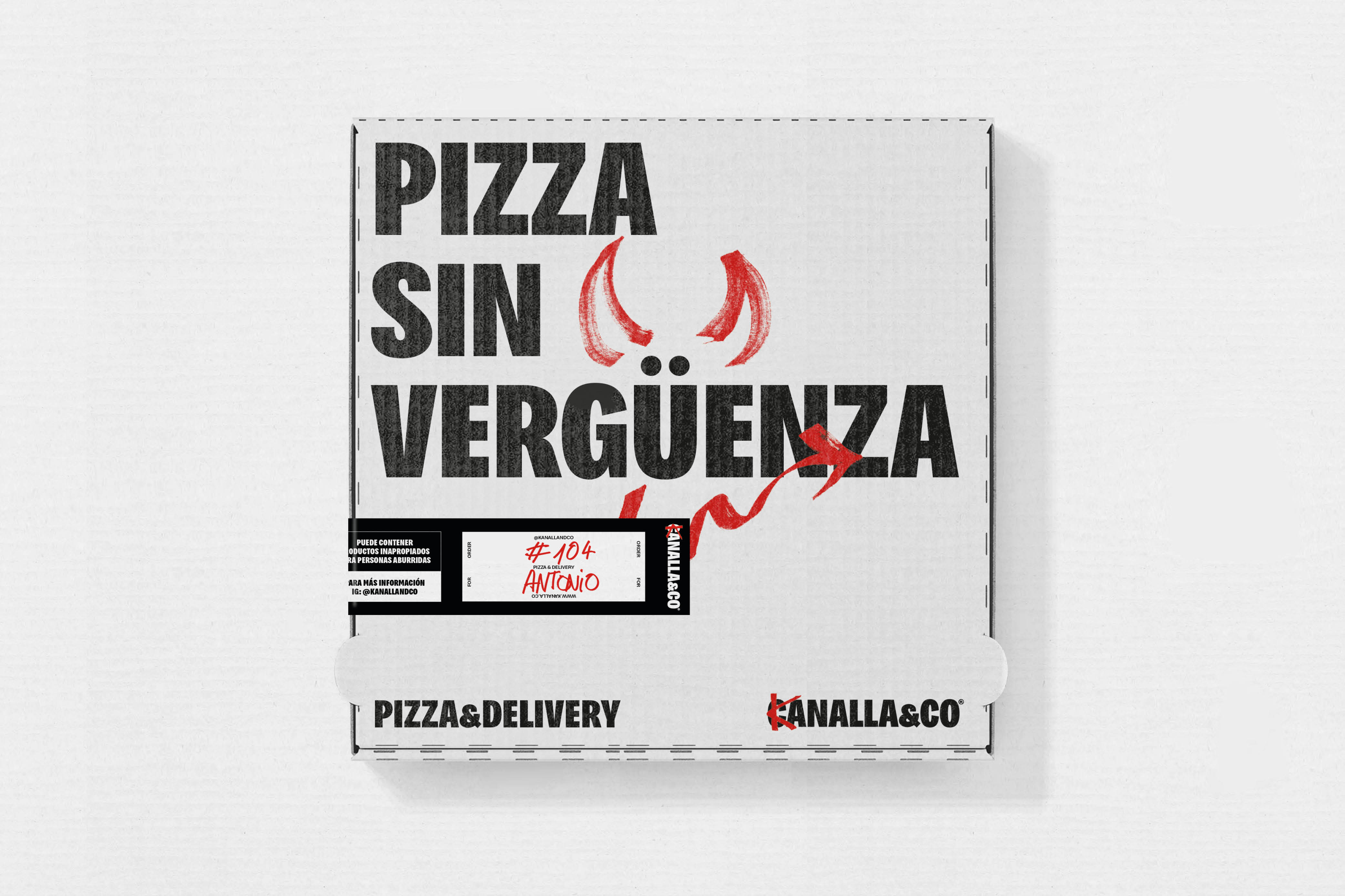
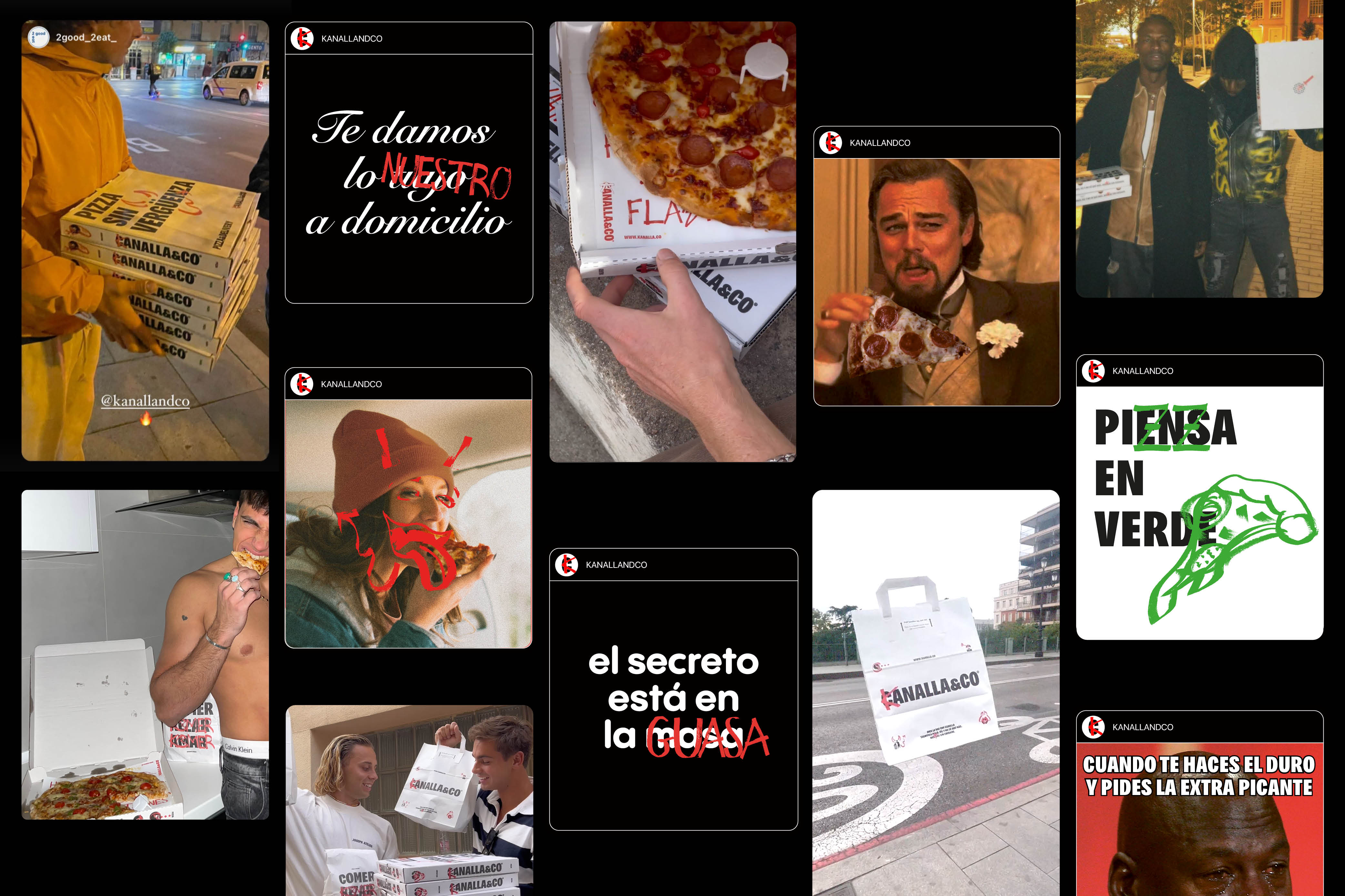
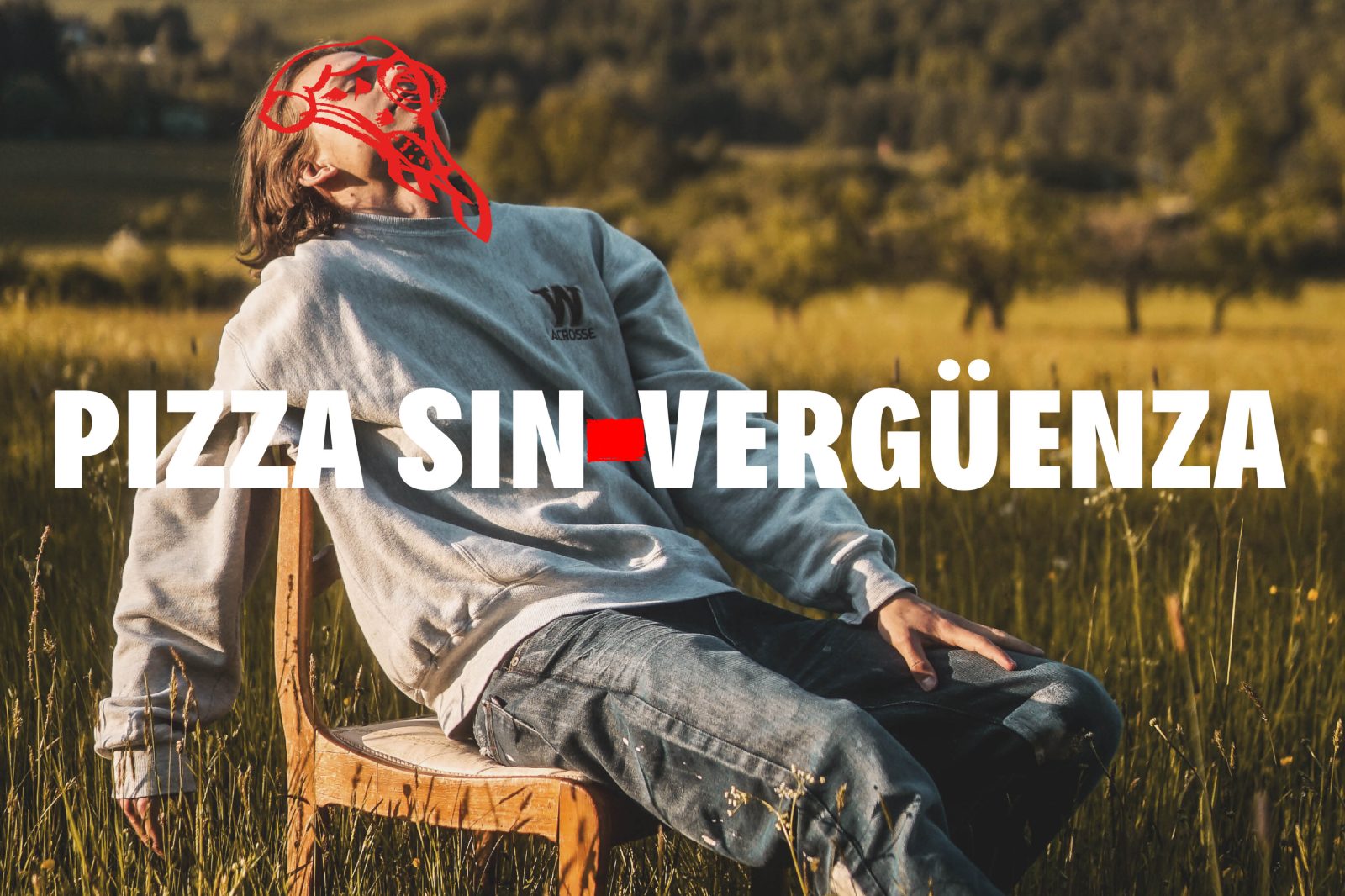
Pizza, outside Italy, is colloquially associated with a casual meal – “guarreo”-. Food for everyone – even vegans – in a world where people take control of what they want to do, say, read and above all eat.
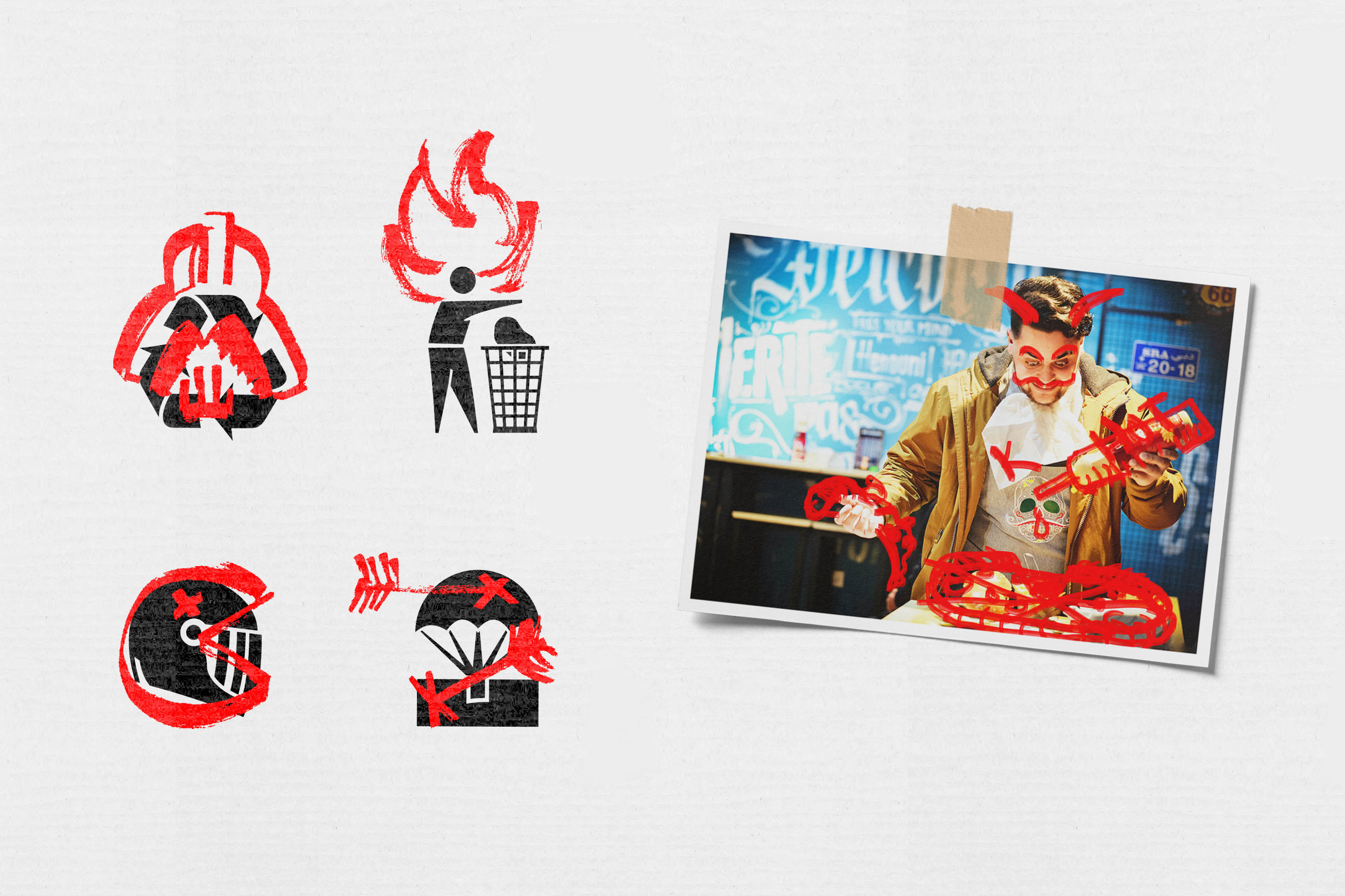
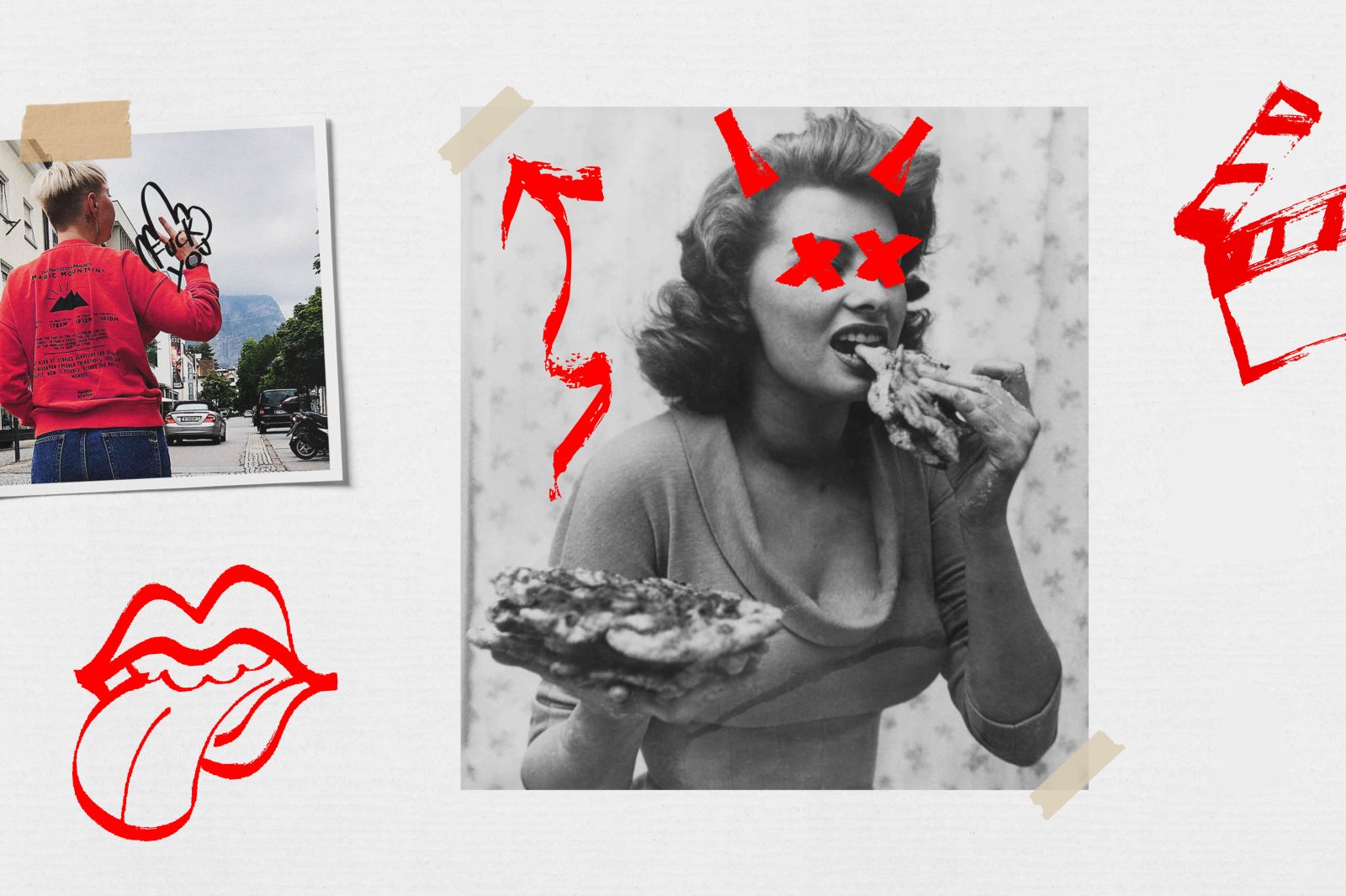
To elevate the moment of consumption through a trash and urban language -meme culture-, inspired by the clandestine restaurants of NY -Burger Joint-; acid, critical and interventionist with humorous purposes. Junk food is beautiful. Kanalla food is sublime.
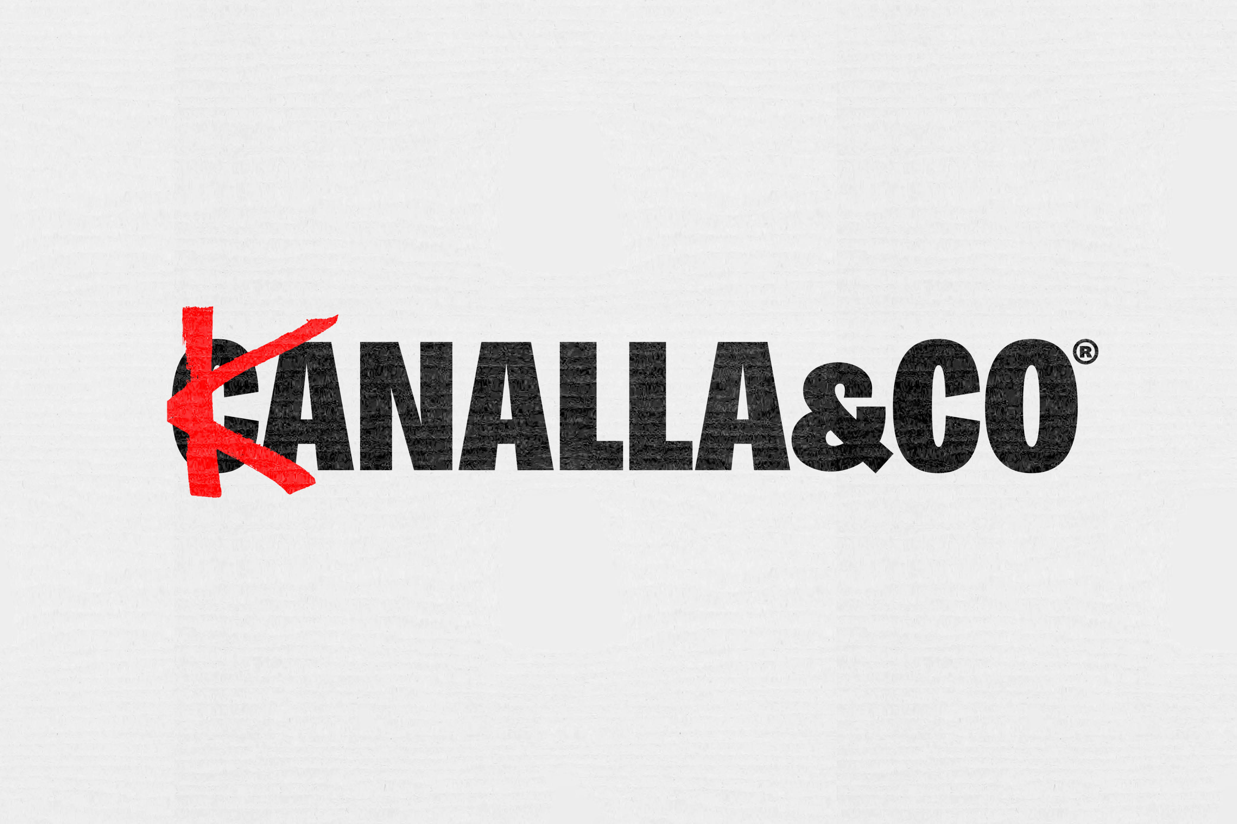
The etymology of canalla takes us to the Italian language, more precisely to the term canaglia. A canalla is an infamous, wicked or mean individual. The name of the brand led us to work on a rebellious, transgressive and nonconformist archetype, which we translated into an urban, fresh and creative language.
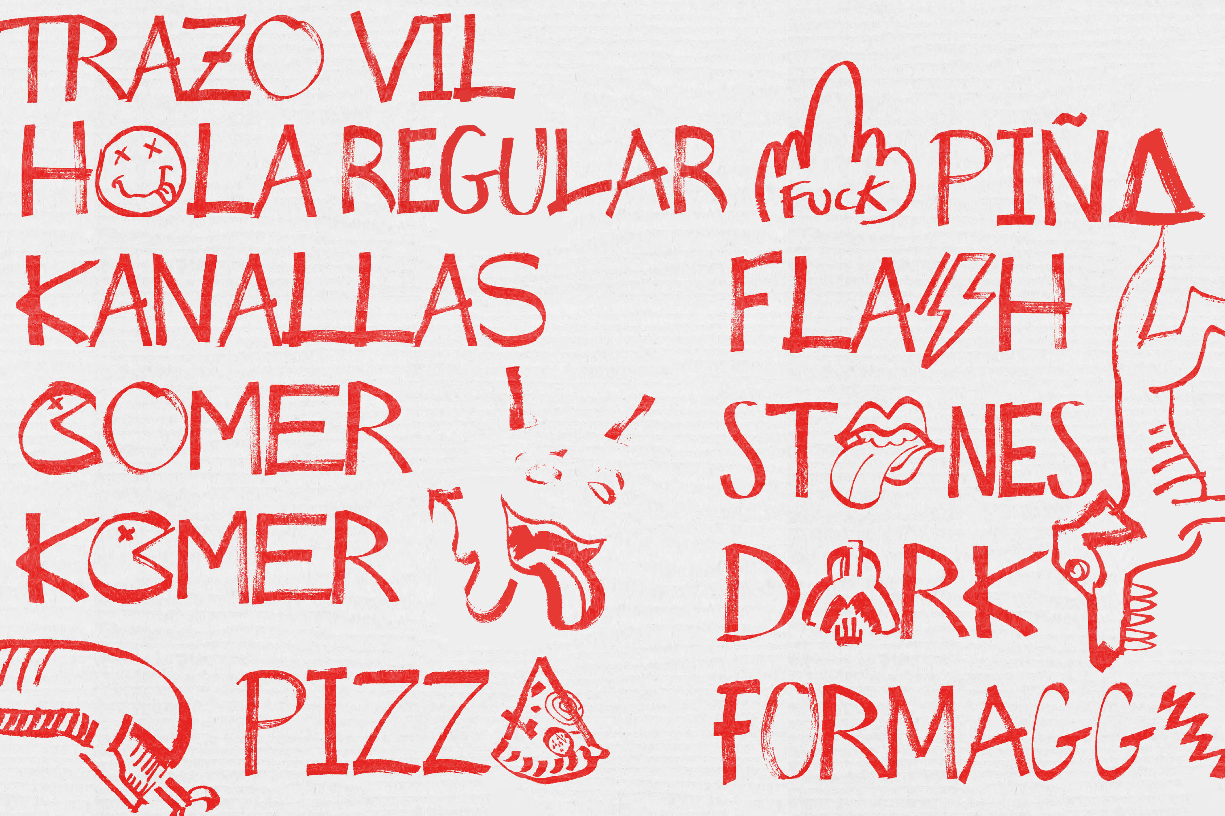
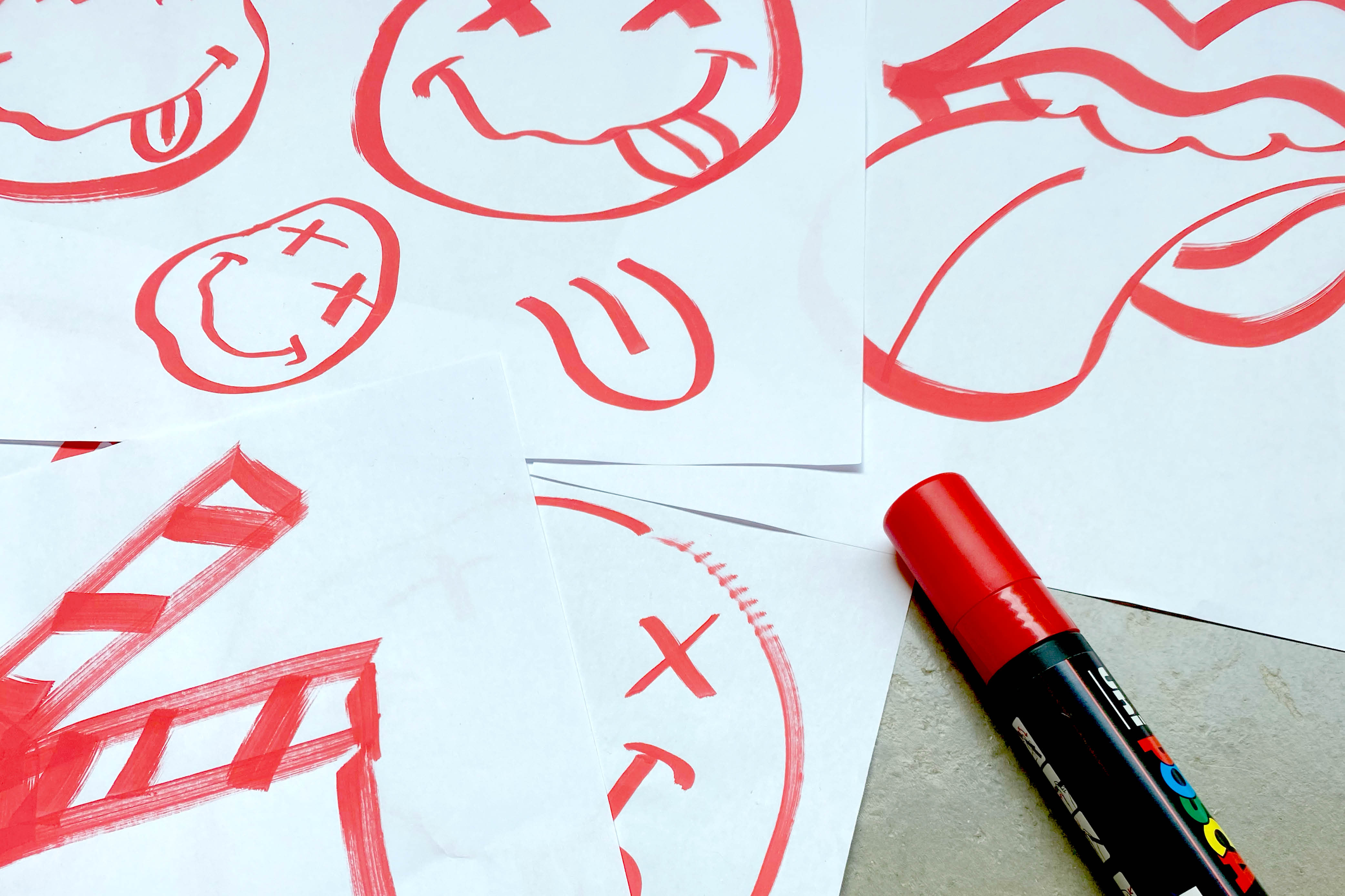
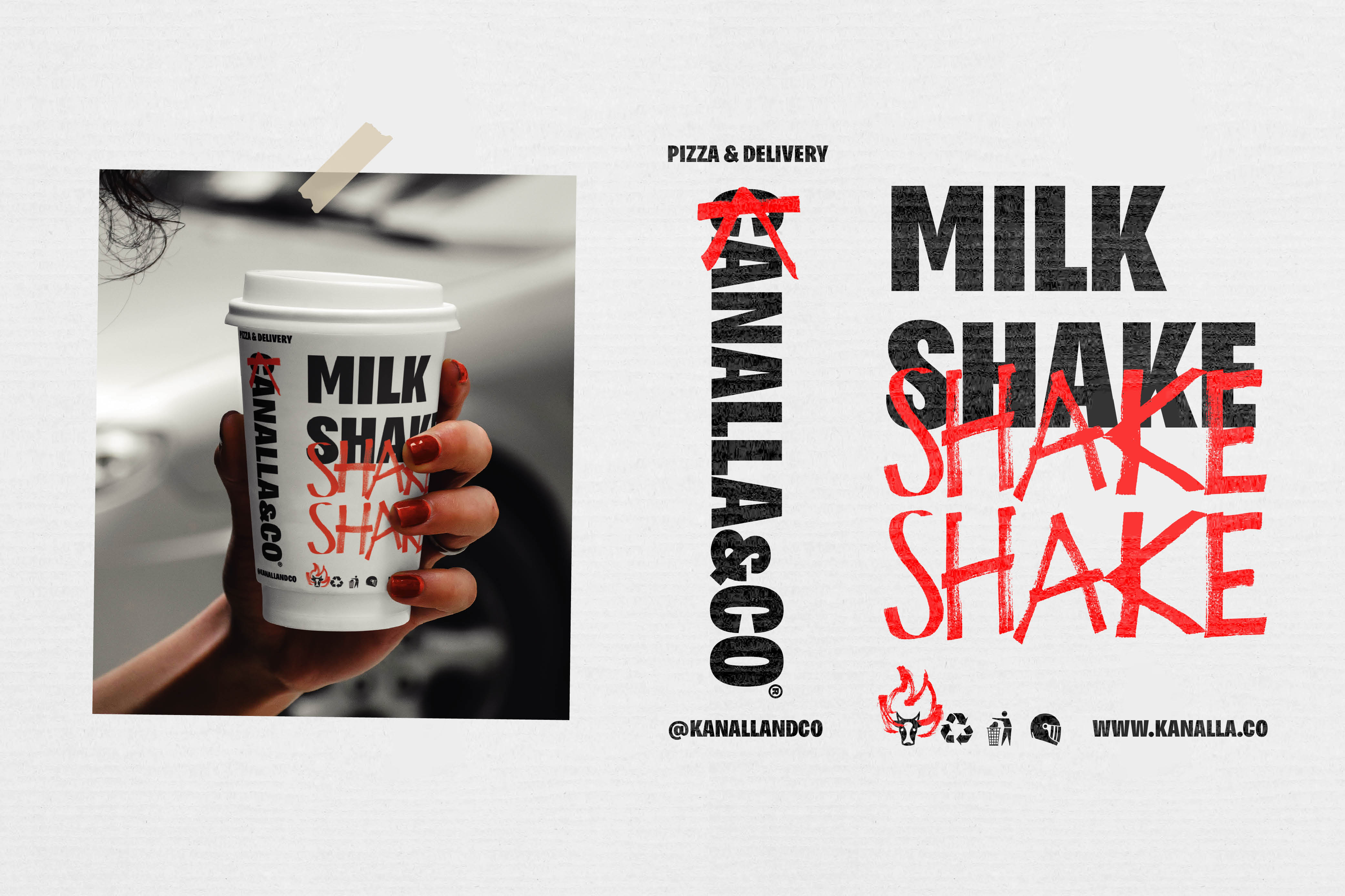
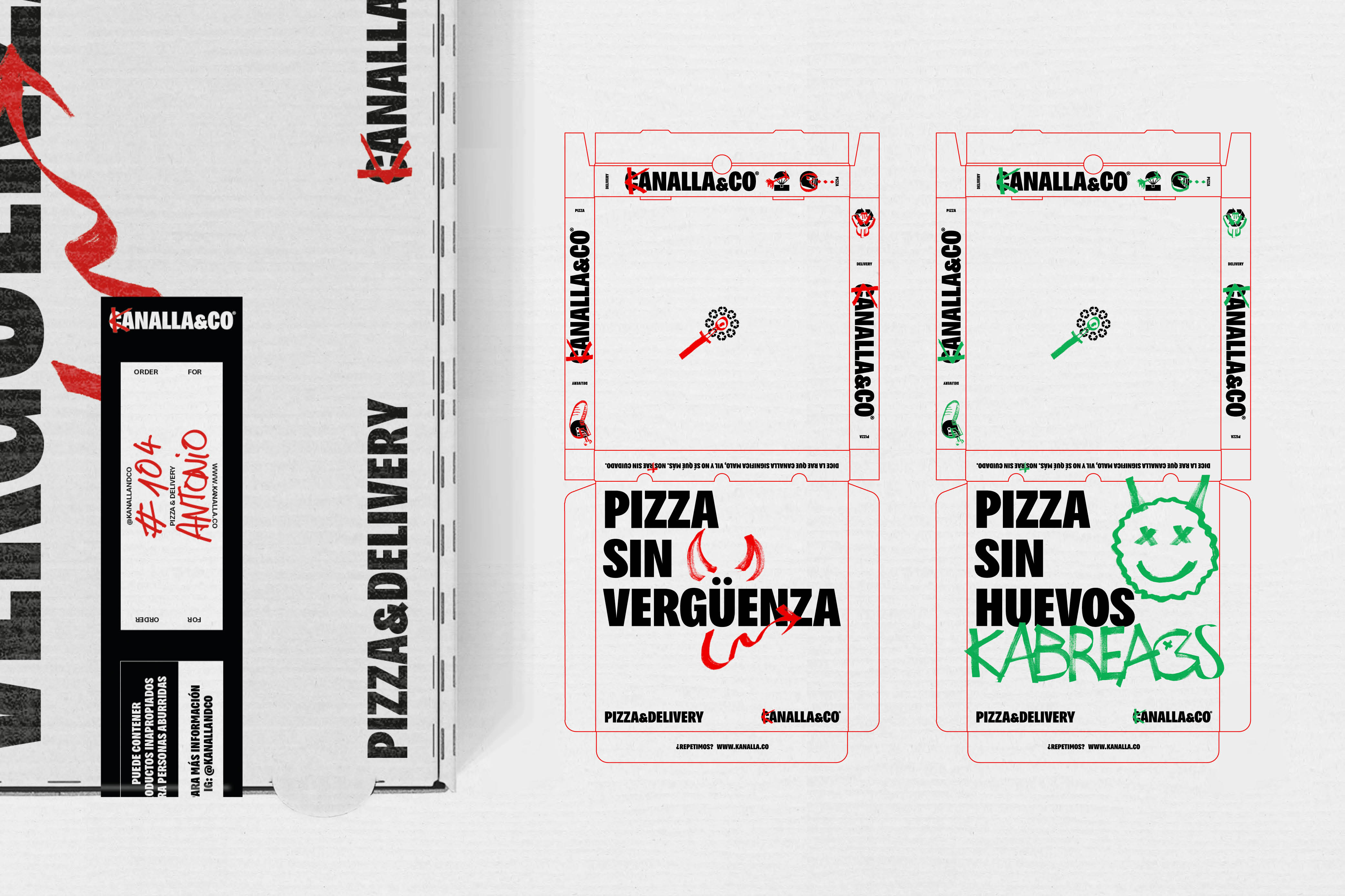
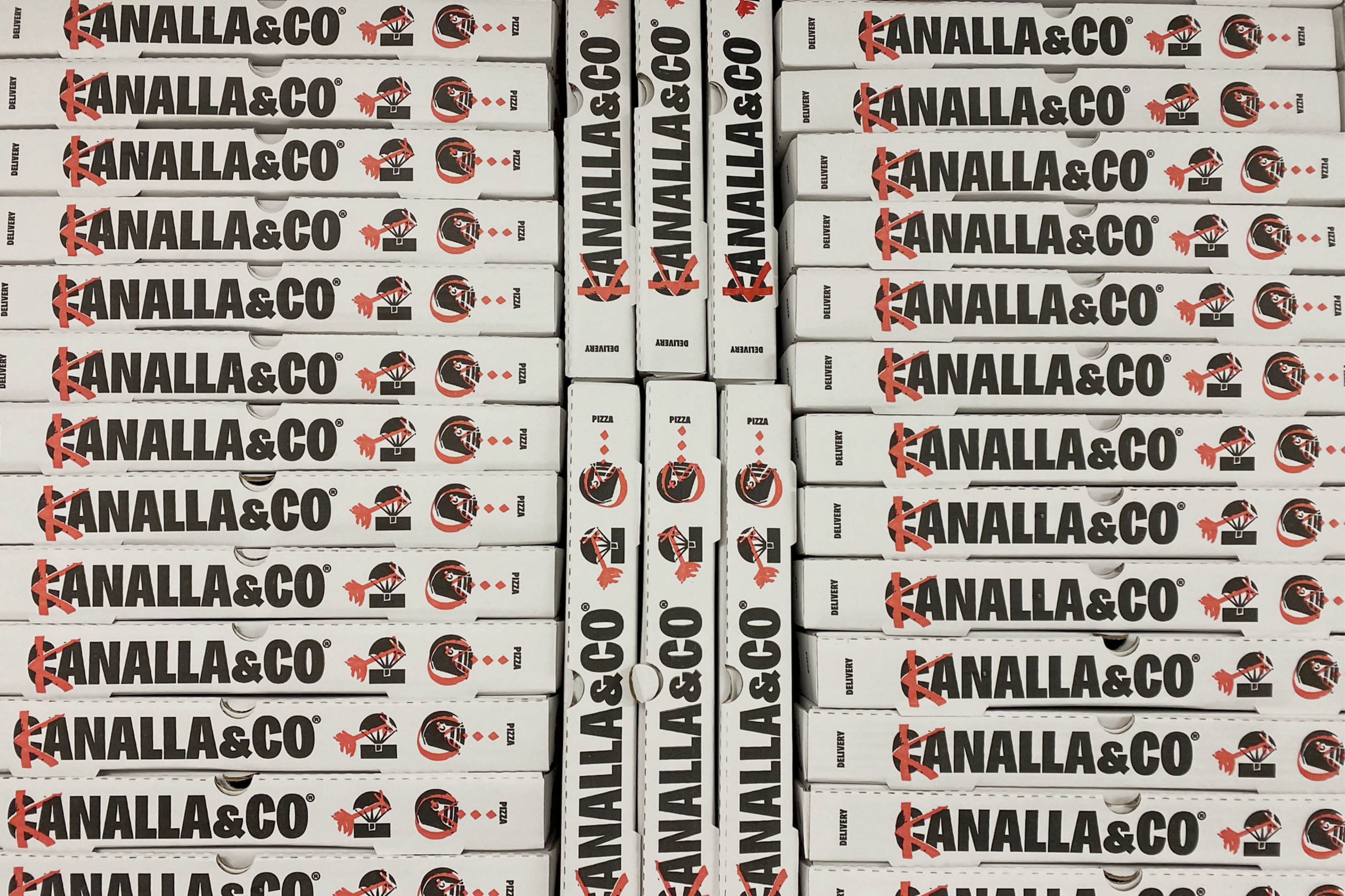
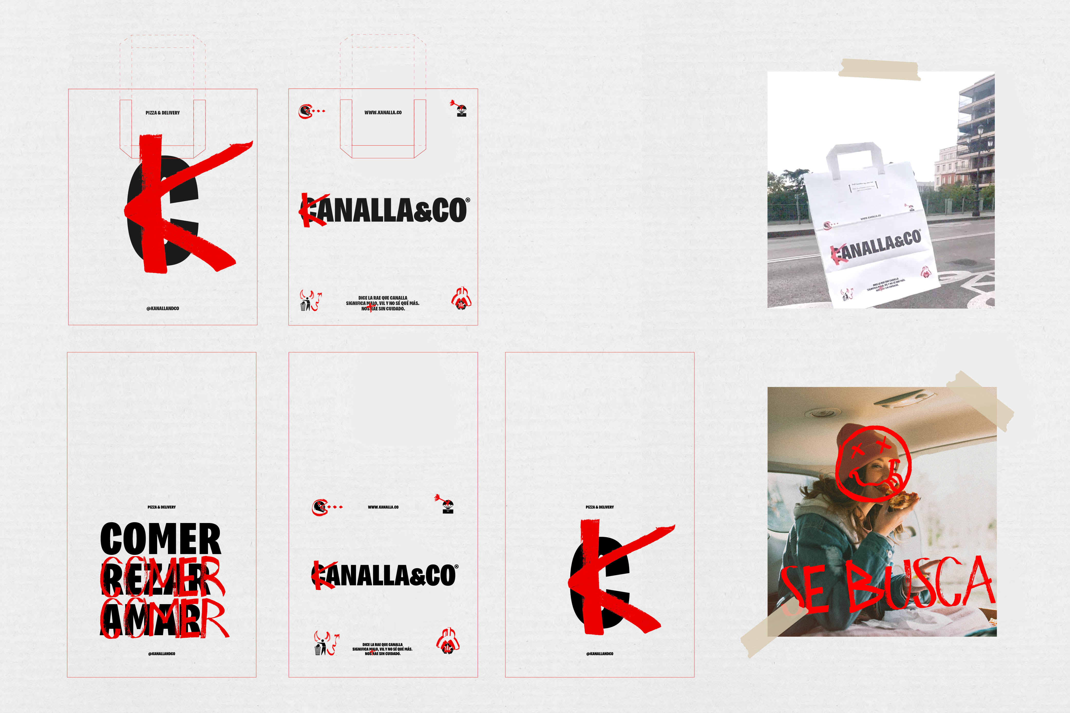
The Kanalla brand expresses itself in a simple, direct and modern way, without mincing words. It is designed with the idea of giving a solid image and diffusion of the new identity. For this we used a typographic combination with a font created for headlines (inspired by Impact) and a handwritten one, the TrazoVil typeface, the interventionist typeface created for the client. The TrazoVil has been built from scans of an alphabet drawn with a Posca marker, to bring uniqueness to the identity and give it personality.
CREDIT
- Agency/Creative: Morillas Brand Design
- Article Title: Kanalla: La Pizza Sin Vergüenza
- Organisation/Entity: Agency
- Project Type: Identity
- Project Status: Published
- Agency/Creative Country: Spain
- Agency/Creative City: Barcelona
- Market Region: Europe
- Project Deliverables: Advertising, Brand Design, Brand Identity
- Industry: Food/Beverage
- Keywords: WBDS Agency Design Awards 2023/24
- Keywords: Identity ,Brand Design Creation
-
Credits:
Design Agency: Morillas Brand Design


