The specialty coffee industry is bustling, brimming with countless brands and endless cups of beans. Almost all that could be expressed about coffee has already been spoken, making it progressively difficult for brands to stand out amidst the espresso shots and the latte art. Enter Time Capsule Coffee Co. – the ultimate journey through time with each sip, fashioned meticulously for the discerning palates of today’s coffee enthusiasts.
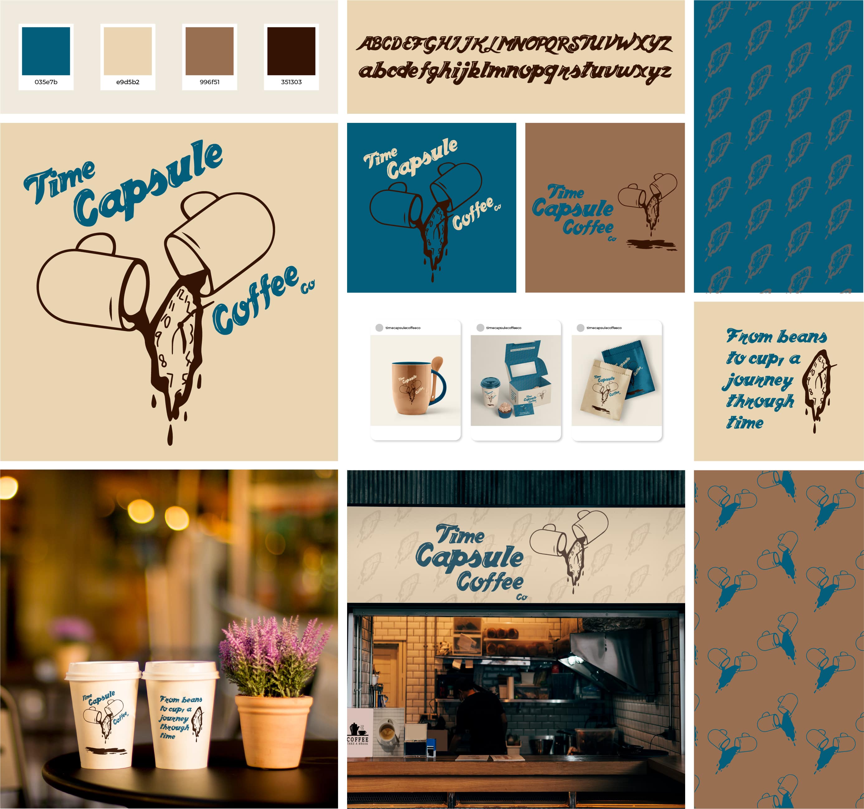
In the effort to distinguish this conceptual company, we’ve birthed a coffee brand that operates in a unique dimension. Although this brand leans into the classic coffee-house aesthetics, the brand emblem most certainly does not. The logo, a brilliantly designed play of an open time capsule morphed into coffee mugs pouring out coffee shaped like a clock, embodies the dedication and time invested to perfect every brew. The blend of fun and whimsy in the chosen color and font selection further amplifies the essence of our brand, creating an inviting atmosphere that leaves customers yearning for more.
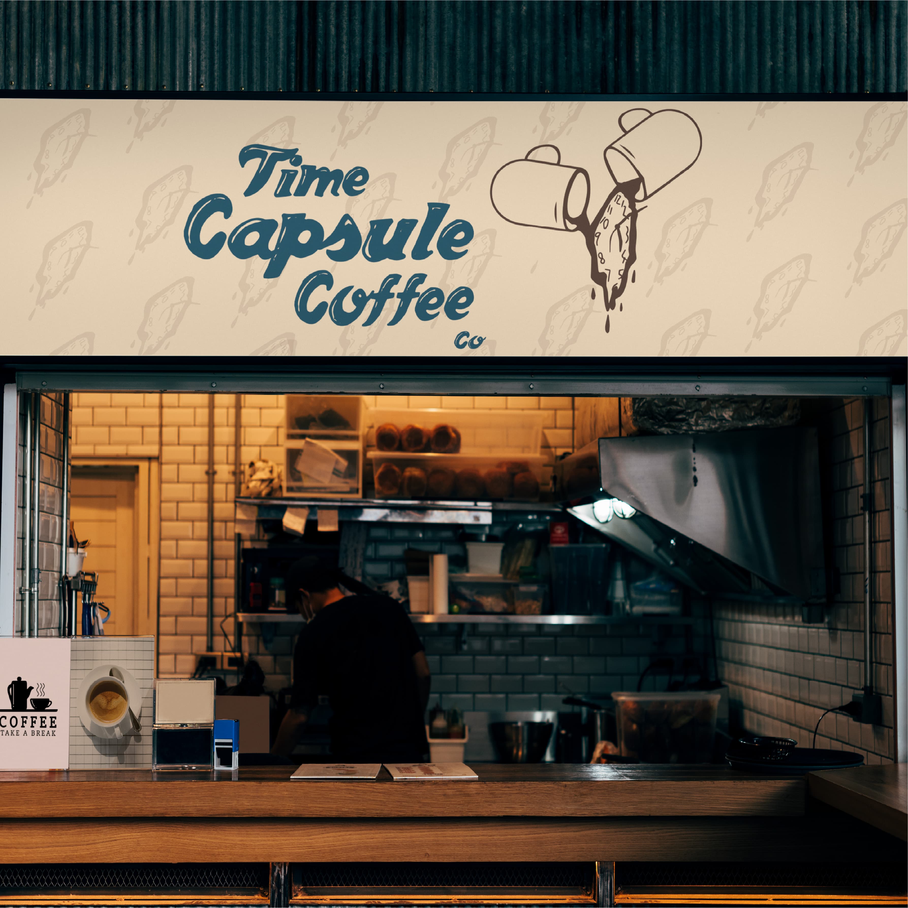
The centerpiece of our brand’s visual identity pays homage to your quintessential neighborhood coffee shop, striking a balance between bold and playful, comfortable yet exciting. This versatility gives our brand a dynamic personality, designed to engage, amuse and, most importantly, bring a smile to our customers’ faces.
Our brand assets were meticulously crafted, each element echoing the ethos of the Time Capsule Coffee Co. – a dedication to quality, a celebration of diversity, and a commitment to provide a joyful coffee-drinking experience. Cassidy Merideth, also known as the Marketin Monster, brought this concept to life, resulting in a design system that’s both distinctive and compelling.
Typography plays a crucial role in our identity, with fonts selected to manifest our brand’s dual nature – the unwavering seriousness in coffee brewing and the light-hearted love for the journey it entails.
Get Coffee – is an elegant yet whimsical typeface that mirrors the ‘brand’s’ tone of voice: timeless, inviting, with a hint of classic charm with its cursive features.
This divergent typeface is matched by an equally contrasting color scheme of warm, earthy brown and vibrant cyan, representing the balance between the grounded nature of coffee and the stimulating effects it imparts. The use of a clean, tan backdrop underlines the brand’s core colors, mirroring the freshness of each brew, thereby giving a visual narrative to our philosophy.
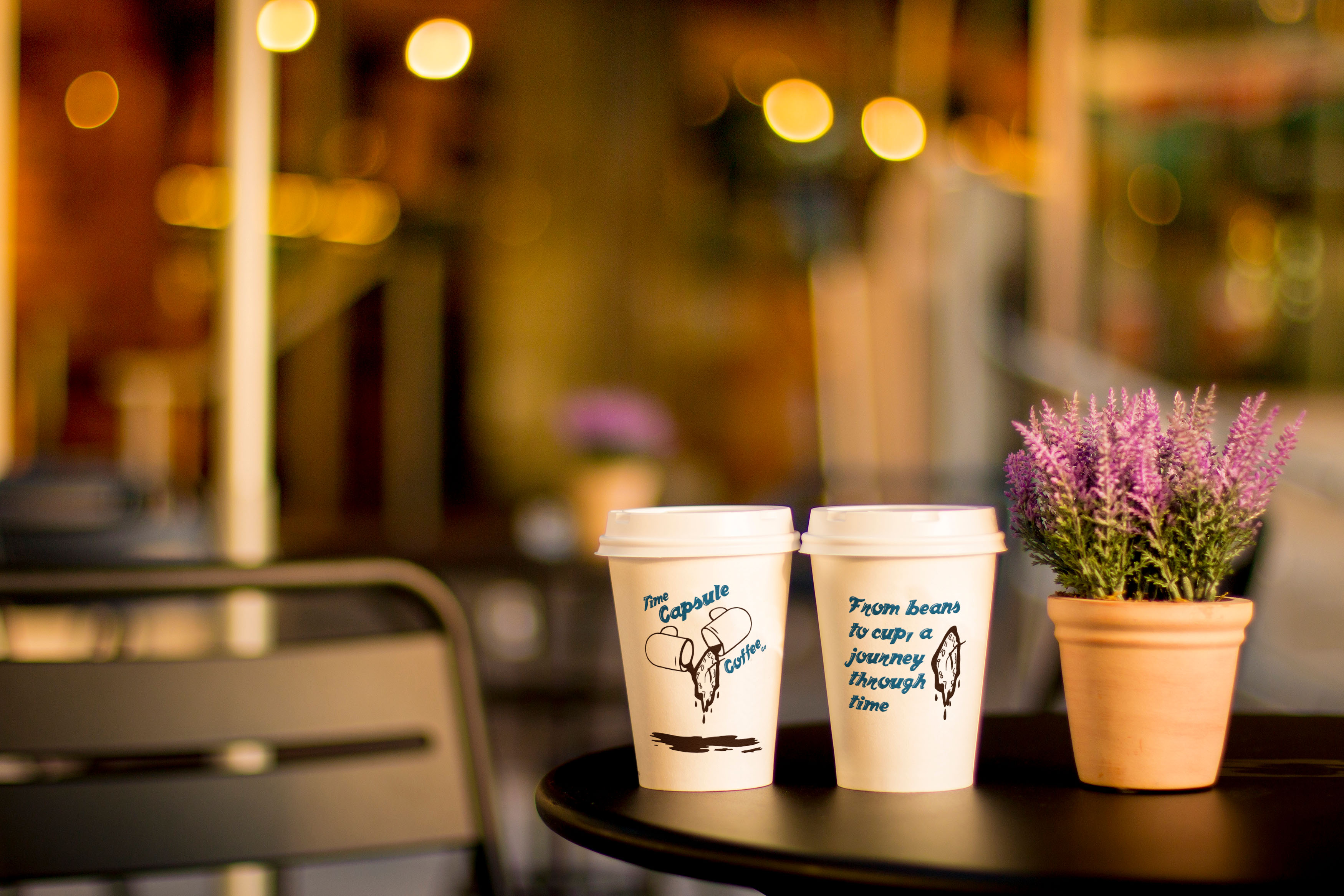
The final touchstone of this brand identity is its suite of lifestyle and product photography, highlighting the brand’s engagement with the community, its commitment to sustainable practices, and the shared moments over cups of our signature coffee blends.
Time Capsule Coffee Co. concept has been created for Cassidy’s passion for exceptional coffee and a desire to make every cup an unforgettable experience. With an engaging visual language and a brand story that resonates with the contemporary coffee lover, Time Capsule Coffee Co. successfully fuses the past and the present in a timeless coffee-drinking experience.


CREDIT
- Agency/Creative: Marketin Monster
- Article Title: Time Capsule Coffee Co. Branding
- Organisation/Entity: Freelance
- Project Type: Identity
- Project Status: Non Published
- Agency/Creative Country: United States
- Agency/Creative City: Chino Hills
- Market Region: North America
- Project Deliverables: Brand Creation
- Industry: Food/Beverage
- Keywords: Coffee Shop Brand Identity
-
Credits:
Branding Specialist: Cassidy Merideth


