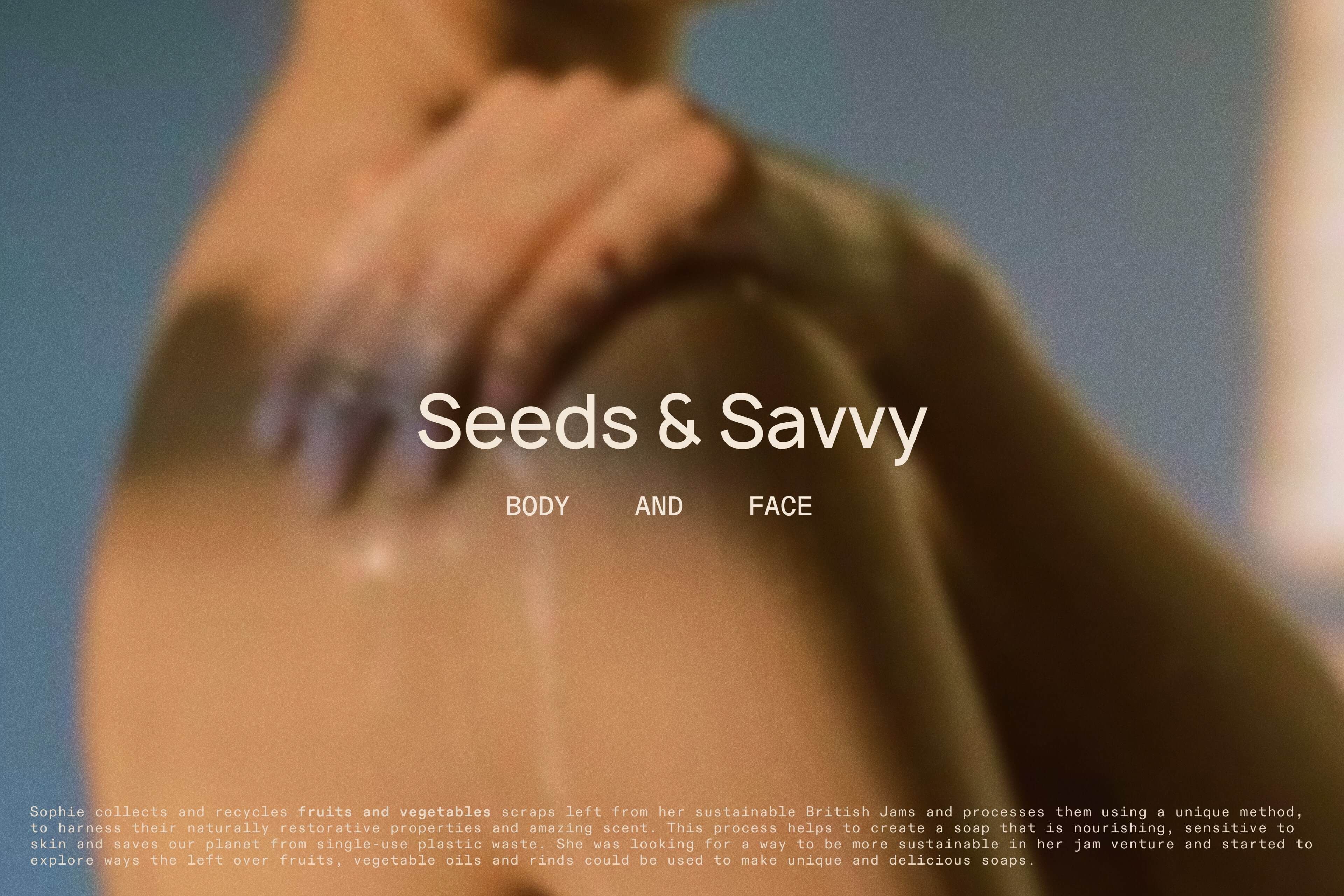
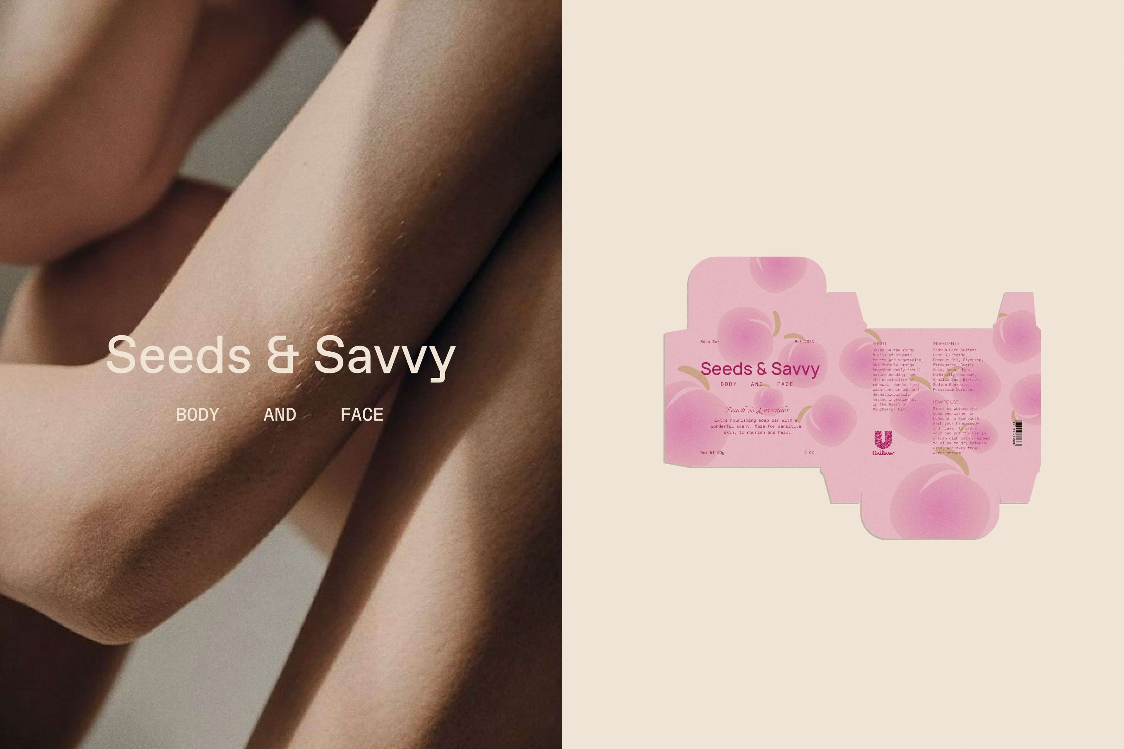
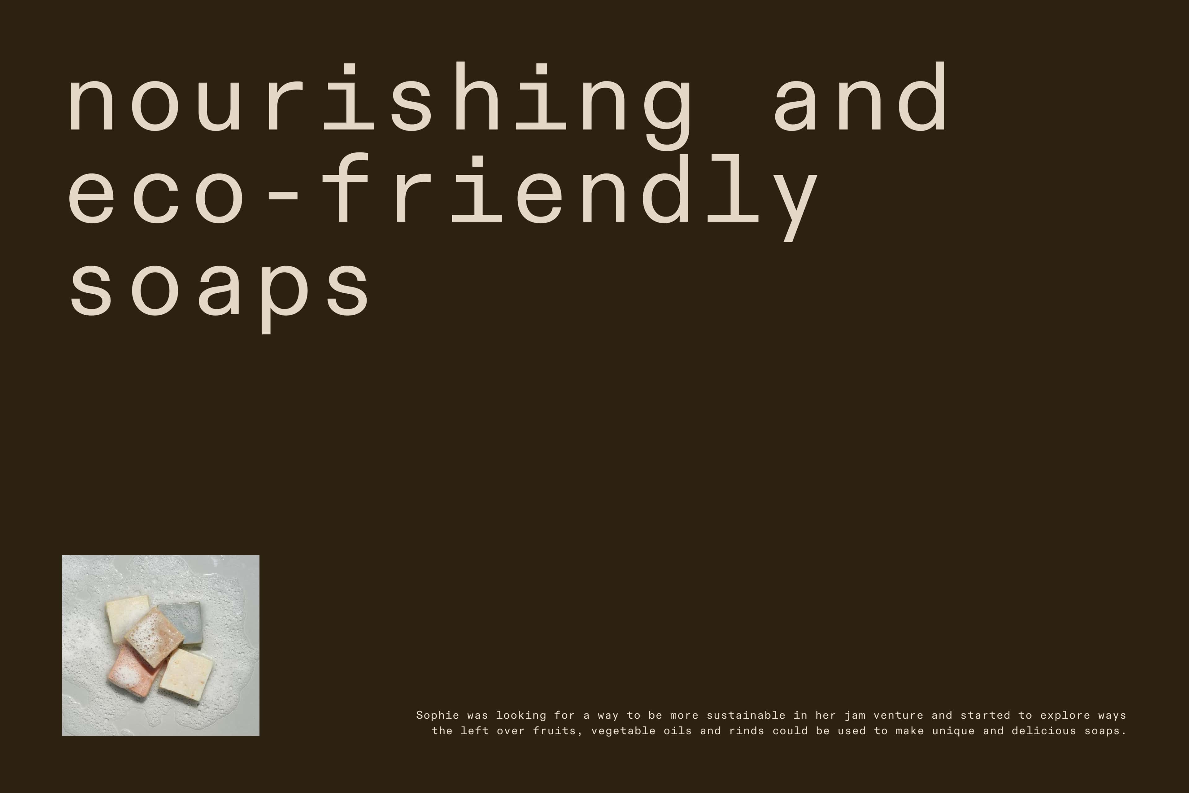
Seeds & Savvy is a soap brand that prides itself on its sustainable practices and commitment to the environment. The design of the packaging reflects the brand values and aims to convey the concepts of natural beauty, sustainability, and freshness.
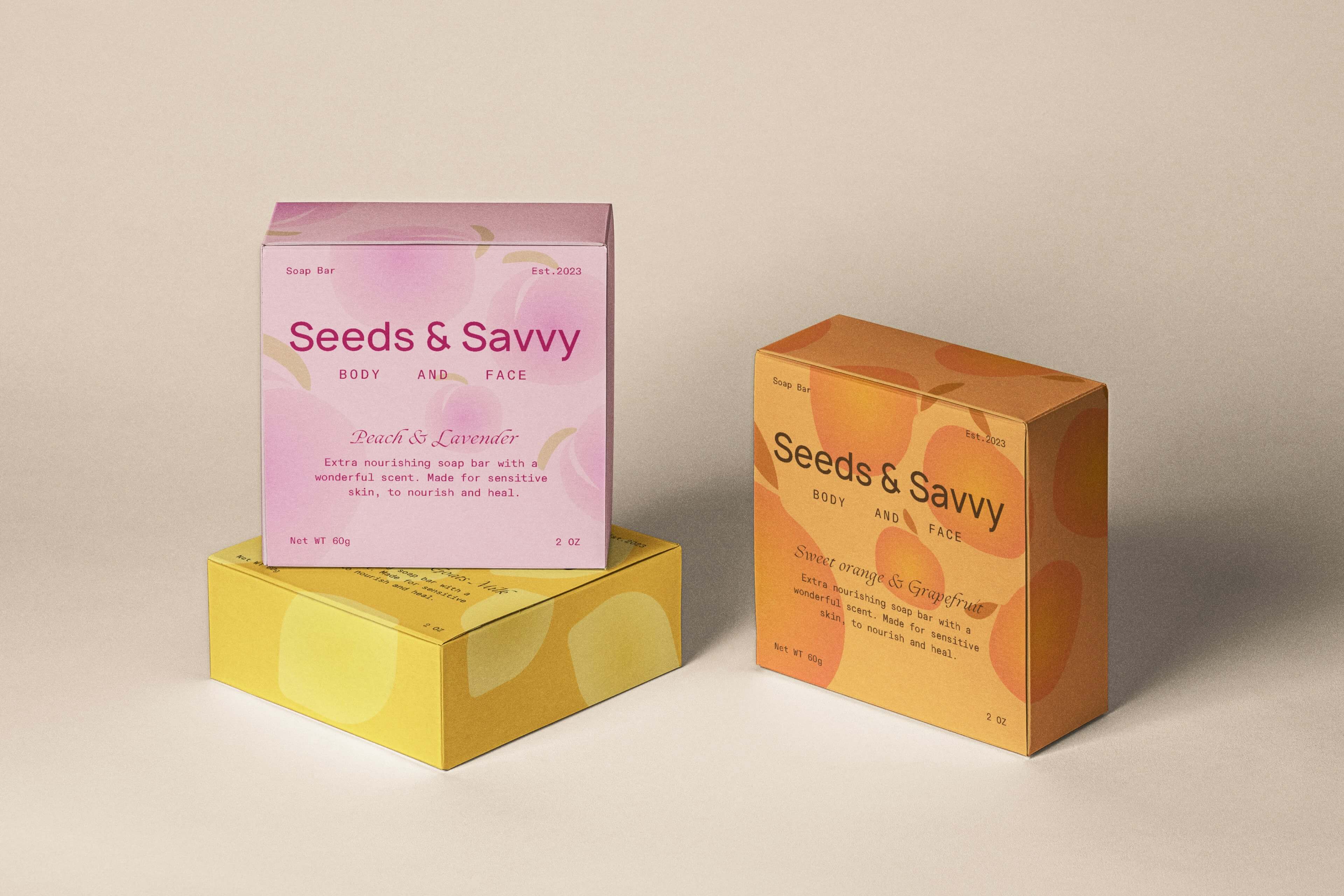
The visual language of Seeds & Savvy revolves around geometric shapes, which add a modern and contemporary touch to the packaging design. These shapes are used strategically to create depth and movement, drawing the viewer’s attention and creating a visually engaging experience. The use of smooth gradients further enhances the sense of movement and adds a dynamic element to the design.
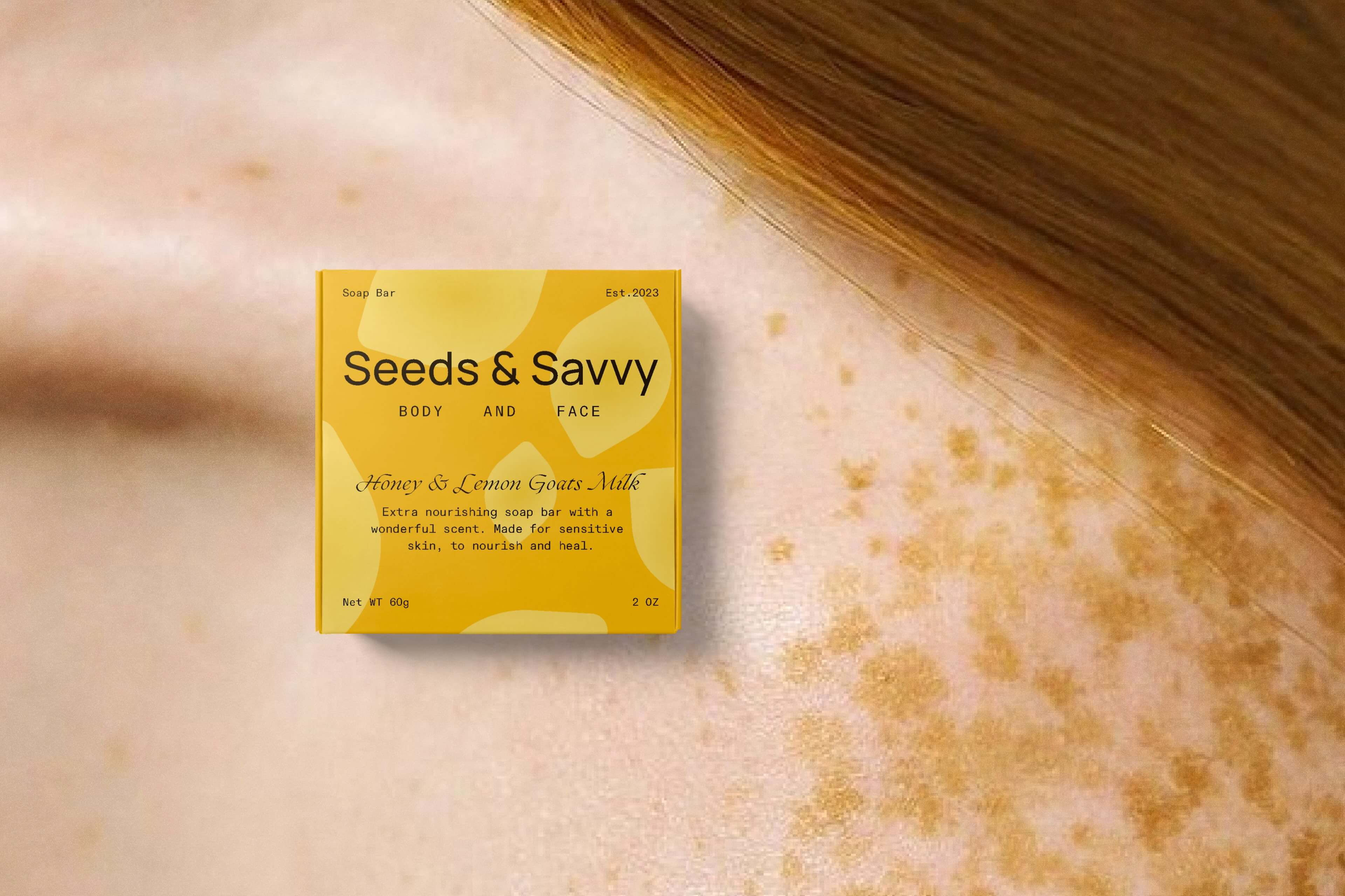
The color palette chosen for the packaging design is inspired by nature and aims to evoke a feeling of freshness. Cool tones such as pink, orange and yellow dominate the palette, representing the natural ingredients used in the soap-making process. These colors also help convey a sense of calmness and relaxation, which aligns with the brand’s target audience using bath/shower time as a moment to unwind.
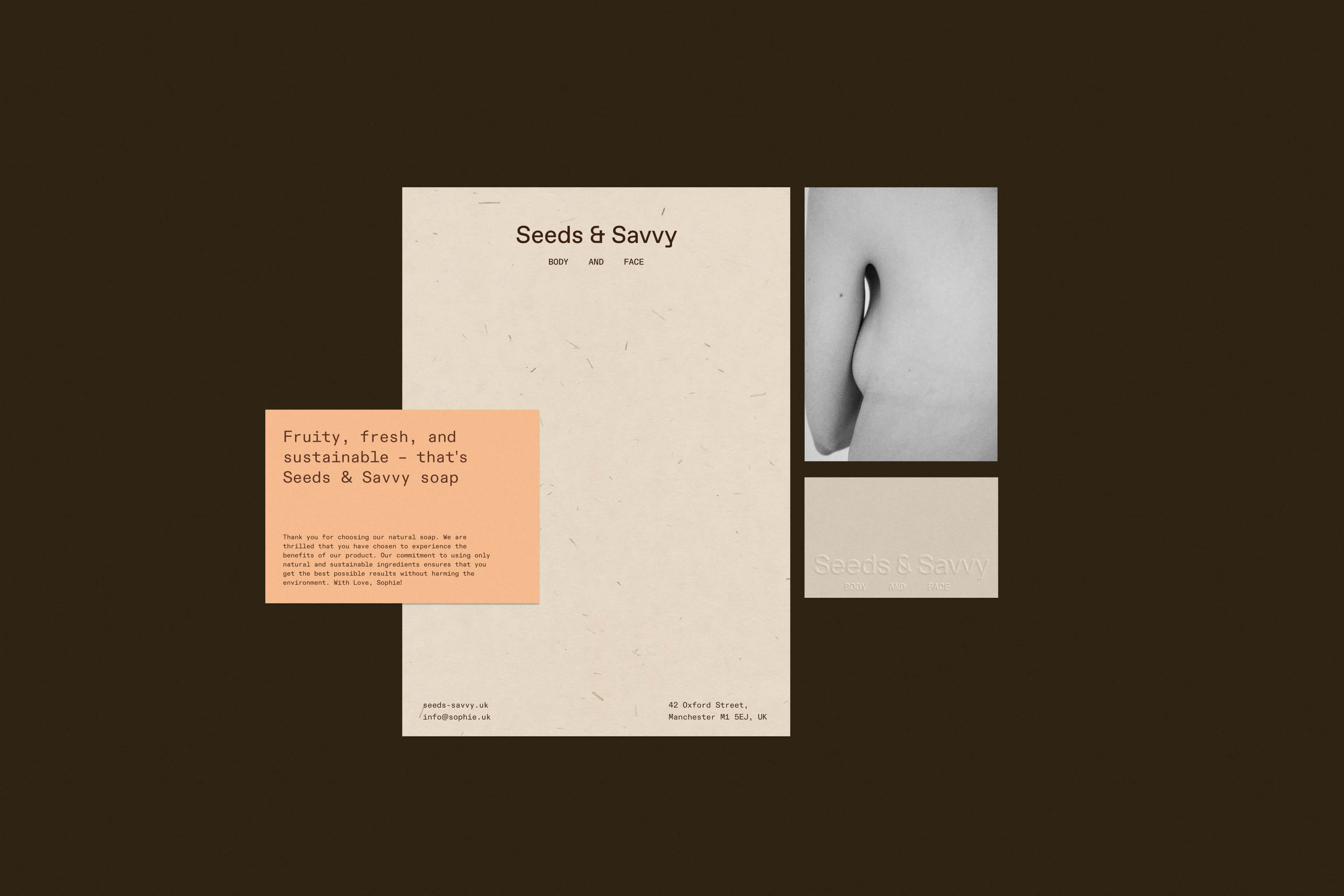
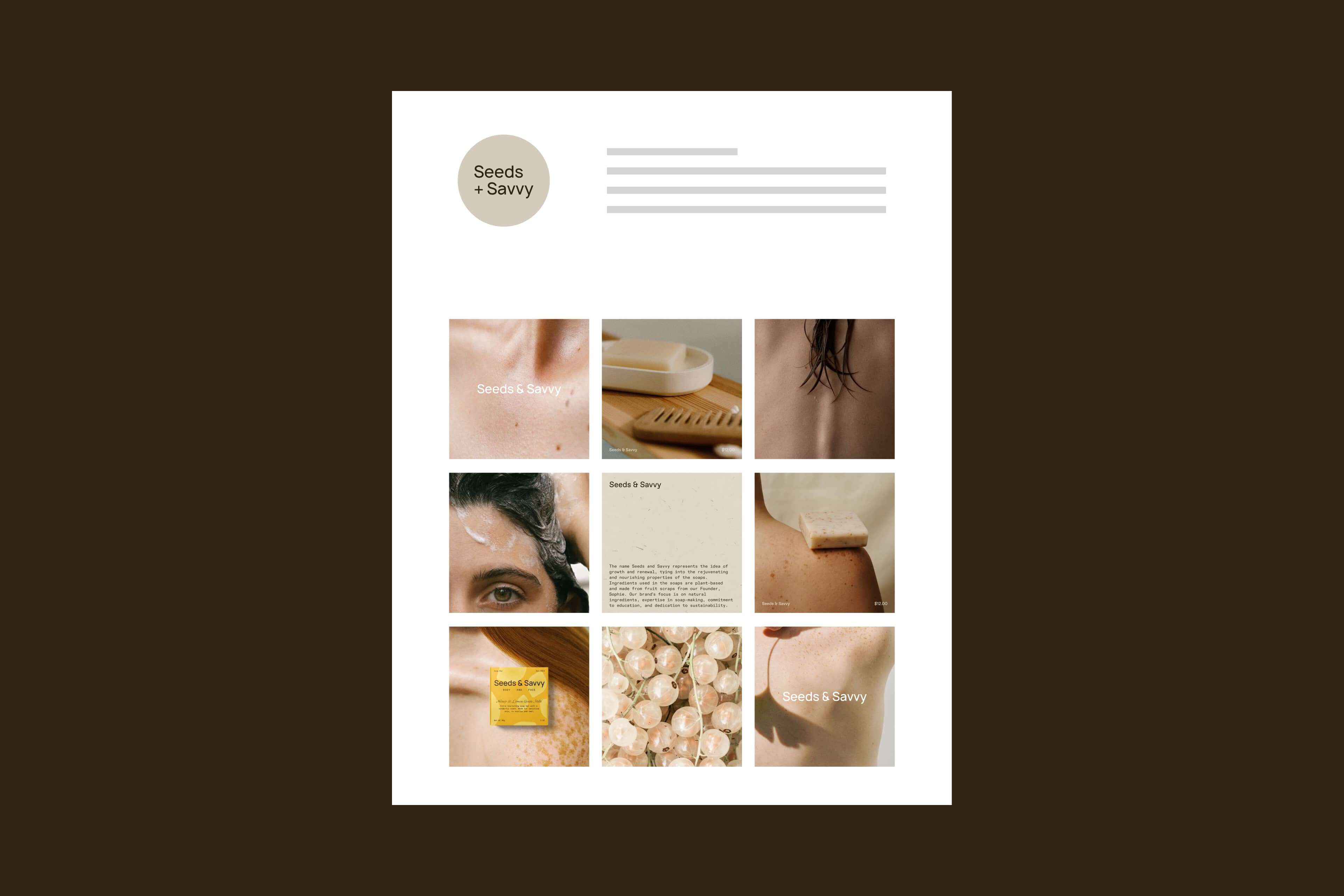
Imagery plays a crucial role in conveying the brand’s message. Carefully selected visuals showcase the fruit and vegetable scraps that are used to create the nourishing soaps. This imagery not only emphasises the brand’s commitment to sustainability and waste reduction but also adds a unique and organic element to the design. The use of texture in the imagery evokes the sensory experience of using the soap, reminding the viewer of the smooth and gentle qualities that are beneficial for the skin.
In addition to showcasing the ingredients, lifestyle photography is also incorporated into the packaging design. These images capture the soap in use, highlighting its gentle and nourishing qualities for the skin. This approach allows the target audience to visualise themselves using the product and reinforces the idea of taking a small moment during bath/shower time to relax and reflect on the day.
Overall, the design packages for Seeds & Savvy successfully convey the brand’s values of natural beauty, sustainability, and freshness. The use of geometric shapes, colors, carefully selected imagery, and lifestyle photography all work together to create a visually appealing and compelling packaging design that resonates with the brand’s target audience.
CREDIT
- Agency/Creative: Nikol Likja
- Article Title: Seeds & Savvy Soap Packaging by Nikol Likja
- Organisation/Entity: Freelance
- Project Type: Packaging
- Project Status: Published
- Agency/Creative Country: United States
- Agency/Creative City: New York
- Market Region: North America
- Project Deliverables: Brand Creation, Logo Design, Packaging Design
- Format: Box
- Substrate: Pulp Carton
- Industry: Beauty/Cosmetics
- Keywords: soap package, cosmetics, brand design, logo design, packaging, soap, minimal, beauty, product
-
Credits:
Graphic Designer: Nikol Likja


