


Today, more and more people are replacing meat products with vegetable ones, denying themselves the pleasure of eating their favorite burger with a juicy cutlet or tasting a fatty steak. They consider it unacceptable to harm animals for the sake of food, but not everyone decides to give up their favorite dishes even in order to save the life of a cow or chicken.
The/Same company grows meat from animal cells, and thereby solves the problems of each of the parties, because with such production people do not limit themselves, and animals continue to live a long and happy life.
It is worth noting that not everyone knows about the existence of a method of growing meat products from animal cells. The task of the corporate identity is to make a direct association with real meat and remove doubts from buyers about the quality of artificial meat.
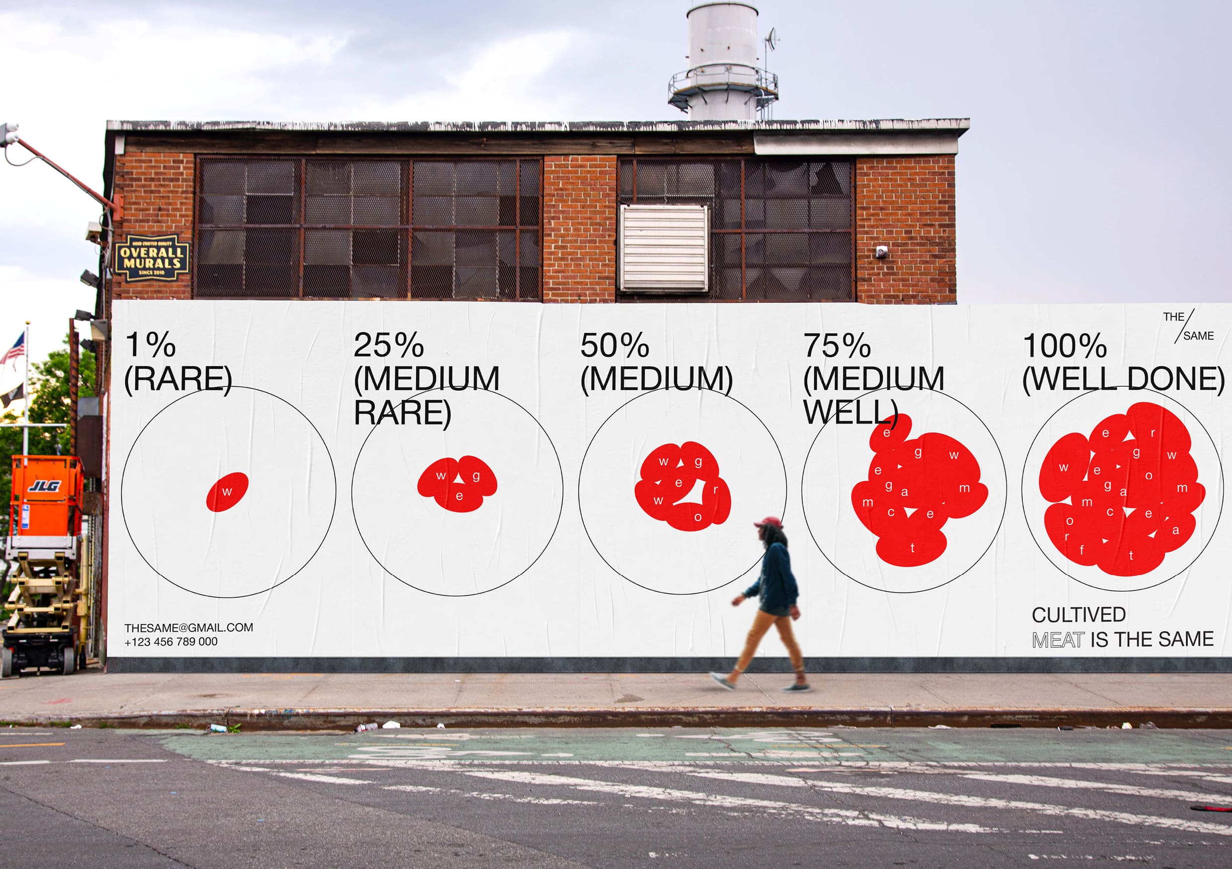
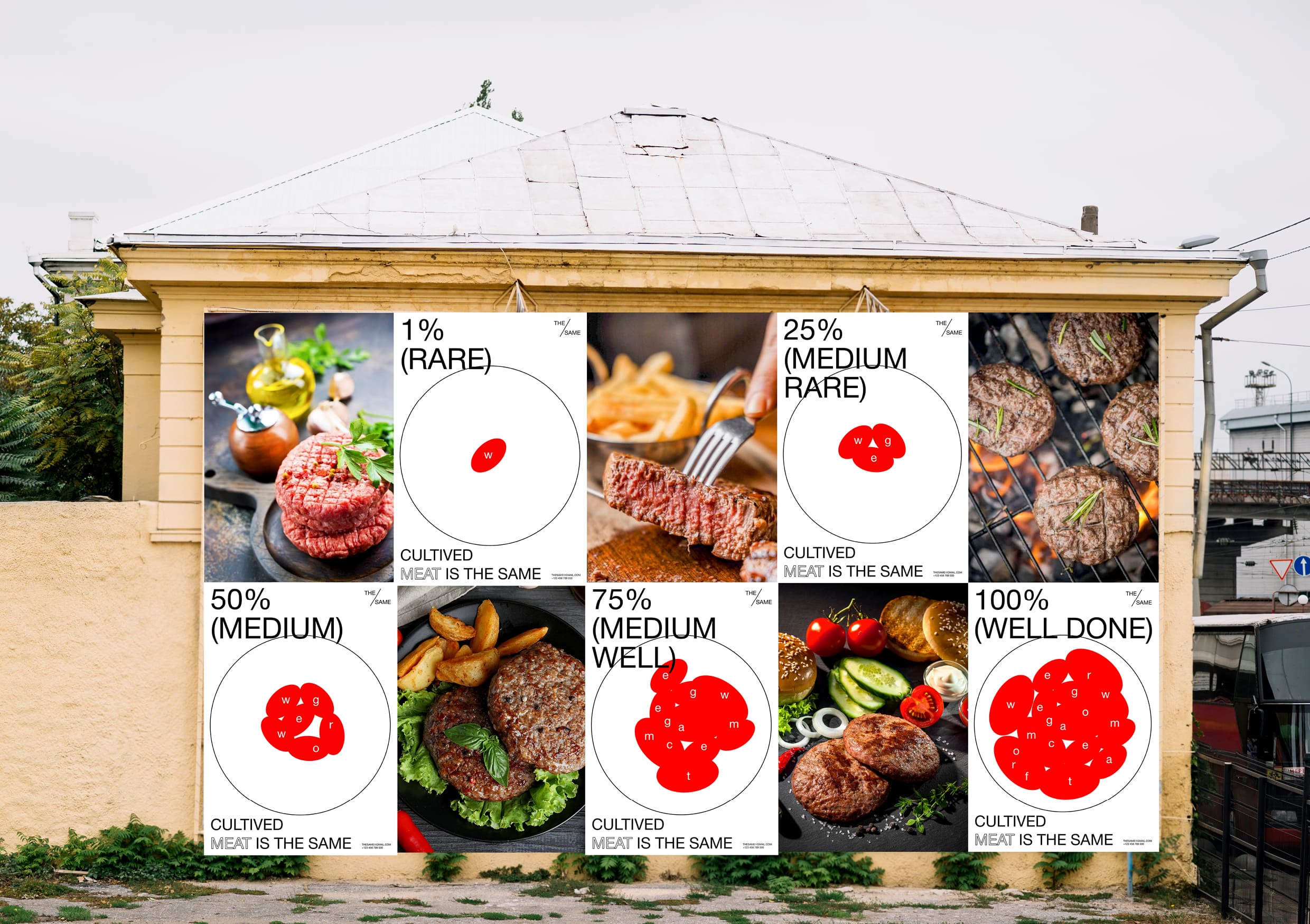
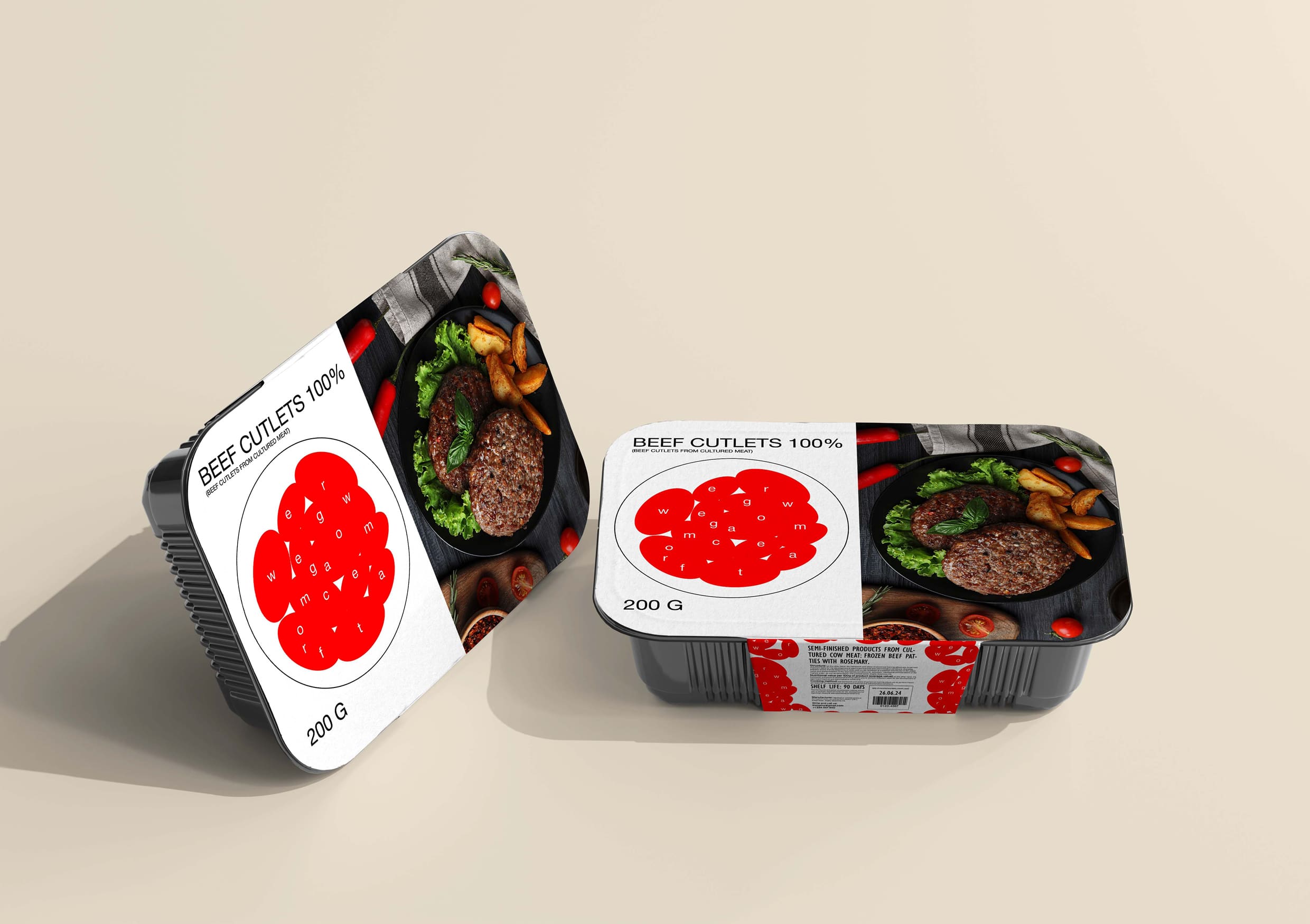
A simplified image of a meat cage is used as the main element in the corporate style. It gradually grows in a laboratory petri dish, turning into a full-fledged burger patty. The degree of growth is reflected in the percentage ratio, which corresponds to the degrees of roasting of meat – rare, medium, well done.
The graphics of the corporate identity are as clean and simple as possible and consist of only two figures: an ellipse (the shape of cells) and a circle (the shape of a petri dish). Small typography resembling a nucleus has been added inside the cell. Growing, the cells form a bright pattern that can have any arbitrary shape.
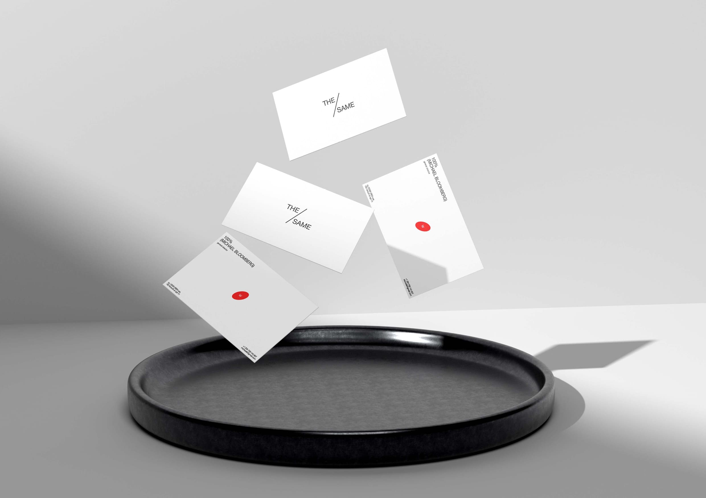
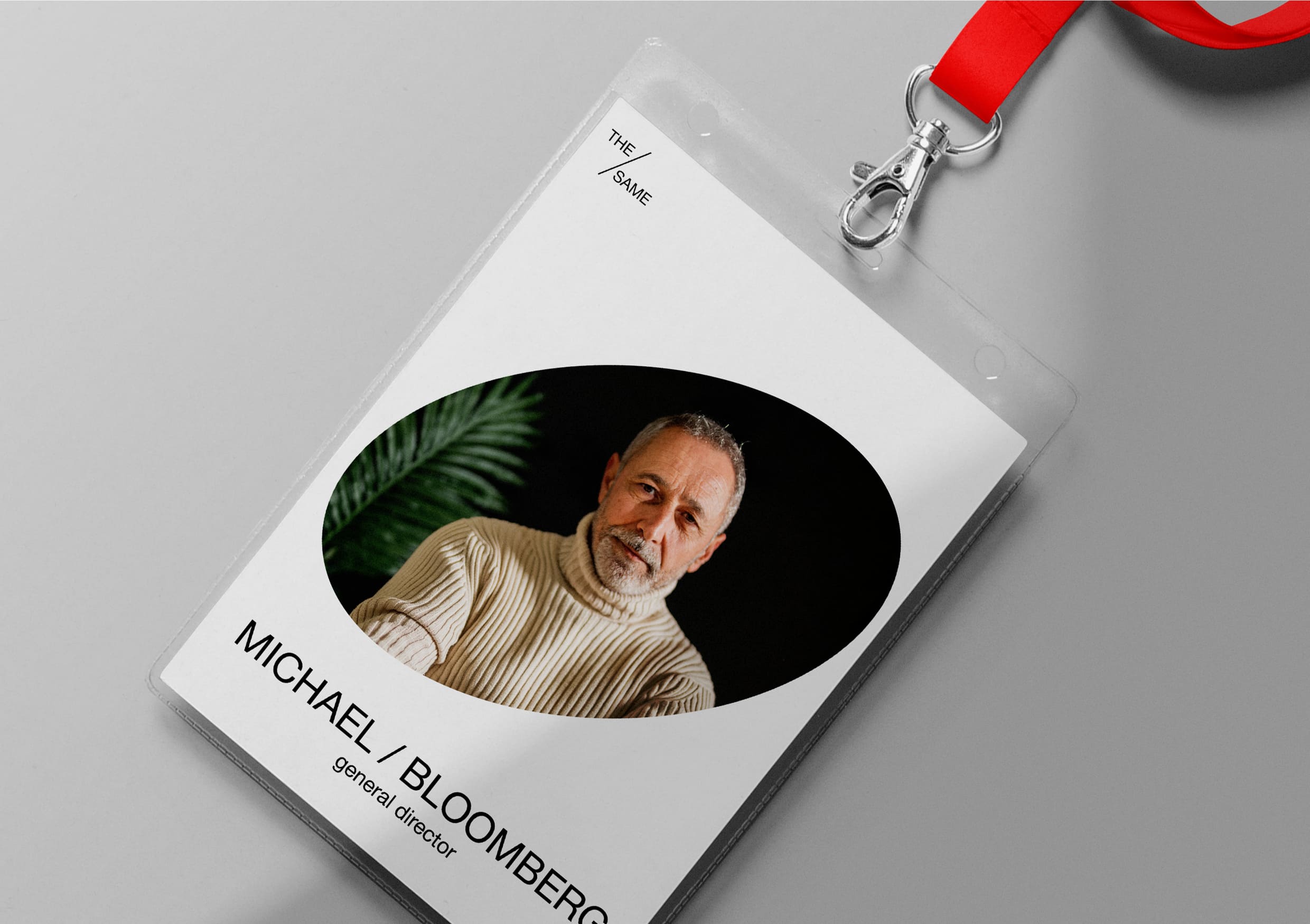
The minimalistic logo of The/Same also echoes the general mood of the corporate identity. It is created from the percent symbol, the main element of which is a diagonal line separating several words. In addition to the logo, this technique works in headlines, for example, on a badge. The main color, of course, is red – it is used to depict meat. Two additional colors are also used: white and black. White is associated with purity, transparency and tranquility. Thanks to him, the red color is not so intrusive and aggressive. The black color is added as a contrast to the white.
In order for cultured meat not to repel customers, but on the contrary, to attract, the corporate identity actively works with photography.
A stylish and concise merch was developed for employees and lovers of artificial meat, and of course, packaging for delicious cutlets and communication for social networks were not ignored, so that everyone could share delicious recipes of cutlets and not miss interesting posts with useful information.
CREDIT
- Agency/Creative: Katya Nadina
- Article Title: The/Same Brand Idenity by Katya Nadina
- Organisation/Entity: Student
- Project Type: Identity
- Project Status: Non Published
- Agency/Creative Country: Russia
- Agency/Creative City: Katya Nadina
- Market Region: Global
- Project Deliverables: Brand Identity
- Industry: Food/Beverage
- Keywords: Katya Nadina brand idenity The/Same
-
Credits:
Tutor: Tanya Dunaeva


