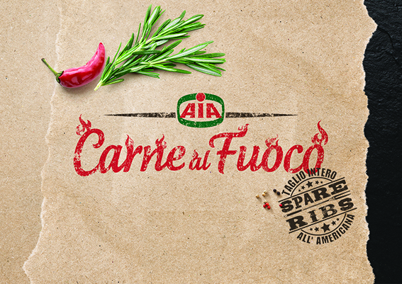
Background: “Carne al Fuoco” (meat on the fire/irons in the fire) is a range of pork and beef specialities ready to be grilled and able to meet various tastes. This brand is the first one reserved to grilling and baking products and it controls this business in a strong and leading way.
At the beginning the aim of the issue was the “Grill/Steak house” that might be found in nearly all the cities. Those places are very direct and simple, where the fire and the taste prevail. The style is often similar to the “country/western” one and this “rough” aspect of it features its style and personality.
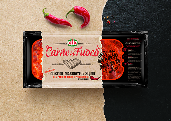
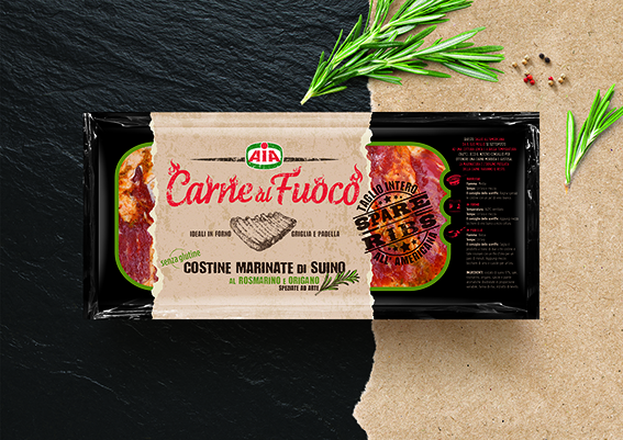
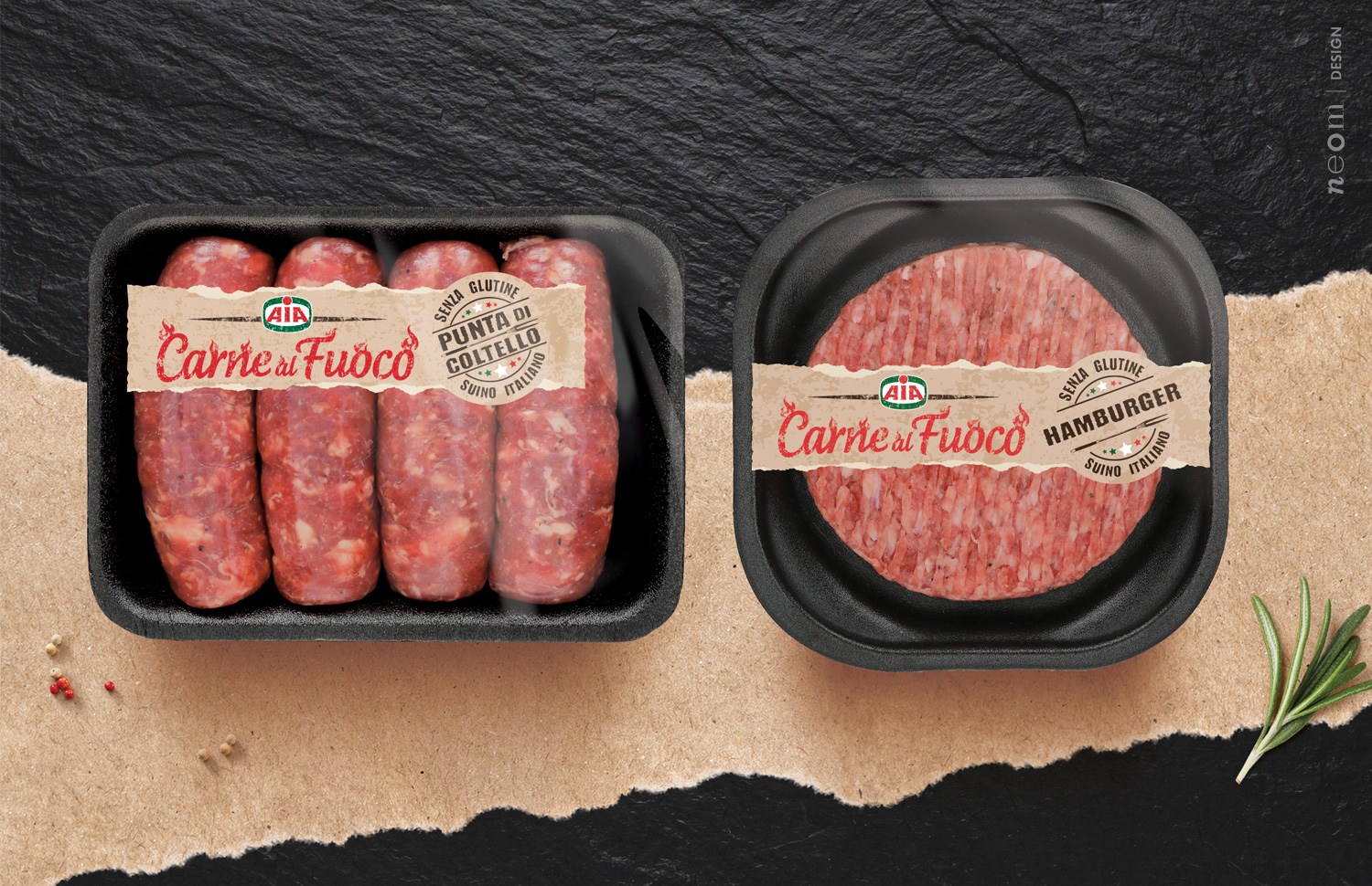
The project: The project originated from an issue that became an opportunity: due to technical reasons the band in PP has been put away in order to print right on plastics using the flexographic technique. This necessity gave the possibility to explore new languages suited to the evolved personality of the brand.
The strategy: Since its initial launch, this brand has evolved a lot and its Italian nature, which is expression of quality and care for the taste and the service, has emerged more and more. For this reason indeed codes and languages have been drawn from the world of the best Italian pork butchery so as to have a high value-added product.
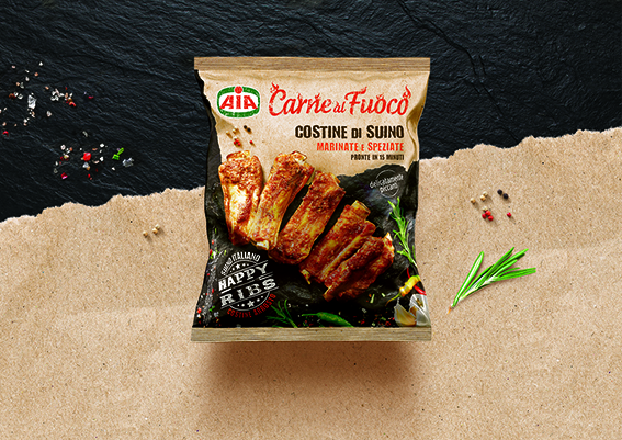
The first project of the marinated ribs originated and developed on this basis. After the achieved success, there has also been a restyling of the fresh products. The system had to adapt to spaces and situations completely different putting a strain on the design concept. Last but not least the frozen ribs are wrapped in a matt covering flow pack that sets a new challenge to the system, but offering at the same time a beautiful opportunity to enrich the brand in terms of contents. In this new situation, with a lot more space, a new environment has been created. In this sense the brand had finally been able to express its best through a zenithal shot that can even express its absolute modern personality through photography.
CREDIT
- Agency/Creative: neom
- Article Title: Carne al Fuoco Redesign
- Organisation/Entity: Agency
- Project Type: Packaging
- Project Status: Published
- Agency/Creative Country: Italy
- Agency/Creative City: Padova
- Market Region: Europe
- Project Deliverables: Packaging Design
- Format: Bag
- Substrate: Pulp Paper
- Industry: Food/Beverage
- Keywords: meat packaging redesign branding
-
Credits:
Partner & Managing Director: Stefano Dell'Orto
Partner & Creative Director: Barbara Cesura


