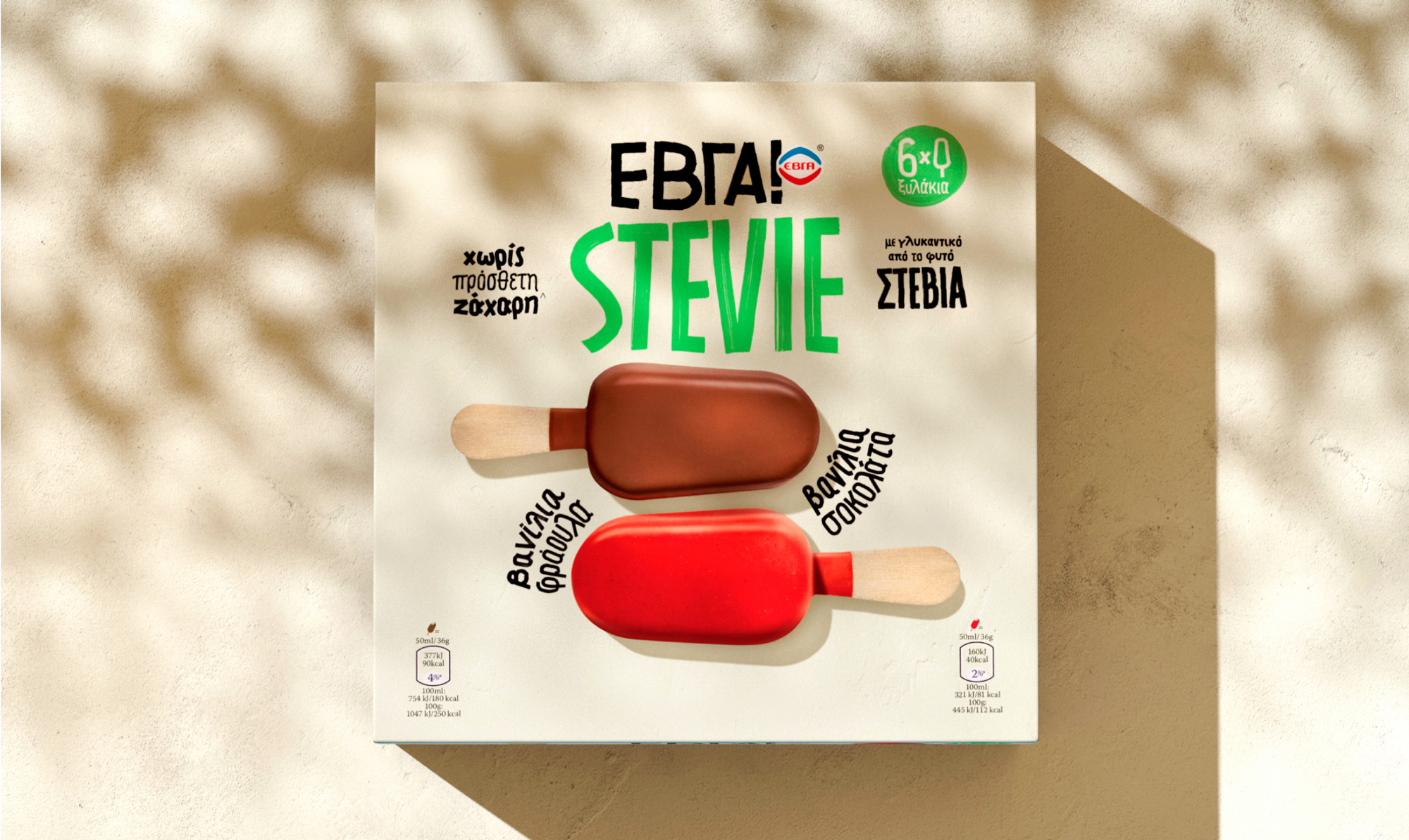
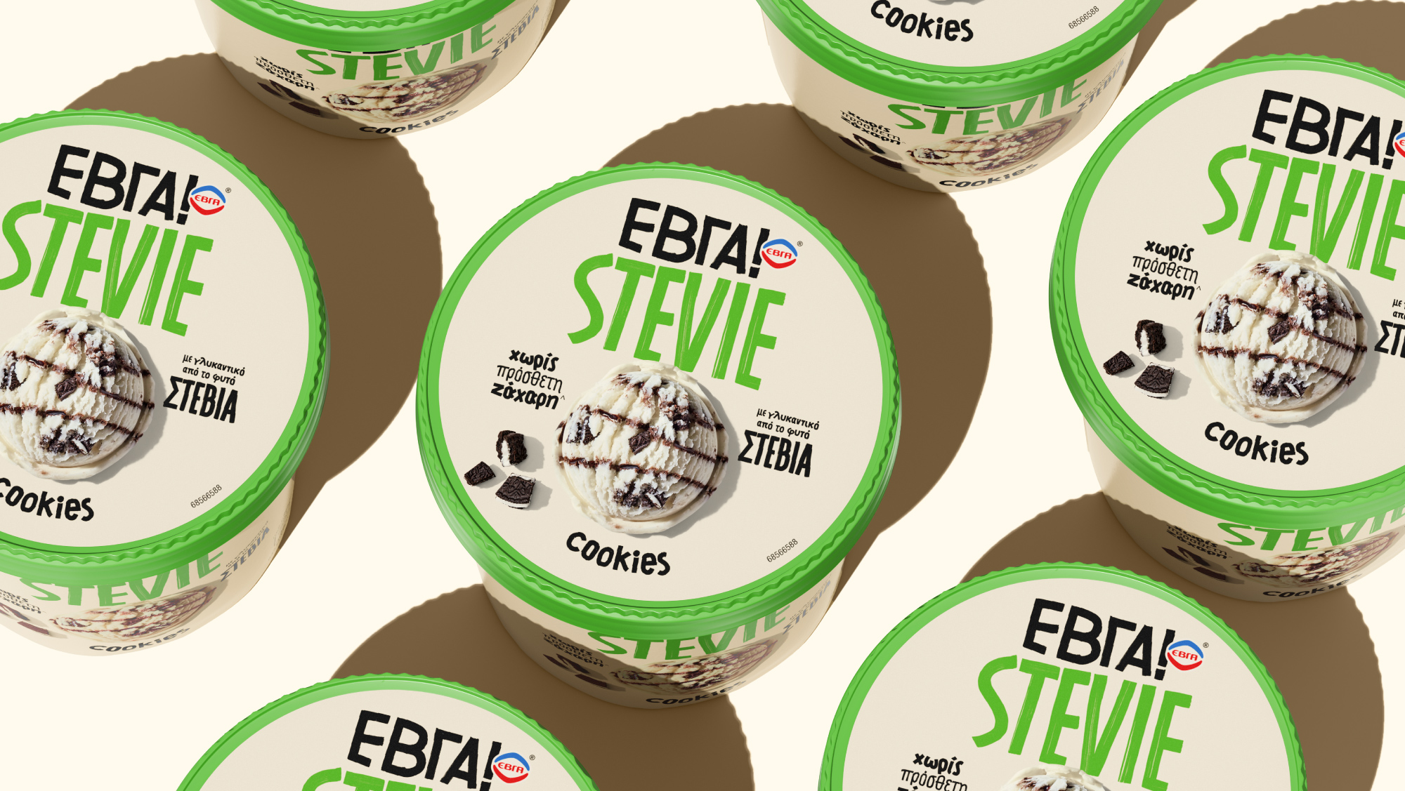
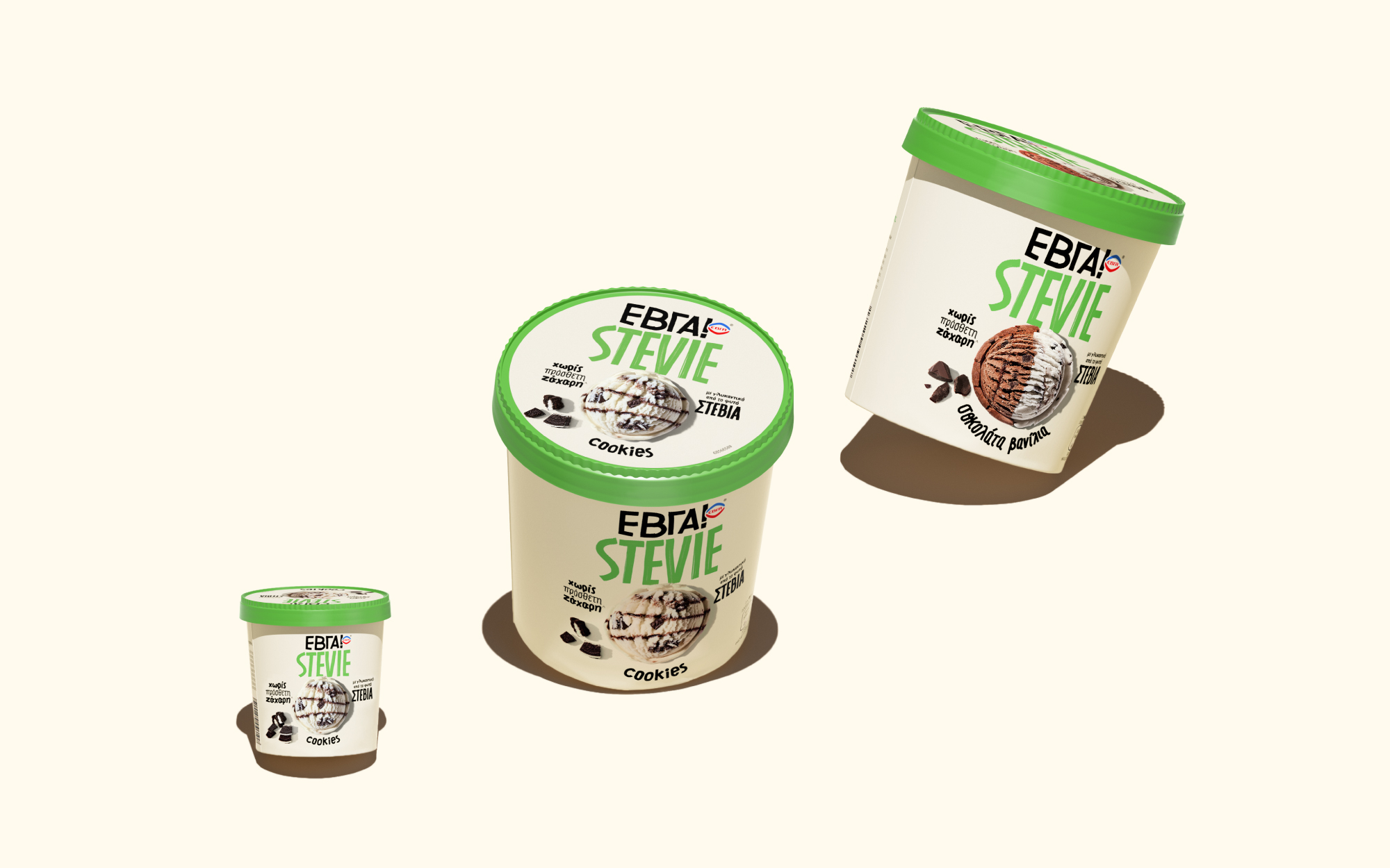
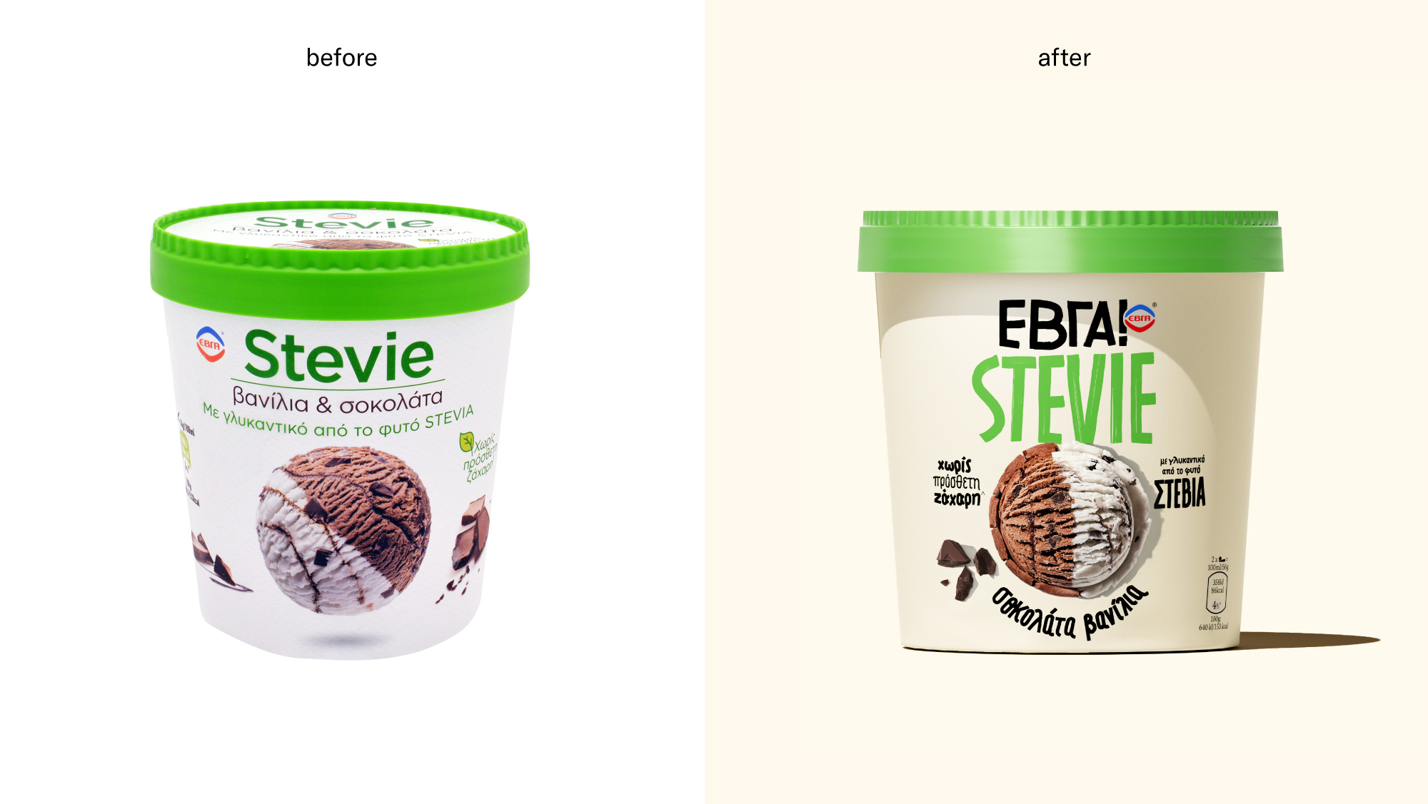
Unilever asked us to redesign the packaging of a rather technical SKU – ice cream with Stevia sweetener instead of sugar- and try to reignite the friendly and natural vibes that made people love the brand in the first place. Our design approach was to create a visual & emotional shortcut to the brand’s origins back in the 1930s and elevate its values of innocence, unpretentiousness, and craftsmanship.
But first, here is some background about the new ΕΒΓΑ Ice creams.
For generations, EVGA (“ΕΒΓΑ” in Greek, meaning Greek milk manufacturing company) ice cream has been the absolute symbol of summer joy for Greeks. That soft feeling of nostalgia and summer bliss was the main inspiration for the brand & packaging redesign we did in 2019. When asked to redesign Greece’s oldest (which came out in 1934!) and most iconic ice cream, we got a major brain freeze. Not because we were out of ideas but because we were so flooded with memories and feelings that we didn’t know where to begin. Long story short, things went great, the launch was super successful, people loved it, sales boomed, and the brand conquered the market, with their product lines (3Ltr family range) climbing to the top of the category. Following this launch, EVGA kept scaling its portfolio offering new choices relevant to the consumer, bringing us to the STEVIE relaunch!
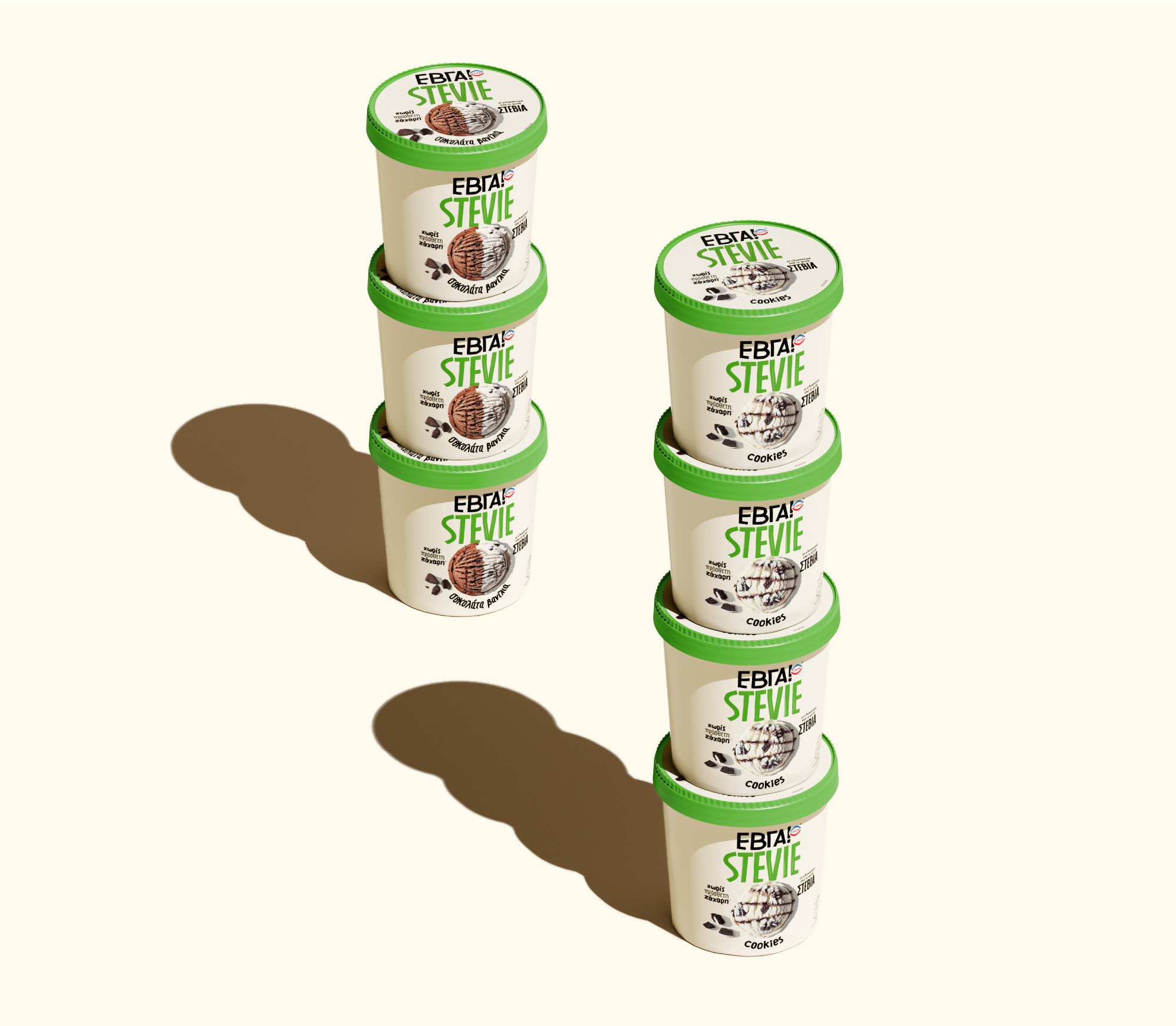
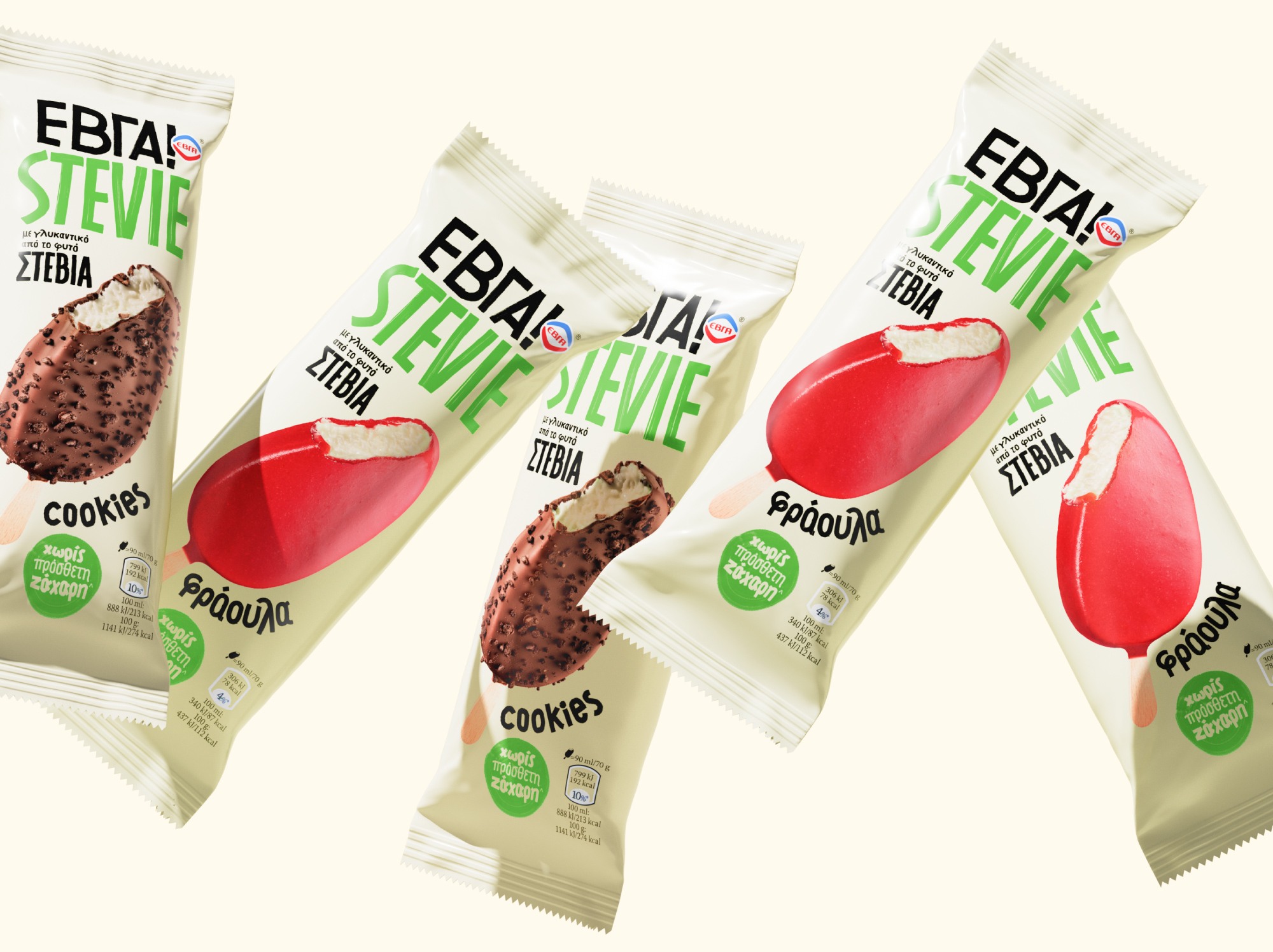
The challenge: ΕΒΓΑ Stevia (from stevia) is a product line with a loyal consumer base that has already existed for several years on the shelves. It comprises 6 SKUs, and the “with stevia sweetener” instead of sugar claim is the main sales driver. In late 2021 after sales had declined, Unilever realized they should take some measures. The packaging looked outdated, and the products looked “too clean” and almost sterile.
The three key requests were:
1. Refresh the overall look & feel and make it up-to-date regarding aesthetics.
2. Give the line a more friendly, soulful, warm, and natural look.
3. Blend the ΕΒΓΑ identity with the STEVIE line to create uniformity for the brand.
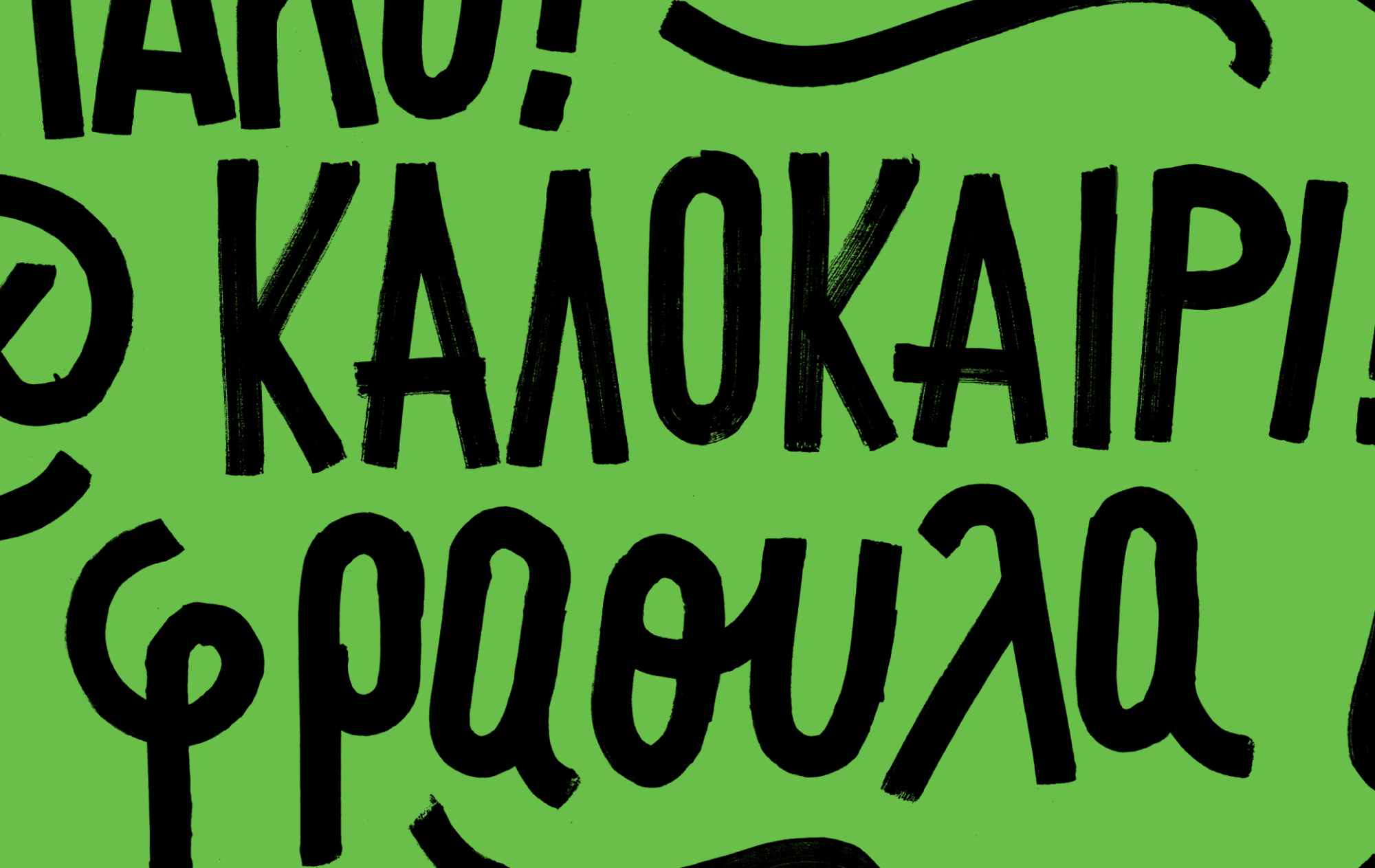
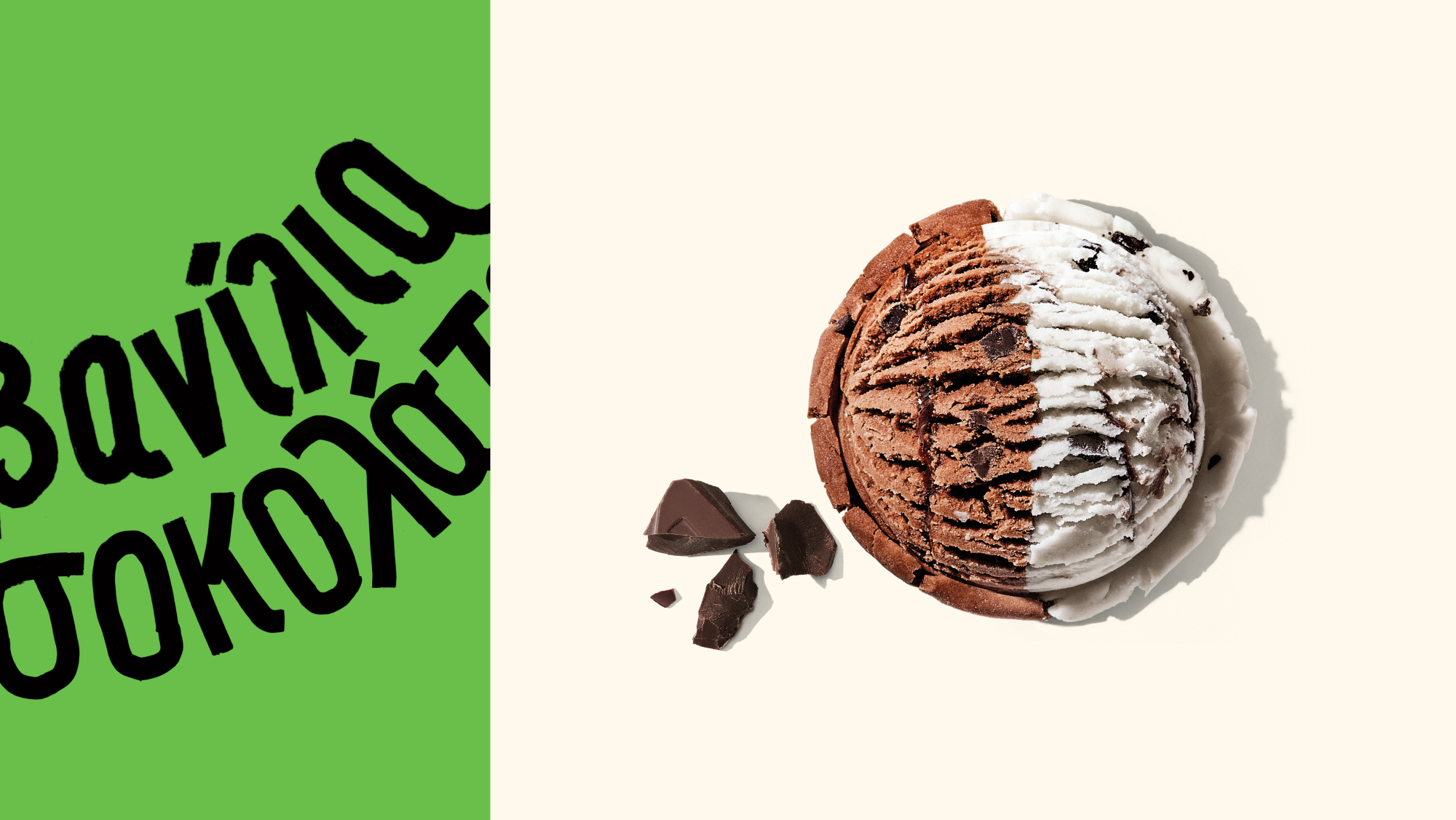
The creative input: Keeping the food styling simple yet mouthwatering was key to giving out honest-to-goodness vibes. We gave the previous cold white a rustic tint but kept the iconic old-school green paper top as a liaison between the past and new packaging. Our tailor-made fonts are inspired by the handwritten signage ice cream carts used to have back then. Thickly brushed lettering, so casual and raw that feels personal and honest.


CREDIT
- Agency/Creative: Caparo DC
- Article Title: Unilever Relaunches Its Popular Greek Stevia Ice Cream Brand With A More Natural And Craft Touch
- Organisation/Entity: Agency
- Project Type: Packaging
- Project Status: Published
- Agency/Creative Country: Greece
- Agency/Creative City: Caparo DC/Athens
- Market Region: Europe
- Project Deliverables: Food Photography, Food Styling, Packaging Design, Typography
- Format: Box, Cup, Flow-Pack
- Substrate: Plastic, Pulp Paper
- Industry: Food/Beverage
- Keywords: Caparo, Unilever, Ice Cream, ΕΒΓΑ, Ice cream brand, Ice cream packaging
-
Credits:
Caparo DC: Caparo DC


