The Concept: Prosfora is a premium olive oil producer based in Greece. According to Herodotus, Apollodorus, Plutarch, Pausanias and more, Poseidon and Athena quarreled over who would become the patron of Athens. The first offered a water spring to the citizens, the other an olive tree – the first of its kind. Athenians chose the olive tree over the spring. That was the core idea of the brand, offering a superior quality extra virgin olive oil to the consumers.
Naming: This is the reason we named the brand Prosfora (προσφορά /pɾo.sfoˈɾa/) a greek word that describes an act of offering, giving someone something solemnly as a sign of respect, love, religious worship, etc.
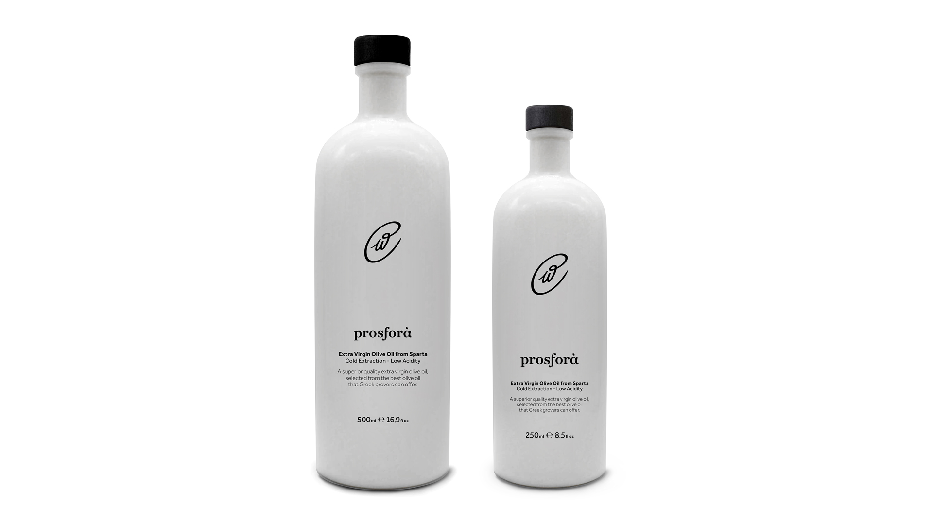
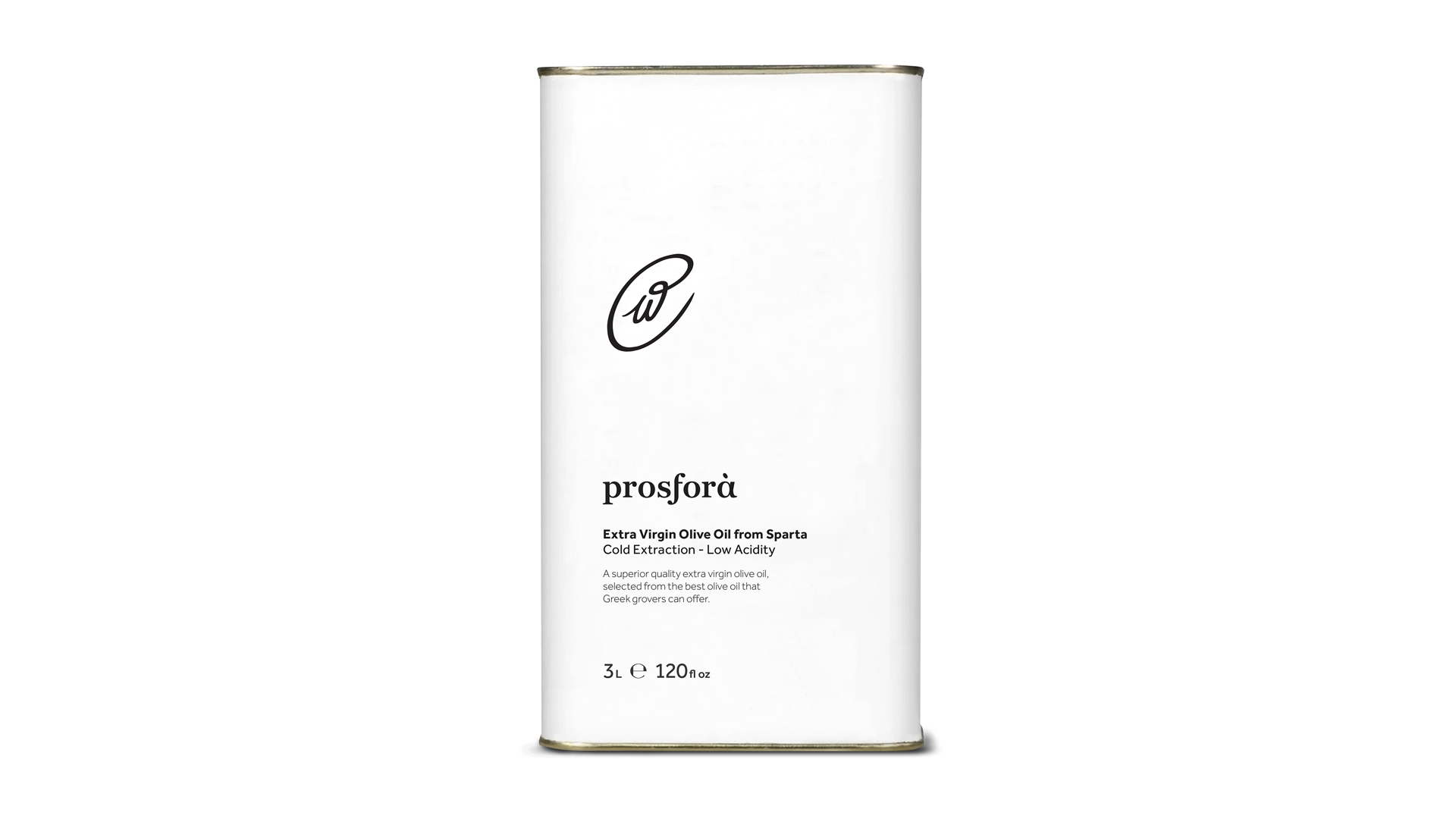
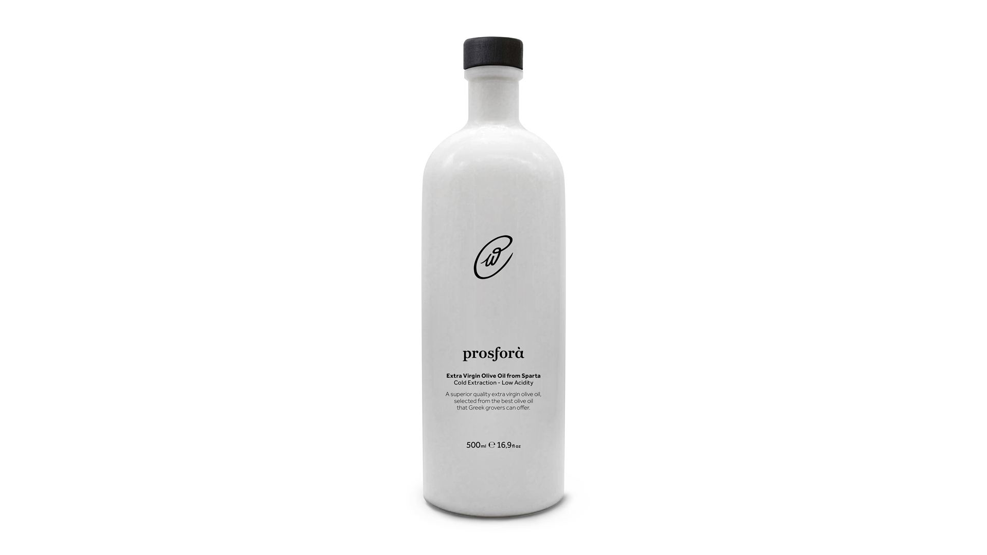
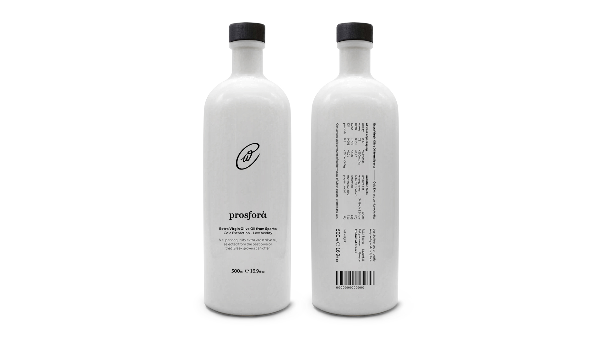
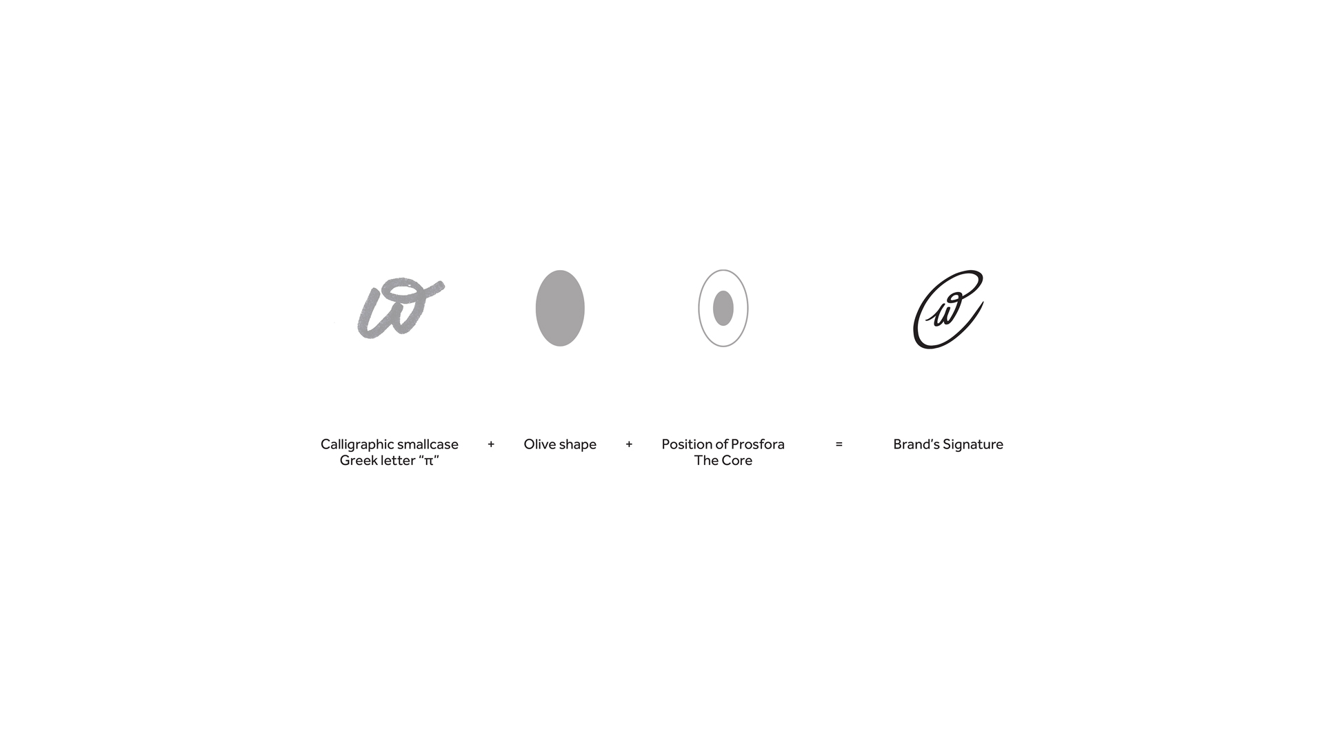
Identity: Austere black and white color palette in combination with the clean use of typography, brings forward the absolute purity of the product, while achieving a modern and elegant design. The signature of the brand derives from the greek letter “π” written in calligraphy, placed in the core of a olive shape to resemble the core value of the brand’s prosfora-offer of premium quality products.
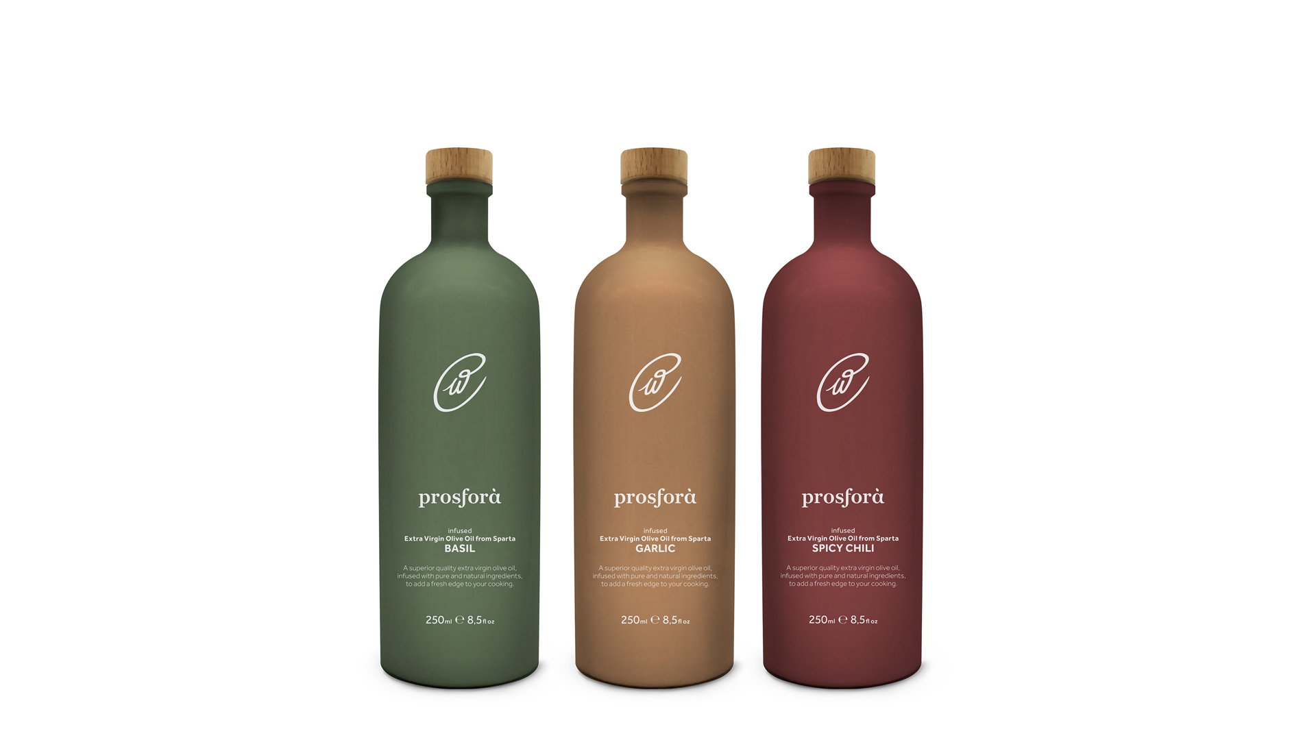
Packaging: Prosfora needed a simple and clean packaging design. One that would reflect the purity of the product, as well as the act of offering itself. As such, the predominant white and black palette was applied through the entire packaging range. The packages that differ are the bottles containing infused olive oil, in order to be easily recognizable, while still maintaining their minimal design.
CREDIT
- Agency/Creative: Semitone Design Studio
- Article Title: Prosfora Olive Oil Packaging Design
- Organisation/Entity: Agency
- Project Type: Packaging
- Project Status: Non Published
- Agency/Creative Country: Greece
- Agency/Creative City: Athens
- Market Region: Europe
- Project Deliverables: Brand Identity, Logo Design, Packaging Design
- Format: Bottle, Tin
- Substrate: Glass Bottle, Metal
- Industry: Food/Beverage
- Keywords: Premium Greek Olive Oil Packaging Design Identity
-
Credits:
Graphic Designer: Chris Gerokostas


