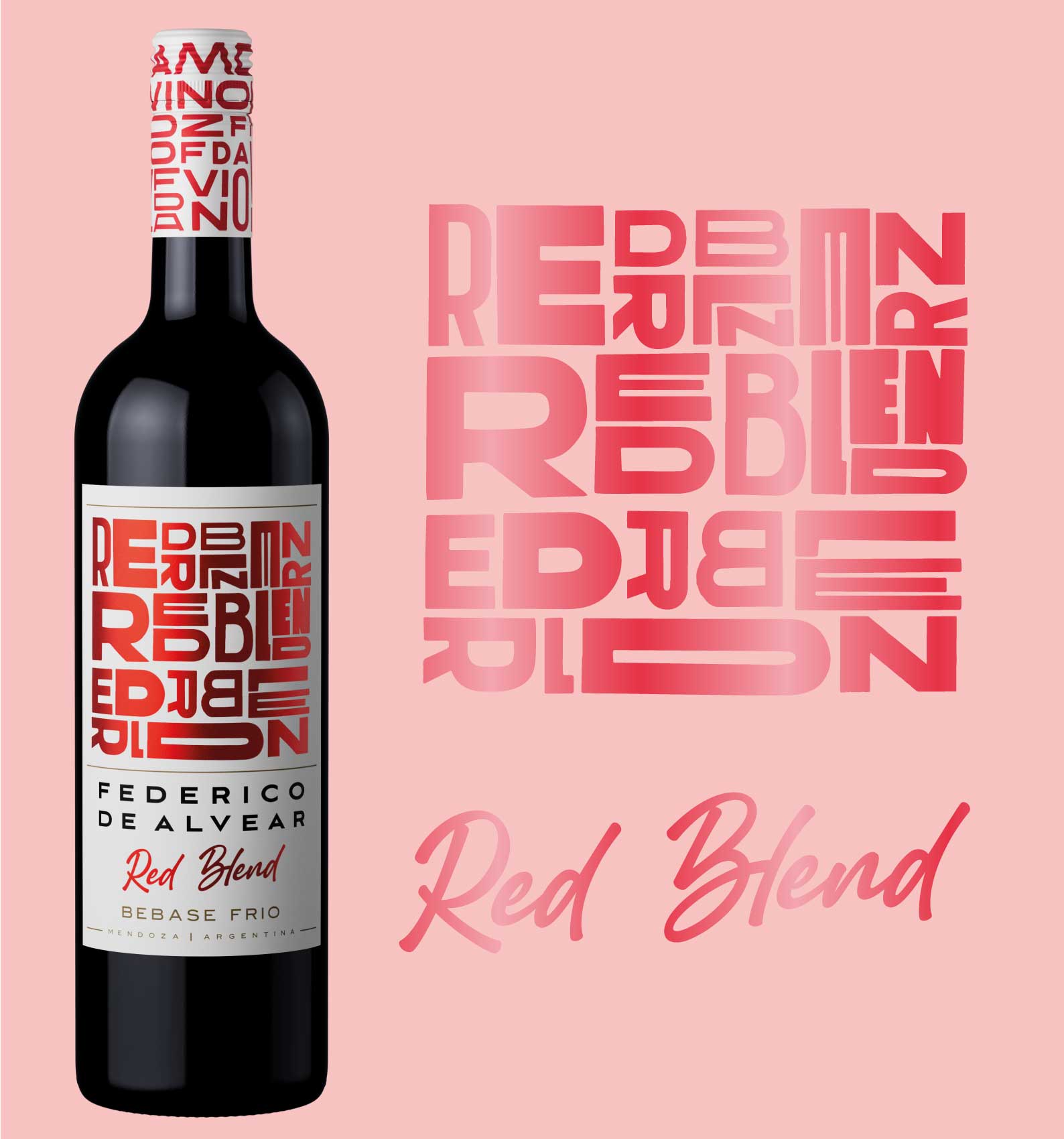
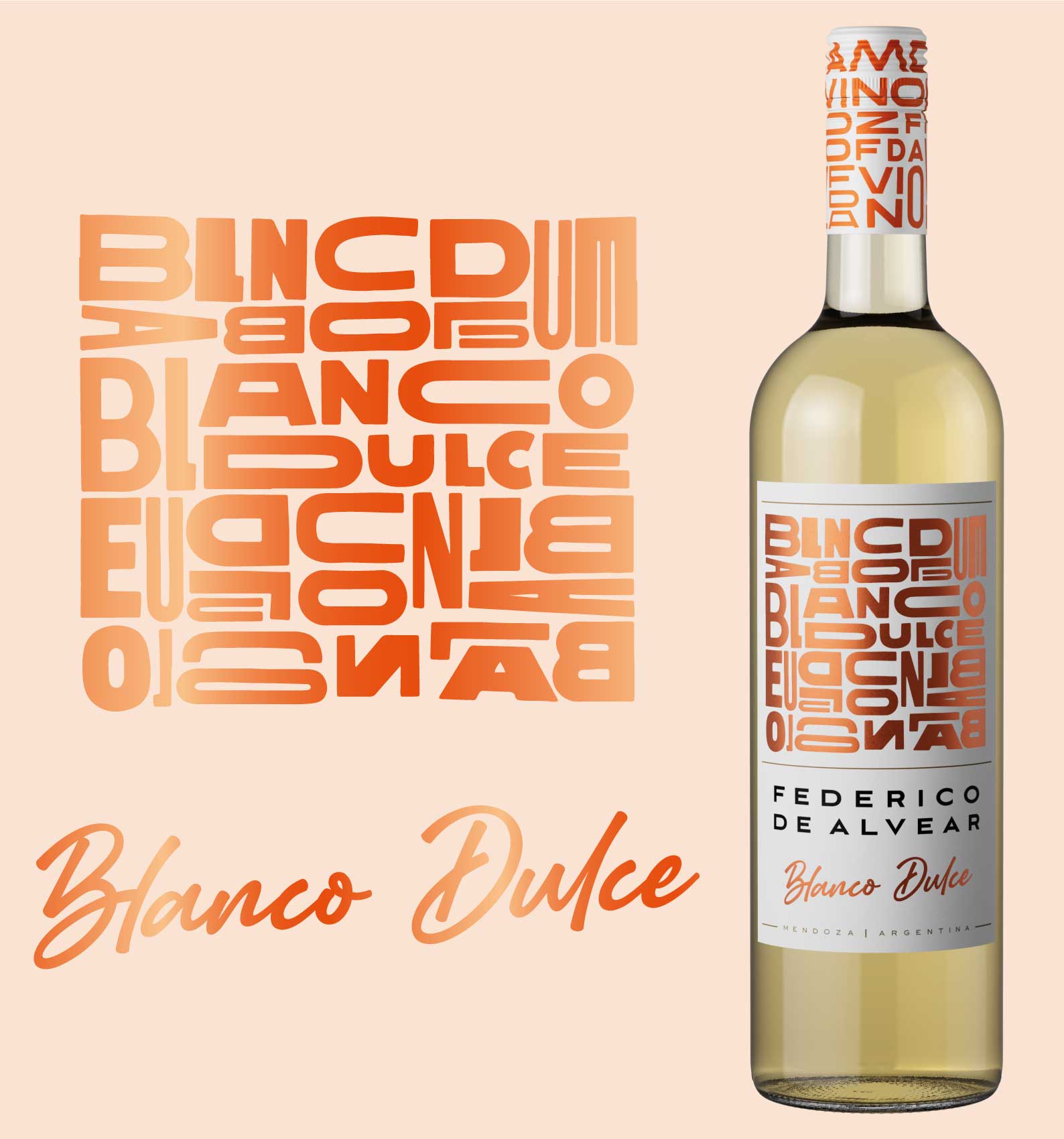
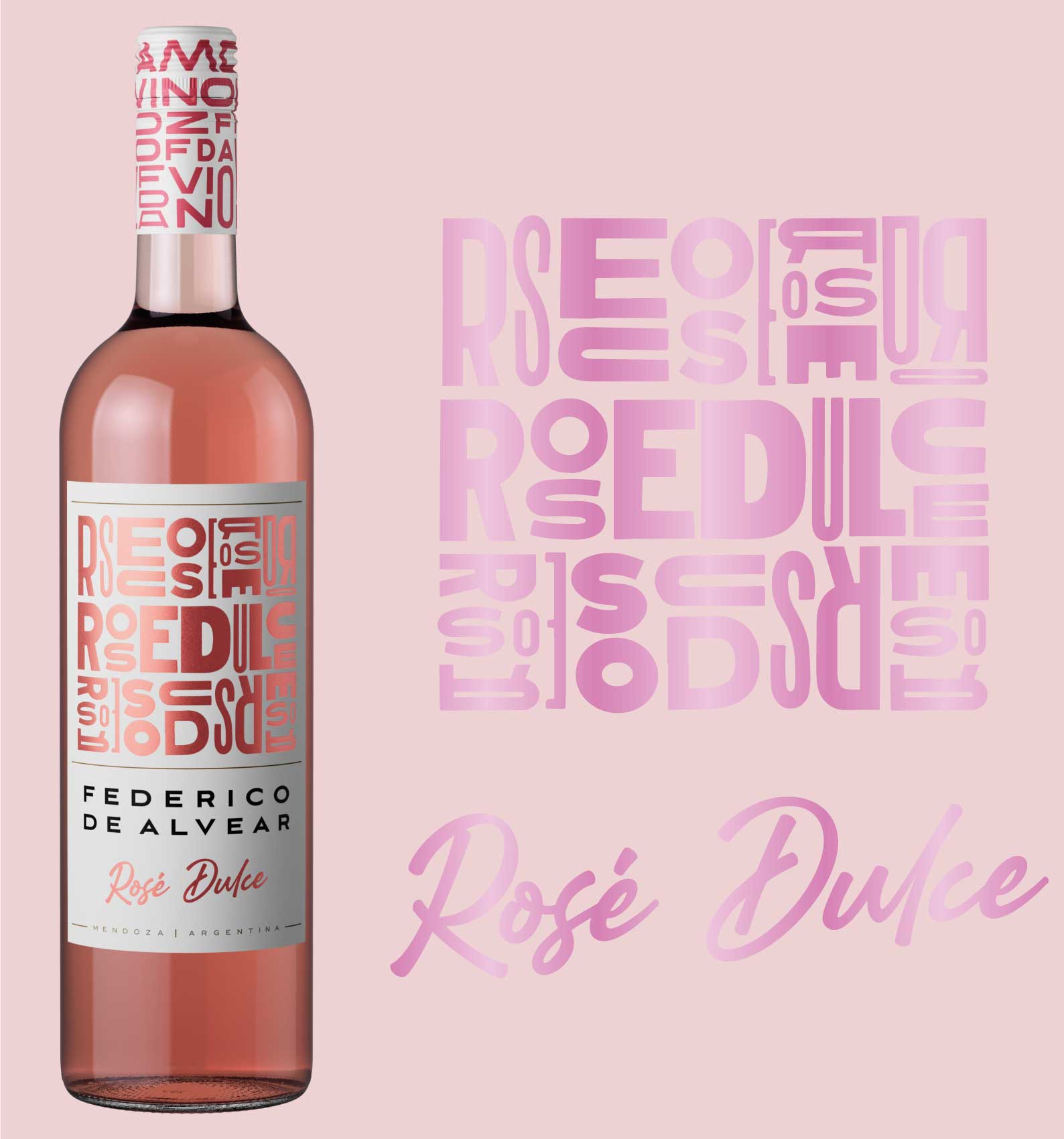
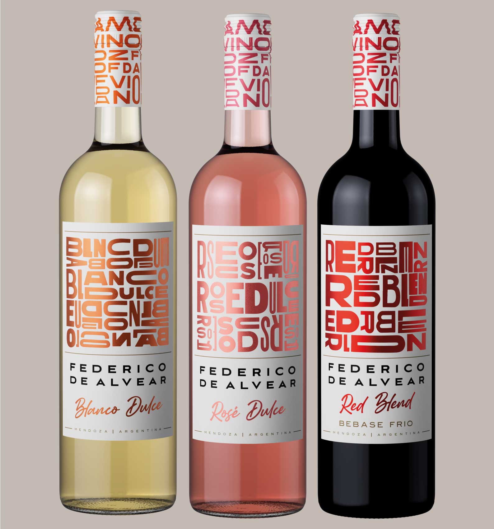
Federico de Alvear presents a new packaging concept for its collection of fresh, light, and lively wines. With a focus on Red Blend, Sweet White, and Sweet Rosé varieties, this design aims to captivate wine enthusiasts with its unique concept, typography, and overall visual appeal.
The concept behind the packaging is to evoke a sense of elegance and sophistication, while also reflecting the lightness and freshness of the wines themselves. The color palette chosen consists of soft pastel hues, representing the delicate and fruity nature of these particular wine types.
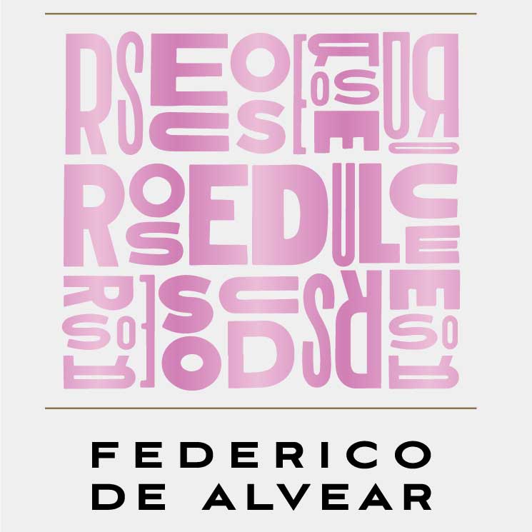
Typography plays a crucial role in conveying the brand’s identity and message. The typography is clean and legible, allowing the consumer to easily identify the wine’s variety and brand.
The overall design is sleek and minimalistic, with clean lines and subtle embellishments. The use of negative space enhances the visual impact, allowing the wines to take center stage. The labels feature a harmonious balance, providing essential information without overwhelming the overall design.
Federico de Alvear’s new packaging for its fresh, light, and light wines aims to entice wine enthusiasts with its elegant and modern design. The combination of concept, typography, and overall visual appeal creates a packaging that not only showcases the quality of the wines but also reflects the brand’s commitment to craftsmanship and innovation.
CREDIT
- Agency/Creative: Sure Brandesign
- Article Title: Wine Packaging Design Concept by Federico de Alvear
- Organisation/Entity: Agency
- Project Type: Packaging
- Project Status: Published
- Agency/Creative Country: Argentina
- Agency/Creative City: Buenos Aires
- Market Region: South America
- Project Deliverables: Packaging Design, Product Design, Typography
- Format: Bottle
- Substrate: Glass, Glass Bottle
- Industry: Food/Beverage
- Keywords: #design #packagingdesign #winedesign #typodesign
-
Credits:
Agency: Sure Brandesign


