Studio RM has a consolidated trajectory of 12 years in the architecture market and, aware of the need to reposition itself, seeks to improve its strategic approach. The main objective of this repositioning and new brand is to attract an ideal customer, one who truly understands the relevance of the work developed by the company and, consequently, attributes significant value to it. This appreciation enables the creation of high quality projects and experiences through active co-creation.
The projects prepared by Studio RM are conceived with the purpose of promoting a better quality of life and well-being for people. Whether to provide a residential environment that provides rest and comfort, or to optimize productivity in the work environment, we aim to provide an exceptional experience when visiting these spaces. In this way, the aim is to establish environments that transcend mere functionality, encompassing aspects that promote the physical and emotional well-being of users.
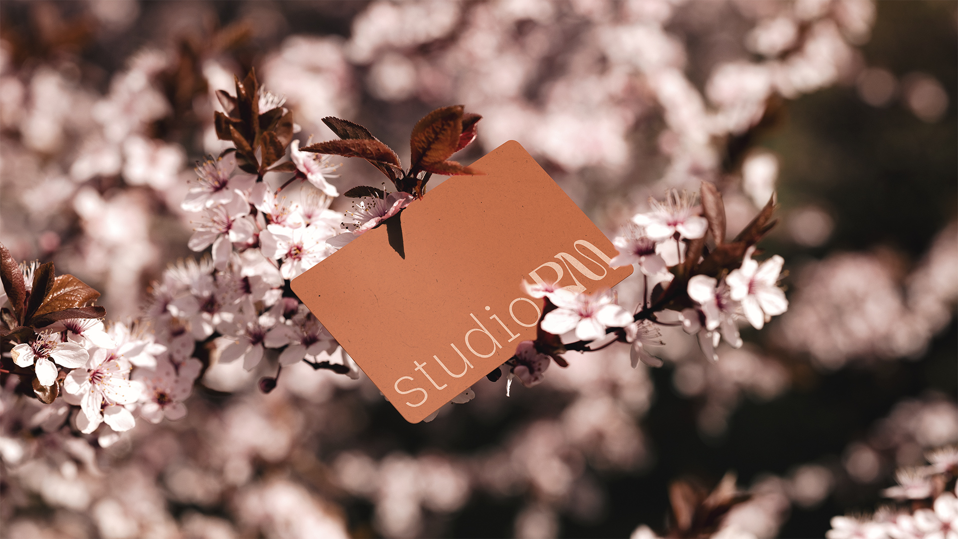
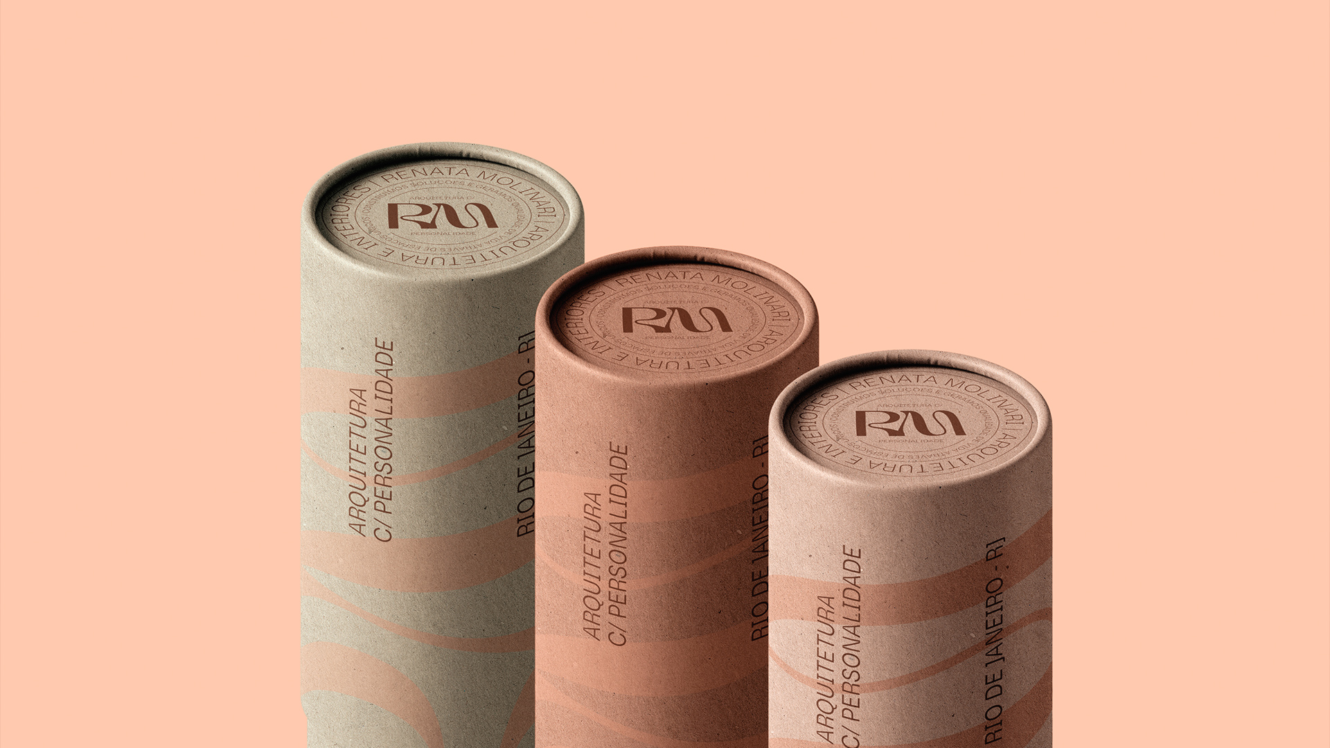
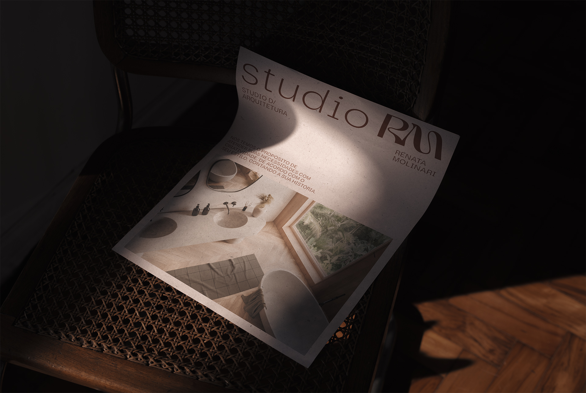
The essence of Studio RM’s brand lies in its unparalleled ability to adapt and customize architectural projects for each client, especially with regard to the individual needs and desires of each family. The core concept of the brand is masterfully represented by the curved lines that make up its visual identity, symbolizing the flexibility and fluidity with which the studio approaches each project.
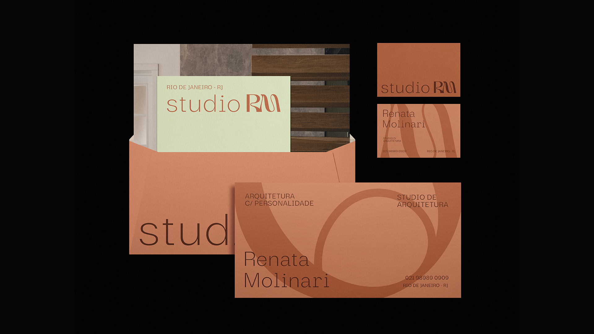
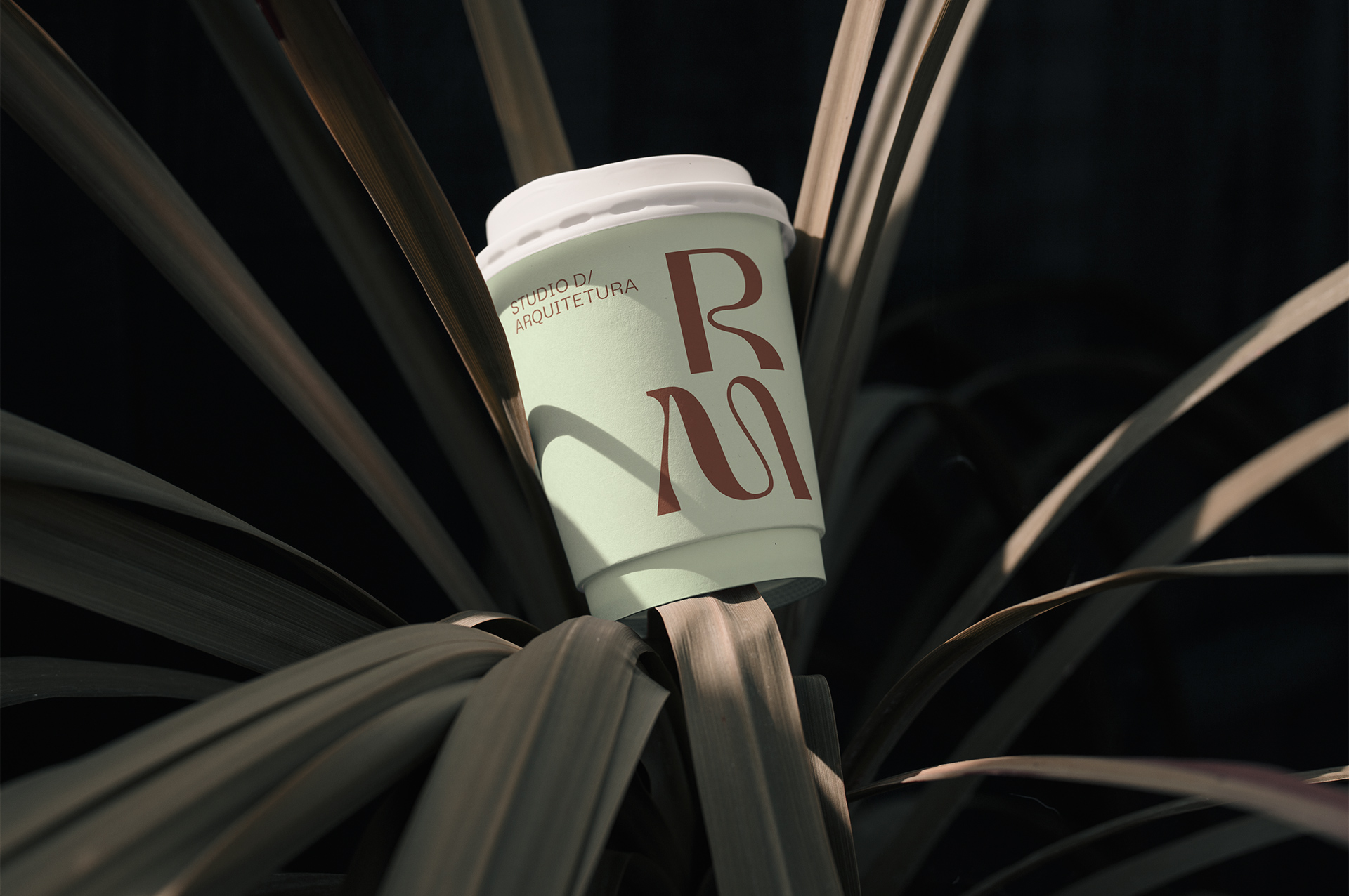
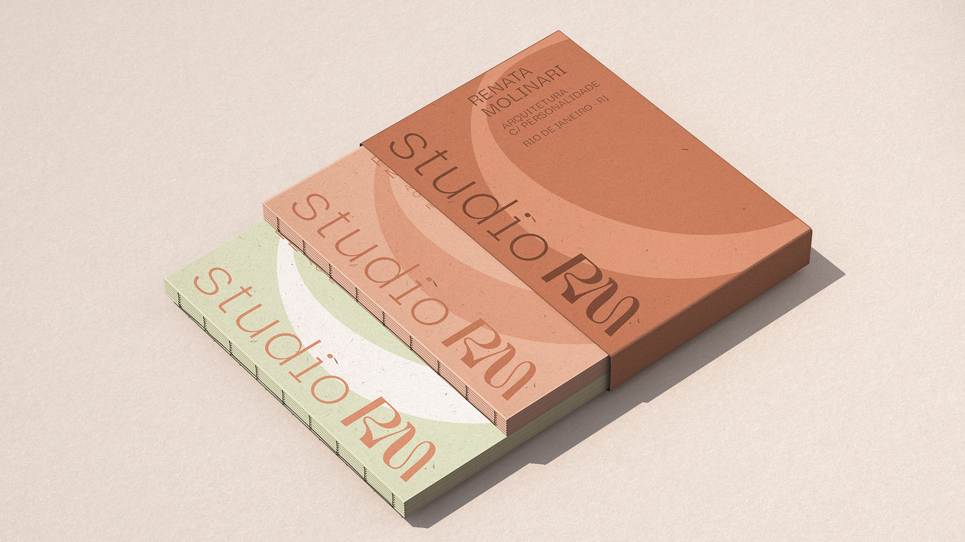
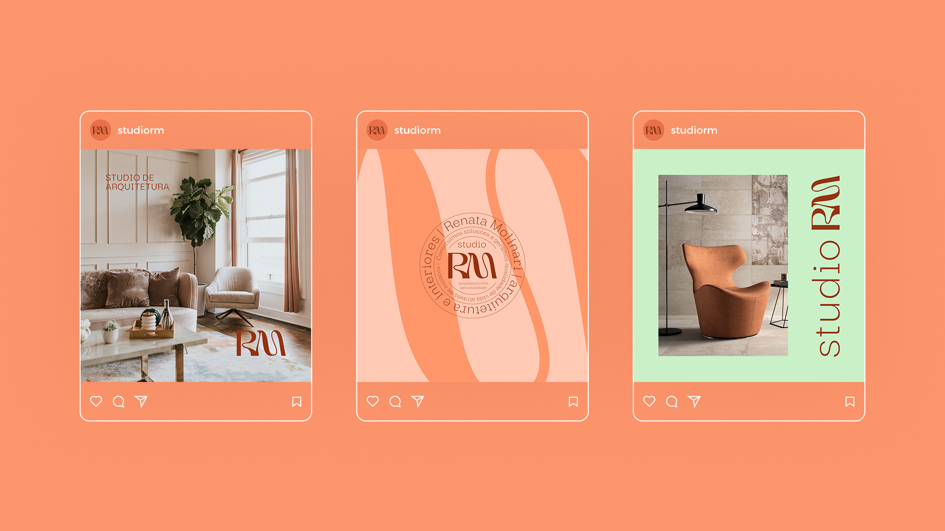
When developing the brand’s color palette, shades of orange, brown and green were selected. This choice was made with the intention of preserving the distinctive colors of the current brand, evoking familiarity and continuity, while introducing new shades to inject vitality and dynamism to the brand identity.
The use of orange, with its energetic and vibrant nuances, evokes the creativity and passion that Studio RM dedicates to each project, as well as the desire to offer innovative architectural solutions. Brown, in turn, conveys a sense of stability, confidence and durability, emphasizing the quality and solidity of the services offered by the studio. Green, associated with nature and growth, introduces an element of freshness and sustainability, reinforcing Studio RM’s commitment to designing harmonious and eco-conscious environments.
This careful color combination creates a visual synergy that represents the evolution of the brand, while keeping its essence intact. By incorporating new shades, Studio RM seeks to convey the idea that it is constantly reinventing itself, following market trends and adopting new architectural concepts to meet the ever-changing demands of its clients. This approach reflects the dynamic vision of the studio, which is always looking for new inspirations and perspectives to further improve the quality of its projects.
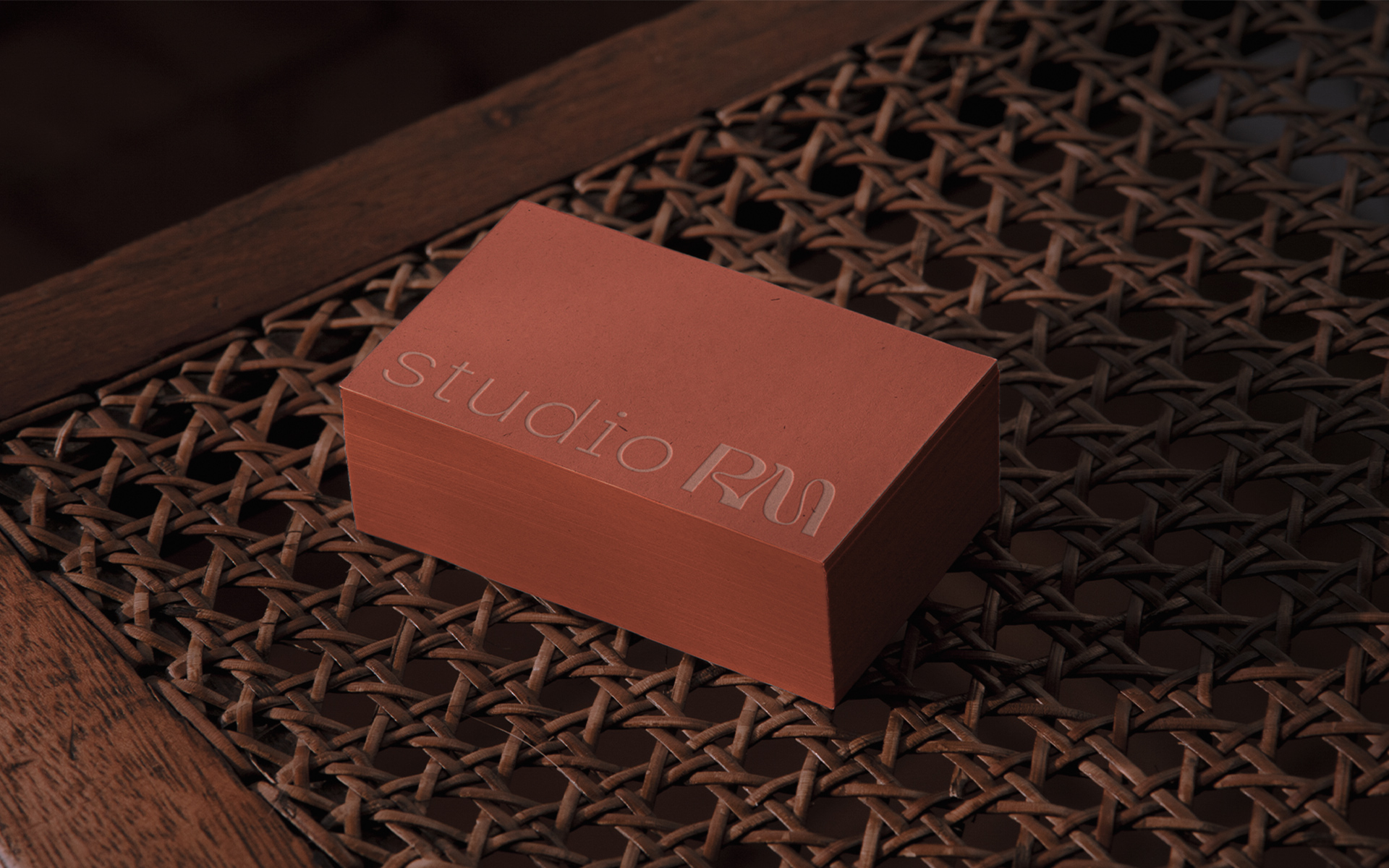
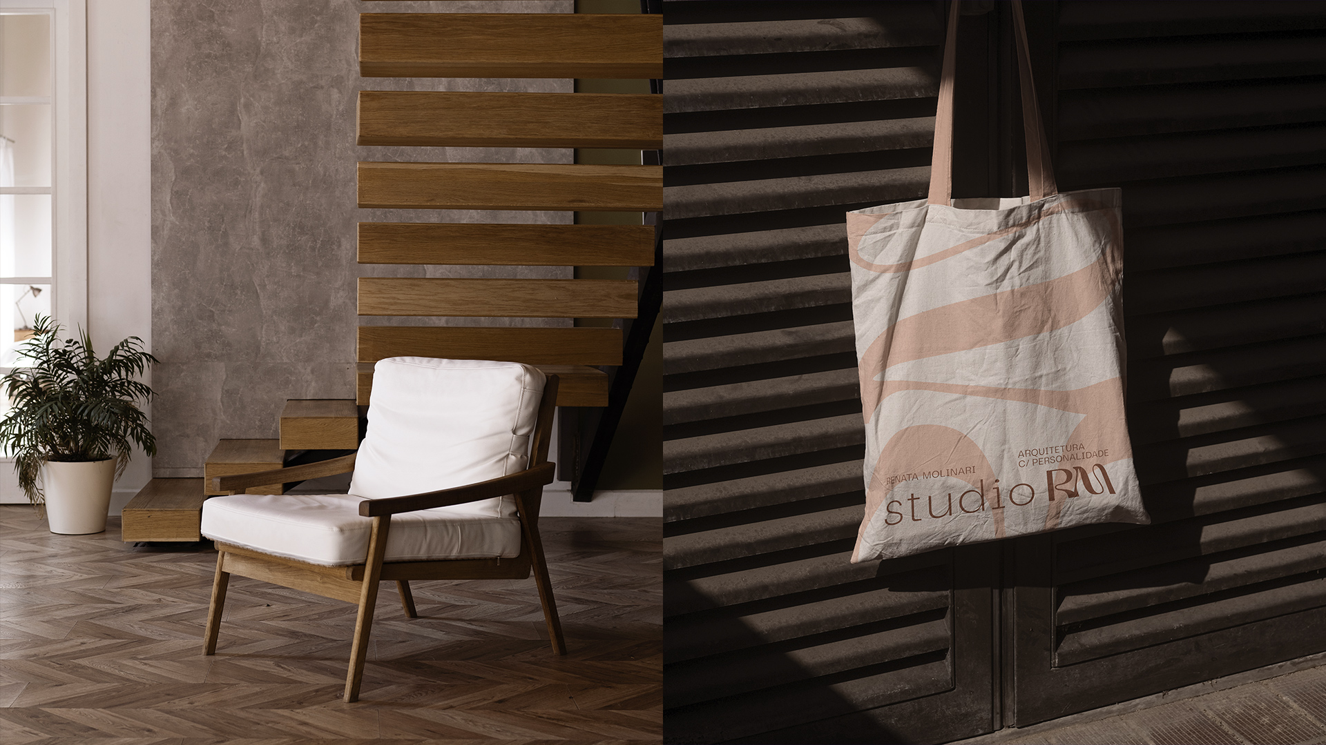
The visual universe of Studio RM’s brand was carefully developed taking into account the curved elements present in its logo. These curves were skilfully incorporated into all aspects of the brand’s communication, with the aim of reinforcing and accentuating its unique identity. In this way, the brand name, “Studio RM”, gains special prominence, becoming the central point of all its visual communication.
By emphasizing the brand name, Studio RM seeks to powerfully and unmistakably convey its essence and purpose. This strategy allows the brand to establish itself in a memorable way and stand out in a highly competitive market, where differentiation and quick identification are essential.
Through the use of the curves present in the logo, Studio RM creates a visual connection with its identity and core values. These curves not only add a pleasing aesthetic element, but also symbolize the adaptability, flexibility and fluidity that are the studio’s hallmarks. This visual approach reinforces the message that Studio RM is able to adapt and customize its designs to meet each client’s unique needs, thus ensuring a truly exceptional architectural experience.
By placing the brand’s name in evidence, Studio RM reinforces its commitment to offering architectural solutions of excellence, conveying confidence, professionalism and recognition of its brand in the market. This visual communication strategy contributes to consolidating Studio RM as a reference in design and architecture, adding value to its reputation and establishing a lasting connection with its target audience.
CREDIT
- Agency/Creative: Nil Brands
- Article Title: Brand Identity for Architecture Studio
- Organisation/Entity: Freelance
- Project Type: Identity
- Project Status: Published
- Agency/Creative Country: Brazil
- Agency/Creative City: João Pessoa
- Market Region: South America
- Project Deliverables: Animation, Art Direction, Brand Architecture, Brand Creation, Brand Design, Brand Guidelines, Brand Identity, Brand Mark, Brand Redesign, Brand Strategy, Branding, Graphic Design, Logo Design
- Industry: Construction
- Keywords: #ArchitectureDesign #InteriorDesign #branddesign #BrandRepositioning #CustomProjects #brand #Spaces #Architectural #logodesign #visualidentity
-
Credits:
Designer and Creative Leader: Nil


