All the members of Prague based agency Goblins are passionate musicians and music-lovers in general. And it shows! For the whole team, the opportunity to create a visual identity for one of the biggest Czech music stores and to take the brand’s social media presentation to another level was beyond exciting.
Music City is the biggest distributor of musical instruments and audio systems in Czechia and Slovakia and is considered to be number two on the market by the general public. Lifestyle products such as headphones, microphones and even cameras are also included in their portfolio.
The challenge here was to differentiate Music City from the competition (mainly kytary.cz which is considered to be number one player on the market) by applying a strong visual identity based on the brand’s logo and with the color palette the brand is currently using. The logo itself is a simple symbol of a guitar pick with typography inside it. The brand’s basic color palette was mainly just a combination of red and white, which are exactly the same colors used by the main competitor. Despite this, the client expressed the wish to keep this color combination.
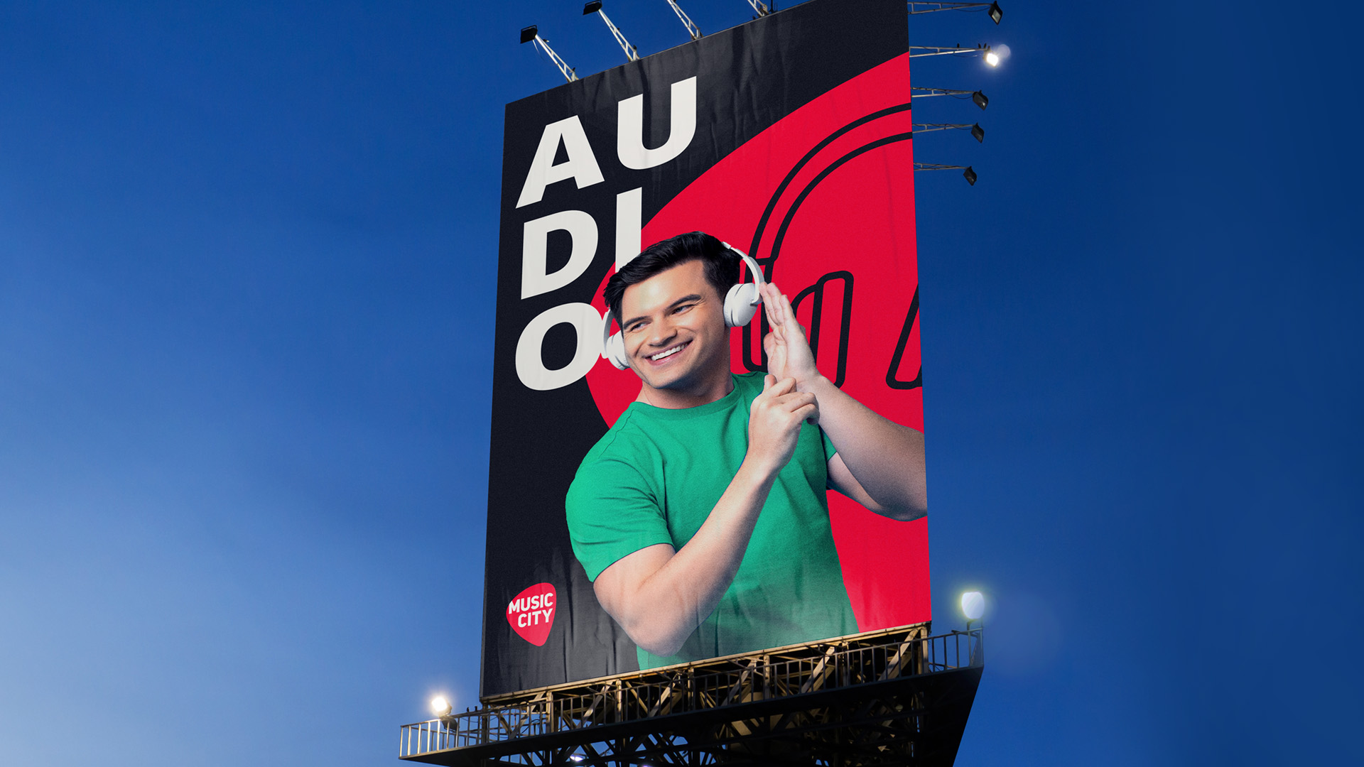
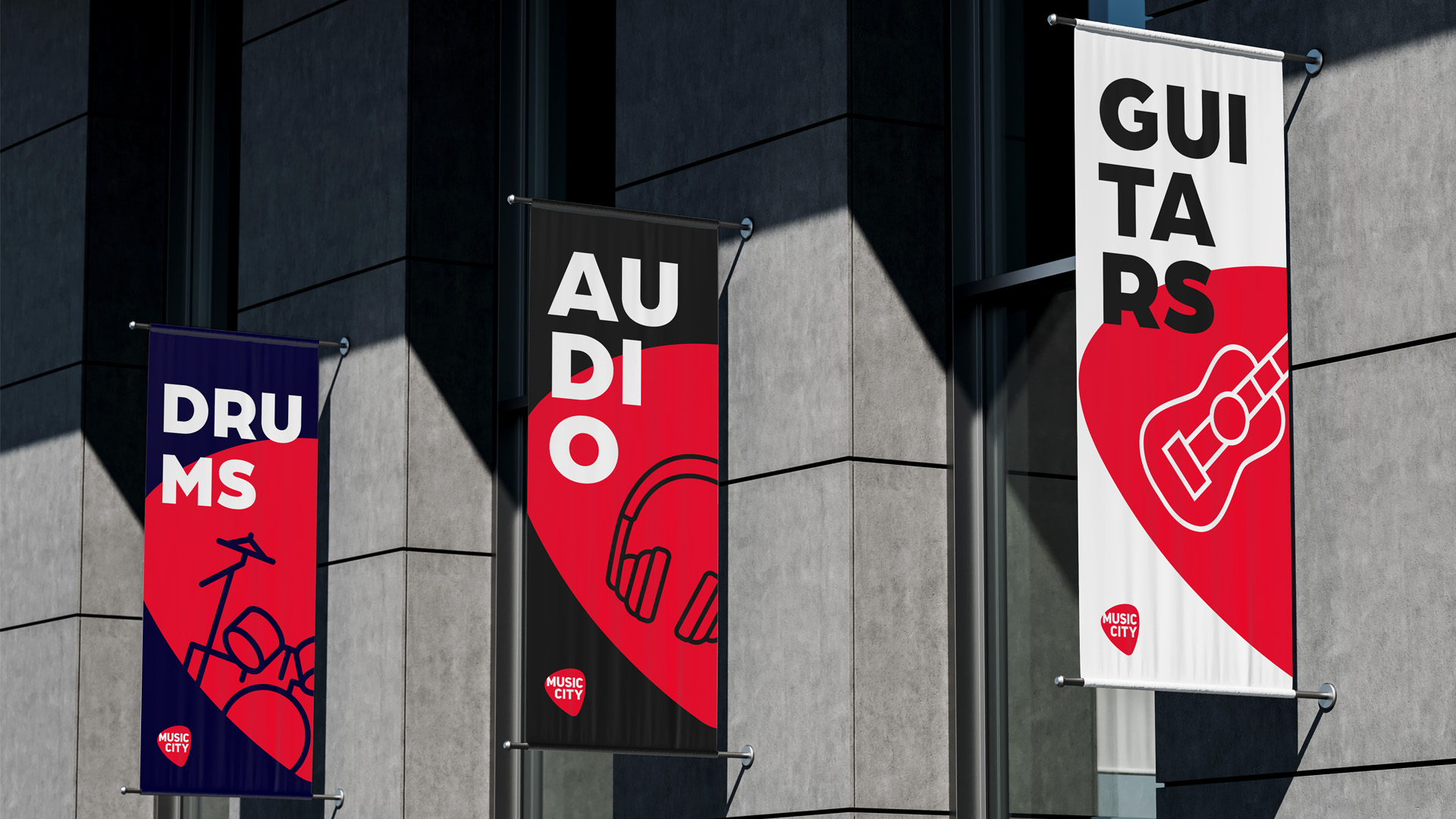
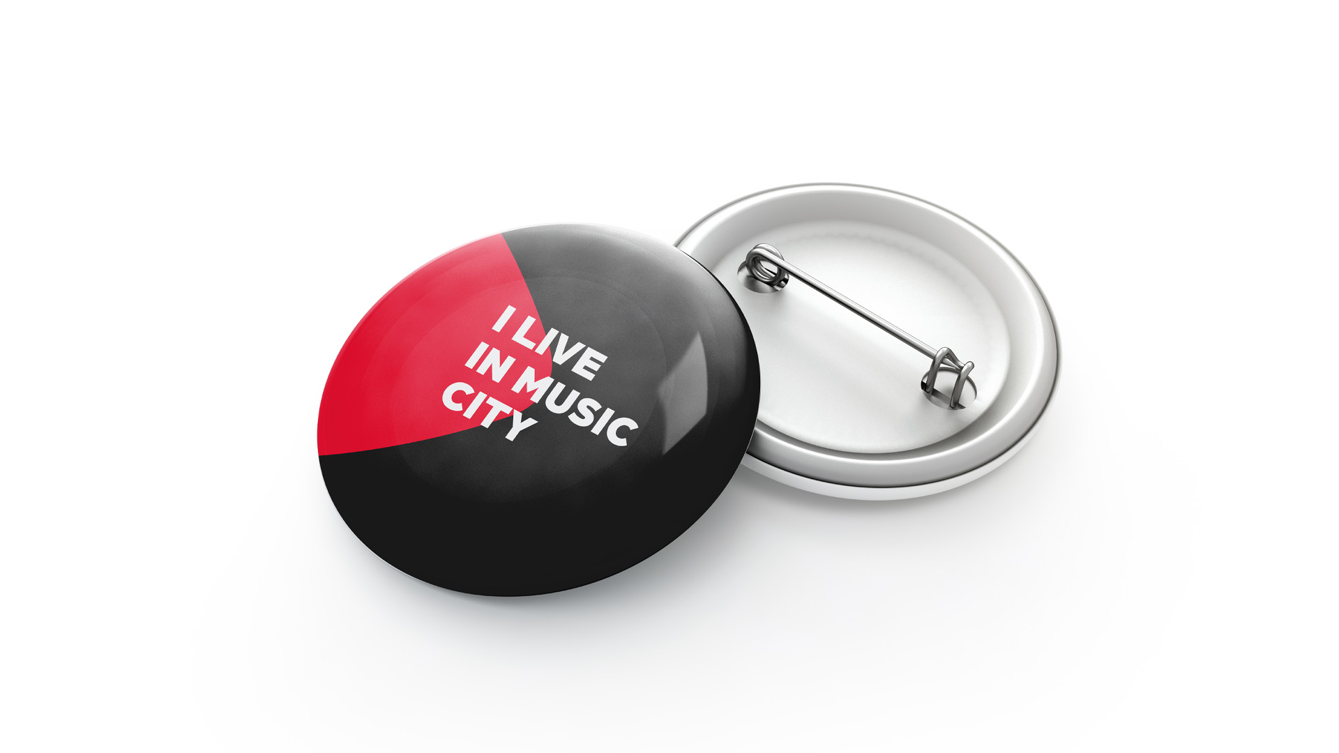
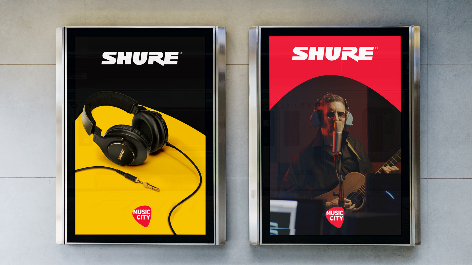
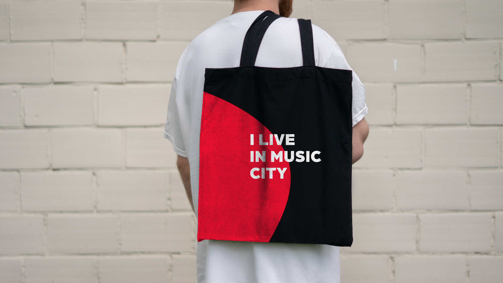
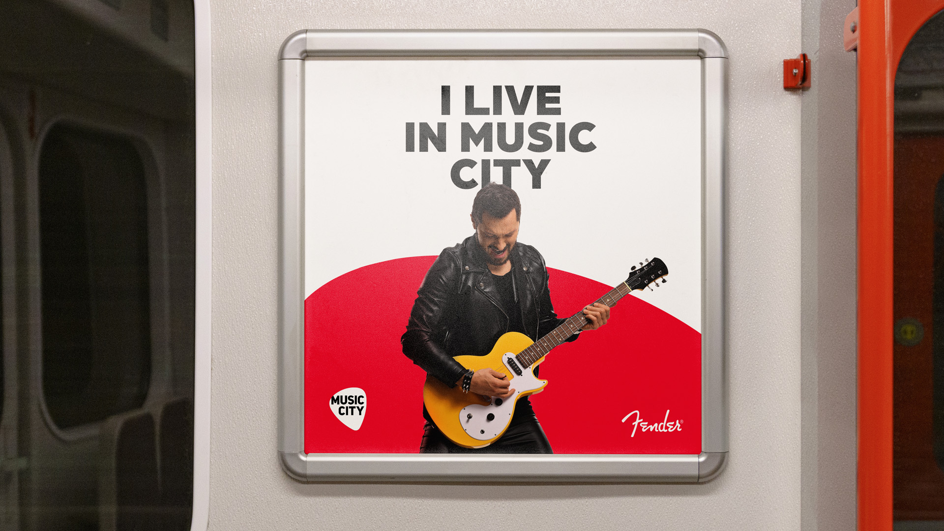
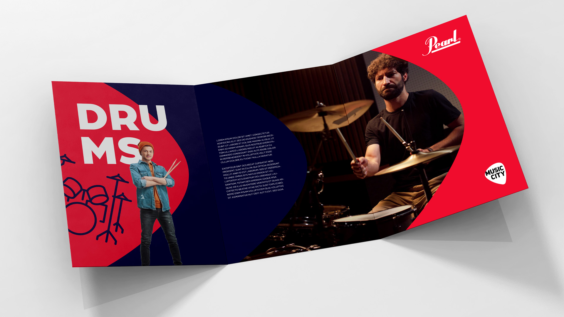
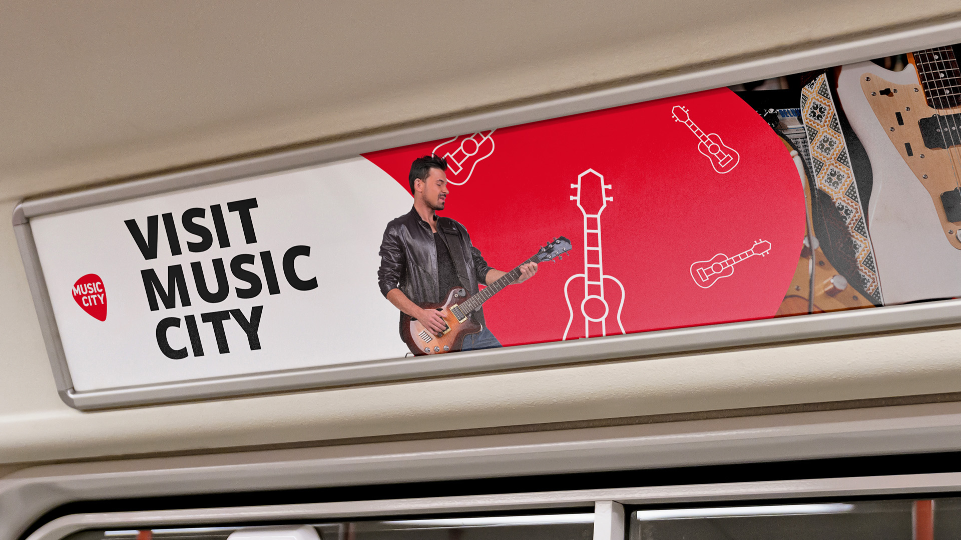
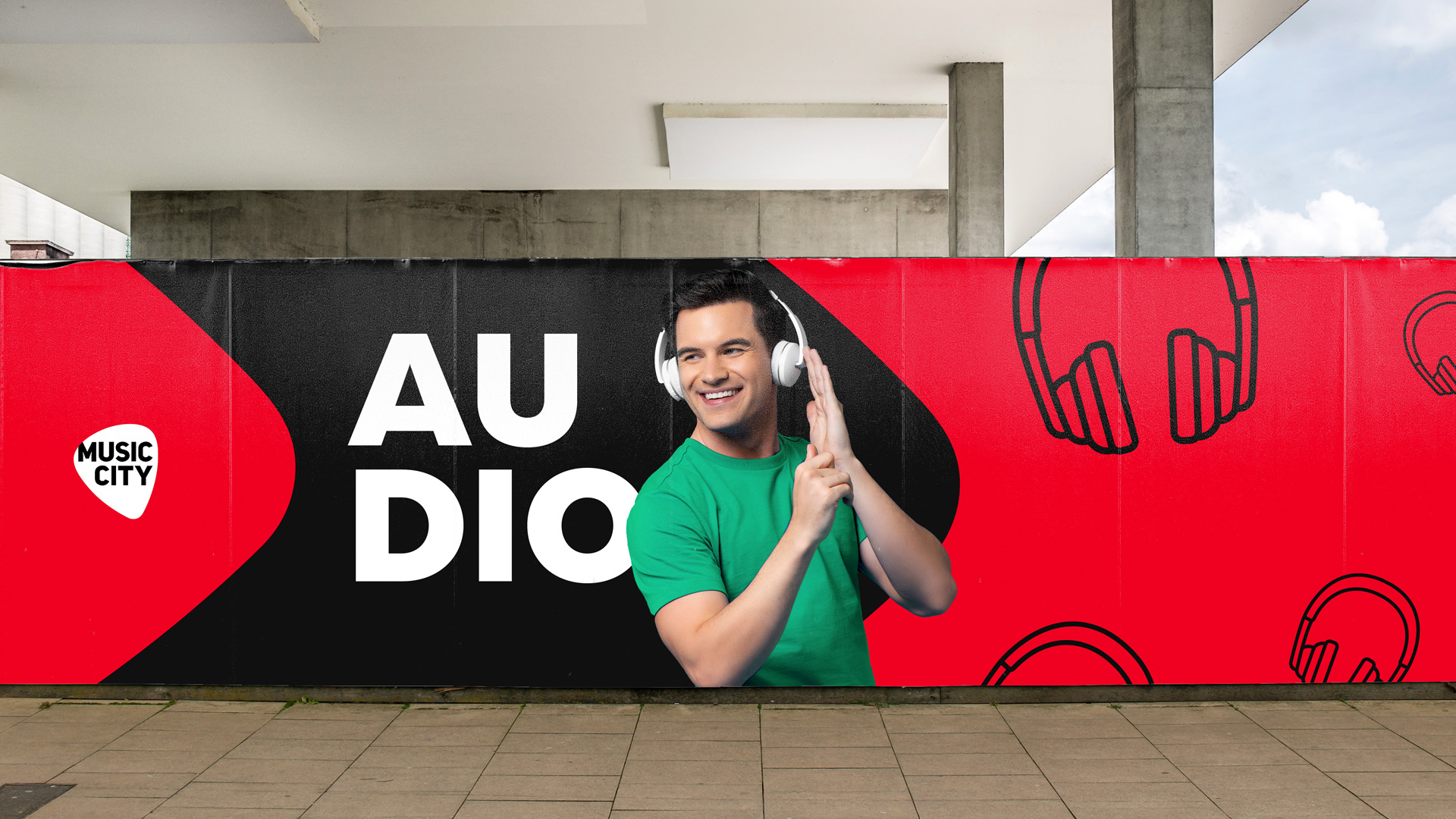
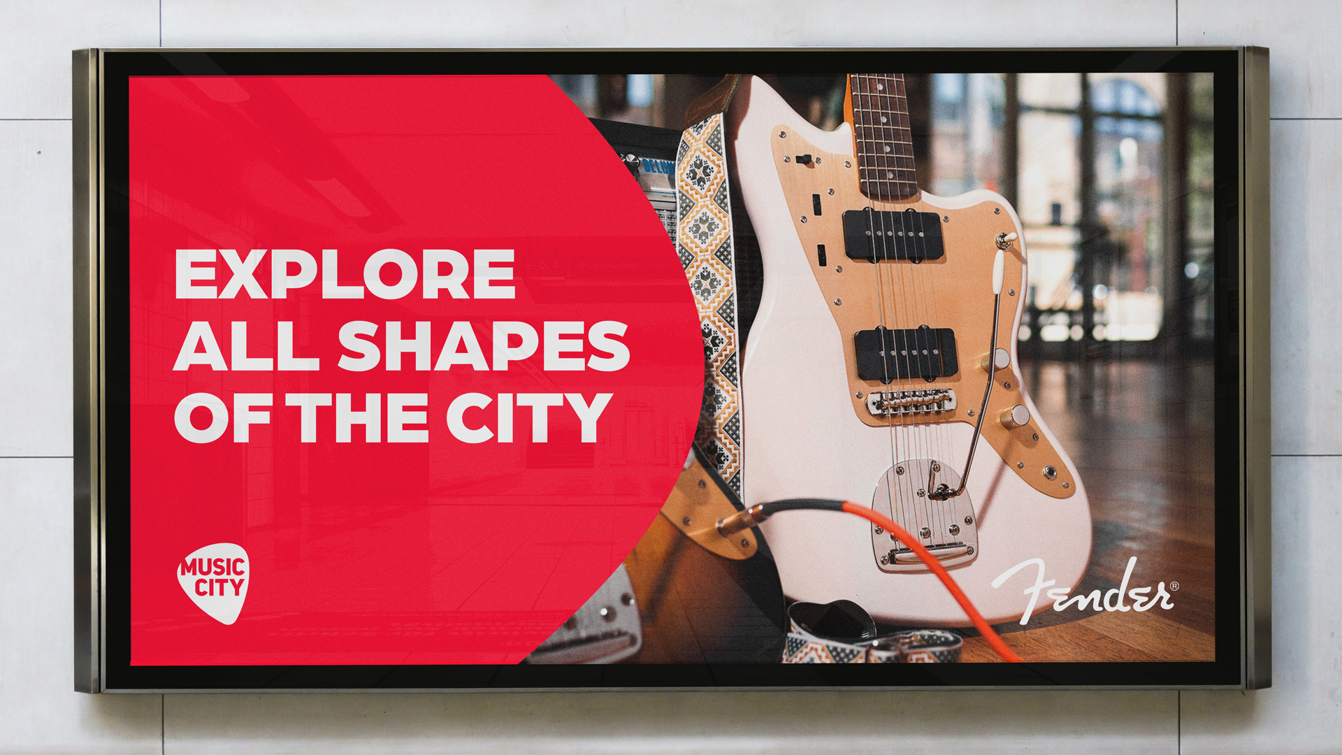
We created the visual identity itself around the guitar pick shape which we enlarged so it could open new ways for us to use it in wider branding. We defined several design principles to be followed when creating branded content, be it a collage, a photo-centered visual or a video. There are always multiple ways to use the main symbol and it will always scream “Music City!”. We used a darker shade of red to not be interchangeable with the main competition and added other primary and secondary colors to the palette: black, dark blue, tourquoise and even yellow.
We also looked at the typography being used and pushed it to the next level as well. As a primary font, we decided to use a rather dominant Arboria, mainly used in black and in bold. As a finishing touch, we created a custom line of iconography for the client’s product portfolio.
Previously inconsistent communication has been unified by using an element from the brand’s already existing logo – a guitar pick – as the main design symbol, both online and offline. A visually pleasing Instagram grid, instantly recognizable offline communication and up-to-date social media formats were created to support the new look of the brand, all united by a new playful style which still remained respectful to the brand’s core values.
CREDIT
- Agency/Creative: Goblins
- Article Title: Music City Visual Identity
- Organisation/Entity: Agency
- Project Type: Identity
- Project Status: Published
- Agency/Creative Country: Czech Republic
- Agency/Creative City: Prague
- Market Region: Europe
- Project Deliverables: Advertising, Art Direction, Brand Design, Brand Identity, Design, Identity System, Rebranding
- Industry: Retail
- Keywords: Brand Design, Brand Identity, Design, Identity System, Czech Republic, Goblins
-
Credits:
Art Director/Designer: Jakub Jedinák
Idea Maker/Copywriter: Michal Vitásek
Idea Maker/Copywriter: Martin Bejšovec


