A belly-laughing bonanza
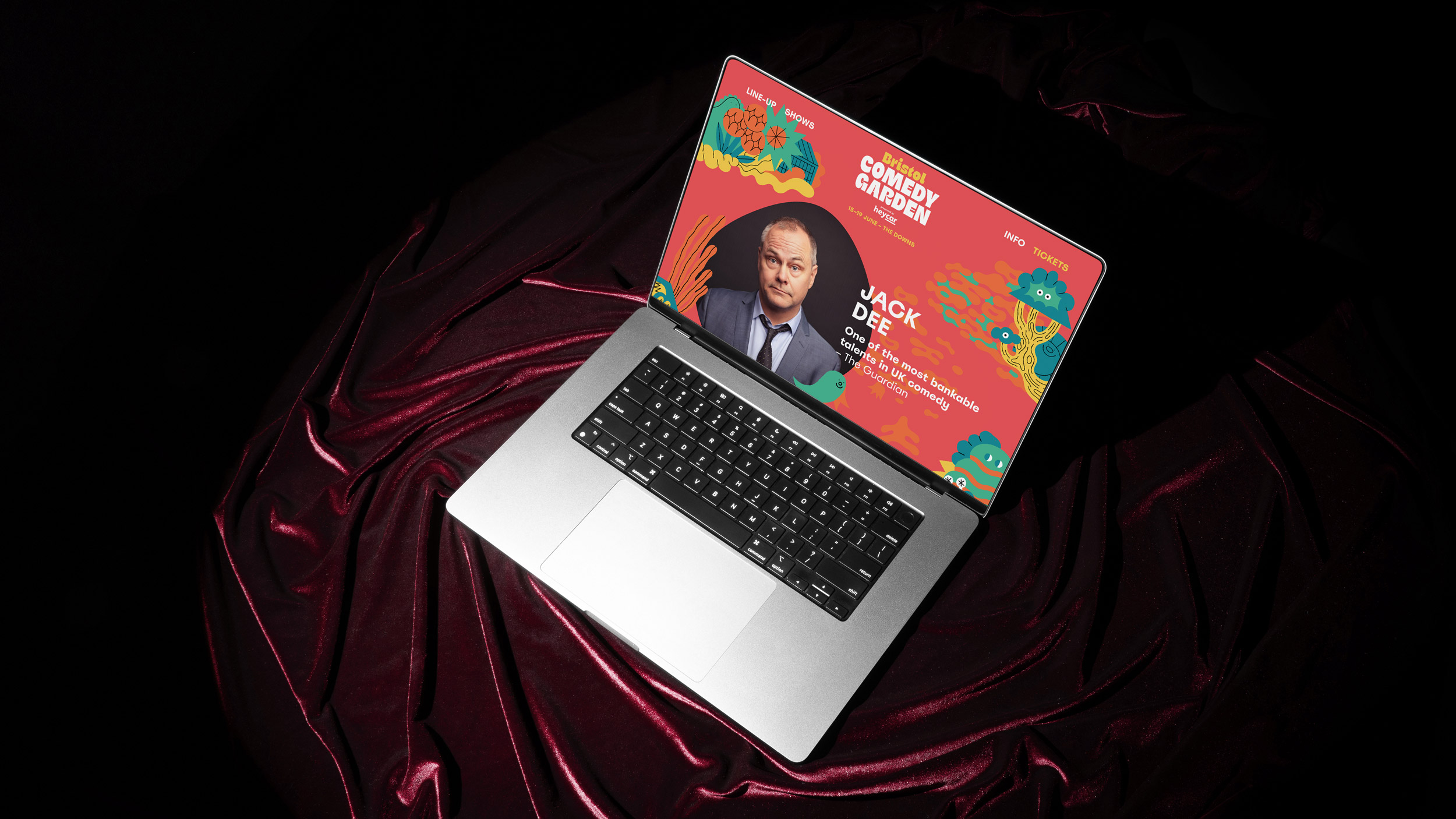
Last year, the founders of 57 Festivals approached Oat Studio to rebrand the identities for a series of nationwide comedy festivals, the first being Bristol Comedy Garden. The festivals had been running for a number of years, and the graphics needed a boost to grab public attention and further project the personality-packed events, featuring the biggest names in UK comedy, such as Jack Dee, Sara Pascoe, Ed Gamble and Nina Conti.
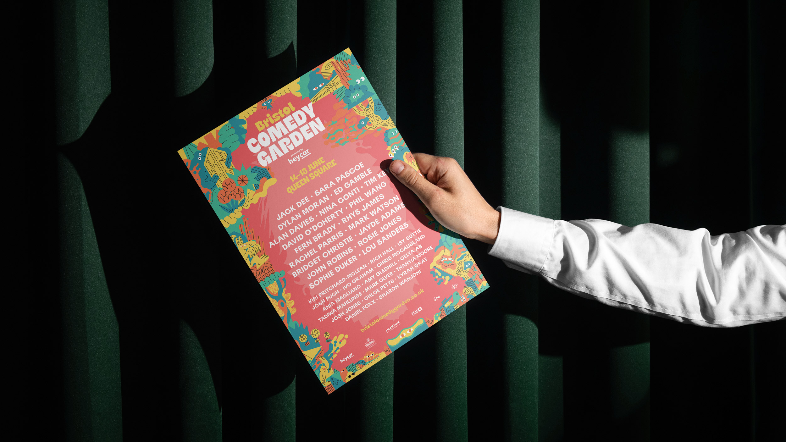
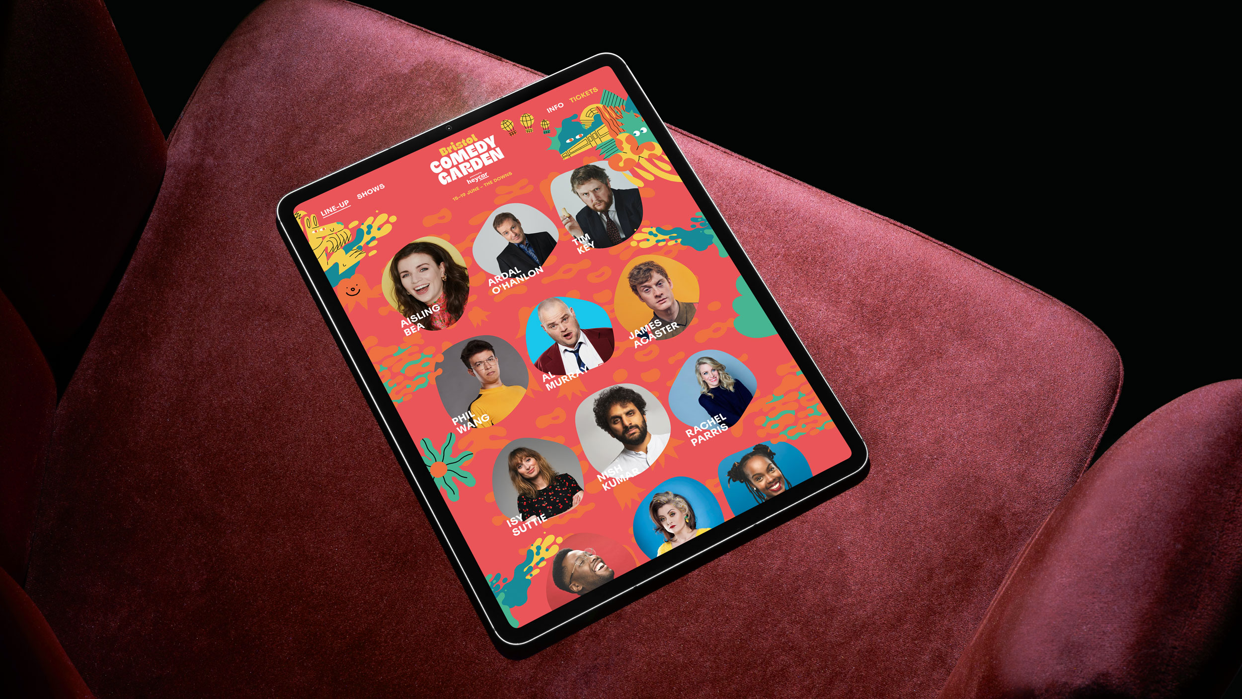
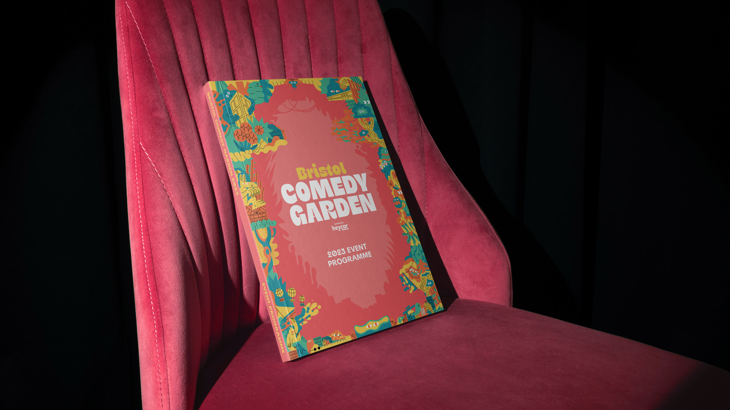
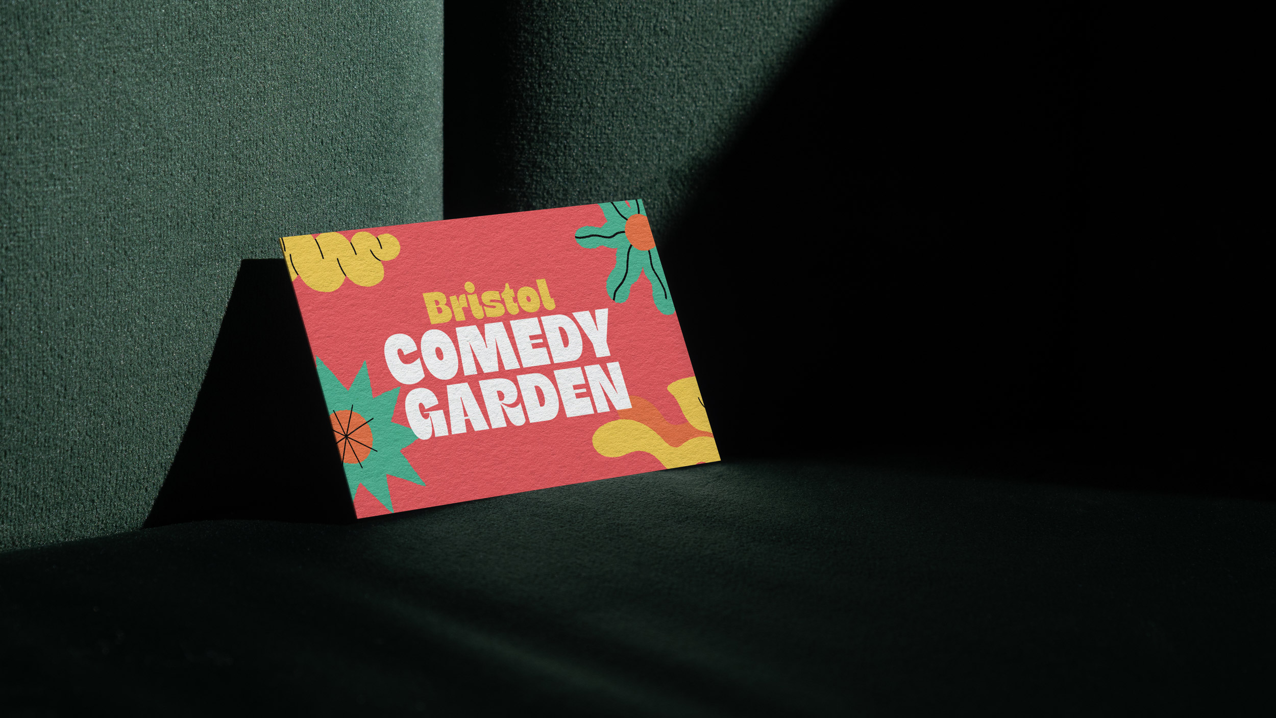
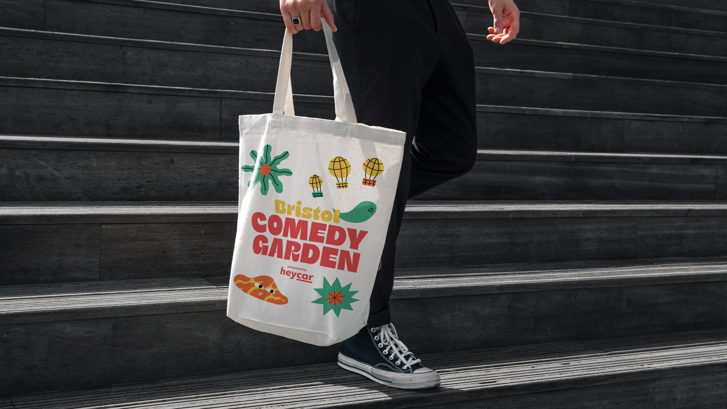
In previous years, the festival had commissioned an illustrator to supply a toolkit of illustrations that were implemented in a sparse and minimal fashion. After discussions with the client, we decided to expand and develop this and build a fully-illustrated border, packed with characters and interesting colourful abstract shapes. We spent time researching a suitable illustrator that would convey the right mix of fun and creativity, whilst not appearing too ‘childish’. After whittling down a huge list of potentials, we selected Zac Fey, an Melbourne based illustrator with an arsenal of awesome odd-ball figures.
In Zac’s illustration brief we asked for: ‘dark and twisted, colourful, full of fantastical, freaky exotic plants, flowers and foliage, with hybrid characters: animal-like humans and human-like animals. From being fans of Zac’s for a while, we knew he would nail the brief, which he did with ease – the resulting imagery was exactly the right mix we had been looking for.
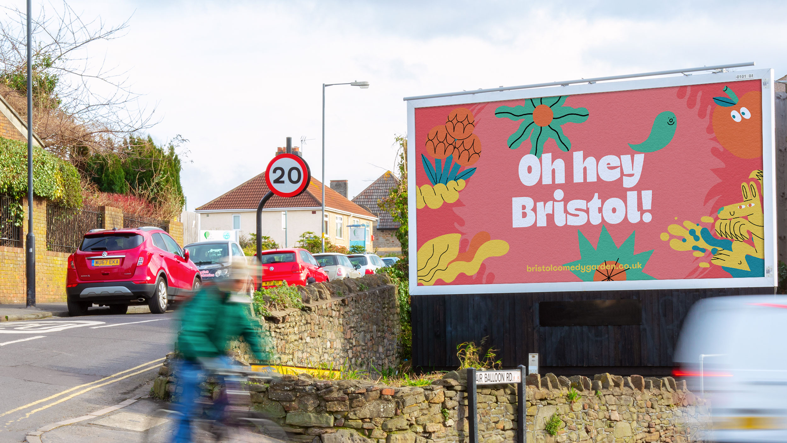
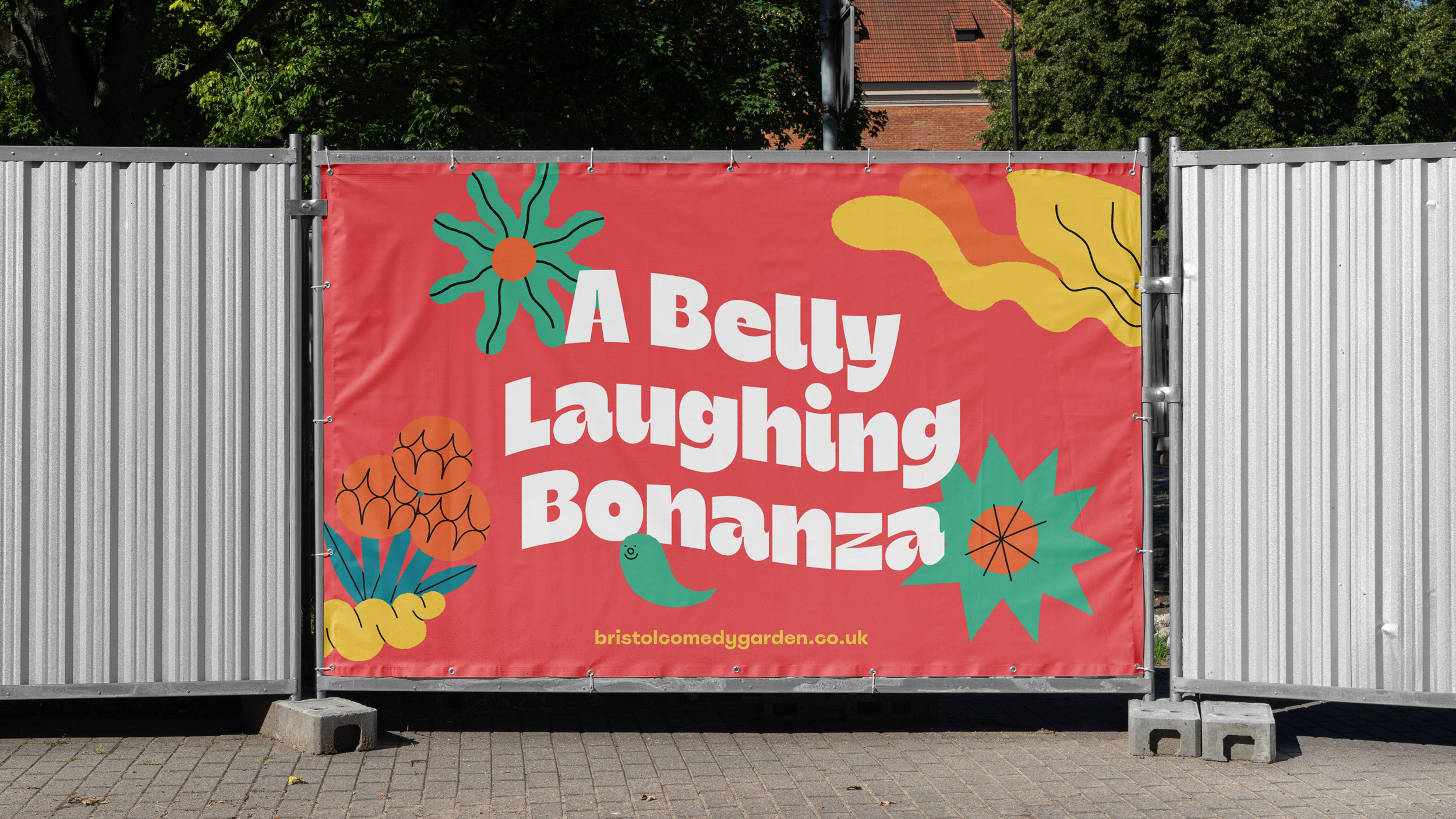
To expand on the fun, maximalist concept, we created a curvy and characterful logotype, the chunky letterforms were designed to fill the space at the top of the poster and shout the event name. We also introduced a bold and playful supporting typeface, with descenders on the y’s and g’s reminding us of big smiles – providing bags of personality throughout the brand identity.
We knew that the illustrations had to be flexible enough to be re-worked for event signage, social media and web use. Having a vast toolkit of wonderful characters and abstract shapes allowed us to make every aspect of the brand identity varied and exciting, whilst also maintaining a level of consistency.
One of the biggest challenges was that the Bristol Comedy Garden was one of four events in the schedule – the events all needed to be differentiated from each other but have a similar aesthetic. We solved this by working on four different but complimentary colour palettes that could be applied to each festival location, and had some bespoke site-specific illustration elements, so that each poster had subtle differences. This allowed the posters to be distinctive, yet work as a series.
The final outcome is a unique and exciting brand for Bristol Comedy Garden, that perfectly captures the playful fusion of good times and belly laughs.
CREDIT
- Agency/Creative: Oat Studio
- Article Title: Bristol Comedy Garden Event Branding by Oat Studio
- Organisation/Entity: Agency
- Project Type: Identity
- Project Status: Published
- Agency/Creative Country: United Kingdom
- Agency/Creative City: London
- Market Region: Global
- Project Deliverables: 2D Design, Advertising, Brand Design, Brand Identity, Environmental Graphics, Graphic Design, Typography, Web Design
- Industry: Hospitality
- Keywords: Comedy Festival, Brand Identity
-
Credits:
Illustration: Zac Fay


