Shivelight Premium Beverage Co. came to CF Napa Brand Design to revamp their packaging design for their premium line of shrubs. Their brand name “Shivelight” refers to the factions of light that stream through the leaves of trees, much like how the shrub illuminates and enlivens whatever beverage it’s mixed into.
From the brand: “Our name references the beautiful scene of fractured light through the forest one can observe during mid-day. In Montana, where we are still creating shrubs, there is an abundance of trees and light, and the breathtaking shivelight they together produce. We started with a vision to recreate this optic inspiration as a drinking experience. By meticulously mixing the abundant agriculture provided by our pristine landscape into a pure shrub beverage, we hope that you too can enjoy the wild and delicious flavors of nature, stimulating more than your taste buds, but the peace and well-being nature gifts us. At Shivelight, we are confident that our shrubs are world class quality. Our time-tested method and thoughtfully sourced recipes are something that will never change. We invite you to take part in our story, experiencing the difference in our quality as you are then transported to an enchanted forest where the light beams through the trees and warms your heart for years to come!”
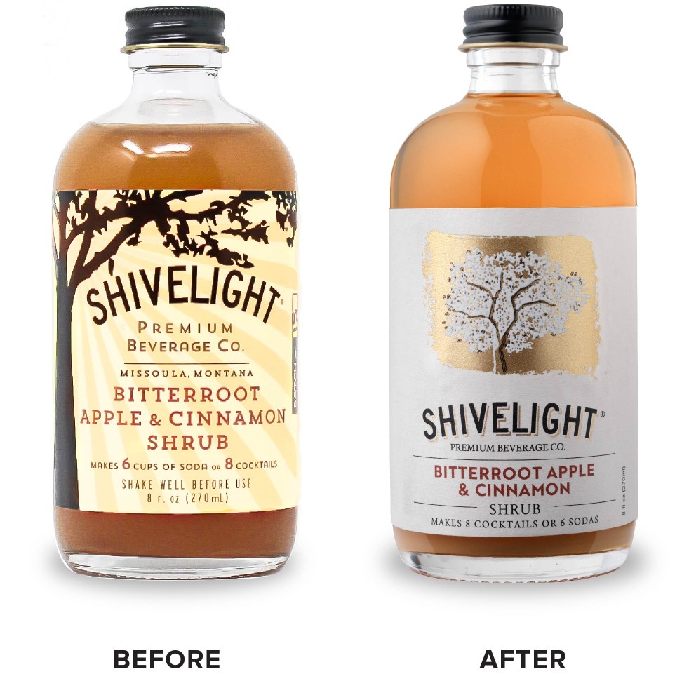
The new packaging design needed to better represent the visual phenomenon of shivelight while also accentuating the brand’s position as a high-quality mixer made with natural ingredients and handcrafted in Missoula, Montana.
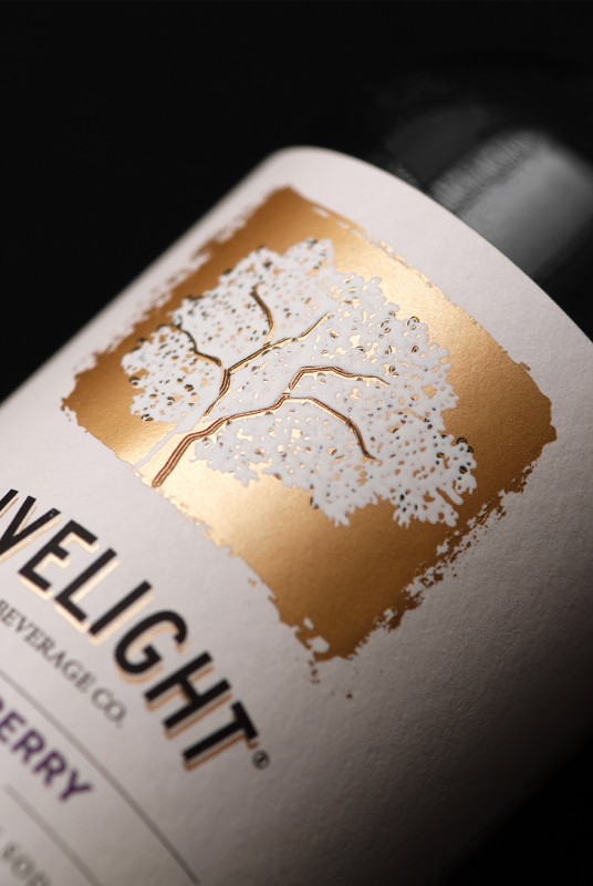
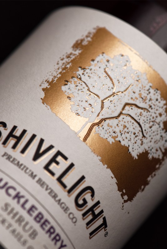
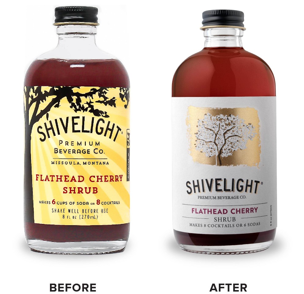
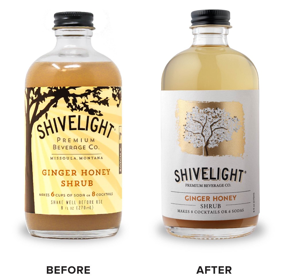
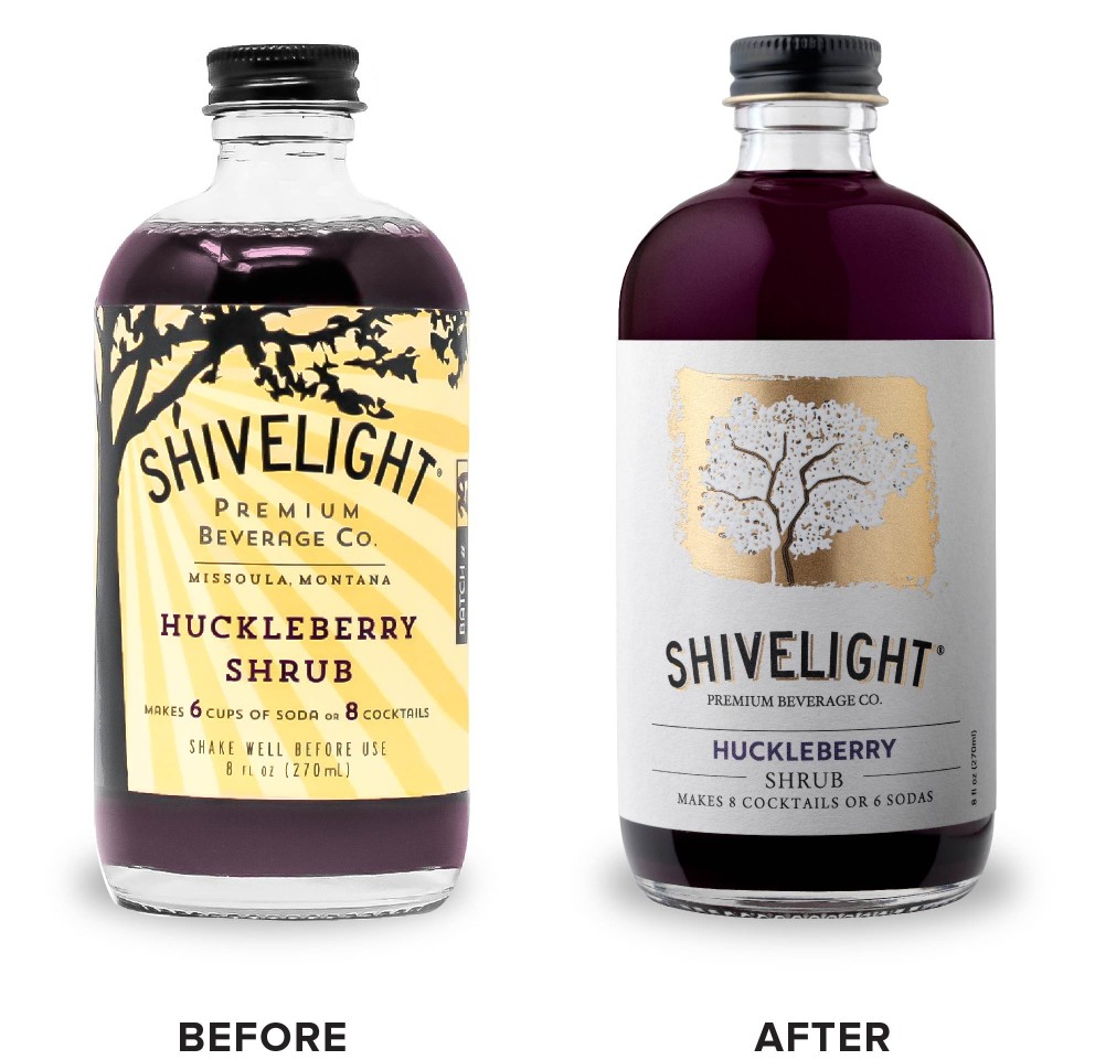
CF Napa Brand Design captured the concept of shivelight by developing a tree as the main icon. The tree is juxtaposed within an organic swath of gold foil and leaves are dappled in gold foil throughout the tree. The refined wordmark was carried from their old packaging as a brand equity element and accented with gold foil to tie it to the new graphic icon.
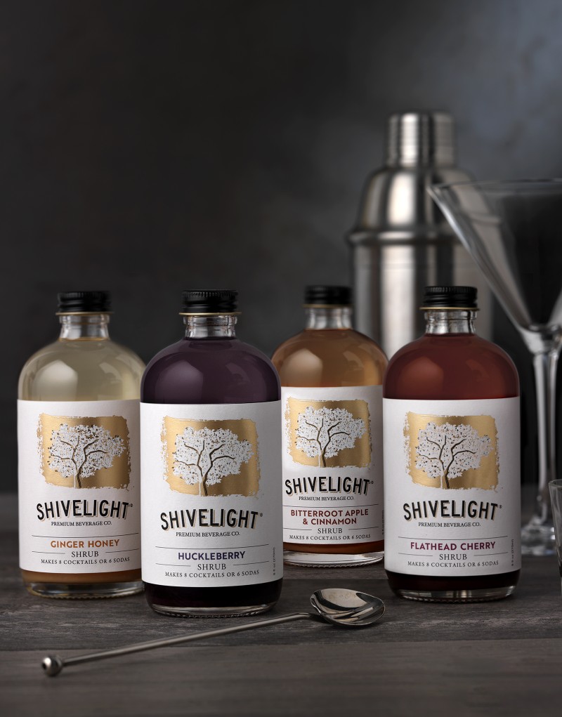
A clean, light cream label with simplified type gave the shrubs an apothecary sensibility. The flavor names were color-coordinated with each of the shrubs’ liquid colors to allow for easy differentiation between flavors:
– Bitterroot Apple & Cinnamon
– Flathead Cherry
– Ginger Honey
– Huckleberry
For an extra tasty detail, each of the four flavors include a recipe for a classic cocktail specifically tailored to accentuate each flavor profile.
CREDIT
- Agency/Creative: CF Napa Brand Design
- Article Title: CF Napa Shines New Light on Premium Shrubs
- Organisation/Entity: Agency
- Project Type: Packaging
- Project Status: Published
- Agency/Creative Country: United States
- Agency/Creative City: Napa, United States
- Market Region: North America
- Project Deliverables: Art, Art Direction, Brand Architecture, Brand Design, Brand Identity, Brand Mark, Brand Redesign, Brand Refinement, Brand Rejuvenation, Brand Strategy, Branding, Creative Direction, Design, Graphic Design, Icon Design, Identity System, Illustration, Label Design, Logo Design, Packaging Design, Rebranding
- Format: Bottle
- Substrate: Glass, Glass Bottle, Metal, Pulp Paper
- Industry: Food/Beverage
- Keywords: CF Napa Brand Design, Shivelight, Shrub, Mixer, Packaging, Packaging Design, Graphic Design, Branding, Illustration, Montana
-
Credits:
Design Agency: CF Napa Brand Design


