ARCTIC-A a new Russian brand of environmentally friendly household chemicals based on natural ingredients. Modern production allows us to create natural and safe cleaning products for the whole family at affordable prices. ARCTIC-A does not use perfume in its products, so detergents and cleaners ARCTIC-A are suitable for children and people with sensitive skin. All ARCTIC-A products are effective, safe and completely washable with water.
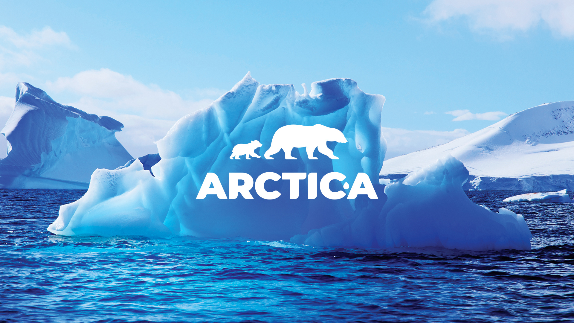
ARCTIC-A is inspired by the purity and freshness of the Arctic nature. Therefore the brand idea is based on associations with the cleanliness and minimalism of the Arctic. The symbol of the polar bear and cubs, conveys the association with cleanliness, and the mother’s care for her child and family.
The studio’s brief was to create a logo and package design for a line of detergents and cleaners. The design had to convey the eco-friendliness of the product’s composition, its safety for the family and children, and the message of the brand’s values to the consumer through the visual component.
In the first phase of the work the logo of ARCTIC-A household chemicals brand was developed. The client was given several logo variants to choose from. The version of the logo with the bear and teddy bear, according to customer feedback, was a “direct hit. Because it fully captures the essence and conformed to the values of the new brand of household chemicals. The smooth lines of the logo do not cause rejection and convey associations with the safety and mildness of the detergents.
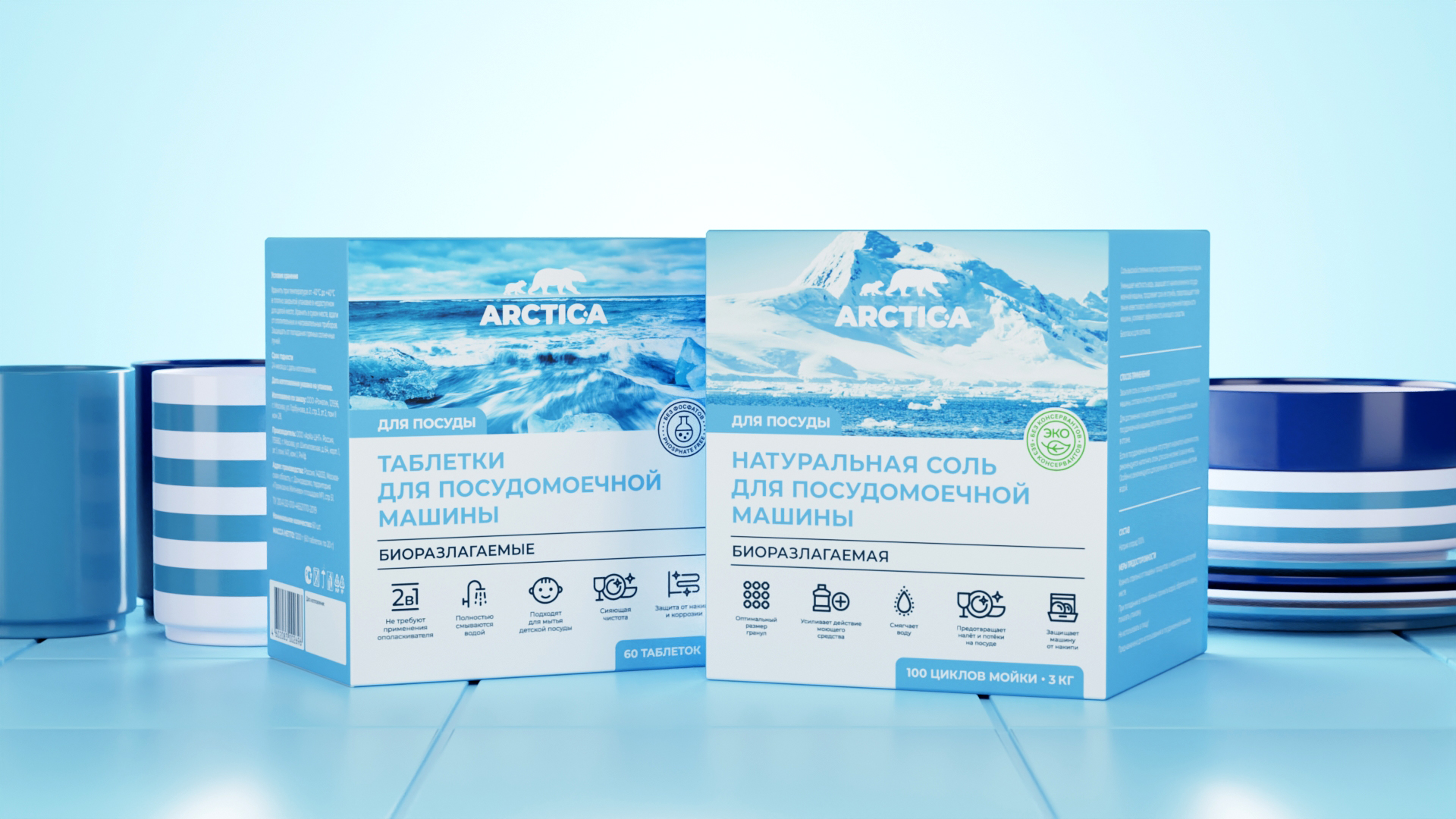
The next step was the development of the packaging design concept of eco-friendly household detergents. At the initial stage, the customer voiced the wishes, which should have been taken into account in the design of the package. The package had to contain the cleanliness of detergent usage, eco-friendly composition and value advantages and at the same time to be “visually pure and minimalistic”, like the nature of the Arctic. Also, the client has already assembled a visual design moodboard.
And in general it is worth saying that during the whole work on the design of the package, we built close and friendly communication between the art-director and the client’s representatives. It allowed us to achieve maximum results in work in quite a short time.
As a result of work on the design of household chemical products packaging the client was given several solutions, among which the choice was given in favor of the variant with the image, translating the nature of the Arctic.
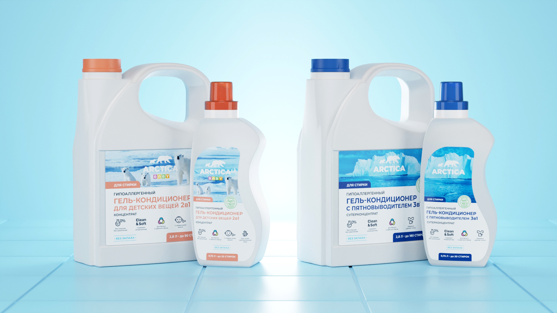
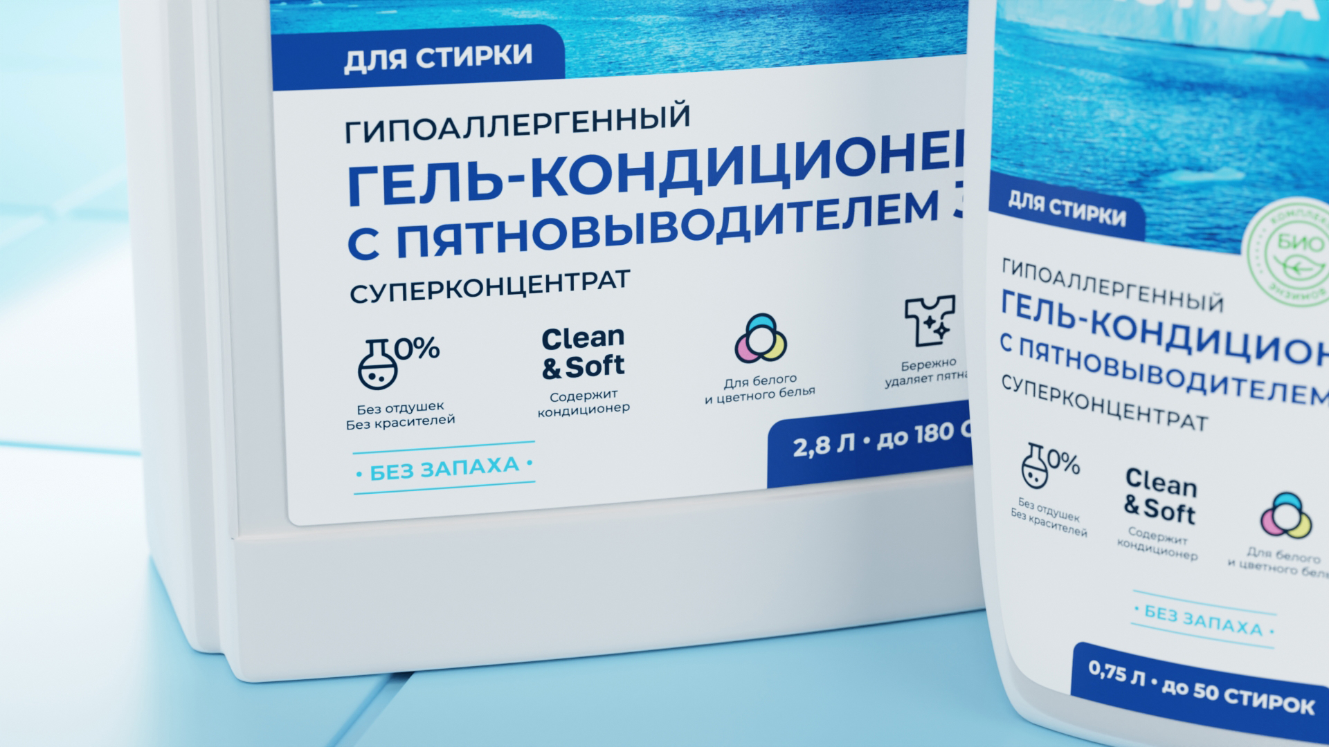
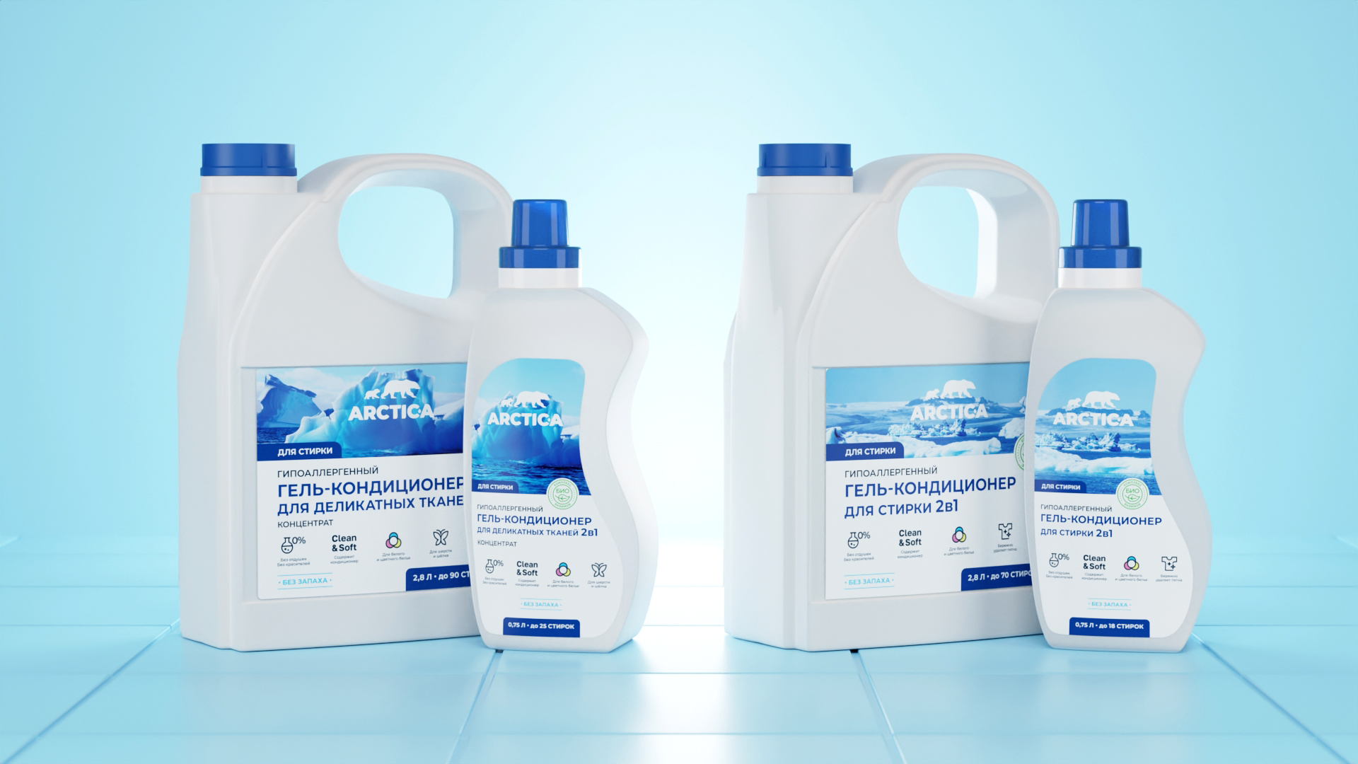
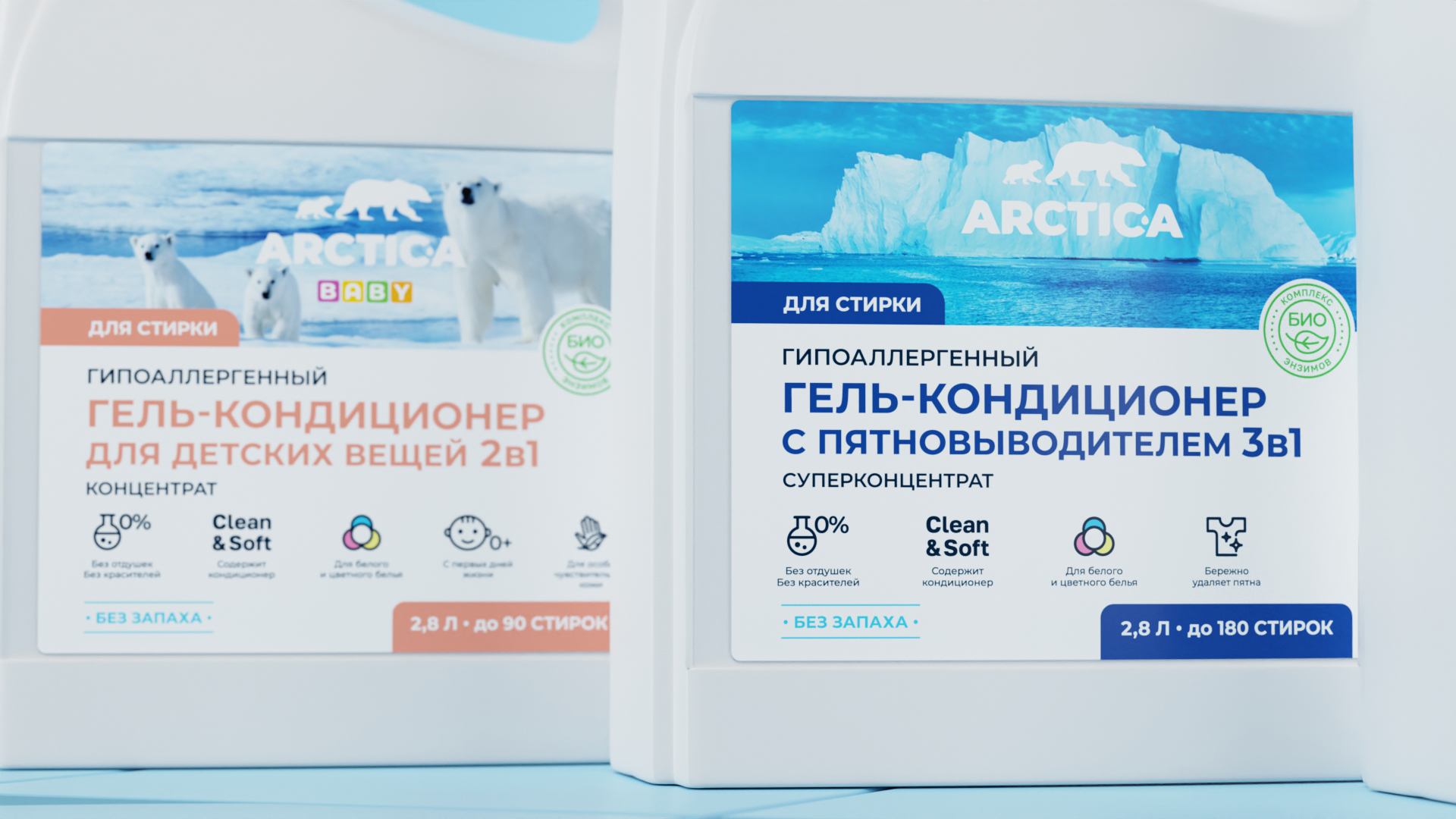
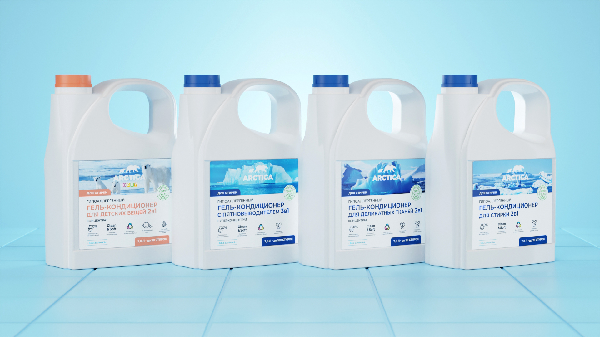
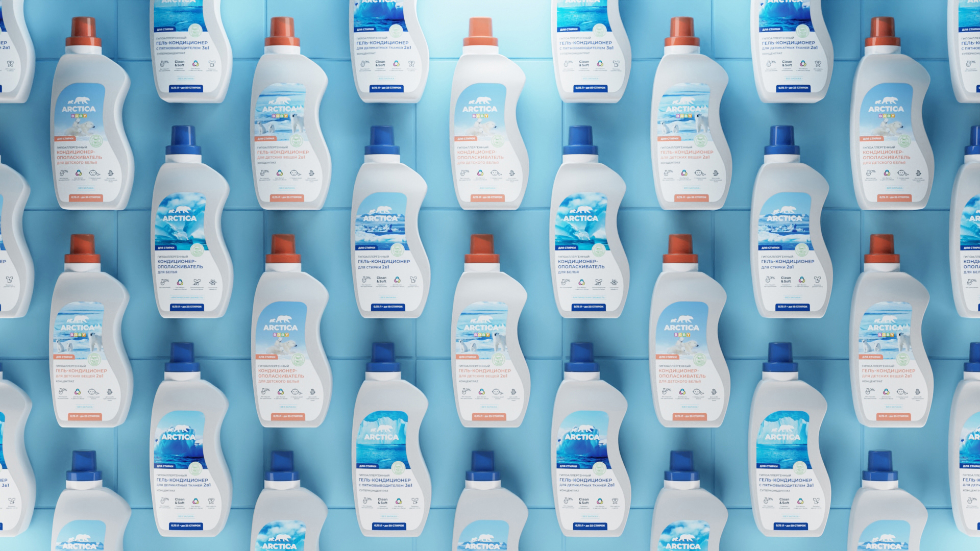
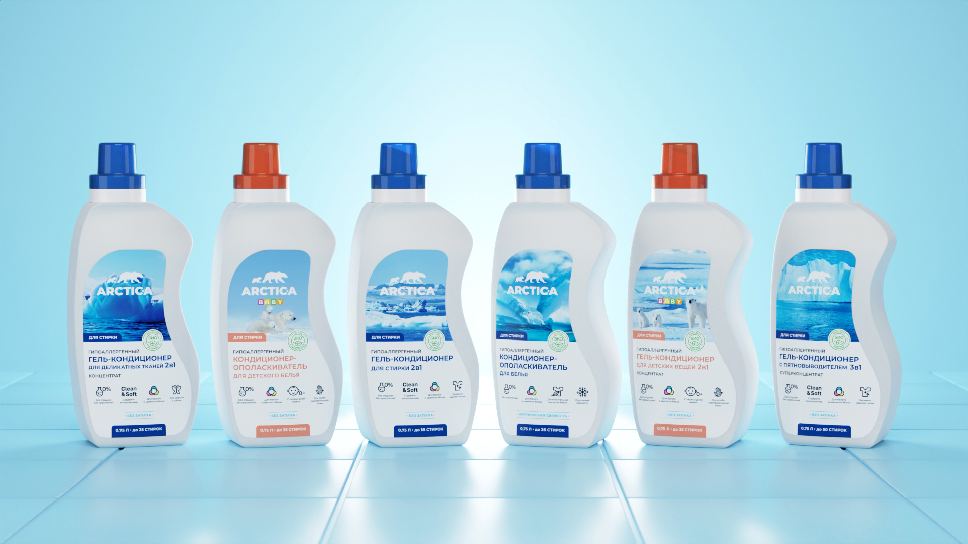
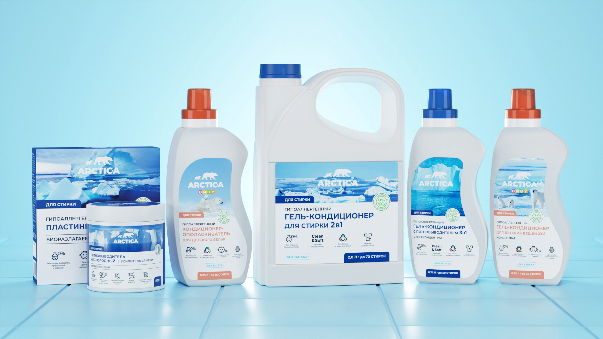
Ecological and clean component of the brand was shown by means of accurate layout and geometry of used fonts. At the top of the label and package design is the image and logo area. This part of the design is designed to attract the consumer and evoke associations with the cleanliness and environmental friendliness of the brand, as well as increase the recognition and memorability of the product. The lower part of the package design is designed to inform the consumer about the product and its benefits. Therefore, in this area, in addition to the name of the detergent, it was decided to place icons with information about the product and its benefits.
To differentiate among the detergents and their purpose within the line, color coding was developed. For example, for laundry detergents the design uses blue, for dishwashing it uses blue. For the children’s line of detergents, in addition to the orange color in the design, an additional version of the logo with the descriptor “baby” is used. Differentiation in the line of detergents is made by changing the images at the top of the package.
All the information on the composition and use of detergents and other technical information was clearly structured and laid out on the back of the package.
As part of our work on the packaging design, we also adapted the labels and packaging to different formats.
As a result, we developed the design of a new line of household chemicals, which will allow the brand to stand out among competitors, attract the attention of potential customers and increase product loyalty.
CREDIT
- Agency/Creative: Yeti Design Studio
- Article Title: ARCTIC-A Detergent Packaging Design
- Organisation/Entity: Agency
- Project Type: Packaging
- Project Status: Published
- Agency/Creative Country: Russia
- Agency/Creative City: Lipetsk
- Market Region: Europe
- Project Deliverables: 3D Modelling, Art Direction, Brand Design, Brand Mark, Branding, Design, Label Design, Logo Design, Packaging Design
- Format: Bottle, Box, Can
- Substrate: Plastic, Pulp Carton, Pulp Paper
- Industry: Retail
- Keywords: detergent household chemicals ecology packaging label
-
Credits:
Art director & design: Igor Vetoshkin


