The Brief
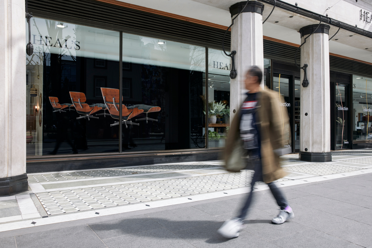
The iconic London-based furniture and homeware brand is extending their flagship store to encompass an entire ground floor block on Tottenham Court Road. Heal’s wanted to promote this new, expanded space as a location that customers can physically experience and go to enjoy the iconic pieces of design that they sell.
The Creative Idea
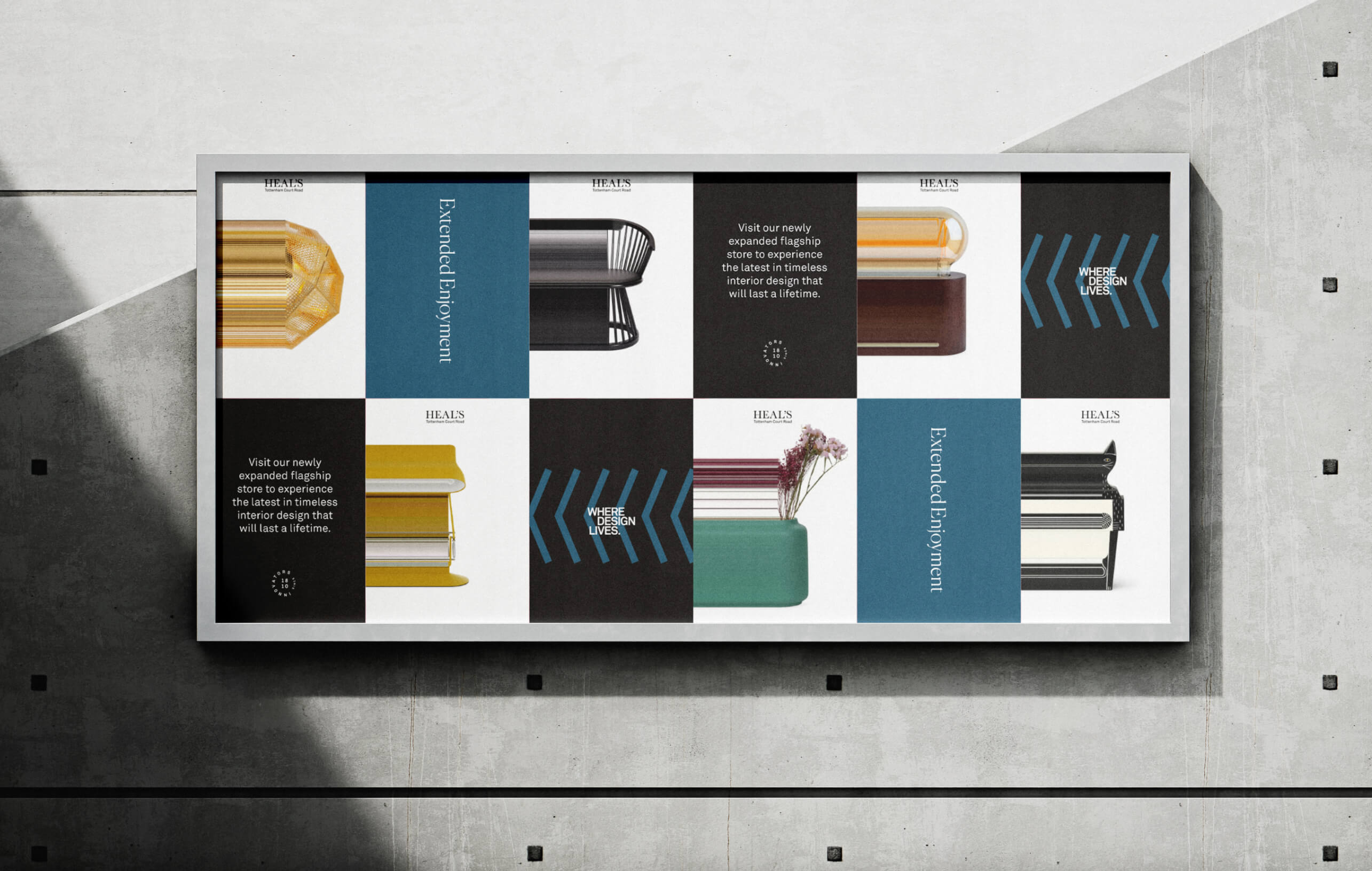
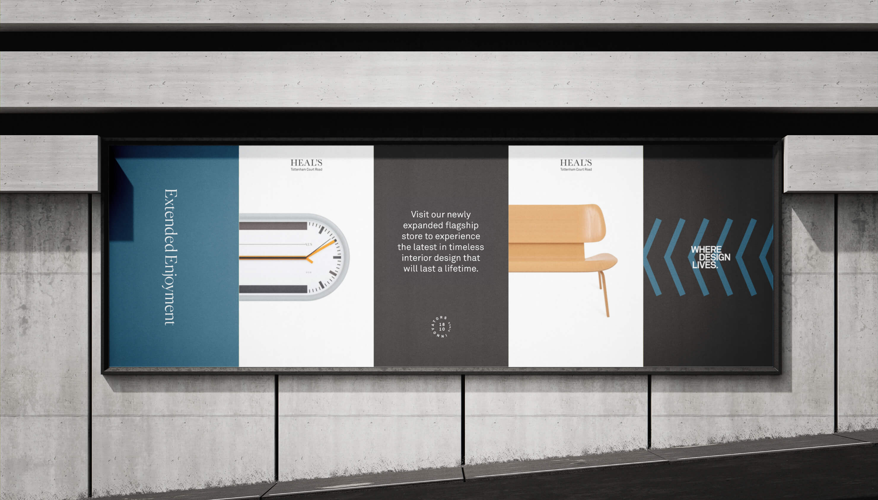
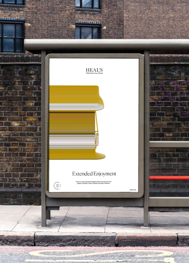
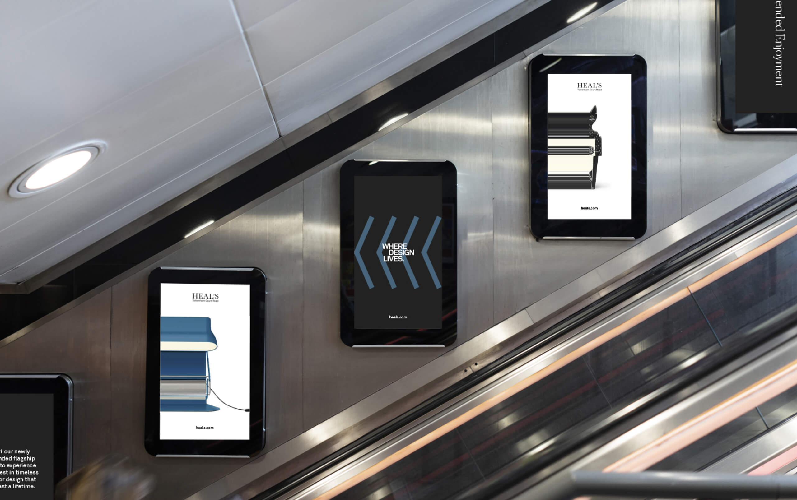
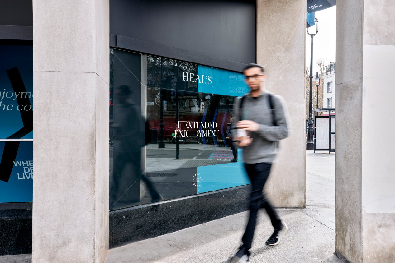
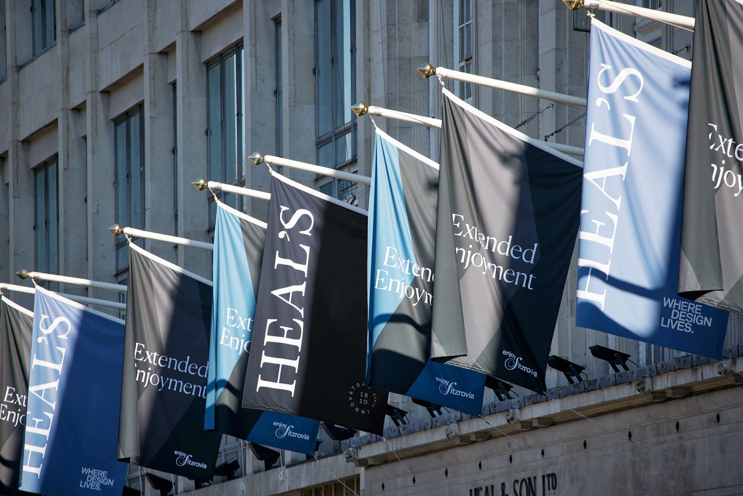
We developed the campaign line ‘Extended Enjoyment’ as a connection between the physical extension of the store, Heal’s timeless designs, and the furniture’s long lasting quality, all of which mean ‘extended enjoyment’ for the consumer. A graphic image treatment of extending product imagery visualises the campaign line and mimics the store extension that always goes to the left, whilst further developing a flexible ‘split’ graphic system that Deep introduced when we rebranded Heal’s in 2020. Bold graphic arrows are derived from some of Heal’s heritage posters, another nod to the brand’s longevity. Flyposter style advertising billboards were installed across London and print advertising featured in design magazines. Animations add weight to the campaign and make it more immediate and impactful on social and digital advertising spaces.
The Results
The Tottenham Court Road store was triumphantly officially re-opened on 28th April, supported by the campaign that was pushed through digital marketing channels, outdoor advertising and in-store promotions, to contribute towards driving footfall to the iconic flagship store in the coming months.
CREDIT
- Agency/Creative: Deep
- Article Title: ‘Extended Enjoyment’ Campaign: How Heal’s Promoted Its Flagship Store Extension
- Organisation/Entity: Agency
- Project Type: Campaign
- Project Status: Published
- Agency/Creative Country: United Kingdom
- Agency/Creative City: London
- Market Region: Europe
- Project Deliverables: Advertising, Creative Direction, Motion Graphics
- Industry: Retail
- Keywords: Heal's, Brand, Campaign, Advertising, Billboards
-
Credits:
Lead Designer: Stuart Lamont


