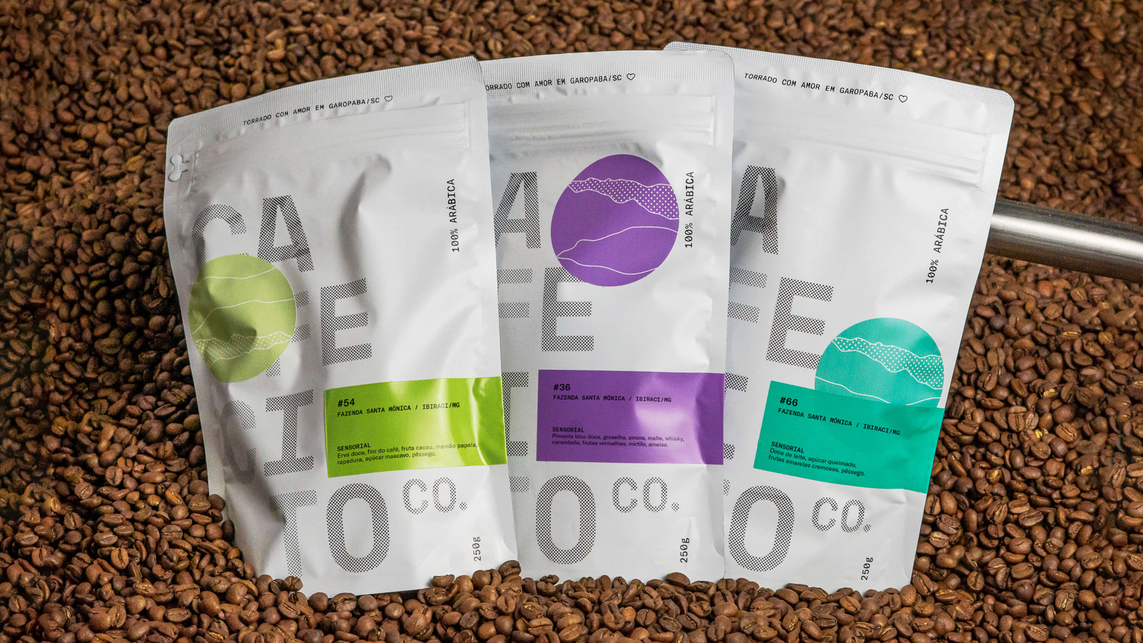
Cafecito Co. is a brand of specialty coffees with roasting and coffee shops in Garopaba/SC and Balneário Camboriú/SC – Brazil. A company that values and is close to the entire coffee process, from knowing the farms and producers to distributing the product to customers and other coffee shops in Brazil. The need to create a new visual identity and packaging emerged with the expansion of the business, considerably increasing the amount of roasted coffee and consequently the varieties of beans. The project, with a contemporary visual language and infinite color combinations, represents the company’s new moment, much more mature and confident about its personality.
The main challenge of the project was to create a visual system that could adapt to the different points of contact with the brand, such as architecture, packaging, clothing, and products, without being repetitive and monotonous. It was also necessary for the brand to be able to keep pace with the company’s rapid growth without becoming old-fashioned. The letters of the logo are presented in different layouts, horizontally and vertically stacked, filled, or with a reticule. Many stickers were created to reinforce the adaptable characteristics of the brand and expand the visual universe with the public. The circular stickers add color to different objects of the brand and can be used on the packaging, transport boxes, purses, bags, and any other asset.
The brand’s new visual language was applied in the architecture of the coffee shops, uniting industrial elements, plants, and art objects in a modern and cozy environment. Less than a year after launching the new brand, Cafecito Co. moved to a new address in Garopaba/SC/Brazil and opened a new operation in Balneário Camboriú/SC/Brazil.
The main packaging challenge was to create a contemporary visual system that made it possible to create different versions of each new variety of grains, with low production costs. We created a white main packaging with black printing. This packaging is produced on a large scale and is used for all coffees. To differentiate the grains, we developed adhesive labels with technical information, as well as a pack of colored stickers to stick on the packaging along with the labels. Each package is unique, with different positions of the stickers. They are also used in other brand materials, such as boxes, purses, and bags.
![]()
![]()
![]()
![]()
![]()
![]()
![]()
![]()
![]()
![]()
CREDIT
- Agency/Creative: Céu Design
- Article Title: Cafecito Co. Branding and Packaging Design by Céu Design
- Organisation/Entity: Agency
- Project Type: Identity
- Project Status: Published
- Agency/Creative Country: Brazil
- Agency/Creative City: Jaraguá do Sul
- Market Region: South America
- Project Deliverables: Brand Identity, Branding, Identity System, Packaging Design
- Industry: Food/Beverage
- Keywords: Coffee, Coffee Shop, Coffee Roaster, Cafecito
-
Credits:
Creative Direction: Vítor Scarpato
Design: Vítor Scarpato
Design: Glauber Vilvert
Photography: Lucas Gründling


