Floretto is a project which we developed from the beginning. In other words, our client came to us with an idea, and we gave it form, structure and transformation.
We began with the original concept, which was based on the location name, Vía Primavera, and the sensorial sensations that our client wanted to transmit – that each aroma found in a coffee shop is an incentive for awakening sensual delights, memories and smiles.
In this way, the aromatic path was leading us to the creation of a romantic springtime-like logo with an air of sophistication!
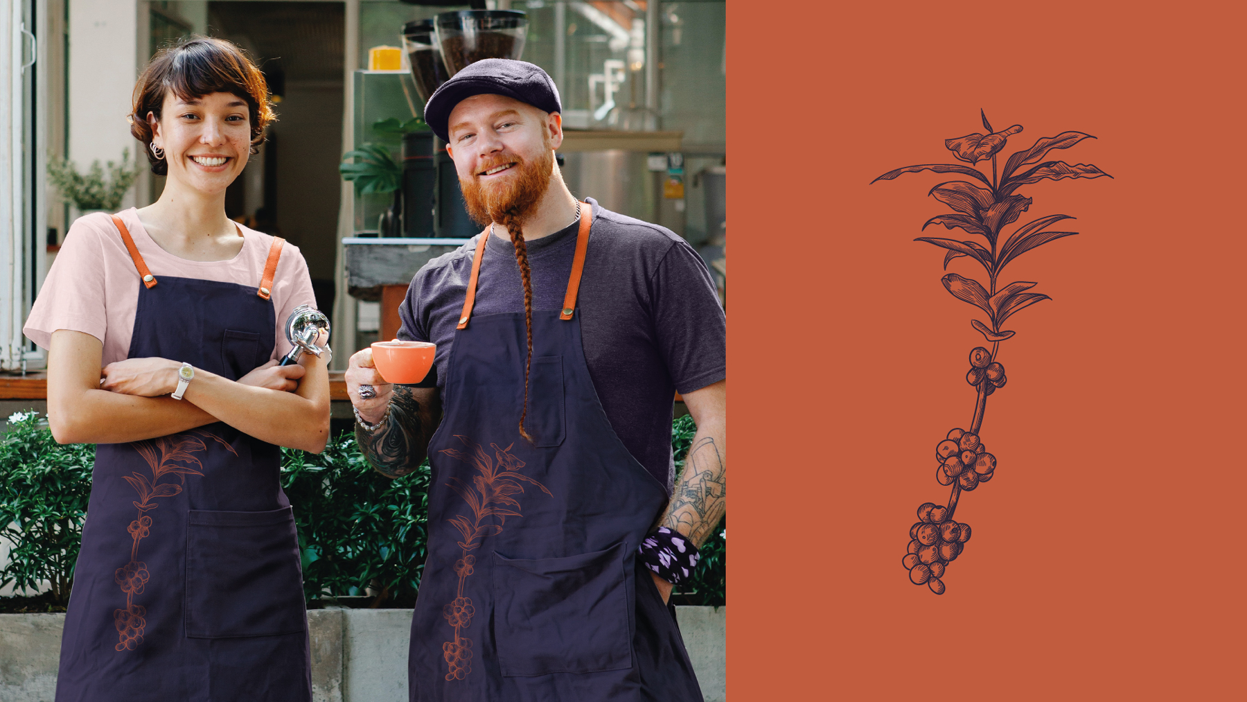
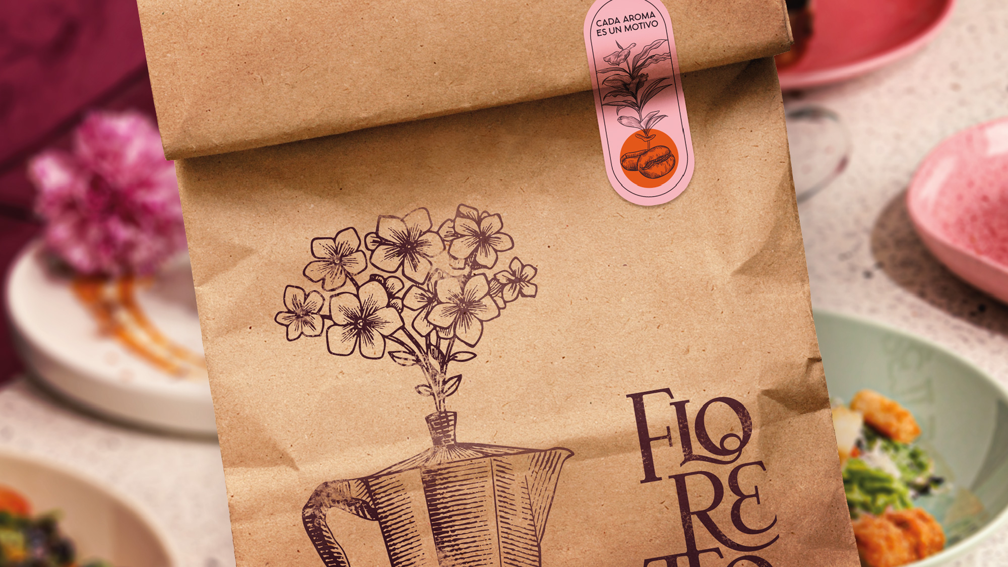
Building on the original concept, we then added flowers and cafeto to the naming process. Flowers because they evoke the aromatic spring season and cafeto, a tree with white perfumed flowers bearing seeds of coffee.
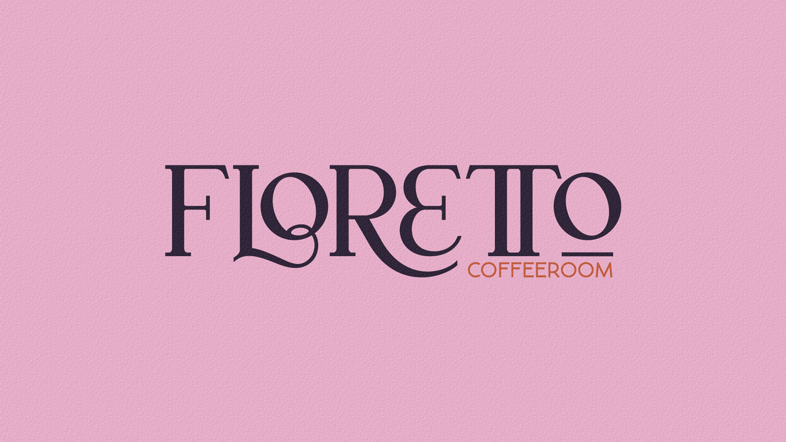
Thus, the sum of these two words created our name: Flores (flowers in Spanish) + Cafeto (coffee tree) = Floretto.
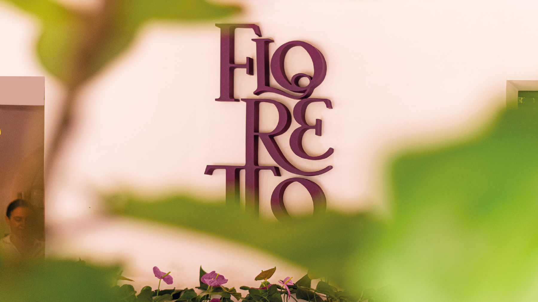
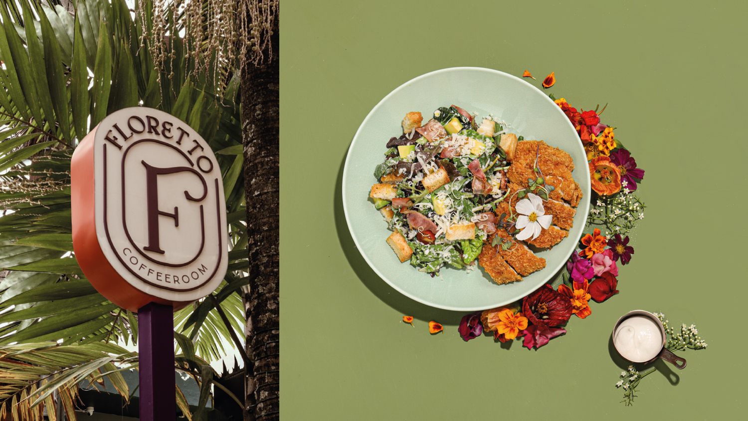
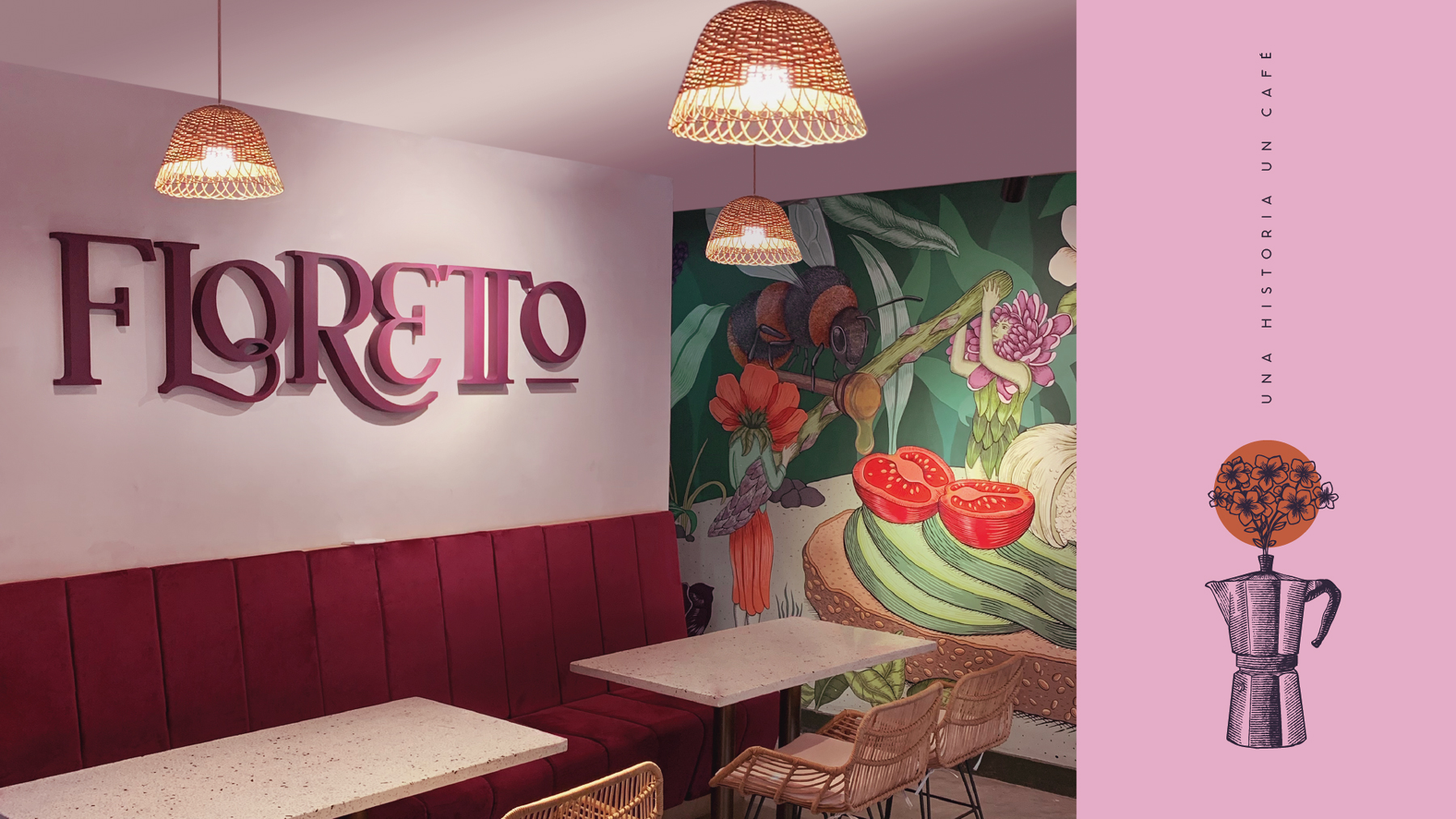
In the name ‘Floretto itself, we embraced the letter “R” with the letter E’ to represent sought-after closeness & connection, and we joined the double letter “T” to further reinforce it.
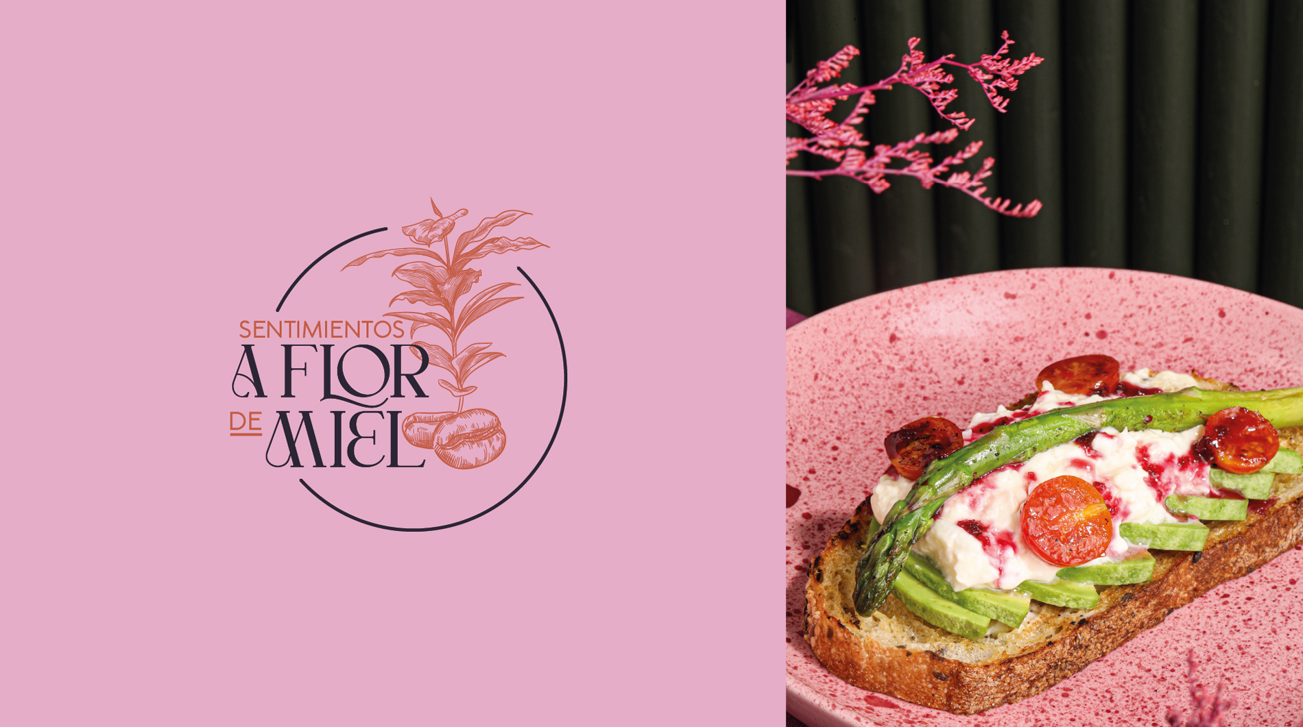
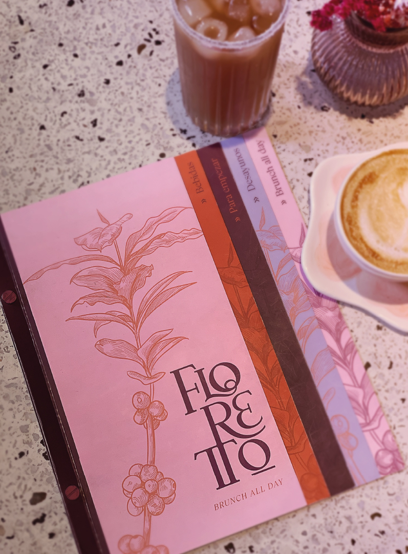
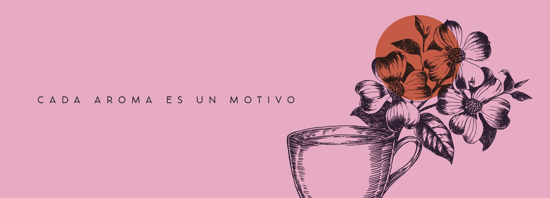
In the graphic world, we paired the sophisticated brand, Floretto, with illustrated collages to make the perfect match. The photography of culinary dishes to accompany their written descriptions were a key factor in developing the menu.
Ultimately, the scent of fresh spring air combined with the color explosion acheived the perfect union in this beautiful garden called Floretto!
Floretto es un proyecto que desarrollamos desde su comienzo, es decir, nuestra cliente llegó con una idea a la cual debíamos darle forma y estructura.
CREDIT
- Agency/Creative: 781studio
- Article Title: Brand Design for Floretto Coffeeroom
- Organisation/Entity: Agency
- Project Type: Identity
- Project Status: Published
- Agency/Creative Country: Colombia
- Agency/Creative City: Medellín
- Market Region: South America
- Project Deliverables: Brand Identity
- Industry: Food/Beverage
- Keywords: coffeeroom, colombia, medellín, branding
-
Credits:
Graphic design: 781Studio


