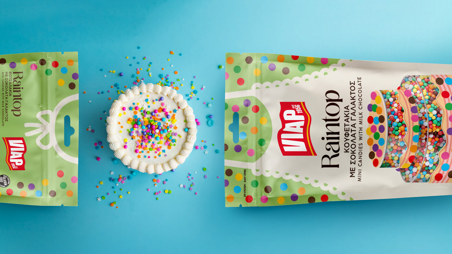
The joy of showering cupcakes and all sorts of sweeties with sprinkles is not to be indulged alone but to be shared, especially with kids. Chocolate ones, pressed into shapes, plain or rainbow, they all fall like rain to add colour and joy, to top the yummy cake just before the first long anticipated bite.
The name Raintop defines the way they look when they shower a dessert and their actual function, which is topping it. The sprinkles fall like rain along with sweet smiles and chatty words while baking together.
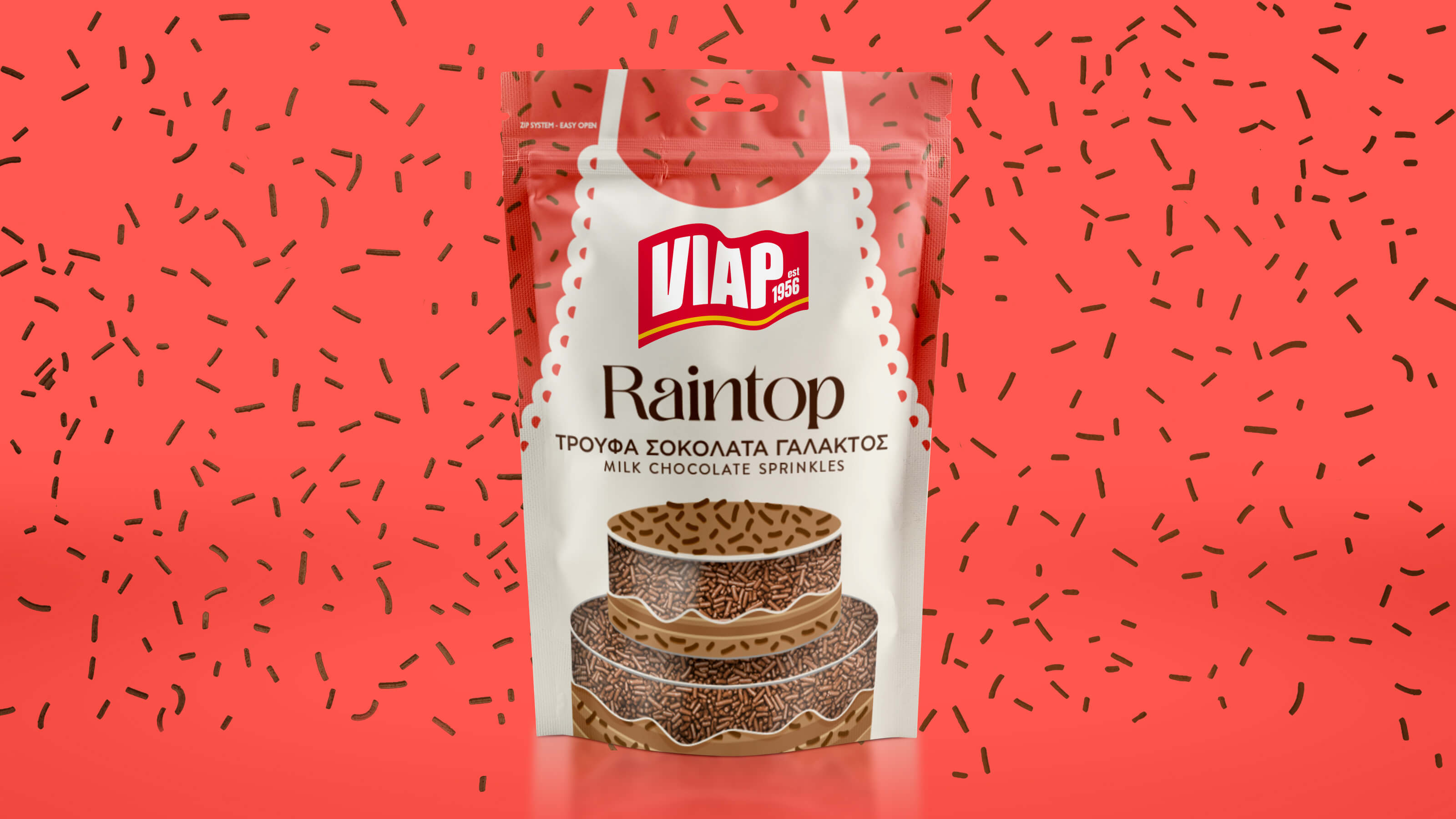
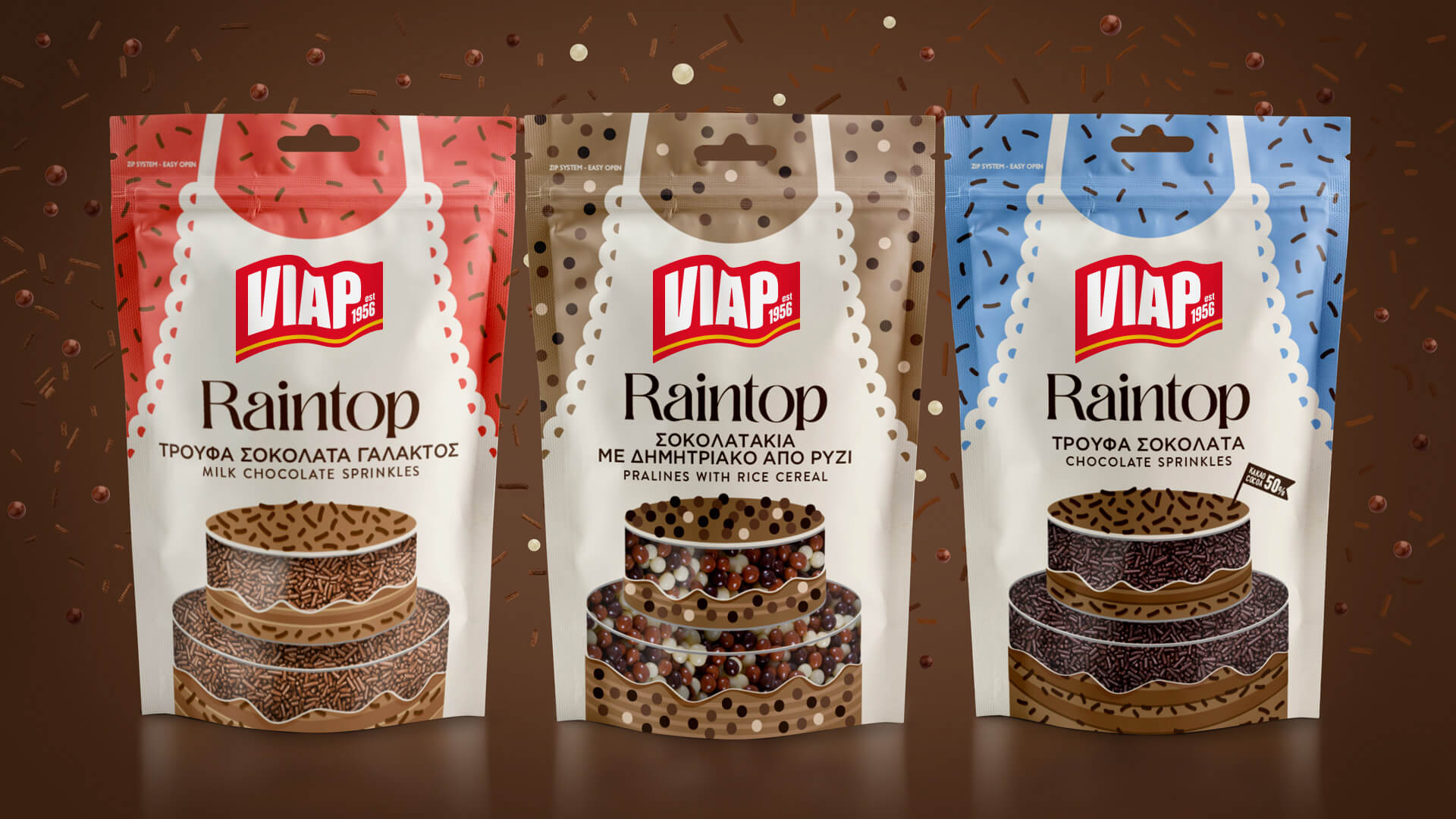
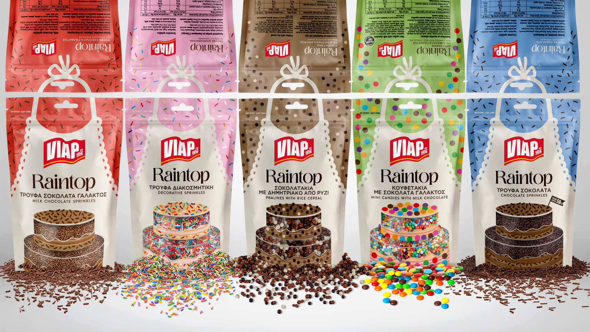
The design transforms the usual little bag into an interesting concept about baking. It’s portrayed as an apron, belonging to an imaginary pastry maker. The yummy cake is presented in front of the apron as if the bag itself is the hero or heroine making the cake. The double layered cake has illustrated sections showing how the product inside is used, but also transparent ones through which we can see the real sprinkles inside the bag.
The apron is not a professional baker’s one. It belongs to the owner of the kitchen, most probably the mother who has made the cake along with the children. The apron has lace finishes as reference of an older period in history, say the homey ‘50s. It’s a decade of endless fun in the kitchen, cooking together and the design wants to convey this sense of carelessness and nostalgia.
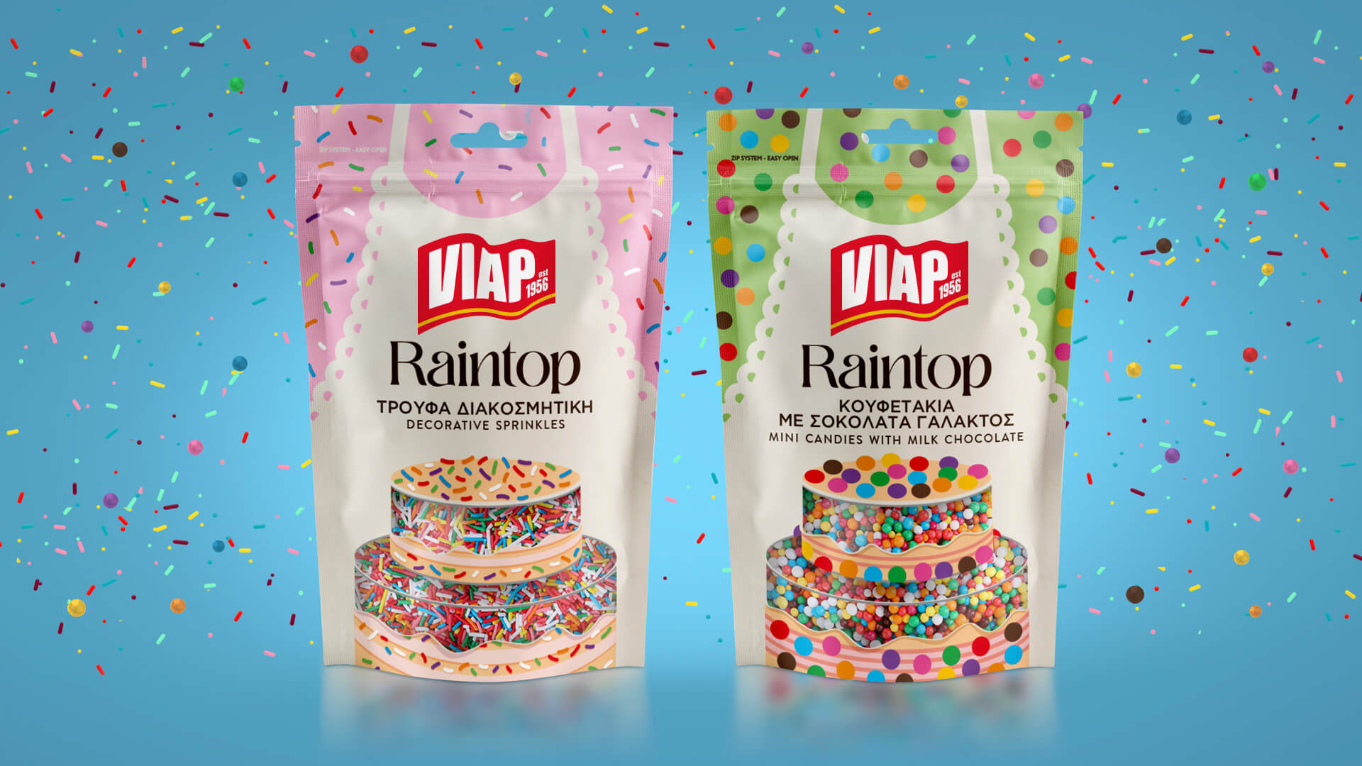
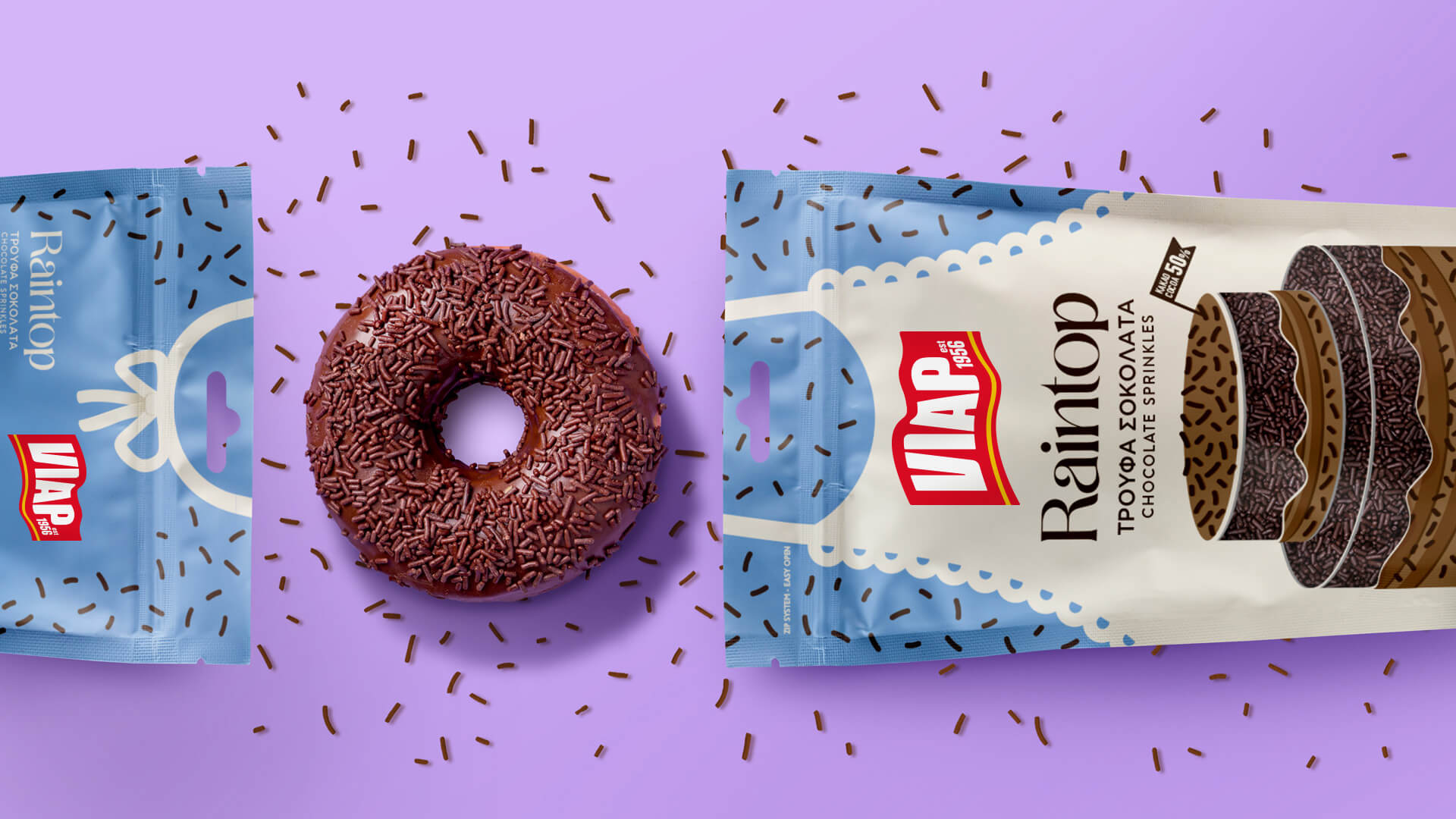
The background of the apron is basically the shirt the mother wears. It’s different in every variant, forming a pattern made of the illustration of products which, at the same time, resembles a shirt pattern. There is a festive mood on every pack transferring the feeling of cooking together with the child and the excitement of making something for the whole family to enjoy. There is a detail at the back of the pack where we can actually see the back side of the apron, as if we can see the neck of the pastry maker.
The typography is round and friendly conveying motherly tenderness and love.
The flag-like logo of the company is a redesign of their old logo – also a flag – which keeps the old elements but bring them to a new century.
Overall, the way the product line has been designed is one that will accept more variants if they come along, without looking boring, dated or uninterestingly similar. The centre-point, the cake is the trigger that differentiates between variants, but the common element, the apron, keeps everything under the same distinctive brand.
CREDIT
- Agency/Creative: A.S. Strategy
- Article Title: Packaging Design for VIAP Raintop Sprinkles by A.S. Strategy
- Organisation/Entity: Agency
- Project Type: Packaging
- Project Status: Published
- Agency/Creative Country: Greece
- Agency/Creative City: A.S. Strategy/Athens
- Market Region: Europe
- Project Deliverables: Graphic Design, Illustration, Packaging Design
- Format: Pouch
- Substrate: Plastic
- Industry: Food/Beverage
- Keywords: food, candy, chocolate, sprinkle, party, decoration, illustration, cake
-
Credits:
Creative Director: Antonia Skaraki


