Consumers are increasingly concerned about their health.
As a result of the pandemic, an ever-increasing number of people are more importantly seeking out foods which can help boost their immune systems. With this in mind, Kaiku challenges us to create a Super Kefir focused on all those who take good care of themselves and want their diet to be healthy.
A “superfood” which shows itself to be natural, with nothing artificial, clearly conveying its benefits at a glance, without compromising on appetite and taste as the deciding factor.
Objectives
To capture consumer interest on the shelf and, as a critical factor, to ensure the Kaiku guarantee is clearly present.
To summarise its benefits for the body at a glance.
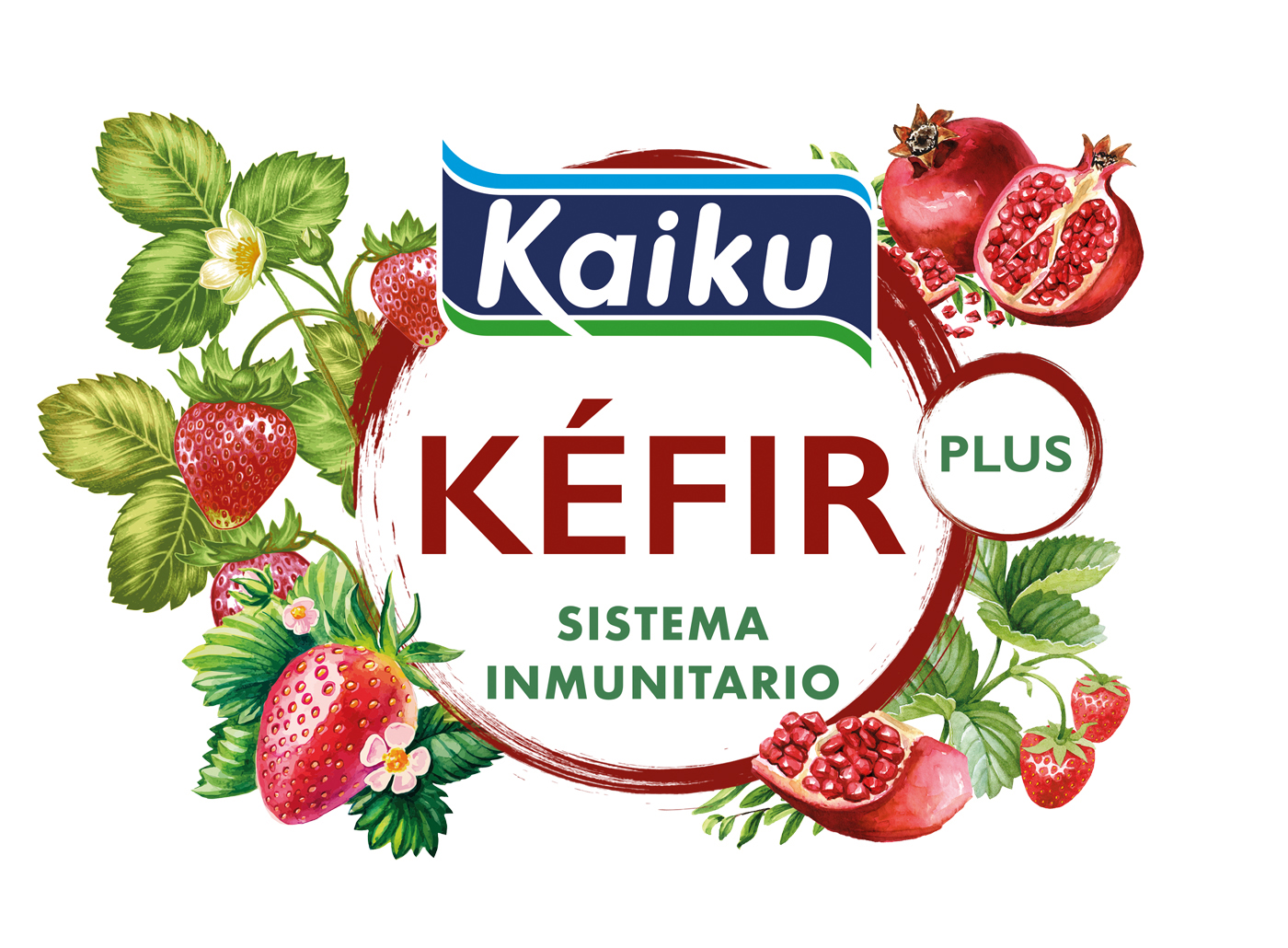
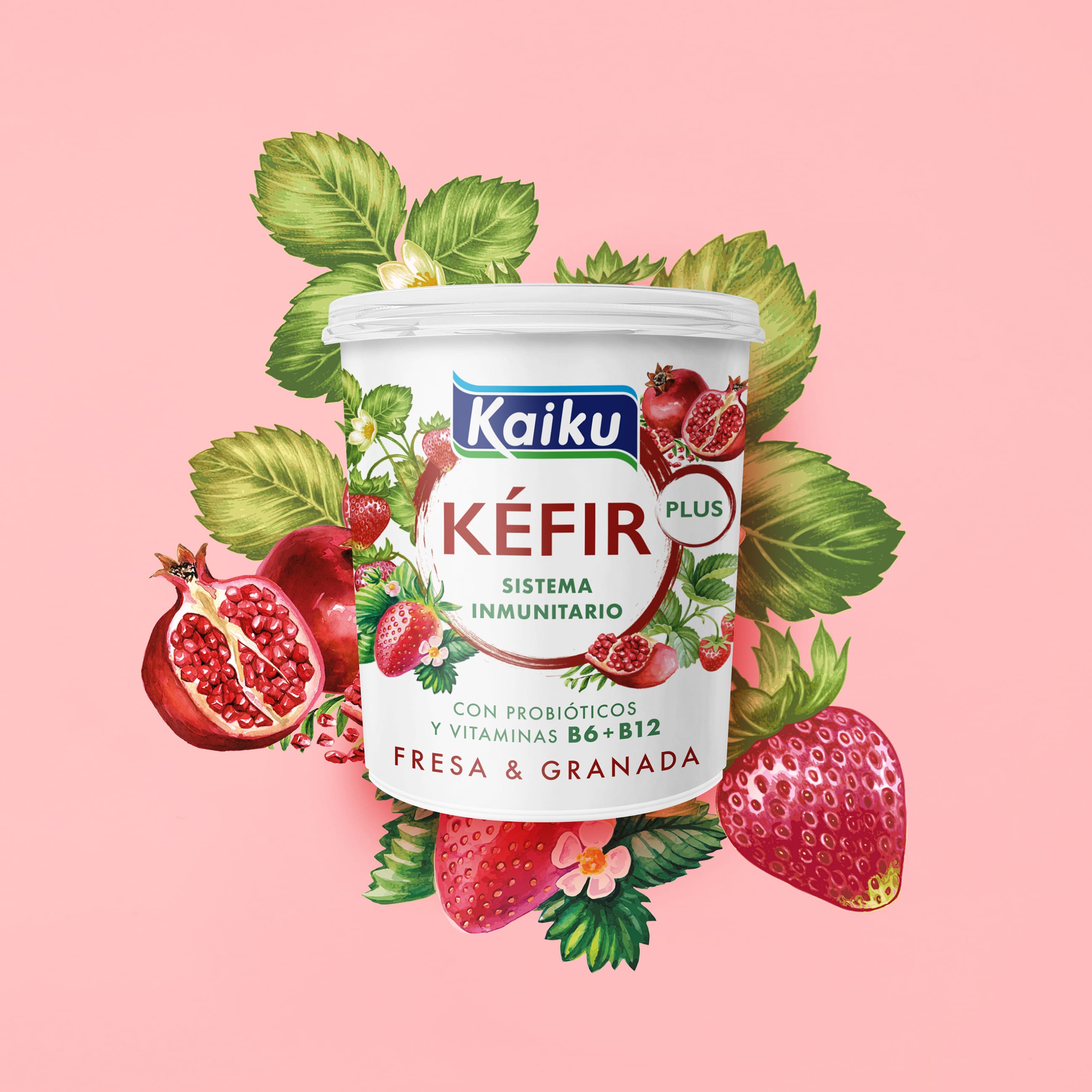
In addition to the benefits of Kefir, to convey those of the fruits which accompany it, and the appetising nature of the product.
Proposal
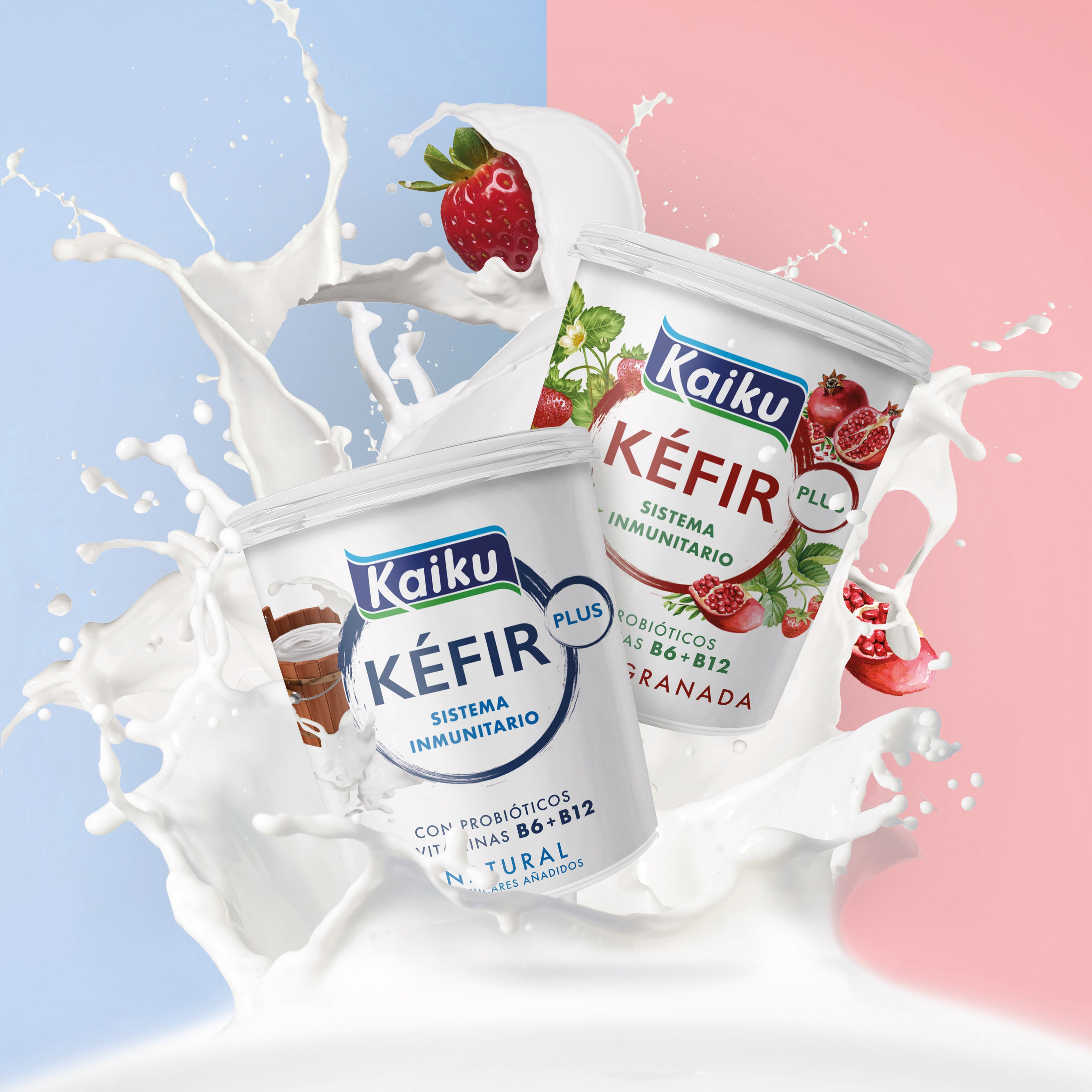
An explosion of flavour and an immune system boost in every spoonful, is how we would sum up our proposal. A very graphic representation of what we offer and how we solve the current need for what we consume to help us make a positive impact on our nutrition without sacrificing taste.
Graphic Solution
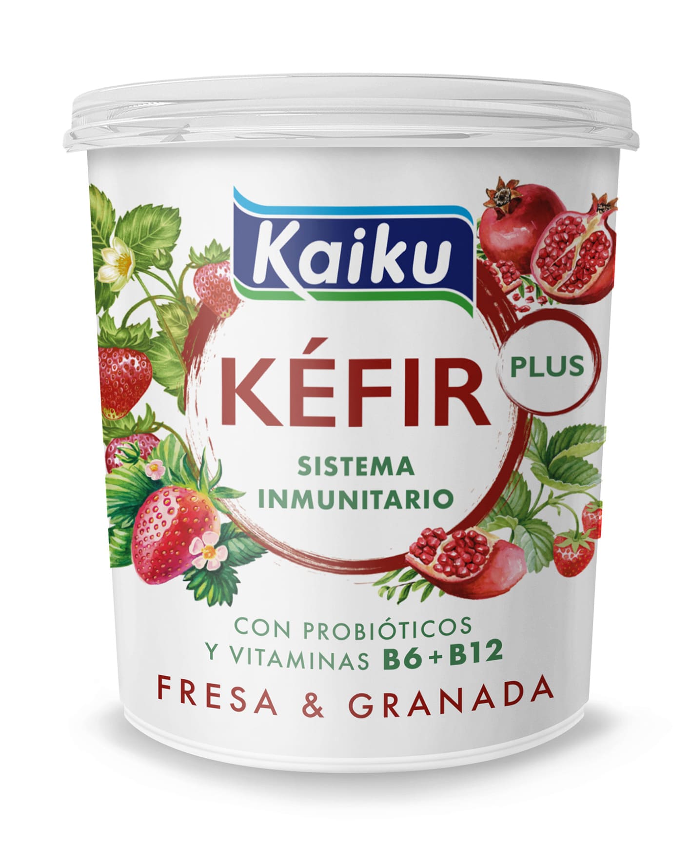
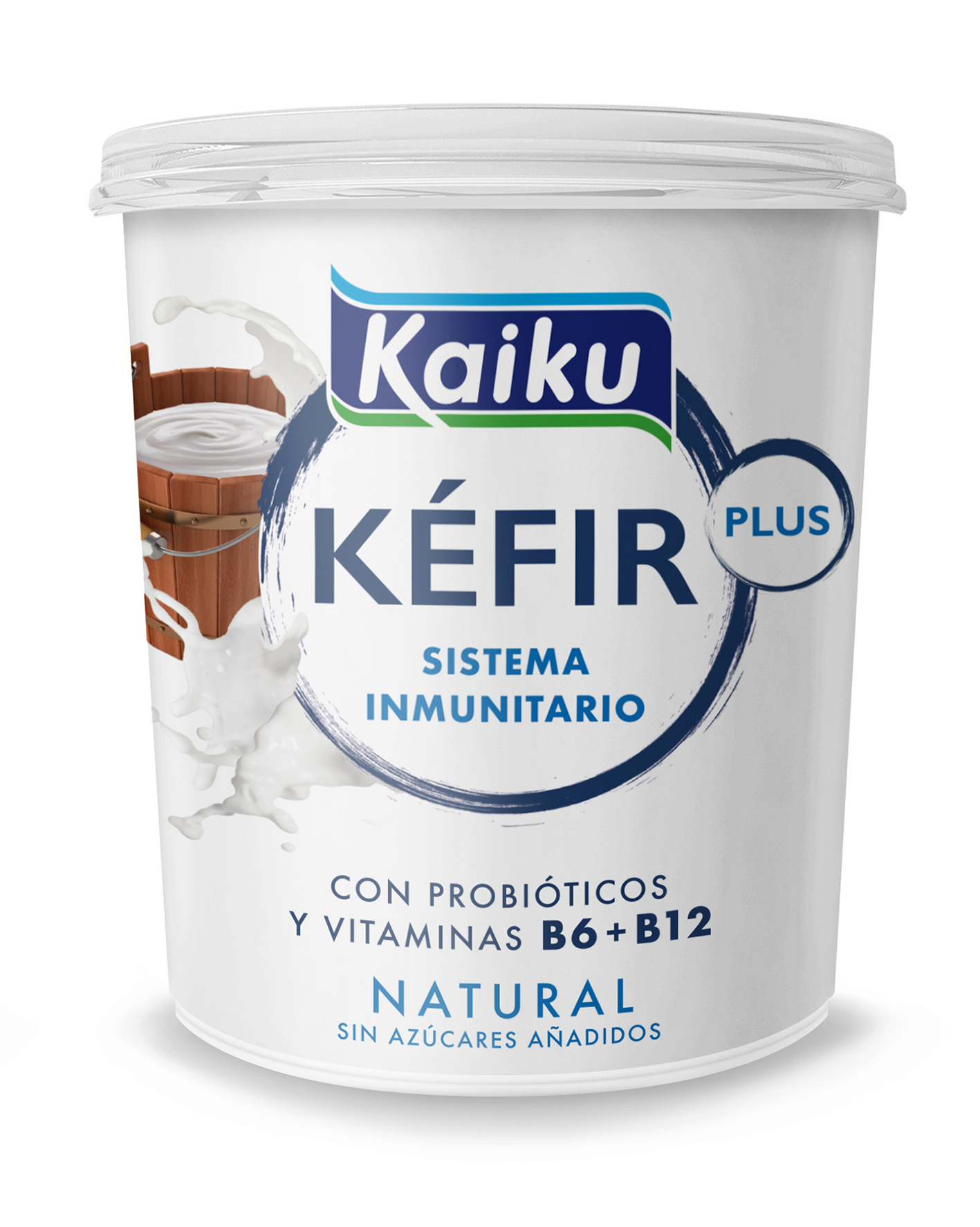
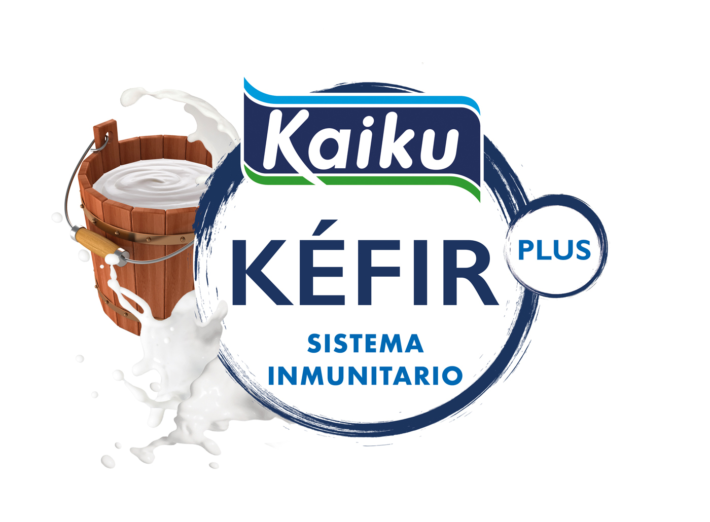
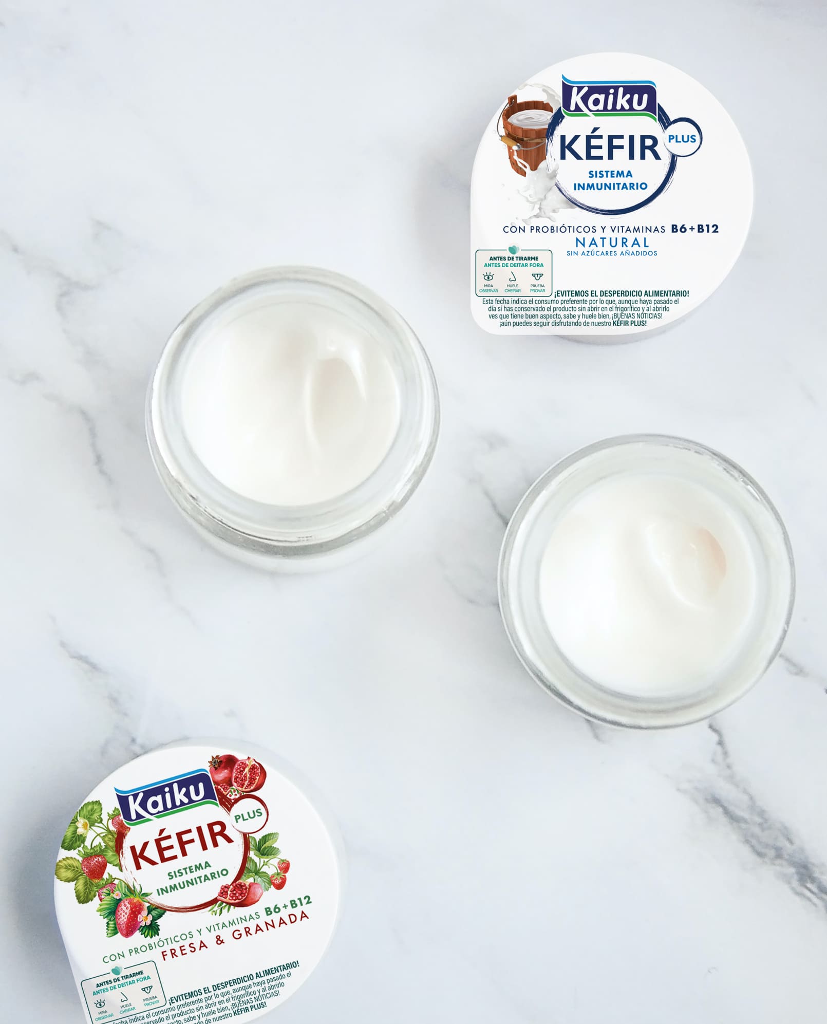
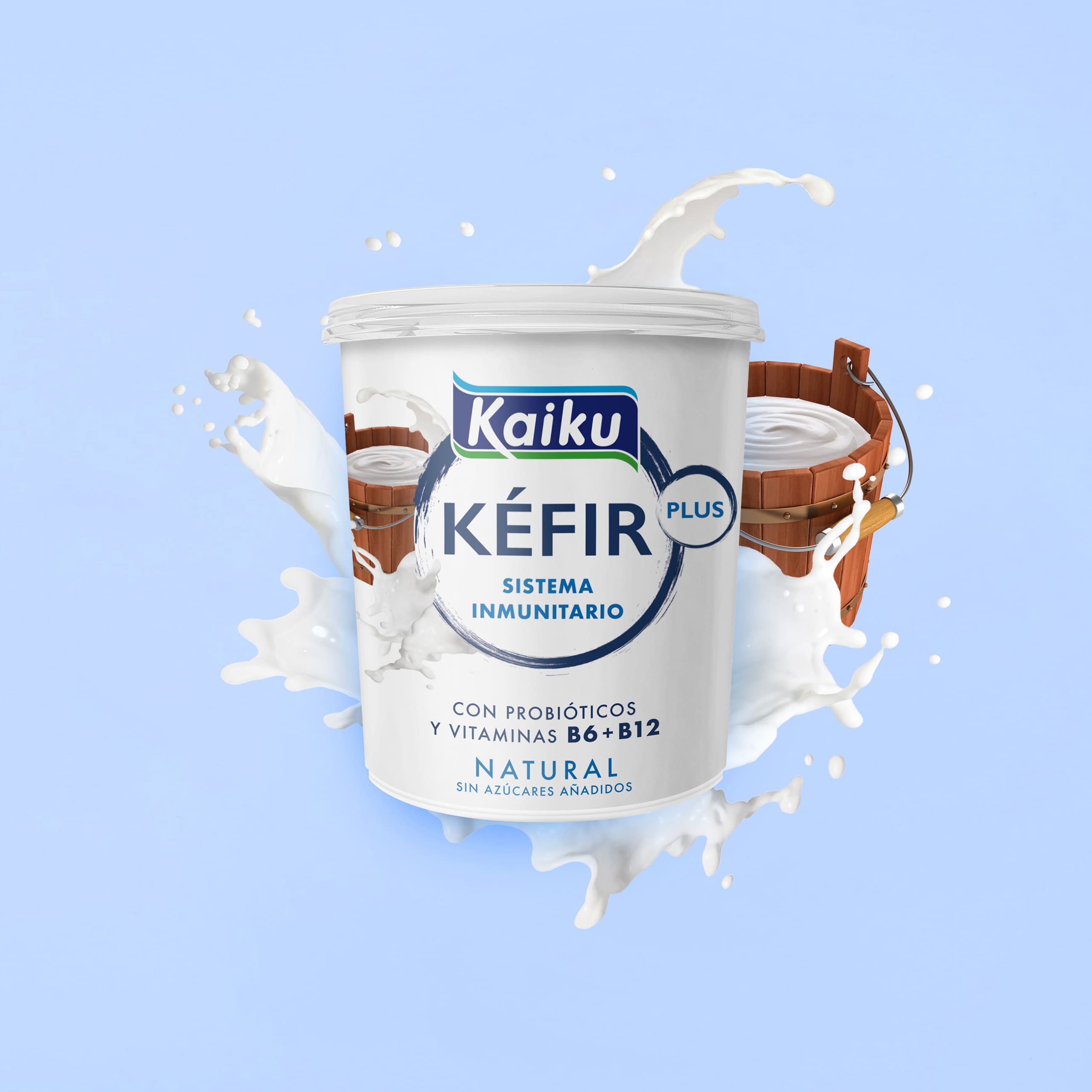
We build an imaginary around a focal point which helps us to synthesise the benefits of the product. It is almost an altarpiece in which a central mandorla agglutinates the naming, flanked by an explosive appetite for the components which make it unique.
Its dimensions facilitate brand recognition, while standing out from the competition on the shelf.
The colours are natural, not artificial or flashy like other brands on the shelves, as we must make it clear that it is a natural, healthy, refreshing and functional product.
Production
The big-pot format allows us to explore and visually narrate the benefits of Kaiku Super Kefir. Its generous front helps it to be perceived as having more personality.
Social media
A bold and daring design which succeeds in impacting on the shelf while showing appetite, flavour and its functional attributes. Kaiku, once again, challenges us with a Kefir which helps us to boost our immune system with a rich flavour in every spoonful. An explosion of flavour and functional benefits for the consumer.
CREDIT
- Agency/Creative: TSMGO
- Article Title: Kaiku Packaging Design – Super Kéfir for Better Health
- Organisation/Entity: Agency
- Project Type: Packaging
- Project Status: Published
- Agency/Creative Country: Spain
- Agency/Creative City: Logroño
- Market Region: Europe
- Project Deliverables: Brand Identity, Brand Strategy, Packaging Design
- Format: Bottle
- Substrate: Pulp Paper
- Industry: Food/Beverage
- Keywords: Kefir, Spain, Packaging, Branding, Kaiku,Design, Ilustrator, yogur, Brand Identity
- Keywords: #packaging #brand #graphicdesign #logo #design #marketing #designer #logotype #vector #business #illustrator #creative #graphicdesigner #logos #yogur #logodesigner #typography #brandidentity #kaiku #art #brand #logoinspirations #smallbusiness #logodesign #behance #graphic #kefir #marca #etiqueta #naming #branding
-
Credits:
Agency: TSMGO


