Nortada In-house creative team – Nortada Rebranding
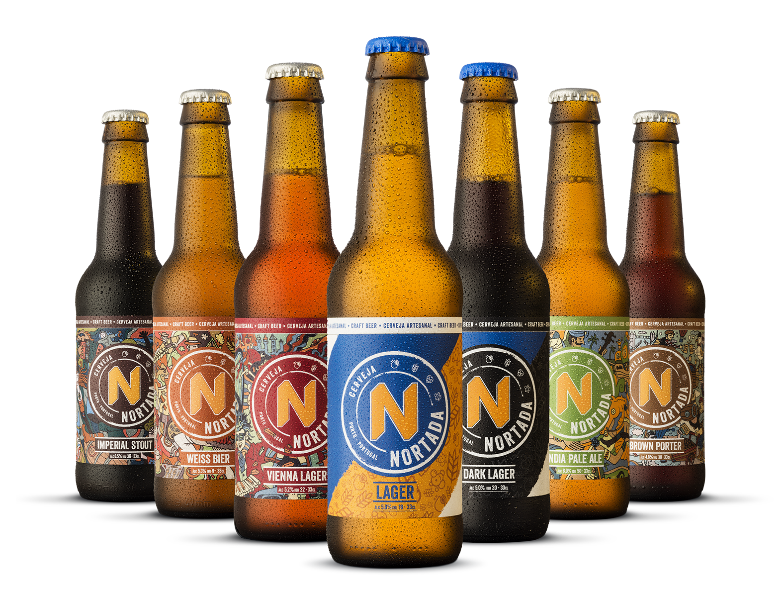
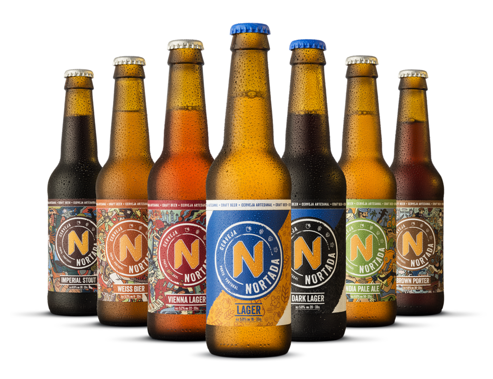
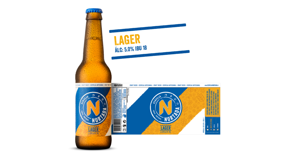
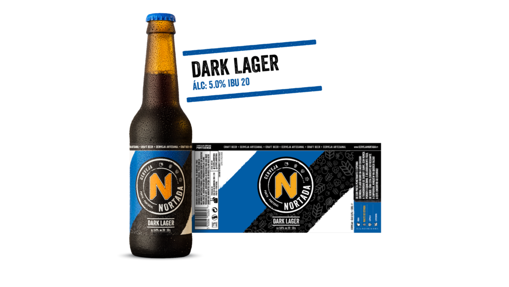
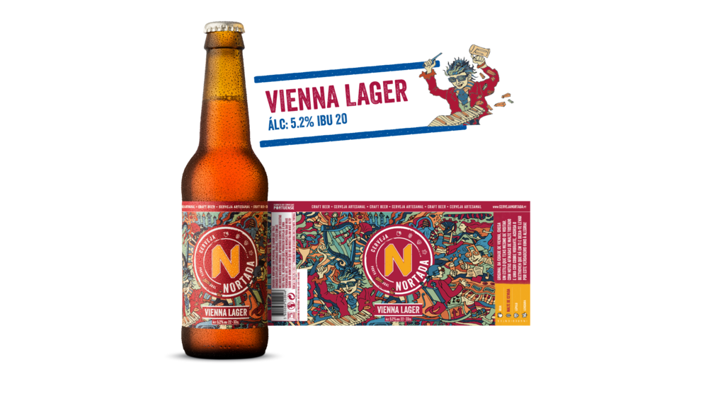
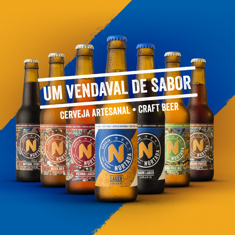
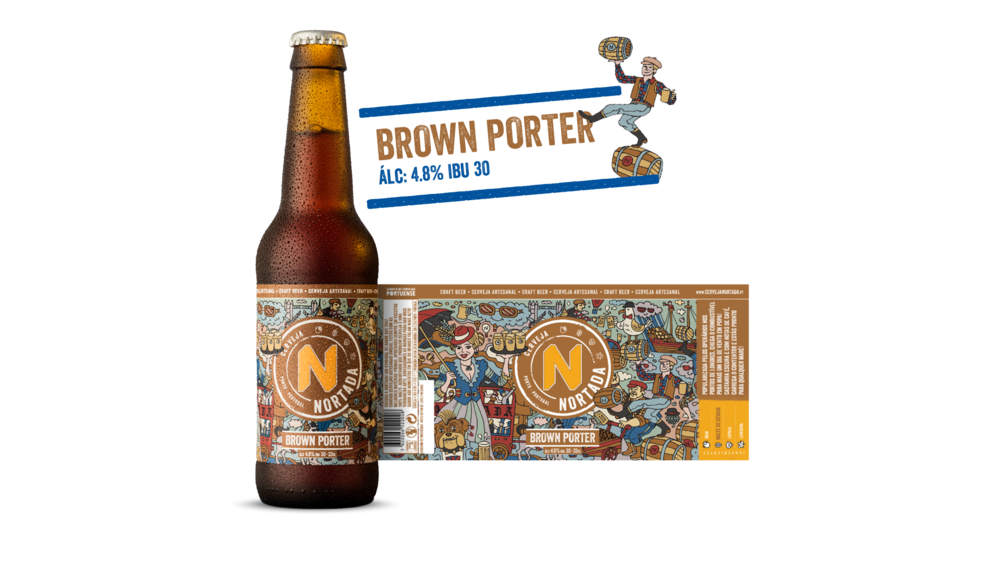
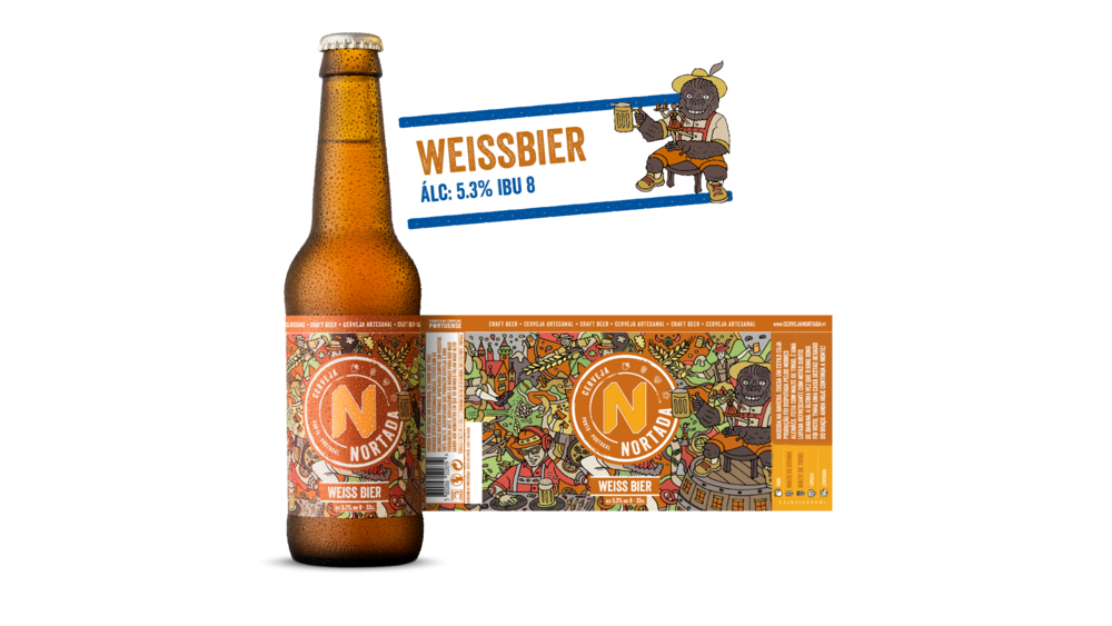
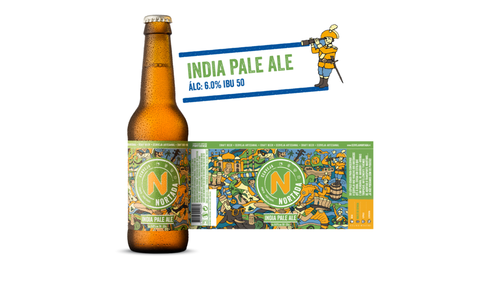
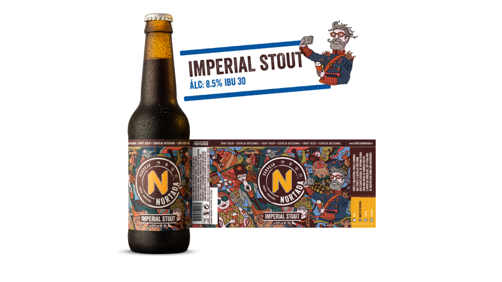
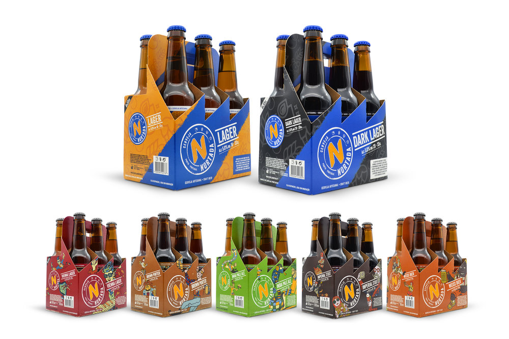
“Launched in April 2007, it didn’t take long for Nortada’s marketing team to recognise that the brands visual aesthetic didn’t create a great impact on their target audience and needed an innovative approach that gave it an appealing look that would engage the younger generation of beer lovers. Developed by Cerveja Nortada in-house creative team, the focus of the rebranding was to truly reflected the brand’s core attributes (Superior Quality, Beer culture and Regional Pride) and its fun and youthful personality, while maintaining some connection with the past. The process began with the development of a new brand identity, “The Stamp”. This element was created to give the brand a contemporary and aesthetically pleasing identity that was aligned with the rebranding objectives: the iconic “N” was enhanced to connect the past to the present; the iconography of the four key ingredients was included as a way to reinforce Superior Quality and Beer culture; and special emphasis was given to the origin of the product (“Porto. Portugal) as a way to support the brand’s pride on offering locally produced beer. The choice of a round shape came about to guarantee great visual consistency throughout all product packaging and communication, as it could easily be implemented on any material. Looking into the label design, the brand’s new strategy for it’s 7 products was to create a clear distinction between two groups: two beers with a lower price point and five premium styles with higher price point. The challenge was to create two distinct visual approaches while maintaining a high level of consistency throughout the portfolio. This was achieved by applying a diverse approach for the background composition of each set of products while keeping the Stamp as the key element. For the first group, the diagonal strips were brought to life, with the blue one working as a connection to the brand’s main colour, while the other highlights the ingredients that were used to brew these delicious beers; For the more premium set of beers, a more refined look was created. Since all styles are iconic beer styles, each styles historical background was brought to life with illustrations developed by João Martins. This approach gave us a wide range of extraordinary visuals that were applied to all packaging and communication materials.”
CREDIT
- Agency/Creative: Nortada In-house creative team
- Article Title: In-house Creative Design Team Rebranding a Portuguese Craft Beer
- Organisation/Entity: Agency Commercial / Published
- Project Type: Packaging
- Agency/Creative Country: Portugal
- Market Region: Europe
- Format: Bottle
- Substrate: Glass


