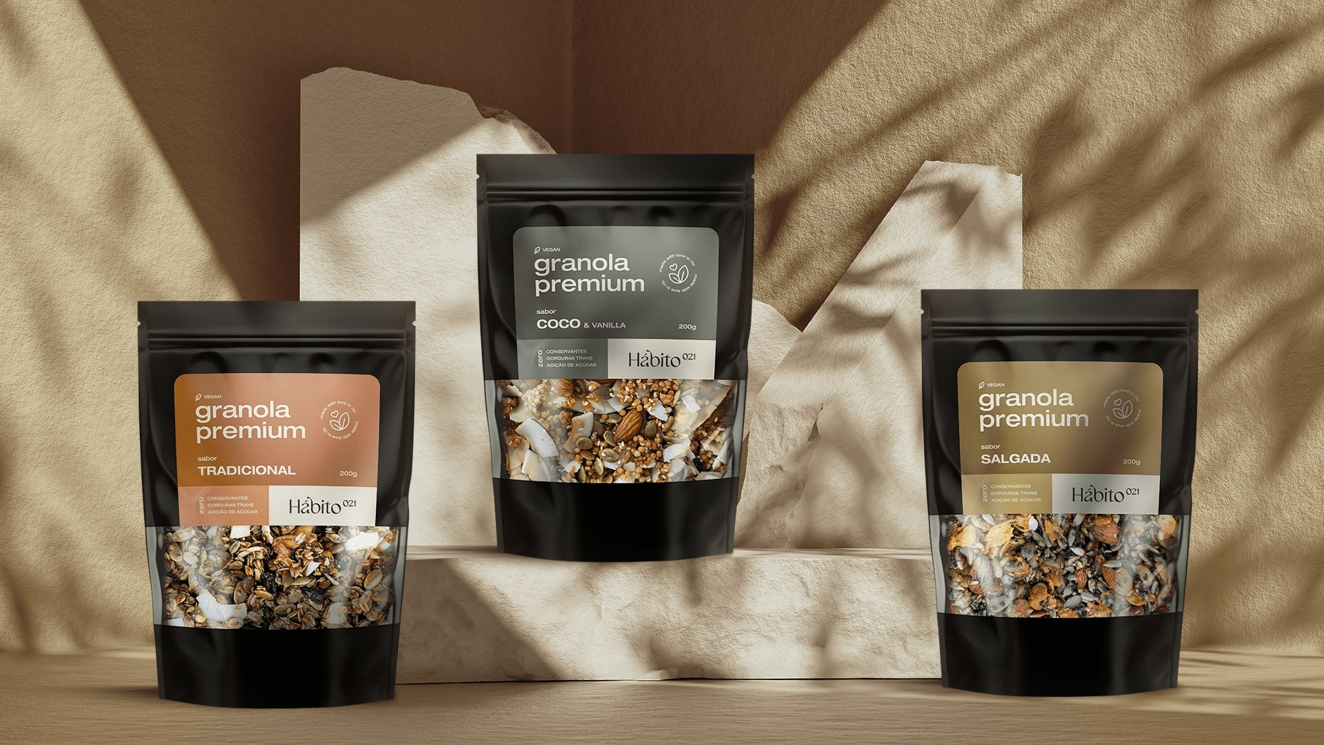
Hábito 021 is a premium granola brand that was born from the perception of a natural granola consumer, and based on its experienced taste, it seeks to place the best and most nutritious granolas in the Brazilian market. With production in the city of Rio de Janeiro, the brand sells products composed of noble ingredients that promote health, well-being and nutrition for those who consume them.
Based on the pillars, attributes and brand positioning, the concept addressed for the logo and visual identity of Hábito 021 was the repetition time for an act to become a habit (21 days), that is, the idea is to create the habit of consuming the brand’s premium granolas daily.
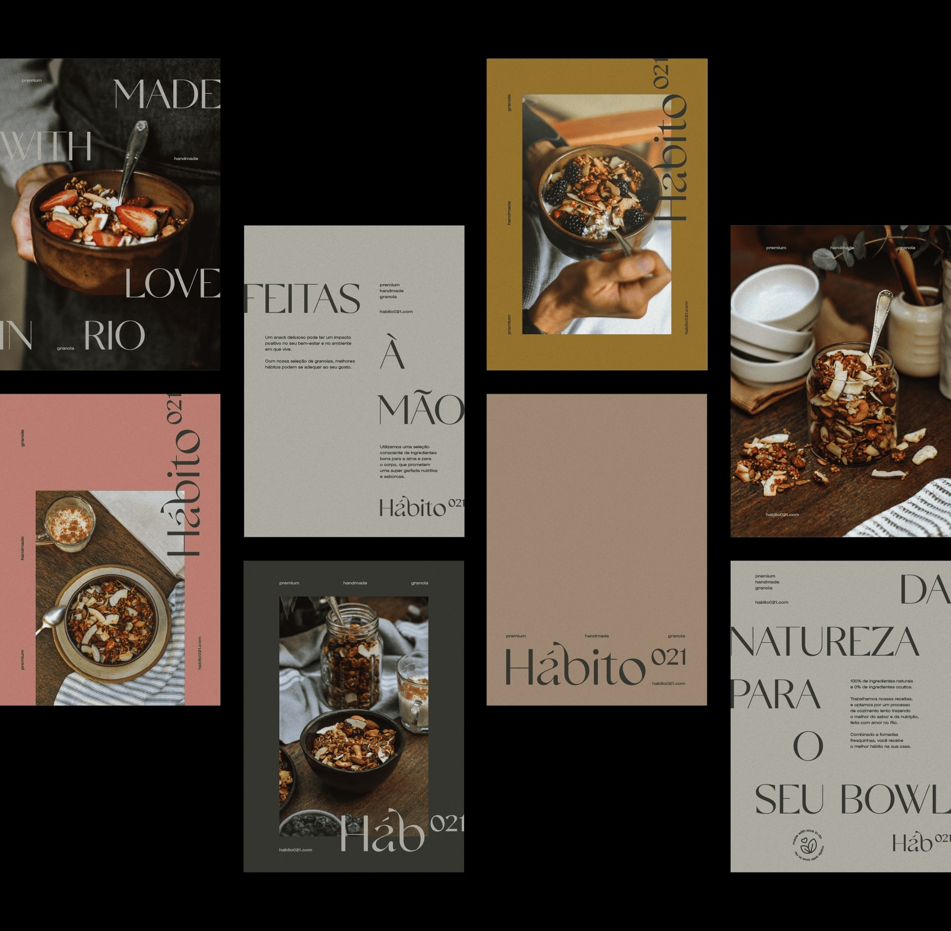
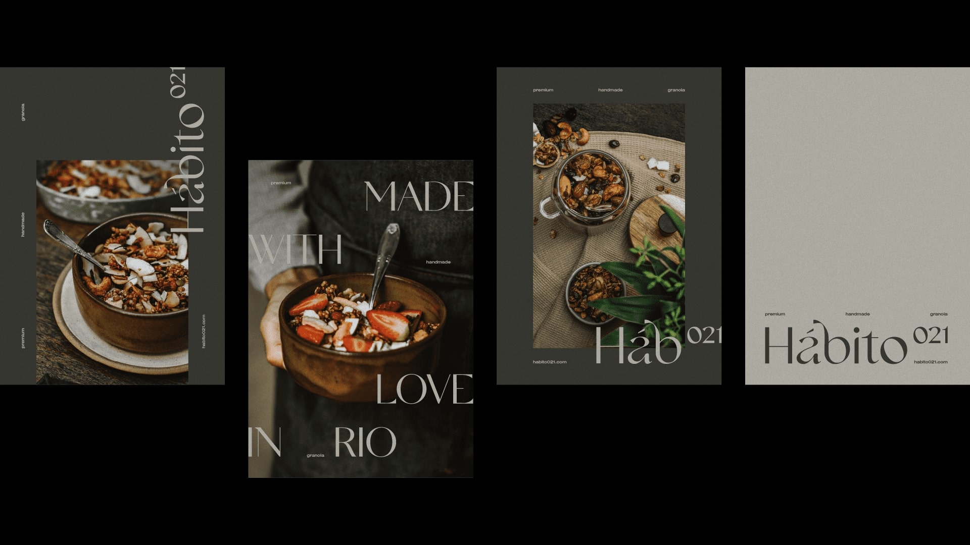
To reflect the purpose of the brand, a typography was adapted to embrace the personality of Hábito 021, bringing authenticity to the logo. The idea behind the type’s unusual arabesques and serifs is to bring the lightness of the brand’s products, as well as the delicacy of their production.
The numbers contained in the name, raised to the upper right end, are purposely placed there to refer to a mathematical power account. The idea is to bring the concept of repetition time so that an act becomes a habit (21 days), that is, the habit of eating Habit 021 granola starts at 21 days, but must continue for much longer (the high number, as a power).
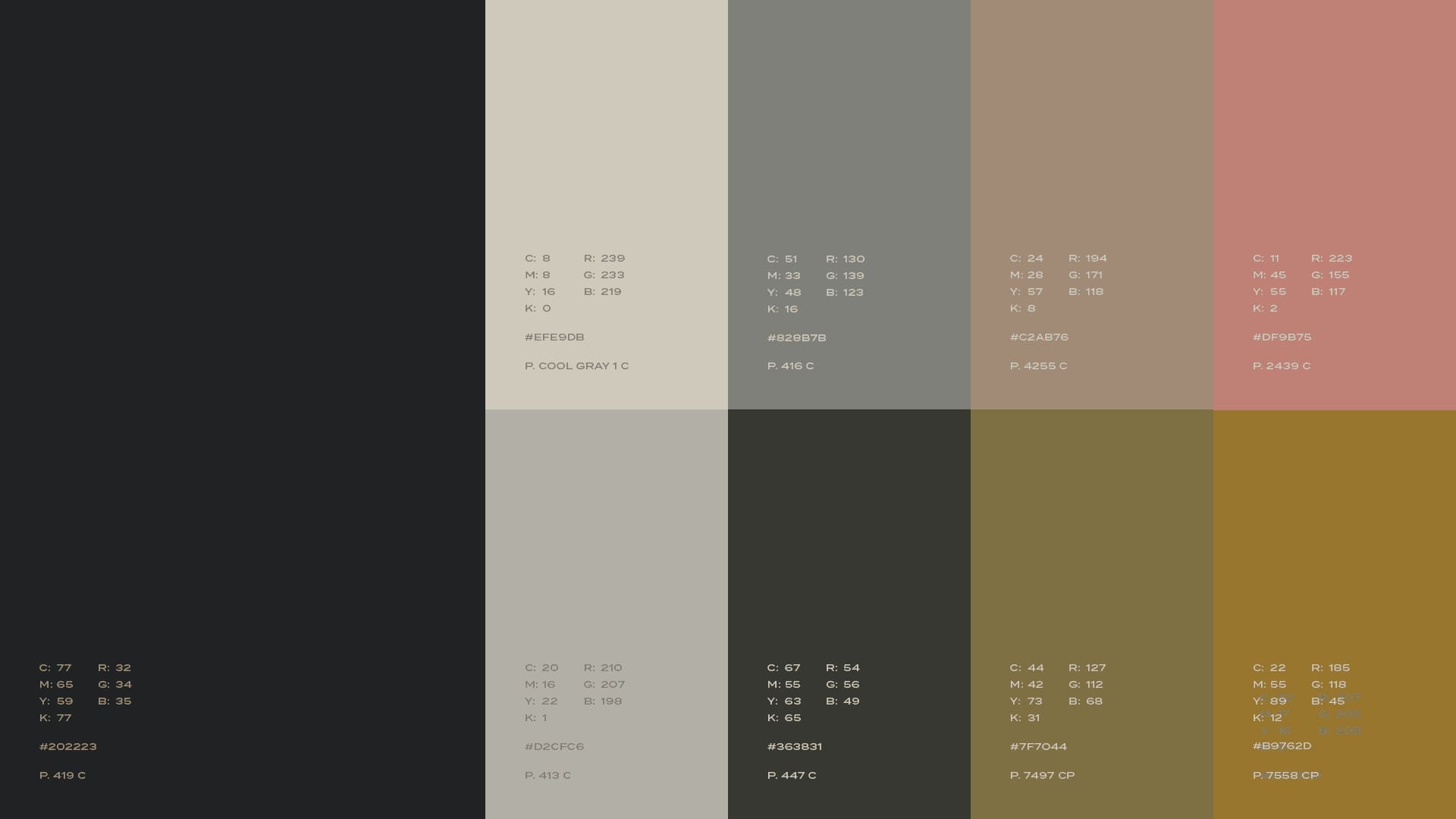
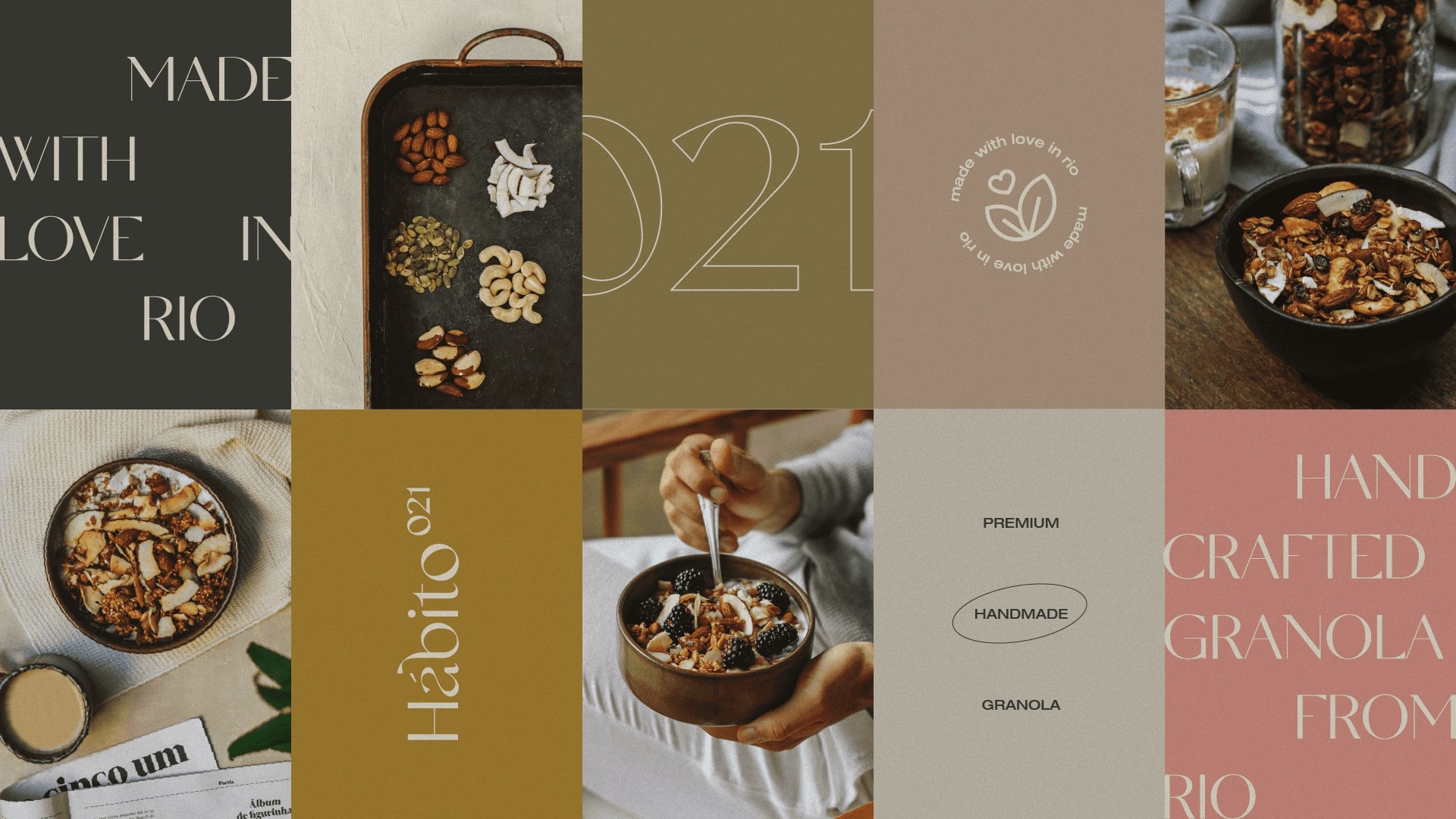
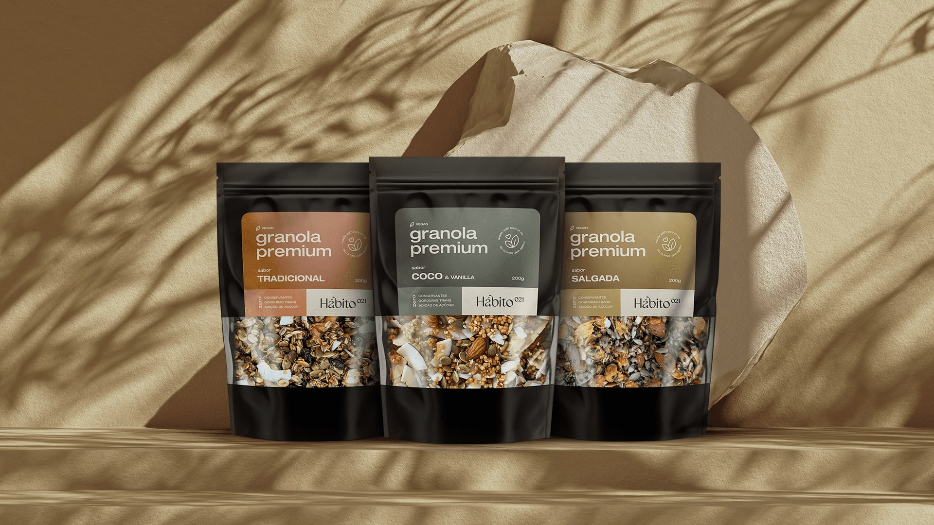
The colors of the Hábito 021 palette were designed so that its visual identity conveys the attributes and characteristics of each of the products and their respective flavors. The combination of all these colors with a certain baroque aura, creates a perfect environment for the universe in which the brand is inserted, that of healthy eating.
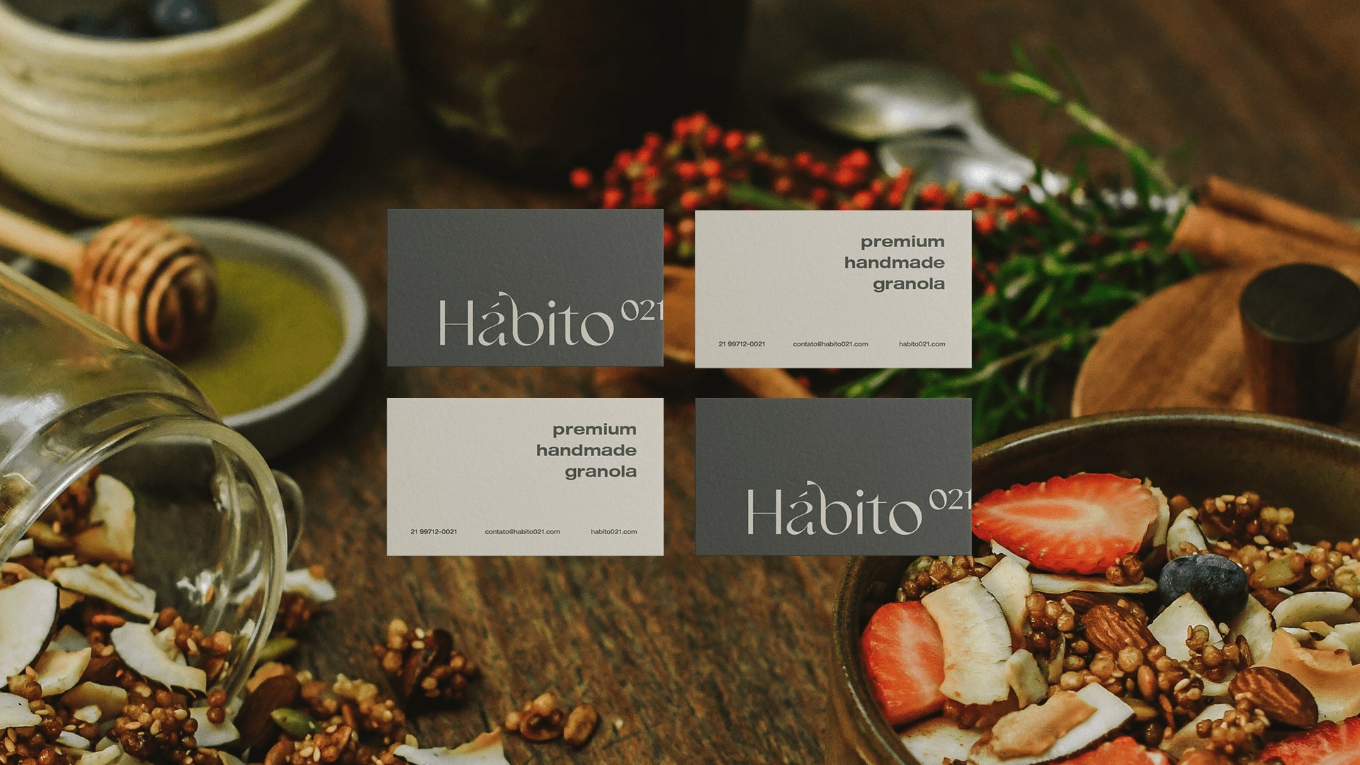
Typography gains a certain role in the construction of the brand’s visual identity. The idea behind the unusual layout of titles and texts, which are unglued and sometimes “glued” to the edges, is to give modernity and at the same time sophistication to graphic pieces and packaging.
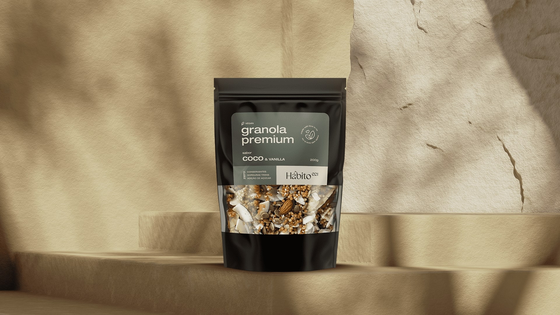
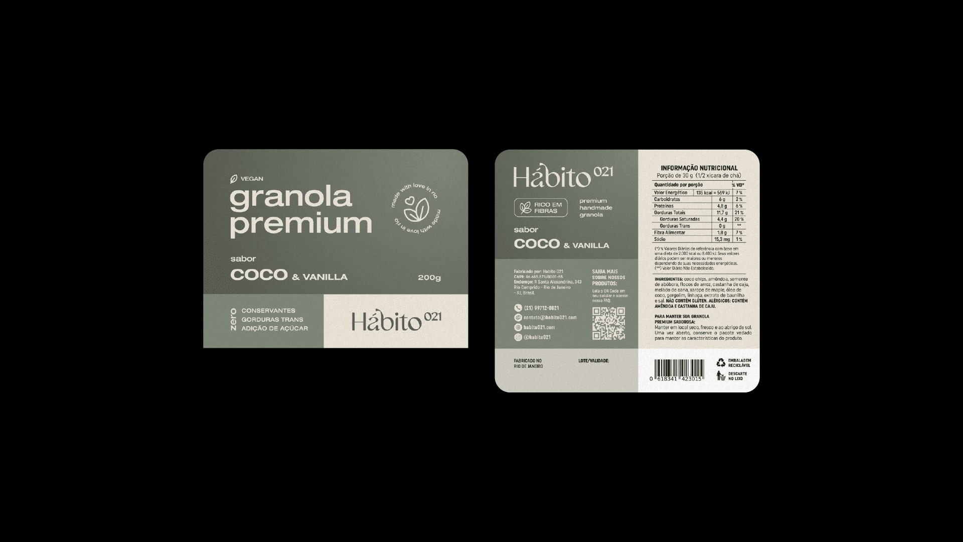
As for the packaging, they were strategically designed and created so that they could enhance the most positive aspects of the products, as well as clearly convey the attributes and benefits of each of the granolas. To create differentiation between the flavors in addition to the name described, colors were associated with each of the products in a way that facilitated identification on the shelf.
The result is a light brand full of personality, which conveys a sense of well-being, and which reflects the characteristics of Hábito 021 and its products.
CREDIT
- Agency/Creative: Matheus Ferreira
- Article Title: Hábito 021 Visual Identity and Packaging Concept by Matheus Ferreira
- Organisation/Entity: Freelance
- Project Type: Packaging
- Project Status: Published
- Agency/Creative Country: Brazil
- Agency/Creative City: Lençóis Paulista
- Market Region: South America
- Project Deliverables: Art Direction, Brand Design, Brand Guidelines, Brand Identity, Food Photography, Graphic Design, Packaging Design, Packaging Guidelines
- Format: Flow-Pack
- Substrate: Plastic
- Industry: Food/Beverage
- Keywords: Granola, Premium, Nuts, Rio de Janeiro
-
Credits:
Photographs: Studio Ocre


