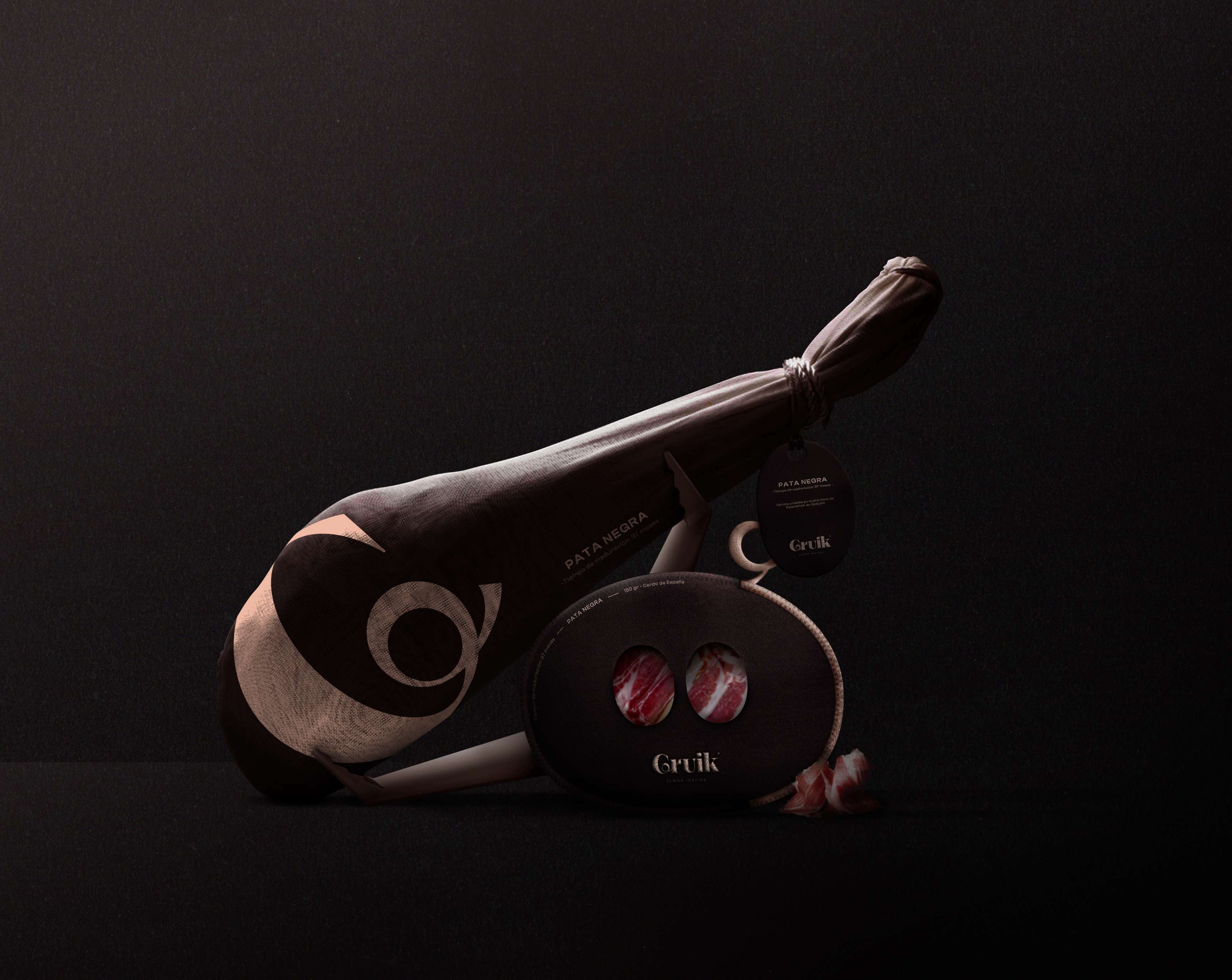
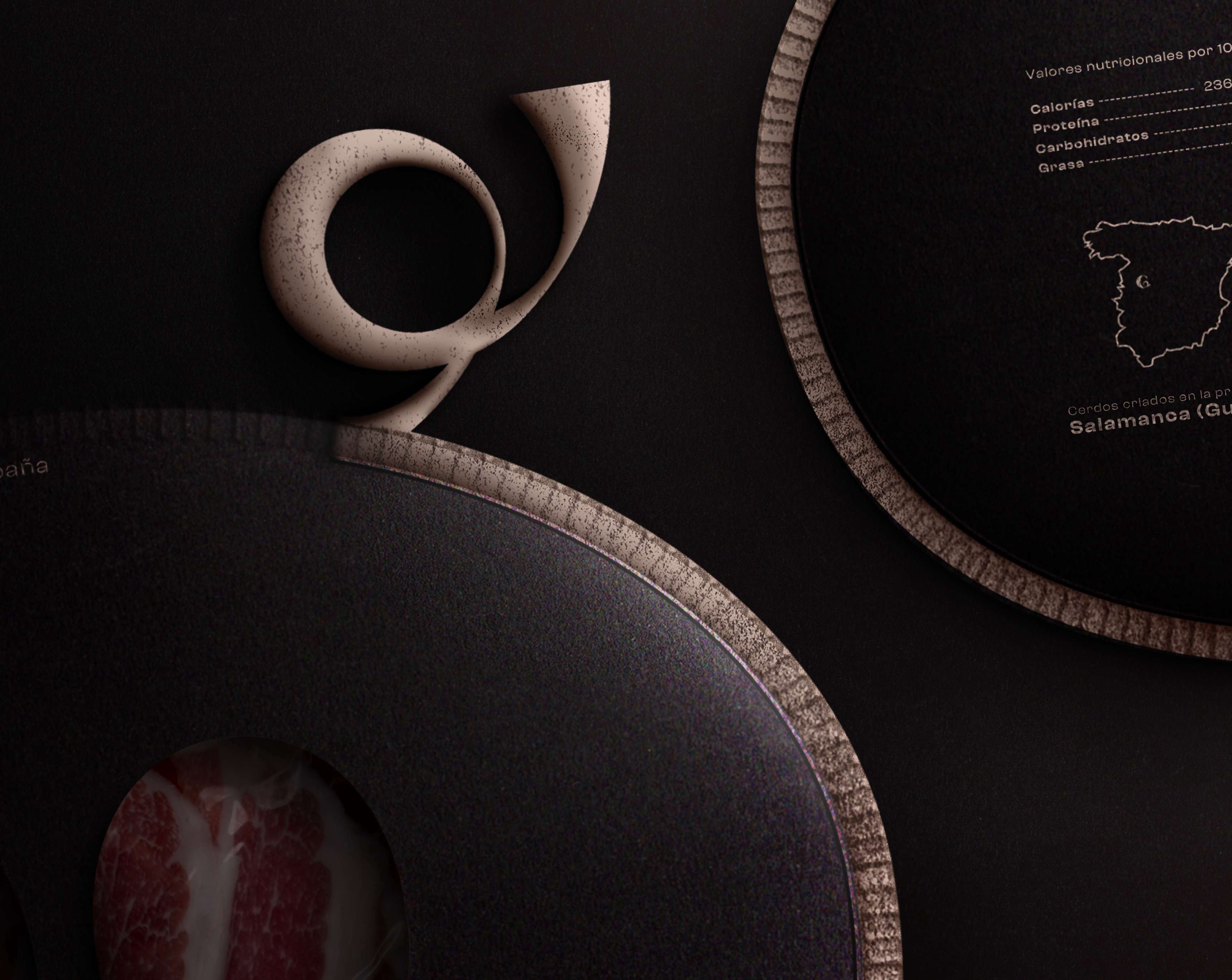
Pata Negra is an ancient Spanish tradition. Known as The exceptional ham, Gruik strives to perpetuate this know-how and authenticity through its products. This is why its Pata Negra is made with Iberian pigs raised in the region of Salamanca and more precisely in Guijuelo, a place steeped in history and traditions around Iberian ham. This makes for an exceptional product, just like the Gruik logo.The typography used in this logo is a blend of contemporary and traditional, forming an identity that is in tune with the times, but with an attachment to the know-how of the past. The corkscrew tail of the pig is subtly integrated into the letter “G”, to correlate with the Pata Negra. Simplicity in the logo, but also in the name, evocative and often associated with the cry of the pig. It should be noted that the proportions of the typographic logo are similar to those of the Iberian pigs.The colour combination also serves to underline this refined, yet authentic, aspect, with a brownish black reminiscent of the colour of pigs, as well as a pale pink. A sobriety that underlines the quality and high standard of Gruik’s products.
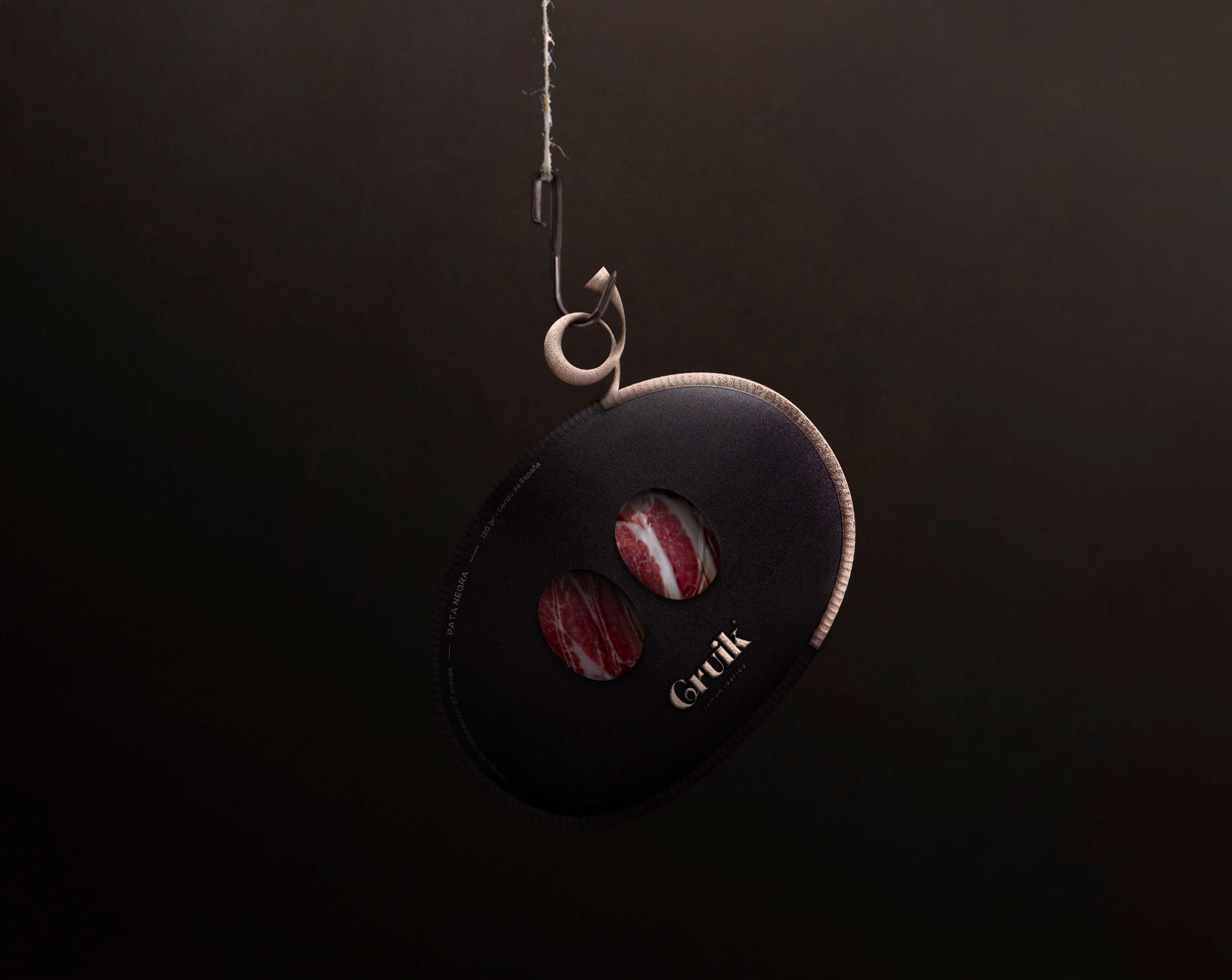
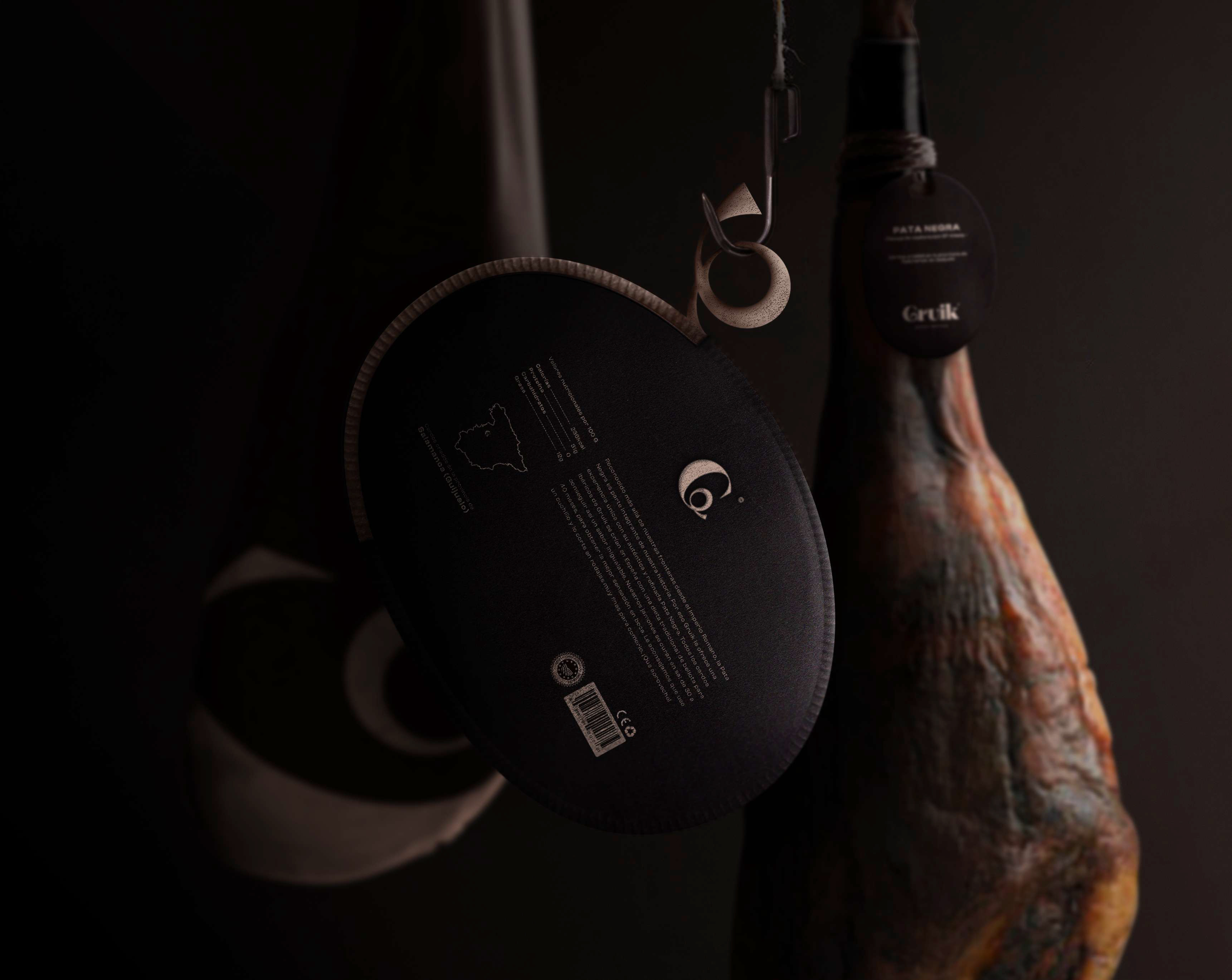
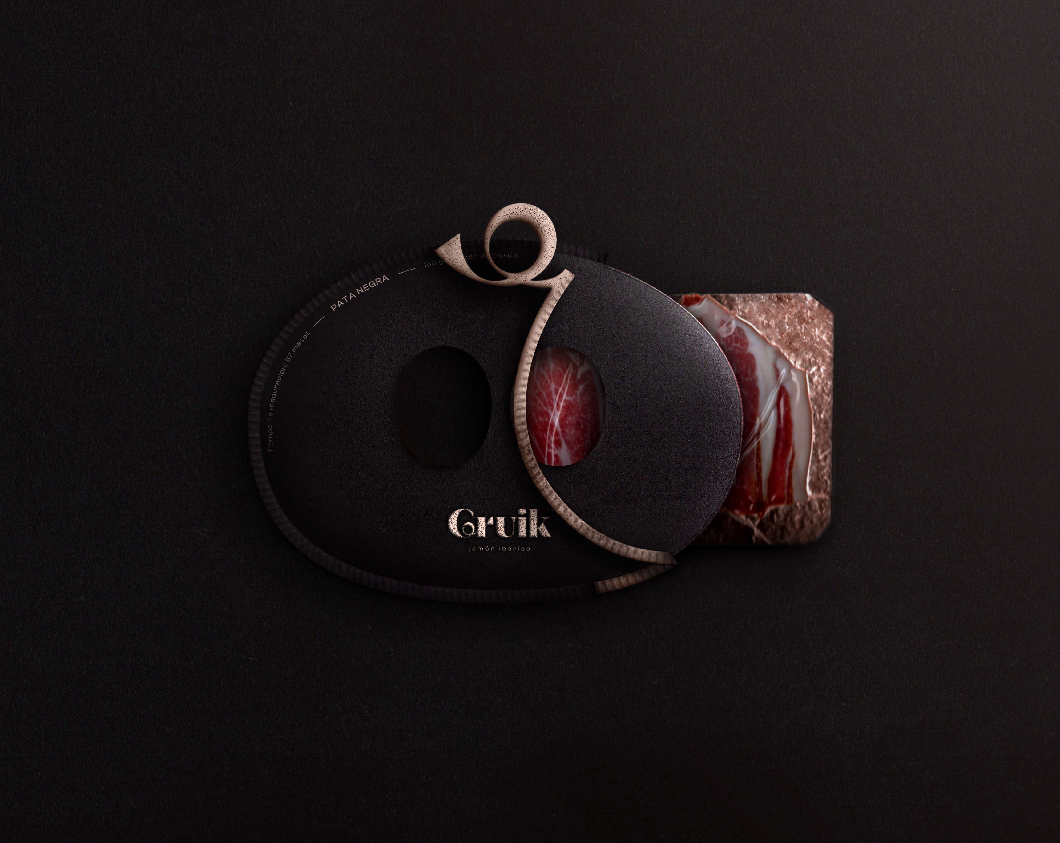
Elegance and authenticity are the key words of Gruik’s packaging. Their shape and oval cuts remind us of the snout of the Iberian pig. The brownish black colour reinforces this idea. Just like the pull-tab to open the packaging, which is shaped like a pig’s tail. This loop is taken from the “G”, also reminding us of the logo. The Pata Negra is visible in order to establish trust with the consumer and to be transparent about the products. The information on the back allows the consumer to get to know the Iberian ham and its origin. The composition is deliberately minimalist and sober, because what is precious in Gruik is the Pata Negra.
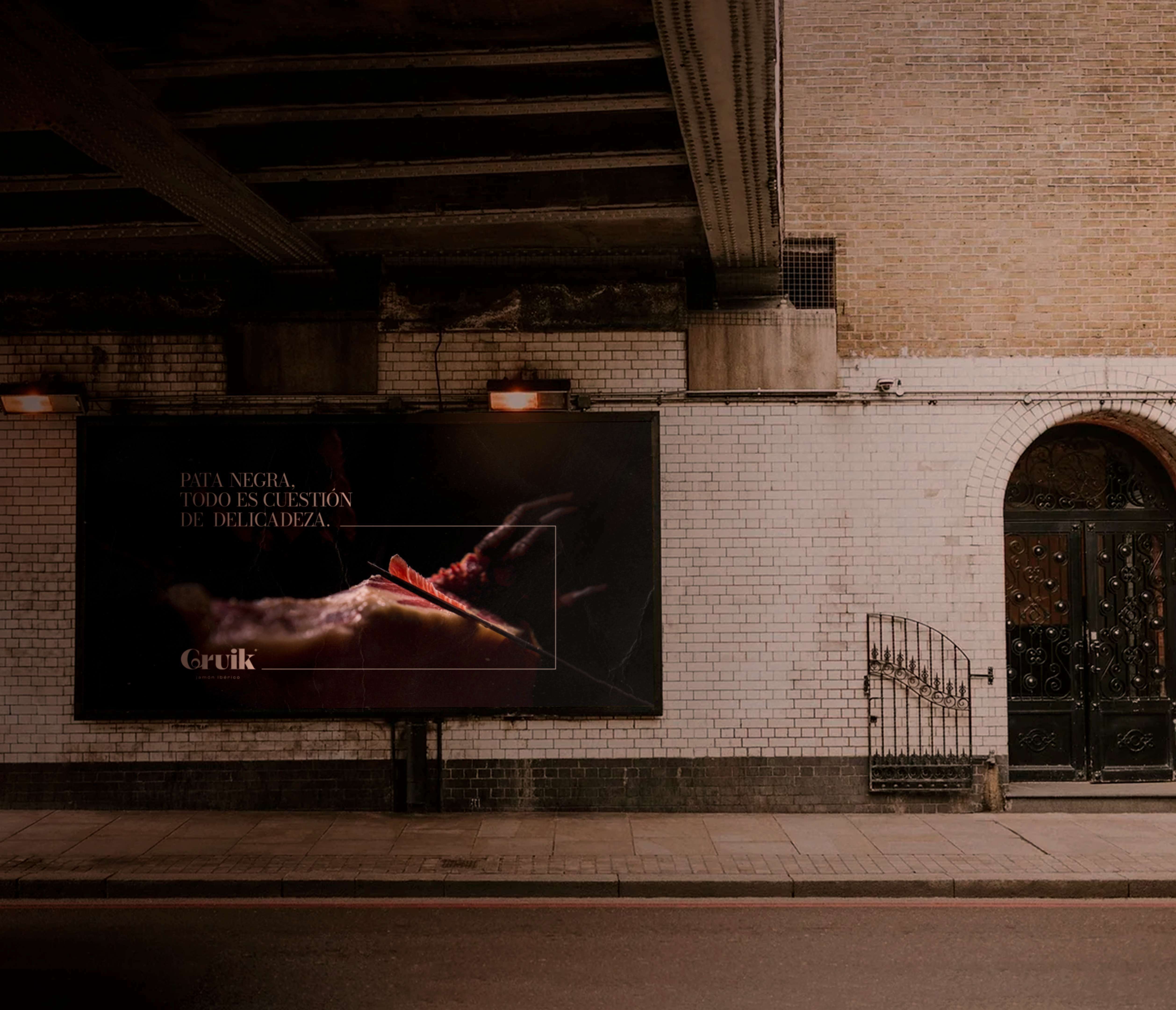
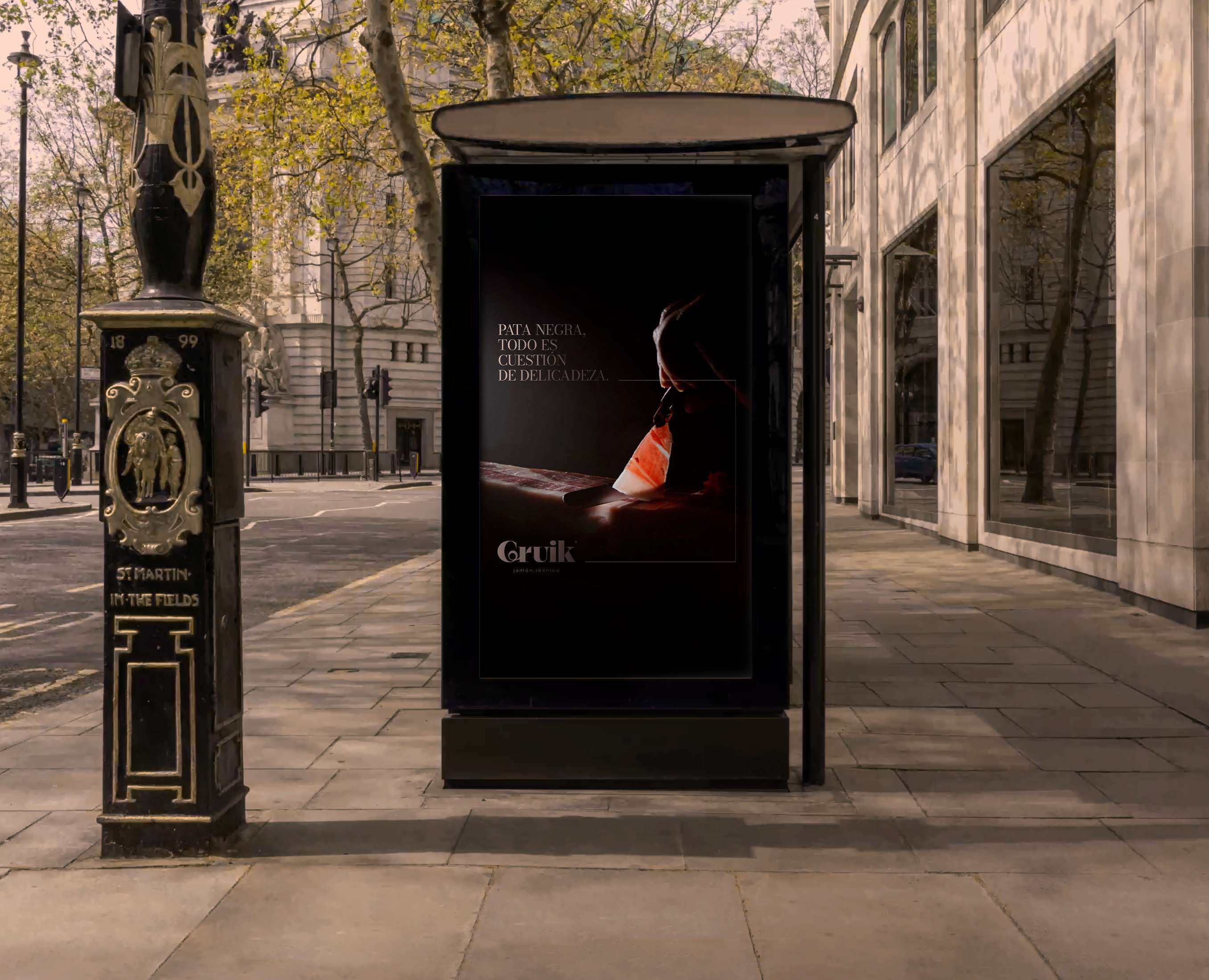
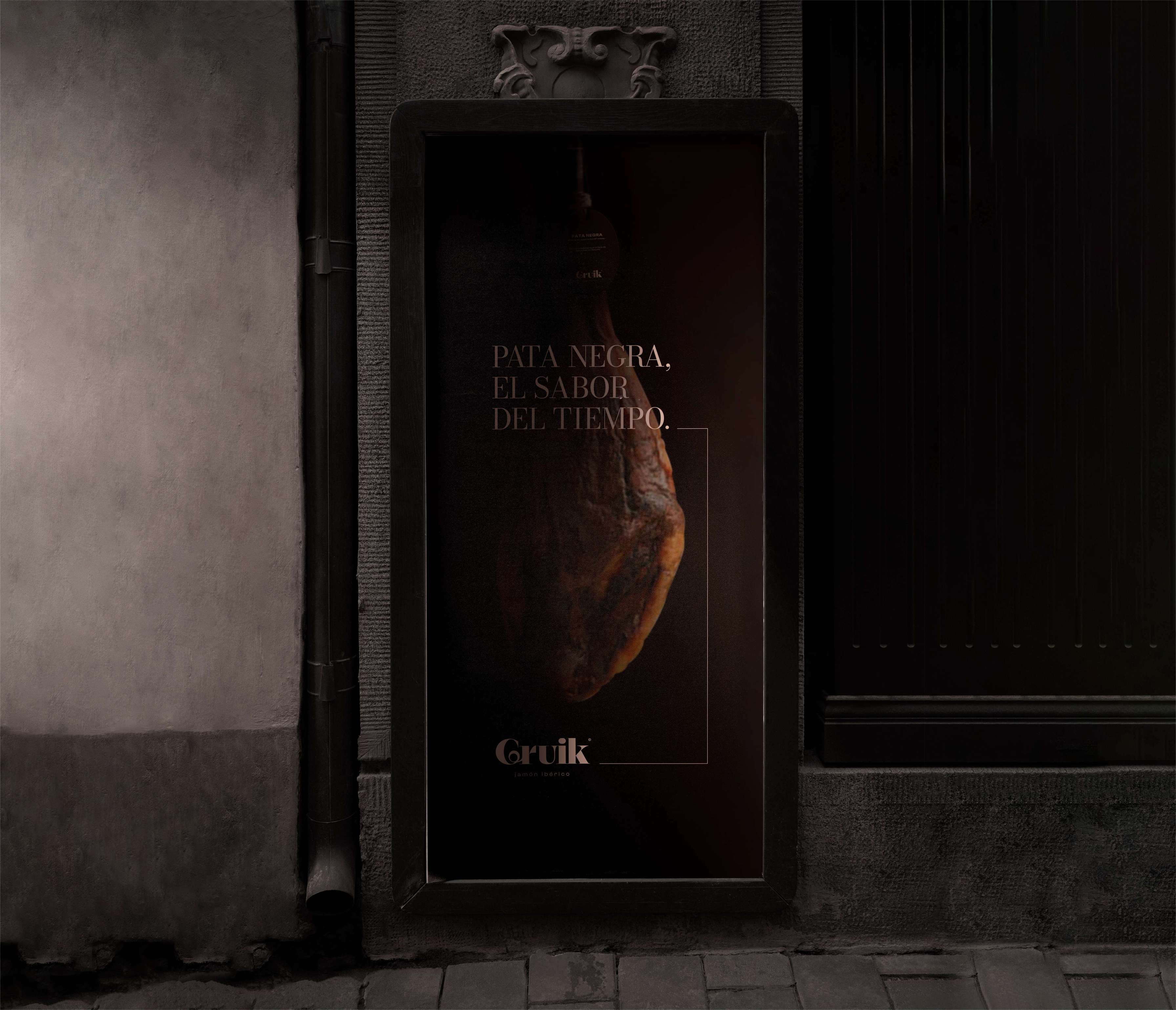
Gruik wanted to create its advertisements in a calm and refined atmosphere. The various photographs highlight the important stages in the production of pata negra. The 30 to 50 month curing period is a characteristic of Iberian ham, which is why the slogan “Pata Negra, the taste of time. (Pata negra, el sabor del tiempo in Spanish) makes sense. The cut is also very important, because if it is not done properly, the taste will be different and will not reflect the real quality of the ham. The slogan “Pata Negra, it’s all about finesse”. (Pata negra, todo es cuestión de delicadeza in Spanish) seemed to me to be an obvious way of characterizing this technique that only some people have mastered.
The logo and the slogan in pale pink remain discreet so that the image is at the heart of the composition. The nets framing the photograph draw our attention to what is essential, the Pata Negra. The common atmosphere that emerges plunges us into the know-how and authenticity of the product, while evoking the top of the range.
CREDIT
- Agency/Creative: Hurtikonn Design
- Article Title: All the Know-How of Pata Negra in a Packaging
- Organisation/Entity: Student
- Project Type: Packaging
- Project Status: Non Published
- Agency/Creative Country: France
- Agency/Creative City: Hayange
- Market Region: Europe
- Project Deliverables: Brand Creation, Brand Identity, Branding, Logo Design, Packaging Design
- Format: Pouch, Sleeve
- Substrate: Pulp Carton
- Industry: Food/Beverage
- Keywords: packaging, logo, ad, advertising, brand, jamon, ham, pig, iberic
-
Credits:
Graphic Designer: Mattéo Tabutieaux


