Forgotten in the freezers, Extrême wanted to win the attention back of their younger audience. What was needed was an injection of social awareness, creativity and expressionism.
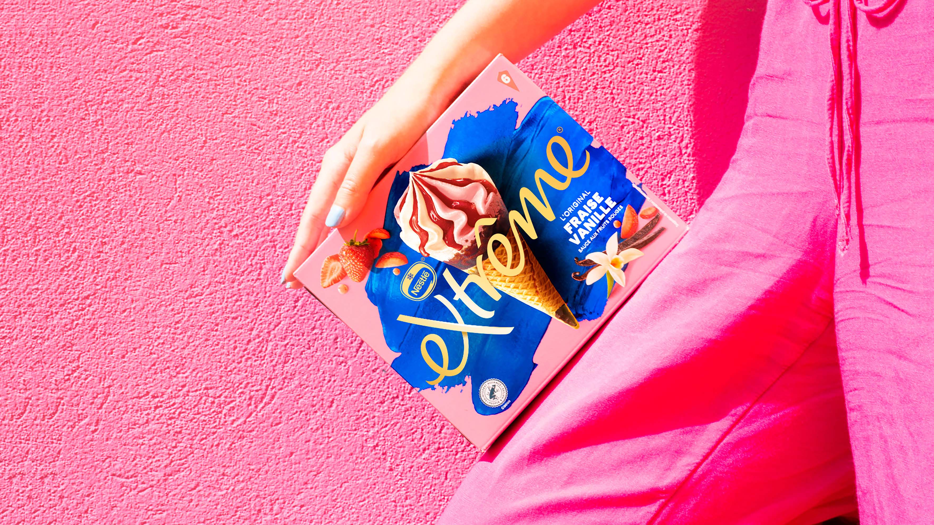
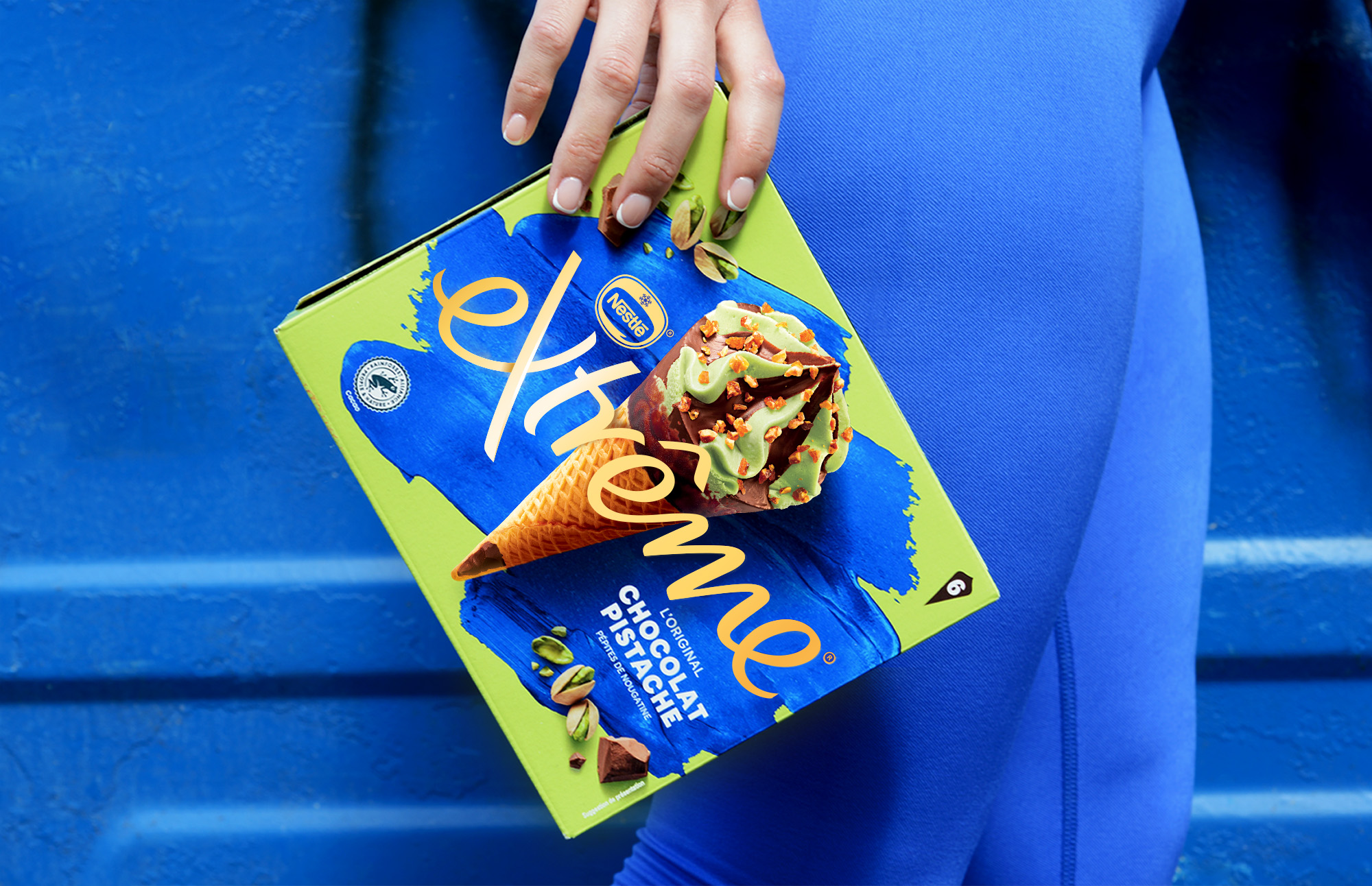
Taking the Extrême brand on a radical journey, we created a new language for premium. An escape from the normalities of ice cream, creating a visual world of bold stand out to win back attention and market share.
The ice cream market is dominated by Magnum which is seen as more special than a cone. Extreme was not able to compete with the glamour of Magnum and was struggling to remain relevant amongst a younger audience.
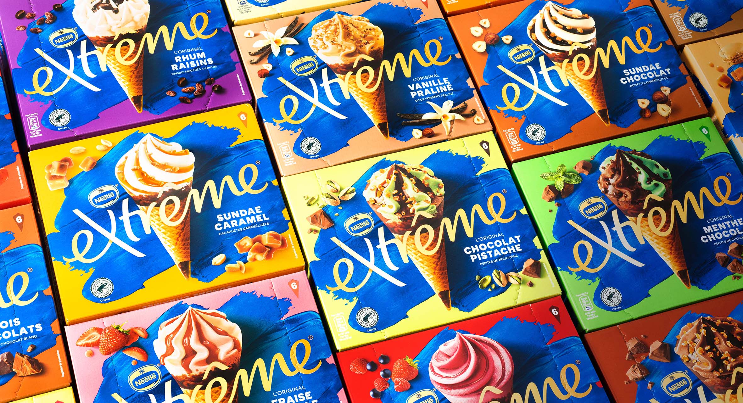
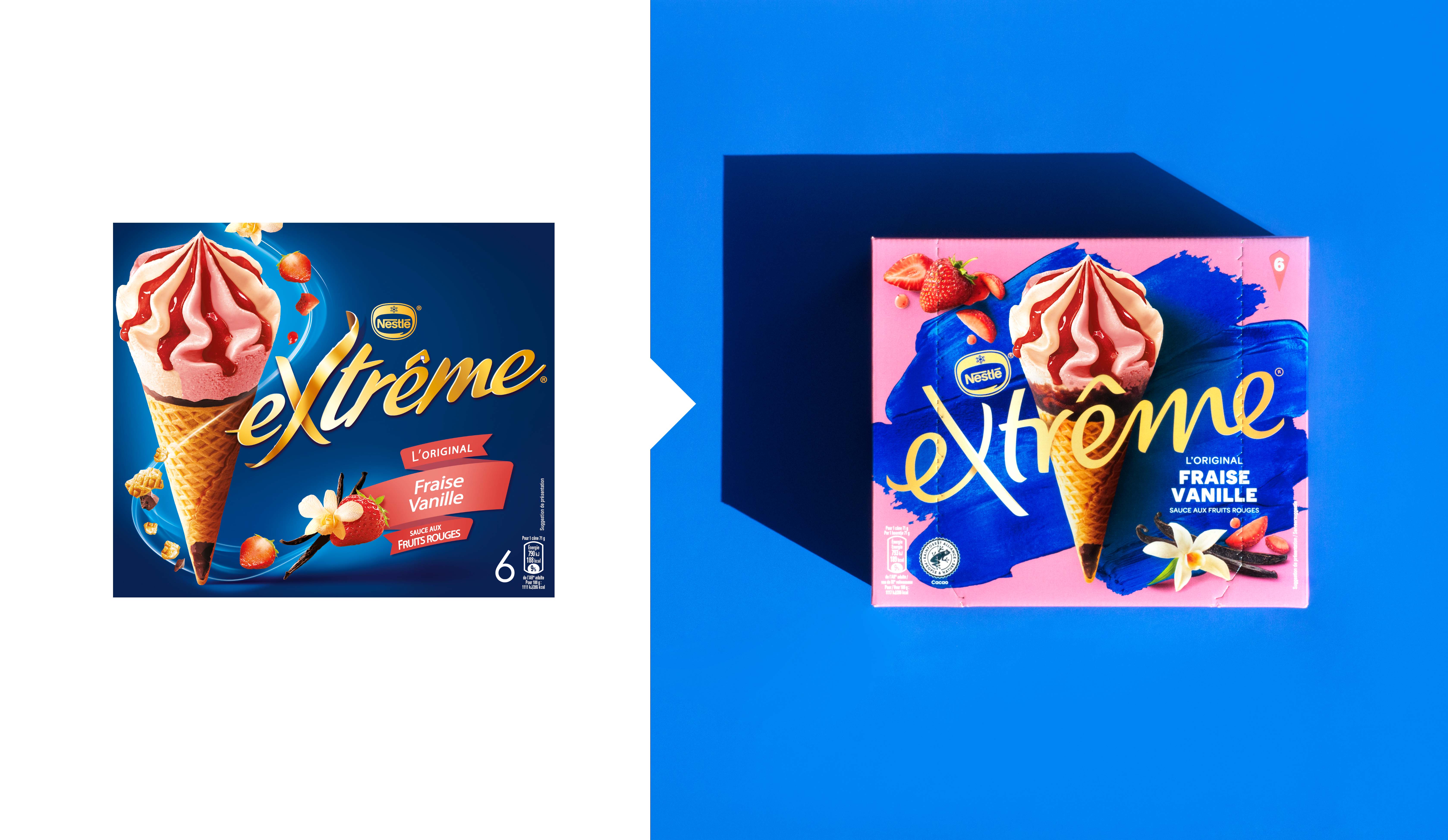
The brand assets had become so dated that they failed to communicate the high quality products and the wall of dark blue brand blocking was ineffective in communicating the exciting range of flavours and innovations that Extrême has to offer. We needed to take our existing consumers on a journey and attract a new following along the way.
The soul of our brand strategy was to take the brand to the Extrême! This informed our creative direction for all aspects of the brand evolution.
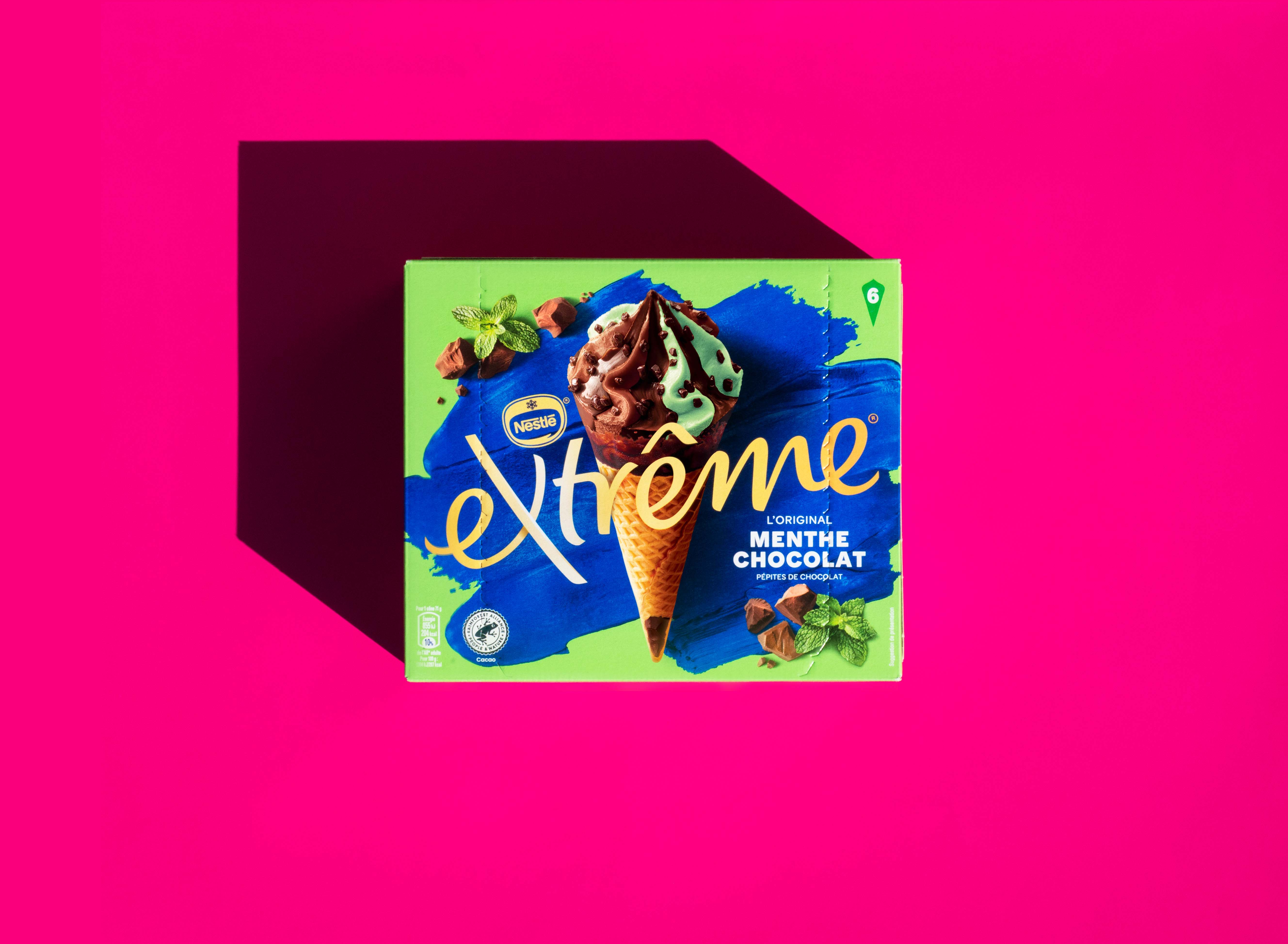
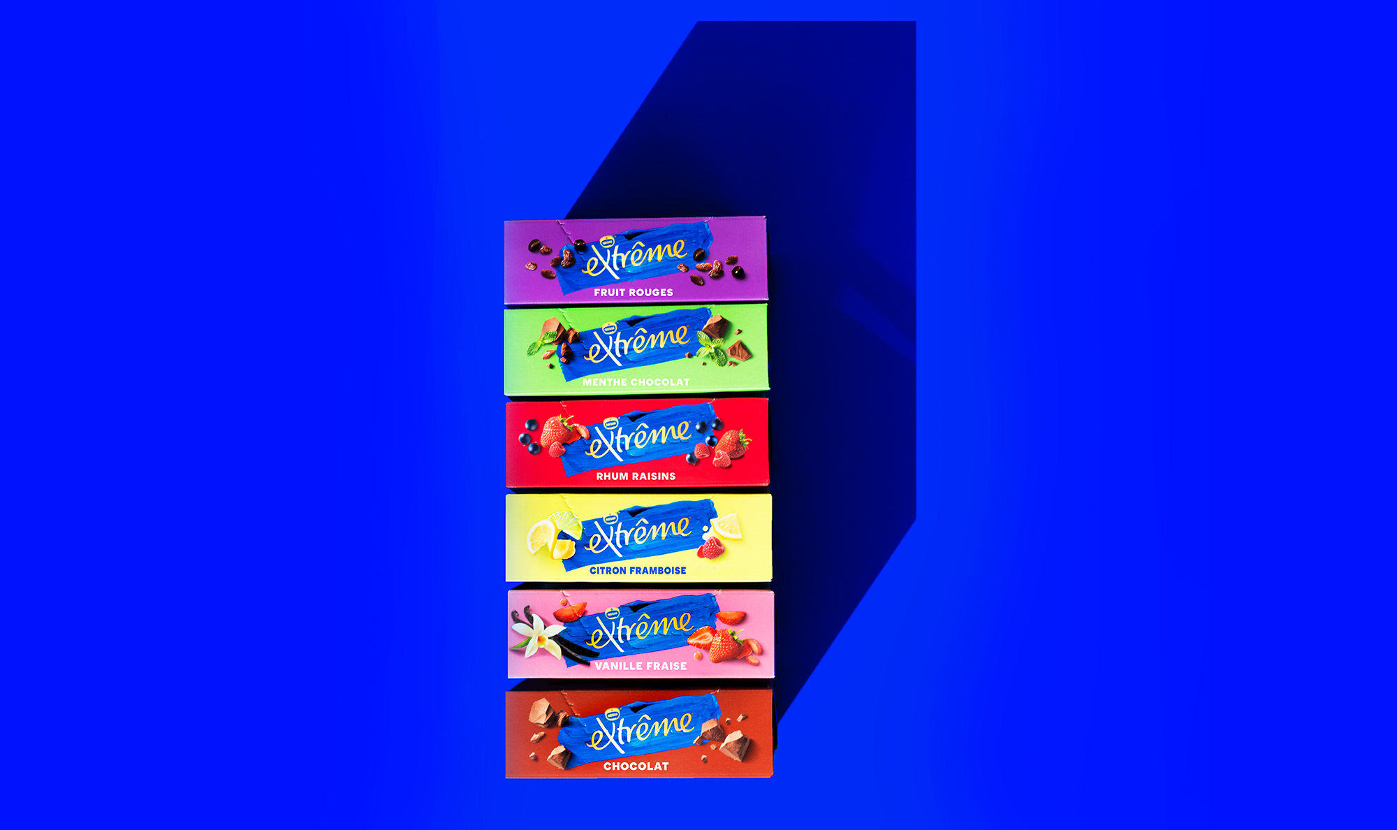
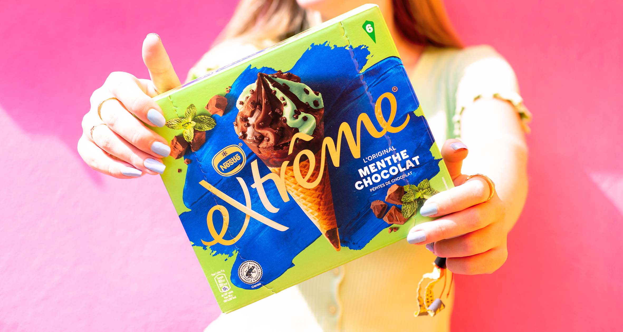
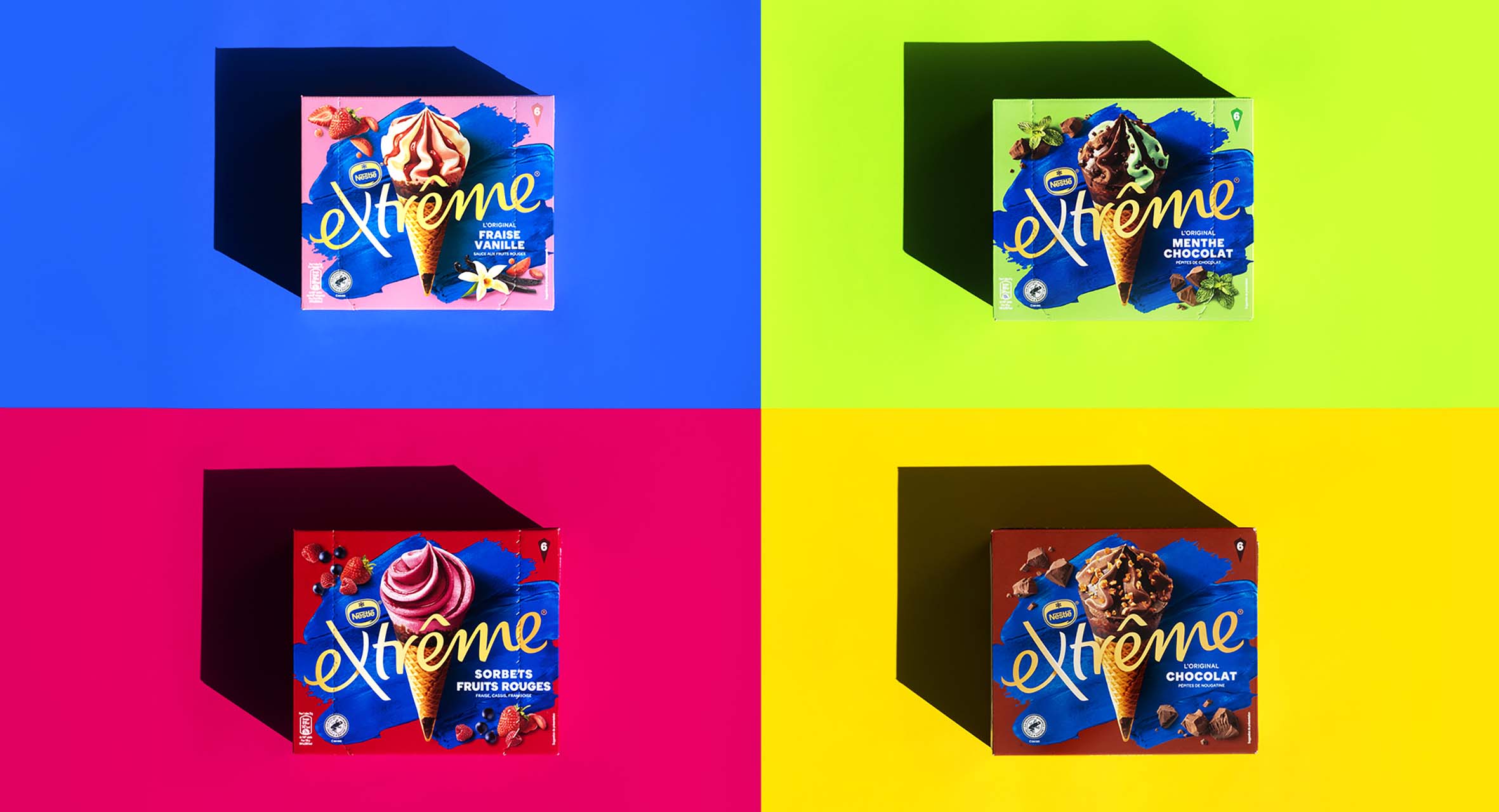
We created a bold visual world for the brand by evolving the logo, retaining recognition with existing consumers, but becoming relevant in the modern ice cream fixture. The new brand mark transformed the brand blue into a brand expression, whilst hits of bold colour communicate the variety of exciting flavours in the range. Our new photography took each product to the Extrême, with more detail, realism and enticing ingredients to dial up the taste.
CREDIT
- Agency/Creative: Springetts
- Article Title: Springetts Creates Packaging Design for Extreme Ice Cream
- Organisation/Entity: Agency
- Project Type: Packaging
- Project Status: Published
- Agency/Creative Country: United Kingdom
- Agency/Creative City: London
- Market Region: Europe
- Project Deliverables: Brand Redesign, Packaging Design
- Format: Box
- Substrate: Pulp Carton
- Industry: Food/Beverage
- Keywords: Brand redesign
-
Credits:
Springetts: Springetts


