Blanton’s Single Barrel Bourbon
2022 Special Edition Packaging for La Maison du Whisky, Whisky Live Paris, and Whisky Live Singapore
Design Purpose and Concept
Blanton’s Single Barrel Bourbon is widely recognized as one of the world’s finest spirits. Each year, La Maison du Whisky (LMDW) in Paris selects a few barrels for an exclusive edition featured at Whisky Live Paris. Blanton’s commissions COHO Creative to design packaging each year for the prestigious event.
The challenge for such a package is that it can’t just be a good design. It has to be as luxurious as the spirit within, as exclusive as the event it’s made for, and it must visually tell a complex story of character, heritage, and craft. Since 2019, COHO Creative has achieved this with a design each year themed upon some key facet of the Blanton’s brand.
The 2022 design pays homage to the distiller’s renowned Warehouse H, a historic rackhouse built in the 1930s that has become something of a legend among bourbon connoisseurs.
Design Walk-through
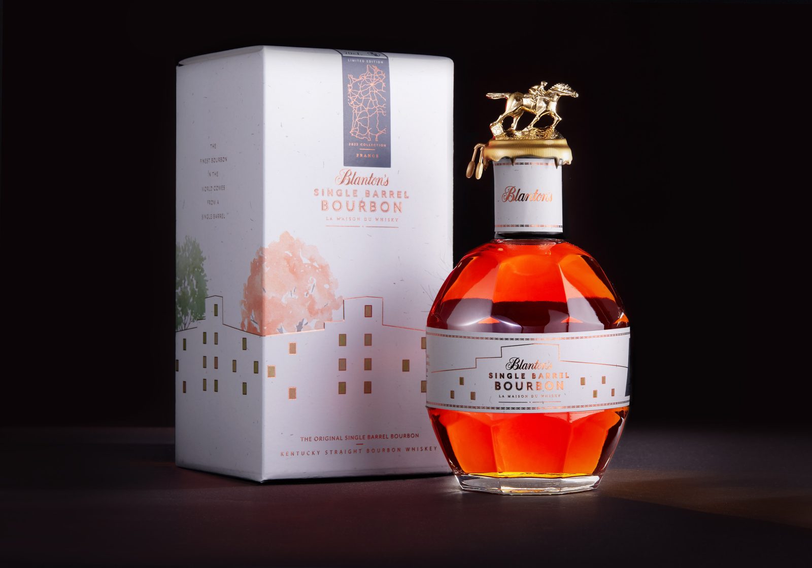
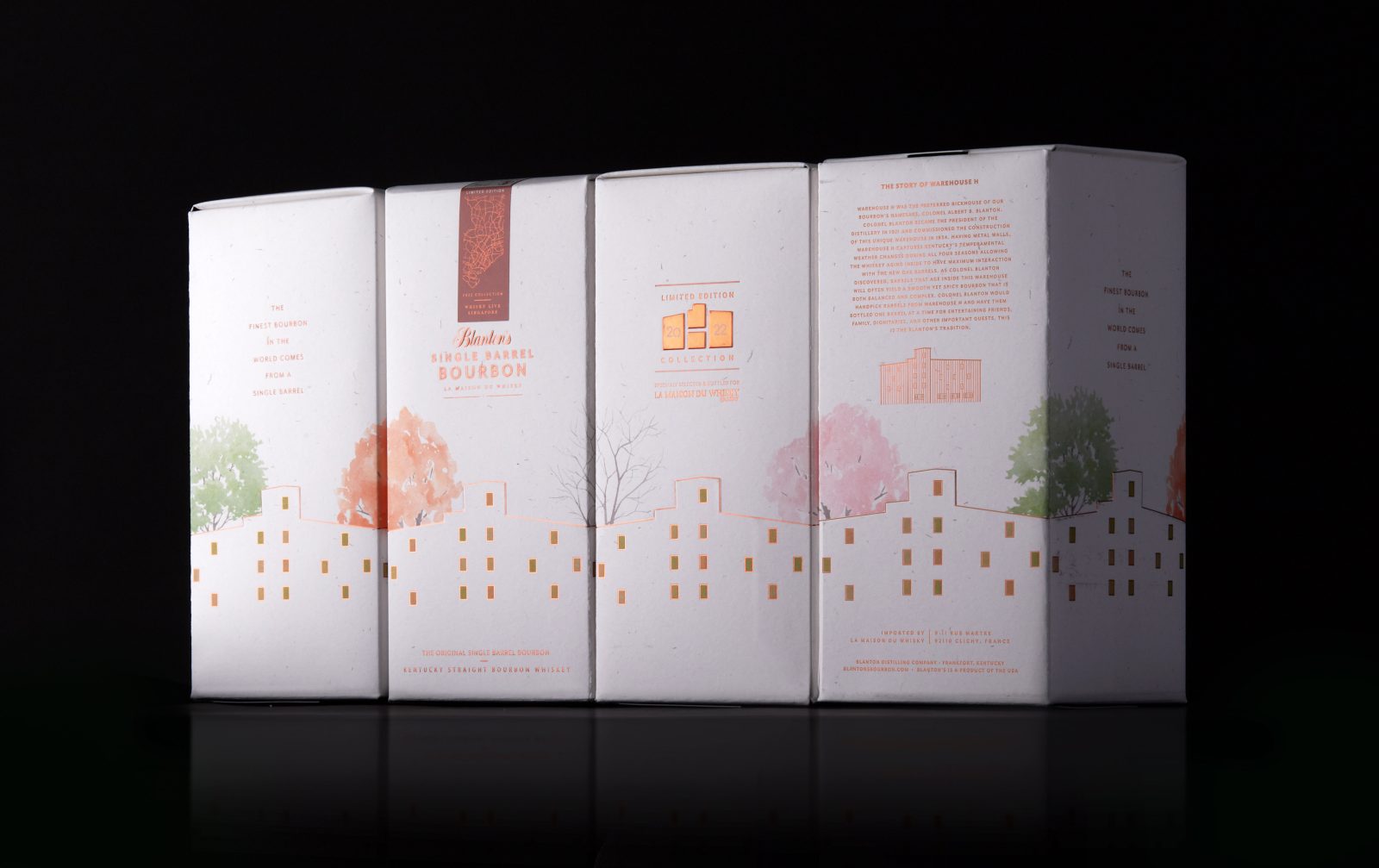
Warehouse H was built to take advantage of Kentucky’s extreme seasonality, which is key to excellent bourbon aging. Designed in a four-panel sequence, each side of the 2022 special edition package portrays the four seasons of the year through transitional watercolor depictions of trees found on the grounds of Warehouse H.
The watercolor feel of the package speaks to the artisanship and craft Blanton’s engages at Warehouse H. Its natural character also connects to the woody elements of the building and of aging barrels.
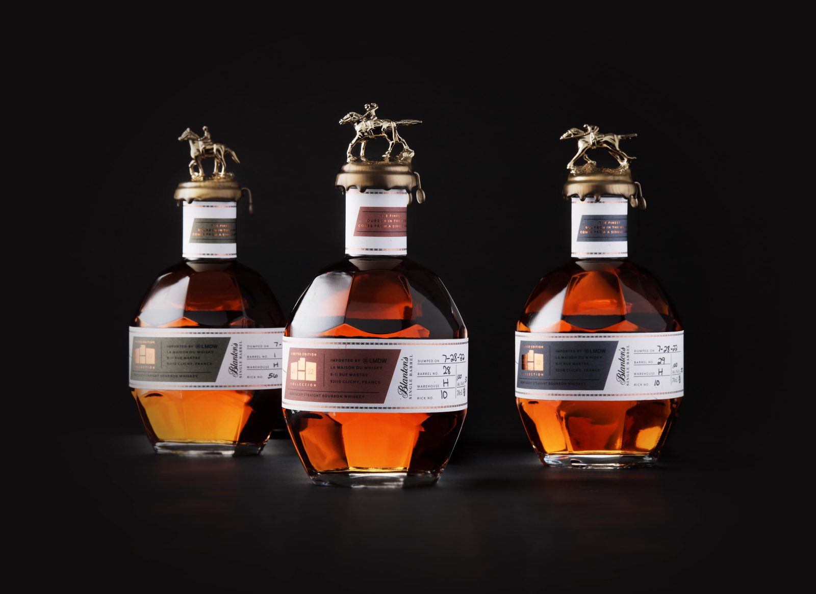
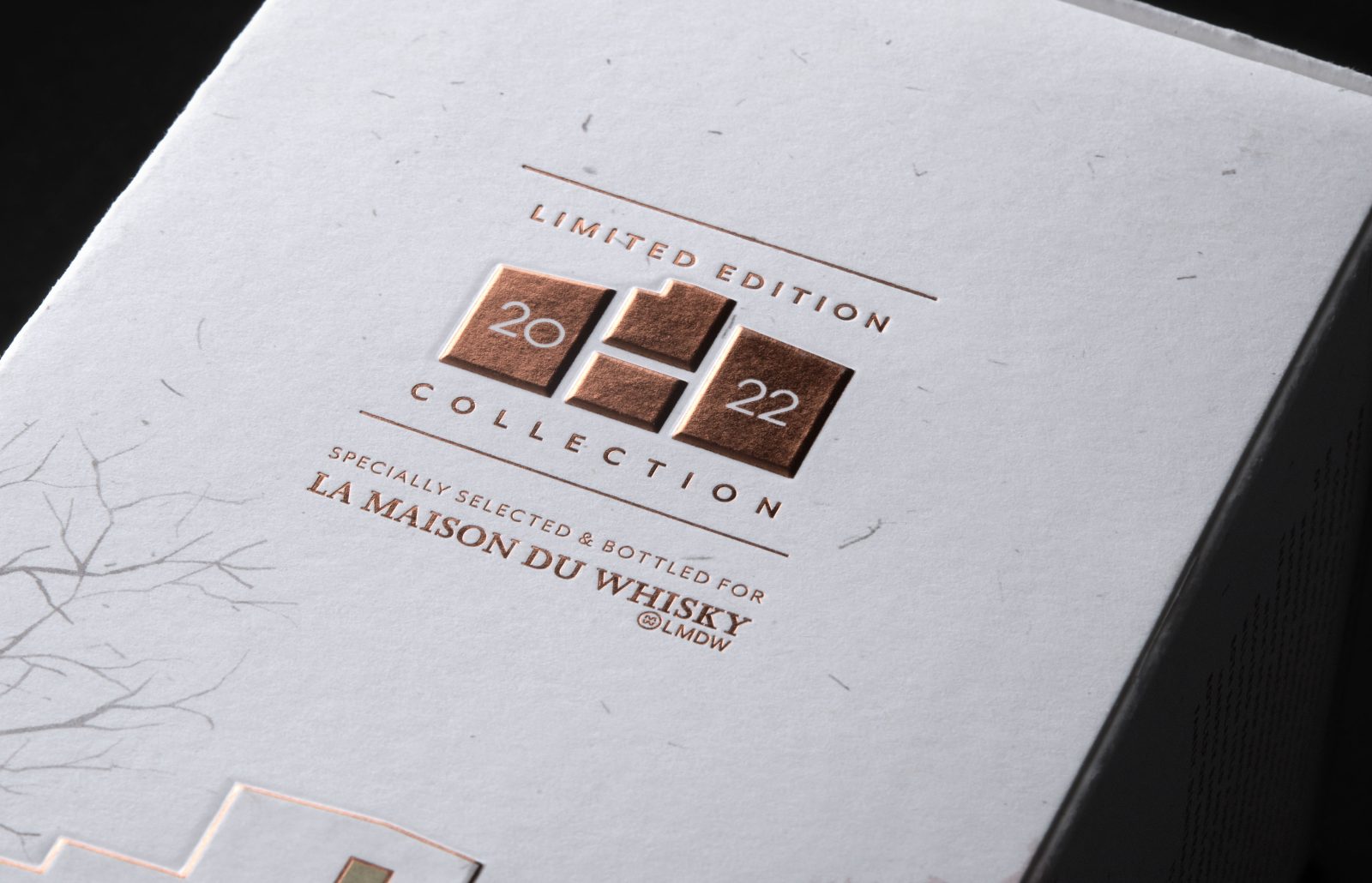
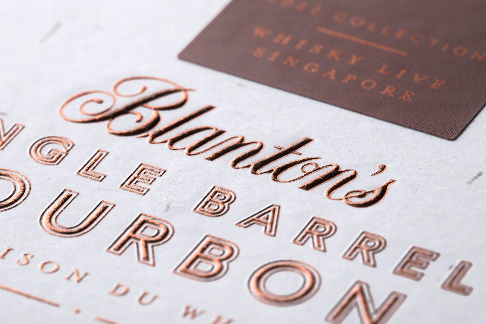
A key part of what makes Warehouse H so effective is its copper sheathing. So copper becomes a key element throughout the design. A silhouette of Warehouse H is depicted in a rich copper-leafed emboss, as is the product masthead and the 2022 edition seal. Much of the type and many graphic elements are set in copper metallic inks on the carton as well as the bottle’s necker and belly band.
The design of the 2022 collection seal centers a letter H on the shape of the warehouse. Colonel Albert Blanton, the brand’s namesake, who led the brand for over 50 years through the early to mid-20th century, considered barrels at the very center of Warehouse H to be the finest. He reserved them for special events and visiting dignitaries. Today, only barrels aged in that part of Warehouse H become Blanton’s Single Barrel Bourbon.
For continuity with designs from prior years, cartography motifs on the tape seals designate bottles sold at Whisky Live Paris, Whisky Live Singapore, and at the La Maison du Whisky store in Paris. These tapes are also printed in copper ink.
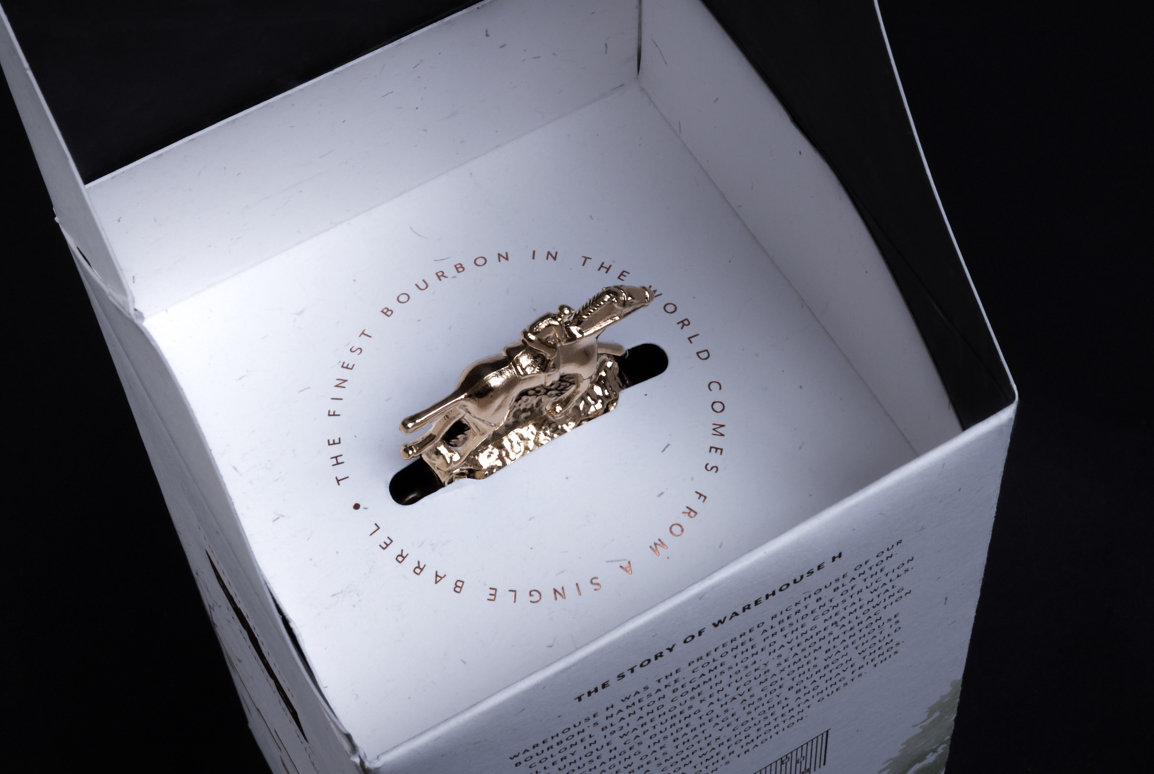
The bottle labels pick up and expand on the design theme with handwritten distiller notes and regulatory information. And for added surprise and delight, the interior surfaces of the carton are printed with a black-and-white image from inside the rackhouse.
The design comes together as a whole with an aesthetic that is at once sensitive, inviting, and sophisticated, giving the viewer a sense of having visited one of the great landmarks in bourbon.
Brand Positioning
Blanton’s Single Barrel is positioned in the apex of American Bourbons. The brand consistently delivers a product that is both steeped in generations of distillation craft and continuously revisited for any improvement recent innovations could potentially bring. It is recognized by connoisseurs and collectors worldwide as one of the finest top-shelf amber spirits.
Because collectors are the primary consumer of this perennial special edition, they expect a design worthy of the spirit and one that elevates its perceived value. This year’s La Maison du Whisky bottling, as in years prior, leverages unique design aesthetics and processes to convey a sense of something special, even in the context of the already-very-special Blanton’s brand.
Competitive Landscape
Because this package is sold as a collector’s item at special events, it doesn’t compete on-shelf at mass retail. It is, however, designed with an emotive sensitivity that stands out in the bourbon category. Where many premium bourbons leverage a hard-edged, amber-toned feel, this one steps back to a subtle, clean, and calm place that creates a quiet aesthetic.
Production
COHO Creative partners with Eurostampa for production. This Italian-based printer of ultra-luxury label and packaging is able to bring keen material and process insights to elevate the final outcome. This collaboration has grown over time and created a relationship of trust.
Interestingly, this year’s edition was produced during a global paper shortage, and the initial stock selected by the design team could not be acquired in time. Eurostampa and COHO resolved the issue through printing processes using stock with similar characteristics. And while sustainability was not a key focus of the design, all papers are FSC Certified, and little to no plastic is present in the package. In the unlikely event recycling should be required, standard processes apply, and biodegradation is assured.
Product Performance
The LMDW edition of Blanton’s sells out very quickly at both Whisky Live Paris and Singapore as it does at the LMDW store, making the secondary collector’s market prominent in positioning and design intent. While the initial offering at the events and store price of the special edition at around 150 Euro, the equity impact of the release is the Brand’s key driver. At the point of this submission, bottles were not available en masse to the secondary market, but a full line with varying ABV was auctioned for €5,400, approximately a 500% increase over the per bottle cost, or an economic impact of over €1M if extrapolated to the release.
CREDIT
- Agency/Creative: COHO Creative
- Article Title: Blanton’s 2022 Limited Edition Packaging by COHO Creative
- Organisation/Entity: Agency
- Project Type: Packaging
- Project Status: Published
- Agency/Creative Country: United States
- Agency/Creative City: Cincinnati
- Market Region: France, Republic of Singapore
- Project Deliverables: Packaging Design
- Industry: Food/Beverage
- Keywords: WBDS Agency Design Awards 2022/23
-
Credits:
Chief Creative Officer: Jon Shapiro
Design Director: Annie Ledford
Design Director: Kate Raterman
Designer: Maria Fisher
Realization Designer: Michael Simmons
Senior Designer - Rendering Development: Kevin Bova


