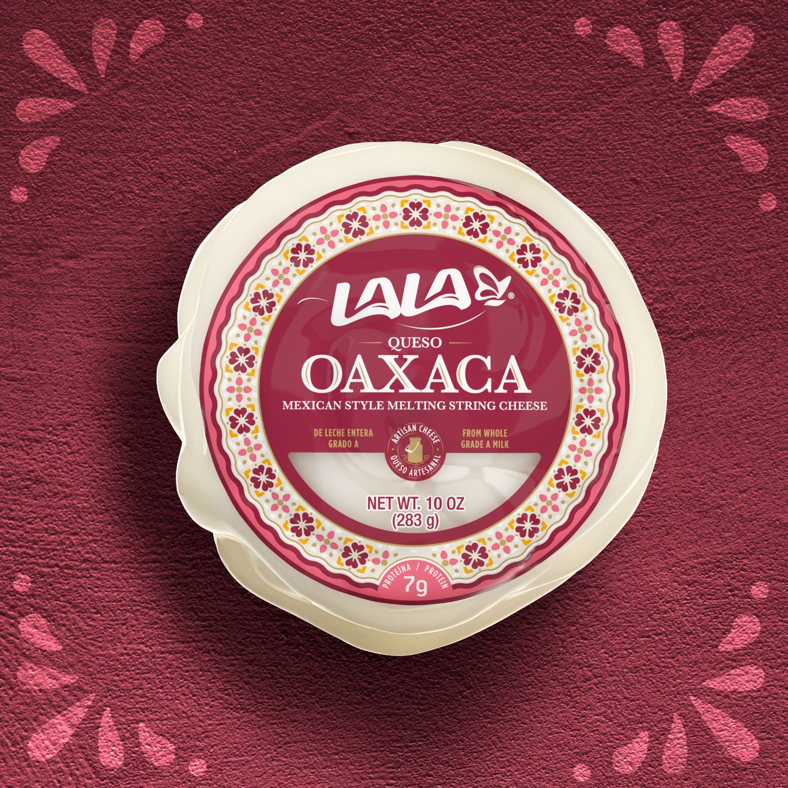
Lala Artisanal Cheeses. Line design for the Hispanic market in the U.S.
The design must convey values of Mexican tradition and origin. Lala, Mexico’s leading dairy brand with a strong presence in the U.S. Market, needed to launch a robust packaging to make a strong impression on U.S. consumers.
With this in mind, the brand was able to enhance its positioning as a genuine and authentic Mexican brand with natural Mexican cheeses. Being part of the mainstream dairy products in U.S. states with strong Hispanic heritage, Lala needed a quick solution to separate itself from other brands that started to launch Mexican-style products.
Lala had all the Mexican legacy and strategically decided to use it to enhance its brand perception with both Hispanic and American consumers.
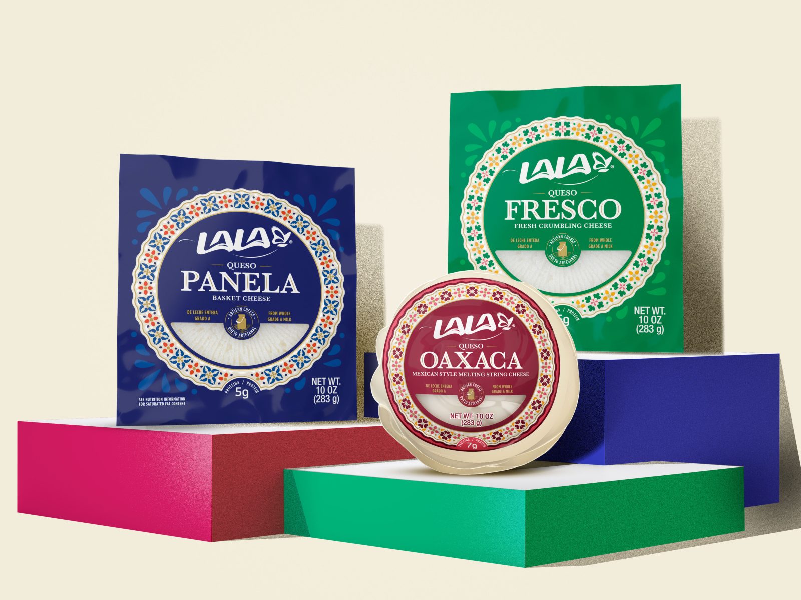
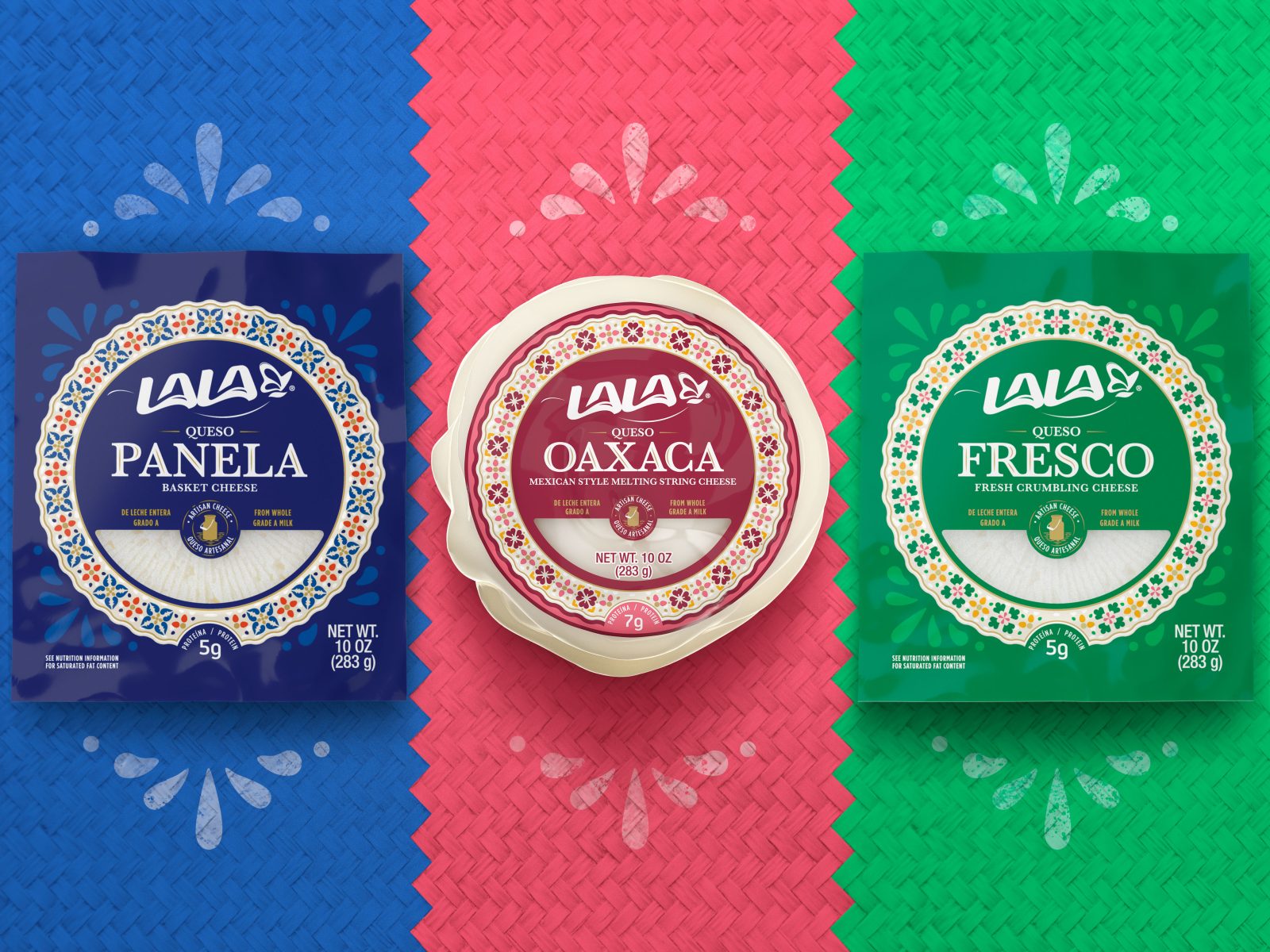
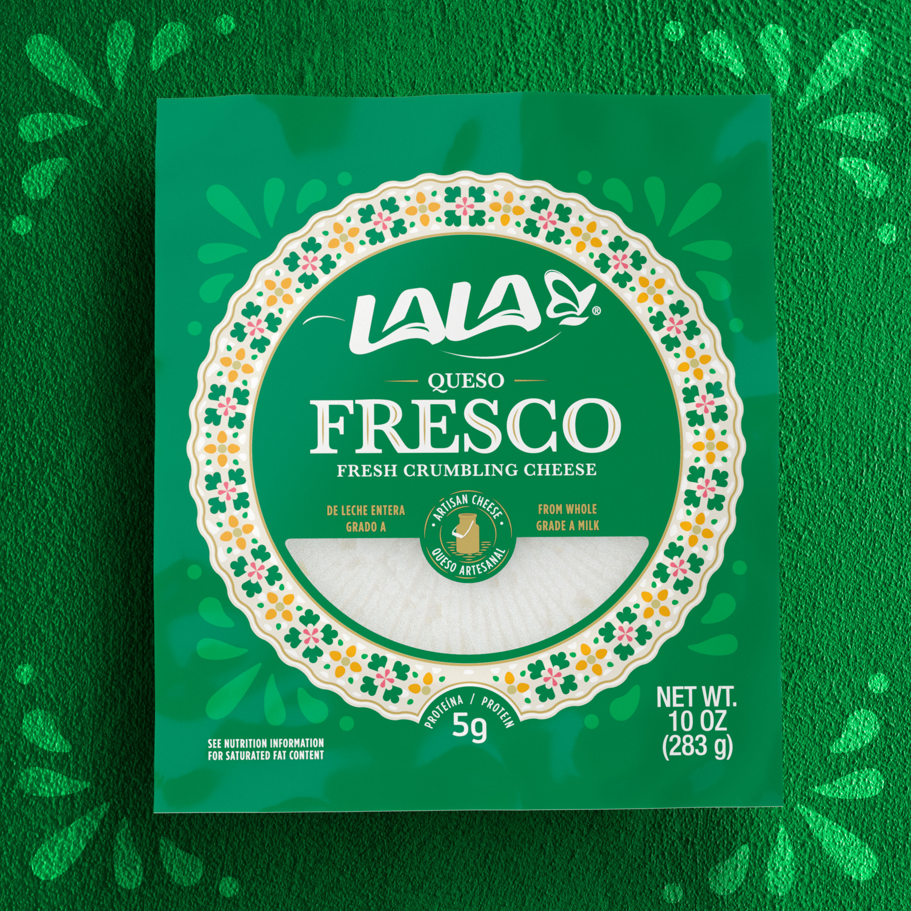
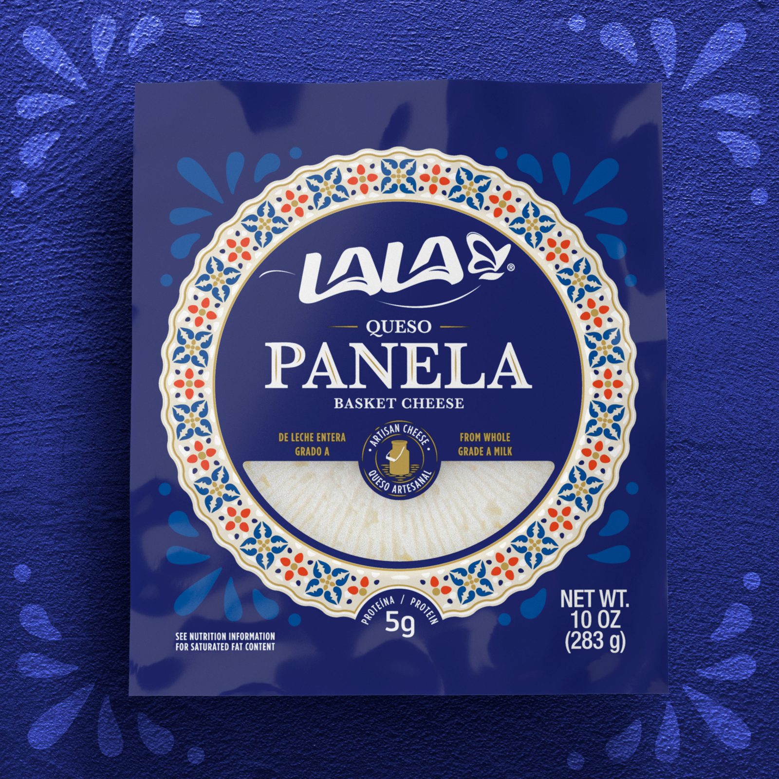
Genuine Mexican flavors inspired the new branding experience with simple but powerful traditional Mexican motifs. The proposed new color palette uses primary yet very recognizable colors. Blue, Green, and Red were chosen to make the new line outstanding on a shelf typically saturated with white and yellow. A circular crown with colorful handmade motifs completes the artwork.
Understanding that these are typical fresh cheeses, white was a pivotal element in communicating freshness. A transparent window was left in the bottom part of the artwork so that the consumer would see the natural product. The white and classic type fonts and the white Lala Brand logo helped the label become a fresh-looking and high-quality proposal. This approach enabled the label to use white/cream as a unifying color for the whole line extension.
This new branding strategy aims at a colorful solution that will become an artisanal design and an icon for Hispanic and American consumers. The exploits simple colors and Mexican style patterns to help generate differentiation on the shelf, highlighting each cheese version: PANELA, OAXACA, and FRESCO.
The new Lala Mexican-Style Cheese line is a unique and authentic packaging solution that claims ownership of the most important Mexican dairy producer in the US Market. It is a powerful declaratory of ethnic graphic values that separate from typical low-quality brands, making a standpoint of high-quality Hispanic pride with an authentic and valuable design.
CREDIT
- Agency/Creative: De Leon Pro
- Article Title: Lala Quesos Packaging Design
- Organisation/Entity: Agency
- Project Type: Packaging
- Project Status: Published
- Agency/Creative Country: Mexico
- Agency/Creative City: Mexico
- Project Deliverables: Packaging Design
- Industry: Food/Beverage
- Keywords: WBDS Agency Design Awards 2022/23
-
Credits:
Senior Designer: Rocío González
Design Director: Víctor Hernández
Brand Design Manager: Luisa De Garay
Director: F. Javier De León
Head Designer/CEO: F. Javier De León


