Bolter worked with Tala back in 2016 and were impressed by the mark they were making in the world of lighting. Earlier this year, Tala approached Bolter to realise their brand refresh. The visual language made use of diagrammatic and straight‐to‐the‐point graphics which fell short of communicating the vision of the company and founders. This next step presented an opportunity to embed poetry and energy into the identity.
Bolter dug deep into the Tala DNA identifying that what united them with their audience was a desire to improve their environment – whether a homeowner, third‐party retailer or interior designer and specifier.
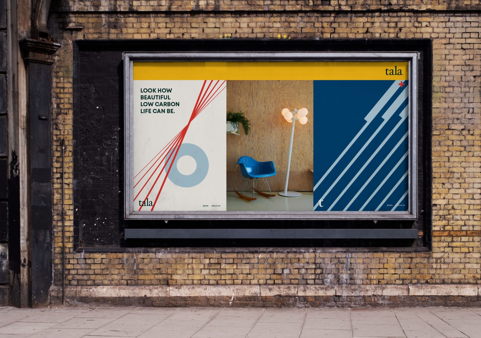
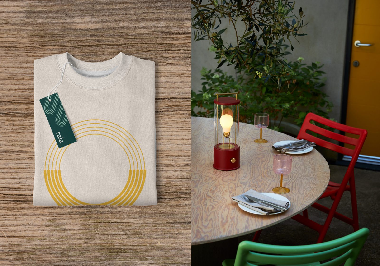
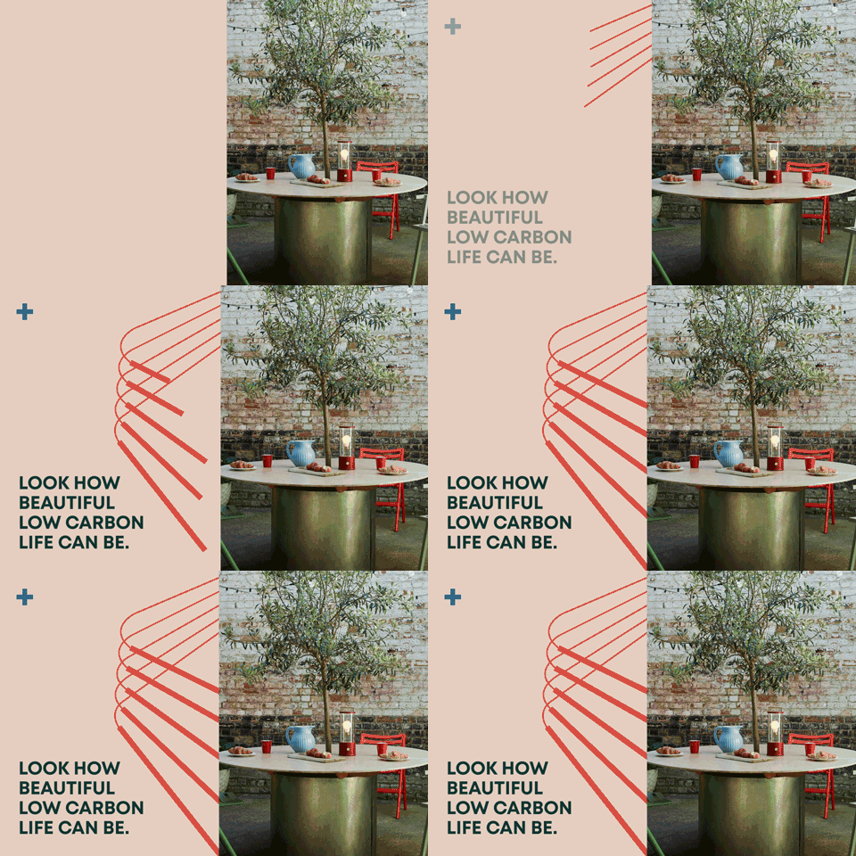
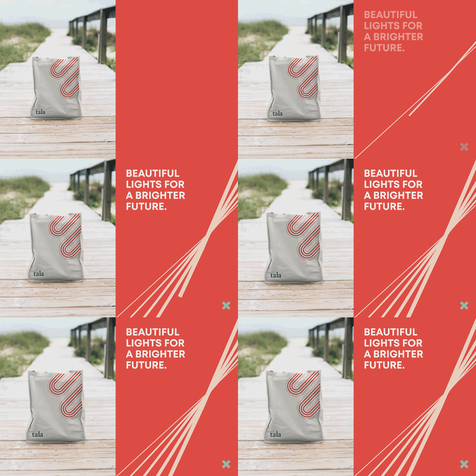
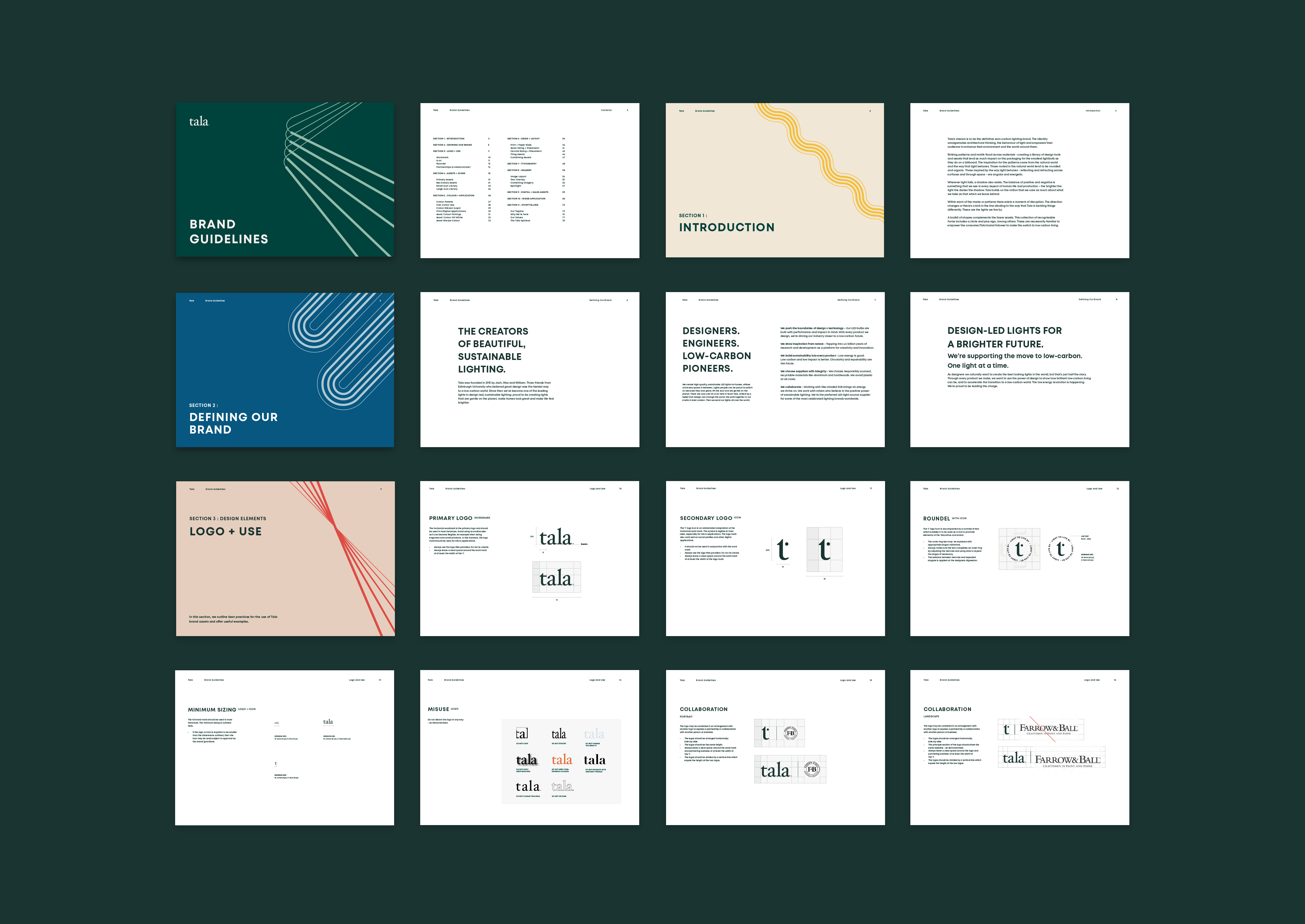
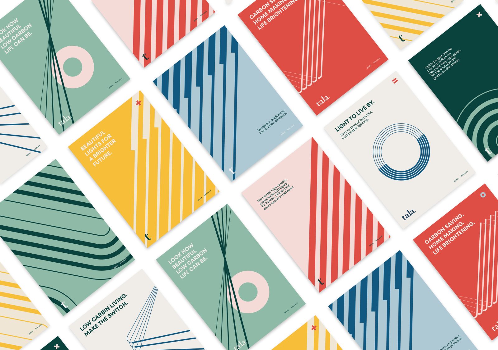
Powerful storytelling helped to build out the toolkit across the brand touchpoints. The inspiration for the assets came from the natural world and the behaviour of light. Rounded shapes echo the sensitivity of organic forms and dramatic, angular formations allude to reflection and refraction.
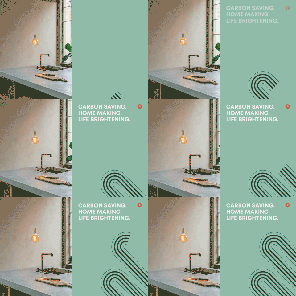
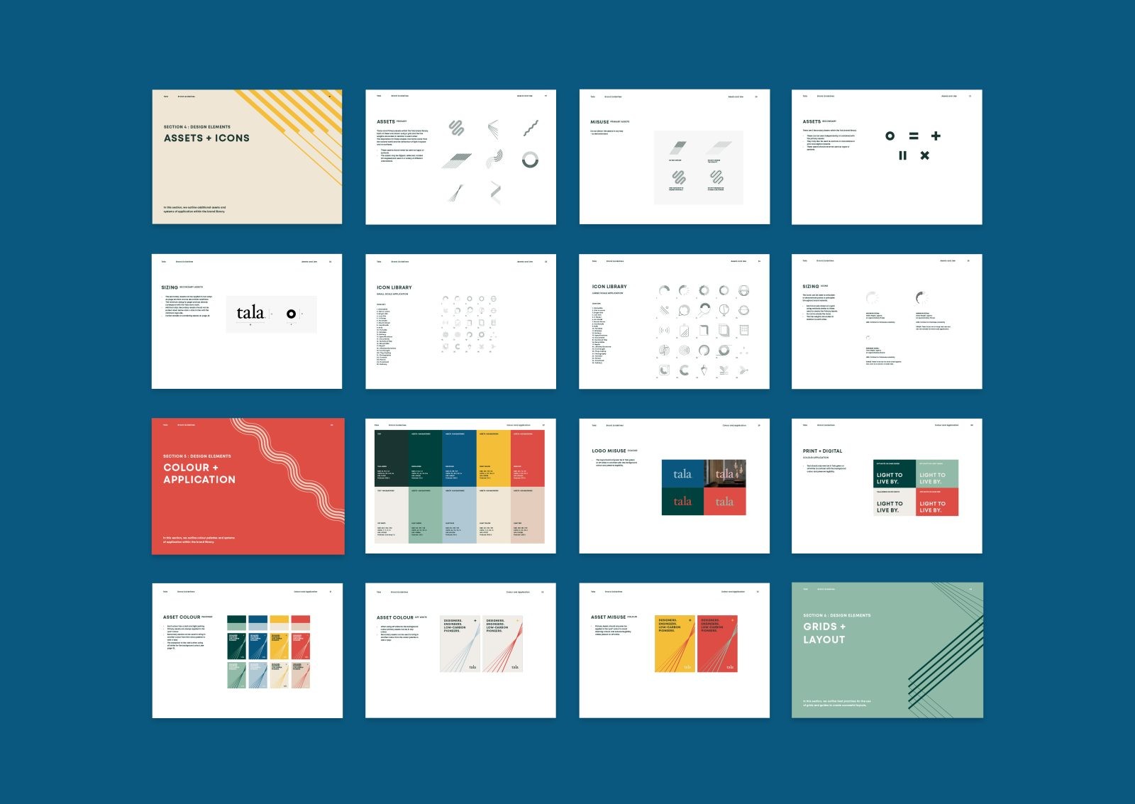
Wherever light falls, a shadow exists. The balance of positive and negative is something that we see in every aspect of human life and production – the brighter the light the darker the shadow. Tala care as much about what they take as that which they leave behind. This duality is represented through the application of lighter and darker shades of the same colours in the graphic material.
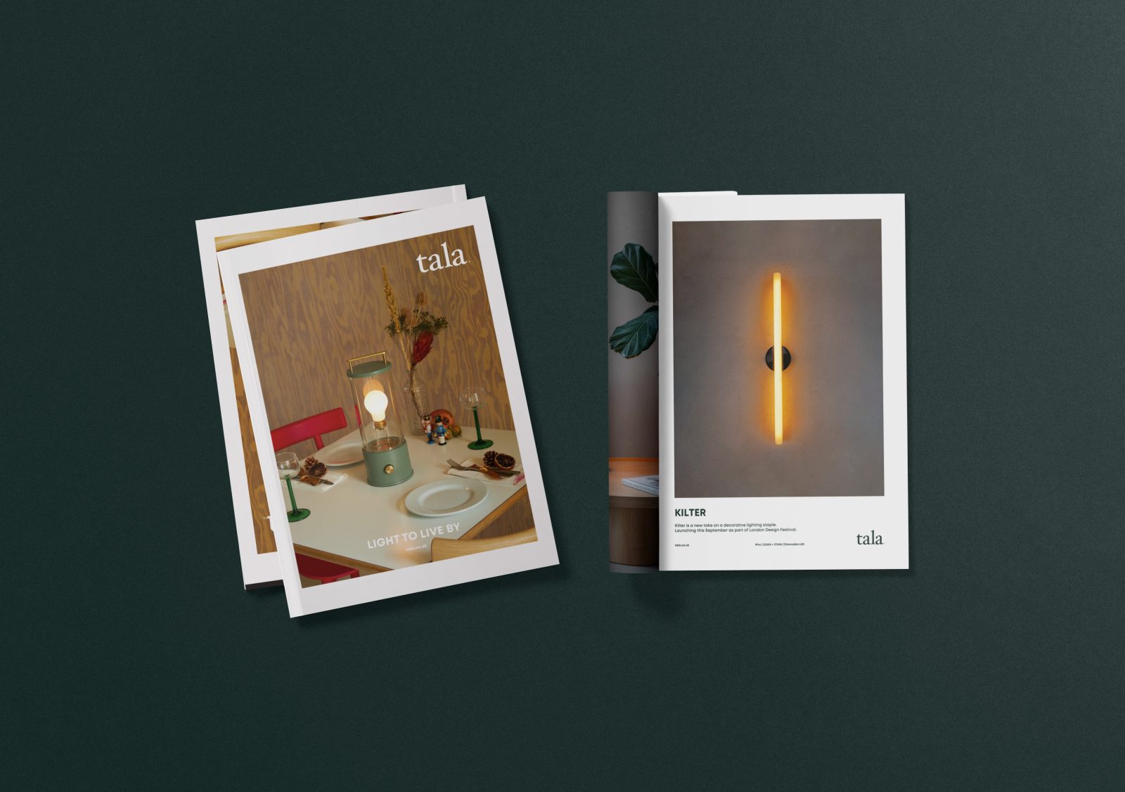
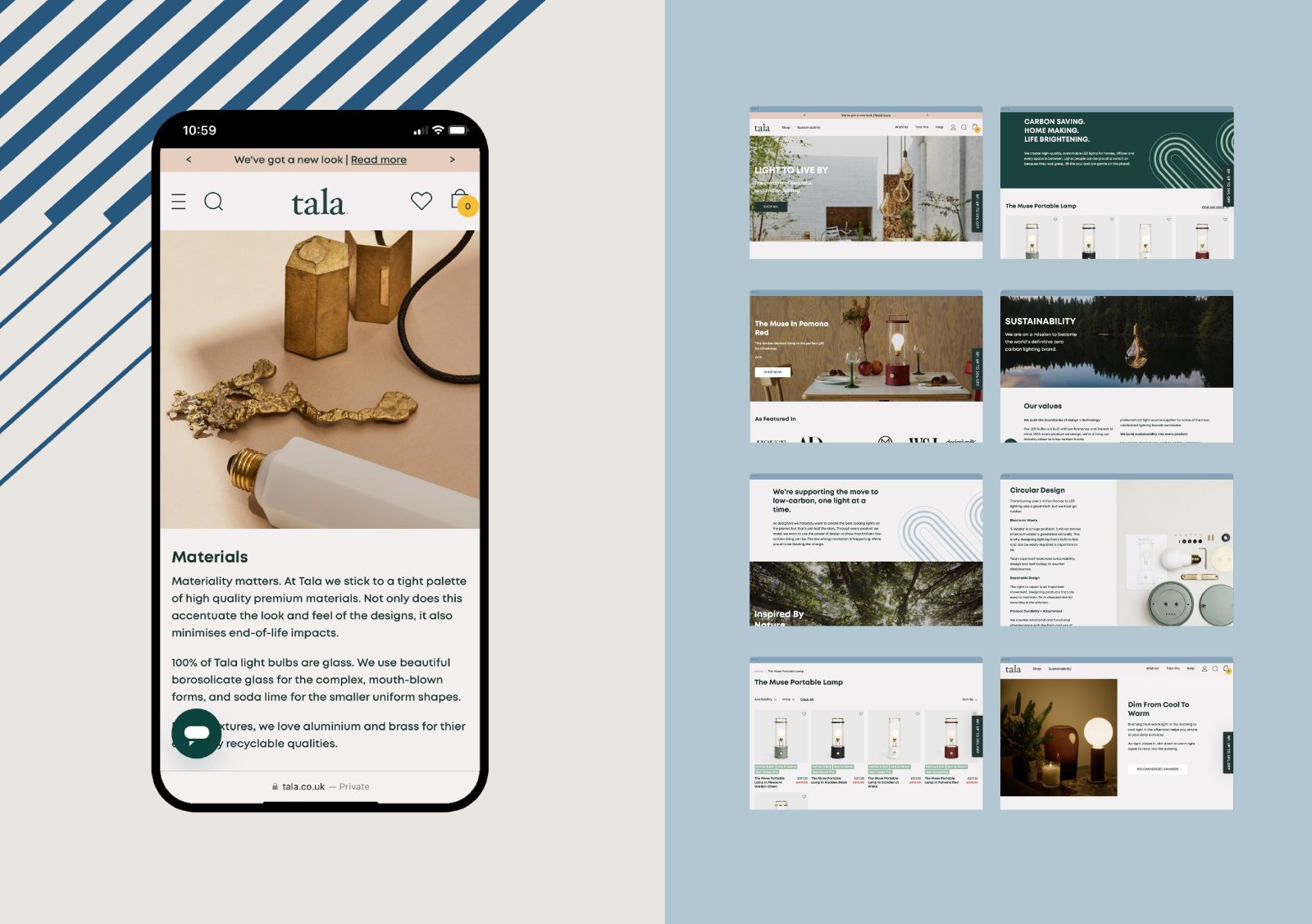
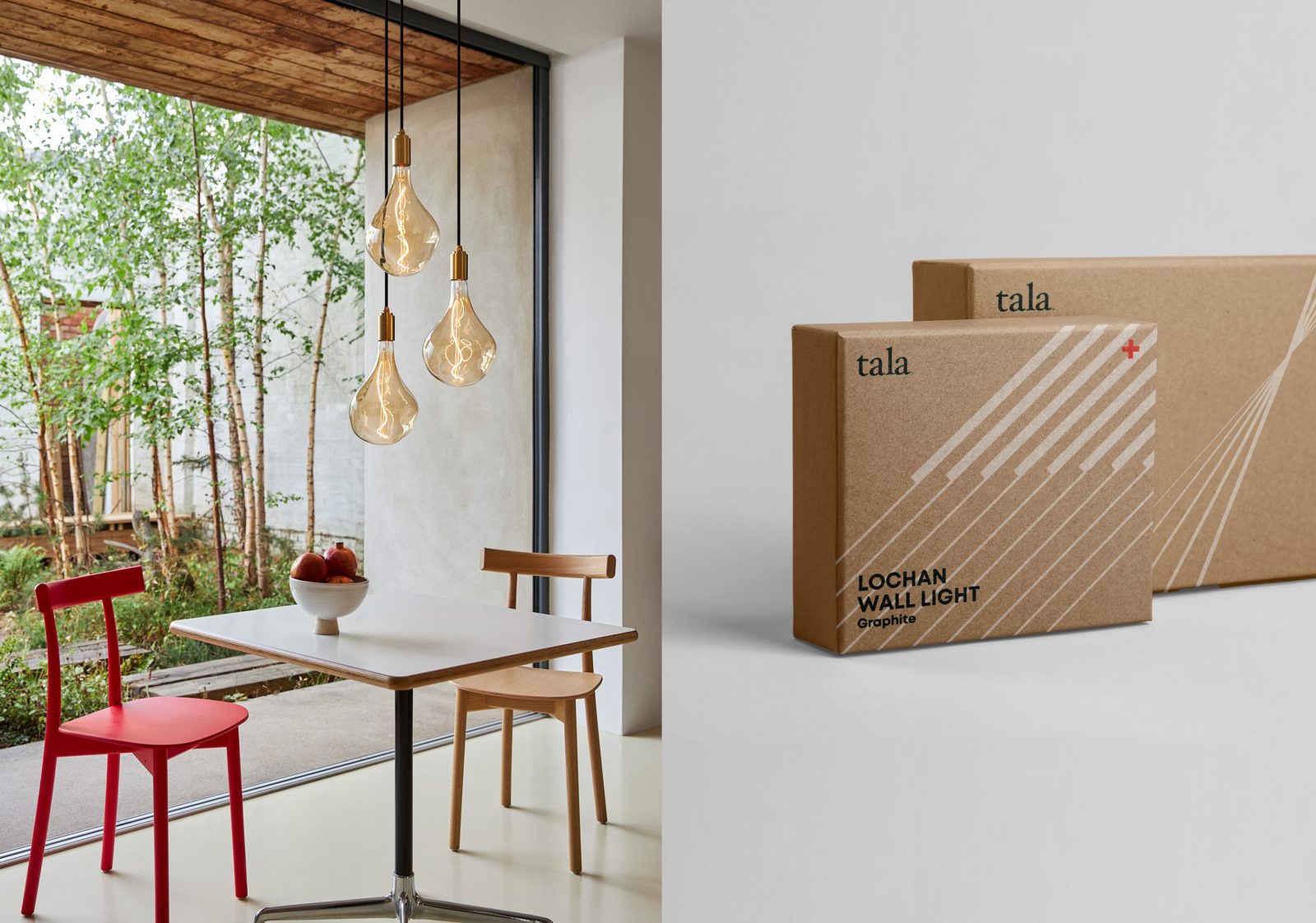
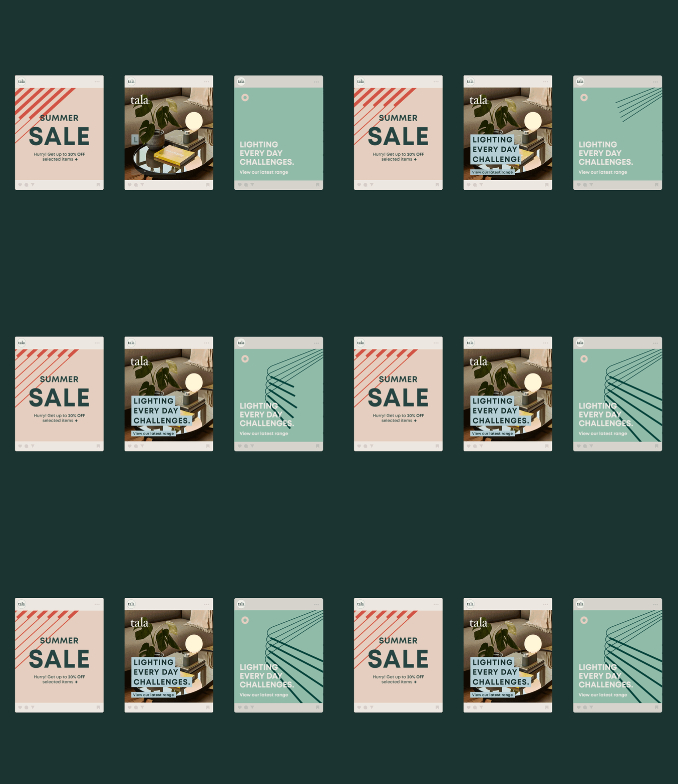
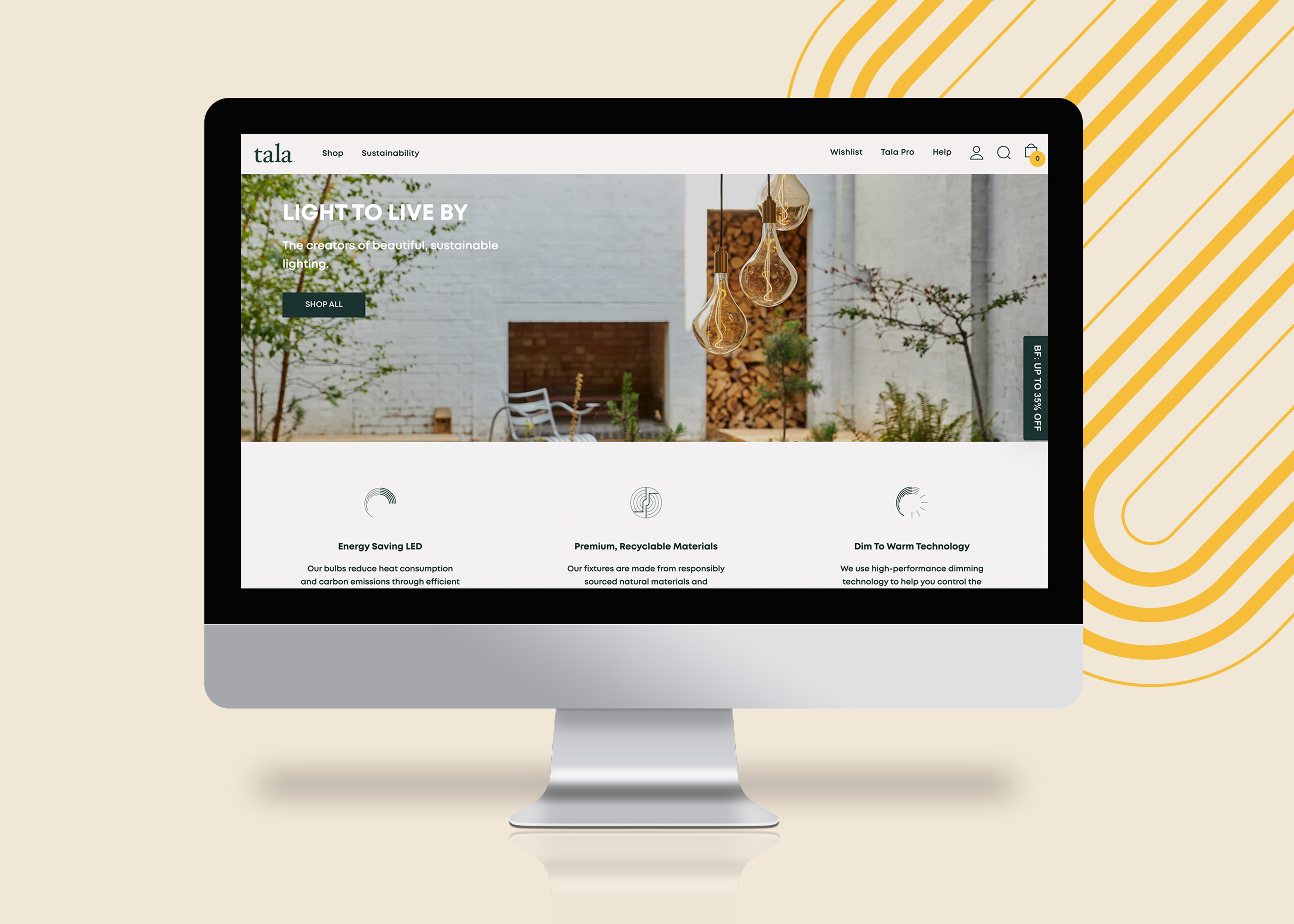
A set of familiar shapes and symbols complements the linear assets and these assemblages scale, move and interact across the collateral, from the website to digital marketing to catalogues, business cards and stationery, to environmental and packaging design.
Messaging is made clear through the application of a single typeface in response to the way Tala interact with their customers and how their community consumes the brand’s content. Mont is a legible, digital-friendly typeface that works across various platforms, devices and accessibility needs. It has a distinctive character and can be used in multiple weights allowing impact and the implementation of information hierarchy but retaining the clarity of Tala’s visionary approach. In line with the unification of the font library, the tone of voice was enhanced to reflect the brand’s evolution: less words, more impact.
Inspiration for the colour palette came from circadian rhythms and light spectrums; as day turns to night, the sky transforms inspiring a natural colour palette that harmonises with the elegant and textured material palette from which the products are made. The overarching brand colours of off-white and dark green nod to Tala’s sustainability agendas and give a fresh clarity to the brand.
A shorthand version of the logo enables brand visibility as the scale of material decreases. The roundel is encircled by key brand messaging to convey special features and product ranges.
A bespoke icon library represents product technology and design features and extends the thread of the visual narrative throughout functional material, where industry‐standard icons may also be seen. These break away from conventional icon styles to create something unique to Tala.
The result is a brand that builds a relationship with the consumer and promises to deliver the move to low carbon living, one light at a time.
![]()
![]()
CREDIT
- Agency/Creative: Bolter Design LLP
- Article Title: Tala Brand Design Refinement
- Organisation/Entity: Agency
- Project Type: Identity
- Project Status: Published
- Agency/Creative Country: United Kingdom
- Agency/Creative City: London
- Market Region: UK, US and global
- Project Deliverables: Brand Design
- Industry: Energy, Retail
- Keywords: WBDS Agency Design Awards 2022/23
-
Credits:
Words and Tone of Voice: Writing Club
Website Development: Brave the Skies


