Tequila finds its origins under the shadow of the historic Volcan de Tequila’s last eruption, occurring over 200,000 years ago – coating the entire valley under a veil of ash. This mineral-rich ash helped to create the ideal soil conditions for the Blue Weber Agave to thrive, and a unique flavor profile indicative of the region. ElVelo, which means “The Veil”, celebrates the distinctive character of the Tequila Valley. It’s made from 100% Puro de Agave, sourced entirely from its volcanic-rich soils.
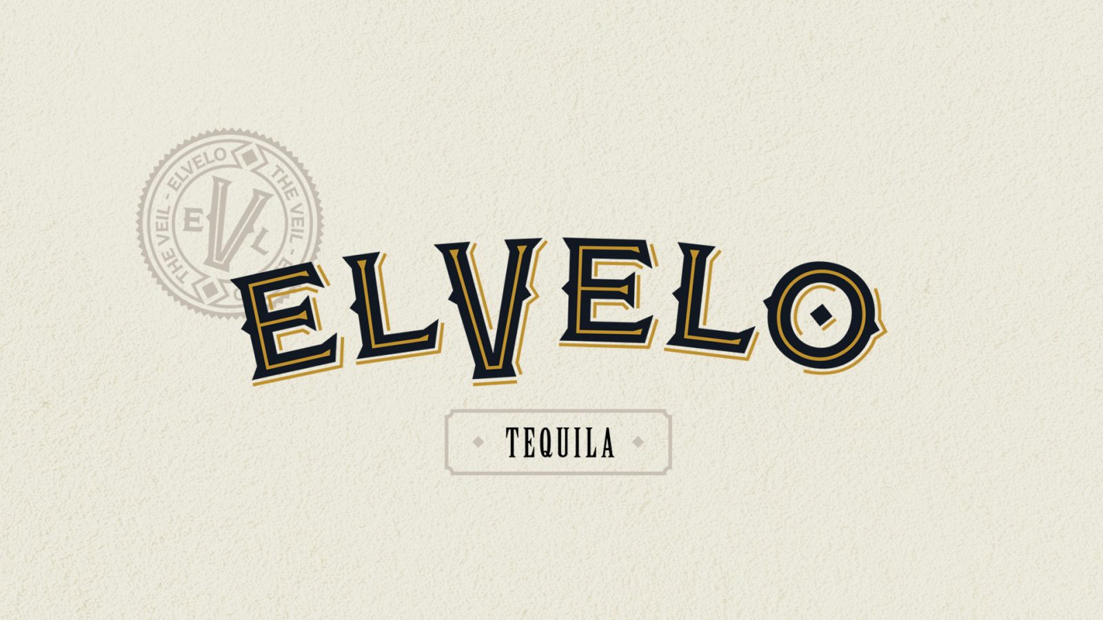
The goal of this redesign was to convey traits of this robust, agave forward tequila, highlighting the unique qualities of the region’s terroir. Formerly feeling delicate and more like a wine, the new brand needed to be bold, rugged, and crafted. We took notes from the rough terrain to develop a logotype that stands out proudly and paired it with fonts that felt authentic and celebratory.
ElVelo was conceived in collaboration from the second-generation Master Distiller Carlos Hernandez Ramos of La Cofradia, with the goal of producing a Tequila that makes the very best cocktails. From the package to cocktail, the incredible history of the Tequila Valley is told, experienced, and commemorated with ElVelo.
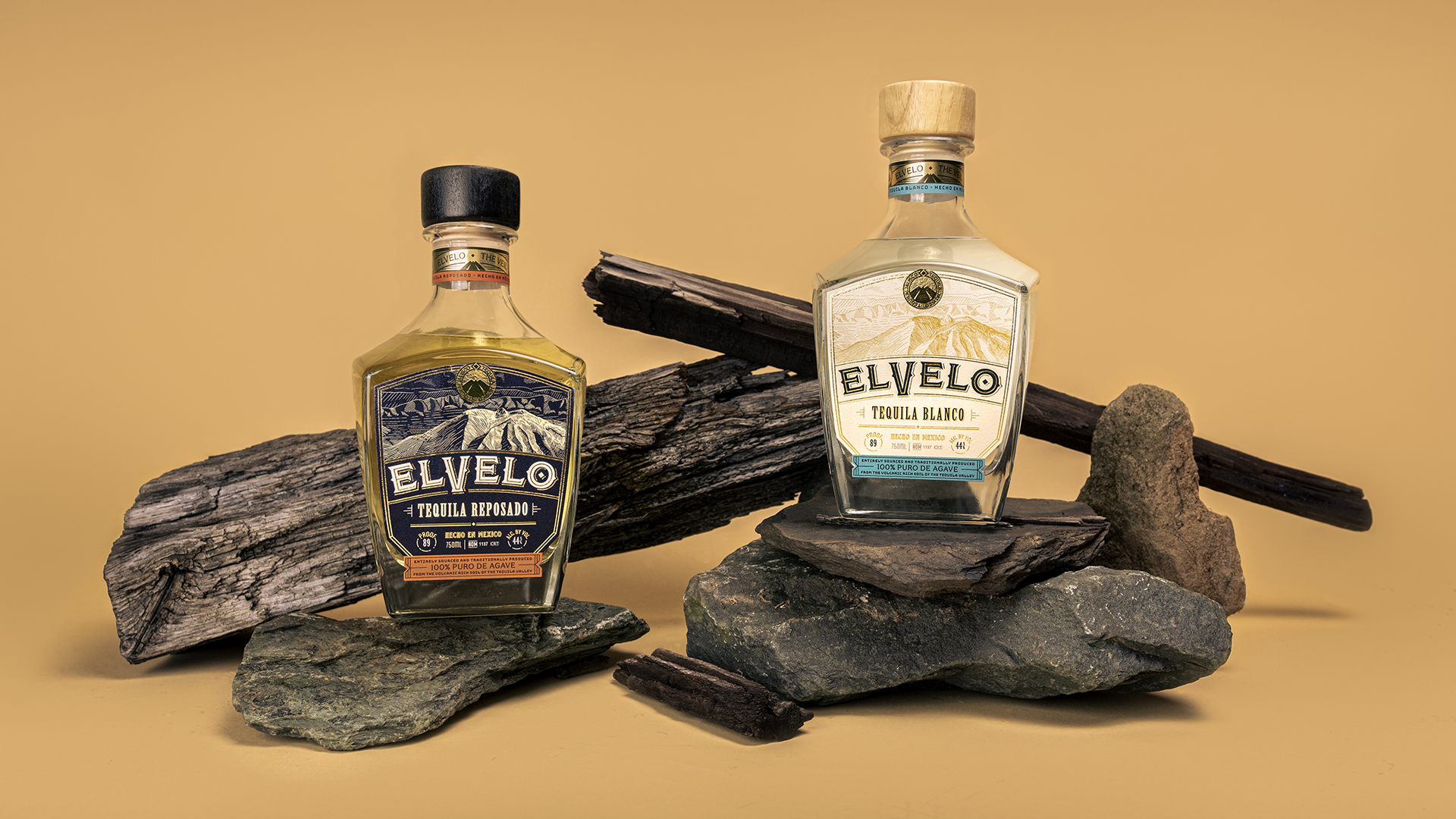
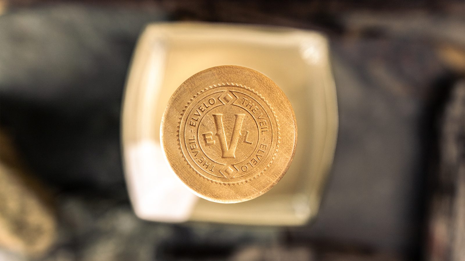
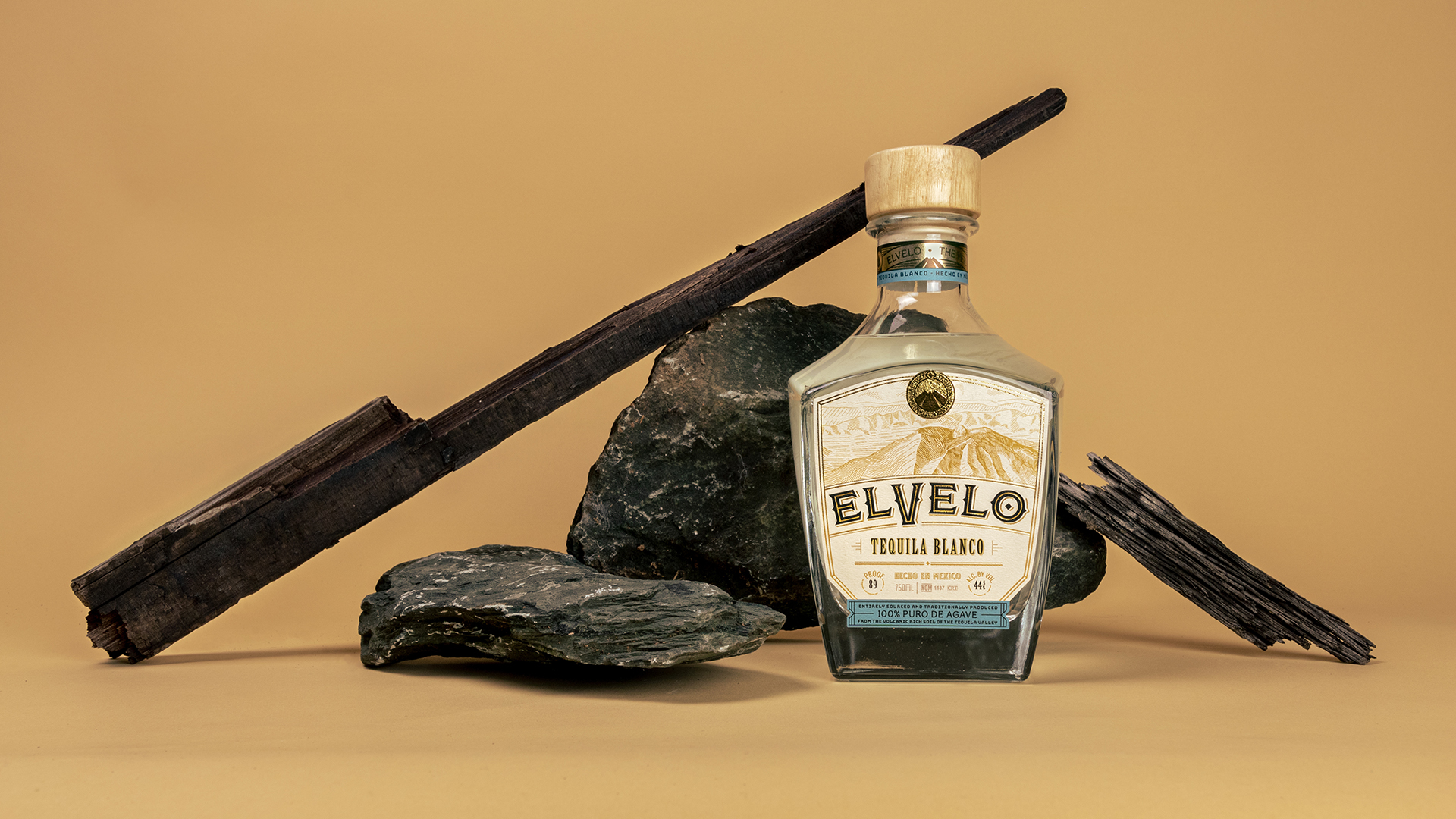
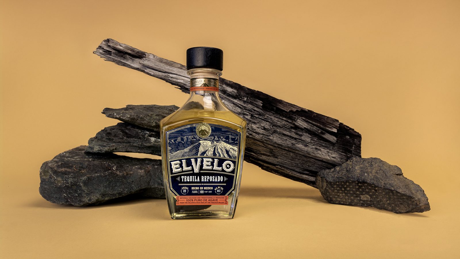
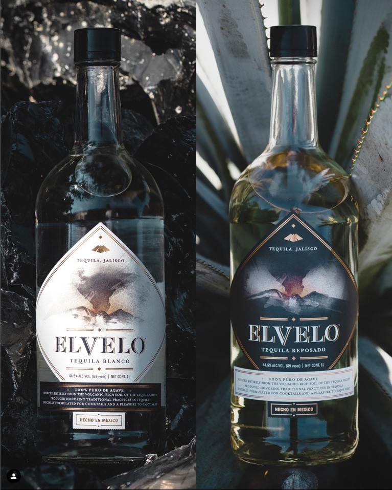
For the package, we began by selecting a bottle that is more reflective of traditional tequila vessels. A thinner neck provides great handling for the end user, with a custom, wider closure to balance the weight of the wider glass body of the bottle. The finish of each bar top compliments the liquid as well as the color palettes of used in each label design. A lighter wood bar top adorns the Blanco, with a black closure on the reposado. The top of each closure is engraved with the ElVelo branding, leaving no detail undone as is expected with the premium nature of this product.
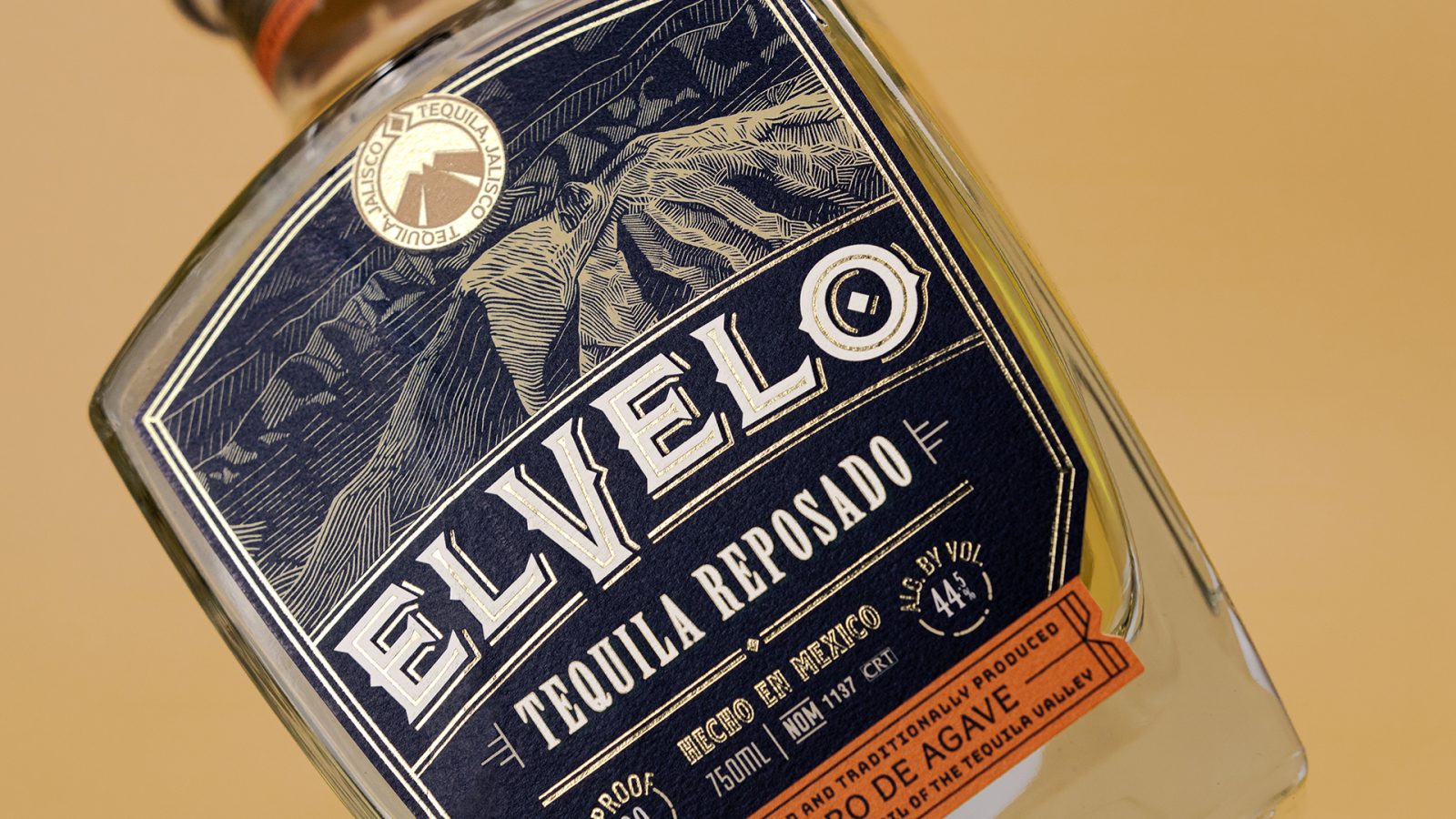
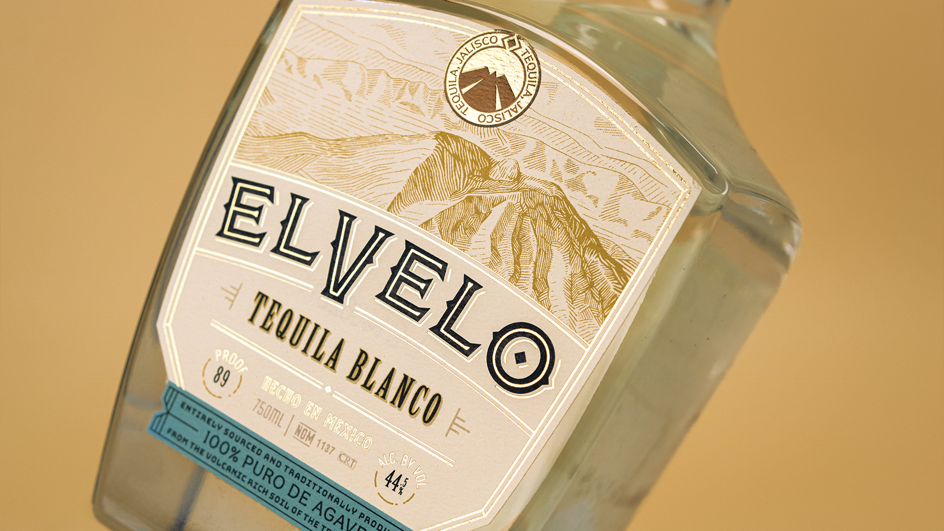
The Blanco and Reposado sit beautifully next to eachother with consistency lent by the hand-illustrated view of the Volcan de Tequila, logotype placement, and golden Tequila, Jalisco stamp at the top of each label. The label follows the unique shape of the bottle as it tapers down to the colorful call out at the bottom of each label. Distinct, bold color differences clearly dictate which expression of tequila you are approaching from the background to the bikini label.
Transitioning from the more photo-like, delicate illustration on the previous design to a more hand-drawn feel focused on the crafted portion of the brief.
Other details of the label, like the decorative elements and foiled accents emphasize the caliber of this traditionally crafted product. A neck label was added to draw your eye upward, marrying the color callout at the bottom to the top of the package.
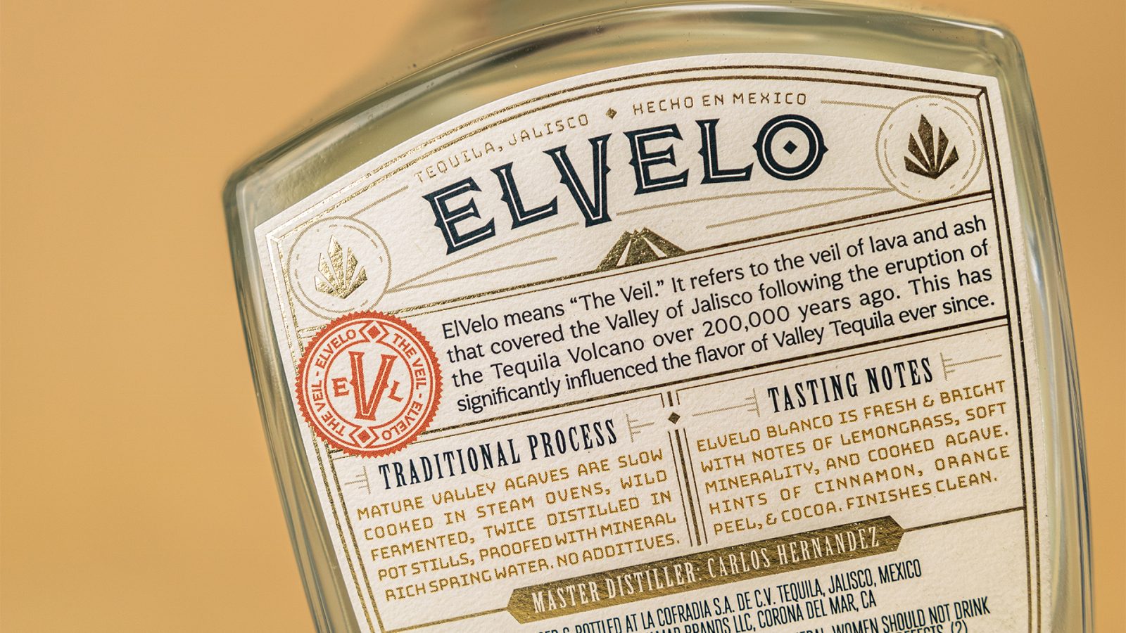
The back label takes a dive into the brand story and reinforces the visuals introduced on the front of package. ‘Tequila Credentials’ are highlighted, like the esteemed Master Distiller, process and notes for each expression.
CREDIT
- Agency/Creative: Watermark Design
- Article Title: Packaging Redesign for ElVelo Tequila
- Organisation/Entity: Agency
- Project Type: Packaging
- Project Status: Published
- Agency/Creative Country: United States of America
- Agency/Creative City: Charlottesville
- Project Deliverables: Brand Design, Brand Identity, Illustration, Packaging Design
- Industry: Food/Beverage
- Keywords: WBDS Agency Design Awards 2022/23
-
Credits:
Creative Director: Darcey Lacy
Package/Graphic Designer: Seth McDuffie


