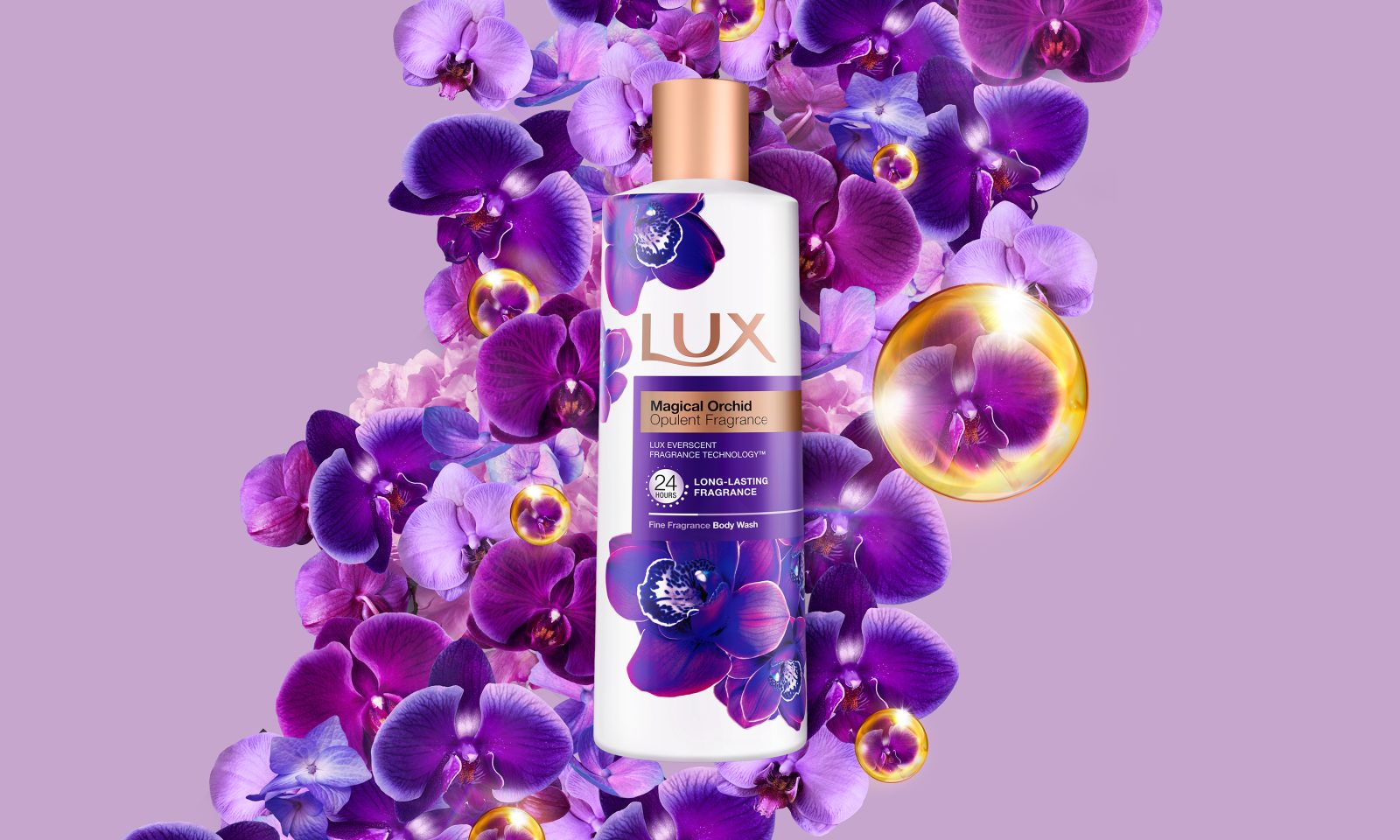
LUX, A Unilever billion-dollar brand powered by a purpose to empower women.
Since 1925, LUX has been serving women who take pride and pleasure in their beauty. What the brand offers them is not just quality beauty products, but also an unapologetic expression of beauty and femininity, built around pleasure and modern glamour.
This societal redefinition of modern glamour and femininity, which comes hand in hand with women playing a bigger role in advocating for their independence, served as a base for the new brand design.
It consists in shifting outdated comprehension of beauty standards from a male gaze perspective defined by entitlement and privilege, towards a female self-centric gaze focus, which cultivates powerful and resilient self-love and self-belief. This changes the perception of women’s femininity and beauty as an armour, a source of strength, and no longer as a weakness.
This new purpose of the brand redefined the way LUX addresses women around the world: rise above everyday sexist judgments to express their beauty & femininity unapologetically.
Objective
Bring to life the brand’s empowering role for women in all brand touchpoints through its BVI system revitalization and Masterbrand principles.
Target Audience
For a Genzenniall audience that connects with the brand’s Queen Bee archetype: self-assured, confident, powerful, and glamorous.
Scope
Re-launching the Masterbrand’s visual identity across markets and different product platforms & communication formats.
Creative Idea
Celebrate every aspect of strong and unapologetic femininity around the world, through the lens of a glamourous, inspirational, and iconic brand with a modern fashion editorial look. To reflect the confidence and pride of the women we serve, the idea was to present the LUX logo as a badge of honour, encouraging women to proudly celebrate our brand and our purposeful presence globally and across our communications.
The Logo, A Badge of Honour
The first step was to enlarge and elevate the LUX brand logo to a badge of honour, to show the pride we take in our brand and its purpose — not only modernizing the feel of the brand but aiding brand recognition and stand out.
Vision With Purpose
Strong, multi-faceted women are at the forefront of the brand. Women who exude confidence and real glamour by refusing to be defined or limited by their beauty. LUX women are glamorous but relatable to reflect the Millennial and Gen-Z women the brand serves. To ensure that the LUX purpose is embedded into every piece of creative communication, 4 key creative guiding principles were defined to abide by.
Distinct & Harmonious Pillars
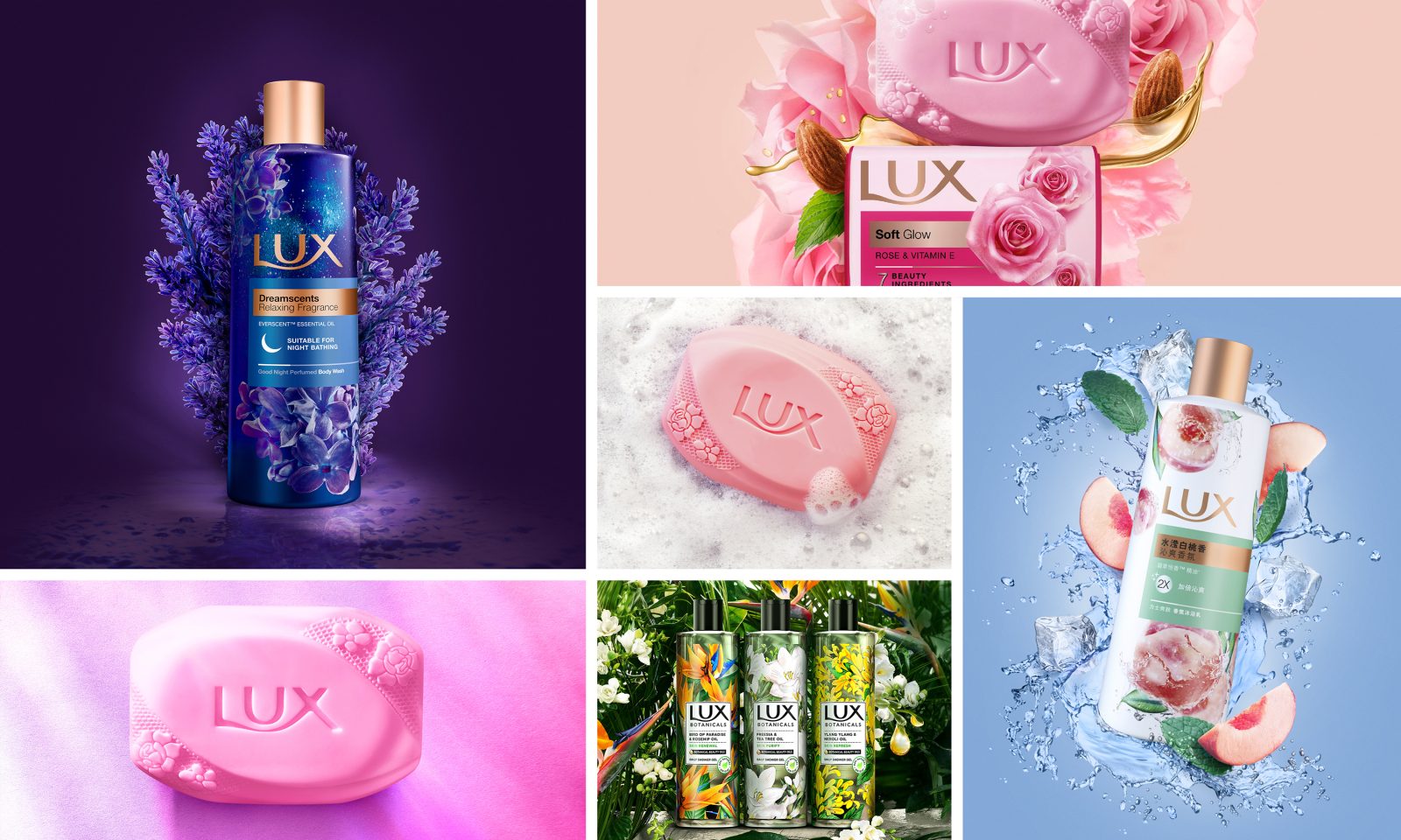
Each product pillar builds from the Masterbrand to bring its unique proposition to life and build the notion of establishing beauty as a source of strength for women.
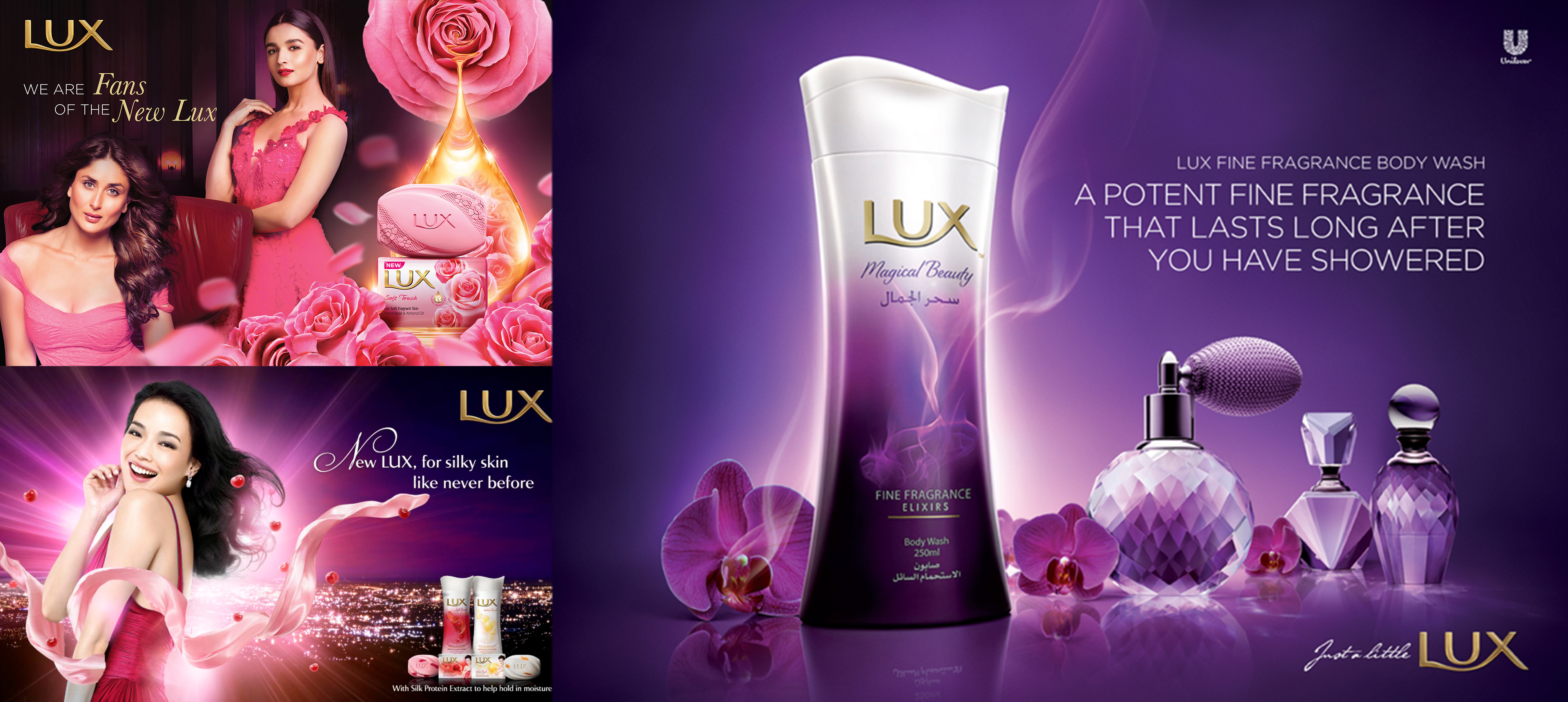
The fine fragrances of Core Liquids and the delicate glow of Core Bars with the natural potency of Botanicals.
Creative Expression
From the new graphic charter to the brand’s packaging design system, the creative idea is to meet women’s expectations by remaining modern, simple, and elegant while retaining inherent femininity.
Type & Iconography: Modern, simple, and elegant to work with the global brand. Ensuring communication is clear and direct whilst maintaining inherent femininity.
Global Typography: Identifying local language font type for consistency through global applications for key markets like China, Saudi Arabia, India, and Thailand.
Brought to Life
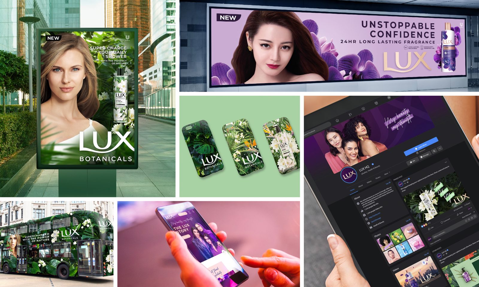
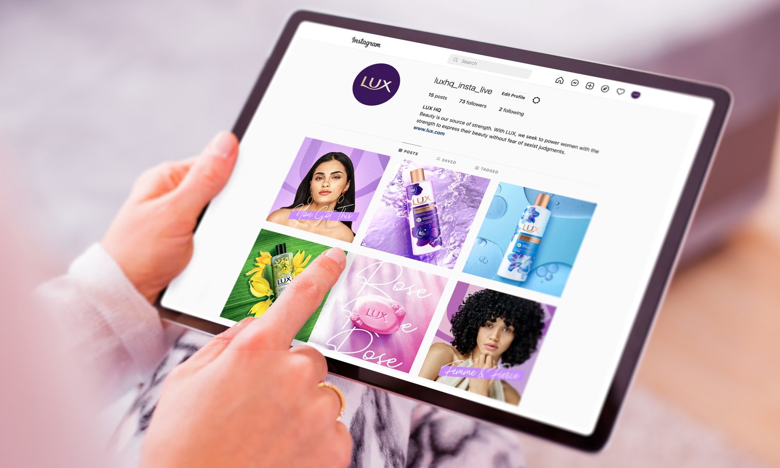
To fully express the new glamorous world of LUX, the new BVI is brought to life through multi-channel touchpoints like retail stores, digital, social media, large formats like billboards, moving media like TVC; stretching and flexing the new assets to create the full LUX experience.
Results
In 2021, the Beauty market saw a resurgence (versus hygiene), which served as the perfect opportunity for the brand’s visual identity re-launch, especially in its key markets.
With a dual-pronged approach of combining strong products, communication mix, and the consistent use of the new visual principles, this creates a more cohesive brand identity across different product platforms across the world, making LUX an increasingly salient brand.
As a result, LUX saw a significant uplift in its business in key markets around the world.
The Chinese market presented continuous growth at the end of 2021.
In India, the business increased its market share, making it a complete turnaround in the new brand identity and communication efforts.
LUX went back to number one brand in terms of category penetration in Pakistan and Brazil.
After years of declining business, the combination of new brand identity with communication efforts allowed the brand to show a remarkable turnaround with strong double-digit growth in market share and penetration gains at the end of 2021.
CREDIT
- Agency/Creative: CBA Design
- Article Title: Brand Redesign for Unilever LUX A Global Brand Powered by Purpose
- Organisation/Entity: Agency
- Project Type: Identity
- Project Status: Published
- Agency/Creative Country: Singapore
- Agency/Creative City: Singapore
- Project Deliverables: Brand Redesign
- Industry: Health Care
- Keywords: WBDS Agency Design Awards 2022/23
-
Credits:
Global Brand Vice President - Lux: Severine Vauleon
Global Brand Manager, LUX: Lynn Goh
Global Digital Manager: Nicolas Tran-Dinh
Managing Director - Singapore: Marion Micoud
Client Services Director - Singapore: Dammy Chowdhury
Managing Director - London: Lewis Jones
Creative Director - London: Anthony Cruice
Managing Director - Paris: Anne Malberti
Creative Director - Paris: David Leonard
Social and Digital Creative Director - Paris: Cécile Gaspard
Strategic Planner – Paris: Christine Martin


