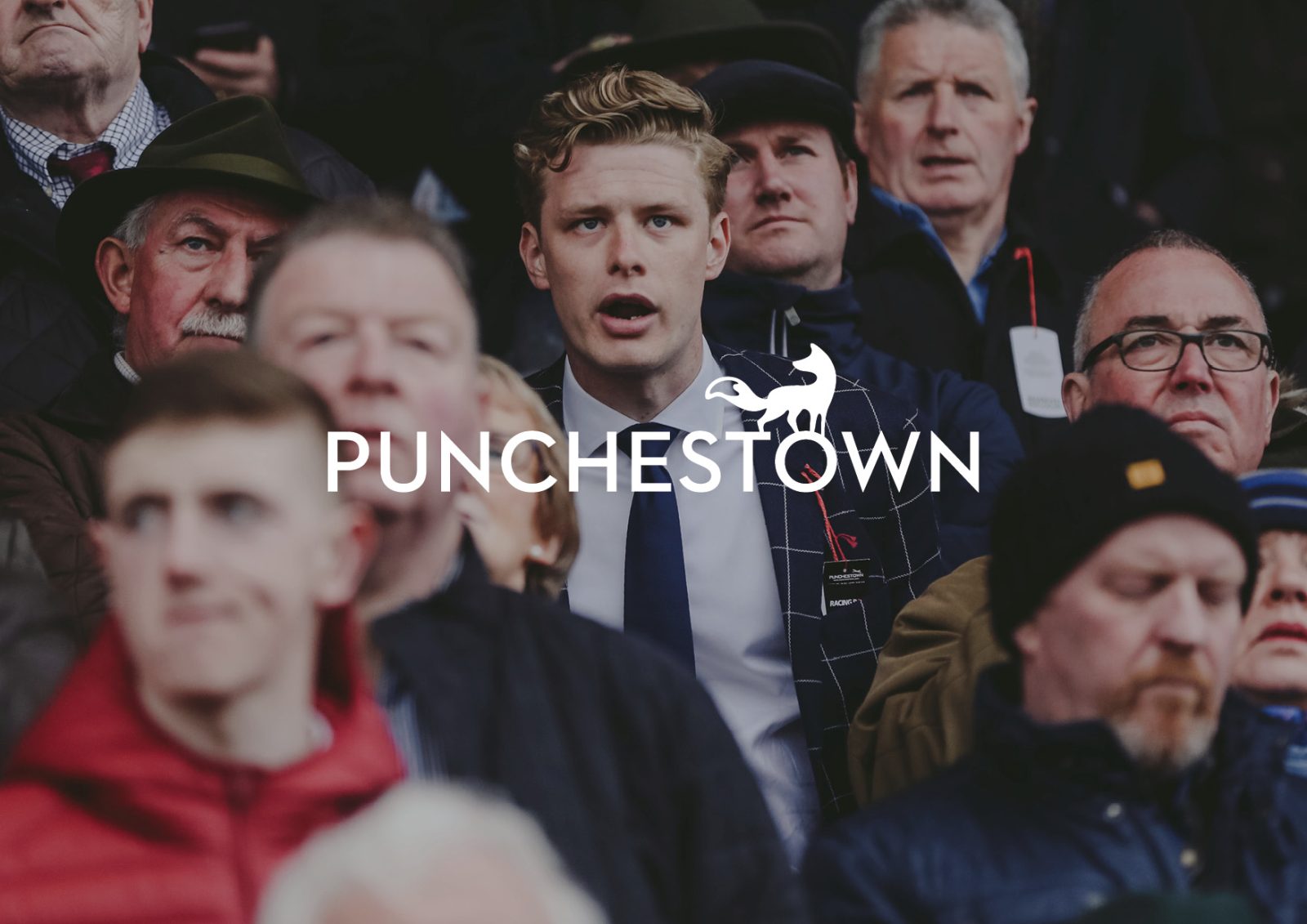
It’s Our Town
The team was approached to create an aspirational, lifestyle-orientated brand for Punchestown to help it move into a more premium space.
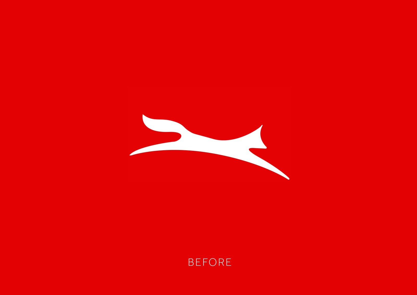
Punchestown’s existing branding felt tired and dated, and no longer representative of the customer it wanted to appeal to. The new brand identity needed to position it as more aspirational and high end.With several hundred thousand attendees and millions watching across the world, the Punchestown Festival is the major horse racing festival of the Irish National Hunt Season. We were tasked with respectfully redesigning the brand, website and creating the annual campaigns for their world famous racing festival
Opened in 1875 Punchestown is Ireland’s leading independent racecourse. Each year in late April the Punchestown Festival attracts over 300,000 attendees to Co.Kildare. As markets change, Punchestown chose to proactively target and market the racecourse to new racegoers across the UK & Ireland. With a brand steeped in such heritage, our focus was respecting the heritage of the brand while providing opportunity for it engage new audiences.
Working with the Senior Communication team and Board members, we conducted a brand profiling workshop to better understand the racecourse as an organisation. Already having a robust knowledge of the business of horse racing, we wanted to further understand the commercial opportunities unique to Punchestown. Armed with knowledge, our team delivered unique branding concepts, campaign suites and supporting digital assets to present each brand. While branding is an objective process, we understand that those stakeholders involved in this process will always be vested within the project. We justified our research and after a little adaptation, the chosen brand moved into real world application.
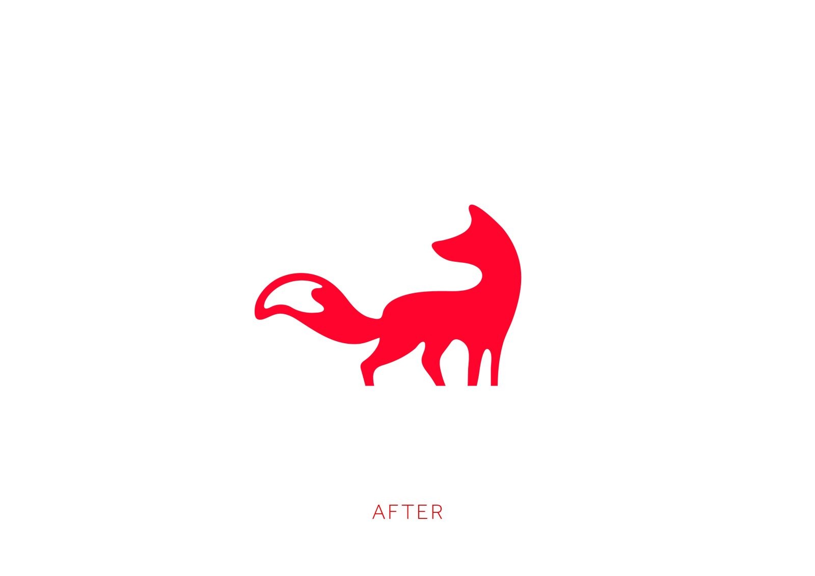
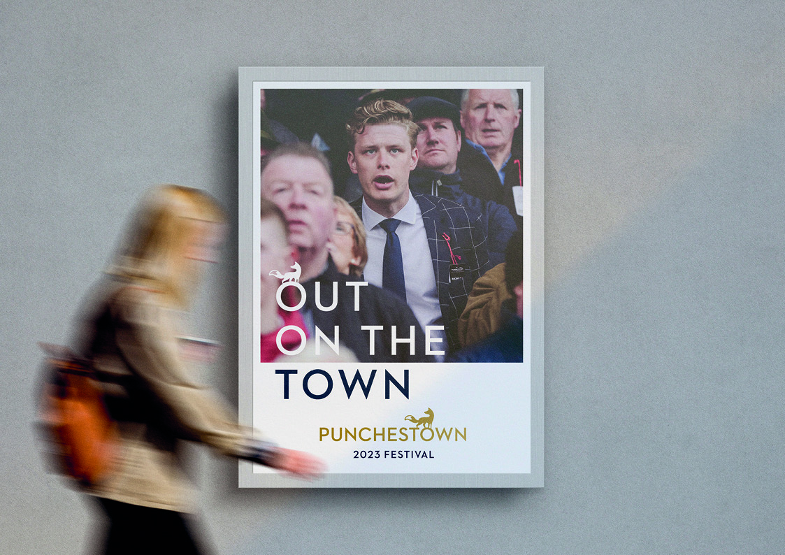
Based on the team’s brand concept of ‘Our Town’ (reflecting the idea that people ‘go to town’ for a night at the races), the new identity represents a modern, forward looking racecourse that stands ahead of it’s competitors.
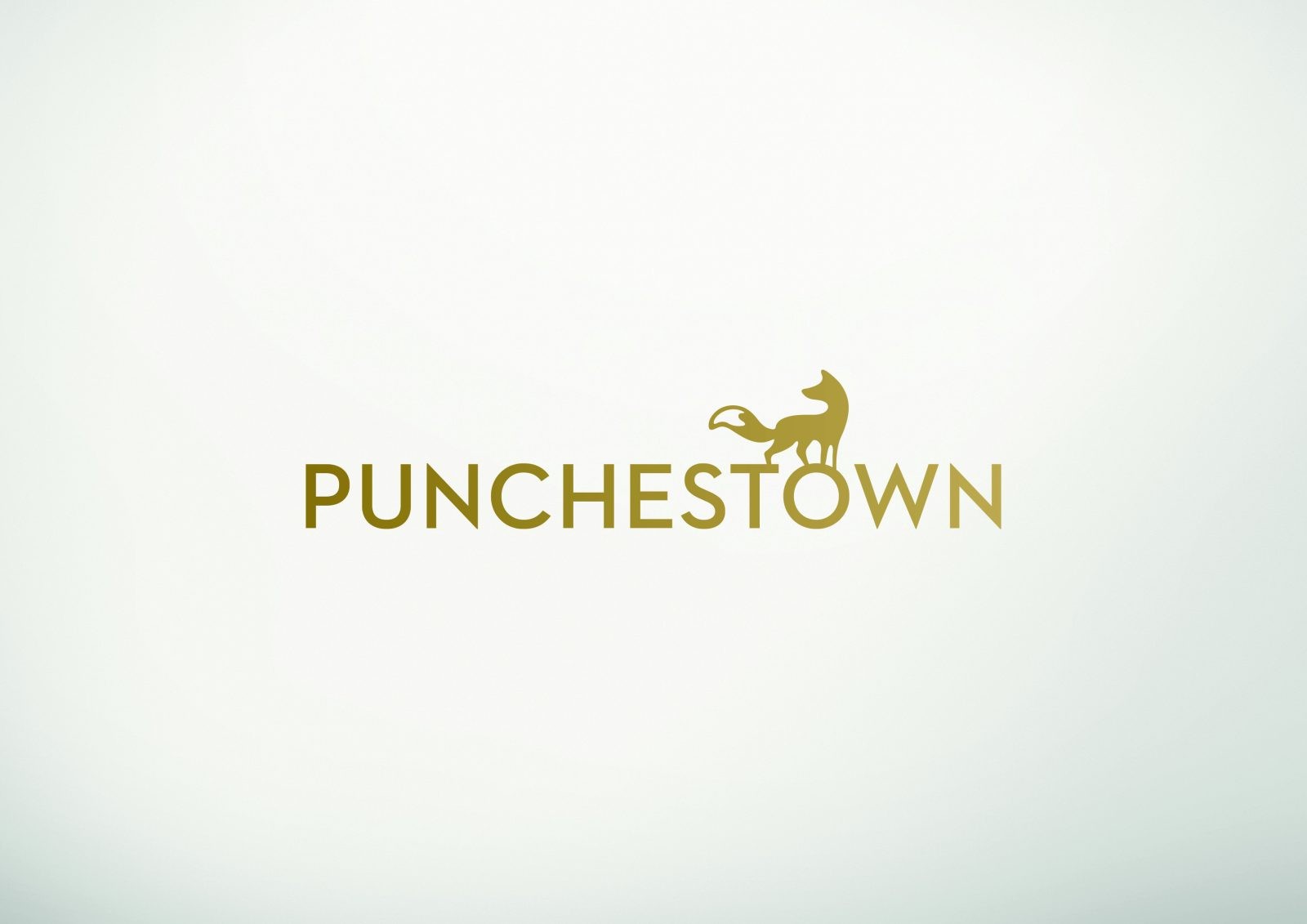
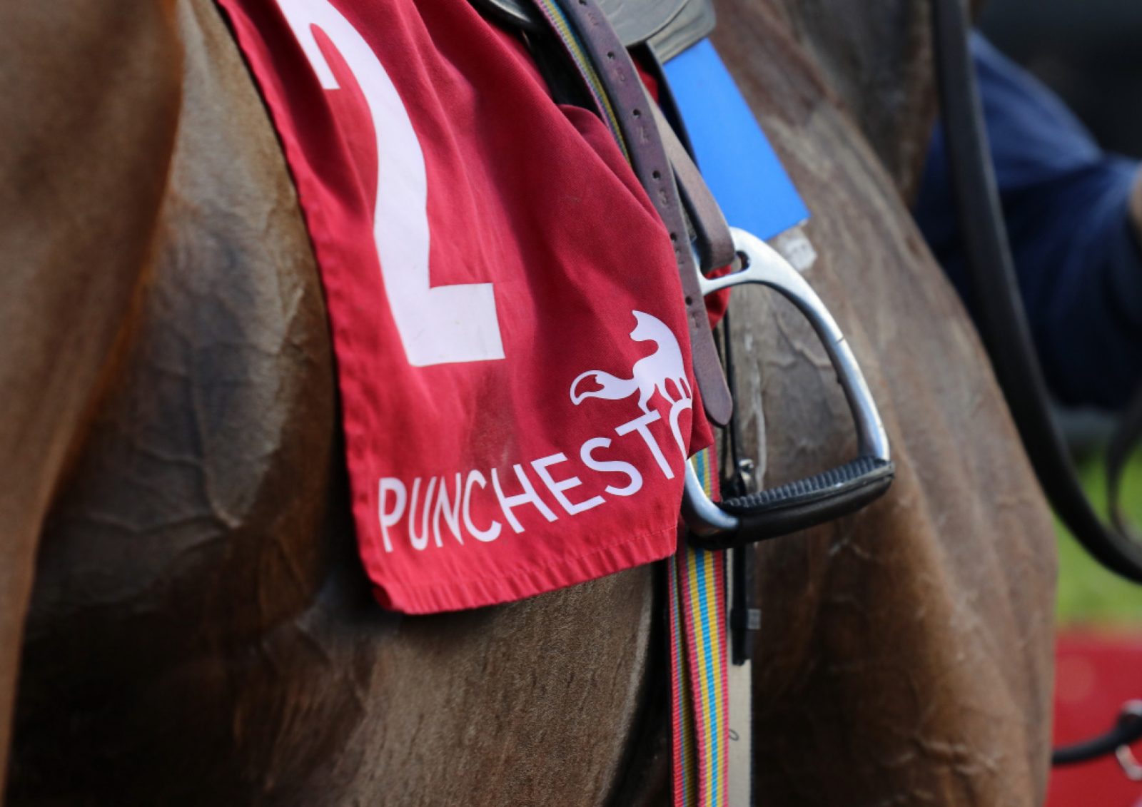
The bespoke fox mascot offers a sense of curiosity and the letter-spaced capital letters and light weighting of the font position the brand in a luxury, premium market.
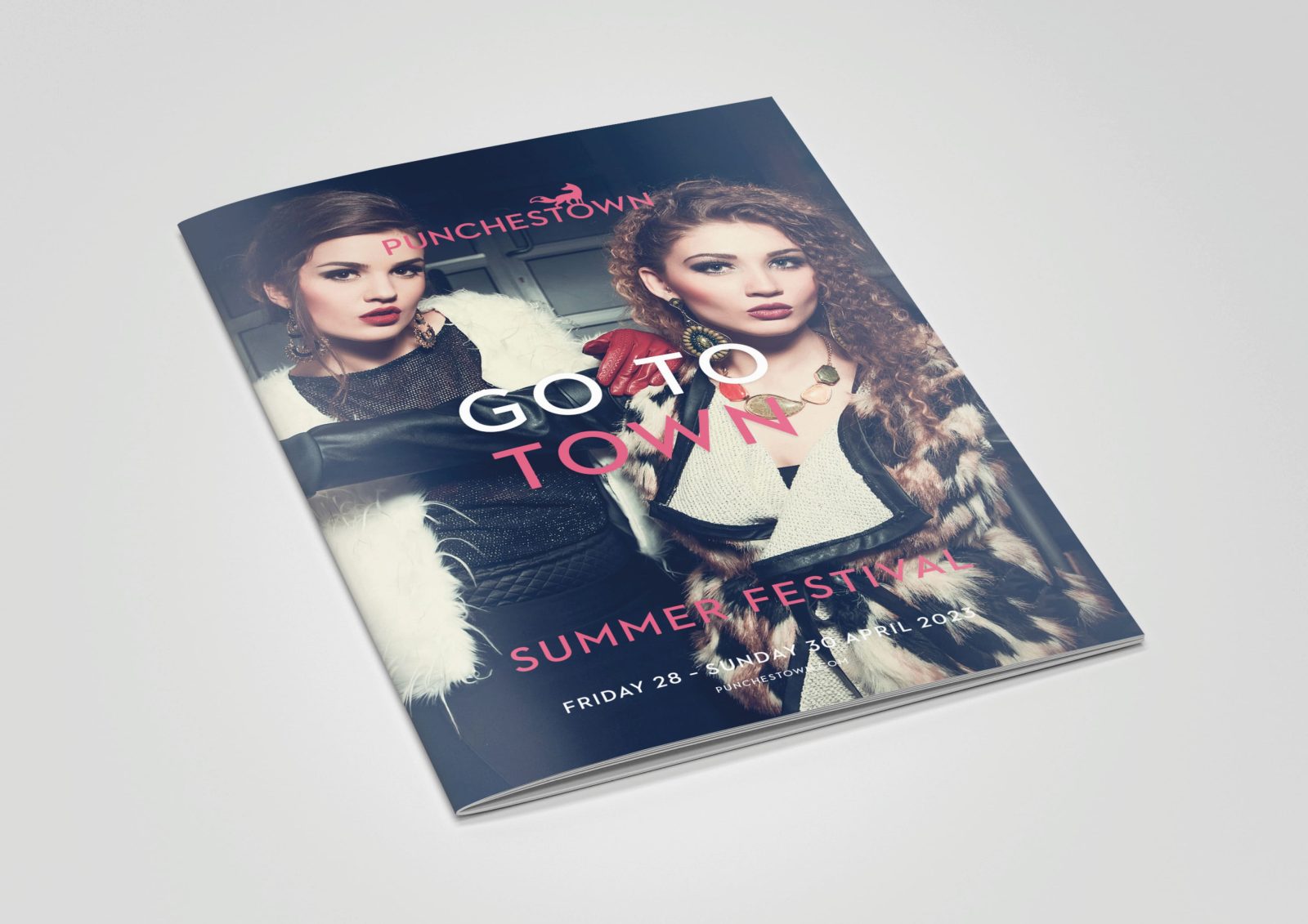
As part of the brand language, we took ownership of Punchestown through the use of “It’s Our Town”. This language set the tone for our post-brand campaigns. The new colour palette of red, navy and gold is unique within the racing sector, helping set Punchestown apart and positioning it within the premium brand space.
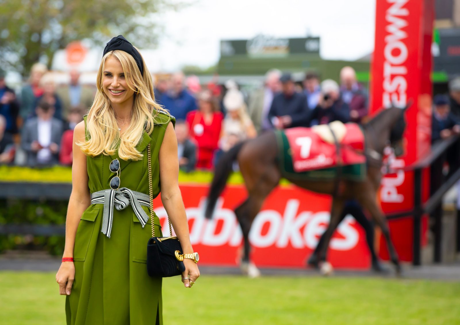
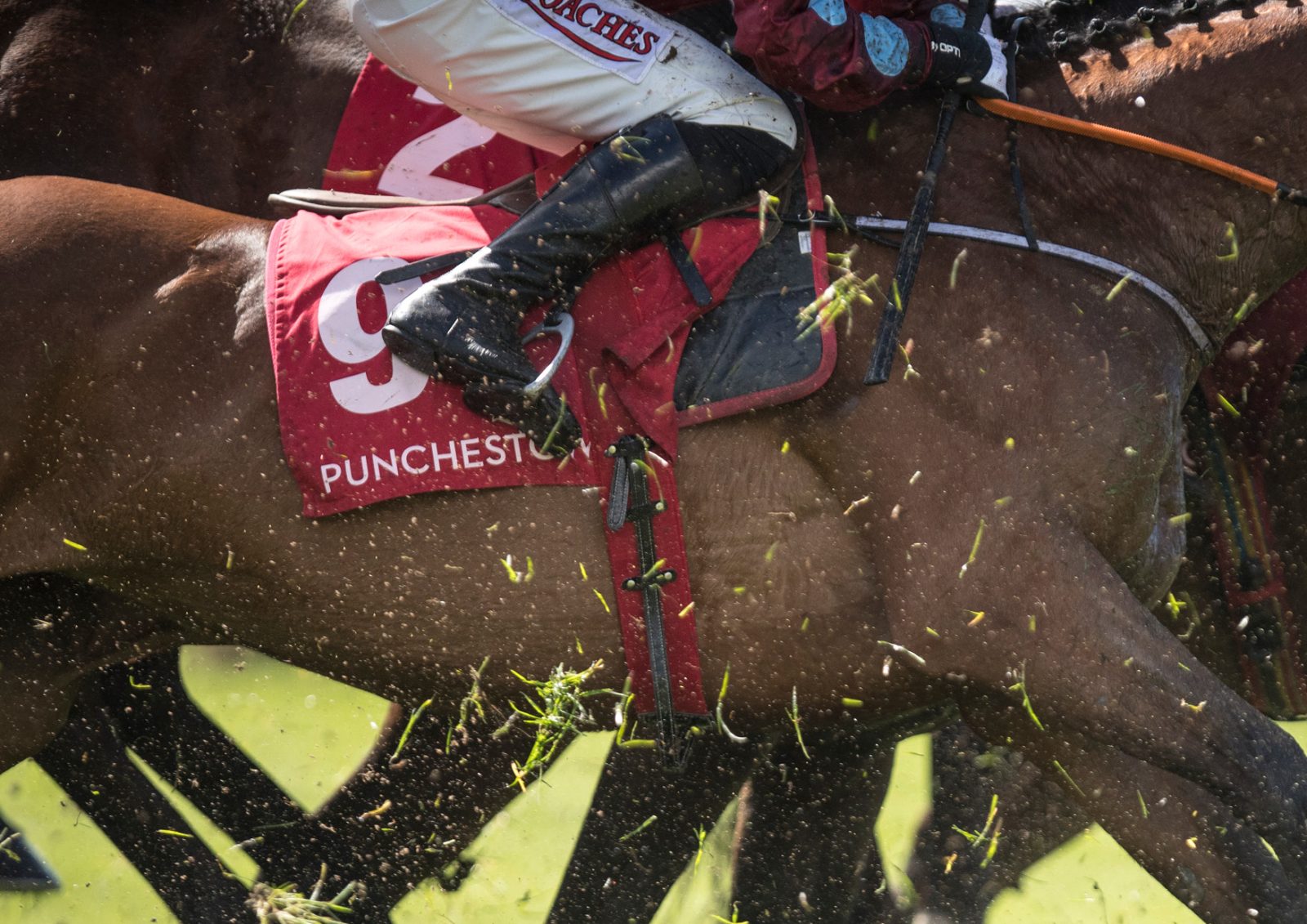
Sophisticated photography adds to the premium feel and showcases the hospitailty, racing, fashion and premium event that Punchestow can offer its customers.
Finally a note from Punchestown following the re-brand:
“So, great news is Punchestown landed Racecourse of the Year at the national awards last night. We would really like to thank you and your team for all your hard work. Can’t help but feel Kaizen is an extension of the Punchestown team.” – Shona Dreaper – PR & Communications Manager – Punchestown Racecourse
CREDIT
- Agency/Creative: Kaizen
- Article Title: Punchestown Brand Redesign
- Organisation/Entity: Agency
- Project Type: Identity
- Project Status: Published
- Agency/Creative Country: United Kingdom
- Agency/Creative City: Belfast
- Market Region: Dublin
- Project Deliverables: Rebranding
- Industry: Entertainment
- Keywords: WBDS Agency Design Awards 2022/23
-
Credits:
Design Director: Ryan Stanfield
Senior Designer: Shaleen O'Neill


