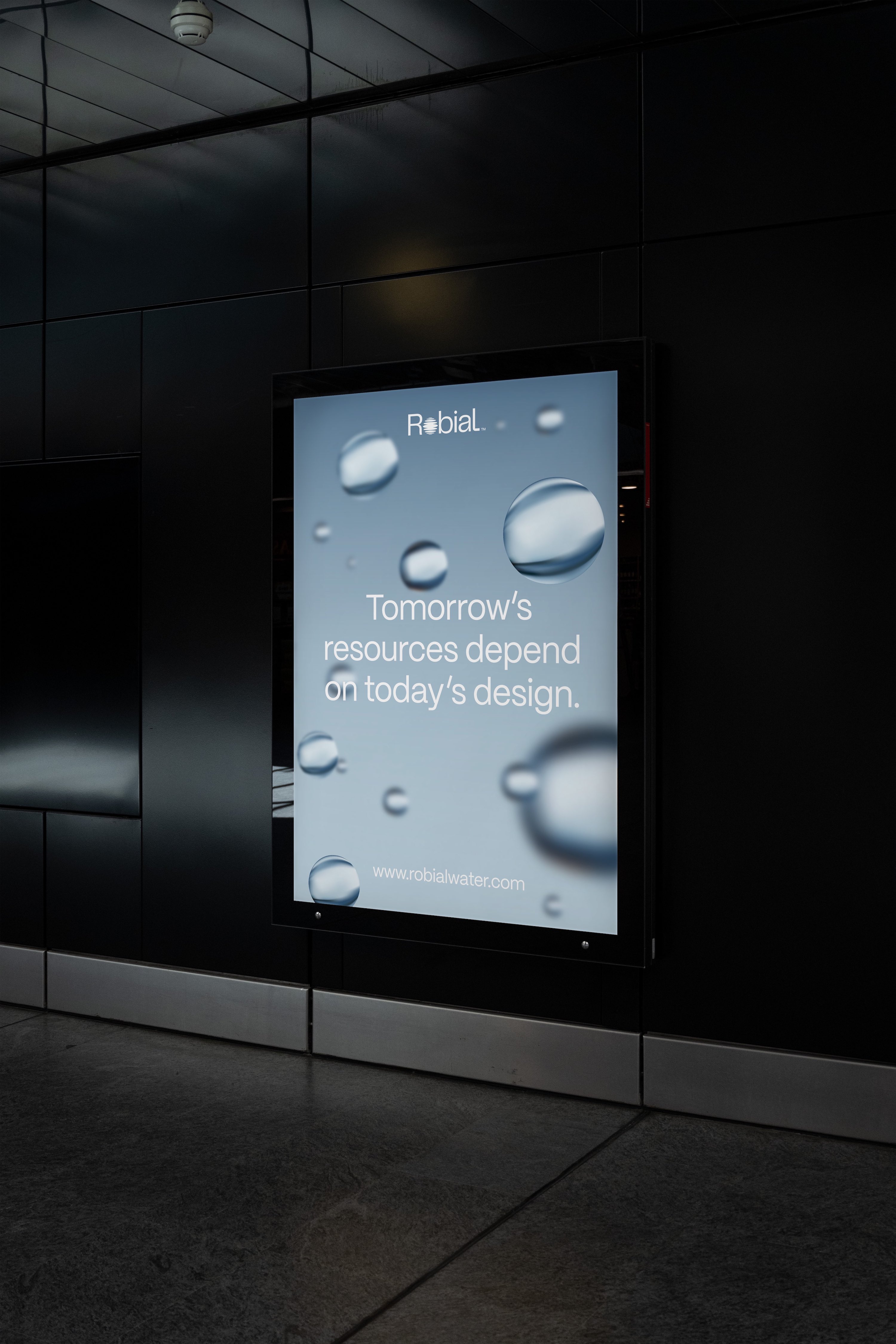
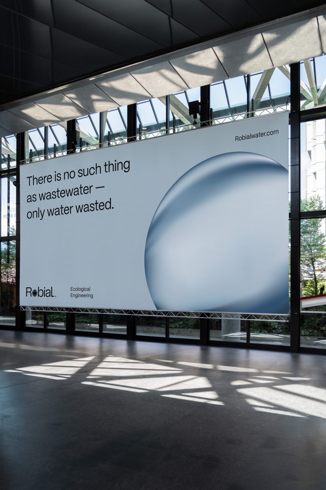
Robial is a water and wastewater engineering firm providing sustainable, next-gen solutions for commercial and residential clients. Unlike traditional, chemical-centric wastewater treatment, ecological wastewater solutions rely on natural microbial processes to create a closed-loop, regenerative system. Robial’s founder approached us about developing a visual identity that would help transform general perception about wastewater’s potential as a resource, and which could inspire greater credibility with their target clients.
Our work began with extensive discovery, learning all we could about Robial’s peers and competitors, researching the history and essential processes of wastewater engineering, and narrowing in on target demographic profiles. We identified unique positioning opportunities within the engineering sector and drafted language around the foundational values of the org.
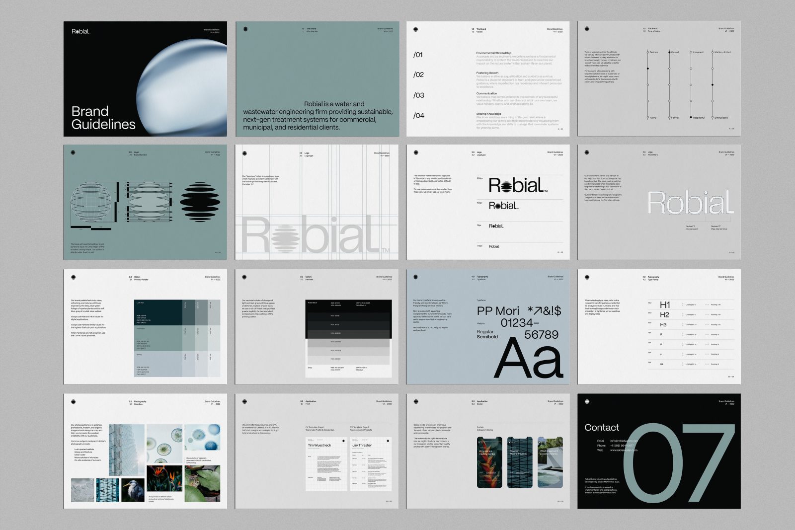
As a starting point for our direction, we devised a lush, riparian palette that would challenge the most fundamental association with wastewater — the “ick” factor — by creating deeply refreshing visual universe for the brand.
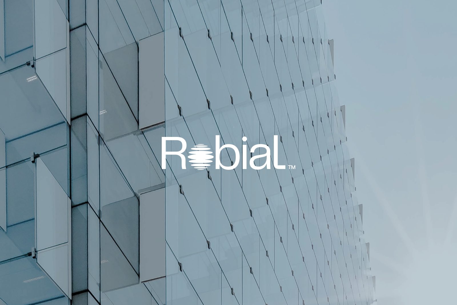
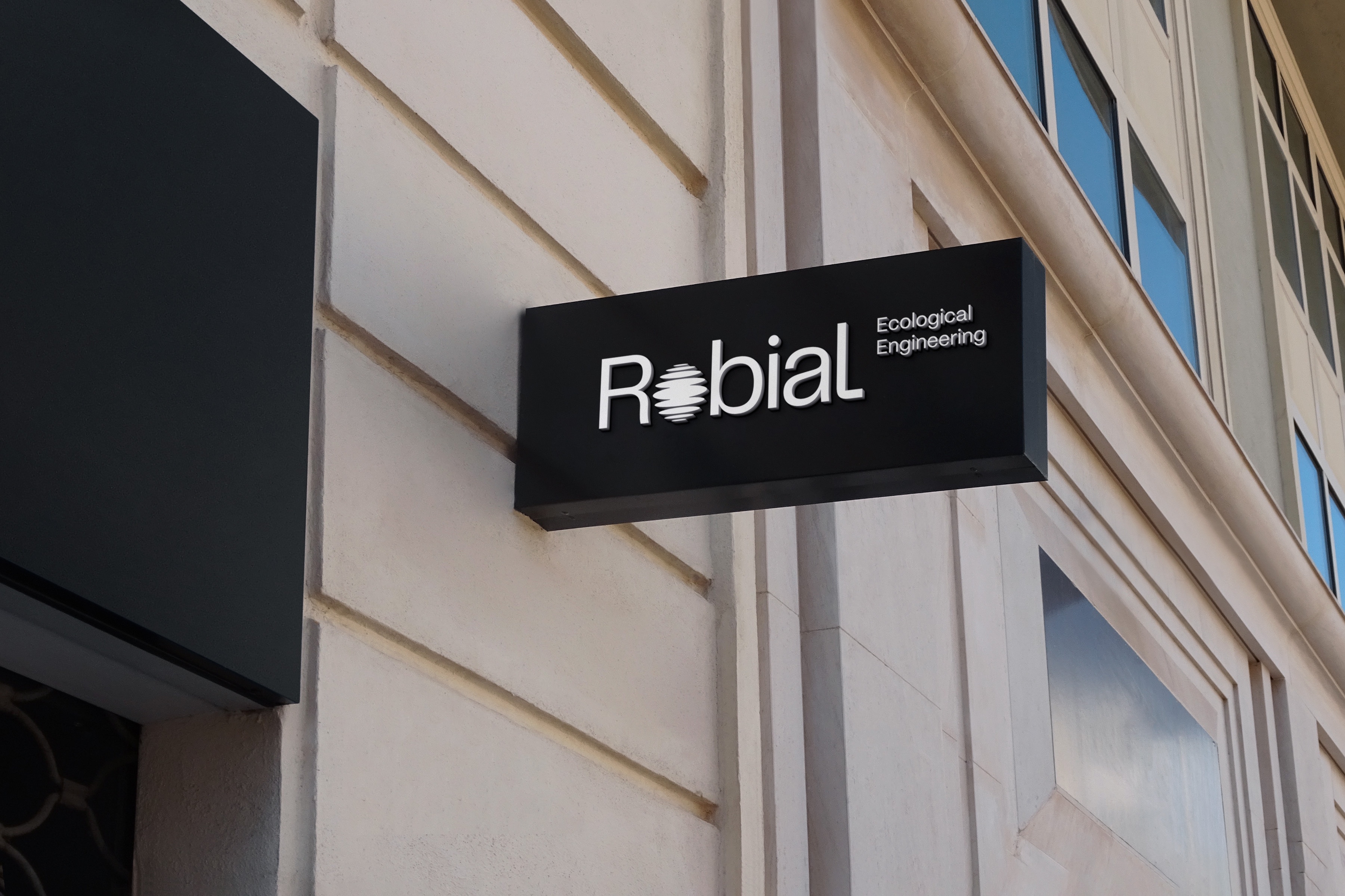
To help Robial establish greater recognition, we opted for a logotype, using PP Telegraf as a base and integrating a brand symbol in place of the lowercase “o”. Our symbol itself is a simple nod to the shape of light refracting on water. The type system followed naturally, built on PP Mori, an ultra-friendly and functional sans serif.
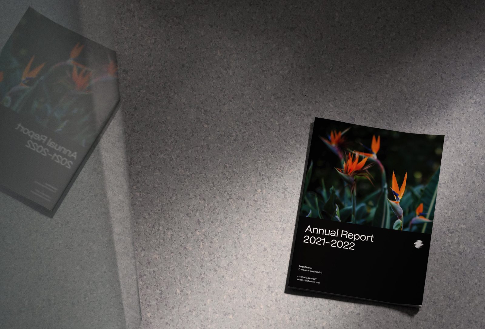
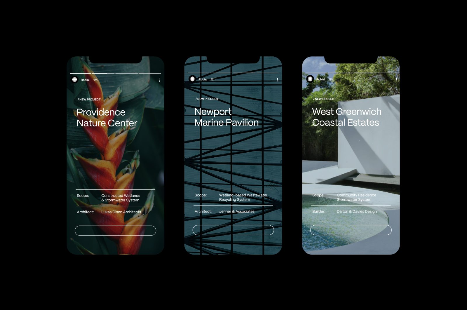
By intermixing images of healthy wetland ecosystems with architectural spaces, we can create emotional resonance for Robial’s target audiences while also building new associations with the material reality of wastewater engineering. The guidelines we developed for the management of the identity system offer clear instruction on how best to integrate imagery, as well as editing tips to help the entire Robial team make the most of their on-site imagery.
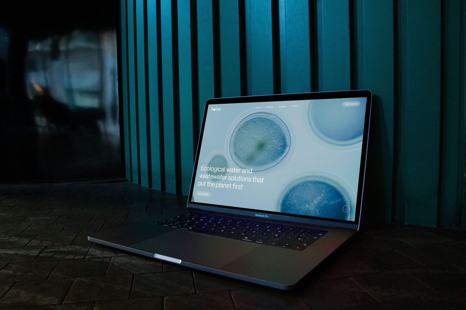
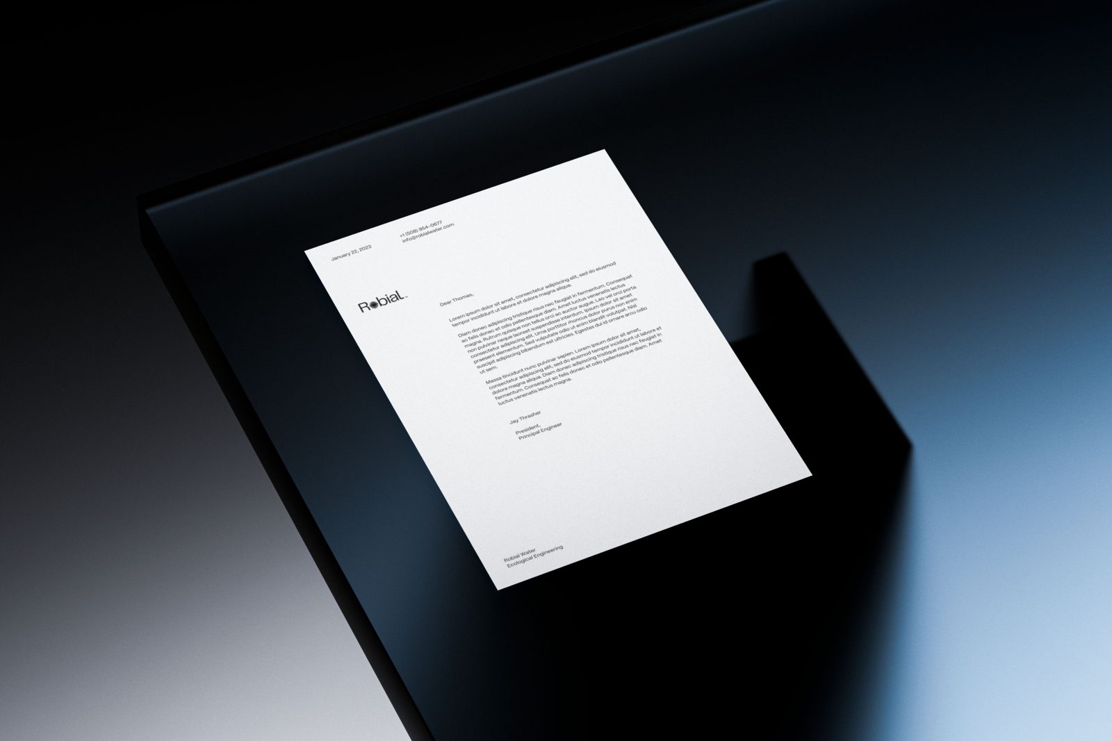
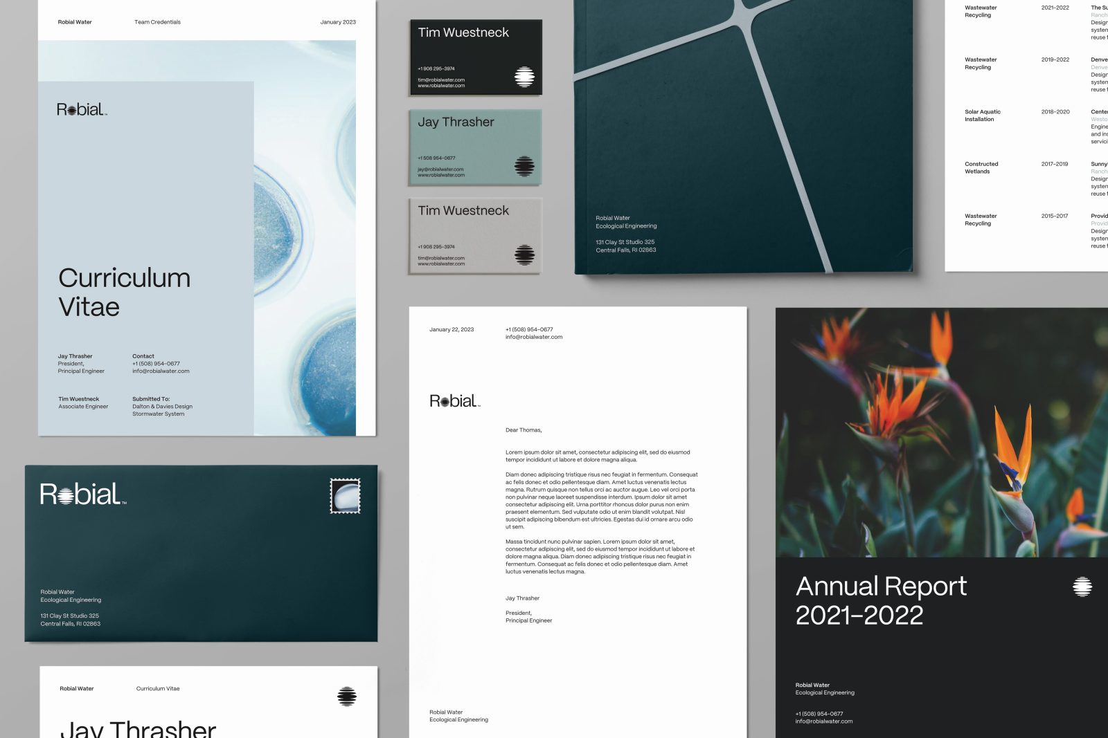
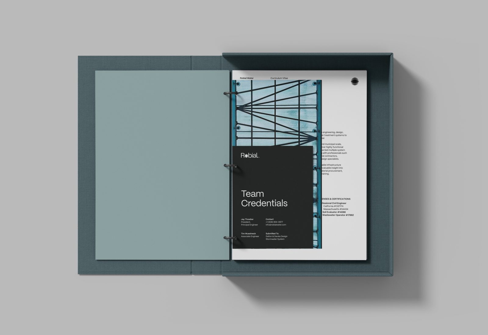
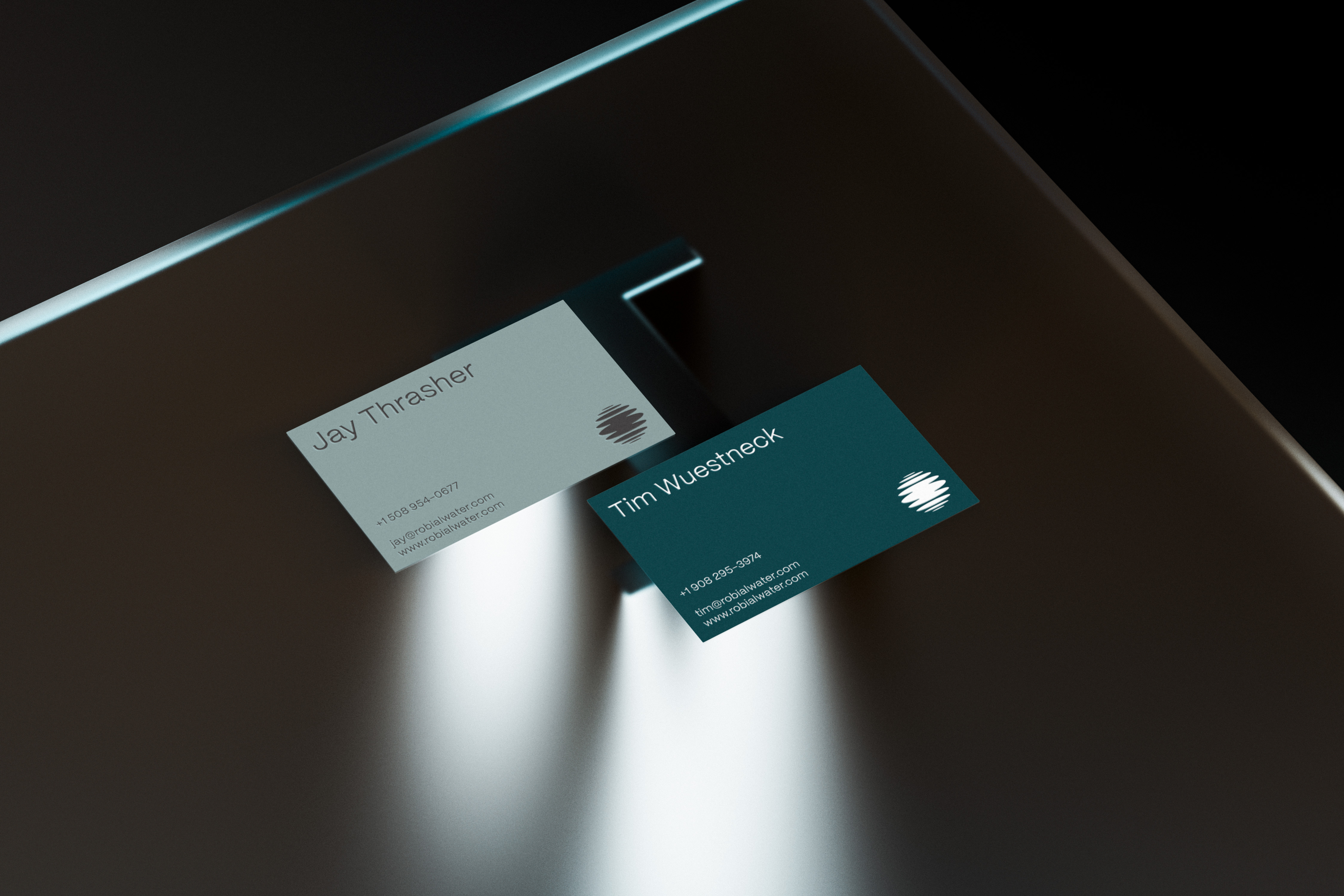
A clean grid system provides structure and consistency across all printed materials, including business cards, letterhead, and a teammate credentials dossier. Meanwhile, digital applications take on a polished and professional attitude with ample white space and a photo-forward approach to layouts.
CREDIT
- Agency/Creative: Aubrey Sanders
- Article Title: Robial Brand Identity
- Organisation/Entity: Creative
- Project Type: Identity
- Project Status: Published
- Agency/Creative Country: United States of America
- Agency/Creative City: Denver
- Industry: Public Utility
- Keywords: WBDS Creative Design Awards 2022/23


