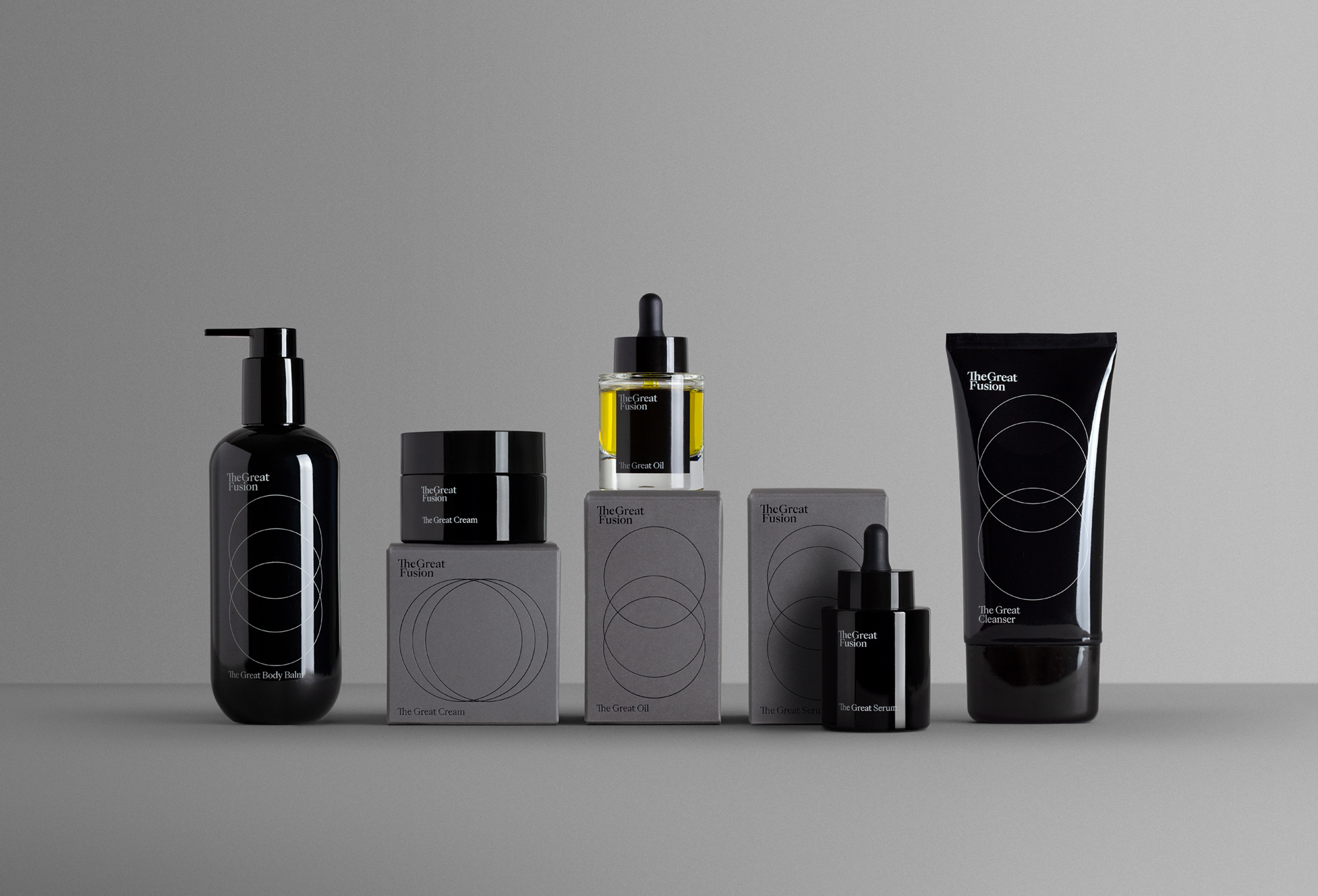
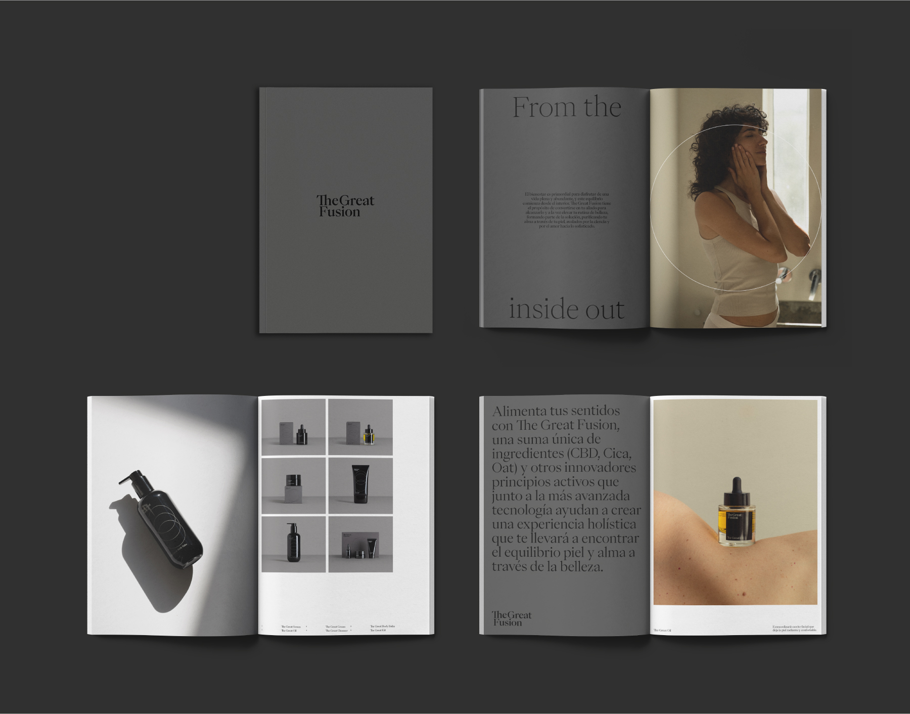
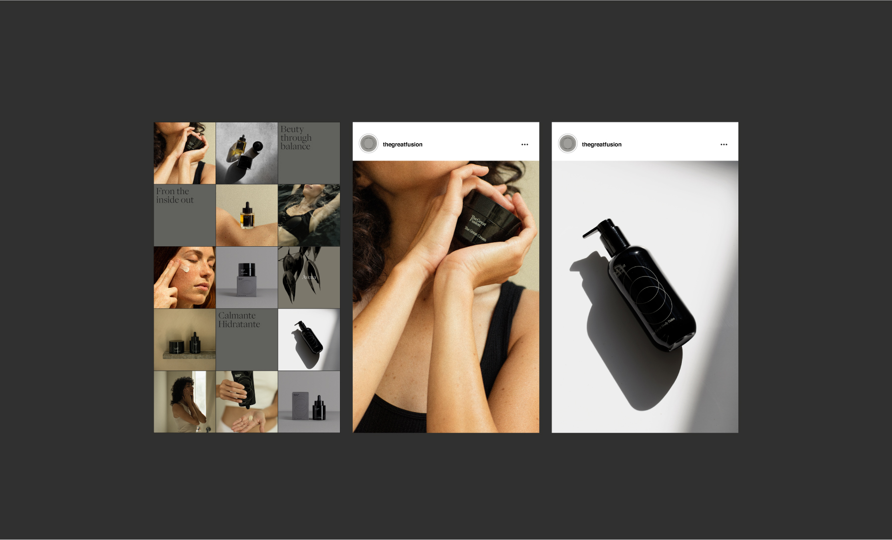
This is an indie beauty brand that considers the individual as a whole and offers products that promote calm and inner peace while acting on the skin, so that external care also becomes a moment to seek personal balance and inner care — a product line that goes beyond beauty.
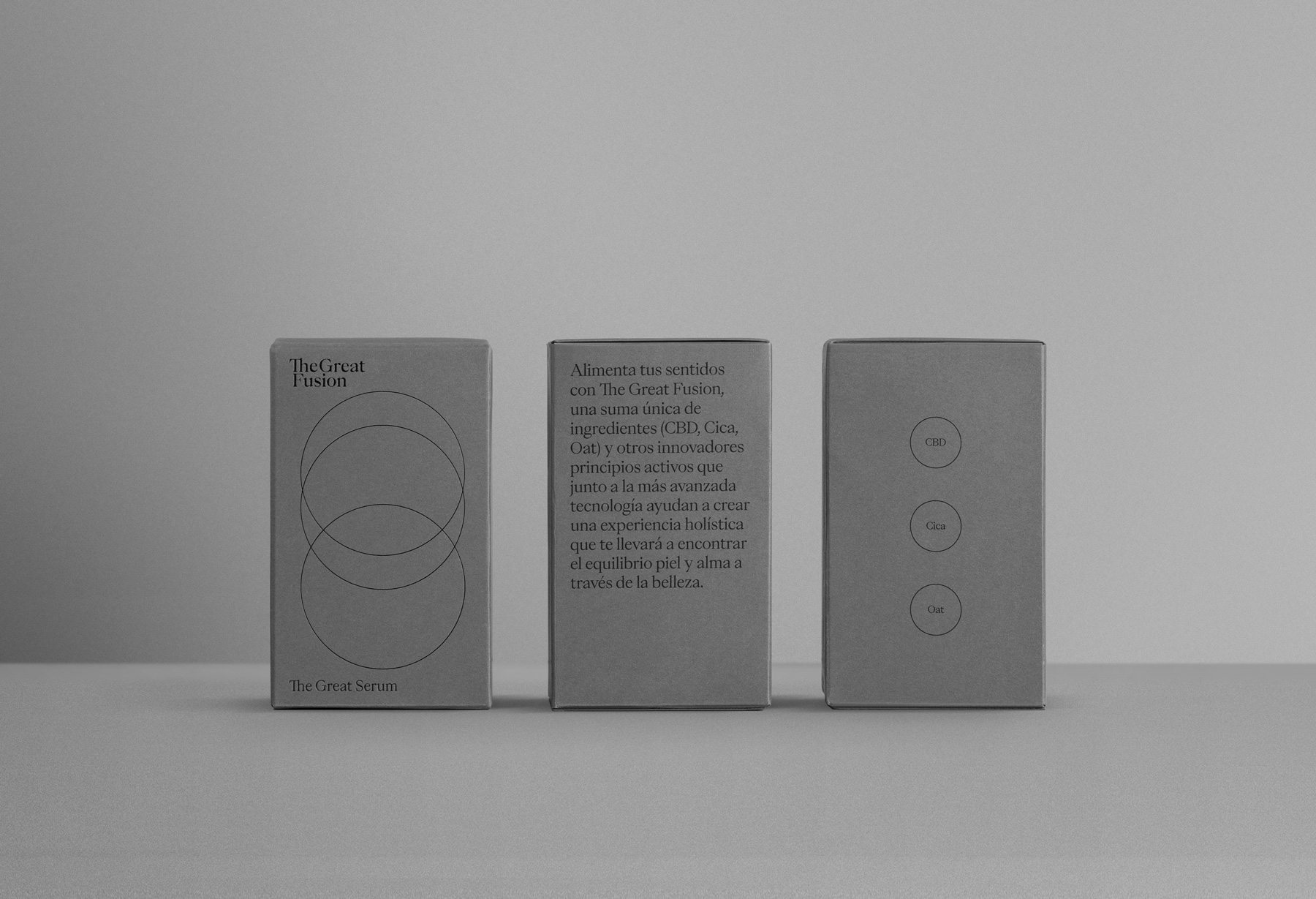
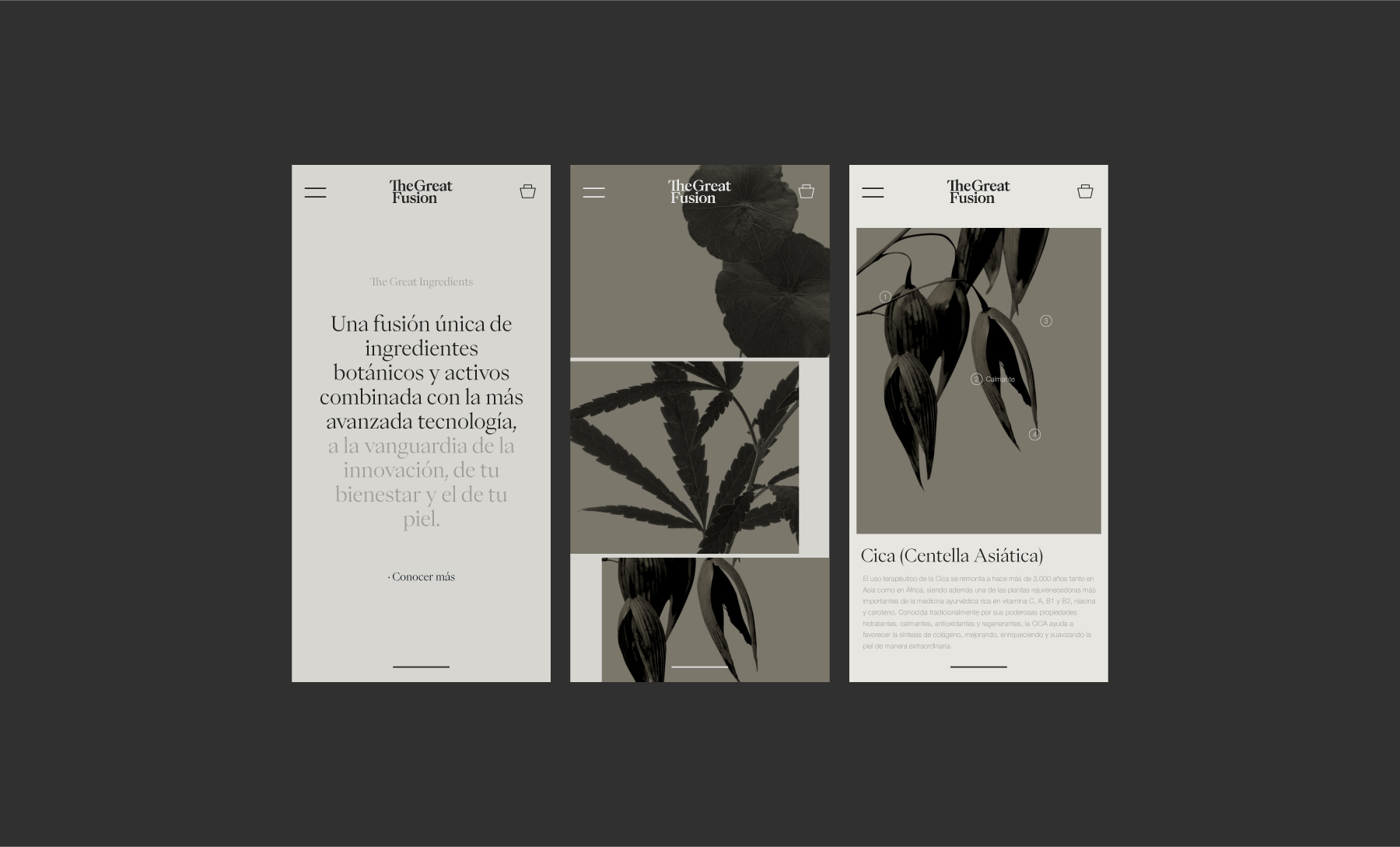
It is the result of combining traditional botanical knowledge with the most advanced technology, through which they have fused the three key ingredients: hemp, cica and oat. The calming properties of hemp have been known for centuries. Cica or Centella asiatica is a plant that has been widely used in Asia and Africa for over 3,000 years. And oat baths have long been recommended for sensitive skin. In Buddhism, the power of the number 3, which is considered magical in many cultures, is manifested through awareness, balance and harmony.
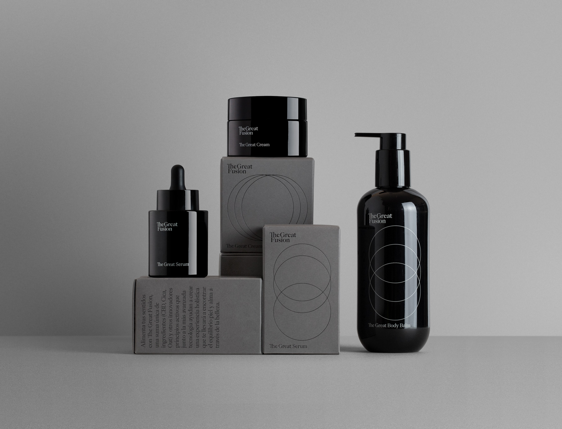
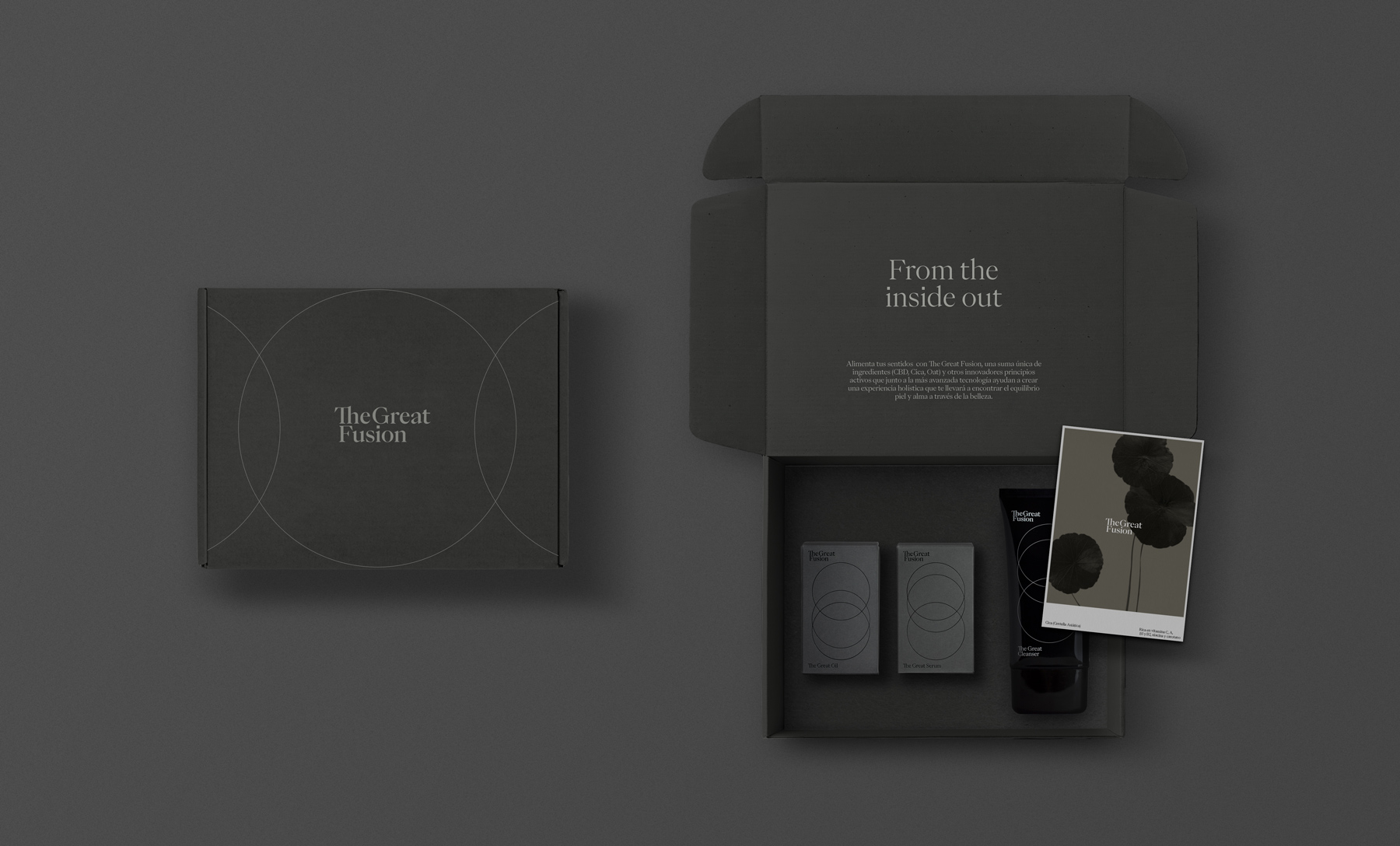
The logo is structured on two lines, separating the two core concepts: Great and Fusion. It is composed in the PP Eiko typeface, in its Medium and Regular styles, both for titles and short messages, as well as in the text body. Eiko is, beyond any doubt, a typeface that conveys both elegance and refinement. It is inspired by the work of the Japanese artist Eiko Ishioka, a graphic artist and film costume designer.
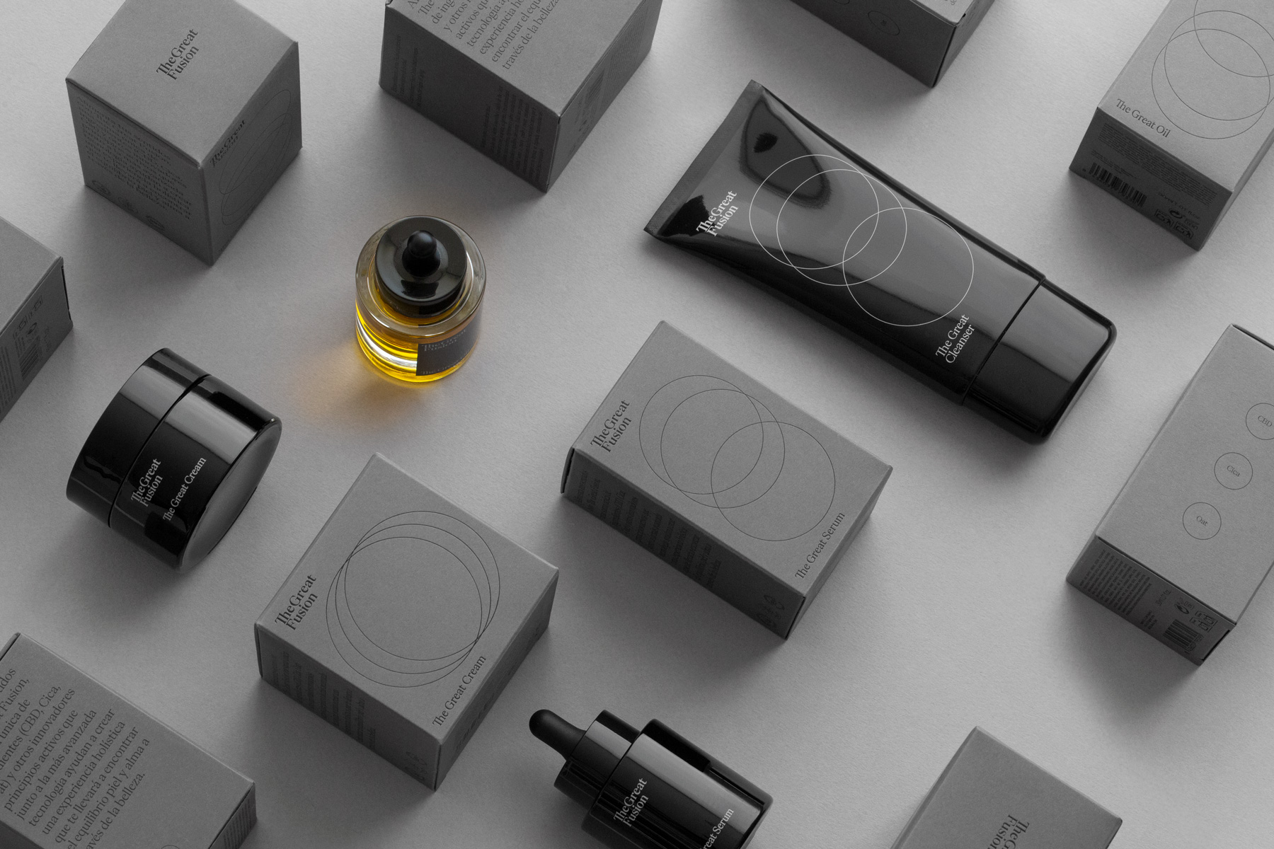
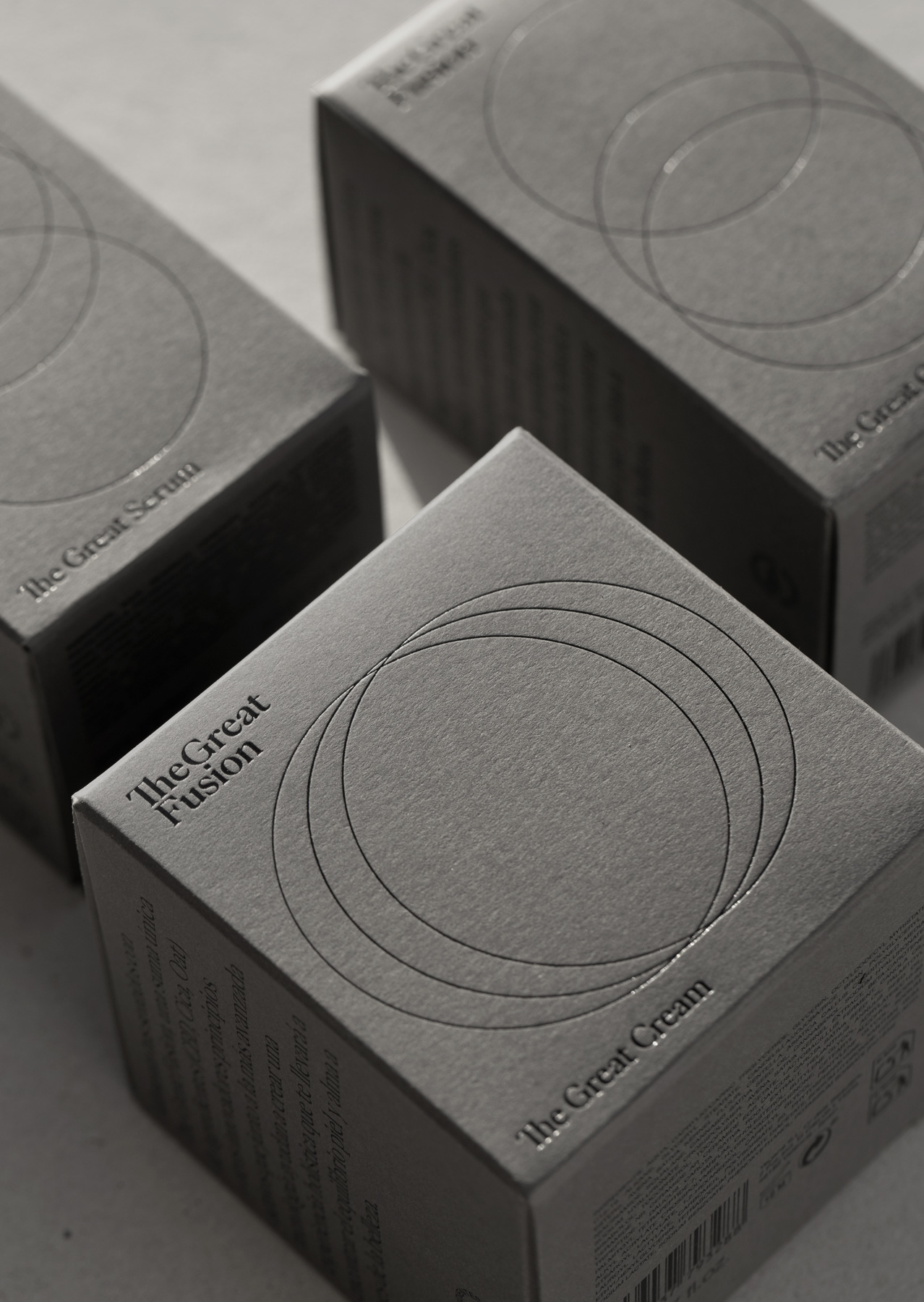
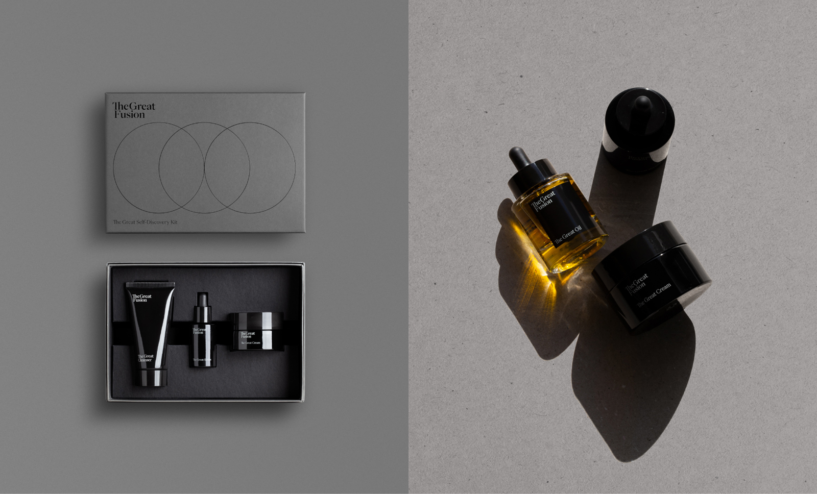
Another key element of the graphic design consists of the three circles frequently used to accompany the brand in communications, packaging, etc. to emphasise this threefold fusion: its technological aspect, its perfection and its harmony. The circle represents perfection, it both highlights and isolates, and will often be used as a counterpart to the way we talk about the brand, as a way of emphasising what we are saying, of placing the focus on something important.
CREDIT
- Agency/Creative: Lavernia & Cienfuegos
- Article Title: The Great Fusion Packaging Design by Lavernia & Cienfuegos
- Organisation/Entity: Agency
- Project Type: Packaging
- Project Status: Published
- Agency/Creative Country: Spain
- Agency/Creative City: Valencia
- Market Region: Europe
- Project Deliverables: 2D Design, App Design, Art Direction, Beauty Photography, Brand Identity, Brand Mark, Design, Logo Design, Web Design
- Format: Bottle, Box, Jar, Tube
- Substrate: Glass, Plastic, Pulp Carton
- Industry: Health Care
- Keywords: WBDS Agency Design Awards 2022/23
- Keywords: Skin Care, Cosmetics, CBD, Body Care
-
Credits:
Creative Director: Nacho lavernia
Creative Director: Alberto Cienfuegos
Senior Designer: Tomas Martín


