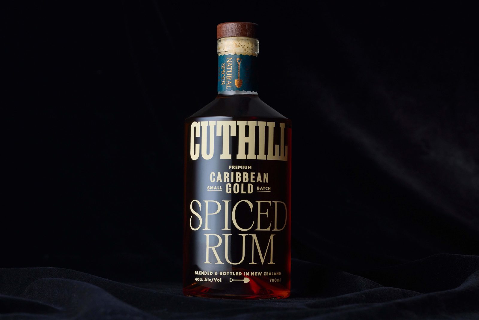
Born in the rural Northern reaches of Auckland, New Zealand, Cuthill is a distinctive Spiced Rum inspired by the workmen the toiled away in the same area a century before, searching for, what was back then, liquid gold.
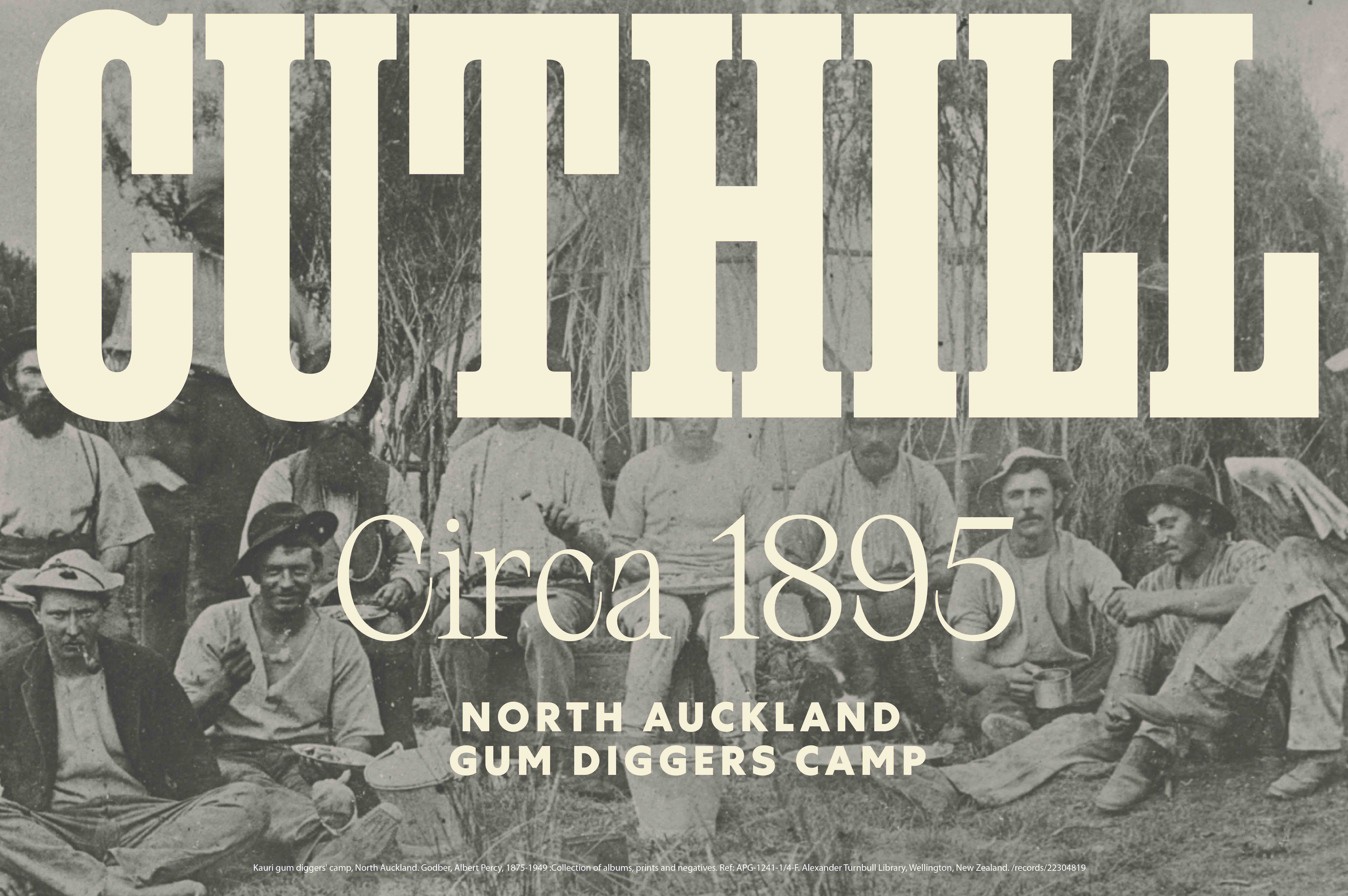
Kauri Gum is the fossilised resin or sap of the local Kauri Tree. This was dug up by hand, refined, shaped and sold as incense, most commonly becoming frankincense. This was a major export trade for New Zealand in the early 19th century. But digging trenches to extract these was incredibly hard manual work – the men who undertook the endeavour, commonly called Gumdiggers, toiled in soil for weeks to extract the minimum amount of gum. This was the story behind Cuthill. The name is derived from a popular area on the Auckland boundaries and where several gumdigging camps were established. Life was hard, with minimal luxuries and amenities. Alcohol, moonshine Rum and variations of Caribbean Spiced Rum were hot commodities and consumed among friends to end each day.
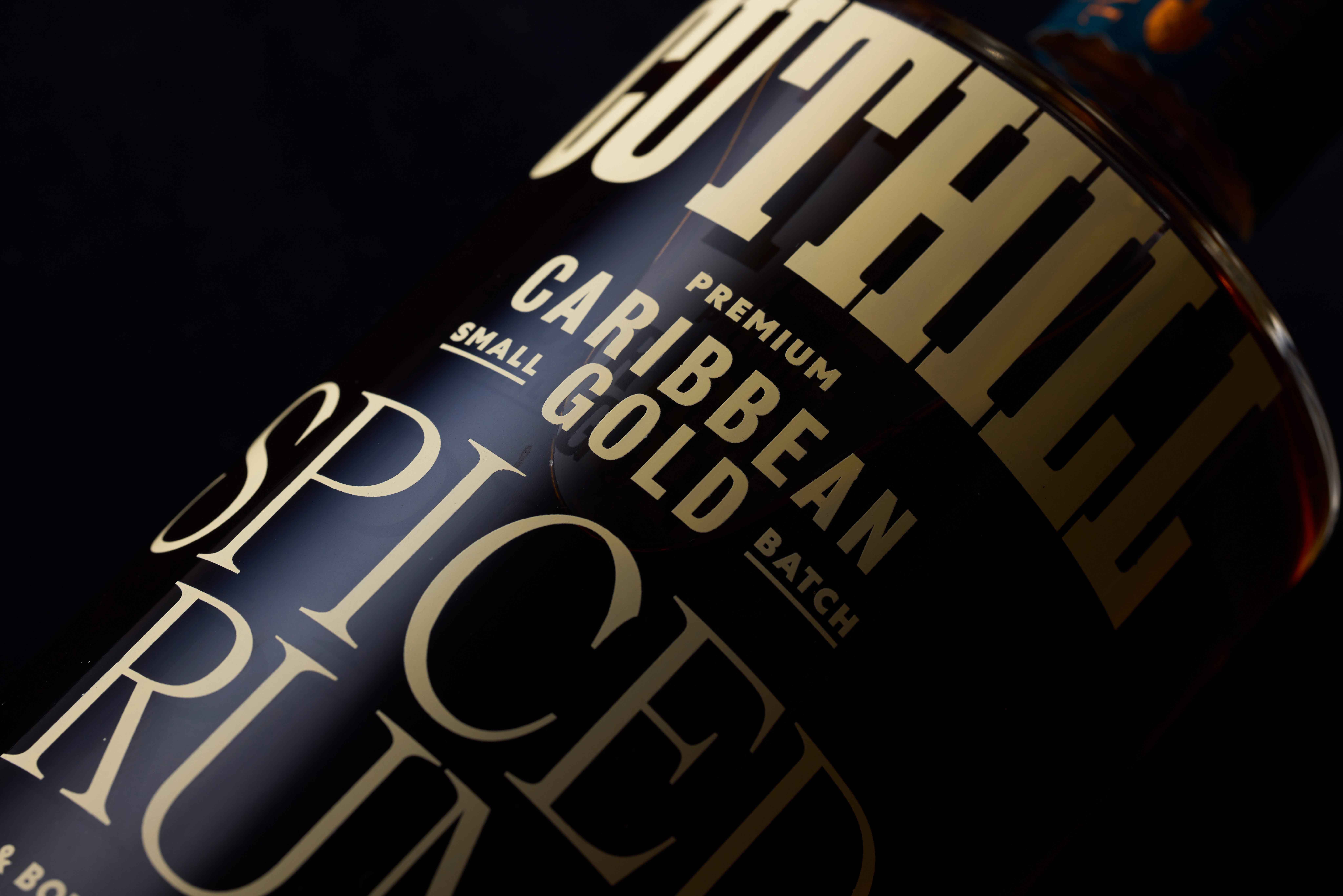
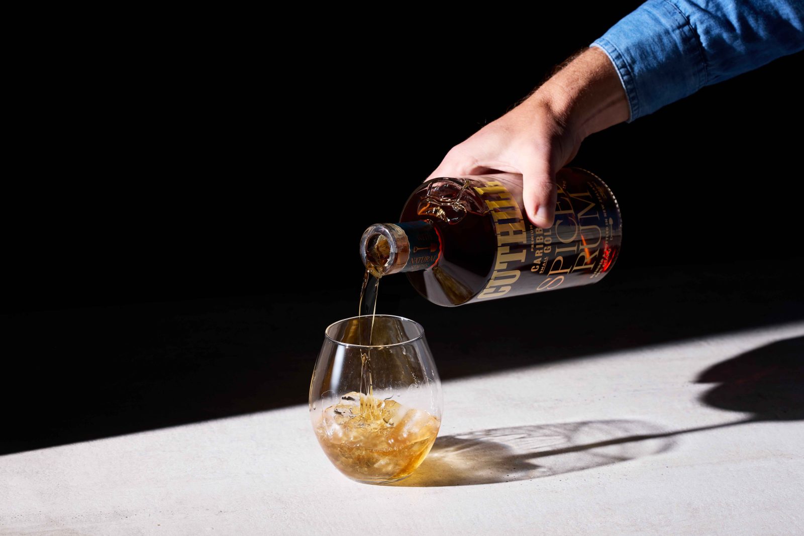
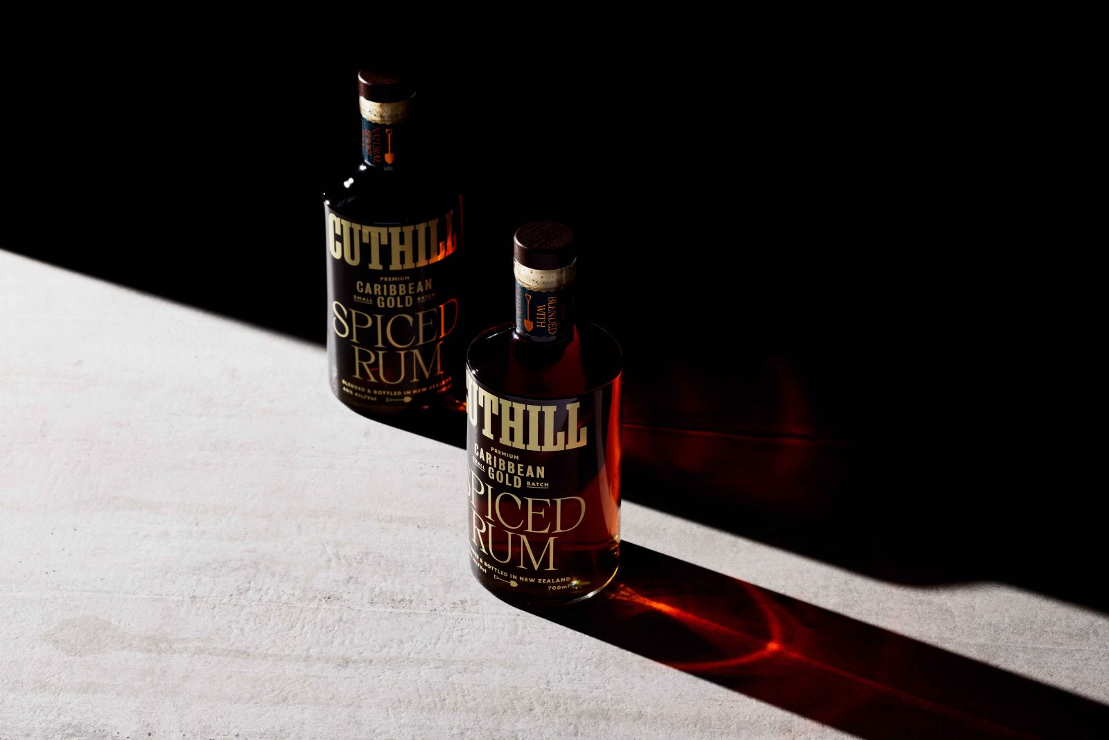
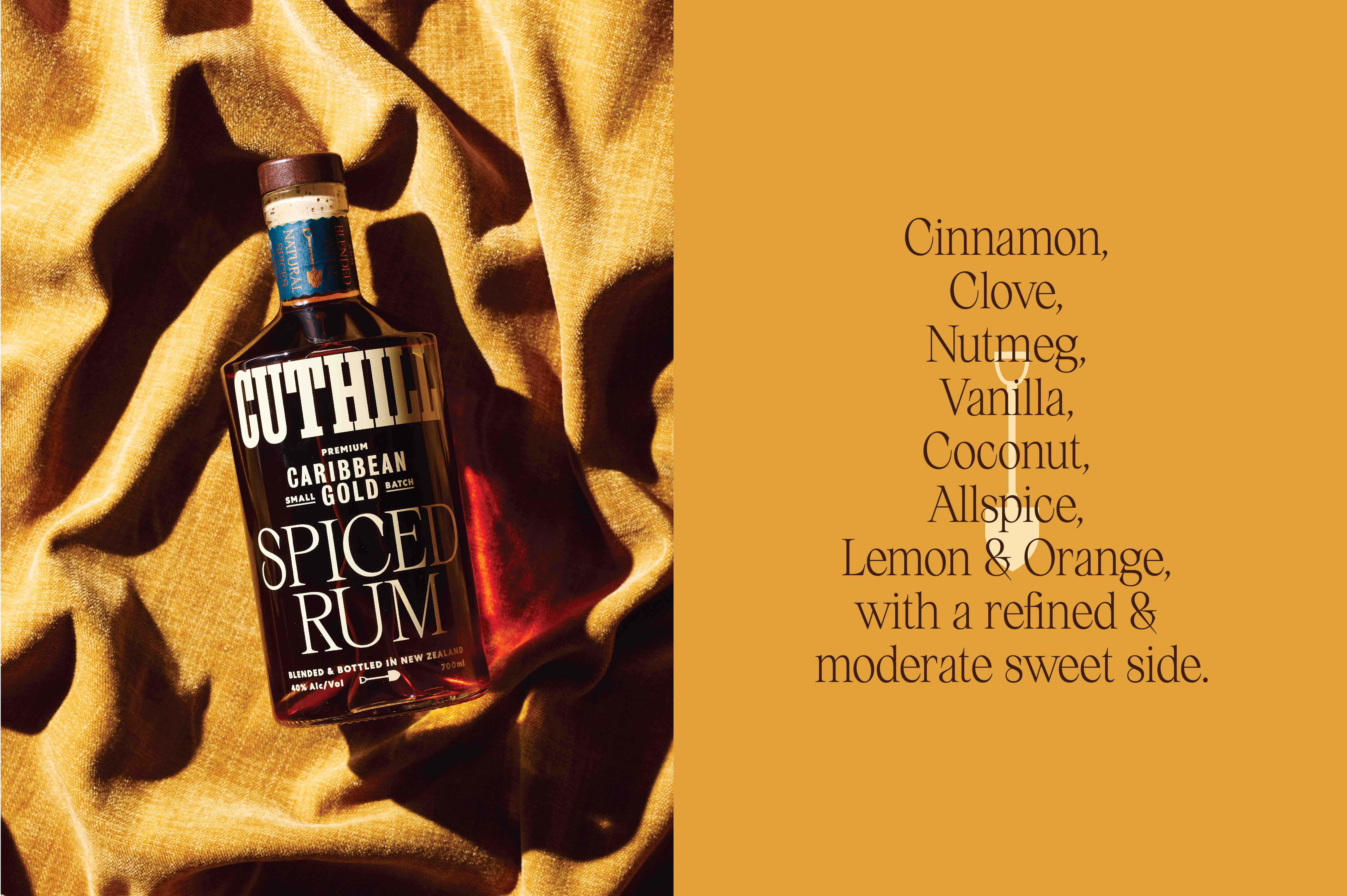
Cuthill Spiced Rum recalls those drinks and occasions with friends. A utilitarian shaped bottle has little pretence and minimal embellishments. Instead of an ornate body label, the main brand elements are screen-printed onto the glass. Stripped back, with a nod to the simple and raw lifestyle of the gumdiggers.
Typographically heavy, the design mimics the jerry cans, porcelain casks and trademarked mugs of the time. The Cuthill font is overtly heavy, with overemphasised and stylised serifs referencing the hard, honest work undertaken. Modern in appearance, there are several references to the turn of the century typography trends. The secondary type is minimal and simplistic. This allows for the overt and over-the-top typography Spiced Rum. While simple in its production, the recipes from that ear were complex, with layers of subtle and smooth flavours and tasting notes. This typography reflects this – a touch, or moment, of opulence and flare in an otherwise workman-like situation.
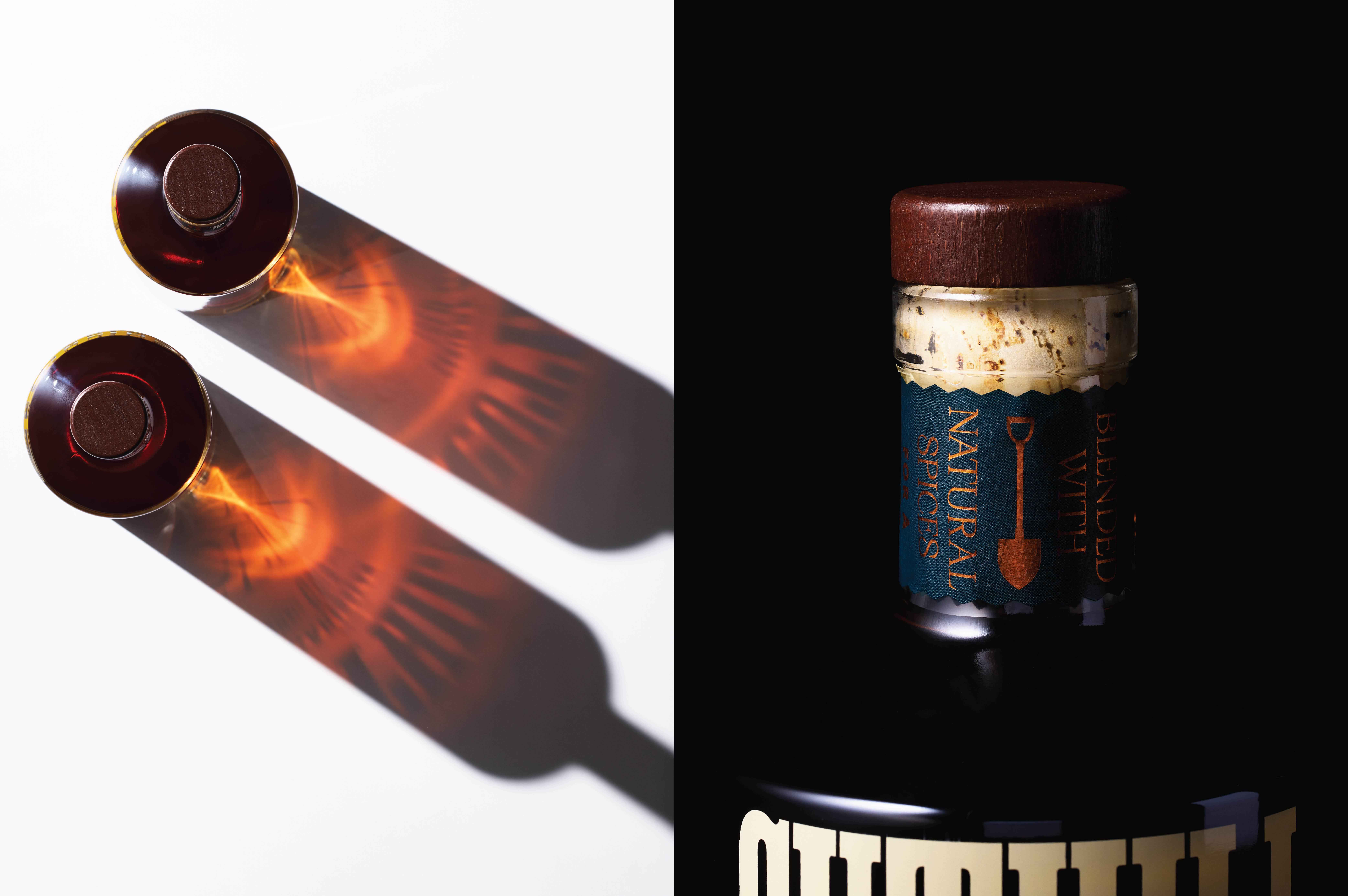
The neck label serves as a device to message distinctive tasting notes – dark blue colour, copper foiling adds depth and elegance to the oversized typography statement below.
CREDIT
- Agency/Creative: MG Studio
- Article Title: Cuthill Spiced Rum Packaging Design by MG Studio
- Organisation/Entity: Freelance
- Project Type: Packaging
- Project Status: Published
- Agency/Creative Country: New Zealand
- Agency/Creative City: Auckland
- Market Region: Oceania
- Project Deliverables: Art Direction, Brand Design, Brand Identity, Creative Direction, Packaging Design, Typography
- Format: Bottle
- Substrate: Glass Bottle
- Industry: Food/Beverage
- Keywords: WBDS Agency Design Awards 2022/23
- Keywords: Drink, Beverage, Alcohol, Typography, Graphic Design
-
Credits:
Creative Direction: Matt Grantham


