Investorfi, an Australian property investment company, aims to go beyond the obvious to align with every client’s vision. “For nothing can’t be created for younger generations with the right personalized investment strategies”. That’s precisely who our client is, and it speaks for our greater manifesto as a brand: to create something for leaders to inspire the younger generations. We care about society as a reflection of our inner motivations, and this can be translated in the creative process: investment resources and home loans, besides its traditional appeal, can be showcased in an artistic way that exudes its hidden -or not so hidden- rebellious values.
That’s what they needed, that’s what we created.
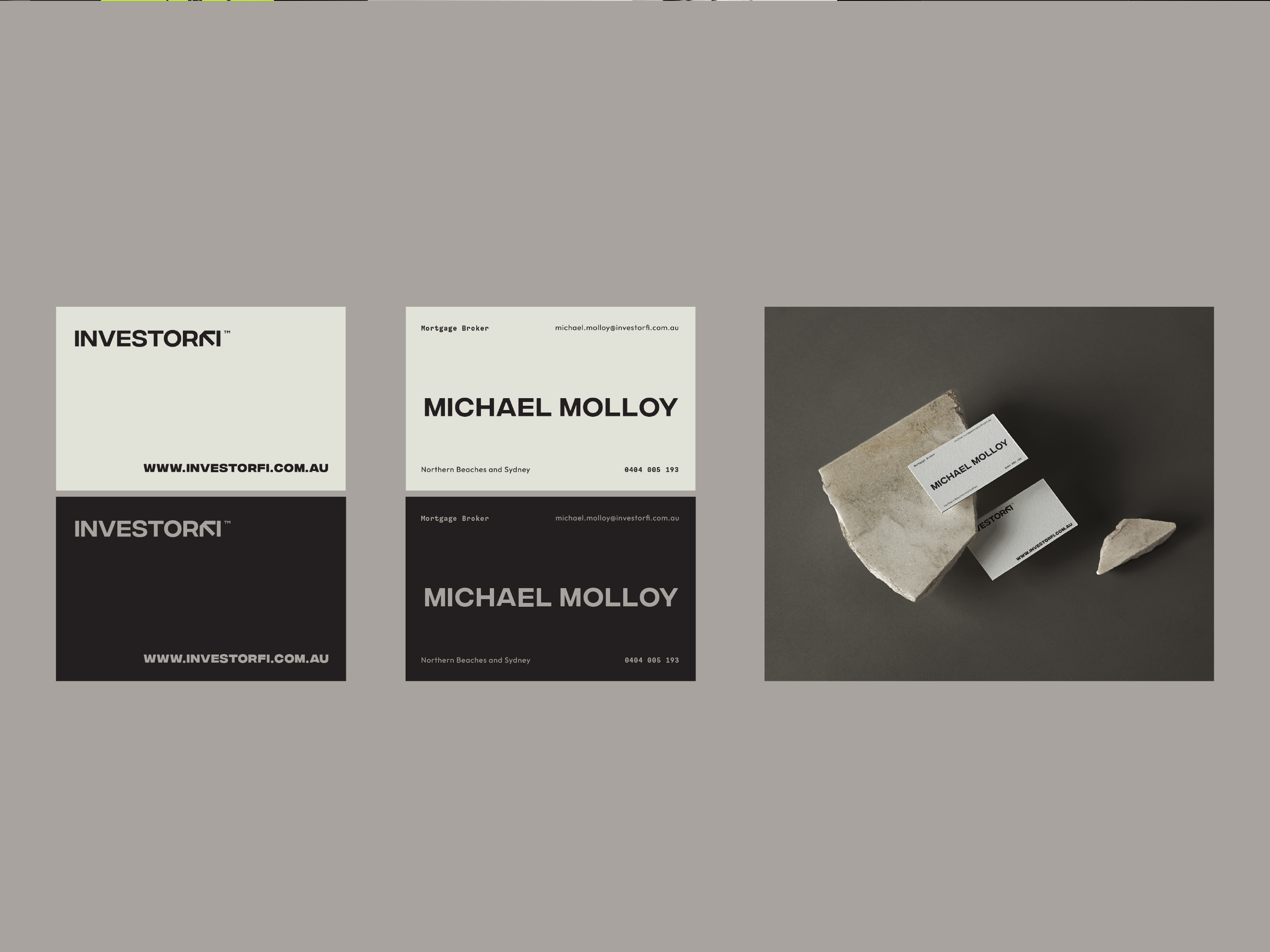
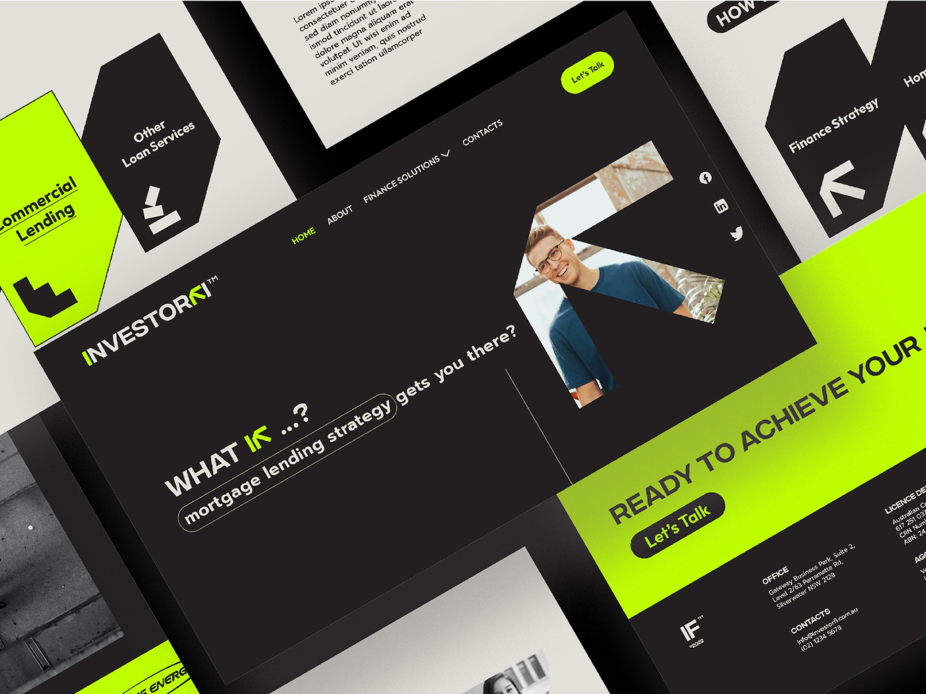
Our client was looking for a brand identity –including logo, brand strategy, icons, website landing page design and logo animation. The reason behind this necessity? A renewed image to convey a fresh look, separated from traditional finance companies, that could arrive to young generations in the most efficient and artful way. Of course, one element wasn’t enough to create this imagery: it’s in the combination of identity elements that the target client can absorb with its mind, and perceive in a holistic way, the real essence of a brand. And, of course, the biggest point behind it all was to reveal “hidden” values in the graphic language. Making investment accessible to everybody who’s willing to devote themselves in: a real challenge, after all, but delightfully carried out with every piece of the branding puzzle on mind.
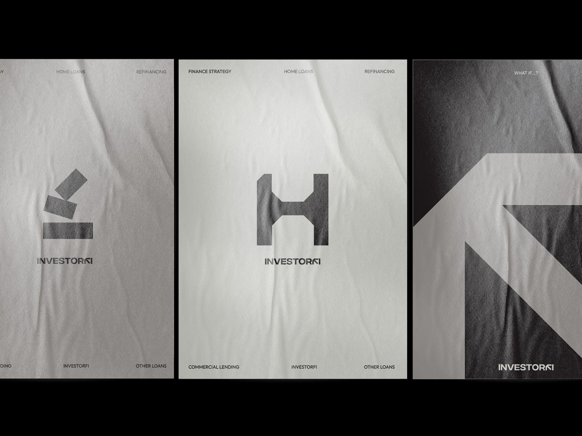
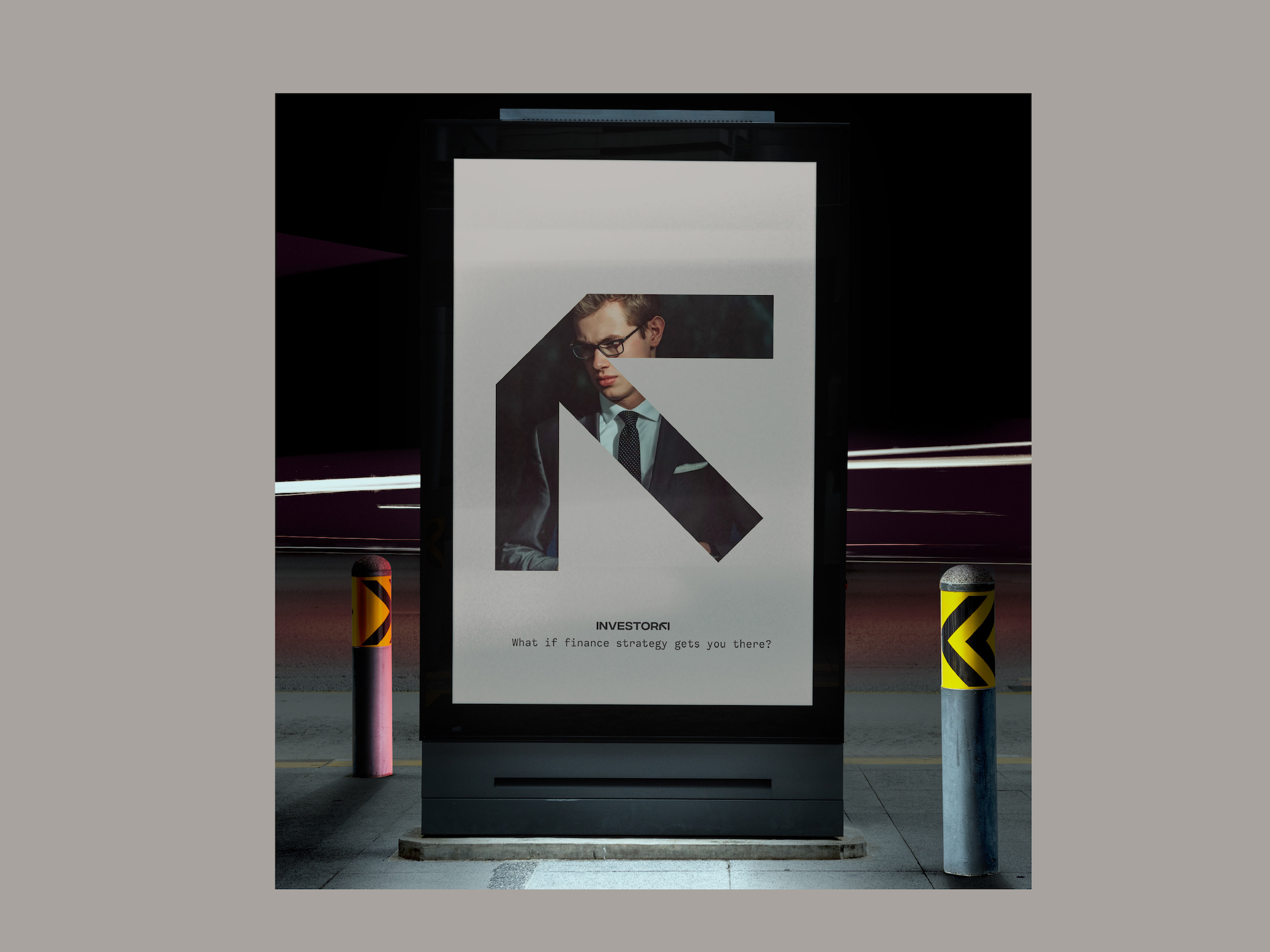
The solution came in visuals and images, embodying the self-made men spirit in every tangible of details: from the contours of the letters to the intensity of the hues. A balance among street art (young & new), inspired by European Art galleries with its ever-traditional essence. The rebellious vibe needed to become an absolute protagonist: a man coming out of its drifting ways to help create the world anew, with its hands. A hard working commitment above all else, ready to unfold the brightest of futures, as the brand exhibits itself.
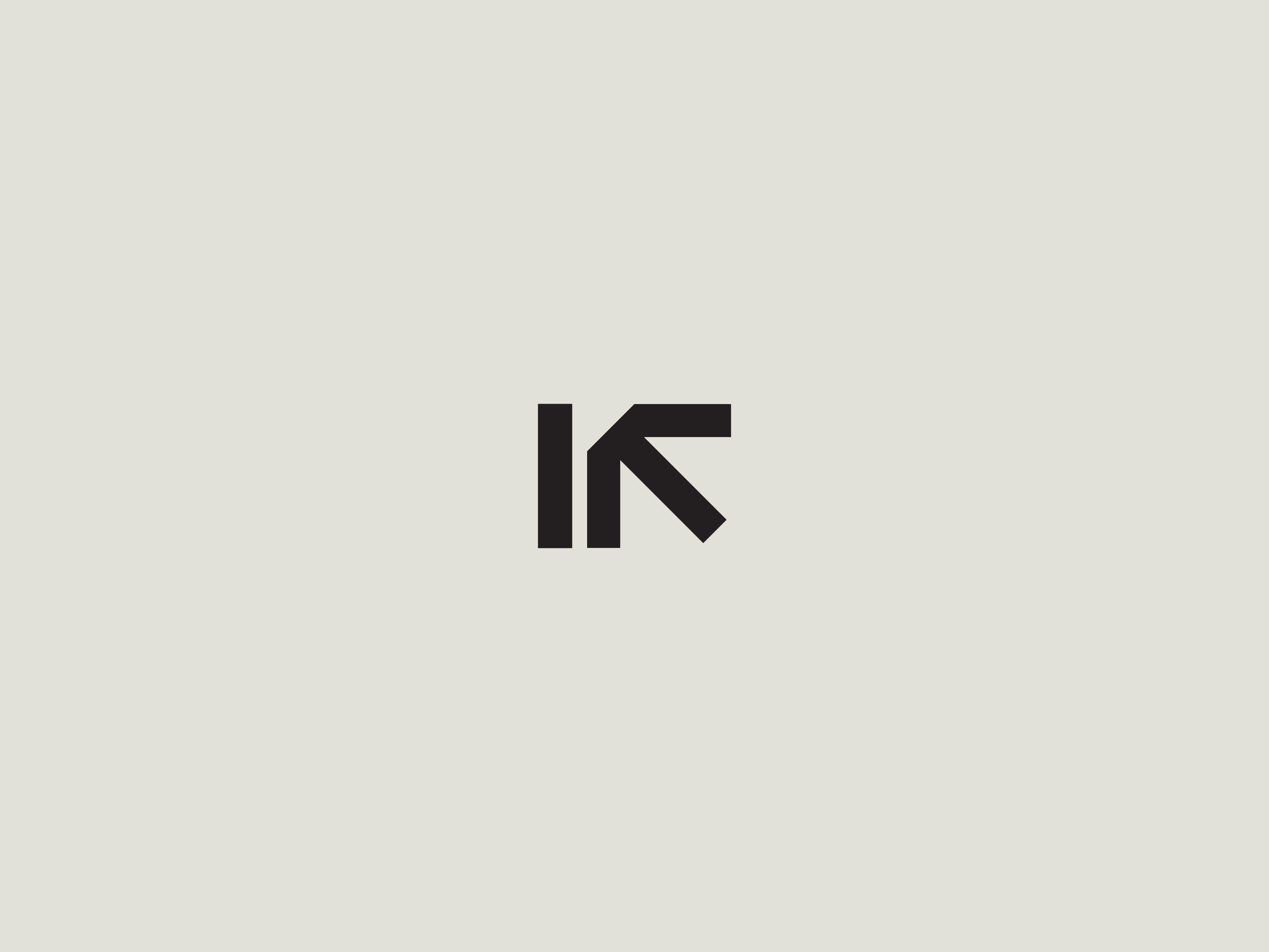
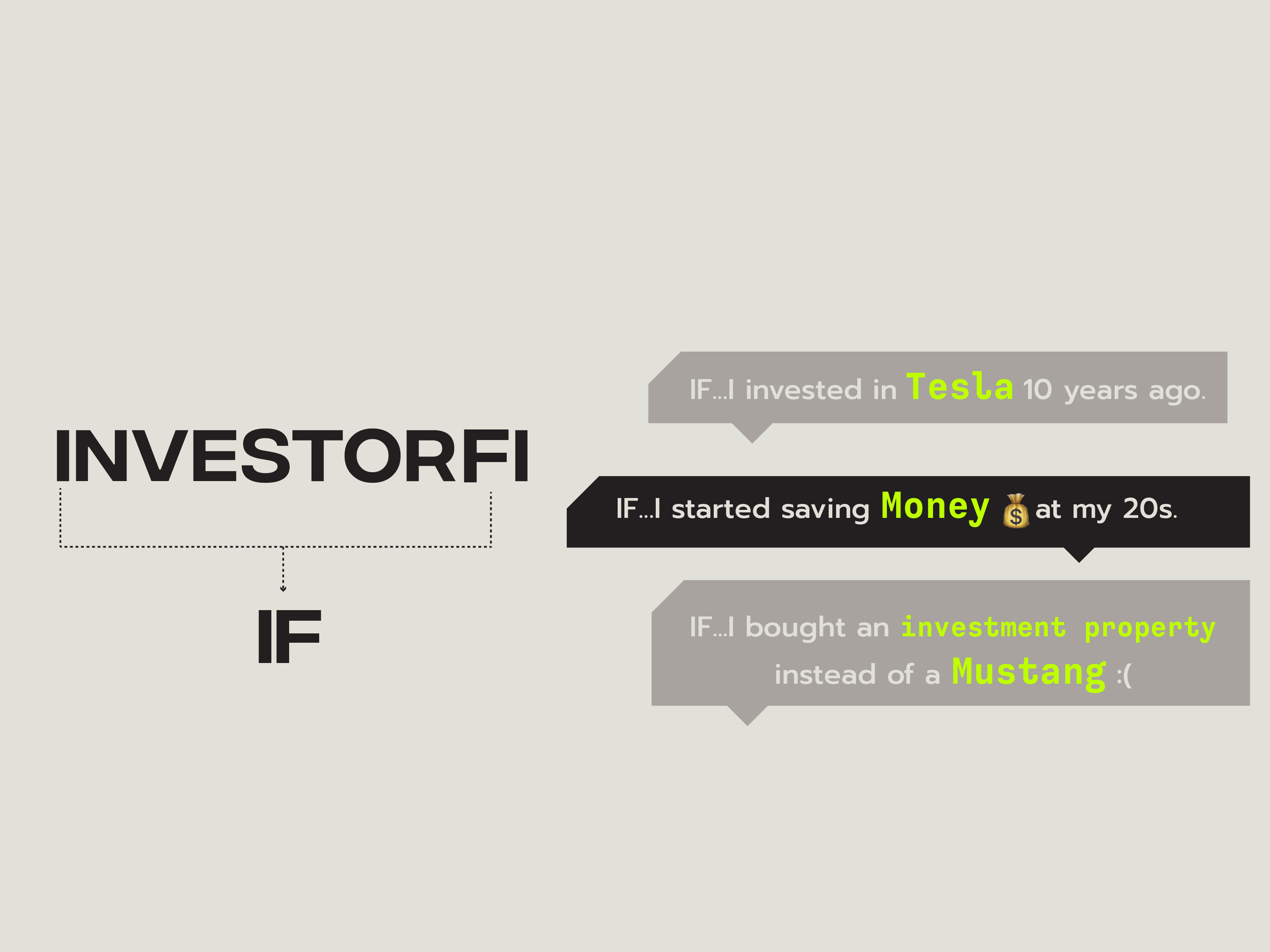
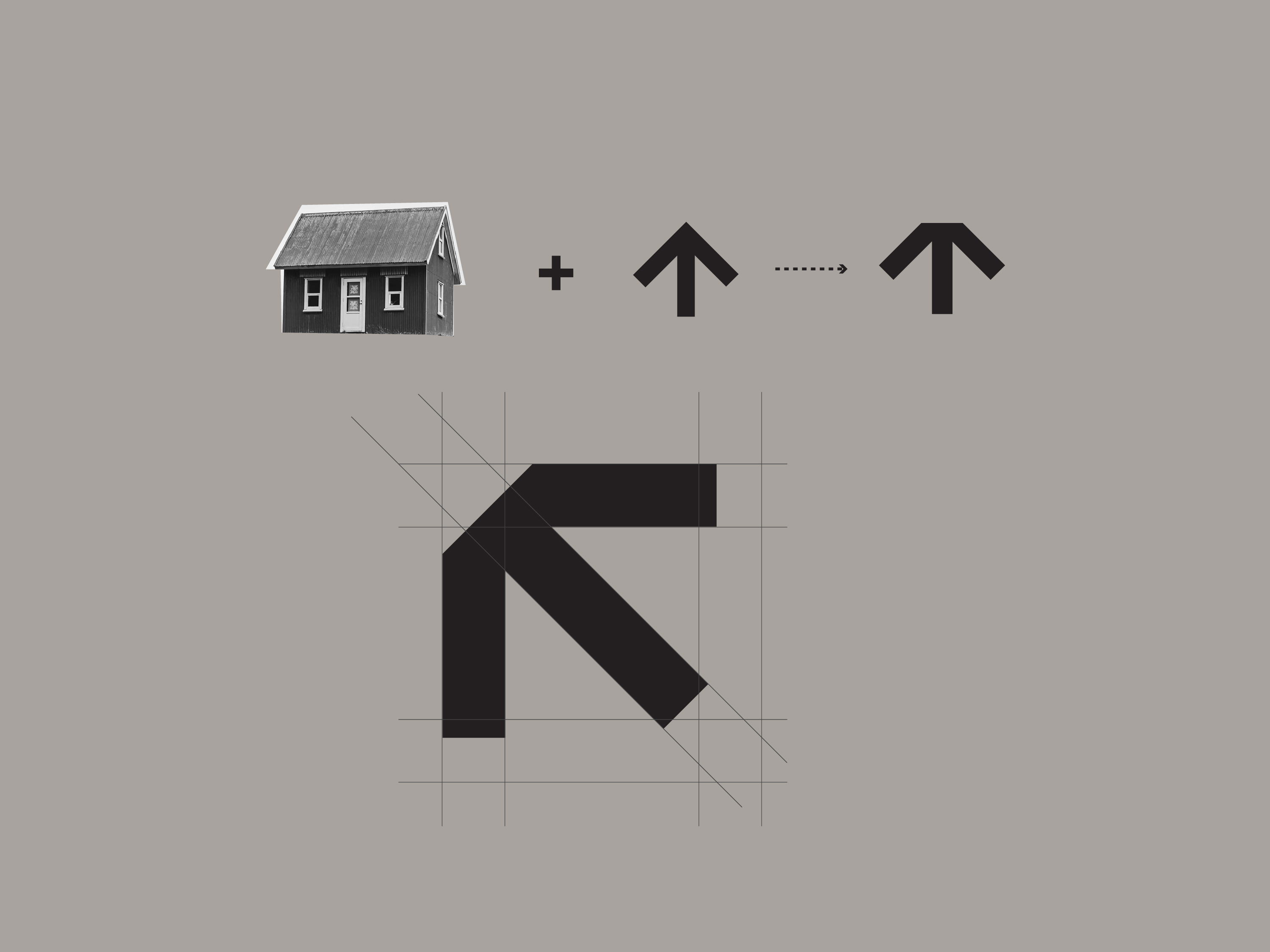
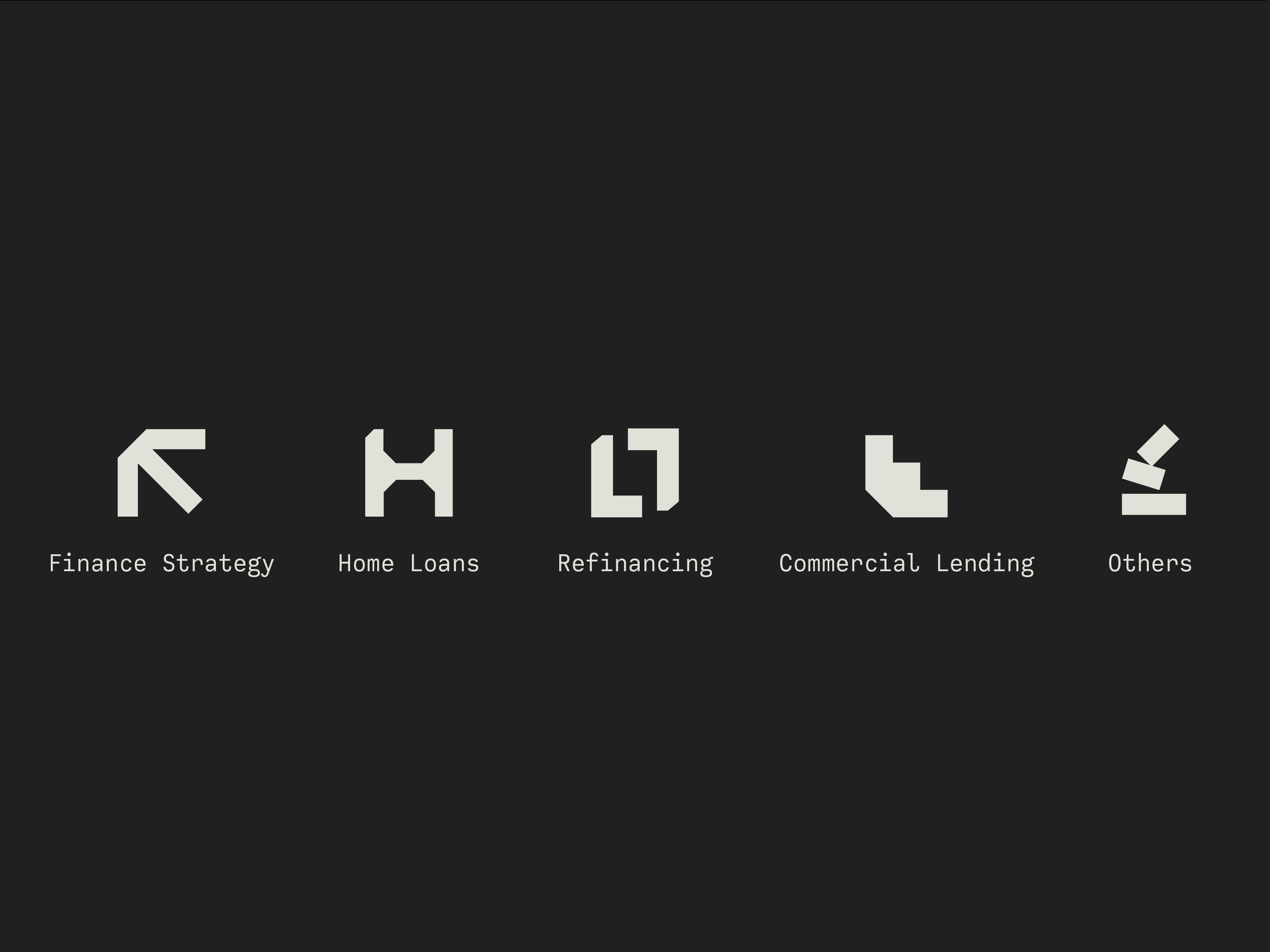
As simple and as complicated as taking Investorfi’s I and f to merge them into “if”, to evoke the possibilities in its branding, “What if?”, which can be directly related to investing: we may regret it in the future if we don’t act today. “What if?” which can be, also, related to young generations perspectives regarding their lives. That’s what the design is, inspired by the daily street signs and urban jungle, created in a similar shape in both the logo mark and set of icons: like building-blocks. The cut-cornered F gives it an overall edgy look, ready for new times, and is made out of an increasing arrow. As for the color selection, it carries a symbolic meaning as well: the minimalistic taupe, ivory
and dark colors, combined with bright green conveys the self-made men spirit, for investment can eventually give you return while on the journey, but you may need to cut off all unnecessary expenses in life.

CREDIT
- Agency/Creative: Studio Dopamine
- Article Title: Investorfi Brand Identity Design by Studio Dopamine
- Organisation/Entity: Agency
- Project Type: Graphic
- Project Status: Published
- Agency/Creative Country: Australia
- Agency/Creative City: Melbourne
- Market Region: Oceania
- Project Deliverables: Animation, Brand Design, Brand Identity
- Industry: Financial
- Keywords: finance, property, investment, brand identity, logo design, website landing page, Logo Animation
-
Credits:
Creative Director / Graphic Designer: Wenfei Hu
Animator: Ashot Sargsyan


