We all grew up on it. We all love it. But did you know that most peanut butters are filled with crap? Ya, hate to break it to you. But that PB&J your mom used to pack you for lunch…no bueno.
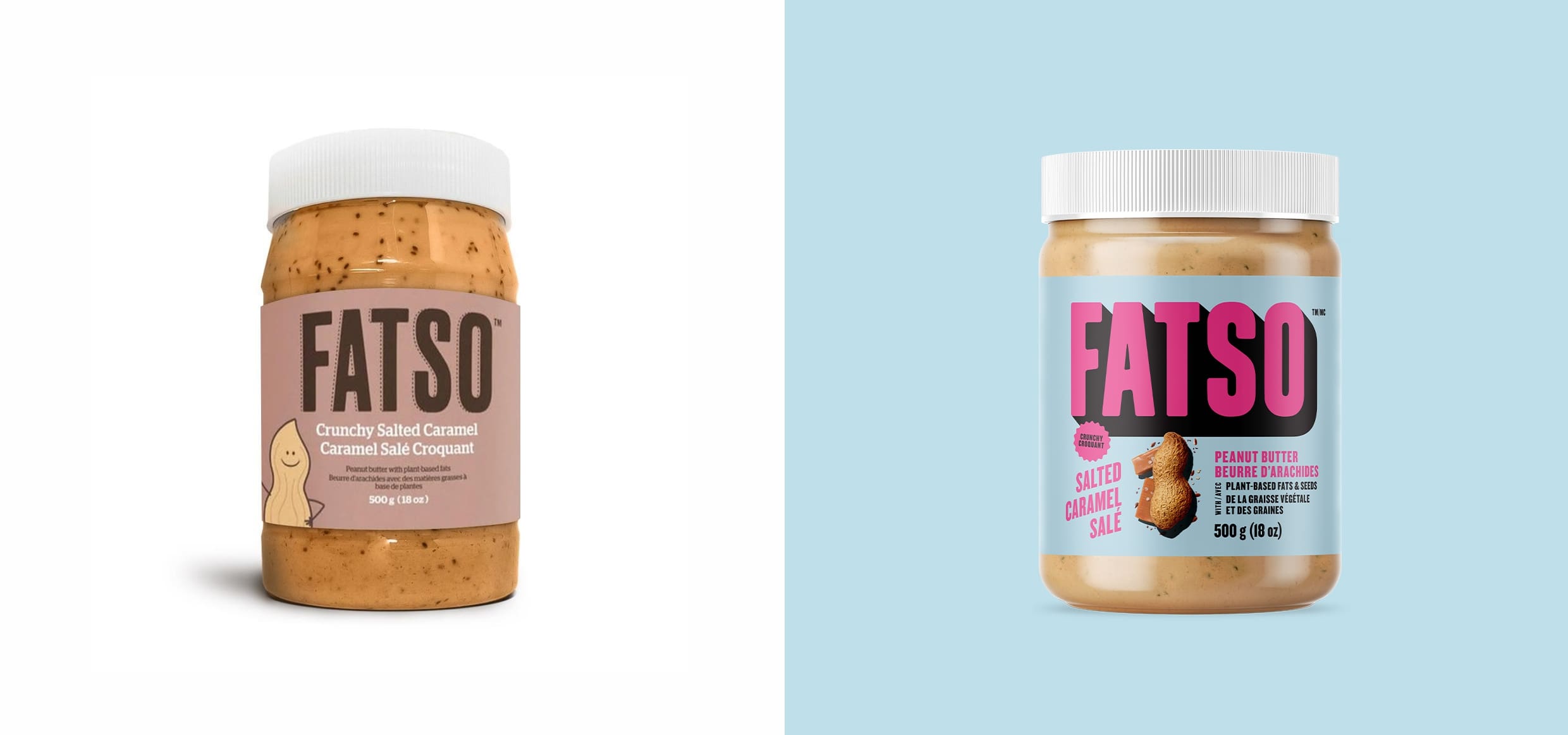
Enter Fatso! A peanut butter loaded with healthy fats and nutrients. Founded in 2016; Jill Van Gyn launched the brand with hopes of getting the world off junk-filled nut butters and onto something better. The name ‘Fatso’ speaks to the healthy fats that it’s loaded with. Which is fitting for a playful and unconventional brand like Fatso. So, what was the problem? Well, the brand look and feel just didn’t live up to the bold energy of Jill and the brand. The name is striking, but the visuals didn’t bring that same kind of vibe. That’s where we come in.
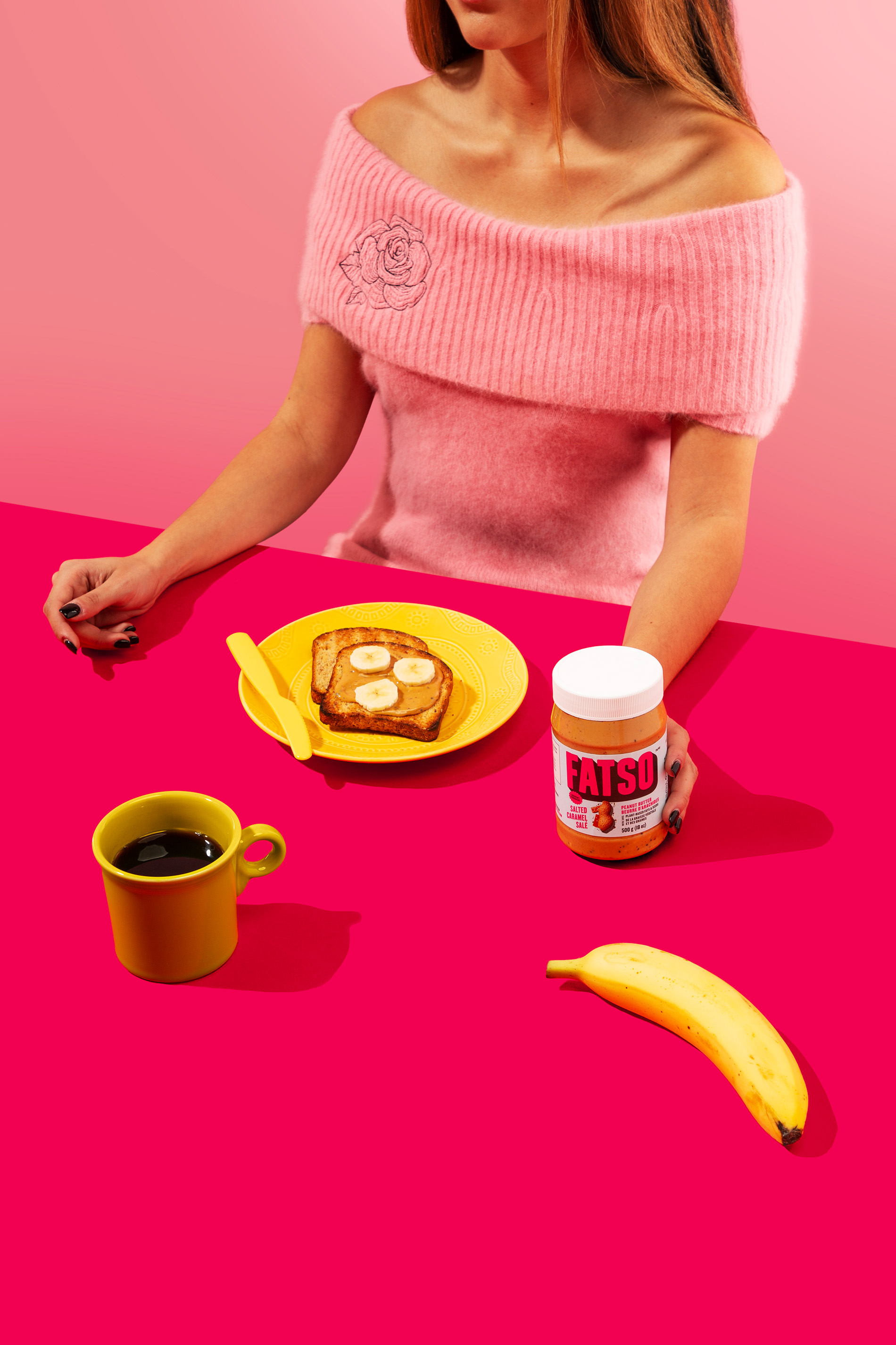
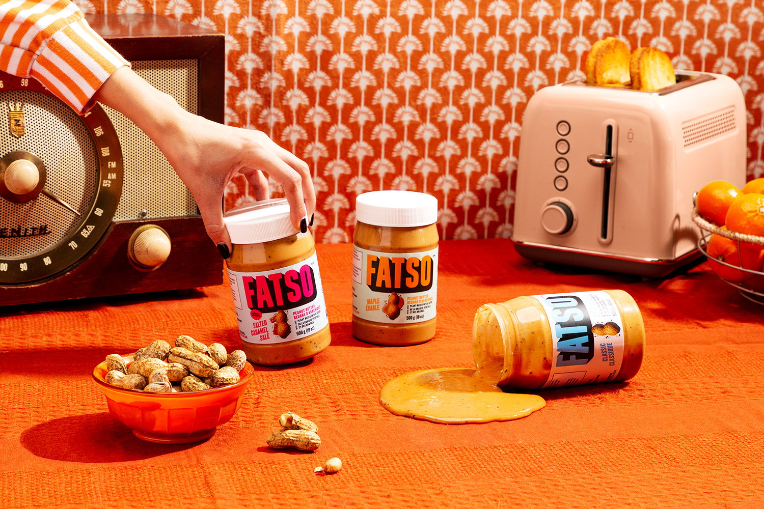
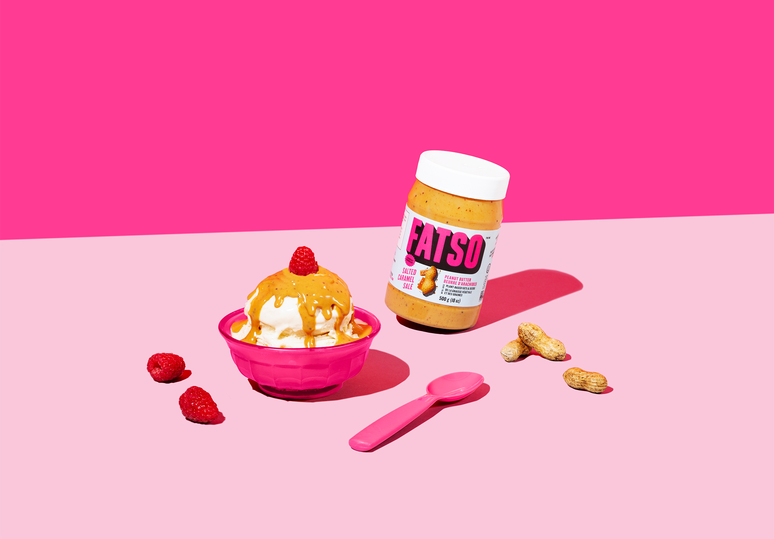
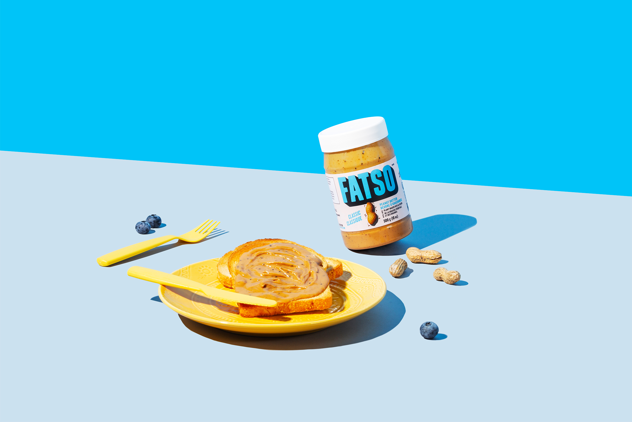
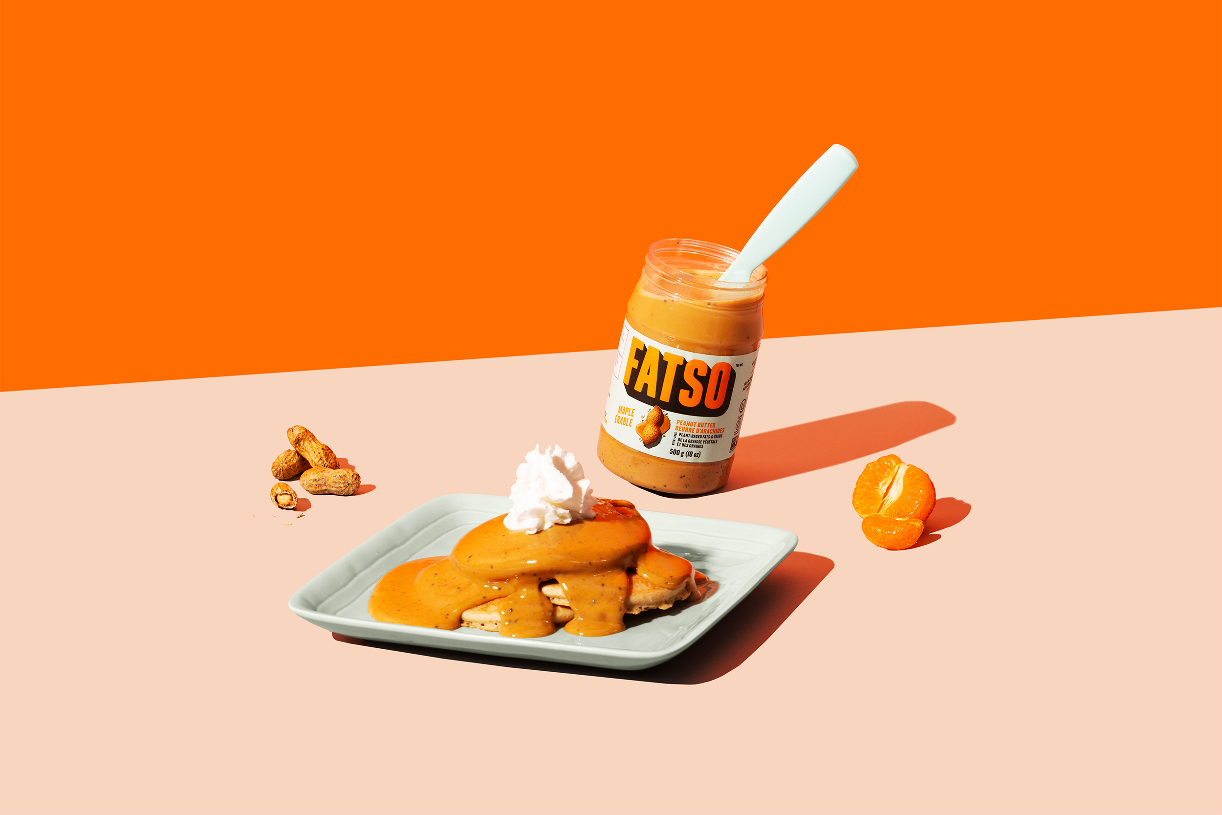
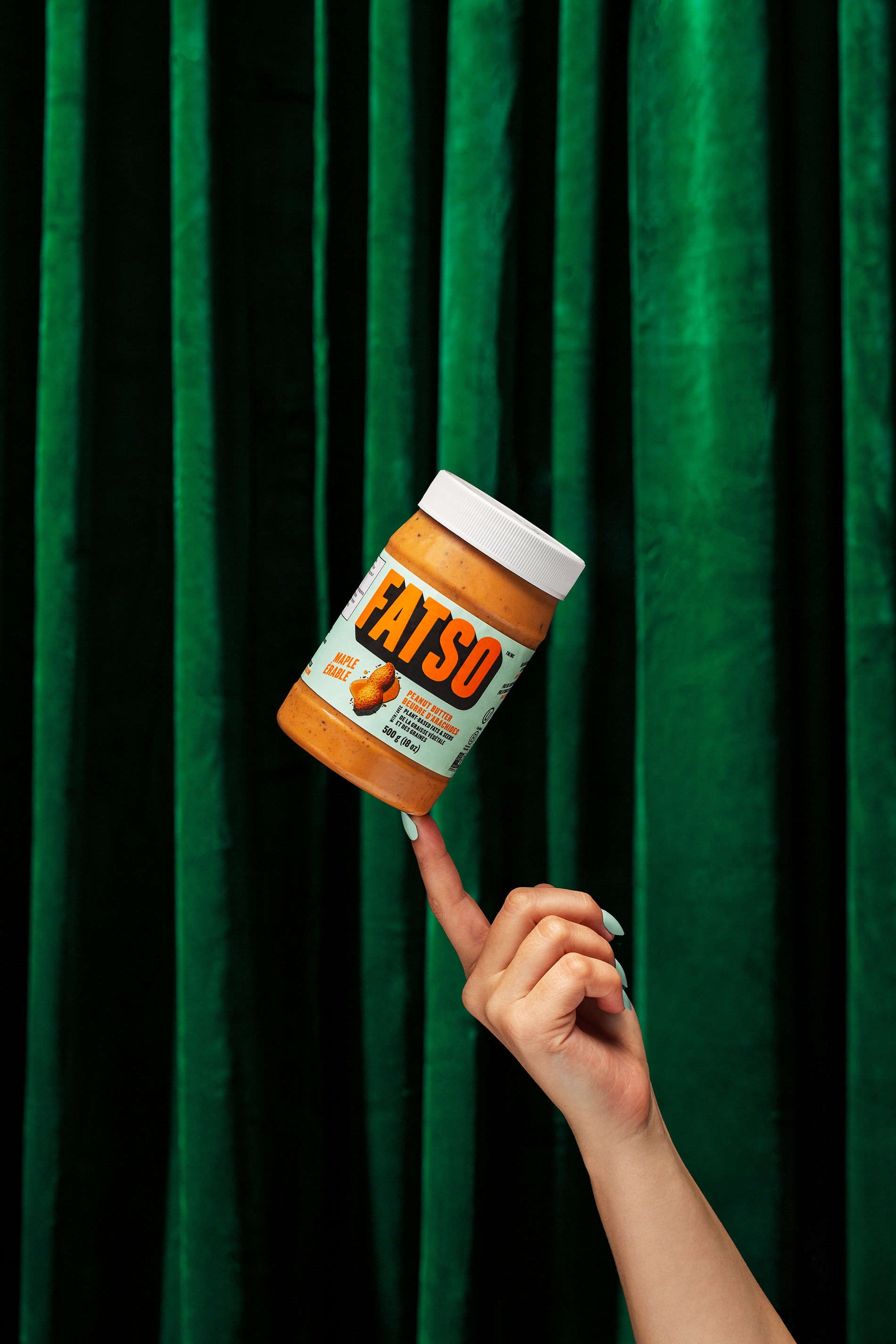
Packed with plant-based superfats and carving out a category of its own within the peanut butter landscape, the design needed to stand out from the rest. We took the design from ma n’ pa to pow! Using a bold condensed custom typeface and a deep drop shadow, we created a wordmark that’s in-your-face and impossible to miss. Flavour? You can’t miss it either. We give our hero nuts and seeds the spotlight right front and centre on the pack.
Colour played a huge role too. We paired vibrant colours with pastels to elicit big taste and confidence as well as to distinguish between the three mouthwatering flavours. The visual combination of the logo and colours also nod to the nostalgic and retro personality that is Jill and the Fatso brand. Fatso finally feels like Fatso. And it’s finally getting the attention it deserves.

CREDIT
- Agency/Creative: Crew
- Article Title: A Retro Rebrand for Fatso Peanut Butter by Crew
- Organisation/Entity: Agency
- Project Type: Packaging
- Project Status: Published
- Agency/Creative Country: Canada
- Agency/Creative City: Vancouver
- Market Region: North America
- Project Deliverables: Logo Design, Packaging Design
- Format: Jar
- Substrate: Plastic, Pulp Paper
- Industry: Food/Beverage
- Keywords: Rebrand, Food, Peanut Butter, Label, Packaging, Retro, Bold, Bright, Colorful, Maximalism
-
Credits:
Chief Creative Officer: Gerald Schoenhoff
Creative Director: Daniel Ryu
Associate Creative Director: Nicholas Schembri
Designer: Morgan Hueston
Account Manager: Nate Douglas
Photography: Greg Beck
Art Direction: Courtney Thompson
Production Designer: Cliff Borromeo


