Italian food heritage is unparalleled – quality of produce, attention to flavor detail, leisure and pleasure. Developing a packaging to wrap up the characters of Italian food and capturing the honest and high-quality flavors of the produce in a visual narrative was key for us.
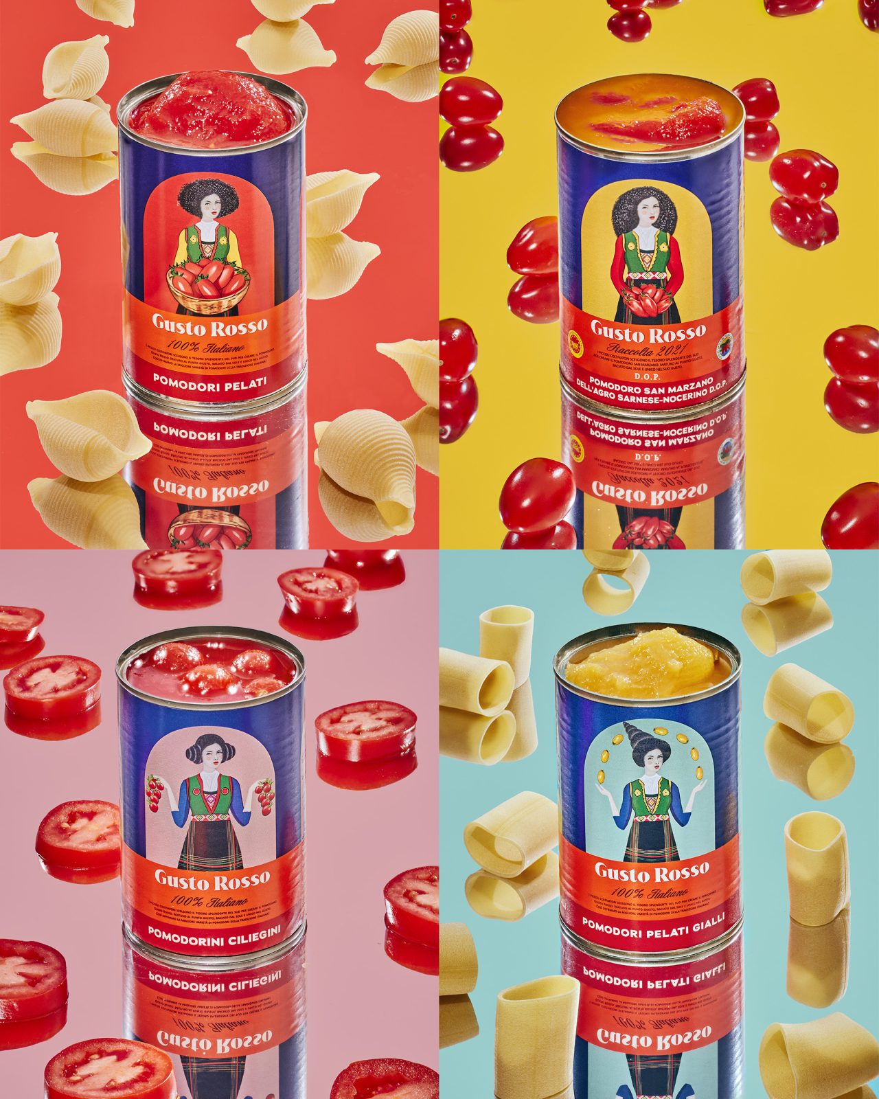
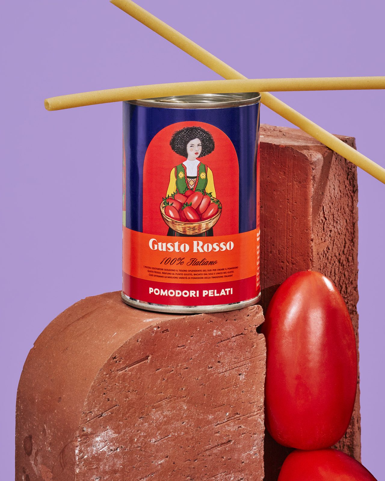
Working with Gustini, one of the biggest German online retailers for Italian delicacies, we redesigned their premium Gusto Rosso selection of tinned fruity fresh summer tomatoes from southern Italy. The tomatoes are carefully selected from many small tomato farmers in the Italian countryside to ensure bringing together the best produce. Often these are small family farms that still harvest by hand. These precious pomodori are immediately processed fresh to preserve the unmistakable sun-drenched aroma and the best tomato flavor.
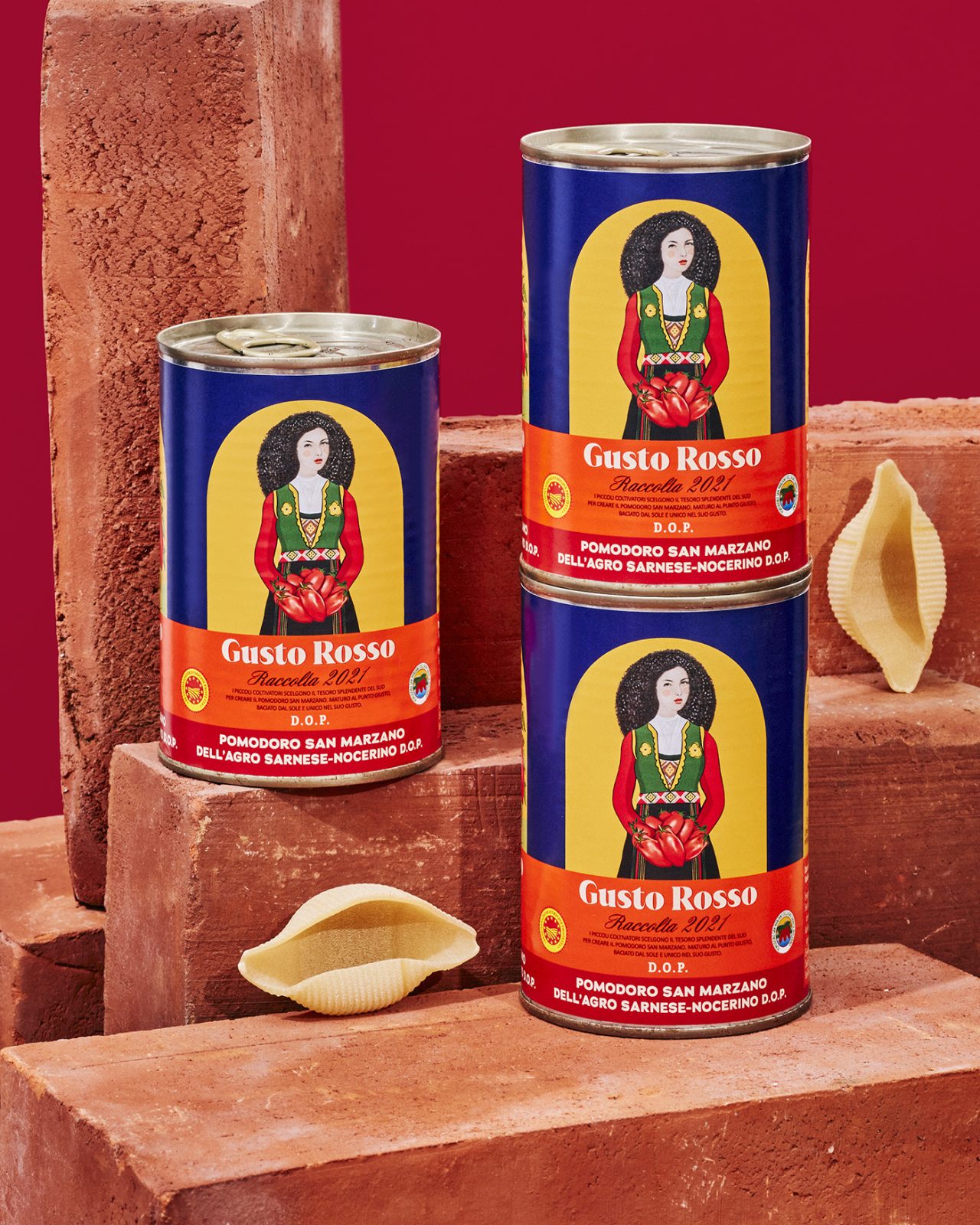
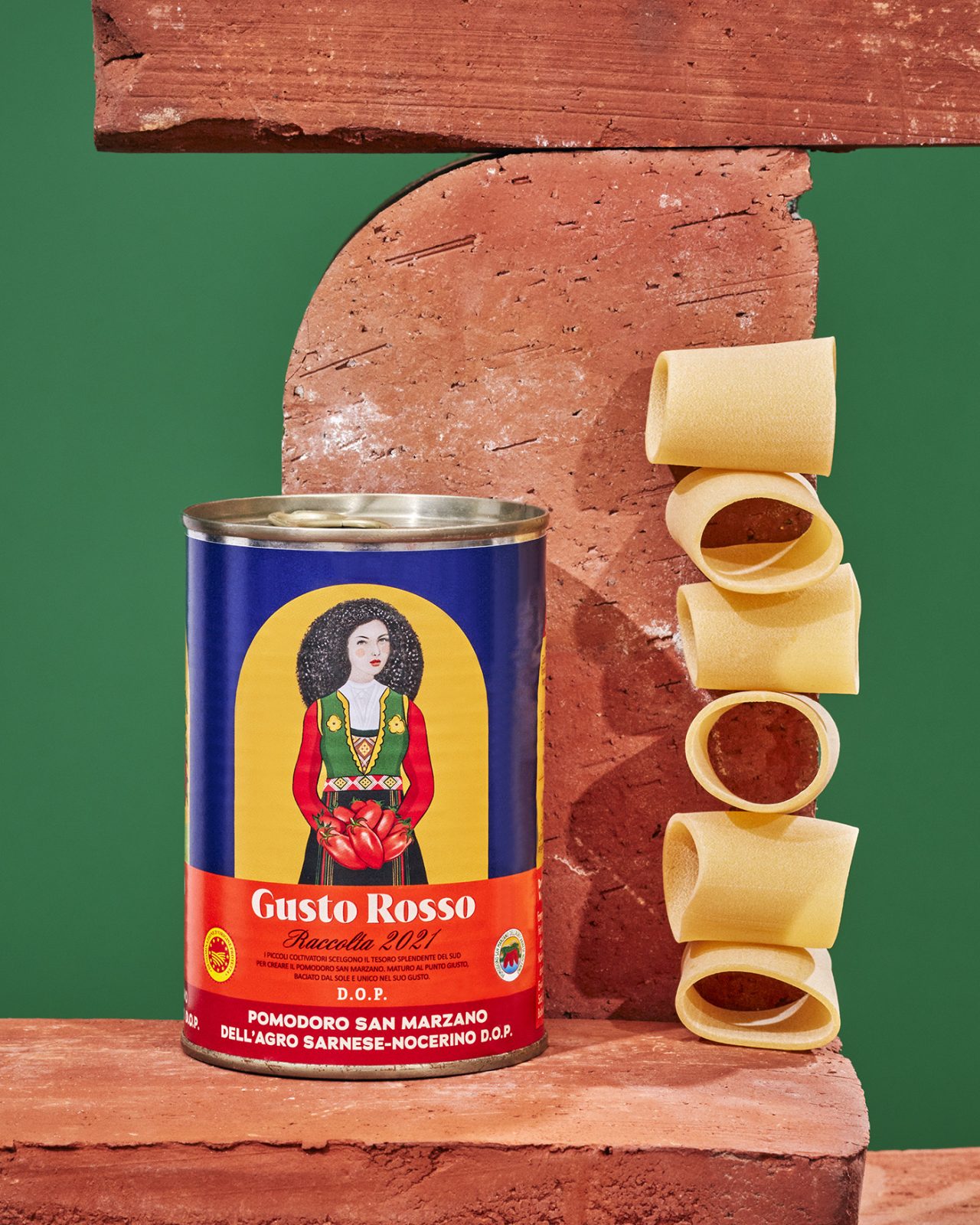
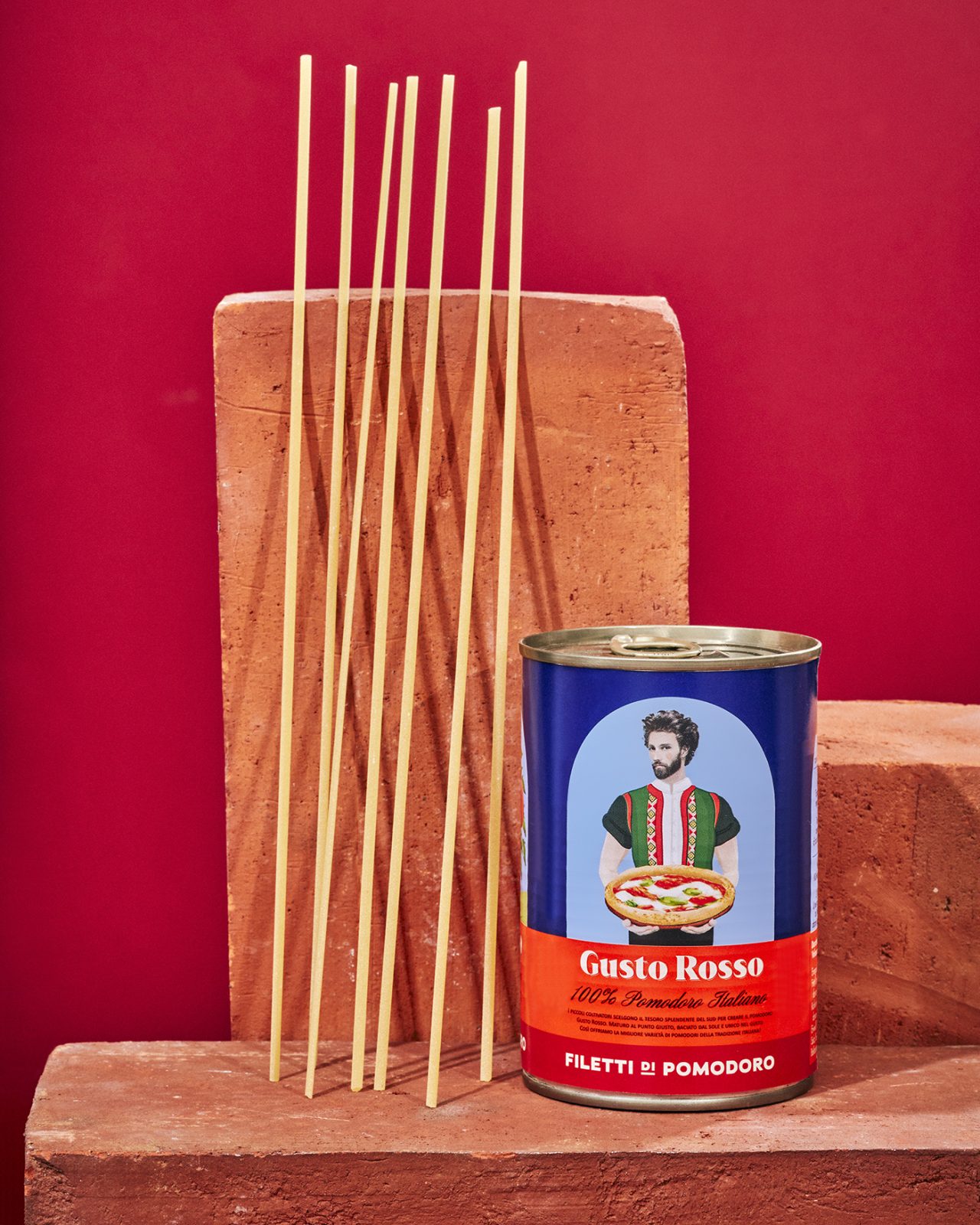
Gusto Rosso is a line for sophisticated tastes and 100% Italian. We wanted to reflect this in the design through showcasing this quintessential Italian flair. Sounds outdated? A core question for us was how to bring in the 21st century and reflect today’s younger generations. Combining traditional outfits with characters styled in a contemporary young and fresh fashion, we are calling out to renew and redefine Italian classics!
Standing out in today’s attention economy is no small feat, so we decided to go big and bold in color and style: Zampano meets Verdi meets miu miu – bringing together the drama of Italian flair, the sophistication and culture and the timeless and inherent fashion sense. All that represented in characters that a young generation can identify with and feel inclined to connect to.
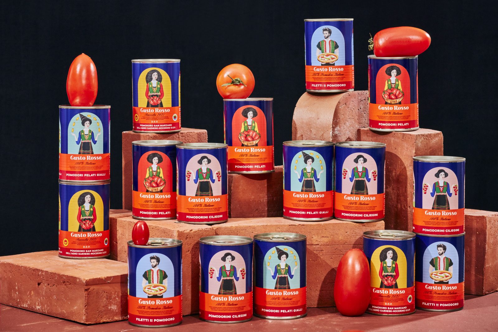
The elegant Italian lady with buns, the wild one with a mane of hair, or the scruffy young Italian man who could have just gotten off his scooter, leisurely zipping through the streets of Rome to meet friends for dinner at their favorite trattoria. The characters speak for themselves, as if quickly captured between actions of their daily life in Italy. Iconic Italian with a pinch of humor, some drama and plenty of love.
The architectural arch structure behind each character brings the collection of five tins together, with bridging arches between them. Setting the stage through this architectural element, the characters position themselves as if in an opera by Giuseppe Verdi – can you hear it?
CREDIT
- Agency/Creative: Ruska Martin Associates
- Article Title: Gusto Rosso Series Packaging Redesign
- Organisation/Entity: Agency
- Project Type: Packaging
- Project Status: Published
- Agency/Creative Country: Germany
- Agency/Creative City: Berlin
- Industry: Food/Beverage
- Keywords: WBDS Agency Design Awards 2022/23
-
Credits:
Strategy & Creative Direction: Roman Ruska
Strategy & Creative Direction: Francisca Martin
Design: Eugeniusz Orda
Design: Carla Rotenberg Taboada
Design: Theo Sarry
Illustration: Eugeniusz Orda
Illustration: João Colaço
Photography: Ragnar Schmuck


