


Nipiol : a whole new story has just begun
Design Group Italia signs Nipiol’s brand relaunch, a historical reference for baby-food in Italy. Well known for their value-for-money offer of baby-food products, today Nipiol addresses parents who are looking for simple, accessible and smart solutions, without giving up baby-food quality standards, set by baby-food products.
The project has brought the Brand to a full renovation in terms of the brand equity’s visual assets, positioning itself as one of the most creative relaunches in the large-scale Italian distribution for:
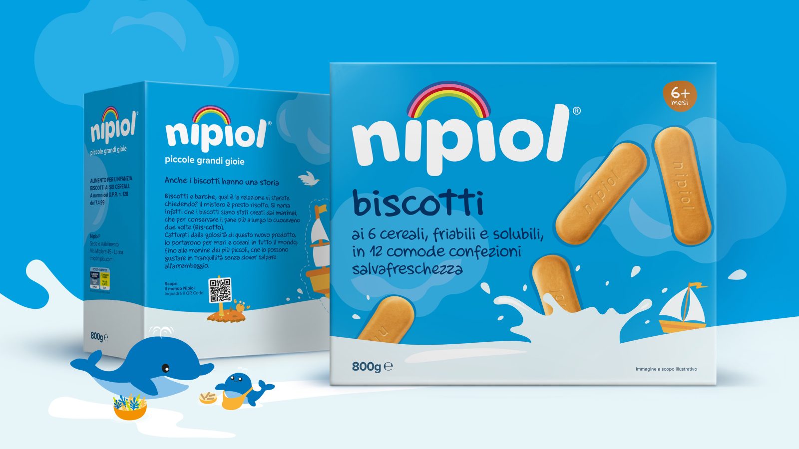
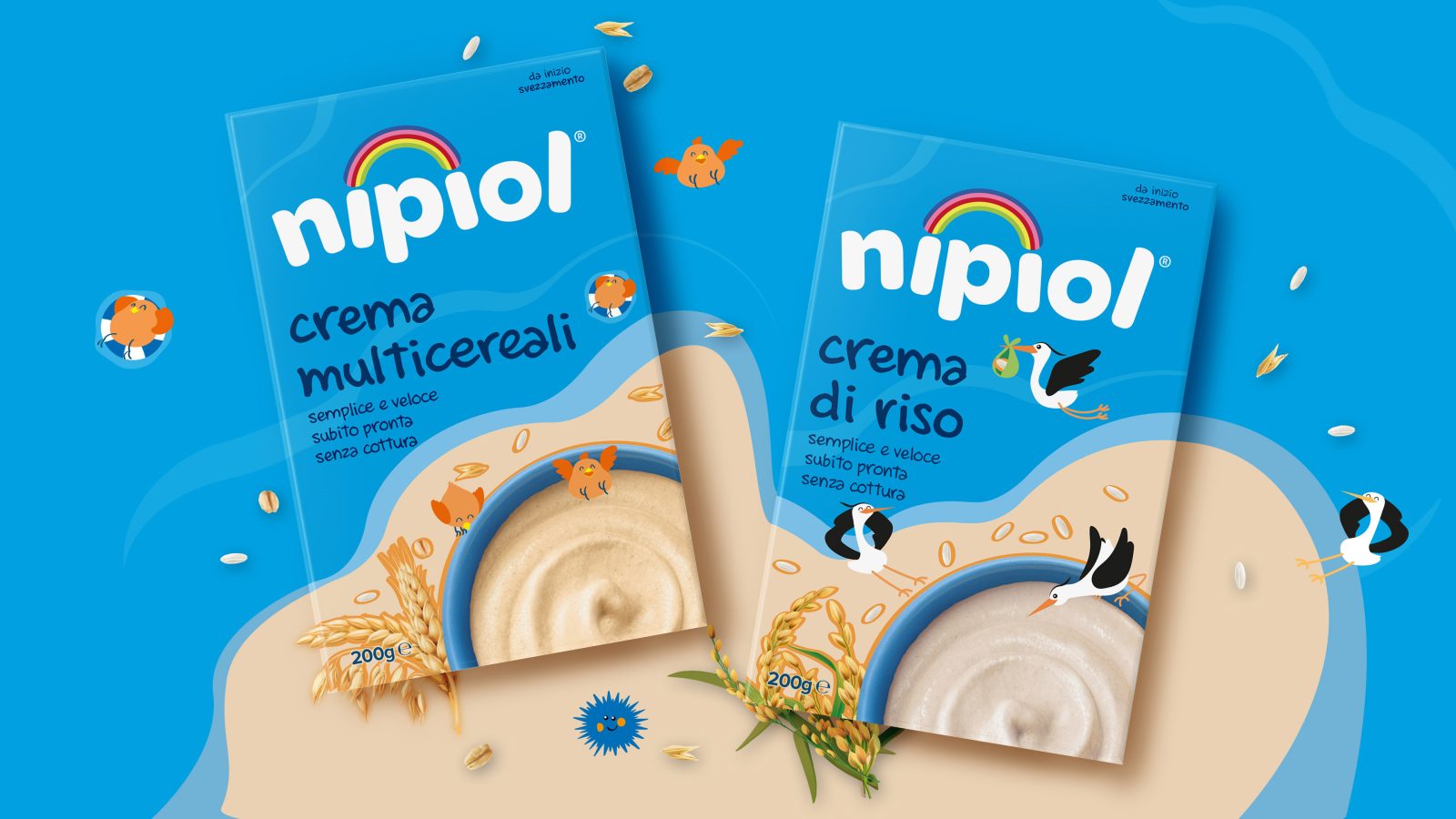
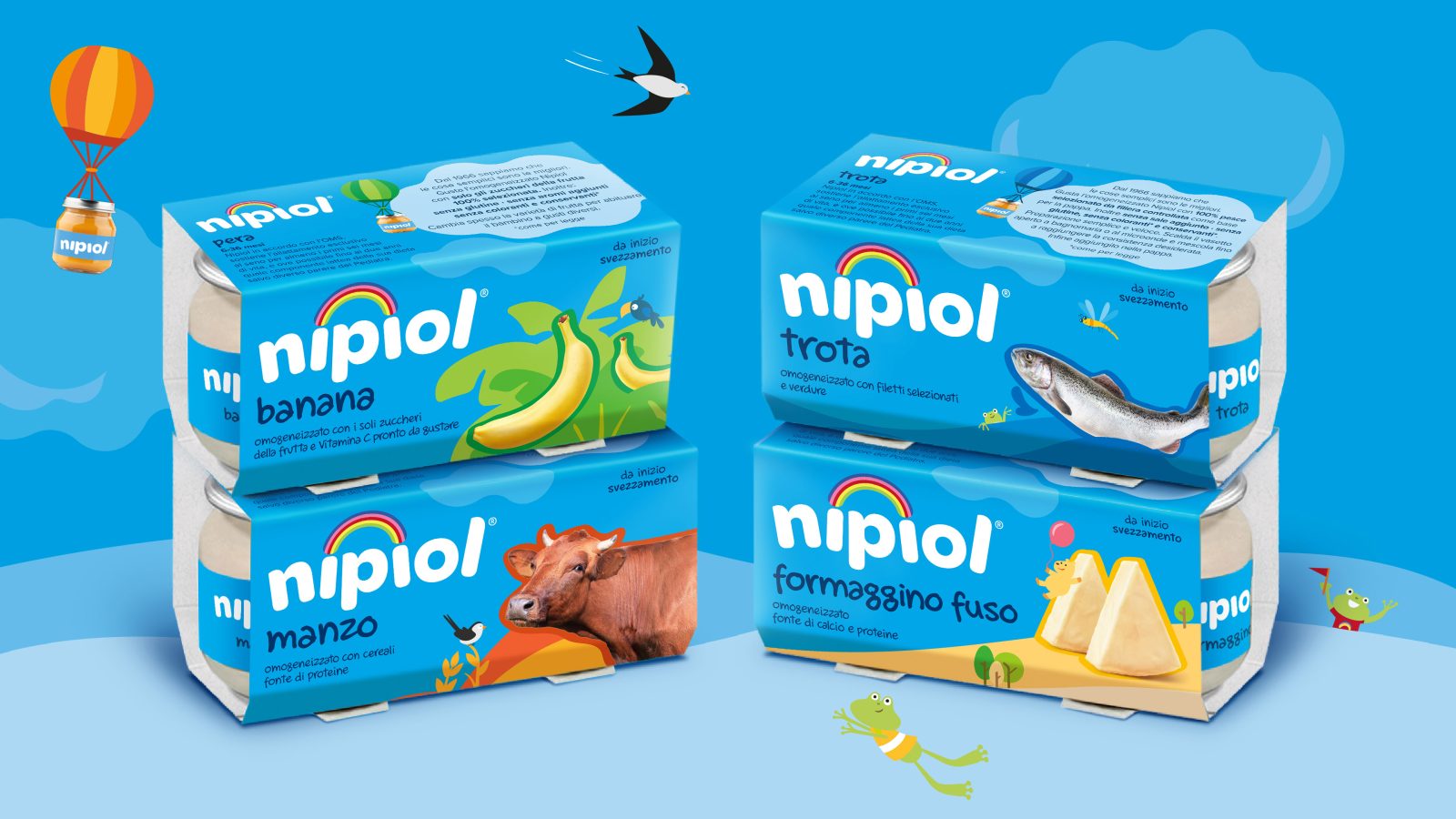
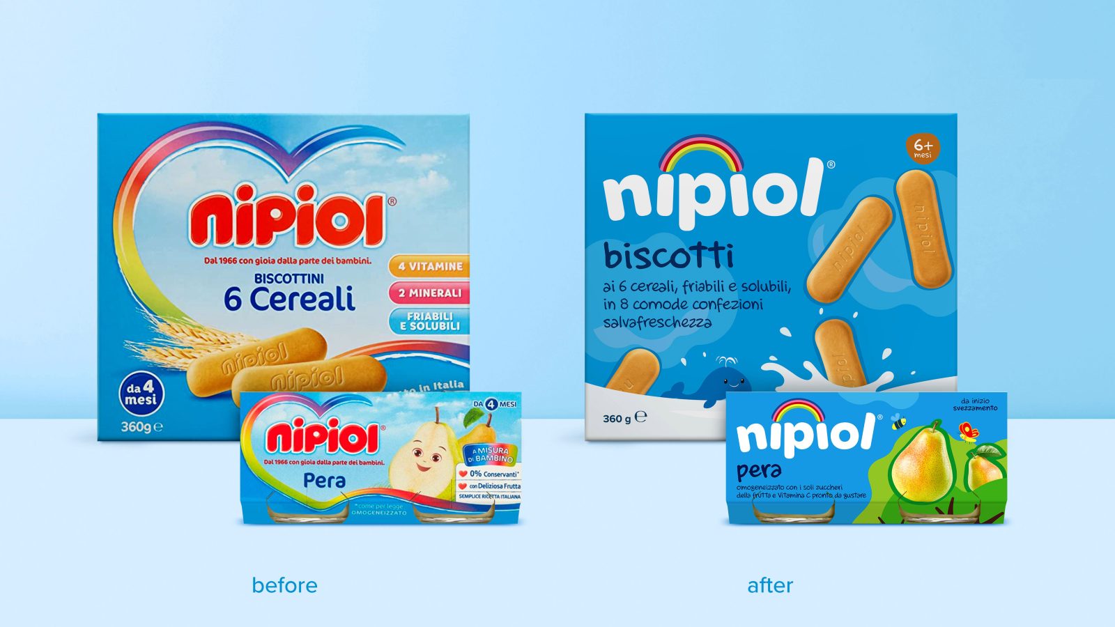
A completely transformed brand identity, composed of a new sky-blue brand colour, with a strong shelf appeal, and a brand-new logo with soft but dynamic typography, which capitalizes on the idea of the rainbow as a pillar element of a joyful, inclusive present-day, though bonding with the past.
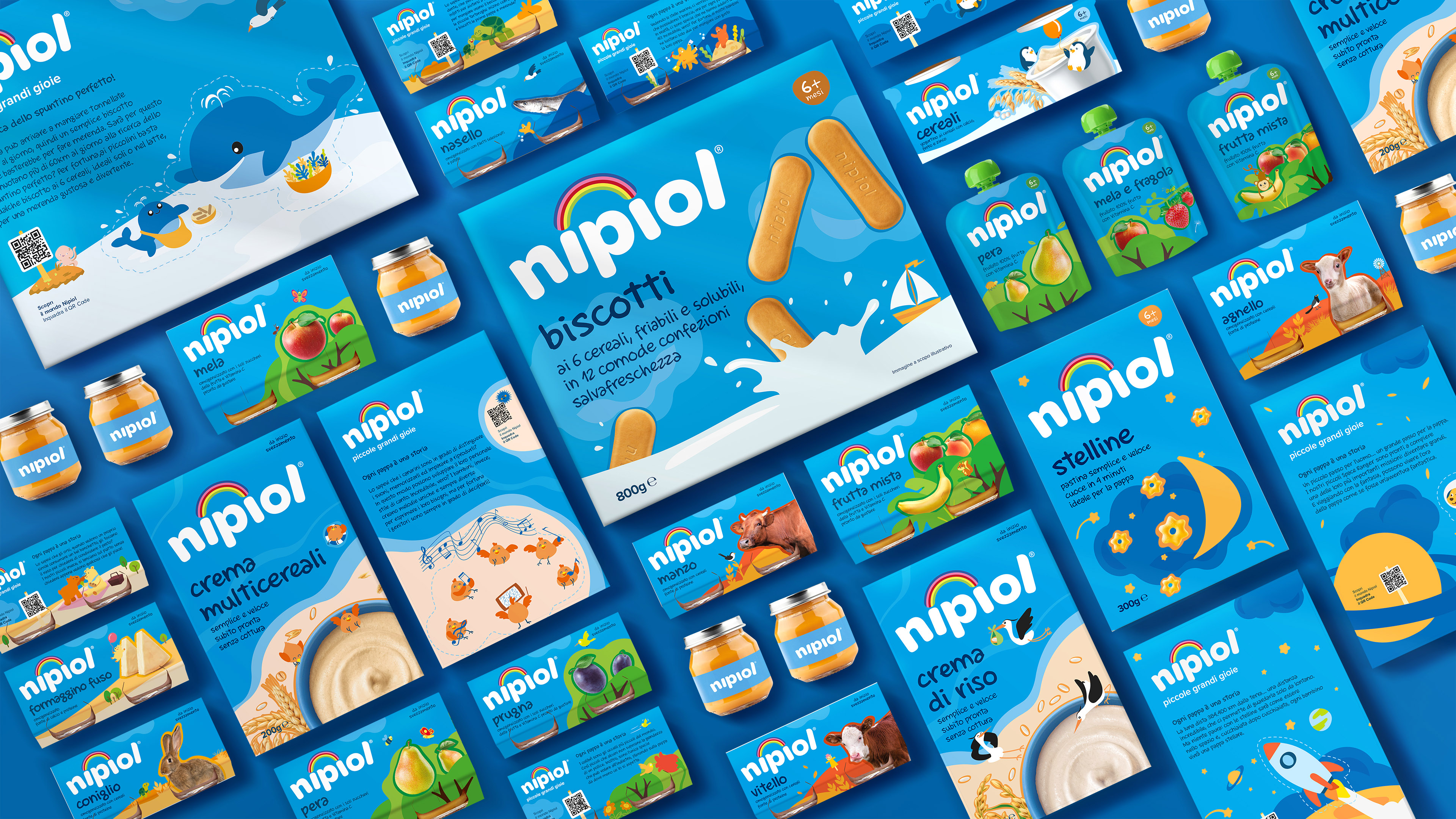
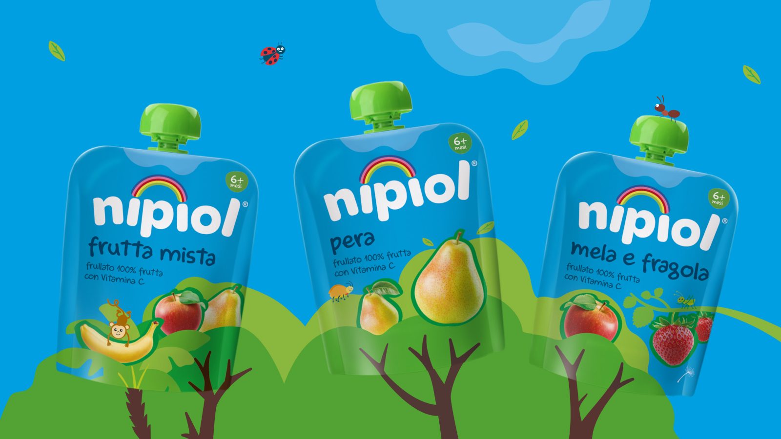
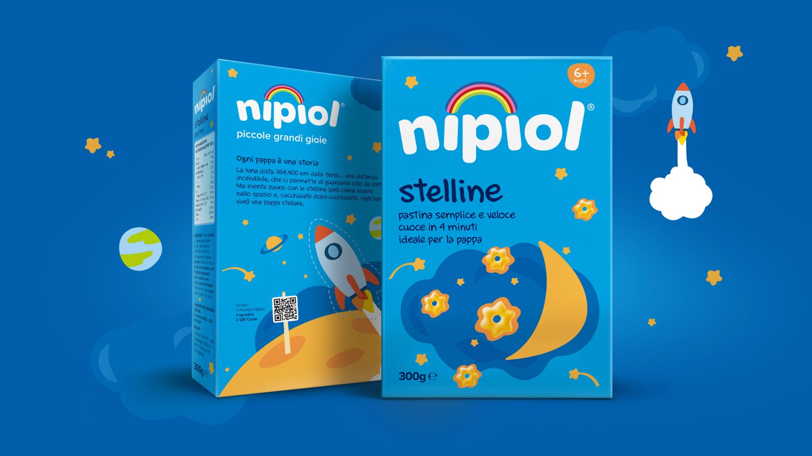
A new packaging identity, where each product becomes a single episode – for over 40 different subjects – of an illustrated story which portrays a world of nature, fantasy and irony.
Logo, ingredients and fictional characters coexist and interact on the front of pack, narrating the product’s recipe through a proprietary illustrative style, engaging and impactful, identifying the new Brand’s visual identity inspired by children’s books. The storytelling continues towards the back-of-pack, holding tips and curiosities inspired by the recipes and the leading characters.
The flexibility of the packaging system can be easily adapted to every key-visual and pack format, responding to the need of synthesis and a simple consumer navigation (content and hierarchy). Nonetheless, the ingredients are exalted through a new depiction style that emphasizes their natural and dynamic essence, and their role in the product’s storytelling.
With Nipiol, every product is a story to tell, a small but big joy to live.
Total Rebranding and New Packaging Identity
The repositioning and total rebranding of Nipiol are based on a strategy of gradual ascent of the Brand, in very polarized geographical areas, populated by very different core targets for recognition, awareness and relative presence of Nipiol.
Northern Italy, where the Brand needs a heavy relaunch to increment appeal and market quotes through an impactful look&feel, which is also engaging and modern
Center-South of Italy, where the Brand praises of loyalty and awareness, but has to consolidate its performances towards targets and parents who are becoming more and more dynamic and modern
In the medium-long term period, the transversal objective of this strategy is to bring Kraft Heinz to rebalance presence and penetration of Nipiol in all of the Italian Peninsula.
CREDIT
- Agency/Creative: Design Group Italia , Kraft Heinz
- Article Title: Nipiol Total Rebranding and New Packaging Identity
- Organisation/Entity: Agency
- Project Type: Packaging
- Project Status: Published
- Agency/Creative Country: Italy
- Agency/Creative City: Milan
- Industry: Food/Beverage
- Keywords: WBDS Agency Design Awards 2022/23
-
Credits:
Head of Marketing Kraft Heinz: Francesco Meschieri
Brand Design Director Design Group Italia: Michele Favaretto
Senior Brand Strategist Project Manager Design Group Italia: Simone Pase
Senior Graphic Designer Design Group Italia: Vania Viscardi
Marketing Manager Kraft Heinz: Elisa Cavestro


