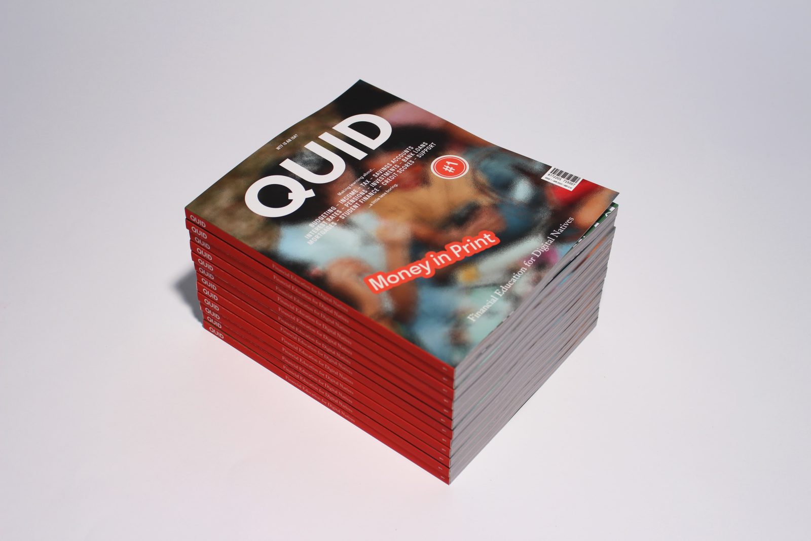
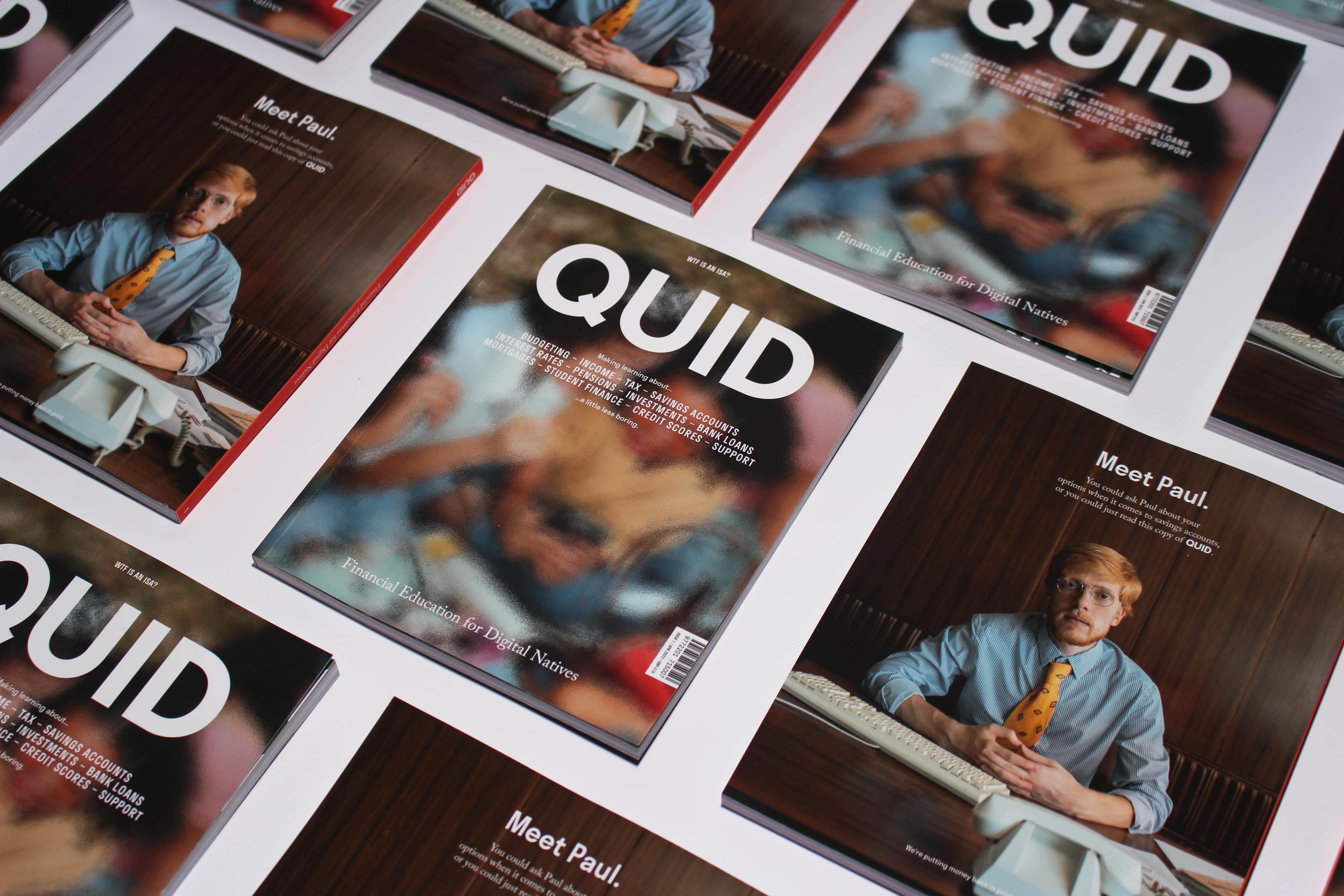
Quid is an annual publication providing clarity through print on financial education topics for digital natives. The full issue was concepted, designed, written, and edited by Ben Clarke as part of his Final Major Project, studying BA Graphic Design at Northumbria University, Newcastle.
Almost half the UK population (48%) lack basic financial literacy. Quid stands to change this by targeting young adults (15-21yrs) at the start of their financial independence, it’s a one stop reference that breaks from the digital screen and provides clarity on a range of financial areas. Money is something that isn’t effectively taught about in schools; topics are often slotted into the curriculum and it’s importance isn’t echoed in the delivery. Banks and government are unengaging in their approach and a lack of clarity in terminology makes learning difficult.
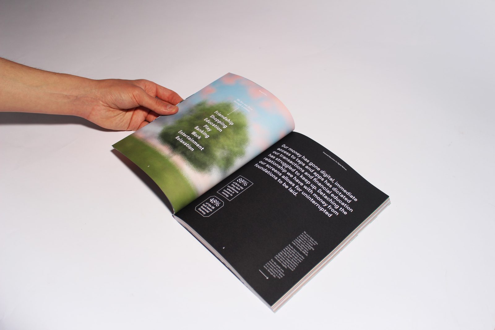
Our money has gone digital, instant access to taps and apps has dictated our transactions however financial education has struggled to keep up. Studies have found young adults learn more effectively through print than through screens, as scrolling has a disruptive effect on comprehension. They are overwhelmed with a constant flow of noisy content and breaking through this noise is difficult digitally.
Quid aims to solve this by detaching the relationship young people have with money from their digital devices allowing for uninterrupted educational foundations to be laid through print.
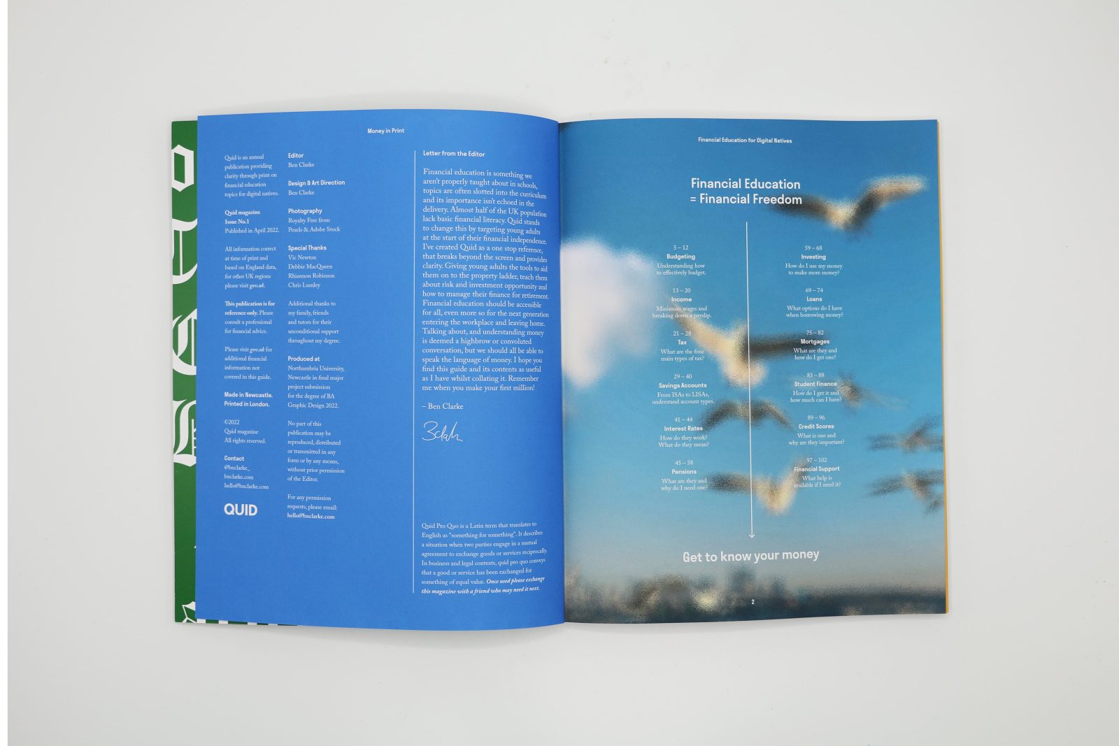
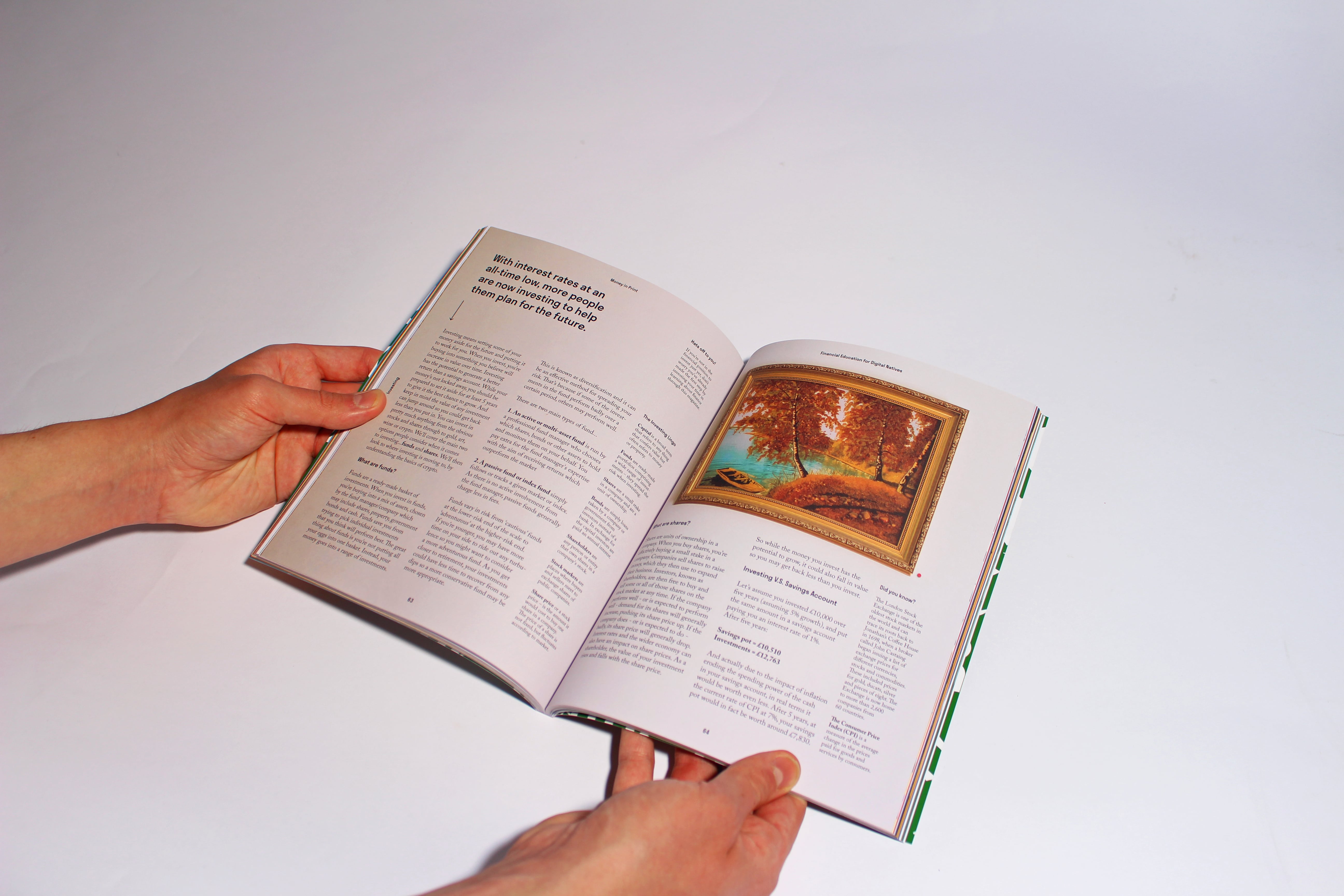
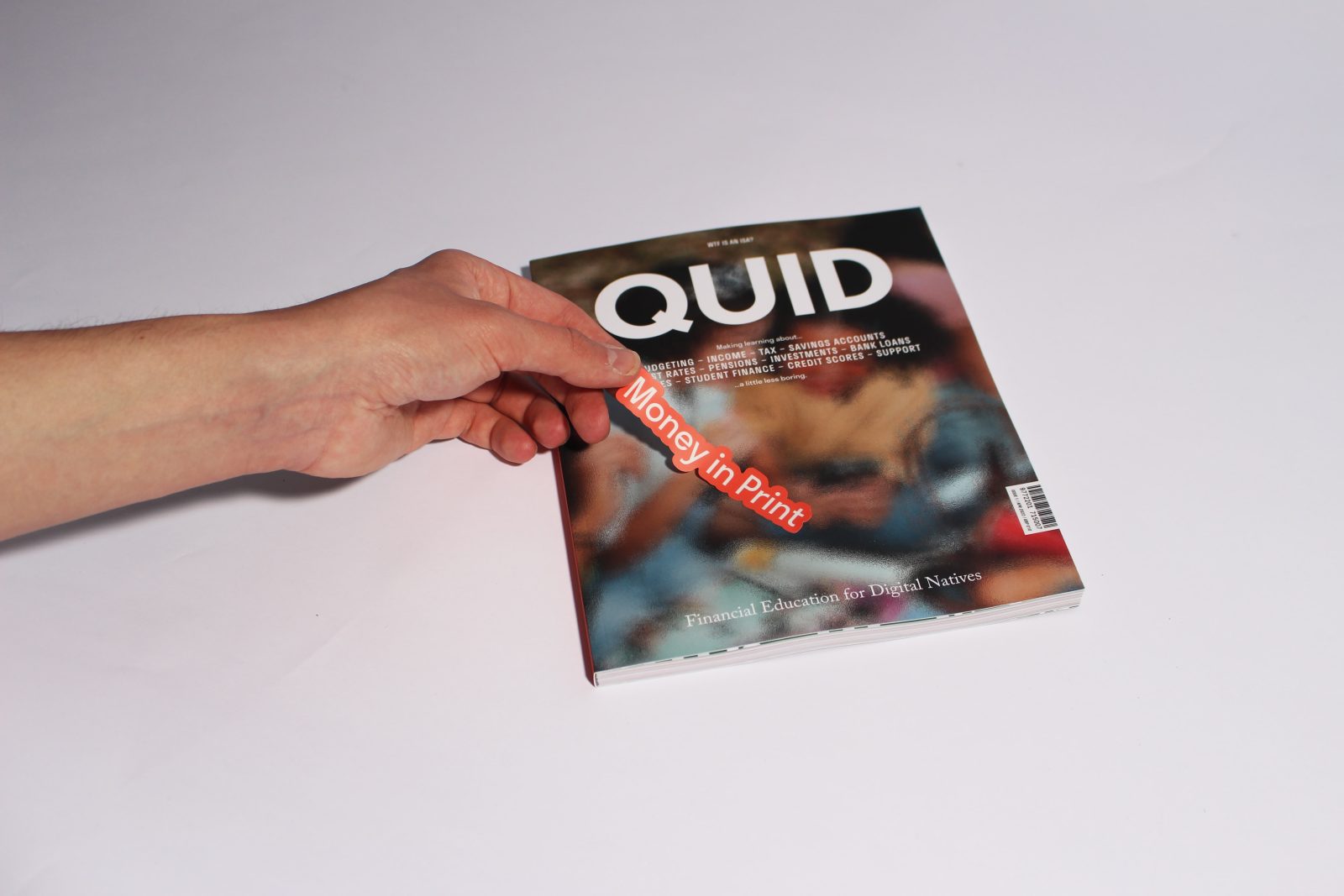
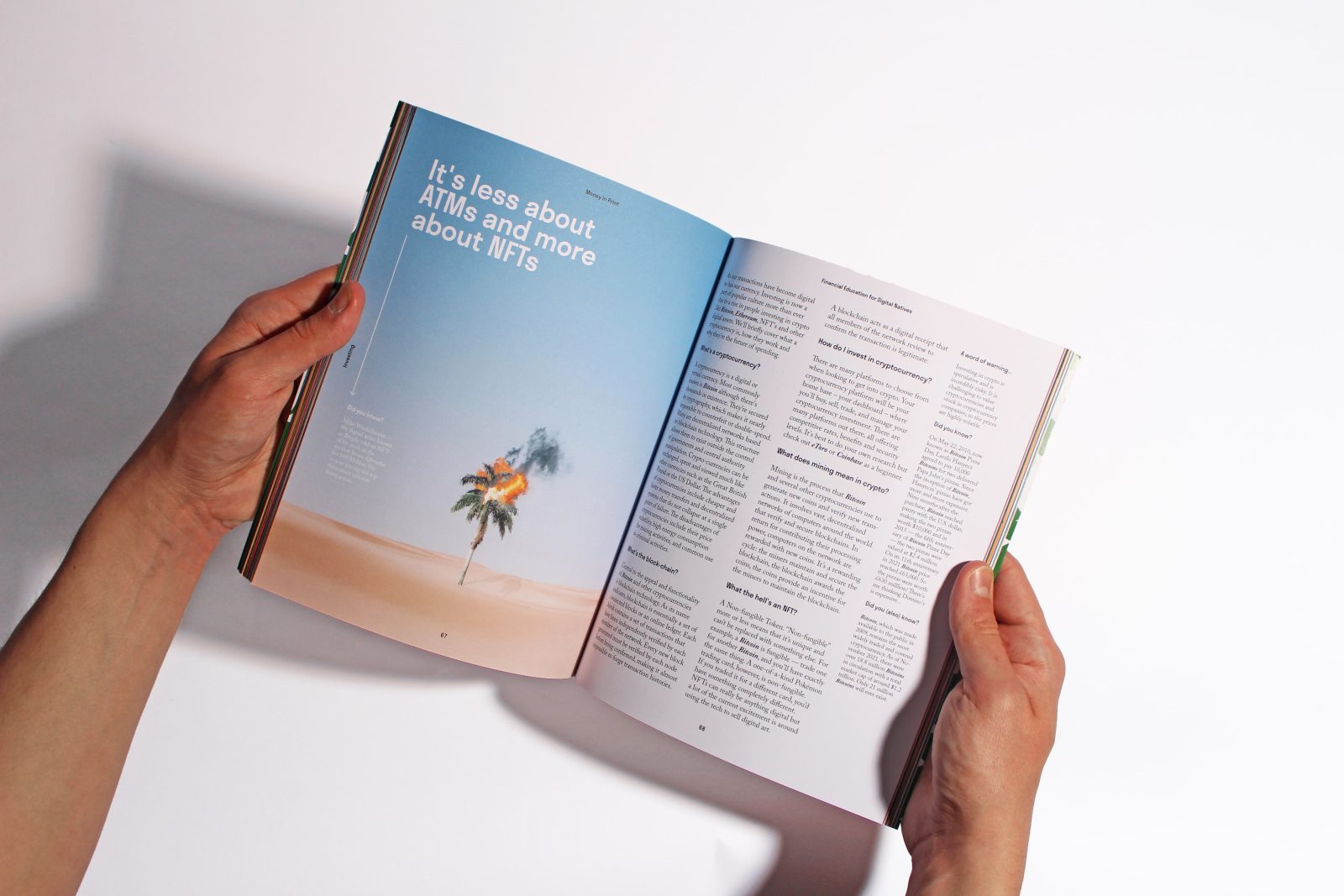
Quid gives young adults the tools to aid them in budgeting, being on the property ladder, teaching them about risk and investment opportunities, and how to manage their finance for retirement. Issue 1 is 108 pages, covering 12 core financial topics and printed on 150gsm uncoated stock with a 350gsm soft-touch lamination cover.
Named after the Latin term ‘Quid Pro Quo’; which is used as a noun and defined as ‘a favour or advantage granted in return for something’, It describes a situation when two parties engage in a mutual agreement to exchange goods or services for reciprocal benefit. I.e. Buying a magazine to learn about finance. Quid is also relatable to the target audience as a slang term for a pound coin.
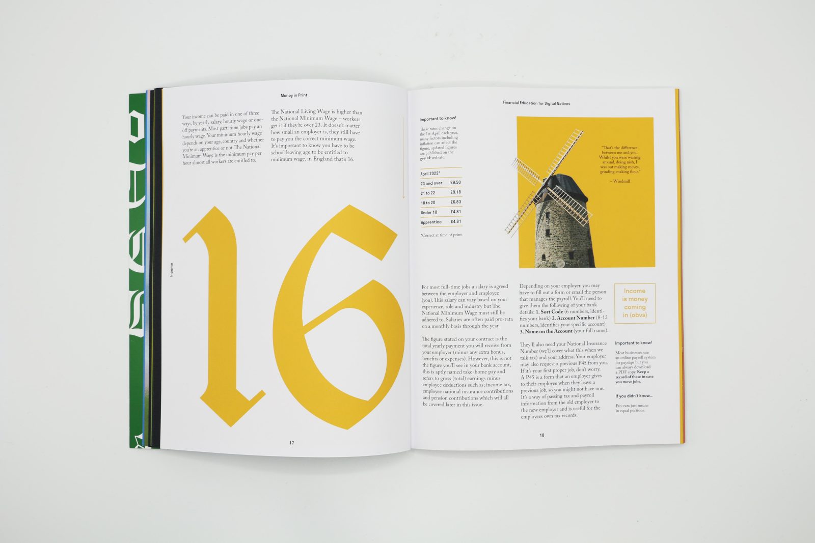
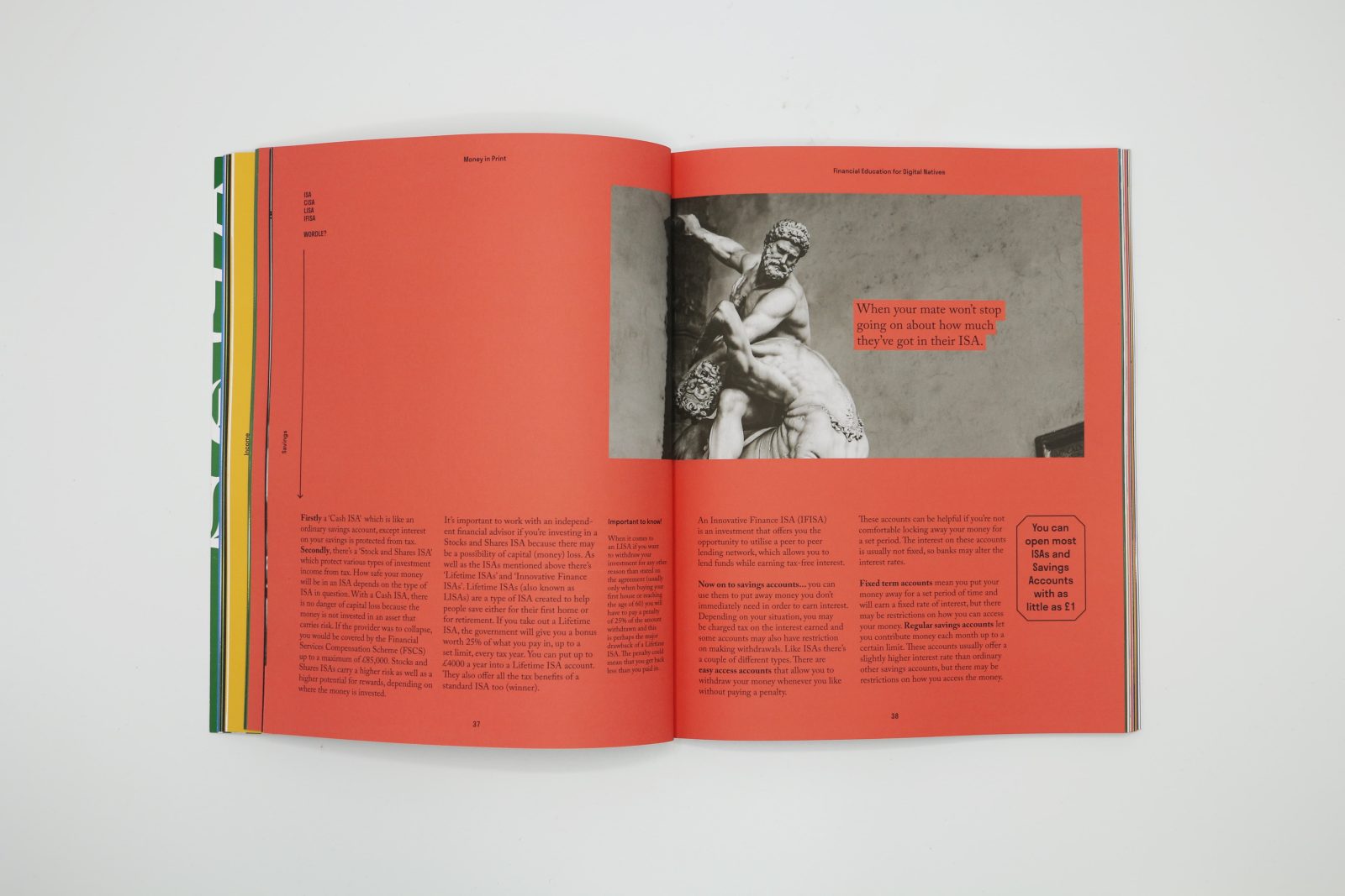
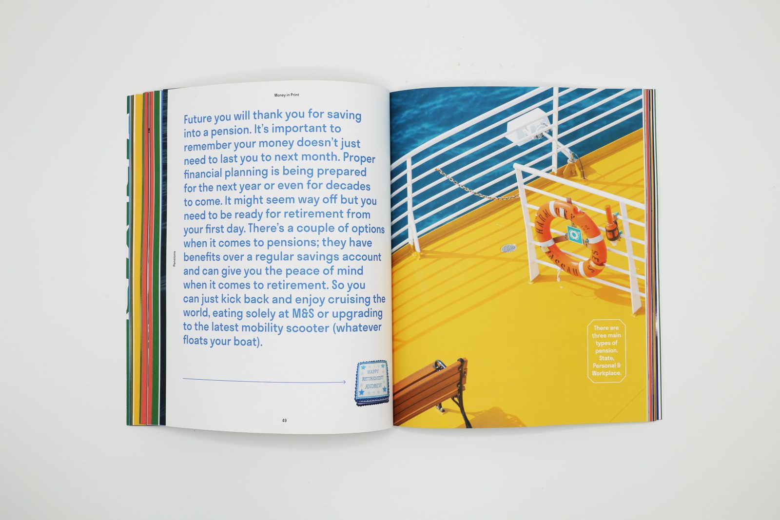
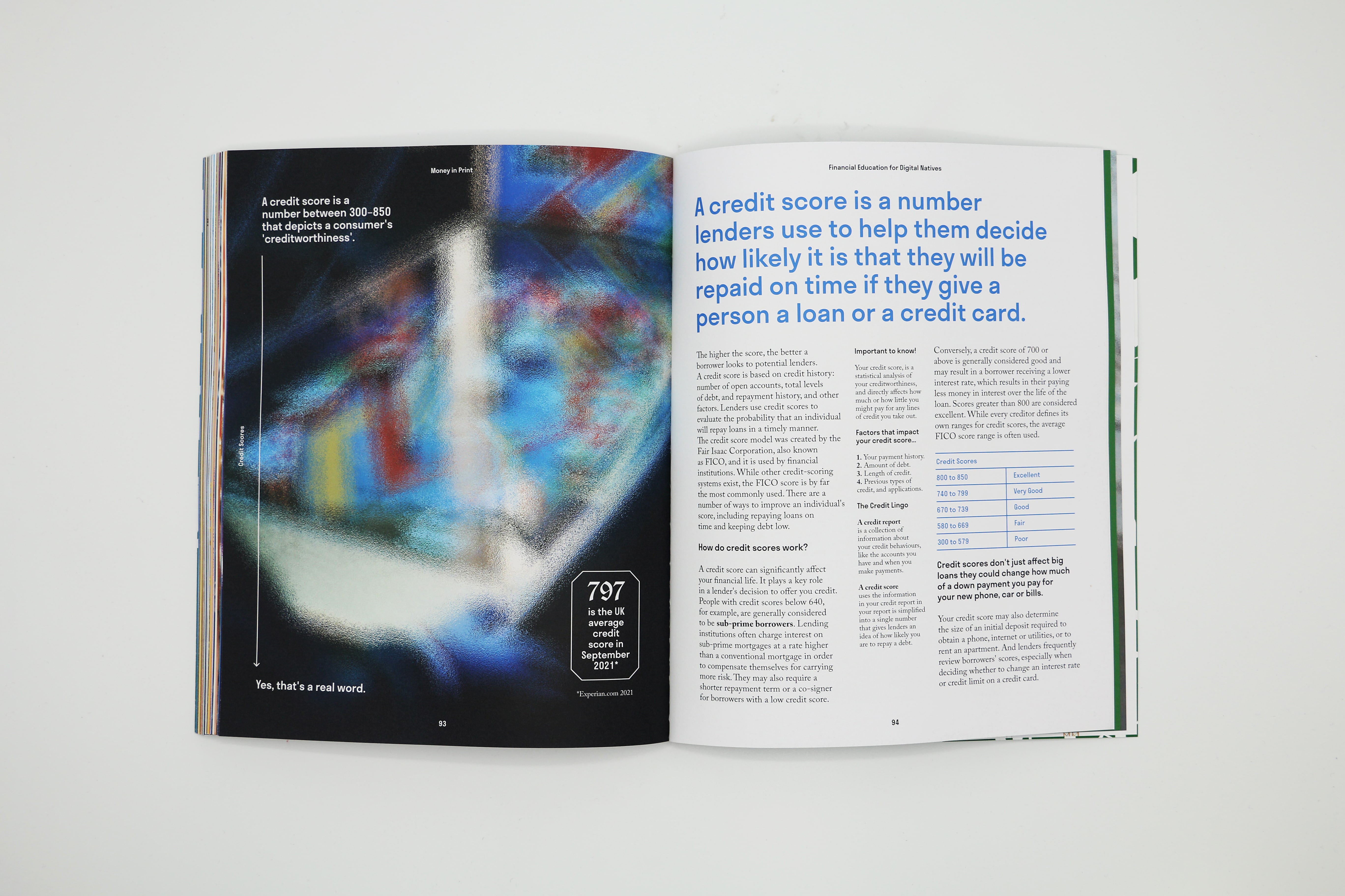
Imagery was freely sourced and aims to entice a feeling related to the specific topic, often using visual puns related to a caption or body copy. Quid never uses finance related imagery (such as piggy banks and stacks of cash) or that of real people to keep the brand away from the stereotypical finance aesthetic. As we are providing clarity beyond the screen, a glass effect is sparingly used across imagery to nod to this.
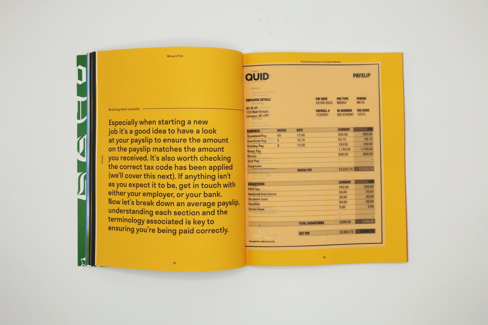
The detail in the educational content was sourced from government websites and publicly available resources from banks, building societies and financial institutions where appropriate.
Quid aims to stand out from stagnant and corporate banking colours by using a bold and confident palette that takes direct inspiration from many people’s first interaction with money, the board game ‘Monopoly’.
Talking about, and understanding money is deemed a highbrow or convoluted conversation, but we should all be able to speak the language of money. When it comes to tone of voice Quid is informative but non-advisory. Youthful without trying hard to sound cool and uses language our audience speaks; making the technical clear, by swapping formal words for ones in daily use. We engage readers with puns and playful titles whilst ensuring a trusting, knowledgeable undertone runs consistently through all copy.
Financial education should be accessible for all, even more so for the next generation entering the workplace and leaving home. It is proposed that a copy of Quid be available in every school library or common room as well as being available to purchase online and has been well received so far by those who have bought a copy.
CREDIT
- Agency/Creative: Ben Clarke
- Article Title: Quid Magazine Graphic Design for Publication – Financial Education for Digital Natives
- Organisation/Entity: Student
- Project Type: Graphic
- Project Status: Non Published
- Agency/Creative Country: United Kingdom
- Agency/Creative City: Newcastle
- Industry: Education
- Keywords: WBDS Student Design Awards 2022/23
-
Credits:
Educational Institution: Northumbria University - Art, Design and Social Sciences - Graphic Design BA
Educator's Name: Victoria Newton & Debbie MacQueen


