Brand Background
As the first building in Taiwan to combine an art museum and a library, the significant feature of Taichung Public Library is its space planning and utilization. Based on the concept “Library in the Park, Art Museum in the Forest”, the library is located in a city park, an extension of the forest and city. The pure white building stands in the forest and represents the intersection of the city and nature, constituting a new cultural indicator.
Design Concept
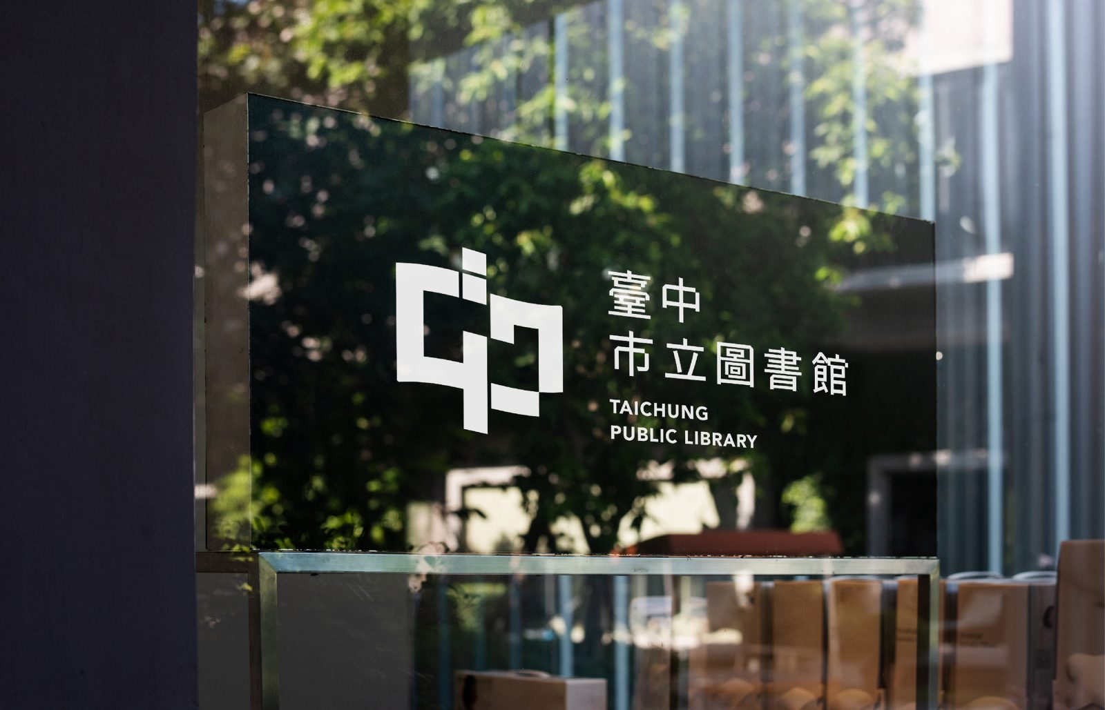
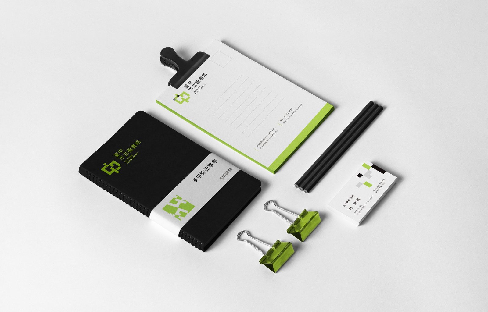
I helped the library develop a visual strategy based on the core concept. The Logo was inspired by books, the character “中” from Taichung, and the library building. Block-shaped graphics are used to extend the combination of books and the character “中”, which matches the building’s square design. The wavy edge makes the Logo flexible, like jumping in a book sea and enjoying gaining knowledge. I use green as the primary color. The black block is on the park’s north side, where the library is located.
Flexibility
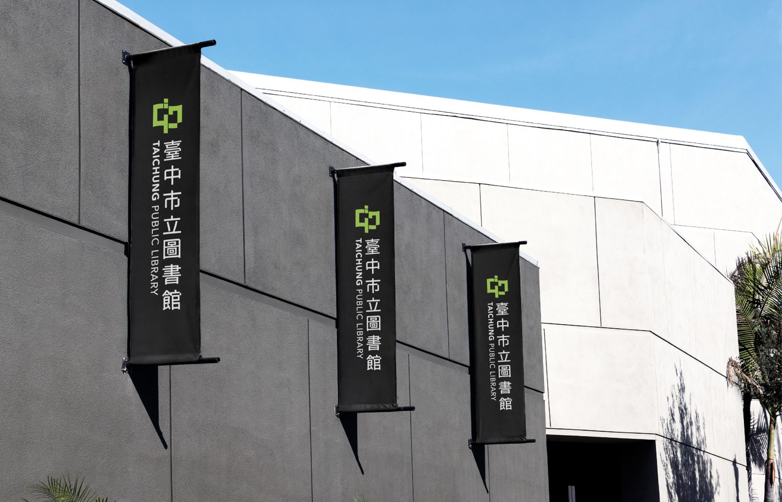
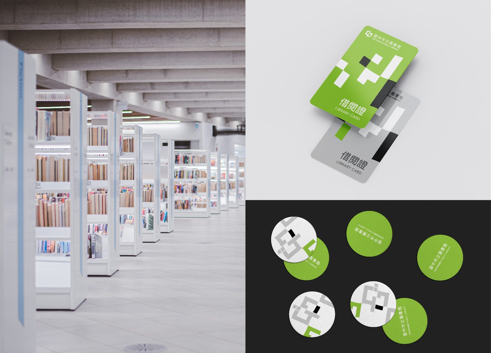
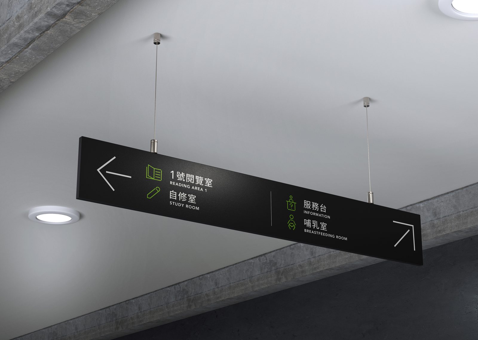
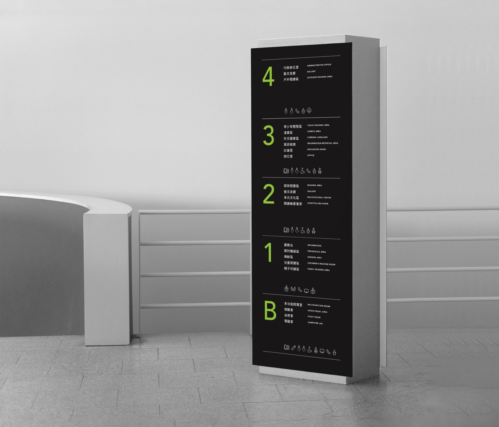
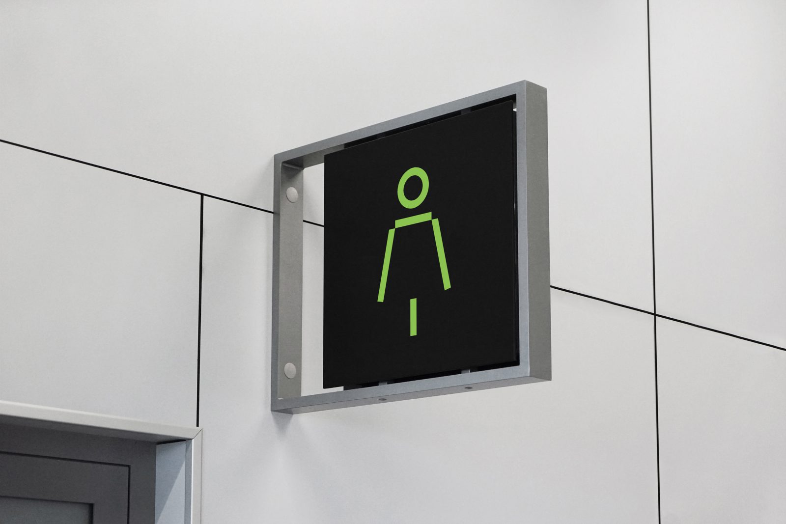
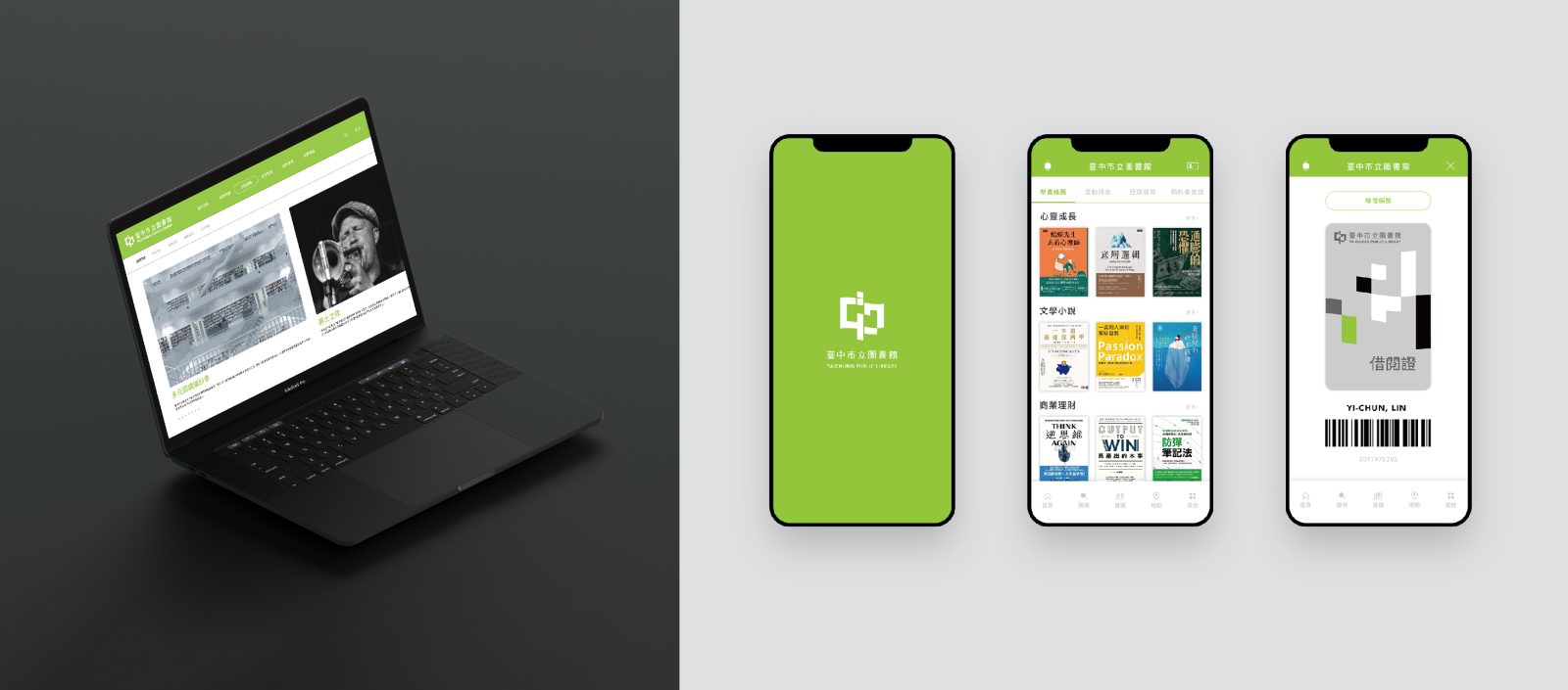
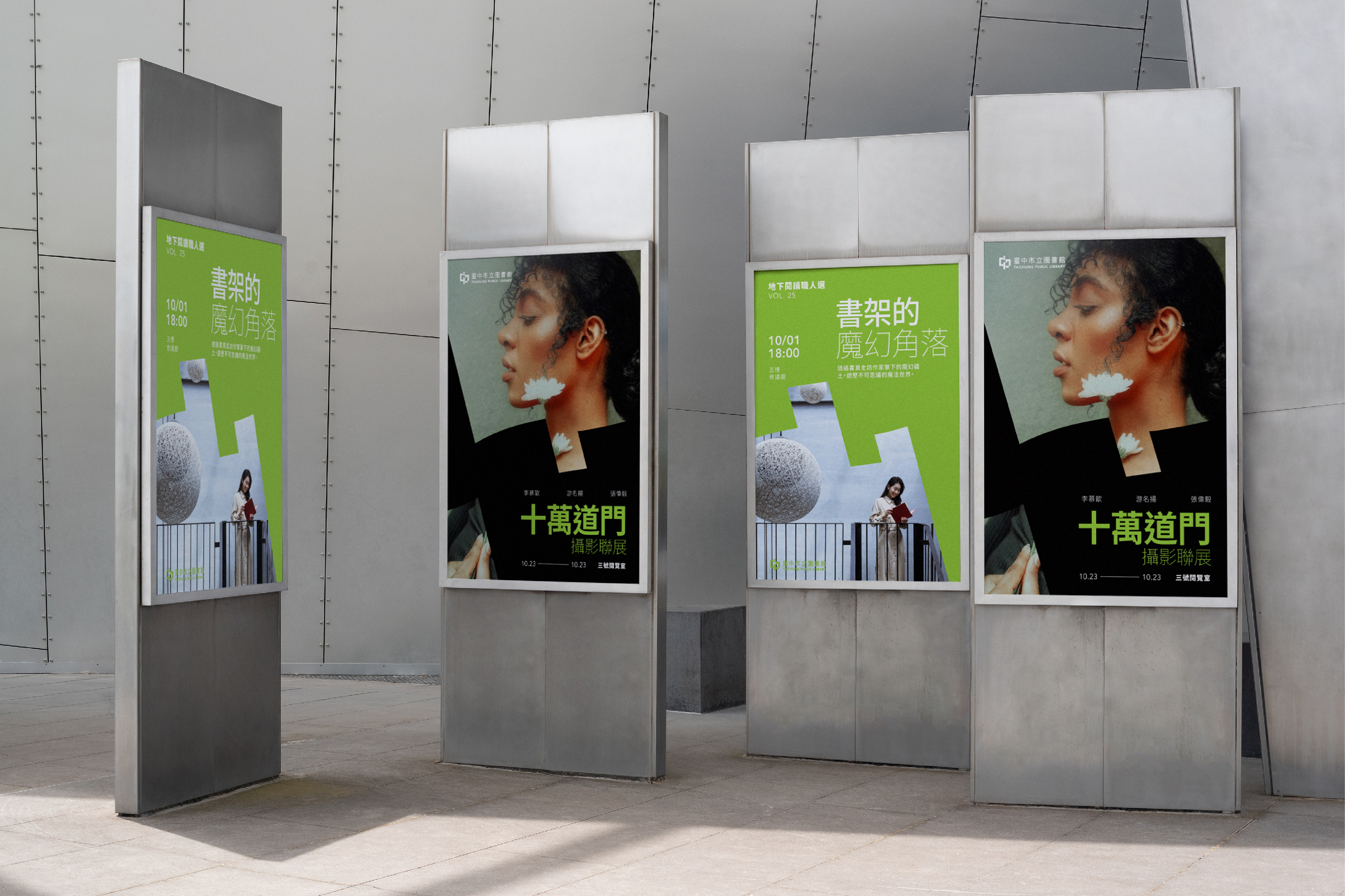
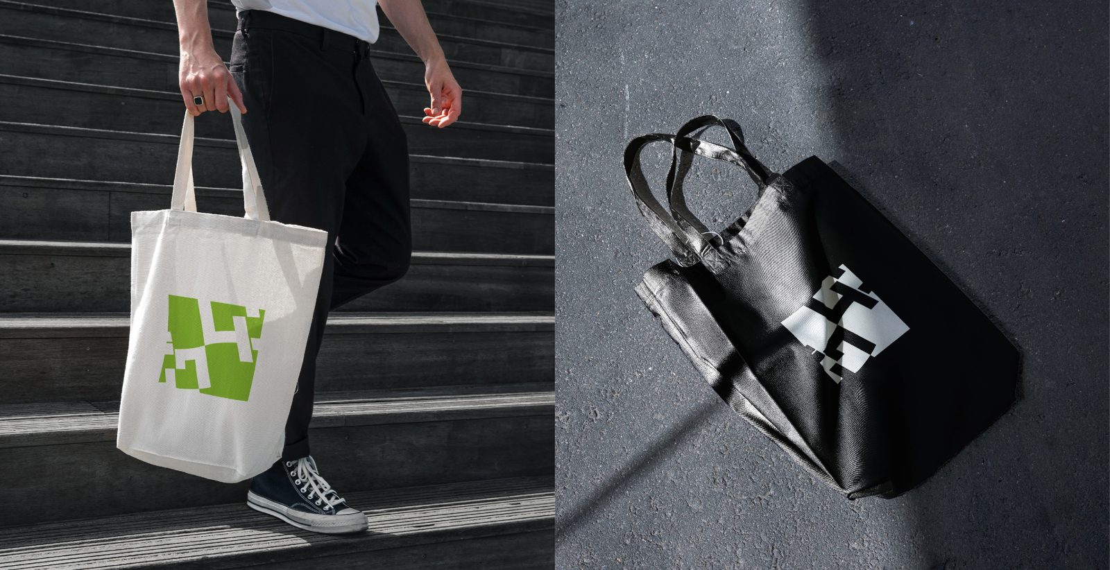
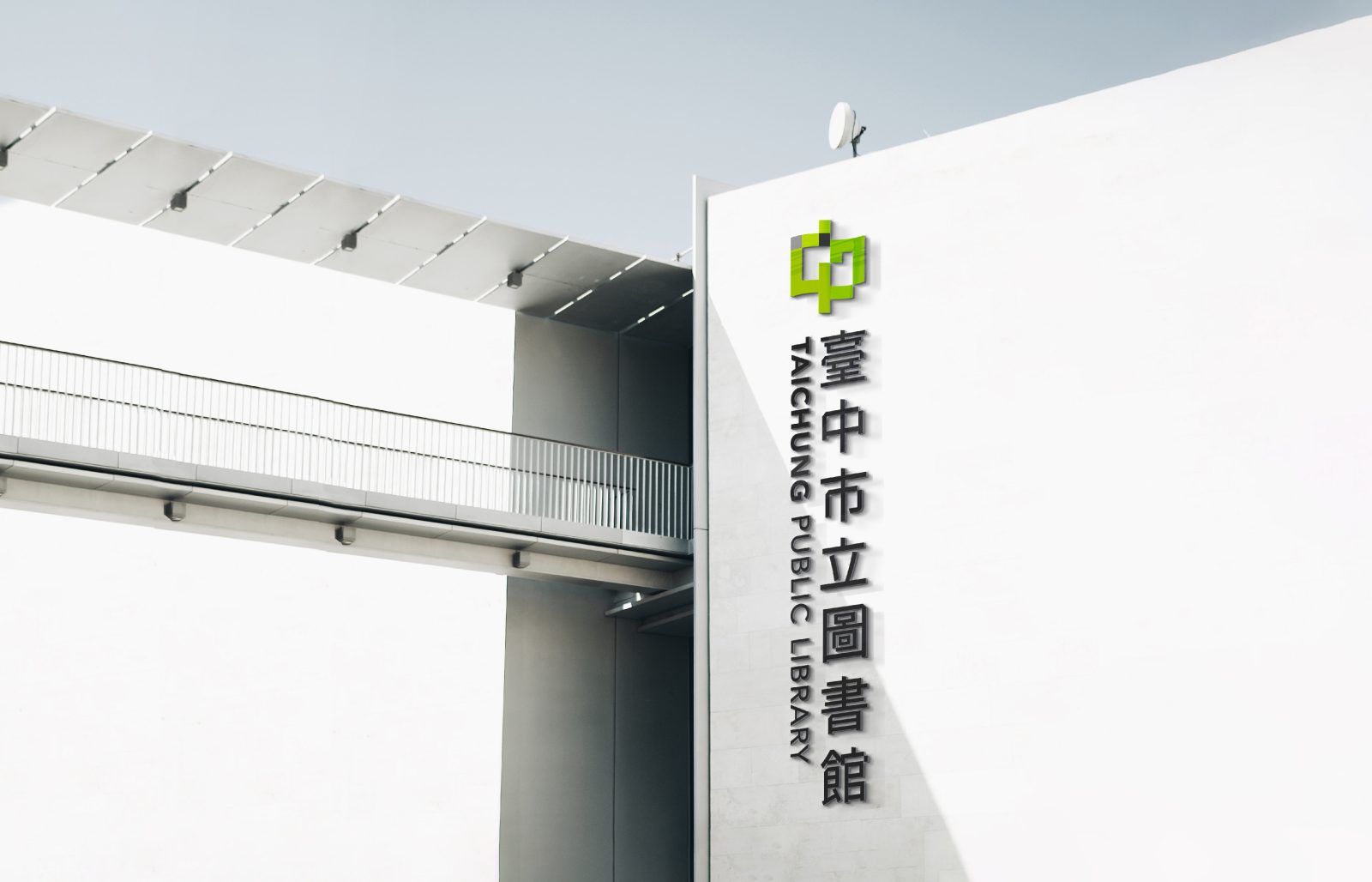
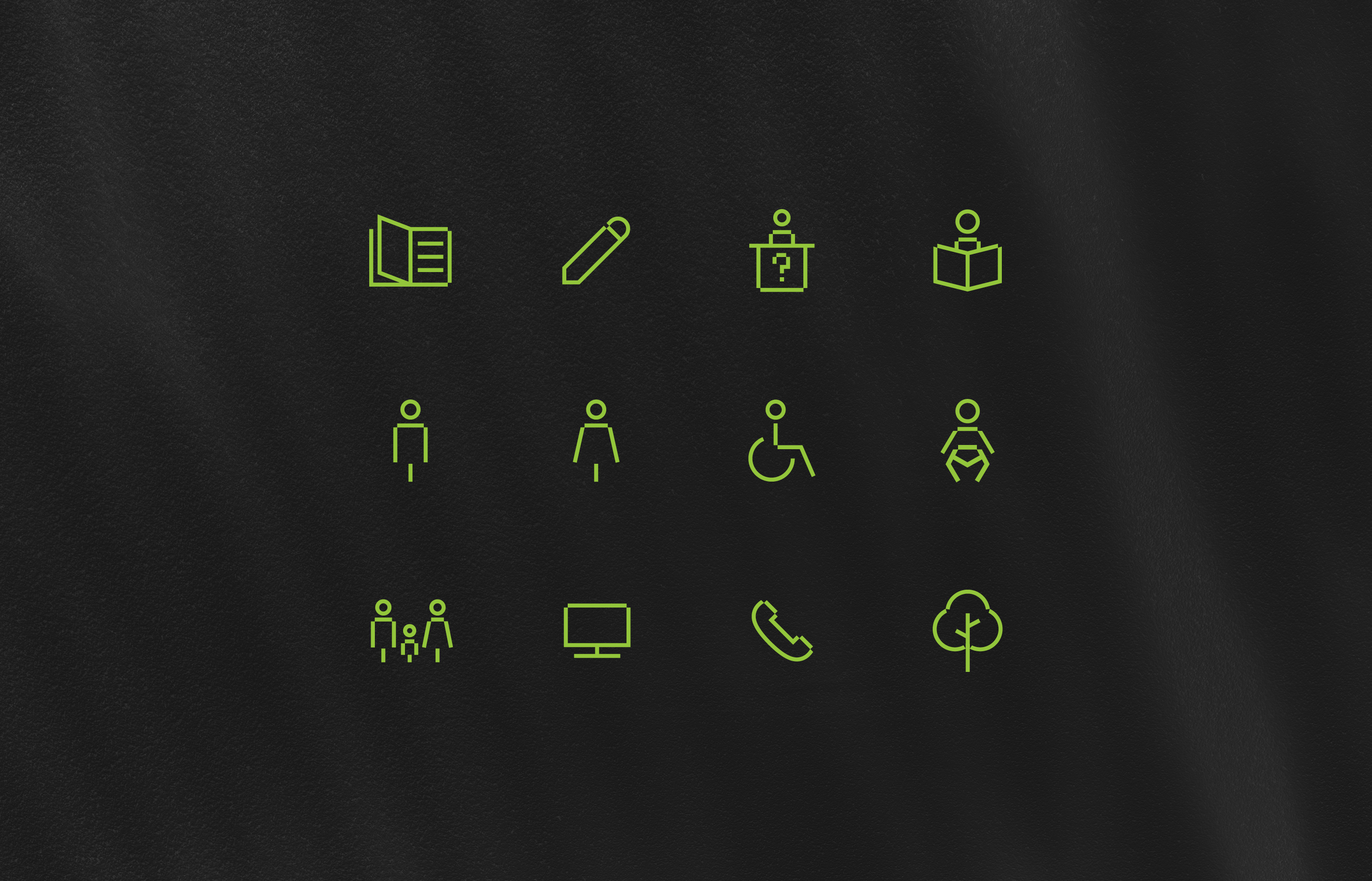
Depending on the branch name, the wordmark can be customized and used as exterior signage. The Logo can be applied to the library merchandise. With the extension of the graphic units and color palette, identification can be present on various products and official documents with the system.
Color Palette
According to the concept of the location of the library and the building park, the logo design uses green, white, and black. Green is the priority color; the black block is on the park’s north side, where the library is located. The font of wordmark is Noto Sans for Chinese and Avenir for English. To match the wordmark better to the Logo, I modified the proportion and details of the wordmark. I emphasized the feature of the block-shaped graphic element, which corresponds to the library building.
Challenge
The library is expected to open in 2025, so we can only know what the building will look like from the renderings. This increases the difficulty of the design process, and the designer cannot see the effect of actual application in facilities and merchandise.
CREDIT
- Agency/Creative: Yichun Lin
- Article Title: Taichung Public Library Brand Identity
- Organisation/Entity: Creative , Freelance
- Project Type: Graphic, Identity
- Project Status: Non Published
- Agency/Creative Country: United States of America
- Agency/Creative City: New York
- Market Region: Taiwan
- Industry: Education
- Keywords: WBDS Creative Design Awards 2022/23
-
Credits:
Photographer: Keith Camiller
Photographer: Ryunosuke Kikuno
Photographer: Gabriel Sollmann
Photographer: Aarón Blanco Tejedor
Phototgrapher: Bernard Hermant
Photographer: Tove Liu
Photographer: Beatriz Santana


